Using Radar Charts
A radar chart is a chart in which each data point gets a separate copy of a single value axis, with the axis copies distributed radially around a center point. Because each series gets its own value-axis copy, the chart has no need for a category axis. Figure 27-6 shows one of these remarkable creatures.
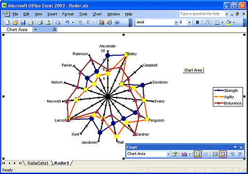
Figure 27-6. Because this radar chart plots 15 points for each of three data series, the plot uses 15 separate copies of the value axis.
The three series, Strength, Agility, and Endurance, have 15 data points each. Hence, the chart has 15 copies of the value axis. Only one of these copies, the one that points straight up toward ...
Get Microsoft® Office Excel 2003 Inside Out now with the O’Reilly learning platform.
O’Reilly members experience books, live events, courses curated by job role, and more from O’Reilly and nearly 200 top publishers.

