Chapter 14. Using Excel Charts
Numeric information is often easiest to understand when it is presented graphically in an Excel chart (Figure 14.1).
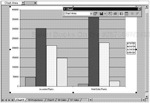
Figure 14.1. An Excel chart.
In Excel, you can create a default chart with a single click. Once Excel has created the chart, you can tailor it to your needs by clicking any element and using Excel’s tools to edit that element. You can add, change, or delete titles, labels, legends, and gridlines. You can choose any of nearly two dozen chart styles, including bar, column, line, area, pie, scatter, bubble, and radar charts, and you can add 3-D effects to many of them. You can easily add, change, or remove ...
Get Microsoft Office XP for Windows: Visual QuickStart Guide now with the O’Reilly learning platform.
O’Reilly members experience books, live events, courses curated by job role, and more from O’Reilly and nearly 200 top publishers.

