Examples
Could this just be a fluke, a peculiarity of this one example? Let's try it on several other charts, different tickers and different timeframes. In the following charts, the standard curves are dotted, and the new Calibrated Curves are solid.
FIGURE 9.2 A Calibrated Curve, inserted between two primary curves.
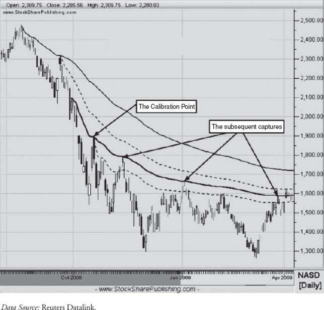
Figure 9.3 is the weekly bars chart of AT&T, ticker T, from 2001 through mid-2006.
That huge price drop in late November 2002 was due to a major divestiture and reorganization, after which it really became a completely different company, so you might expect that technical analysis (TA) tools like MIDAS curves would not hold their ...
Get MIDAS Technical Analysis: A VWAP Approach to Trading and Investing in Today's Markets now with the O’Reilly learning platform.
O’Reilly members experience books, live events, courses curated by job role, and more from O’Reilly and nearly 200 top publishers.

