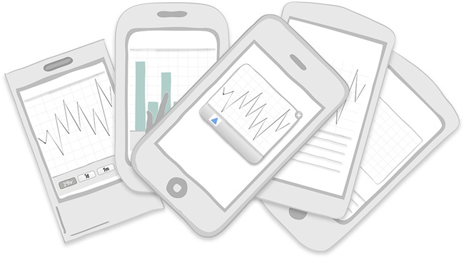
Chapter 6. Charts
- Patterns
Chart with Filters, Interactive Timeline, Data Point Details, Drill Down, Overview plus Data, Interactive Preview, Dashboard, Zoom, Sparklines, Integrated Legend, Thresholds, Pivot Table
Designing charts for the mobile form factor is a challenge. However, it also provides an opportunity to get to the very core of the best practices for data visualization. A chart should tell a story by depicting important relationships in data. If it isnât doing that, it is just a waste of space.
In the first part of this chapter, I offer some tips to help you make sure the charts you design are clear and meaningful to your audience. Along the way, weâll look at some good and bad examples to illustrate these tips. In the second part of the chapter, weâll look at common chart design patterns. Finally, weâll wrap up by looking at a couple of apps that pull everything together in exemplary fashion.
- Tip 1: Learn the basics
Many of the guidelines and best practices for print and desktop chart design apply to mobile chart design as well. A great introductory book on this topic is The Wall Street Journal Guide to Information Graphics by Donna Wong (Norton, 2013). âData Visualization Best Practicesâ (http://slidesha.re/1fFbP2W), a presentation on SlideShare by business information analyst Jen Underwood, is a very quick and easy way to learn the basics.
There are many chart ...
Get Mobile Design Pattern Gallery, 2nd Edition now with the O’Reilly learning platform.
O’Reilly members experience books, live events, courses curated by job role, and more from O’Reilly and nearly 200 top publishers.

