Chapter 1. Setting the Stage to Learn Mobile HTML5, CSS3, and JavaScript APIs
If you’re anything like me, you’ve hated older versions of Internet Explorer for years. Those browsers were full of fail. However, they failed the same way everywhere for their entire life spans.[6] We all knew IE6 sucked, but it sucked in the same way. Once we figured out how to polyfill for IE6, we had it figured out.
In the mobile landscape, we also have failure, but we have failure in newer, more diverse, ever-changing ways. Different browser versions on different devices may support many new features, but may do so in different ways. Or, they may support a feature, but that feature may not be usable. For example, a modern device may or may not support localStorage. The devices that support localStorage may or may not allow you to write to it. Even if the browser allows you to read from localStorage, reading from it may take a long time and hinder performance. And, even if the browser generally allows you to write to it, localStorage itself may have reached the storage limit.
We can’t cover all the quirks in all the browsers for all operating systems and devices here. Even if I knew all of the quirks (and I don’t), the quirks could fill a tome, and said tome would be outdated before I finished writing it. This book is, in fact, out of date. The landscape is ever changing. There is no way to produce a book that is up to date because by the time it goes to print—or even by the time you finish a chapter—the landscape has changed. While some of the browsers, features, phones, and sites mentioned may already be obsolete, the best practices brought forth in this book should be relevant for the next few years. A guiding principle for this book: if you use best practices and code to standards, your code will work in current devices and all future devices.
I included browser support for features, but not lack of support for browser features, as it is expected that all browsers will move forward in the right direction. What is a quirk in a browser today may be resolved tomorrow.
For these reasons, when using a feature, you do need to both feature detect and you need to test to ensure you can successfully use the supported feature.
This book is using device-, OS-, and browser-agnostic markup and no JavaScript libraries. I’ve gone library free, coding in vanilla JavaScript, to ensure that you learn actual code. By coding in vanilla JavaScript, I’ve hopefully removed any confusion there may be as to whether a method is native or a framework method.
This doesn’t mean you shouldn’t use libraries. On the contrary! Open source libraries are some of the best places to find out about browser quirks. Open source projects have hundreds, sometimes thousands, of contributors. These contributors provide for thousands of eyes developing and testing on a multitude of devices, finding the quirks, reporting the quirks, and checking in fixes to the libraries to handle the quirks or provide workarounds and polyfills. These thousands of eyes are also reporting bugs, alerting browser vendors as to what is not working to standards so that these bugs can be fixed in future browser releases.
Popular open source libraries and HTML5 JavaScript API polyfills are the best resources for quickly discovering various browser quirks and solutions. They should be considered an important part of your development tool chest. Even if you don’t use them, do read the source code to learn about the mobile browser bugs others have discovered.
The best way to learn HTML5, CSS3, and the associated JavaScript APIs as you read about them is to code. Let’s code.
CubeeDoo: HTML5 Mobile Game
The way I learned HTML5 and CSS3 was to mark up a web application for a single mobile browser and push it to its limits. My first foray into CSS3 was a Twitter/Major League Baseball web application mash-up called Pickleview, written the weekend the iPhone first came out in 2007. At the time, Safari for the iPhone was the most advanced browser on the market (except for maybe Opera). By programming it for a single browser, I didn’t have to worry about IE6, IE7, or Firefox 2 (Chrome didn’t exist yet). Back in 2007, that was the state of the Web.
In 2010, I redid the exercise of coding with the most modern HTML5 and CSS3 in a single browser. A few friends and I created a memory game with animations, storage, offline capabilities, and every new feature that could be found in Chrome 12 on a desktop that wasn’t in Safari 3.1 for mobile. By using a single browser and leveraging all of the new technology I could, I was able to learn to code newer HTML5, CSS3, and JavaScript modules that weren’t yet usable in production because of the need to support legacy browsers. By 2010, some browsers had come a long way since 2007. Others (IE, I am looking at you here), not so much.
In 2013, most browsers support HTML5 and CSS3. As developers, we are being held back by having to support older desktop browsers, namely Internet Explorer 9 and earlier. On mobile, we have our own “IE6.” We are held back by feature phones and by smartphones running Android 2.3 to some extent. But even feature phone browsers and Android 2.3 both support many modern features.
To learn to code HTML5, CSS3, and the associated JavaScript APIs, temporarily forget about older browsers. Together we’ll learn what is possible with these newer technologies. I’ve put the majority of the features that have broad support in modern browsers into the code examples in this book.
CubeeDoo, as shown in Figure 1-1, is a completely frontend-coded memory game. I’ll be using code examples from this game, along with a native iPhone settings application replica (as seen in Figure 9-3) throughout the book. The game is marked up with HTML5 elements. Some of the themes include matching icons created with generated content. CSS transforms, transitions, and animations, along with gradients, rounded corners, and other CSS features are used to create the look and feel of the game. The game also includes SVG, JSON, the deprecated but mobile-supported webSQL, localStorage, sessionStorage, data attributes, HTML5 forms, audio, media queries, and data URIs.

The code in this book uses no frameworks of any kind. As mentioned earlier, everything is handcoded in vanilla JavaScript, HTML5, and CSS. The goal is to teach you the actual APIs, not polyfills. In production, you will likely want to use polyfills, but to smartly use polyfills, you need to understand what the polyfills do. This book teaches you that.
This book covers CSS3, HTML5, and the associated APIs. The focus is learning the technologies in a mobile landscape. We live in a mobile world, but there is no “mobile web.” There is simply the Web. But if you focus on the desktop only, the version of the Web you create may not work for the increasing population that only accesses the Web via mobile devices. And, if you only focus on desktop, you’ll only concern yourself with the lowest common denominator of older Internet Explorer versions.
Never push to production an application that only works in a single browser. However, to learn technologies that are nascent, ignoring “older” browsers can provide you the opportunity to learn, to challenge yourself, to think outside the box, and to get to the top of your game. Take what you learn in this book and, using a single browser, code to the limits of what the browser can do. Experiment. You’ll fall in love with web development all over again.
Development Tools
Before starting to develop your first mobile web application, you’ll want to set up your development environment with the best “tools of the trade.” Good news! You already have these tools.
All you need to follow along with this book is a computer with a text editor and browser. You don’t even need a phone, though having a mobile device will be hugely helpful.
Text Editor
You should be developing in a plain-text editor or integrated development environment (IDE). An IDE is software that generally includes a text editor, debugger, and any other features or plug-ins, such as a file transfer protocol (FTP), that you may need to get the job done. People have their preferred IDEs. Pick whatever suits you. My preference is Sublime Text, but you can use TextMate, Dreamweaver, Eclipse, WebStorm, or whatever makes you happy. While you only need a plain-text editor, you’ll discover that using an IDE can help you organize and streamline your development process. I recommend selecting an IDE and becoming best friends with it. IDEs can be hugely powerful tools that make developing pleasant—almost a dream.
Browser
You also need a browser. I prefer developing in Chrome Canary, which is the beta version of Google Chrome. I prefer this browser because of the debugger. All modern browsers have debuggers, but the Chrome debugger is one of the best, and the Canary debugger provides me insight and access to all the new bells and whistles before they even enter into a browser release.
If you don’t have an Apple computer, you won’t easily be able to develop native iPhone, iPad, or iPod touch applications. If you don’t have Windows 8, it would be hard to develop what are formally known as Metro-style applications. No worries! For what we are learning, all you need is a modern browser. The operating system or the device does not matter. You can test all the examples in this book on Windows, Unix, Android phones and tablets, and Macs—you name it.
Your IDE and desktop browser will be your main tool for mobile web development. Your mobile application is previewed and debugged in your desktop browser throughout the development process. There are features that your desktop browser will not succeed at emulating, including mobile rendering accuracy, JavaScript performance, memory and bandwidth limits, and API availability. However, these differences can be overcome with other tools and by testing directly on real or virtual devices.
While you will enjoy developing in your favorite browser, you should have in your toolkit multiple browsers available for testing. You will want access to Internet Explorer for easier testing of the Windows Phone environment. Safari or Google Chrome will enable you to test Android, Bada, Blackberry, and iOS. You’ll also want Firefox for Gecko devices. Opera is currently needed for testing all the devices that run the Presto rendering engine, but as Opera Mobile 14 is Chromium-based, and the most recent Opera and Chrome are on Blink,[7] the browsers you need for development need to be updated to match the landscape you are developing in.
If you haven’t done so already, download Safari if you’re on a Mac, or the latest Internet Explorer if you’re on Windows. Download Chrome, Firefox, and Opera on your device as well, even if you’re on Unix. You can also download Chrome Canary, Aurora, Opera Next, and WebKit Nightly builds to test in the next releases of the major browsers. These are the current desktop browsers at the time of this writing, but the landscape is ever changing.
Debugging Tools
Browsers come with development tools. Developer tools are built-in browser tools that allow you to inspect and debug your source code. Using the tools, you can manipulate the Document Object Model (DOM), edit and debug JavaScript code, edit and debug CSS, analyze resource requests, and audit the performance of web content and web applications on live content.
Developer tools are generally hidden because most users, other than developers, don’t utilize these browser features. Mobile browsers often have some debugging capabilities in the device browser. These limited debugging tools are usually available via the device settings interface. Though device-level debugging may be available, it is much easier to debug applications in the much more robust tools you access on your desktop.
Desktop Debuggers
If you’ve been developing websites for any amount of time, you’re likely familiar with Firebug,[8] F12, Web Inspector, and/or DragonFly. Firebug is a Mozilla extension. F12, Web Inspector, and DragonFly ship with Internet Explorer, Chrome/Safari, and Opera, respectively. These developer tools all allow the debugging, editing, and monitoring of a website’s CSS, HTML, DOM, and JavaScript, and enable you to analyze features like HTTP requests, local storage, and memory consumption.
Firebug is available from getFirebug.com. Safari’s developer tools can be found under the Develop menu, but has to be made available via Preferences→Advanced, by checking “Show develop menu in menu bar.” In Chrome, you can open the developer tools via View→Developer→Developer Tools.
You can also open Chrome, Safari, Firebug, and Opera debuggers using Command-Option-I or Control-I. F12 and Firebug can also be opened by clicking F12. These tools are the browsers’ best tool for debugging CSS, JavaScript, and HTML.
You will want to become familiar with the Web Inspector, Error Console, and User Agent switcher. These debuggers allow you to inspect a web page’s CSS, HTML, JavaScript, DOM, and headers. Whether you use Web Inspector, Firebug, DragonFly, F12, Developer Tools, or some combination of these, get to know your debugging tools. Your debugger will become your other best friend.
Likely you have several years of experience using browser-debugging tools for desktop applications, so we won’t dive deeply into them here. However, even if you’ve been using them for five years, chances are you’re just scraping the surface of debugger awesomeness. I encourage you to dive deeper on your own, exploring every millimeter with a click and a right-click. We cover the developer tools Timeline tab in Chapter 14.
Mobile viewport
To mimic the mobile viewport, you can simply resize the desktop browser window to the size of the mobile viewport you want to test. The desktop browser viewport is the browser window. In mobile, the viewport is what you see, but not necessarily what is painted to the screen, but resizing the window should be close enough for most of the testing you’ll need to do.
When you resize your browser manually, you can get random sizes. In the Overrides panel of the Settings window, as shown in Figure 1-2, Chrome Developer Tools provides several preset device sizes. Access the Web Inspector settings window by clicking the gear in the bottom right of Developer Tools.
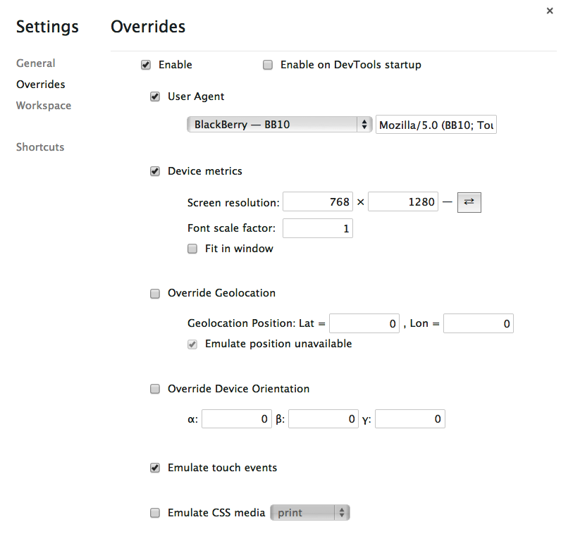
When you select a device from the User Agent select menu, Chrome switches the user agent to the selected device user agent, and creates a viewport within the browser window that is the size of the selected device. This provides you with a browser viewport that is the same size as the viewport of the selected device.
If your device is not listed, simply enter the device width and height in the two input boxes under device metrics. You can toggle between landscape and portrait mode dimensions by clicking on the toggle button to the right of the device metrics. Check out ScreenQueri.es to preview exact device screen sizes. You can also enable touch-event emulation, or use thumbs.js as a TouchEvent polyfill.
The Chrome Developer Tools also enable you to override geolocation to emulate a specific longitude and latitude, and, even if your laptop has a gyroscope, you can emulate a specific device orientation.
After you’ve developed the first stage of your application with your desktop browser, you will want to test it on a mobile device. The main hurdle with testing on a mobile device is that you will not have access to the powerful inspectors that you have grown accustomed to on your desktop. This is why remote web inspectors are awesome.
Remote Debugging
There are tools to remotely debug your mobile browser via your desktop browser. Remote debuggers enable your desktop browser to communicate with external devices to remotely execute and capture code. Just like regular debugging, you can use these remote debuggers to inspect your HTML and CSS, manipulate your DOM and make live edits, and debug your scripts.
The Opera browser engine is being replaced. While I don’t know what the future brings, Opera has supported remote debugging of the Opera mobile browser through the Opera desktop Dragonfly debugger since 2008. It has allowed remotely inspecting HTML and CSS, updating the DOM, adding breakpoints, and anything else that could be done with Dragonfly on the desktop.
WebKit began supporting remote debugging via the USB port with Android 4 and iOS 6. To use Chrome to remotely debug, you start Chrome via the command line with a flag, instead of via its icon:
chrome.exe --remote-debugging-port=9222 --user-data-dir=remote-profile
or
/Applications/Chromium.app/Contents/MacOS/Chromium --remote-debugging-port=9222
To debug the Firefox mobile browser, add the Debug API, formerly the Crossfire extension, to Firebug.
Of course, the current state is always changing and improving. Keep up to date with Remote Debugging Protocol of the Browser Testing and Tools Working Group if this is a discussion you’re passionate about.
Android debugging tools
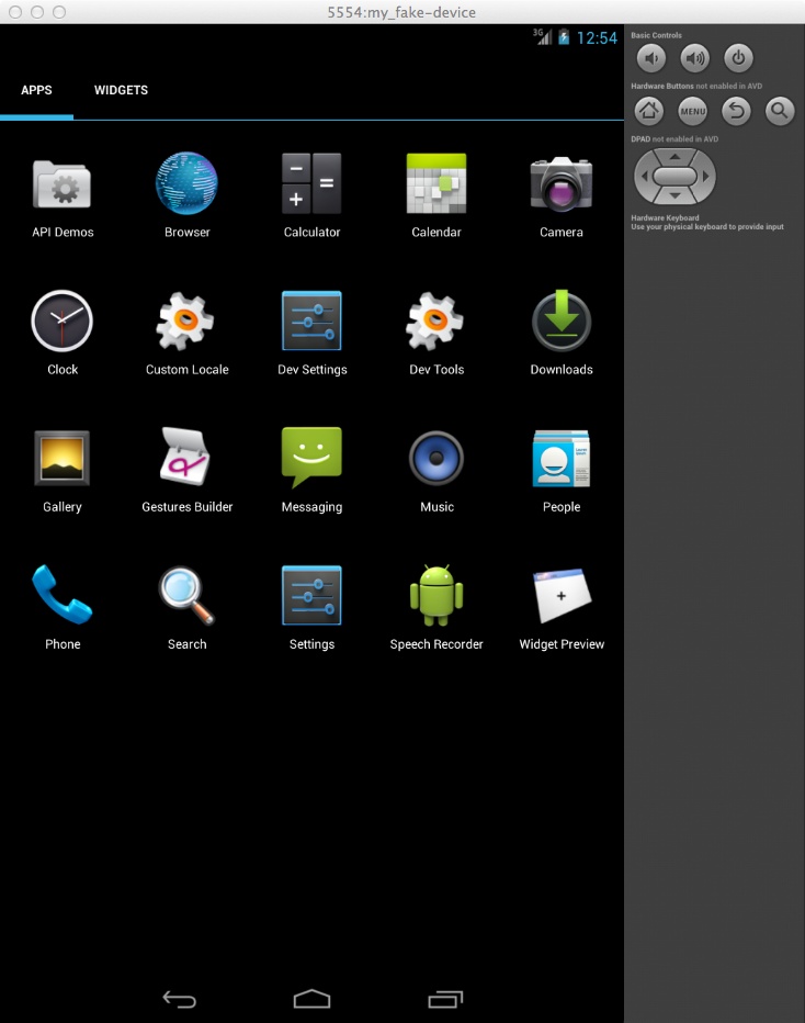
The Android SDK includes the API libraries and developer tools necessary to build, test, and debug apps for Android. You can debug web applications directly from your devices or from emulators the SDK enables you to create, as seen in Figure 1-3.
Downloading the SDK at http://developer.android.com/sdk/ will provide you with the Android Debug Bridge (ADB), debugging, console monitoring, and emulator creating and launching capabilities.
In the downloaded assets, find the tool folder and open android to access adb. The ADB provides various device-management capabilities, including moving and syncing files to the emulator, running a UNIX shell on the device or emulator, and providing a general means to communicate with connected emulators and devices.
If you prefer, the ADB plug-in is a Chrome extension that runs an ADB daemon and enables remote debugging for mobile without needing to download the SDK.
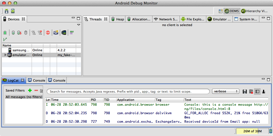
In the same tools folder,
open Monitor to access the
Android Debug Monitor. The monitor contains a console by
which you can debug your applications, including viewing any console.log()s you may have included in your
site. The devices being debugged are listed in the device panel on the
left in Figure 1-4, and the console
log is at the bottom.
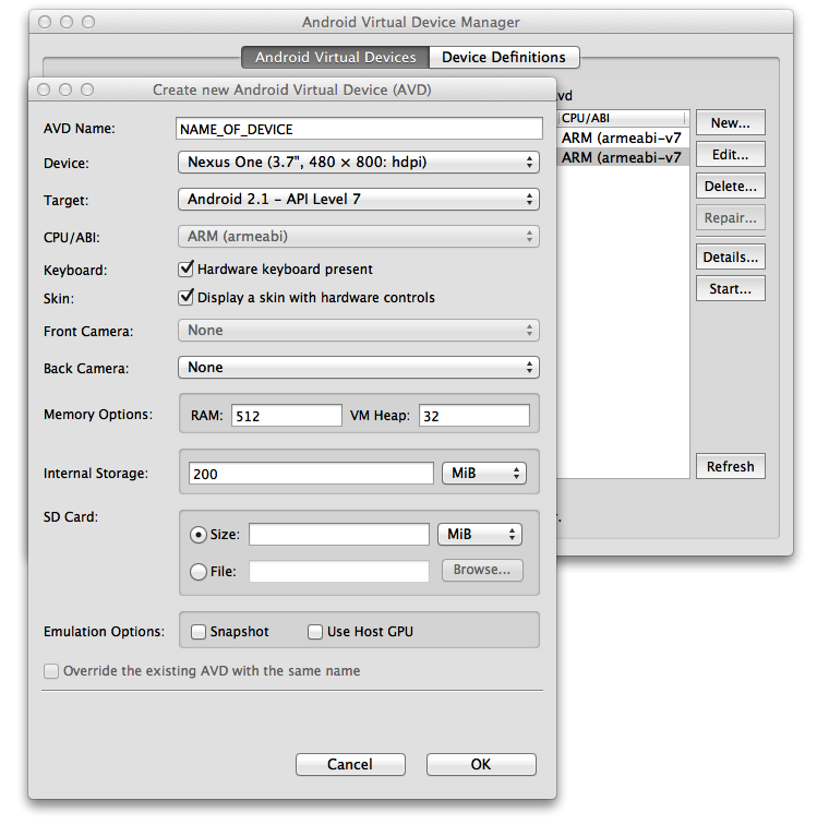
When the Monitor is open, under the Window menu you’ll find the Android Virtual Device Manager, as shown in Figure 1-5. Via this window you can create new emulator testing devices and launch them, as shown in Figure 1-3.
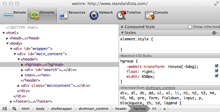
weinre
Weinre, short for web inspector remote, is a powerful remote debugger that lets you inspect and debug JavaScript, HTML, and CSS. Weinre is part of the PhoneGap project; you can use it locally or hosted at debug.phonegap.com. Weinre is also the basis of Adobe Edge Inspect, described in the section .
Weinre is a remote debugger that enables you to connect your current mobile browser window with a stripped-down version of the remote WebKit inspector. Weinre now leverages Node.js and WebSockets.[9]
At the time of this writing, it is a pared-down debugger. With weinre, we’re provided with a live view of the DOM and access to the JavaScript console, but no breakpoints or stack traces are available. The JavaScript console does list errors as you would expect, so debugging is more difficult, but doable.
Using weinre
Weinre can be installed via Java or JavaScript. To install with JavaScript, download and install Node.js, which includes npm, the node package manager. At the command line, enter:
npm -g install weinre
to install weinre. You can now start weinre at the command line by typing:
weinre
By default, the weinre server will run at localhost:8080 until stopped with Control-C,
the computer is rebooted, or the server is otherwise killed.
To be able to debug, add a weinre script to the application with:
<script src="http://localhost:8080/target/target-script-min.js#anonymous">
</script>
In any WebKit browser on the desktop, you can open http://localhost:8080/client/#anonymous to access the debugger. The inspector will display in the full browser window looking very similar to the Chrome Developer Tools, but with limited functionality and fewer tabs.
In the Remote tab, you’ll find a list of the current mobile browser windows available for debugging that are running on the same network as your weinre script. The Elements, Resources, Network, Timeline, and Console tabs, as shown in Figure 1-6, are similar to those of the desktop web inspector. You may note that Sources, Profiles, and Audit tabs are missing from this stripped-down debugger (though these may be added back in the future).
Adobe Edge Inspect and Ghostlab
To simplify the design debugging process, virtually automating the preceding steps for you, Adobe Edge Inspect enables you to debug in a manner similar to weinre, on which it is based. It does this by obfuscating the tasks of starting the server, entering the URL in the browser, and adding scripts to your markup.
You install Adobe Edge Inspect on all of your remote devices and as a Chrome browser extension on your desktop. With both the testing device and the desktop on the same network, you can create a connection with the device.
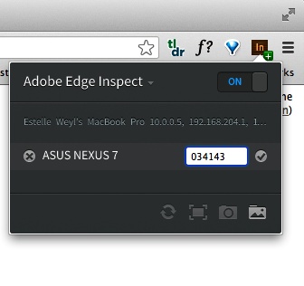
Opening Edge in your mobile device will provide you with a passcode to the device to be entered into the desktop Edge browser extension. Turn on Edge in your desktop browser by first opening up the application and signing into Adobe.
Once you’ve signed in, click on the Edge browser extension icon, as shown in Figure 1-7, which tells the browser to look for devices on the network. When it finds your device, add the passcode from the device into the Edge window.
The passcode ensures that you are giving permission to your computer and mobile device to communicate with each other, preventing other unwanted computers from controlling your device and your computer from controlling other people’s phones.
Once a connection between your computer and one or many devices is made, you can control which page is loaded in all of your mobile browsers at once. The currently open tab in Chrome will be retrieved and displayed on the mobile device(s) connected via Edge Inspect.
To debug a web page from a device, navigate to the page you want to debug in Chrome or on the device. When you click on the Chrome extension Adobe Edge Inspect menu, click the < > next to the device you want to debug. Weinre will start on your local machine, and the device and web page title will be listed as an active link under the Remote tab in weinre, which is the leftmost tab displayed in Figure 1-6.
The free version of Adobe Edge Inspect only allows for interacting with a single device at a time. The monthly subscription allows you to control all of your devices at the same time. It also helps in taking screenshots.
If you are on a Mac and want to test multiple devices, Ghostlab enables you to similarly test multiple devices. If you’re thinking of purchasing either, Ghostlab’s one-time fee may save you money over Adobe Edge’s monthly subscription.
JavaScript debugging with Aardwolf
If debugging JavaScript is your main concern, you can try Aardwolf. Aardwolf is a remote JavaScript debugger with which you can execute and capture JavaScript. Aardwolf works by rewriting your code on the server and adding debugging hooks. Similar to weinre with a Node.js backend, it uses synchronous XHR calls to enable breaking on breakpoints. You can use Aardwolf to remotely step through your code, with support for watching objects, breakpoints, and call stacks.
BlackBerry 10 Debugger
While weinre is awesome, the debugger that comes with Blackberry 10 is more powerful.
Like weinre, the BlackBerry Browser uses a client-server architecture to make Web Inspector functionality available. Unlike with weinre, in this case, the BlackBerry Browser acts as a web server, and serves the web page over HTTP over a USB or WiFi connection. You inspect the content remotely on a desktop browser. You can use any WebKit-based desktop browser on the same WiFi network to navigate to the IP address and port number used by the BlackBerry Browser and begin inspecting the code.
To use the inspector, you must enable debugging under BlackBerry Browser options. Once Web Inspector is enabled, the browser or application displays the IP address and port number it will use to serve the content.
To enable the Web Inspector on BlackBerry 10, from the browser application, swipe down from the top bezel to display the browser’s menu bar. Click the settings icon and then Developer Tools to turn the Web Inspector on. If you’re using the tablet, this can be found under Options→Privacy & Security instead. The browser displays the IP address and the port number required to connect from your desktop browser. If prompted, type your device password to complete the enabling process. Click Back to save and return to the browser window. You can now open a connection to the BlackBerry Browser to remotely inspect displaying pages.
Testing Tools
It is best to run your sites on actual devices, but it is impossible to test on all devices as there are thousands of devices, with new ones coming out all the time. It is therefore suggested that you test on a representative group of devices, covering different configurations of operating systems, browsers, device sizes, and device capabilities, such as different screen resolutions, memory constraints, and bandwidth access.
It can be expensive and time consuming to test on real devices. In addition to the debugging tools covered in the previous section, there are several tools to help us achieve maximum testing abilities.
Emulators and Simulators
An emulator is software that duplicates or emulates the functions of a mobile device (or devices) on a computer, so that the emulated behavior closely resembles the behavior of the actual device. This focus on exact reproduction of behavior is the difference between emulating and simulating. In simulation, an abstract model of the mobile operating system is simulated.
Emulators allow mobile software to be used on your desktop, enabling you to run and debug your code without having all the devices. Even if you are testing in emulators and simulators, you still can’t test in emulators of all the devices. Emulators and simulators simply get you started and quicken the development and debugging process. You should still test on an array of different mobile devices.
When you run your website in a simulator, you are running it in a simulation application on your desktop. Some simulators are for individual devices, and others allow you to choose what device you want to emulate. For example, the iOS Simulator allows you to choose iPhone or iPad. Via menus, you can change the orientation between portrait and landscape. There are virtual buttons to represent the buttons of the device. And, on nontouch devices, you can use your mouse to mimic touch events.
The simulator does not exactly replicate device hardware and there’s no guarantee your application will work identically on the actual device. There are certain libraries that will compile and link fine when targeting the simulator (because it is really running on the desktop), but then will not compile when you target the device.
Simulators and emulators generally include a full SDK for testing native applications in a faux native environment. To test our code, we want emulators and simulators that contain a browser, which each emulator and simulator does. You will likely want to download and test your website in the browsers of the following emulators and simulators:
- Android Emulator
The free Android emulator for Windows, Mac OS, and Linux is available in conjunction with the SDK from http://developer.android.com. As described in Android debugging tools, download the base SDK, then each Android OS separately. The download provides an Android terminal command in Mac/Linux and an SDK Setup.exe application for Windows.
The Android emulator enables you to limit memory for the virtual device to better simulate the phone. In the Android Virtual Device Manager, select the device and click Edit (shown in Figure 1-5). On the hardware, click New and select Device RAM size from the Property drop-down menu.
- iOS Simulator
Only available for Mac OS X, the iOS Simulator offers a free simulation environment including Mobile Safari. Be warned that the iPhone SDK is about 2 GB, so it will take a long time to download.
This is a simulator, not an emulator. There are no hardware emulation or performance indicators. It looks to see how your code is working and how your website is rendering, but it generally fails to measure website performance.
If you simply want to see what your design looks like, with no emulation or simulation, there are many tools like iPhoney and iPadPeek that simply open your website in a browser that looks like an older device model.
- BlackBerry Simulator
BlackBerry simulators for the Windows operating system include the proxy server, plug-ins for Eclipse and Visual Studio for web developers, and the simulators.
- Windows Phone Emulator
The Windows Phone Emulator is only available on Windows-based computers. Windows Phone Emulator is a desktop application that emulates a Windows Phone device. You can download the Windows Phone SDK at http://dev.windowsphone.com/en-us/downloadsdk. The current release and information about installation can be found at http://bit.ly/16t5utu.
Currently, the default emulator image in Visual Studio is Emulator WVGA 512 MB, which emulates a memory-constrained Windows Phone 8 phone.
- Firefox OS Simulator
The Firefox OS Simulator add-on for the Firefox browser is the emulator for Firefox OS, providing a Firefox OS–like environment that looks and feels like a mobile phone. Once installed, go to Web Developer→Firefox OS Simulator in your Firefox desktop browser.
- Opera Mobile Emulator
The Opera Mobile Emulator for Windows, Mac, and Linux can be downloaded at www.opera.com/developer/tools.
- Opera Mini Simulator
A full Opera Mini application of the current version of Opera Mini as a Java applet is available at www.opera.com/mini/demo.
These are the most prevalent mobile operating systems. Most mobile operating systems, like Symbian and WebOS, have SDKs you can load onto your desktop, enabling you to simulate their environment. Depending on your target market, you should test all of the operating systems your target audience is likely to use. For more emulators, visit http://www.mobilexweb.com/emulators.
Online Tools
To quickly assess your device’s vital statistics that impact the basic media queries, open up http://www.quirksmode.org/m/tests/widthtest.html in your device’s browser.
The W3C mobileOK Checker checks your website for best practices, and provides information and links to help make your site more mobile device friendly. mobiReady is an online tool leveraging the W3C mobileOK Checker, displaying the results in a way that is more likely to convince you to take action to make your site more mobile friendly.
Useful for mobile web development, HTTP testing, and privacy, the Modify Headers add-on for Firefox enables you to modify—add, replace, and filter—HTTP request headers sent to web servers. Links to these resources (and all other resources listed in this book) are in the online chapter resources.
Phones
Testing on actual devices is an essential step of the development process, but buying a bunch of mobile devices can be quite an investment. Resizing browsers and using emulators won’t replicate actual site performance, device capabilities, pixel density, and the impact of the mobile network.
If you are creating native applications, you obviously need to get devices with the operating systems you’re developing for. In this book, we are developing with HTML5, CSS3, and JavaScript, not native, so our code will work in browsers on all devices. Although we’re developing for the browser, we do need to test in many devices, including some on phone carrier networks. Always test your code in the real devices with real-world connections, including WiFi hotspots, 3G, 4G, and even EDGE. Take a bus or train ride and try accessing your application from various points while moving in the city and in the suburban and rural areas between bigger cities.
Browser labs
Testing on real mobile devices is a part of the development process that can’t be omitted. There are many browser labs, so try to find one near you. If there aren’t any device labs, get together with others to create one.
If you prefer to have your own device lab, you need devices of different sizes, operating systems, abilities, and browsers. You can create your own device lab with a cross-section of the mobile landscape fairly inexpensively. It is impossible to purchase every device, but you should try to get a sample of different sizes, browsers, and operating systems.
There are also virtual device labs such as DeviceAnywhere, and Nokia Remote Access. These are real devices that you can access remotely. As these are actual devices, if somebody is using one, you need to wait in the queue.
iOS
In North America, iOS devices account for only 5% of Internet traffic overall, with over 50% of mobile traffic.[10] If you don’t already have an iOS device in your household, and your application is not solely targeted at impoverished populations in underdeveloped countries, invest in one.
Acquire a device with the latest iOS operating system, and one with an older version of the operating system. You can acquire an older device on Craigslist or eBay for little money. Currently, only 1.8% of iOS users, or 0.13% of Internet users, are on iOS 4.3 or earlier, and 12.5% of iOS users, or 0.93% of Internet users, are on iOS 5.
When acquiring a device, you need the browser to work. That’s it. If budget is an issue, cracked-screen devices can be acquired for next to nothing. One device should be a phone. The other can be a phone, iPad, or iPod touch.
Once you’ve acquired your iOS device(s), download Opera Mini, which is available for free through iTunes.
If all your iOS devices have high-resolution displays, make sure some of your other devices do not. Also, make sure that not all of your devices are phones—include a tablet or two.
Android
Android is the most popular and diverse mobile operating system worldwide. Android runs on a plethora of devices, including phones and tablets. Acquire at least two (preferably more) Android devices: a highly capable smartphone with a recent operating system and a bargain phone running an older version. At the time of this writing, although it’s already archaic, Android 2.3 is still being sold in stores on cheap/free devices, and is currently the most popular version of Android, with 34% of the Android market, totaling 2.3% of global Internet users.[11]
In addition to multiple Android OS versions, get devices of different sizes, processing power, resolutions, and makers. On your Android device, you can add other browsers, including Chrome, Opera Mini and Mobile, Firefox Mobile, and Dolphin Mini and HD.
Windows
If you are going to invest in a Windows device, invest in the most recent operating system. The Windows Phone 7 was never hugely popular, but the Windows Phone 8 has the potential to be. Both have the Metro UI interface. In addition to testing your application to make sure your markup works, actually play with the Windows phone. The user interaction of the device is quite different from Android and iOS. You may realize that you will want to adjust some UI interactions to better match the default behaviors developed by using the Windows device.
BlackBerry
The BlackBerry 10 device has the best debugger of any mobile device, but definitely not the largest user base.
There are more of the older BlackBerry devices on the market than the BlackBerry 10. BlackBerry users of both new and older devices surf the Web. I recommend getting a BB6 or BB7. Fortunately, older phones are inexpensive and it is good to have a nontouch device to test your websites on.
Prior to BB6, the browser was not WebKit based. There are fewer users of these really, really old devices. If your target market is likely to be on a BB5 or less, a third BlackBerry device may be in order.
Nokia
By Nokia, I mean the Symbian OS, not the Lumia Windows Phone.
Symbian, Series 40, Samsung, and to a lesser extent Sony Mobile and Motorola, are more common than Android, iOS, BlackBerry, and Windows in some countries. If I suggest a particular device, by the time this goes to print, my suggestion will be outdated. Just realize that internationally, Nokia is a huge player in the mobile market with massive reach. I recommend getting a feature phone that has D-pad input and a small screen so that you can get a sense of what a large percent of the world will see when accessing your site.
Automated Testing
The testing tools just listed help you test visually and manually. To really test properly, you have to rotate, zoom, pan, click, and scream in frustration. For appearance, you need to actually look at the rendered page in different device sizes, browsers, and operating systems. For static content, that may suffice, and tools like Adobe Edge can help.
For web applications, you likely need to automate testing. You need to continuously test your application to make sure the code actually works, testing all your events and results. There are several testing libraries for JavaScript.
Jasmine is a behavior-driven development framework. PhantomJS is a headless WebKit, not a testing library, with native support for various web standards, including DOM handling, CSS Selectors, and JSON. You can download a pre-built binary for any OS at the PhantomJS website.
To leverage PhantomJS for automated, frontend tests, download CasperJS. To fake AJAX calls, you can use Sinon.JS. Each site provides well-written documentation to get you up and running with these libraries for testing in WebKit. It doesn’t solve the testing on mobile issue.
There are online testing tools. Some, like SauceLabs, enable you to test against hundreds of mobile and desktop browser/OS platforms.
Pick what is right for you and your application—but always test.
Now let’s start coding so we have something to test.
[6] IE6 was cutting edge when it was released in 2001. With an almost monopoly on browser market share, there was little competition, and it was never updated.
[7] Blink is a fork of WebKit’s WebCore component made at revision 147503. It is the browser engine in Chrome since version 28, Opera starting with version 15, and other Chromium-based browsers going forward.
[8] Firefox comes with web developer tools, but most developers use Firebug, a Firefox add-on.
[9] Originally, it was Java based. Before WebSockets, it leveraged CORS, JSON, and XHR.
Get Mobile HTML5 now with the O’Reilly learning platform.
O’Reilly members experience books, live events, courses curated by job role, and more from O’Reilly and nearly 200 top publishers.

