Chapter 4. Gtk#
Gtk# is the Mono wrapper for the GTK+ user interface toolkit. GTK+ was originally created to provide the user interface for the GNU Image Manipulation Program (GIMP), hence the expansion of its acronym: Gimp Tool Kit. These days GTK+ is most closely associated with being the toolkit behind the GNOME desktop platform. Gtk# is the native Linux user interface toolkit of choice for the Mono project.
Mono will eventually implement a complete compatibility layer for the
Windows.Forms user interface toolkit from
Microsoft’s .NET platform.
Windows.Forms should be seen as a migration
strategy: Gtk# is the preferred toolkit for Linux.
The labs in this chapter lead you through creating basic GTK+ applications using Gtk# (pronounced GTK-sharp), the Mono API to the GTK+ toolkit. You’ll discover the event loop concept behind GTK+ applications, how to create windows and use widgets, and how to subclass widgets to customize their behavior.
If you followed the labs in Chapter 1, you should already have the Gtk# assemblies installed on your computer and be able to jump right into these labs. If not, return to Section 1.1 to install gtk-sharp.
Write a Basic Gtk# Program and Handle Events
Any user interface programming toolkit defines a way for delivering events from the user to the program. Whereas with noninteractive programs the flow of control is under the programmer’s direction, interactive programs must respond to the events they receive.
Note
Mono wrappers for other Linux toolkits such as Qt are available but not maintained as part of the Mono project.
Mono wrappers for other Linux toolkits such as Qt are available but not maintained as part of the Mono project.
In Gtk#, the flow of control is governed by a main event loop. The program yields its control to the main loop, which is responsible for processing input events. When events occur that the program is interested in, handlers for those events are called and control is given to the main program.
This lab demonstrates the concept of the Gtk# main loop and handling events.
How to do it
Construct a basic Gtk# program using a window and a button. Both of these raise events and need handlers assigned for those events that the programmer wants to process. Example 4-3 shows the program listing.
// 04-gtk/01-basics
using System;
using Gtk;
class MainClass {
public static void Main (string[ ] args)
{
Application.Init ( );
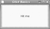
Window w = new Window ("Gtk# Basics");
Button b = new Button ("Hit me");
// set up event handling: verbose to illustrate
// the use of delegates.
w.DeleteEvent += new DeleteEventHandler (Window_Delete);
b.Clicked += new EventHandler (Button_Clicked);
// initialize the GUI
w.Add (b);
w.SetDefaultSize (200, 100);
w.ShowAll ( );
Application.Run ( );
}
static void Window_Delete (object o, DeleteEventArgs args)
{
Application.Quit ( );
args.RetVal = true;
}
static void Button_Clicked (object o, EventArgs args)
{
System.Console.WriteLine ("Hello, World!");
}
}Either create the application as a project inside MonoDevelop, or use a regular text editor to create it in Main.cs and compile and run it by hand:
$mcs Main.cs -pkg:gtk-sharp$mono Main.exe
When you run the application, you will see a window as in Figure 4-1: the button takes up the entire window. Click the button a few times, and you’ll see the output on the terminal as shown in Example 4-2.
How it works
The Gtk namespace is imported with using Gtk. The basic Gtk# tasks of initializing the toolkit are
performed by the
Application class.
Specifically, there are three static methods of interest:
Note
If you want your application to check whether it can use graphics, use the InitCheck method instead of Init. That way it won’t fail horribly and you can fall back to a text interface.
The creation of the window and its button is a trivial matter: there
are more interesting examples in the following labs. What is more
relevant here is the hooking up of the event handlers. Every
widget (a user
interface element) in Gtk# is capable of raising a variety of events.
Many of these are derived from the basic
Widget class, from
which all the Gtk# widgets inherit. Typical events include
Focused, sent when
the widget receives user focus, and
DeleteEvent
, sent when the widget is
deleted.
For more information on events as a feature of C#, refer to Section 2.5. When an event is raised, the assigned
handlers are invoked. Events can have any number of handlers
assigned. Example 4-3 shows the handler
Window_Delete being added for the event
DeleteEvent.
Our Window_Delete handler does two things of
interest. First, it instructs the main loop to exit when control is
returned to it. Second, it sends true back as a
return value via the args object. This prevents any
subsequent handlers from getting the event.
The handler for the Button is much the same, and
is more typical of the general widget event handler. Buttons have
some specialized events, of which
Clicked
is the most useful.
Note
The event handlers need not be static methods if they need to access an object instance. The only difference is to assign them prefixed by the instance.
The assignment of the handlers has been shown in full to give some hint as to the underlying implementation. However, it’s possible to take a shortcut, and write the two lines as shown:
w.DeleteEvent += Window_Delete;
b.Clicked += Button_Clicked;
Where to learn more
An introduction to programming with Gtk# can be found as part of the documentation shipped with Monodoc. Refer to the “Mono for Gnome Applications” section of the Mono Handbook, available from the Monodoc table of contents. As ever, another excellent source of reference material is the Gtk# API reference itself in Monodoc. More information on Monodoc can be found in Section 1.2.
To understand more about delegates and events, refer to Chapter 2 of C# Essentials by Ben Albahari, Peter Drayton, and Brad Merrill (O’Reilly).
A good introduction to the GTK+ toolkit can be found in the GTK+ 2.0 Tutorial, available at http://www.gtk.org/tutorial/. Although specific to the C language implementation of GTK+, the tutorial contains a lot of theory about the toolkit that we will only gloss over in this book.
A document outlining the changes available in C# 2.0 can be found linked from Microsoft’s C# web site at http://msdn.microsoft.com/vcsharp/team/language/default.aspx.
Arrange Widgets Using Boxes
Most user interface layout in Gtk# is done using boxes. These are invisible widgets into which other widgets are packed. By packing widgets into boxes, you can create layouts that remain consistent at different window sizes, and orient boxes either vertically or horizontally.
This lab shows how to put boxes together to create a simple user interface design. As well as boxes, you’ll learn about widget expansion, borders, and padding.
Note
The rarely used alternative to boxes is table layout. Similar to their HTML cousins, tables provide a very regular grid-like layout structure.
How to do it
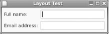
Figure 4-2 shows the desired layout: a couple of labels and corresponding text entry boxes. The labels must be left-aligned, and the text entry boxes the available space to the right-hand side of the window. Example 4-3 shows the code needed to achieve this.
// 04-gtk/02-layout
using System;
using Gtk;

class MainClass {
  public static void Main (string[  ] args)
  {
    Application.Init ( );
    SetUpGui ( );
    Application.Run ( );
  }

  static void SetUpGui ( )
  {
    Window w = new Window ("Layout Test");

    HBox h = new HBox ( );
    h.BorderWidth = 6;
    h.Spacing = 6;
    w.Add (h);

    VBox v = new VBox ( );
    v.Spacing = 6;
    h.PackStart (v, false, false, 0);

    Label l = new Label ("Full name:");
    l.Xalign = 0;
    v.PackStart (l, true, false, 0);

    l = new Label ("Email address:");
    l.Xalign = 0;
    v.PackStart (l, true, false, 0);

    v = new VBox ( );
    v.Spacing = 6;
    h.PackStart (v, true, true, 0);

    v.PackStart (new Entry ( ), true, true, 0);
    v.PackStart (new Entry ( ), true, true, 0);

    w.DeleteEvent += Window_Delete;
    w.ShowAll ( );
  }

  static void Window_Delete (object o, DeleteEventArgs args)
  {
    Application.Quit ( );
    args.RetVal = true;
  }
}
As usual, you can either create the application as a project inside MonoDevelop, or compile and run it by hand as demonstrated in Section 4.1.
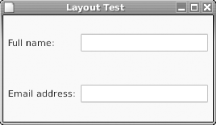
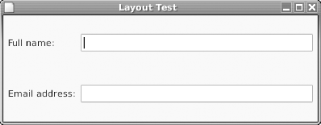
When the application runs, try resizing the window. If you make the window vertically larger, you’ll get the effect as shown in Figure 4-3. Try making it wider too, and you should get a result similar to Figure 4-4. In both cases, the labels and text entries remain aligned with each other, and the text entries expand to fill the available space.
How it works
To get the box design correct, start from the inside and work out.
The left and right edges of the widgets must be aligned. To achieve
this, each column is packed inside a
VBox. As the two
columns must be next to each other, both of the
VBox widgets are packed in an
HBox. This is then
added to the main window.
A box has two useful properties,
Spacing and
BorderWidth
. Spacing
dictates the number of pixels to leave between child (contained)
widgets. BorderWidth dictates the border in
pixels to be placed between the box’s contents and
its own parent container.
Examine the
PackStart method used
in the example. It adds widgets to a box with reference to the start
of the box. For HBox, the start of the box is the
left, for VBox it’s the top. A
PackEnd
method is also available, which packs
with respect to the opposite end of the box.
PackStart’s declaration looks
like this:
public void PackStart (Widget child, bool expand, bool fill, uint padding)
The expand parameter, if true,
causes the widget to expand to use all the space available to it. The
spare space in a box is shared evenly among all the widgets whose
expand parameter is set to true.
The fill parameter, if true,
causes the widget to use all the space allocated with
expand for the widget’s rendering.
If false then the extra space will be used for
padding. The final parameter, padding, allows the
addition of spacing pixels around the widget above and beyond the
spacing specified by the containing box.
Note
The Add method can be used with boxes, as with the window. The result is the same as using PackStart with the default values for the last three parameters: true, true, 0.
The effects of the choices for expand can be seen in
Figures Figure 4-3 and Figure 4-4. Both labels and text entries are set to
expand within their VBoxes: you can see that they
fill the increased vertical space regularly. As the width of the
window increases, however, only the text entries grow in size. This
is because the containing VBox of the labels does
not have expand set, yet that of the text entries
does. Additionally, each text entry is packed with
expand and fill, so they grow to
fill the available space.
The last thing to note is the alignment of the widgets. By default, a
widget’s rendering is centered in the space
allocated to it. Any widget that can be aligned in different ways
implements the Gtk.Misc interface. This interface
provides the Xalign
and Yalign
properties. These are numbers of the float type,
whose value can range from 0 (left or top) to 1 (right or bottom). In
Example 4-5, the Xalign values
are to set 0 in order to left-align the labels. As the text entries
are set to expand and fill, their alignment is immaterial.
Where to learn more
For API documentation, refer to the “Gtk” section of the Gnome Libraries reference in Monodoc. More tutorial information is available in the “Gtk#: Packing Widgets” section of the Mono Handbook, available in Monodoc.
The gold standard for interface layout under GTK is the GNOME Human Interface Guidelines document, or HIG for short. It can be found online at http://developer.gnome.org/projects/gup/hig/.
A useful exercise to complete to learn more about layout would be to alter the example in this lab to be conformant to the GNOME HIG: there must be a minimum of 12 pixels between the window border and its contents, and 12 pixels between the labels and the text entries. There’s more than one way to do this!
Make Widgets Interact
A user interface not only needs to respond to the user, but to read data from the interface and change the interface in response. In Gtk# this is normally done through the properties of the widgets.
Note
User activity in one part of the interface often affects another part. Event handlers provide the plumbing.
In this lab we extend the user interface developed in Section 4.2 and add an event handler to the text entry widgets. We read and write the text property of text entries, and introduce keyboard shortcuts to focus widgets.
How to do it
Figure 4-5 shows the sort of signup window you might expect to see in an application that subscribes you to an ISP. Because the best applications help and guide the user, we want our application to automatically fill in a suggested email address as the user types his name in.
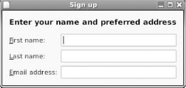
Note
Notice the underlines by the labels; these mnemonics allow the user to focus a widget by typing Alt and the mnemonic letter.
The listing in Example 4-4 shows the code to do the job. Compile and run the listing, and play around with the interface. When you alter the first and last name fields, the email address will change. Try hitting Alt-F to focus the first-name widget.
// 04-gtk/03-signup
using System;
using Gtk;

class MainClass {
  private static Entry firstname_entry, lastname_entry,
    email_entry;

  public static void Main (string[  ] args)
  {
    Application.Init ( );
    SetUpGui ( );
    Application.Run ( );
  }

  static void SetUpGui ( )
  {
    Window w = new Window ("Sign up");

    firstname_entry = new Entry ( );
    lastname_entry = new Entry ( );
    email_entry = new Entry ( );

    VBox outerv = new VBox ( );
    outerv.BorderWidth = 12;
    outerv.Spacing = 12;
    w.Add (outerv);

    Label l = new Label ("<span weight=\"bold\" size=\"larger\">" +
      "Enter your name and preferred address</span>");
    l.Xalign = 0;
    l.UseMarkup = true;
    outerv.PackStart (l, false, false, 0);

    HBox h = new HBox ( );
    h.Spacing = 6;
    outerv.Add (h);

    VBox v = new VBox ( );
    v.Spacing = 6;
    h.PackStart (v, false, false, 0);

    l = new Label ("_First name:");
    l.Xalign = 0;
    v.PackStart (l, true, false, 0);
    l.MnemonicWidget = firstname_entry;

    l = new Label ("_Last name:");
    l.Xalign = 0;
    v.PackStart (l, true, false, 0);
    l.MnemonicWidget = lastname_entry;

    l = new Label ("_Email address:");
    l.Xalign = 0;
    v.PackStart (l, true, false, 0);
    l.MnemonicWidget = email_entry;

    v = new VBox ( );
    v.Spacing = 6;
    h.PackStart (v, true, true, 0);

    v.PackStart (firstname_entry, true, true, 0);
    v.PackStart (lastname_entry, true, true, 0);
    v.PackStart (email_entry, true, true, 0);

    // hook up handlers
    firstname_entry.Changed += Name_Changed;
    lastname_entry.Changed += Name_Changed;
    w.DeleteEvent += Window_Delete;
    w.ShowAll ( );
  }

  static void Window_Delete (object o, DeleteEventArgs args)
  {
    Application.Quit ( );
    args.RetVal = true;
  }

  static void Name_Changed (object o, EventArgs args)
  {
    string e = firstname_entry.Text.ToLower ( ) +
      "." + lastname_entry.Text.ToLower ( ) +
      "@example.net";
    email_entry.Text = e.Replace (" ", "_");
  }
}
How it works
The Gtk.Entry widget has
a number of interesting properties. The most useful of these is
Text, which contains the string contents of the
text entry box.
Note
Other useful properties of Gtk.Entry include IsEditable and MaxLength. You could use these to change the example so that it limits names to ten characters or prevents the user from changing the email address.
Notice that the Name_Changed method handles both
the first and last name text entries. When either of these change,
that method uses simple string manipulation to formulate a new email
address. To change the contents of the email address box, the
application needs merely to set the Text
property. If you care which text entry caused the
Changed event, use the object
argument to determine which object raised the event:
if (o =  = (object) firstname_entry) {
    // first name changed
}
The widget interaction is simple to understand. The creation of the interface using boxes should also be familiar from the previous lab. However, there are some new features introduced that give the user interface a little more polish and are worth noting:
- XML Markup
The first feature of note is the use of XML markup in the label value. The
UseMarkupproperty of the label is set correspondingly. Normally, the<span>element and its various attributes are used to set styles. Gtk# also borrows some elements from HTML to use as convenient shortcuts:<b>,<big>,<i>,<s>,<sub>,<sup>,<small>,<tt>, and<u>.- Keyboard Shortcuts
One of letters in each label is rendered as underlined in the interface, indicating that the user can type Alt plus that letter to focus the corresponding text entry. The mnemonic letter is indicated by the use of an underscore in the label text. The widget to give focus to is set in the
MnemonicWidgetproperty of the label.
Where to learn more
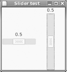
To further investigate widget interaction, try linking up some of the
other widgets. A good candidate is synchronizing the values of
Gtk.HScale and Gtk.VScale
sliders when the ValueChanged event is raised,
as shown in Figure 4-6.
The Monodoc documentation for Gtk.Entry explains
in the detail the name and purpose of the various properties,
methods, and events the widget provides. Try altering the example to
experiment with some of these.
The markup facilities available in the labels are actually implemented by Gtk#’s underlying text rendering library, called Pango. A reference to this markup can be found in the “Basic Pango Interfaces” section of the Pango Reference Manual, available from http://developer.gnome.org/doc/API/2.0/pango.
Make Dialogs by Subclassing
The dialog is a time-honored way of notifying the user of an error, asking them a question or otherwise letting them control the flow of the program. A dialog is a window whose purpose is to deliver a message and optionally return a user response to the calling program.
Note
Dialogs get re-used more than many other things. Subclassing is the best way to make this easy.
Gtk# provides a basic
Dialog class, which is
a window with some parts of the user interface already preconfigured.
As dialogs often get reused, it makes sense to take advantage of the
fact that C# supports inheritance and creates a customized
Dialog subclass for our own use. Indeed, whenever
complex configuration of a widget is required, the recommended course
of action in Mono is to subclass it. This keeps the initialization
code and contained widgets tidily inside the class that they belong
to.
This lab illustrates a simple subclassed dialog, and introduces the use of stock items in the user interface.
How to do it
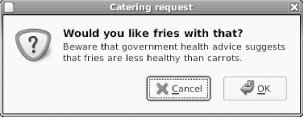
Figure 4-7 shows a dialog conforming to the GNOME HIG, with typical components: an icon on the left, a heading and subheading, and response buttons.
Example 4-5 shows the code to create the required
dialog, displays it to the user, and takes appropriate action based
on her choice. Being encapsulated in the MyDialog
class, the insides of the dialog aren’t visible from
the main program. The implementation of MyDialog
is shown in Example 4-6.
// 04-gtk/04-subclass/Main.cs
using System;
using Gtk;

class MainClass {
  public static void Main (string[  ] args)
  {
    Application.Init ( );
    MyDialog d  = new MyDialog ("Catering request",
      "Would you like fries with that?",
      "Beware that government health advice suggests that " +
      "fries are less healthy than carrots.");
    ResponseType resp = (ResponseType) d.Run ( );
    if (resp =  = ResponseType.Ok) {
      Environment.Exit (0);
    } else {
      Environment.Exit (1);
    }
  }
}// 04-gtk/04-subclass/MyDialog.cs
using System;
using Gtk;
public class MyDialog : Dialog {
public MyDialog (string title, string question,
string explanation) : base ( )
{
this.Title = title;
this.HasSeparator = false;
this.BorderWidth = 6;
this.Resizable = false;
HBox h = new HBox ( );
h.BorderWidth = 6;
h.Spacing = 12;
Image i = new Image ( );
i.SetFromStock (Stock.DialogQuestion, IconSize.Dialog);
i.SetAlignment (0.5F, 0);
h.PackStart (i, false, false, 0);
VBox v = new VBox ( );
Label l = new Label ("<span weight=\"bold\" size=\"larger\">" +
question + "</span>");
l.LineWrap = true;
l.UseMarkup = true;
l.Selectable = true;
l.Xalign = 0; l.Yalign = 0;
v.PackStart (l);
l = new Label (explanation);
l.LineWrap = true;
l.Selectable = true;
l.Xalign = 0; l.Yalign = 0;
v.PackEnd (l);
h.PackEnd (v);
h.ShowAll ( );
this.VBox.Add (h);
this.AddButton (Stock.Cancel, ResponseType.Cancel);
this.AddButton (Stock.Ok, ResponseType.Ok);
}
}Compile and run the application using the following command line:
$mcs Main.cs MyDialog.cs -pkg:gtk-sharp$mono Main.exe
How it works
All the work of setting up the subordinate widgets that make up the
dialog is done in the constructor of MyDialog. In
addition to setting some of the properties that dialogs have in
common with windows, the HasSeparator setting is
set to false. This member controls whether a
horizontal line is drawn between the body of the dialog and the
bottom row of buttons, known as the
action area.
Note
Having separator lines everywhere must have seemed a good idea at the time, but they’re not used much these days as they add to visual clutter.
A dialog comes with some widgets already constructed. It contains a
VBox, referenced by the VBox
member, and an HButtonBox referenced by
ActionArea. There are convenience methods for
adding widgets to the action area. The packing of the
HBox that forms the body of the dialog should be
familiar territory from earlier labs.
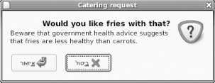
Widget packing always uses the concepts of start and end, where we in the West might more naturally think of left and right. Not all cultures read left to right though, and Gtk# handles this well. Figure 4-8 shows the example run in a Hebrew locale. Note how all the elements of the user interface that Gtk# controls have been adjusted accordingly. In this locale, start means right and end means left.
The text in the buttons was automatically translated because the example uses stock items. These are predefined constant images or text with an agreed meaning when used as part of an interface. The rightmost button in Figure 4-7, for example, shows the text “OK” used in conjunction with the curving arrow image. Stock items not only save time for the developer, but they greatly aid the consistency of an interface’s look and feel.
Note
GTK+ permits the user to set a themed look-and-feel using the preferences. Stock items automatically change their look to fit the theme.
To show that the user is being asked a question, the stock
“dialog question” image is added to
the dialog, using the IconSize.Dialog dimension
to get the proper size. Note the use of
SetAlignment as a shorthand for setting the
Xalign and Yalign
properties separately.
The final thing to note from the example is the convenience method
AddButton, specifically intended as a shortcut
for adding stock items to dialogs. This performs the same thing as
the following code:
Button b = new Button (Stock.Cancel);
this.AddActionWidget (b, ResponseType.Cancel);
The Gtk.ResponseType enumeration contains
well-known return codes for dialogs, which should be used where
applicable. If you need to hook up your own codes, any positive
non-zero integer can be used without clashing with these predefined
codes.
What about ...
...More sophisticated subclassing? Earlier in this lab it was observed that subclassing is the recommended way to encapsulate any non-trivial amount of widget-based code. Study Example 4-7. It implements a button that keeps a count of how many times it has been clicked.
// 04-gtk/04-button
using System;
using Gtk;

class MyButton : Button {
  private int hitcount;

  public MyButton (string text) : base (text)
  {
    hitcount = 0;
  }

  protected override void OnClicked ( )
  {
    hitcount++;
    base.OnClicked ( );
  }

  public int HitCount {
    get
    {
      return hitcount;
    }
    set
    {
      hitcount = value;
    }
  }
}

class MainClass {
  public static void Main (string[  ] args)
  {
    Application.Init ( );
    Window w = new Window ("Hit Count");
    MyButton b = new MyButton ("Hit Count");
    b.Clicked += Button_Clicked;
    w.Add (b);
    w.ShowAll ( );
    Application.Run ( );
  }

  public static void Button_Clicked (object o, EventArgs e)
  {
    MyButton b = (MyButton) o;
    Console.WriteLine ("Click number {0}", b.HitCount);
  }
}
One useful feature of subclassing is that
the program gets an opportunity to process an event before the
delegate handlers are invoked. Compile and run the example program,
and observe that the reported hit count starts at
1, demonstrating that the delegate for the clicked
event is invoked after the OnClicked
method.
Where to learn more
A fuller discussion of subclassing in C# can be found in C# Essentials by Ben Albahari, Peter Drayton, and Brad Merrill (O’Reilly).
The GTK+ 2.0 Reference Manual has a fine reference, with example graphics, of all the stock items. This can be found online at http://developer.gnome.org/doc/API/2.0/gtk/gtk-Stock-Items.html.
What if the stock items don’t cover a
program’s requirements, but the theming flexibility
of stock items is still required? It’s possible to
register custom stock items, which GTK+ theme designers and other
programs can then use. Further information on doing this is available
from the Gtk.StockManager and
Gtk.StockItem entries in Monodoc.
Draw Graphics
A picture paints a thousand words, and it can often visualize data much better than a thousand widgets too! Handling graphics tends to be done at a lower level than widgets, and a little more work is needed from the programmer to receive results.
In Gtk# graphics are handled using the APIs available in the
Gdk namespace. One of the most common uses of
Gdk is to handle bitmapped graphics, such as
PNG or JPEG files.
Gdk calls these Pixbufs. This
lab demonstrates how to set up a drawing area and render bitmapped
images into it.
How to do it
Although an application could take responsibility for drawing the whole of its window, it would be a large waste of effort. By combining a drawing area with normal widget layout mechanisms the regular Gtk# look and feel can be preserved, while still drawing custom graphics.
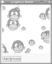
Figure 4-9 illustrates a demonstration application window, composed of a drawing area and a regular button widget. The monkey pixbuf is loaded from a PNG graphics file. When the button is clicked the graphic is rendered at a random point on the drawing area, scaled by a random factor between 1 and 3.
The
drawing area is made using the Gtk.DrawingArea
widget. This is in reality a blank widget; managing its appearance is
left to the application. Because of this, the example code will also
give some insight into how widget implementations work.
Compile, link, and run the listing from Example 4-8.
$mcs Main.cs -pkg:gtk-sharp \-resource:monkey.png,monkey.png$mono Main.exe
The -resource option
embeds the monkey.png file into the assembly.
(Not to be confused with the -r, which is short for
-reference.) This technique saves the hassle of
distributing graphics files separately. The syntax of this option
requires two names: the first is where to find the resource and the
second is the name to give it in the assembly. For convenience, one
of the constructors of Gdk.Pixbuf will load an
image directly from an assembly.
// 04-gtk/05-graphics
using System;
using Gtk;
using Gdk;

class MainClass {
  private static Gtk.Button add_png;
  private static Gtk.DrawingArea darea;
  private static Gdk.Pixmap pixmap;
  private static Gdk.Pixbuf pngbuf;
  private static Random rand;

  public static void Main (string[  ] args)
  {
    rand = new Random ( );
    Application.Init ( );

    pngbuf = new Pixbuf (null, "monkey.png");

    Gtk.Window w = new Gtk.Window ("Graphics Demo");

    VBox v = new VBox ( );
    v.BorderWidth = 6;
    v.Spacing = 12;
    w.Add (v);

    darea = new DrawingArea ( );
    darea.SetSizeRequest (200, 200);
    darea.ExposeEvent += Expose_Event;
    darea.ConfigureEvent += Configure_Event;
    v.PackStart (darea);

    HBox h = new HBox ( );
    add_png = new Button ("Add _Primate");
    add_png.Clicked += AddPng_Clicked;
    h.PackStart (add_png, false, false, 0);
    v.PackEnd (h, false, false, 0);

    w.ShowAll ( );
    w.Resizable = false;
    w.DeleteEvent += Window_Delete;

    Application.Run ( );
  }

  static void PlacePixbuf (Gdk.Pixbuf buf)
  {
    Gdk.Rectangle allocation = darea.Allocation;
    int width = allocation.Width + 2 * buf.Width;
    int height = allocation.Height + 2 * buf.Height;
    int x = rand.Next (width) - buf.Width;
    int y = rand.Next (height) - buf.Height;
    pixmap.DrawPixbuf (darea.Style.BlackGC,
      buf, 0, 0, x, y,
      buf.Width, buf.Height,
      RgbDither.None, 0, 0);
    darea.QueueDrawArea (x, y, buf.Width, buf.Height);
  }

  static void AddPng_Clicked (object obj, EventArgs args)
  {
    int scale = rand.Next (3) + 1;
    PlacePixbuf (pngbuf.ScaleSimple (pngbuf.Width / scale,
      pngbuf.Height / scale, InterpType.Hyper));
  }

  static void Configure_Event (object obj, ConfigureEventArgs args)
  {
    Gdk.EventConfigure ev = args.Event;
    Gdk.Window window = ev.Window;
    Gdk.Rectangle allocation = darea.Allocation;

    pixmap = new Gdk.Pixmap (window, allocation.Width,
      allocation.Height, -1);
    pixmap.DrawRectangle (darea.Style.WhiteGC, true, 0, 0,
      allocation.Width, allocation.Height);
  }

  static void Expose_Event (object obj, ExposeEventArgs args)
  {
    Gdk.Rectangle area = args.Event.Area;
    args.Event.Window.DrawDrawable (darea.Style.WhiteGC, pixmap,
      area.X, area.Y,
          area.X, area.Y,
           area.Width, area.Height);
  }

  static void Window_Delete (object obj, DeleteEventArgs args)
  {
    Application.Quit ( );
    args.RetVal = true;
  }

}
How it works
The
creation of the user interface follows the regular pattern of boxes
and packing. The most interesting aspect of the
Main method is the assignment of handlers for
the
Expose and
Configure events for
DrawingArea. These events are inherited from the
base class, Gtk.Widget, and are not particular to
the DrawingArea. The
Configure event is raised whenever the
widget’s window changes size.
Expose is raised whenever the
widget’s window needs redrawing.
The choice of how to redraw the DrawingArea is
implementation dependent. One very common choice, employed in Example 4-11, is
double-buffering.
This is the technique of keeping a copy of the desired area in
memory, which is simply copied onto the target drawing area on
request.
The buffer is set up in the Configure_Event
method, by the allocation of a Gdk.Pixmap of the
same dimensions as the drawing area, and the graphics characteristics
of the parent window. The area is initialized with a solid white
rectangle. Drawing the DrawingArea in response to
the Expose event is simply a matter of copying
the pixmap over.
Note
Were we to allow the user to resize the window, initializing to a white rectangle would be unhelpful. Instead we’d need to preserve the existing image and enlarge it.
The names
Pixmap and Pixbuf are
unhelpfully similar. While a Pixbuf is an
in-memory representation of an image, a Pixmap is
an in-memory drawing area with all the necessary additional data
structures to support drawing operations.
The final element to the program is the actual drawing of the graphic
into the off-screen Pixmap buffer. Given a
suitable Pixbuf, the
PlacePixbuf
method does this. Most of
the code in this method is the arithmetic required to compute the
random positioning; the drawing itself is quite simple. But as this
only affects the off-screen buffer, how is the on-screen drawing area
updated? The
DrawingArea.QueueDrawArea
method is used to cause an Expose event to be
raised. Note that the parameters to this method cause only the
affected portion of the off-screen buffer to be redrawn. In more
complicated applications, this can be an important efficiency
saving.
Where to learn more
As ever, Monodoc is the first place to look for references on the
Gdk APIs and the Gtk.Pixbuf
classes. Further illustrations of their use can also be found in the
example programs that ship with the Gtk# source code.
The best way of getting to grips with drawing and basic widget implementation is to try and extend the example. Possibilities include:
Allowing exact mouse placement of an image by using the
ButtonReleaseEventevent.Drawing lines to join an image with the previously drawn one. See the
DrawLinemethod ofGdk.Drawable.Remembering the placement of each image and permit resizing of the window, where each image keeps its position relative to the window dimensions.
Drawing is not typically the major constituent of a Gtk# application,
and even the most generous observer will admit that the API from the
Gdk namespace is large and complicated. Keeping
the class documentation, Google, and a large set of examples nearby
is essential!
Create Menus
Menus give users access to the fundamental “verbs” of functionality offered by a program. If a feature is offered in a Gtk# application, then users expect it be accessible via a menu item.
In Gtk#, there are three important menu classes.
Gtk.MenuItem
represents an item in a menu.
Gtk.Menu
collects items together into a menu.
Menus can be submenus of menu items. Finally,
Gtk.MenuBar
collects items together into a widget
allowing users to navigate its items and subordinate menus. This is
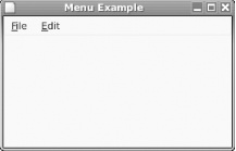
illustrated in Figure 4-10.
To create a set of menus in Gtk#, follow this general procedure.
Create a menu bar
Create a menu item for each top-level menu
For each top-level menu item:
Attach a new menu as a submenu of each top-level menu item
Create each item of the submenu
Attach the top-level menu item to the menu bar
This lab demonstrates the main features of menu creation in Gtk#, including the use of stock items to add interface consistency.
How to do it
A polished Gtk# application adheres to certain conventions in creating menus to provide a faster and more consistent interface to the user. Mnemonic keys are assigned to each menu item. The menu can be activated by holding down Alt and the mnemonic letter. Stock items are used for common menu items, and keyboard accelerators (a fancy name for shortcuts) are provided for rapid access to menu functions.
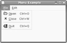
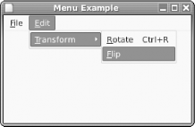
Figure 4-11 shows a submenu that has been activated either by a mouseclick on the “File” menu item or they use pressing Alt-F. It is composed entirely of stock items and has a separator. Figure 4-12 shows a submenu with a further submenu activated. None of the items in these submenus are stock.
To construct the menus shown in the figures, compile and run the code from Example 4-9:
$mcs Main.cs -pkg:gtk-sharp$mono Main.exe
// 04-gtk/06-menus
using System;
using Gtk;
using Gdk;

class MainClass {
  static Gtk.Window w;

  public static void Main(string[  ] args)
  {
    Application.Init ( );
    w = new Gtk.Window ("Menu Example");
    w.DeleteEvent += Window_Deleted;
    w.SetDefaultSize (260, 150);

    MenuBar mb = new MenuBar ( );

    AccelGroup agrp = new AccelGroup ( );
    w.AddAccelGroup (agrp);

    // file menu
    Menu file_menu = new Menu ( );
    MenuItem item = new MenuItem ("_File");
    item.Submenu = file_menu;
    mb.Append (item);

    item = new ImageMenuItem (Stock.Open, agrp);
    item.Activated += Open_Activated;
    file_menu.Append (item);

    item = new ImageMenuItem (Stock.Close, agrp);
    file_menu.Append (item);

    file_menu.Append (new SeparatorMenuItem ( ));

    item = new ImageMenuItem (Stock.Quit, agrp);
    item.Activated += Quit_Activated;
    file_menu.Append (item);

    // edit menu
    Menu edit_menu = new Menu ( );
    item = new MenuItem ("_Edit");
    item.Submenu = edit_menu;
    mb.Append (item);

    item = new MenuItem ("_Transform");
    Menu transform_menu = new Menu ( );
    item.Submenu = transform_menu;
    edit_menu.Append (item);

    item = new MenuItem ("_Rotate");

    // custom accelerator
    item.AddAccelerator ("activate", agrp,
      new AccelKey (Gdk.Key.R, Gdk.ModifierType.ControlMask,
        AccelFlags.Visible));

    item.Activated += Rotate_Activated;

    transform_menu.Append (item);
    item = new MenuItem ("_Flip");
    transform_menu.Append (item);

    VBox v = new VBox ( );
    v.PackStart (mb, false, false, 0);
    w.Add (v);
    w.ShowAll ( );

    Application.Run ( );
  }

  public static void Open_Activated (object o, EventArgs e)
  {
    System.Console.WriteLine ("Open");
  }

  public static void Rotate_Activated (object o, EventArgs e)
  {
    System.Console.WriteLine ("Rotate");
  }

  public static void Quit_Activated (object o, EventArgs e)
  {
    Application.Quit ( );
  }

  public static void Window_Deleted (object o, DeleteEventArgs e)
  {
    Application.Quit ( );
  }
}
How it works
Menu construction is verbose but largely straightforward. Example 4-12 follows the simple procedure outlined in
introduction to this lab. One key concept to grasp at the outset is
the workings of
AccelGroup, a class
that can accumulate all the required accelerator keys for an
application. The group is attached to the widget for which these keys
are valid. In most cases, and in Example 4-12, this
widget is the window.
Adding stock items is simple. The
accelerator group is passed to the constructor so that the stock
accelerator keys can be registered with Gtk#. The main event of
interest for menu items is
Activated. This is
raised when the user makes a selection. Example 4-12
implements several handlers for this event. Observe that
“Open” is printed to the console
either via the manual selection of the menu item or by the pressing
of the accelerator Ctrl-O.
Where nonstock items are used, you need to do more work to add
accelerators. The
AddAccelerator method
of Gtk.MenuItem performs this function and has the
following signature:
public void AddAccelerator (string accel_signal,
    AccelGroup accel_group,
    AccelKey accel_key)
AddAccelerator is inherited from
Gtk.Widget and is really a generic mechanism for
mapping keyboard accelerators to events on widgets. These events,
passed through the accel_signal, are all-lowercase
versions of the Gtk# event names. The accel_key
parameter controls aspects of the key press: which key to use, what
modifiers must be pressed too, and some flags. The most useful flag
is AccelFlags.Visible, which controls whether or
not the accelerator is rendered on the menu item.
Note
Modifier keys are those such as Shift, Alt, and Ctrl. Some keyboards have more, but these are the ones you can rely on.
The codes for keyboard keys and modifiers are contained in
enumerations in the Gdk namespace. To appreciate
the sheer diversity of keys on international keyboards, browse the
documentation for Gdk.Key! The corollary of this
diversity is that applications should only use accelerators that are
universally available.
It is possible, though not advisable, to place a menu bar anywhere
you want in your program window. To get the bar at the top, the
example packs it into the start of a VBox,
ensuring it won’t expand.
This lab has pursued a laborious and error-prone way of constructing
menus in order to demonstrate the various concepts and widgets.
Rather than repeating code, it would make more sense to create a data
structure and use loops to create the desired menus. This is in fact
what the
Gtk.ItemFactory
class is for, although it is in itself
quite complex to use. Chapter 5 describes an
even easier method of constructing menus, using the
Glade user interface builder.
What about ...
...More complex menu items? In particular, checkboxes and radio buttons are often used in menus, as shown in Figures Figure 4-13 and Figure 4-14.
Checkbox menu items are implemented by
the
Gtk.CheckMenuItem
class. The state of the box can be read
or set using the Active property. The
Toggled event is raised when the user changes
the state. Otherwise, these menu items can be treated in the same way
as any other.
Radio button menu items are implemented
by
Gtk.RadioMenuItem
. Their construction is a little more
complex because of the need to express the grouping of menu items:
Note
CheckMenuItem has another property, Inconsistent, used in those rare cases where you can’t honestly say “yes” or “no."
RadioMenuItem item1 = new RadioMenuItem ("Item label");
// add to the menu...
// and create the rest in the group
for (int i = 1; i < 5; i++) {
        RadioMenuItem newitem = new RadioMenuItem (item1,
                "Item label");
    // add the item to a menu...
}
This further underlines the convenience offered by tools such as interface builders.
Where to learn more
To find out more about the
ItemFactory
a good source of information is the
“Using ItemFactory section” of the
GTK+ 2.0 Tutorial, available online at
http://www.gtk.org/tutorial/.
Although this tutorial refers to the C implementation, you can use it
in conjunction with Monodoc.
Chapter 4 of the GNOME Human Interface Guidelines explains many good conventions for using menus in applications, including standard menu titles and their recommended order. It can be found at http://developer.gnome.org/projects/gup/hig/1.0/menus.html.
Organize Data with TreeView
Lists and trees are ubiquitous in user
interfaces. Gtk#’s TreeView
widget is a very flexible mechanism for allowing the display,
sorting, and editing, of list- or tree-shaped data. With power comes
responsibility, however, and there’s a bit of theory
to grasp before you can use the TreeView
effectively.
The tree view requires a complementary class containing the data to
be displayed in the view. An instance of this class is termed the
model. Typically this is either a
ListStore
or
TreeStore
. Each column in the view must be created
as a
TreeViewColumn
, and have one or more
CellRenderer
instance associated with it, to control
the visual appearance of the data.
Many pages could be written in explanation of the
TreeView. This lab demonstrates the basics and
shows how to present a slightly more adventurous rendering of data.
Note
If you care about the computer science behind this, read up on the Model-View-Controller architecture.
How to do it
The first task is the simple case of a list, as shown in Figure 4-15. The data model being displayed is a list
where each row is composed of two strings. Setting up the data model
requires a ListStore object. Its constructor is
invoked with the type of each column to be stored.
To create the interface a tree view is constructed. For each visible
column, a TreeViewColumn is created and its title
set. The column acts like a widget container, similar to an
HBox or VBox, except that it
must contain CellRenderer instances. Basic
CellTextRenderer
instances are created, packed into the
column, and attached to the corresponding place in the data model.
Note
You can control TreeView header behavior with HeadersVisible (as in the example), HeadersClickable (report clicks on headers), and Reorderable (sort view by different columns).
Example 4-10 shows the full code to achieve this. It can be compiled and run as usual for Gtk# programs:
$mcs Main.cs -pkg:gtk-sharp$mono Main.exe
// 04-gtk/07-listview
using System;
using Gtk;

class MainClass {
  public static void Main(string[  ] args)
  {
    Application.Init ( );
    Window w = new Window ("List");
    w.DeleteEvent += Window_Deleted;
    VBox v = new VBox ( );
    v.BorderWidth = 6;
    w.Add (v);

    TreeView tv = new TreeView ( );
    tv.HeadersVisible = true;
    v.Add (tv);

    TreeViewColumn col = new TreeViewColumn ( );
    CellRenderer colr = new CellRendererText ( );
    col.Title = "Column 1";
    col.PackStart (colr, true);
    col.AddAttribute (colr, "text", 0);
    tv.AppendColumn (col);

    col = new TreeViewColumn ( );
    colr = new CellRendererText ( );
    col.Title = "Column 2";
    col.PackStart (colr, true);
    col.AddAttribute (colr, "text", 1);
    tv.AppendColumn (col);

    ListStore store = new ListStore (typeof (string), typeof (string));
    tv.Model = store;

    TreeIter iter = new TreeIter ( );
    for (int i = 0; i < 4; i++) {
      iter = store.AppendValues ("Point " + i.ToString ( ),
        "Distance " + (4-i).ToString ( ));
    }

    w.ShowAll ( );
    Application.Run ( );
  }

  static void Window_Deleted (object o, DeleteEventArgs e)
  {
    Application.Quit ( );
  }
}
The second major use of TreeView is to display
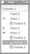
tree-shaped data, as shown in Figure 4-16. To
simplify matters, this example uses only one column. Note that there
is no difference in the way the view is set up. Only the connected
model of data, this time a
TreeStore
, differs. A TreeStore
allows you to store any depth of tree-shaped data.
Note
TreeView has two events that alert the program to use of the triangle-shaped “expanders”: RowCollapsed and RowExpanded.
Example 4-11 demonstrates storing and rendering tree-shaped data.
// 04-gtk/07-treeview
using System;
using Gtk;

class MainClass {
  public static void Main(string[  ] args)
  {
    Application.Init ( );
    Window w = new Window ("Tree");
    w.DeleteEvent += Window_Deleted;
    VBox v = new VBox ( );
    v.BorderWidth = 6;
    w.Add (v);

    TreeView tv = new TreeView ( );
    tv.HeadersVisible = true;
    v.Add (tv);

    TreeViewColumn col = new TreeViewColumn ( );
    CellRenderer colr = new CellRendererText ( );
    col.Title = "Column 1";
    col.PackStart (colr, true);
    col.AddAttribute (colr, "text", 0);
    tv.AppendColumn (col);

    // the above can be written more concisely as
    // tv.AppendColumn ("Column 1", new CellRendererText ( ),
    //                  "text", 0);

    TreeStore store = new TreeStore (typeof (string));
    tv.Model = store;

    TreeIter iter = new TreeIter ( );
    for (int i = 0; i < 4; i++) {
      iter = store.AppendValues ("Point " + i.ToString ( ));
      for (int j = i-1; j >= 0; j--) {
        store.AppendValues (iter, "Visited " + j.ToString ( ));
      }
    }

    w.ShowAll ( );
    Application.Run ( );
  }

  static void Window_Deleted (object o, DeleteEventArgs e)
  {
    Application.Quit ( );
  }
}
How it works
There are two concepts of particular interest underlying the
operation of the TreeView: the creation of and
access to the data model, and the linking of renderers to parts of
the model.
The iterator
provided by the TreeIter class is used heavily in
providing access to the data model. An iterator is a pointer into the
data model using the data that can be read or written. In relational
database terminology, the iterator is a
cursor.
Note
Iterators become very interesting when you start allowing
the editing of data in your TreeView
.
When adding data into a model, the pattern of use of the iterator
varies depending on whether the model is a list or tree. In the
simple case of a list, an iterator is returned by the
ListStore.AppendValues
method. It
points to the next empty row in the list. Other methods such as
InsertAfter
and InsertBefore
take such iterators as arguments, and
SetValue
can be used with an iterator
argument to change particular rows in the list.
If the only access required is to append values, as in Example 4-10, then the returned iterator value can be
ignored. It becomes more important however where tree-shaped data is
concerned. Appending data to a TreeStore follows
one of two patterns:
iter = store.AppendValues (val1, val2, ...)
child_of_iter = store.AppendValues (iter, val1, val2, ...)
The first pattern is similar to that of the list store, and results
in a row being added to the top level of tree. The returned iterator
is of use as it points to a new child row, not a sibling row. In the
second pattern, it can be specified as the first parameter to
AppendValues
, adding the data as a
child. If that child_of_iter is then used as a
parameter to AppendValues, data will again be
added as child of the child, and so on.
Linking renderers to the data model is a matter of setting
attributes on the renderer. These are not C#
attributes, unfortunately, but a term that the Gtk# API uses for this
purpose. The
TreeViewColumn.AddAttribute
method
links an attribute of a cell renderer with the contents of a certain
column in the data model. In Example 4-10, the
text attribute of the two text cell renderers is
linked to three string value contained in each of the columns. The
text attribute corresponds to the
Text property of the
CellRendererText
class, which has a host of other
interesting properties. Among these is Editable.
Using this, for example, the editing of individual cells could be
controlled by linking the editable attribute with
a column in the store of type bool.
What about ...
...More visually interesting trees? Using plain old text all the time can make it difficult for the user to pick out the data he requires. One of the simplest and most attractive ways to differentiate data is by the use of images. Figure 4-17 shows a view where the subordinate rows in the tree have been highlighted by the use of a graphical element.
So how is this done? First, the necessary data must be stored in the
model. It’s not only basic types like
string that can be stored.
Gdk.Pixbuf is also a perfectly good type to store:
Gdk.Pixbuf monkey = new Gdk.Pixbuf (null, "monkey.png");

TreeStore store = new TreeStore (
    typeof (string),
    typeof (Gdk.Pixbuf));

    ...

iter = store.AppendValues ("Point 1", null);
store.AppendValues (iter, "Visited 0", monkey);
With the images and text stored in the model, what remains is to pack
multiple types of cell renderers into the column of the tree. The
CellRendererPixbuf
provides the necessary functionality when
its pixbuf attribute is linked to the
Gdk.Pixbuf entries in the model:
CellRendererPixbuf pixr = new CellRendererPixbuf ( );
col.PackStart (pixr, false);
col.AddAttribute (pixr, "pixbuf", 1);

CellRenderer colr = new CellRendererText ( );
col.PackStart (colr, true);
col.AddAttribute (colr, "text", 0);
Where to learn more
This lab has only scratched the surface
of the possibilities presented by the TreeView.
There are other areas of functionality required for successful use,
including:
- Events
TreeViewraises events for user interactions with the rows in the view.- Searching and sorting
Rows can be incrementally searched by matching against keyboard input from the user, allowing rapid navigation to the desired row. The view can be sorted by different columns in response to user request.
- Editing
CellRendererTextcells can have theirEditableset totrue, in which case they permit user editing of the contents, stored in the linked model. When an edit is done theEditedevent is raised.
A simple first step for further experimentation with the examples in
this lab would be to add another column for boolean data, and attach
a CellRendererToggle renderer to represent its
state as a checkbox.
A comprehensive tree view tutorial can be found online at http://scentric.net/tutorial/treeview-tutorial.html. Though aimed at users of the C GTK+ API, the principles are equally applicable to Mono.
Exchange Data with Drag and Drop
Drag and drop is an effective way of allowing the user to manipulate data, both inside an application and between different applications. Although there may not always be a need for advanced drag and drop functionality, most applications find it useful to allow files dropped from the file manager to be interpreted as a “Load file” request.
Gtk# uses media types to control drag and drop. A drag source must describe which types it can provide, and a drop target must describe which types it can accept. If a match is found, then the drag and drop can proceed. Any widget that can generate events can participate in drag and drop.
Despite seeming like a complex feature of mature programs, drag and drop is actually quite simple to implement. It can vastly improve the integration of your program with others on the user’s desktop. This lab demonstrates both internal and external drag and drop, showing how to deal with different media types.
How to do it
Study our example program window, shown in Figure 4-18. It contains a drop target on the right to where the user can drag files from the file manager. On the left is a graphical image that can also be dropped on to the target.
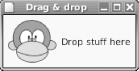
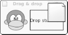
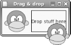
Figure 4-19 shows an external drag and drop in action. A file from the Nautilus file manager has been dropped onto the target. The target area is automatically outlined by Gtk# to give the user feedback as they hold the file over it. Figure 4-20 shows an internal drag and drop. The graphic item from the left has been picked up by the user and held over the drop target. The application has set the drag icon to the same graphic so the user can easily see what it is they are dragging.
To have the drop target accept files from the file manager, the media
type text/uri-list must be registered as
acceptable. When a drop happens, a newline-separated list of
Universal Resource Identifiers (URIs) will be sent to the target
application. It is this ability to use known media types that enables
drag and drop to provide interoperability between programs on the
desktop.
Note
If you’re not familiar with URIs, think of them as URLs used in web browsers. It’s nearly the same thing.
The internal drop of the graphic is not concerned with
interoperability with other applications, so a private application
specific type is invented, application/x-monkey.
The drop target must also register that it accepts that type too.
In order to differentiate between the two kinds of drag and drop, the
application will print the details of each drop to the console. For
text/uri-list, it will print the file URI, and for
application/x-monkey it will print some custom
data.
Example 4-12 contains the full implementation of both drop target and drag source. Its compilation is in Section 4.5.
$mcs Main.cs -pkg:gtk-sharp \-resource:monkey.png,monkey.png$mono Main.exe
// 04-gtk/08-dragdrop
using System;
using System.Text.RegularExpressions;
using Gtk;
using Gdk;

class MainClass {
  // the media types we'll accept
  private static Gtk.TargetEntry [  ] target_table =
    new TargetEntry [  ] {
      new TargetEntry ("text/uri-list", 0, 0),
      new TargetEntry ("application/x-monkey", 0, 1),
    };

  // the media types we'll send
  private static Gtk.TargetEntry [  ] source_table =
    new TargetEntry [  ] {
      new TargetEntry ("application/x-monkey", 0, 0),
    };

  private static Gdk.Pixbuf monkey;

  public static void Main(string[  ] args)
  {
    Application.Init ( );

    monkey = new Pixbuf (null, "monkey.png");
    Gtk.Window w = new Gtk.Window ("Drag & drop");
    w.DeleteEvent += Window_Delete;

    HBox h = new HBox ( );
    h.BorderWidth = 6;
    h.Spacing = 6;

    Gtk.EventBox image = new Gtk.EventBox ( );
    image.Add (new Gtk.Image (monkey));
    h.Add (image);

    Gtk.Label label = new Gtk.Label ("Drop stuff here");
    h.Add (label);

    w.Add (h);
    w.ShowAll ( );

    // set up label as a drop target
    Gtk.Drag.DestSet (label, DestDefaults.All, target_table,
      Gdk.DragAction.Copy);
    label.DragDataReceived += Data_Received;

    // set up image as a drag source
    Gtk.Drag.SourceSet (image, Gdk.ModifierType.Button1Mask,
      source_table, DragAction.Copy);
    image.DragDataGet += Data_Get;
    image.DragBegin += Drag_Begin;
    Application.Run ( );
  }

  static void Data_Received (object o, DragDataReceivedArgs args)
  {
    bool success = false;
    Gtk.Widget source = Gtk.Drag.GetSourceWidget (args.Context);
    string data = System.Text.Encoding.UTF8.GetString (
            args.SelectionData.Data);

    switch (args.Info) {
      case 0:  // uri-list
        string [  ] uri_list = Regex.Split (data, "\r\n");
        foreach (string u in uri_list) {
          if (u.Length > 0)
            System.Console.WriteLine ("Got URI {0}", u);
        }
        success = true;
        break;
      case 1: // monkey
        System.Console.WriteLine ("Monkey '{0}' was dropped", data);
        success = true;
        break;
    }

    Gtk.Drag.Finish (args.Context, success, false, args.Time);
  }

  static void Drag_Begin (object o, DragBeginArgs args)
  {
    Gtk.Drag.SetIconPixbuf (args.Context, monkey, 0, 0);
  }

  static void Data_Get (object o, DragDataGetArgs args)
  {
    Atom [  ] targets = args.Context.Targets;

    args.SelectionData.Set (targets [0], 8,
      System.Text.Encoding.UTF8.GetBytes ("Rupert"));
  }

  static void Window_Delete (object o, DeleteEventArgs args)
  {
    Application.Quit ( );
  }
}
How it works
To receive dragged data the label widget is registered as a drop
target with the static method Gtk.Drag.DestSet.
A reference to an array of
TargetEntry
objects is passed as one of the
parameters, indicating the acceptable media types. Each of these
contains the media type, a flags parameter, and a unique numeric
identifier for this type. This identifier is used again when data is
received.
The label widget is also
assigned a handler for
DragDataReceived
. This is enough to enable it as a
recipient of dragged data. When a drag and drop occurs, the event
handler is called with its DragDataReceivedArgs
parameter containing the details of the dropped data. The
Info property of this object corresponds to the
numeric identifier assigned to the media type in the
TargetEntry table.
The actual data sent by the drop is received as an array of bytes. It
is up to the receiving application to interpret these according to
the media type. In Gtk#, all text is exchanged using the UTF-8
encoding of the Unicode character set. In the example, a string is
derived from the unencoded data for both media types. Our private
application/x-monkey type is used to send the name
of the monkey in UTF-8! The text/uri-list is
further processed to split the lines up into multiple URIs. More than
one URI will be received if the user has grouped multiple files from
the file manager and dragged them all at once.
Note
A mature application would trap errors from invalid UTF-8 that would otherwise cause exceptions.
When processing of the dropped data has completed, the handler must
call Gtk.Drag.Finish. The second parameter to
this method is a boolean flag, indicating whether or not the handler
was able to process the incoming data successfully.
Setting up the Image widget as a source for drag
and drops is almost as simple. In the introduction to this lab it was
noted that widgets must be capable of raising events in order to
participate in a drag and drop. An Image does not
raise events, so it must be embedded in an
EventBox first.
The event box is registered as source with
Gtk.Drag.SourceSet, passing a media type table
in a similar way as for the label. The SourceSet
call also specifies the mouse button to initiate the drag, and the
hint that this drag will result in a data copy.
The only handler that must be implemented for a drag to work is for
the DragDataGet
event. This handler, implemented in
Data_Get converts the data to be transmitted
into a byte array. Because the widget in question only sends data of
type application/x-monkey, the application does
not need to perform detection of media types. Otherwise this would be
achieved by inspecting the value of Name on each
member of targets[ ] and providing the appropriate
encoded data. In this example, the result of
targets[0].Name is
application/x-monkey.
By implementing a handler for the
DragBegin
event, the program is able to set a
special icon for the dragged data. Otherwise, a rather generic icon
is used by Gtk#. Gtk.Drag.SetIconPixbuf sets
this icon to the same Gdk.Pixbuf used for the
image.
Where to learn more
As with most of the Gtk# API, it is possible to exert much finer control over the drag and drop process. For instance, you could receive events when a drag is held over a widget before a drop occurs.
Over time the “Mono Handbook” section of Monodoc will cover such topics, but in the meantime tutorials written using C and GTK+ can provide adequate information. A concise but helpful tutorial is available online at http://wolfpack.twu.net/docs/gtkdnd/.
Get Mono: A Developer's Notebook now with the O’Reilly learning platform.
O’Reilly members experience books, live events, courses curated by job role, and more from O’Reilly and nearly 200 top publishers.

