June 2004
Beginner
504 pages
15h 36m
English
In an Excel spreadsheet, you can highlight red flags and green-light results with formatting.
Studying investments generates a lot of numbers. You need the information, but you can also get lost in the forest as you scrutinize every tree. Excel charts [Hack #13] are good for emphasizing trends in sets of numbers, such as sales and earnings growth, or P/E ratio changes, but Excel can also highlight important values in numerical tables. Excel’s conditional formatting changes the colors in worksheet cells based on the value in a cell or the results of a formula. By associating good results with green and bad results with red, you can draw attention to desirable values and red flags, making the big picture visible at a glance.
You can implement this highlighting feature in several ways. In some cases, you might compare company results to a guideline, such as a debt to equity ratio less then 33 percent. For other measures, you might compare results to the industry average or to other measures for the same company, hoping for improvement but watching for deterioration, as illustrated in Figure 2-5.
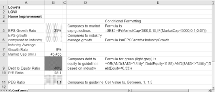
Figure 2-5. Use conditional formatting to rate company results against guidelines, benchmarks, or other company results
Figure 2-5 uses gray patterns instead of colors so you can see them in this book. However, you can use color shading as well.
This technique ...
Read now
Unlock full access


