Calculating R-Squared for a company’s earnings is one way to measure stock quality and risk.
Higher earnings increase the value of a company, which eventually increases a stock’s price when investors realize the stock is worth more. How much the stock price increases depends on perception as much as reality. The stock market hates uncertainty, which is why investors usually pay more for companies that pump out consistently increasing earnings. Predictable earnings represent more safety—a greater chance of a higher stock price as the earnings increase steadily year after year. They also mean that company management is competent, successfully playing the problems and opportunities that every company is dealt. Although statistics are often maligned for twisting the meanings of numerical results, you can confidently apply the standard statistical function R-Squared to evaluate the predictability of a company’s past earnings, and from that forecast its future earnings. Microsoft Excel makes this even easier with a built-in function that returns R-Squared as one of its results.
To measure earnings predictability, you need some earnings data. You should look for companies with at least five years of earnings, because you can’t see meaningful trends with fewer years. To analyze earnings, use earnings per share (EPS), which illustrates how many dollars of earnings one share of stock generates. EPS is more meaningful than total earnings, because EPS can go up or down if a company issues more share, or initiates a stock buyback program. Issuing additional shares reduces the amount of earnings per share as well as the EPS growth rate (not good for existing shareholders), whereas buying back stock increases the EPS and EPS growth rate (good for existing shareholders).
You can obtain annual EPS figures from numerous online sources [Hacks [Hack #18] , [Hack #19] , and [Hack #20] ] and extract those numbers into a spreadsheet. Figure 4-21 shows EPS data for the past ten years for two companies: one grows consistently and the other one grows erratically.
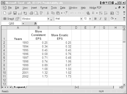
In this example, the spreadsheet has three columns, with each row containing a calendar year and the EPS for each company. You could add additional company data in other columns. In practice, you might save a separate workbook for each company, with separate worksheets for the data and your financial analysis as described in [Hack #42] .
Looking at columns of EPS numbers doesn’t show how quickly or consistently a company is growing. We are visual creatures, so graphs of EPS growth, such as the ones in Figure 4-22, are much more helpful. The data points in these graphs show the EPS for each of the last ten years. The thicker, straight line is an EPS growth trend line, which is called the least squares regression line, and is another statistical tool that Excel provides.
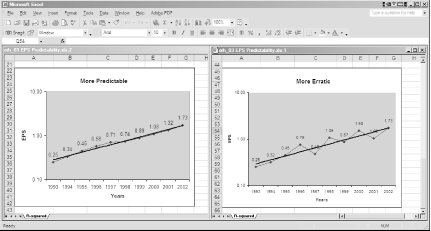
If you’re looking at these EPS growth graphs closely, you might be concerned with the values on the Y-axes. The distance between 10 cents and 1 dollar is the same as the distance between 1 dollar and 10 dollars, but those values are different by an order of magnitude! Similar to interest paid on a bank savings account, EPS growth compounds on itself, and the earnings from the prior year fuel even higher earnings in the next year. Because of this, earnings ideally should grow exponentially. Fortunately, through the magic of mathematics, compounded growth plots as a straight line on logarithmic graphs like the ones in Figure 4-22.
Even if you have created charts in Excel [Hack #13] before, these charts use some Excel features that might be unfamiliar to you. To create a logarithmic chart of EPS growth, follow these steps:
Insert a line chart with markers at each data point by clicking Insert→Chart and clicking Line in the Chart Type list. Click the image of a line chart with markers at each data point and click Next.
Specify the cells containing EPS data by dragging the cursor over them (B2 through B11 for more consistent EPS in the example) and click Next.
To add the years as labels on the X-axis, select the Series tab and click the Categories (X) Axis Labels box. Drag the mouse pointer over the cells containing the years (A2 through A11 in the example). Type a name in the Name box to assign a more meaningful name to the series of data points. Click Next.
To display the values next to the data points, select the Data Labels tab and check the Value checkbox. Click Finish to add the basic chart to the active worksheet.
To change the chart to a logarithmic scale, hover the pointer over the Y-axis until the words Value Axis appear, right-click the Y-axis, and choose Format Axis from the shortcut menu.
Select the Scale tab, check the Logarithmic Scale checkbox, and click OK. Excel will set the units, and the minimum and maximum values for you.
To specify the starting value for the Y-axis, right-click the Y-axis again and click Format Axis. This time, check the Category (X) axis checkbox, type the starting value you want, such as
.1, in the Crosses At box, and click OK.To add a trend line to the chart, right-click the line between any two data points and choose Add Trendline from the shortcut menu. Click the Exponential box and click OK.
Tip
You can right-click other chart elements to format them, for instance to reposition the data labels, remove the legend, or clear the horizontal gridline.
Now that you can visualize earnings growth, you can quantitatively measure the quality of that growth using R-Squared.
R-Squared (a.k.a. the coefficient of determination in the statistical world) compares the least squares regression line to a set of actual data. What does that mean? R-Squared measures how closely a set of data maps to the straight line that fits those points the best. The closer the data fits the straight line, the more predictable the data is. The least squares regression line, represented by the trend lines in Figure 4-22, is a straight line that fits the data points the closest, because the total of all the gaps between the line and the actual points is the smallest value you can obtain.
Tip
You can read more about the math behind R-Squared and the least squares regression line at http://www.stat.washington.edu/pip/courses/stat390/notes5_4.pdf.
To analyze how consistently a company grows, use the least squares method to estimate an average historical growth rate (called a trend line) from a company’s historical EPS. Then, you can calculate R-Squared to measure how predictable the annual EPS is when compared to that growth rate. If you’re trying to choose between two companies of comparable growth, you can evaluate differences in quality by comparing R-Squared values. R-Squared ranges between zero and one: one indicates that the trend line is a perfectly reliable representation of past EPS, and zero means that the trend line is useless.
Microsoft Excel includes two functions, LINEST and
LOGEST, that calculate regression lines and their
associated
R-Squared values.
LINEST works with linear growth rates. Because EPS
should grow exponentially due to the effect of compounding, you use
LOGEST to compute R-Squared for EPS.
The LOGEST function computes the least squares
regression line for a specified set of X and Y values and returns an
array of values that describes the line. Using calendar years for the
X values and EPS as the Y values, the LOGEST
R-Squared measures EPS predictability—how well you can predict
past EPS with a trend line, and thereby determining the confidence
with which you can predict future EPS by extrapolating the EPS growth
trend line into the future. Here’s how the
LOGEST function works.
To use LOGEST(Known-Y's, Known-X's, Const, Stats)
to show EPS predictability, Excel uses the following four parameters:
-
Known-Y's The range of cells that contains the company’s EPS for a number of years.
-
Known-X's The range of cells that contains the calendar years (or simply a sequence of digits) that correspond to the reported EPS. For example, you can use years such as 1993 through 2004 or the numbers 1 through 10 to represent ten years of data.
-
Const A logical value that specifies whether the line is forced through the origin. This constant has no effect on the R-Squared calculation, so you can omit this parameter.
-
Stats A logical value that specifies whether the function returns only the Y-intercept and slope coefficients or also returns additional regression statistics, such as R-Squared (which you should set to
Truefor EPS predictability).
When the parameter Stats is
False, LOGEST returns only the
slope coefficient m and the Y-axis intercept
constant b. When Stats equals
True, LOGEST returns additional
regression statistics, listed in Table 4-9.
Table 4-9. The LOGEST function provides a full set of regression statistics for a data set
|
Statistic |
Description |
|---|---|
|
se1,se2,...,sen |
The standard error values for the slope coefficients. |
|
seb |
The standard error value for the constant |
|
r2 |
The R-Squared measure you use for earnings predictability. |
|
sey |
The standard error for the Y estimate. |
|
F |
The F measure, which determines whether the relationship between the variables occurs by chance. |
|
df |
The degrees of freedom you use to find F-critical values in a statistical table. |
|
ssreg |
The regression sum of squares is the sum of the distances between the points on the line and the average Y value. |
|
ssresid |
The residual sum of squares is the sum of the gaps between the points on the line and the actual data points. |
In this example, you don’t want all those other
parameters. Fortunately, you can retrieve only the R-Squared result
by using the INDEX function, which plucks a value
out of an array. R-Squared is the third value in the
LOGEST array, so you can use the following syntax
to display R-Squared in a cell:
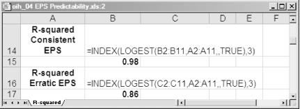
=INDEX(LOGEST(B2:B11,A3:A11,,TRUE),3)
Figure 4-23 shows two examples of combining
LOGEST and INDEX to calculate
R-Squared. The relatively consistent growth shown in Figure 4-22 generates an R-Squared of .98, very close to
the perfect correlation of 1.0. On the other hand, the jumpy earnings
growth shown in Figure 4-22 results in an R-Squared
of .86, indicating less EPS predictability and lower quality of
growth.
Building a spreadsheet just to calculate R-Squared isn’t useful if you plan to evaluate several other aspects of a company. To streamline your financial studies, follow the instructions in [Hack #45] to create a standard spreadsheet to hold all the tools that you use to evaluate a stock: graphs that show sales and EPS growth, financial ratios, and quantitative measures such as R-Squared. For example, you can run a macro, specify the file that contains company data, and watch Excel populate the functions and charts for your analysis.
Get Online Investing Hacks now with the O’Reilly learning platform.
O’Reilly members experience books, live events, courses curated by job role, and more from O’Reilly and nearly 200 top publishers.

