Chapter 23. Case Study: Many Eyes
Crime rates in local communities. Campaign donations. Testimony before Congress. Open government connotes open data. The Obama administration has acted on this premise and produced a series of websites that will function as repositories for government data, at both national and state levels. The next step for public engagement will be to make sense of this data. Visualization can help.
Visualization is a key medium for communication in a data-rich world. It can have a catalytic effect on data “storytelling” and collective analysis. We have seen examples of that power in Many Eyes, a public website we launched where anyone can upload and visualize data. The site fosters a social style of data analysis that empowers users to engage with public data through discussion and collaboration. Political debate, citizen activism, religious conversations, game playing, and educational exchanges are all happening on Many Eyes. The public nature of these visualizations provides users with a transformative path to information literacy.
Policy
Citizens are starting to realize the power of interactive visualization to help make sense of the political world around them at both the national and local levels. In this section, we will illustrate how people have been using visualization to think and talk about policy, the economy, the health of their communities, and their expectations for government.
Looking closely at one’s own backyard can be quite revealing. This is what Jon Udell, a prominent blogger, did when he created a series of Many Eyes visualizations of crime statistics in his hometown of Keene, New Hampshire. Udell wanted to understand whether the facts supported rumors of a crime wave in the area. After looking at the graphs and comparing historical, national, and local trends, Jon concluded that the perception of a local crime surge was not warranted. He then created a screencast documenting his motivating questions, the data collection process, the visualizations he created, and how playing with the visualizations helped him deduce that perception was harsher than reality. His blog post on this screencast generated a healthy number of comments, some of them from people who were hoping to do the same kind of analysis in their own communities.
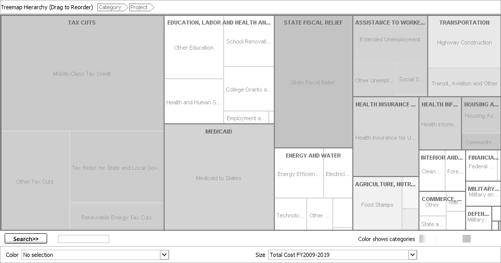
In addition to individual citizens, institutions have also been making use of Many Eyes visualizations to monitor the economic and political world around them. ProPublica, a nonprofit newsroom for investigative journalism, has used Many Eyes to cover a range of issues from unemployment insurance to weatherization projects in the United States. One of the most popular visualizations ProPublica created is a treemap of the February 2009 federal stimulus bill (see Figure 23-1). The interactive visualization was embedded on the ProPublica website and became one of a series of charts created to follow the bill as it passed both the House and Congress deliberations.
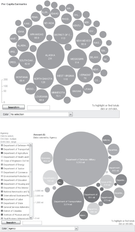
Another example shows both the power of visualization to make an argument engaging, and the potential for web-based visualizations to spread to new sites and audiences. Sunlight Foundation used data on congressional “earmarks” to create Many Eyes bubble charts (a new visualization technique that represents a set of numbers by circles whose areas are proportional to the underlying numbers); see Figure 23-2. A number of blogs picked up the visually striking results. We then saw one of these charts appear in a video created by law professor and reformer Lawrence Lessig, who used it as evidence of the favoritism that permeates the lawmaking process.
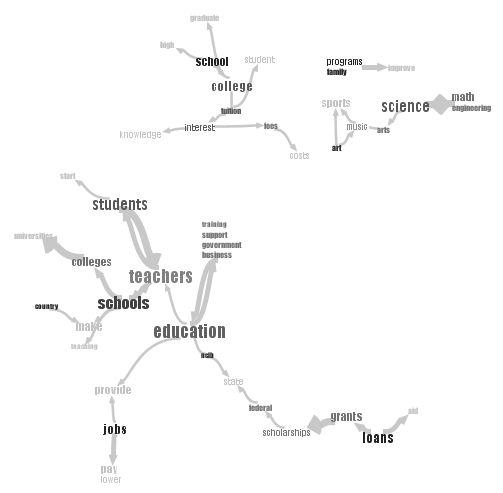
Visualization can function as an accessible way to engage with intimidating amounts of textual data as well as numeric data. In March 2009, President Obama invited citizens to ask him questions about the economy in the first-ever online town hall meeting. More than 71,000 people submitted questions to the White House website. Such a collection can be hard to parse, and the Obama team combed the collection to select the questions that the president should address. But what about the entire collection of questions? As a whole, they could represent the concerns of a nation. The collection was publicly available, but vast, unstructured, and unwieldy. Shortly after the question-and-answer session, Many Eyes users busily began visualizing the entire set of submitted questions. One phrase net (a visualization technique introduced on the Many Eyes site; see Figure 23-3) mapped all the questions on education, revealing islands of subjects: “schools and teachers,” “science and math,” and “college tuition.”
From Policy to Politicians
On September 3, 2008, Alaska Governor Sarah Palin gave a speech accepting the Republican nomination for the vice president of the United States. Within 24 hours, more than a dozen visualizations of her words appeared on Many Eyes. These visualizations (including tag clouds or “wordles”) were accompanied by others that sought clues to her personality and perspective, among them an Alaska State of the Union speech and an adoring column by William Kristol (see Figure 23-4).
These colorful visualizations are a far cry from the numerically intensive crime visualizations described earlier. Yet they serve a clear purpose. In our representative democracy, it’s not the citizens who will change policy, but the politicians they elect. Getting to know these people—their personalities, values, and motivations—is just as important as understanding the issues of the day.
Of course, politicians have always been willing to introduce themselves. (Palin’s speech was a masterpiece of the art of introduction, giving the Republican ticket an instant boost in the polls.) But citizens have always treated politicians’ words with a healthy dose of skepticism. It’s assumed that before a speech is uploaded to a teleprompter, sent to the Associated Press, or posted to a blog, it has been dutifully vetted to remove anything that might be too revealing.
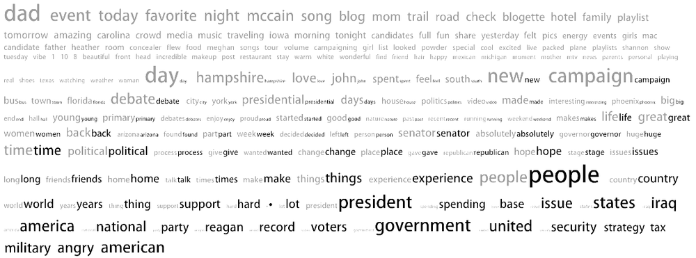
One of the most interesting uses of text visualization is to find a new perspective on carefully manicured words. With the right tools, it might be possible to uncover a perspective that a politician’s handlers did not plan for. We saw examples of this search for meanings on Many Eyes. One user, for instance, created a comparison tag cloud showing John McCain’s blog contrasted with the blog of his 23-year-old daughter Meghan, who was appearing with him on the campaign trail (see Figure 23-5).
In this visualization, the words in orange are taken from Meghan’s blog, while the words in blue are from John’s. The size of each word tells how frequently it occurs, and the words are sorted from more frequent use in Meghan’s blog (top) to more frequent use in John’s (bottom). The comparison ends up being a kind of filter, with common and clichéd words in the center (time, things, senator). At the bottom, however, we see the three words military, angry, and American. At a time when McCain’s campaign was trying to project a softer image, it is interesting to see anger take a prominent place.
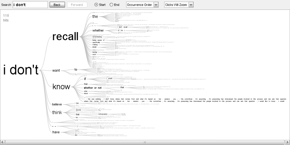
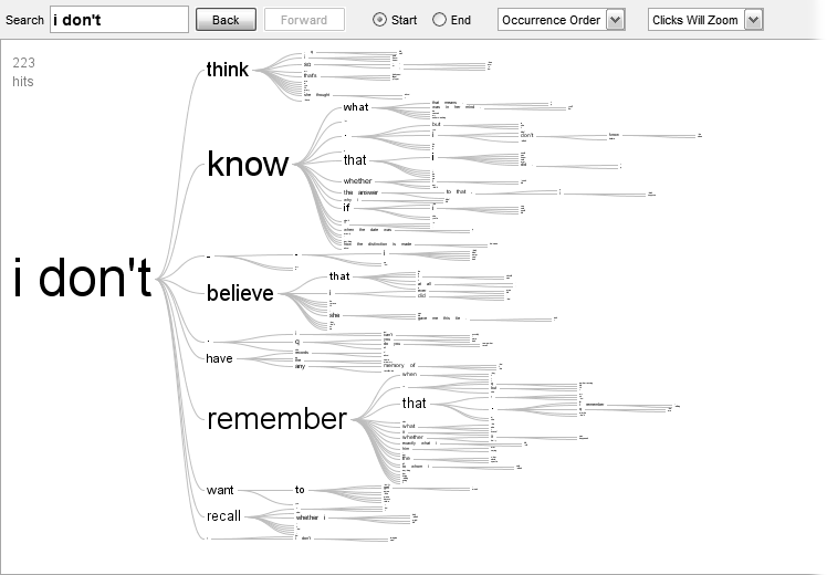
In some cases, a politician may not be merely spinning but actively evading an issue. A recent notorious case was the 2007 testimony of then–Attorney General Alberto Gonzales, regarding the firing of U.S. lawyers. After one of the Many Eyes team members put up a word tree visualization of his testimony, showing the prevalence of the phrase “I don’t recall” (see Figure 23-6), another user on the site quickly followed with an analogous visualization of Bill Clinton’s words in another famous piece of testimony (see Figure 23-7). In this case, the creation of the visualization may be seen as a kind of debate statement in itself—not about policy, but about making the point that evasive testimony crosses party lines.
Visual Literacy
How broadly accessible are these sometimes esoteric visualizations? There’s no doubt that some of the visualization activity on Many Eyes (and other sites) is created by, and plays to, an early-adopter audience that enjoys engaging with data for its own sake. But at the same time there is evidence that both creators and viewers of the visualizations are a diverse group. In interviews with Many Eyes users, we learned that some of the most active users had never worked with data before—and in at least one case, had never used a spreadsheet. We have also seen more than a dozen different classes use Many Eyes for class assignments, indicating that some teachers are putting an emphasis on teaching visual literacy.
Indeed, new and unusual visualization types seem to have the power to pique readers’ interests. Part of what drew bloggers to the earmark bubble chart, for instance, may have been its striking appearance. We certainly see this happening elsewhere as well. Alluring charts and graphs from the New York Times and CNN, for instance, have become national conversation pieces. CNN launched an interactive wall that visualized the evolution of voting patterns during the last presidential election. The New York Times has used interactive visualizations to cover a variety of subjects, ranging from the war in Iraq to how Congress questions Supreme Court nominees.
Conclusion
Our experiences with Many Eyes suggest three principles for how visualization can help with open government.
First, statistical graphics ground debate in reality. For readers, they are effective at communicating basic aspects of an issue. But just as important is the fact that graphs and charts impose a kind of discipline on authors. To create an illuminating visualization, a writer must gather a complete data set, which usually means finding and checking original sources. As we saw with the example of crime in Keene, this process may cause an author to rethink his original point and a healthy debate to ensue.
Second, text is data. People have become used to showing numbers in bar charts or line graphs, but the ability to create diagrams of text is new. New visualizations aimed at words rather than numbers hold out the hope of providing unfiltered insight into the minds of politicians and citizens alike.
Finally, readers today are becoming visually literate. We’ve seen broad uptake and popularity of visualizations that are complex, sophisticated, and often unfamiliar. As far as we can tell, readers are good at understanding the message of complex visualizations, and an unusual diagram is often an active draw for audiences rather than a turnoff.
About the Authors
Fernanda Viégas and Martin Wattenberg are research scientists in IBM’s Visual Communication Lab. Viégas is known for her pioneering work on depicting chat histories and email. Wattenberg’s visualizations of the stock market and baby names are considered Internet classics. Both Viégas and Wattenberg are also known for their visualization-based artwork, which has been exhibited in venues such as the Museum of Modern Art in New York, the London Institute of Contemporary Arts, and the Whitney Museum of American Art. The two became a team in 2003 when they decided to visualize Wikipedia, leading to the “history flow” project that revealed the self-healing nature of the online encyclopedia. They are currently exploring the power of web-based visualization and the social forms of data analysis it enables.
Get Open Government now with the O’Reilly learning platform.
O’Reilly members experience books, live events, courses curated by job role, and more from O’Reilly and nearly 200 top publishers.
