Chapter 3. Formatting and Aligning Your Text
Content may be king, but presentation is queen. You’re going to spend a lot of time choosing just the right text to add to your slides, so don’t blow all that hard work by ignoring the way your text looks. If your text is hard to read or conveys a message counter to the point you’re trying to make—if you choose whimsical, candy-colored fonts for a presentation introducing your company’s expanded line of funeral services, for example—you’re going to confuse (or even lose) your audience.
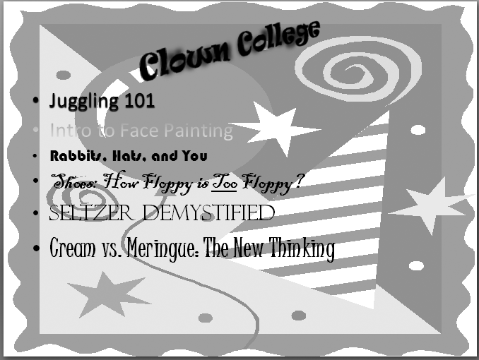
This chapter shows you how to format your text effectively. You’ll find out how to choose fonts, colors, and special effects (such as underlining, shadowing, bordering, and beveling) that support and strengthen your message (Figure 3-1), and how to avoid the effects that detract from it (Figure 3-2).


Get PowerPoint 2007: The Missing Manual now with the O’Reilly learning platform.
O’Reilly members experience books, live events, courses curated by job role, and more from O’Reilly and nearly 200 top publishers.

