Chapter 12. User Interface Controls and Containers
This chapter describes the Flex components used to present data, accept input, and define the application's layout. Rather than duplicating the Flex documents of the components, with their properties, methods, events, and styles, this chapter gives you some practical tips and ideas for using the components in your applications.
Static Controls
These controls present information and are not normally used for any input.
mx.controls.Label and mx.controls.Text
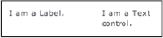
These controls display static text. Although both controls will display a string of characters, the Label control can display only one line of text and will truncate the string if necessary, whereas the Text control will word-wrap the string and automatically increase its height to accommodate the text.
Both controls use the same styles and methods. Figure 12-1 provides an example for each of these controls.
Figure 12-1. Figure 12-1
The following shows the code behind the controls:
<mx:Label text="Hello" />
<mx:Text text="World" />
Tips:
The
selectableproperty for theTextcontrol is set totrueby default, which allows you to highlight the text displayed within the component; it isfalseforLabel. If you useTextandLabelinterchangeably, you may want to set theTextcontrol'sselectableproperty tofalse.When a
Labelcontrol is not wide enough to contain all its text, the remainder is ...
Get Professional Adobe® Flex® 3 now with the O’Reilly learning platform.
O’Reilly members experience books, live events, courses curated by job role, and more from O’Reilly and nearly 200 top publishers.

