Images are an important aspect of most websites. ASP.NET provides several ASP.NET server controls for displaying images. Two of them, the Image and the ImageMap controls, are covered in this section. The AdRotator control, which also displays images, will be covered in the next chapter.
The Image control has limited functionality: it is used for displaying an image on a web page or, alternatively, displaying some text if the image is unavailable. It raises no events for user interaction, other than those inherited from Control, such as Init and Load. However, which image it displays and where it is aligned on the page can be set in code, so it is a legitimate alternative to using a static HTML <img> element.
Tip
If you need an image to have the same functionality as a button (i.e., to capture mouse clicks), you should use either the ImageButton control, or a HyperLink control with its ImageUrl property set.
In addition to the properties inherited from the WebControl class, the Image control has the read/write properties shown in Table 4-7.
Table 4-7. Properties of the Image control
Name | Type | Description |
|---|---|---|
| String | The text displayed in the control if the image is unavailable. In browsers that support the ToolTips feature this text is also displayed as a tool tip. |
|
| Alignment options relative to the text of the web page. See Table 4-8. |
| String | The URL pointing to the location of an image to display. |
The ImageUrl property can be either relative or absolute, as described fully in the “File Locations” sidebar, earlier in this chapter.
There are 10 possible values for the ImageAlign property, as shown in Table 4-8. They each correspond to one of the valid values for the HTML <img> element’s align attribute, with the exception of NotSet. If you need better control of image and text placement, you will probably want to position it with CSS.
Table 4-8. Members of the ImageAlign enumeration
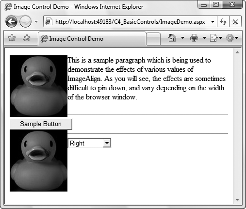
To see how the various ImageAlign values affect the appearance of a web page, create a new web form called ImageDemo.aspx in your C4_BasicControls website. As highlighted in Example 4-16, the form contains two Image controls and a DropDownList containing all the possible values for the Image control’s ImageAlign property. There are also a few horizontal lines and some text to demonstrate the difference in the alignments.
Tip
For the code in ImageDemo.aspx to work correctly, you will need an image file for the ImageUrl. These examples use popflyduck.png, located in the website directory. You can use any image file you want.
Example 4-16. ImageDemo.aspx
<%@ Page Language="C#" AutoEventWireup="true" CodeFile="ImageDemo.aspx.cs" Inherits="ImageDemo" %> <!DOCTYPE html PUBLIC "-//W3C//DTD XHTML 1.0 Transitional//EN" "http://www.w3.org/TR/xhtml1/DTD/xhtml1-transitional.dtd"> <html xmlns="http://www.w3.org/1999/xhtml"> <head runat="server"> <title>Image Control Demo</title> </head> <body> <form id="form1" runat="server"> <div> <p><asp:Image ID="img1" runat="server"AlternateText="Popfly Duck" ImageUrl="~/popflyDuck.png" />This is a sample paragraph which is being used to demonstrate the effects of various values of ImageAlign. As you will see, the effects are sometimes difficult to pin down, and vary depending on the width of the browser window. </p> <hr /> <asp:Button ID="Button1" runat="server" Text="Sample Button" /><asp:Image ID="img2" runat="server"AlternateText="Popfly Duck" ImageUrl="~/popflyDuck.png" /><hr /><asp:DropDownList ID="ddlAlign" runat="server"AutoPostBack="True"><asp:ListItem Text="NotSet" /><asp:ListItem Text="AbsBottom" /><asp:ListItem Text="AbsMiddle" /><asp:ListItem Text="Top" /><asp:ListItem Text="Bottom" /><asp:ListItem Text="BaseLine" /><asp:ListItem Text="TextTop" /><asp:ListItem Text="Left" /><asp:ListItem Text="Right" /></asp:DropDownList></div> </form> </body> </html>
Much like HyperLinkDemo.aspx, the ImageAlign property of the two Image controls is set when the page loads, and the DropDownList’s AutoPostBack property is set to true so that when a new value is selected from the list the page posts back and the ImageAlign properties are reset. The code that sets the property in ImageDemo.aspx.cs appears in Example 4-17. Note that when being set programmatically, the ImageAlign property must be set to one of the predefined ImageAlign enumeration values rather than a simple string.
Example 4-17. The code-behind file in ImageDemo.aspx.cs
using System;
using System.Web.UI;
using System.Web.UI.WebControls;

public partial class ImageDemo : Page
{
   protected void Page_Load(object sender, EventArgs e)
   {
      switch (ddlAlign.SelectedIndex)
      {
         case 0:
            img1.ImageAlign = ImageAlign.NotSet;
            img2.ImageAlign = ImageAlign.NotSet;
            break;
         case 1:
            img1.ImageAlign = ImageAlign.AbsBottom;
            img2.ImageAlign = ImageAlign.AbsBottom;
            break;
         case 2:
            img1.ImageAlign = ImageAlign.AbsMiddle;
            img2.ImageAlign = ImageAlign.AbsMiddle;
            break;
         case 3:
            img1.ImageAlign = ImageAlign.Top;
            img2.ImageAlign = ImageAlign.Top;
            break;
         case 4:
            img1.ImageAlign = ImageAlign.Bottom;
            img2.ImageAlign = ImageAlign.Bottom;
            break;
         case 5:
            img1.ImageAlign = ImageAlign.Baseline;
            img2.ImageAlign = ImageAlign.Baseline;
            break;
         case 6:
            img1.ImageAlign = ImageAlign.Middle;
            img2.ImageAlign = ImageAlign.Middle;
            break;
         case 7:
            img1.ImageAlign = ImageAlign.TextTop;
            img2.ImageAlign = ImageAlign.TextTop;
            break;
         case 8:
            img1.ImageAlign = ImageAlign.Left;
            img2.ImageAlign = ImageAlign.Left;
            break;
         case 9:
            img1.ImageAlign = ImageAlign.Right;
            img2.ImageAlign = ImageAlign.Right;
            break;
         default:
            img1.ImageAlign = ImageAlign.NotSet;
            img2.ImageAlign = ImageAlign.NotSet;
            break;
      }
   }
}
Figure 4-9 shows this page in action.
HTML provides the <map> element to define hotspots on an image. Each hotspot is a defined area of the image that acts as a hyperlink to another area or website. These are known as image maps. The ImageMap server control provides this functionality in ASP.NET. Common uses include:
An image of a map of the world defining a different URL to navigate to depending on which continent or country the user clicks.
Allowing a user to change the color scheme and font of a website by clicking different areas of an image representing those choices. The hyperlinks in this case are often to a client-side function which the browser executes instead of navigating to a different URL.
The ImageMap control derives from the Image class, and adds a number of properties and a single event, Click, to that class to provide the image map functionality. These properties are listed in Table 4-9. All are read/write unless noted.
Table 4-9. Properties of the ImageMap control
Each ImageMap control contains a collection of HotSpot objects, which are clickable regions of the image corresponding to HTML <area> tags within the image map. HotSpots will either raise a Click event on the server, if the HotSpotMode is set to PostBack, or immediately navigate to the URL specified by the NavigateUrl property, if the HotSpotMode is set to Navigate.
There are three types of hotspots:
RectangleHotSpotDefines a rectangular region (in pixels) of the image with
Top, Bottom, Left, andRightproperties, relative to the upper-left corner of the imageCircleHotSpotDefines a circular region (in pixels) of the image with
XandYproperties specifying the center of the circle, relative to the upper-left corner of the image, and theRadiusproperty specifying the radius of the circle in pixelsPolygonHotSpotDefines a many-sided region (in pixels) of the image with a comma-separated list of x and y coordinates of endpoints of line segments outlining the region, relative to the upper-left corner of the image
All of the HotSpot objects have in common the read/write properties listed in Table 4-10.
Table 4-10. Properties of a HotSpot object
Name | Type | Values | Description |
|---|---|---|---|
| String | The text displayed in the control if the image is unavailable. In browsers that support the ToolTips feature this text is also displayed as a tool tip. | |
|
|
| Specifies the action taken when a hotspot is clicked. Individual hotspots may specify different modes. |
| String | Specifies the URL to navigate to when a hotspot with a | |
| String | The value of the clicked | |
| String | Specifies the browser window in which the target page will be displayed. The values of the |
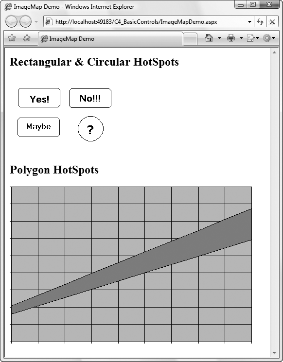
To demonstrate all of these properties and the Click event, add a new web form called ImageMapDemo.aspx to your C4_BasicControls website. This web page is shown in Figure 4-10 after the Yes hotspot has been clicked. This example has two image maps. The one at the top of the page contains three rectangular hotspots—Yes, No, and Maybe—and a circular hotspot around a question mark in the image. The second image map has three polygonal hotspots defined: one above the band, one below, and the band itself.
The markup for ImageMapDemo.aspx is shown in Example 4-18 and the code-behind file in ImageMapDemo.aspx.cs is shown in Example 4-19. The only code of interest in the latter is the event handler method, imgmapYesNoMaybe_Click (highlighted), which is executed whenever a hotspot with a HotSpotMode set to PostBack is clicked.
Tip
For the code in ImageMapDemo.aspx to work correctly, you will need the image files for the ImageMap controls. These examples use YesNoMaybe.gif and plot.gif, which you’ll find in the download folder for this site on http://www.oreilly.com.
Example 4-18. ImageMapDemo.aspx
<%@ Page Language="C#" AutoEventWireup="true"
   CodeFile="ImageMapDemo.aspx.cs" Inherits="ImageMapDemo" %>

<!DOCTYPE html PUBLIC "-//W3C//DTD XHTML 1.0 Transitional//EN"
   "http://www.w3.org/TR/xhtml1/DTD/xhtml1-transitional.dtd">
<html xmlns="http://www.w3.org/1999/xhtml">
<head runat="server">
   <title>ImageMap Demo</title>
</head>

<body>
   <form id="form1" runat="server">
   <div>
      <h1>Rectangular & Circular HotSpots</h1>
      <asp:ImageMap ID="imgmapYesNoMaybe" runat="server"
         ImageUrl="~/YesNoMaybe.gif" HotSpotMode="Postback"
         OnClick="imgmapYesNoMaybe_Click">
         <asp:RectangleHotSpot PostBackValue="Yes"
            Bottom="60" Top="21" Left="17" Right="103"
            AlternateText="Yes please" />
         <asp:RectangleHotSpot HotSpotMode="PostBack"
            PostBackValue="No" Bottom="60" Top="21"
            Left="122" Right="208" AlternateText="No thanks" />
         <asp:RectangleHotSpot PostBackValue="Maybe" Bottom="122"
            Top="83" Left="16" Right="101"
            AlternateText="Well maybe" />
         <asp:CircleHotSpot HotSpotMode="Navigate" X="165" Y="106"
            Radius="25" NavigateUrl="http://www.ora.com"
            Target="_blank"
            AlternateText="I'll have to think about it." />
      </asp:ImageMap>
      <asp:Label ID="lblMessage" runat="server" />

      <h1>Polygon HotSpots</h1>
      <asp:ImageMap ID="imgmapPlot" runat="server"
         ImageUrl="~/plot.gif" HotSpotMode="PostBack"
         OnClick="imgmapYesNoMaybe_Click">
         <asp:PolygonHotSpot Coordinates="4,245,4,3,495,3,495,45,"
            AlternateText="Above the band"
            PostBackValue="Above the band" />
         <asp:PolygonHotSpot Coordinates="4,245,495,45,495,112,3,264"
            AlternateText="In the band"
            PostBackValue="In the band" />
         <asp:PolygonHotSpot Coordinates="495,45,495,112,495,320,4,320"
            AlternateText="Below the band"
            PostBackValue="Below the band" />
      </asp:ImageMap>
   </div>
   </form>
</body>
</html>
In the declaration of the first image map, imgMapYesNoMaybe, an image file is specified, YesNoMaybe.gif, which is located in the same directory as the page itself.
The default HotSpotMode for this image map is set to PostBack. The Yes and Maybe hotspots assume this value, the No hotspot explicitly specifies the same value, and the question mark hotspot uses a different HotSpotMode of Navigate. In this last case, the NavigateUrl and Target properties provide direction as to where and how to navigate. For the postback hotspots, the OnClick attribute of the image map binds the Click event to the imgmapYesNoMaybe_Click method contained in the code-behind file, shown highlighted in Example 4-19.
The second image map, imgmapPlot, defines three irregularly shaped hotspots. Each hotspot is defined by a set of x, y coordinates. In this example, the hotspots are simple, with only four straight sides each. In a more typical usage—say, a map of the United States, with each state defined as a hotspot—you might have many dozens of nodes specified. The more nodes there are, the finer and more accurate the hotspot. However, don’t go too crazy trying to make the outline perfect, because most users click near the middle of the hotspot, and if they are too close to the edge of the region and get the adjoining region by mistake, they will just click the Back button and try again a little more carefully.
The Click event argument is of type ImageMapEventArgs. It exposes a single public property, PostBackValue. This corresponds to the HotSpot property of the same name declared with each HotSpot in the example. This property is retrieved in the Click event handler in Example 4-19 and is used to populate the Text property of the Label control on the page.
Get Programming ASP.NET 3.5, 4th Edition now with the O’Reilly learning platform.
O’Reilly members experience books, live events, courses curated by job role, and more from O’Reilly and nearly 200 top publishers.

