Create a Pivot Table
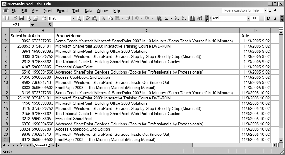
Pivot tables are commonly used to plot multiple data values over time. For example, the worksheet in Figure 13-1 contains the sales ranks of books collected from Amazon.com.

Figure 13-1. In source data, rows have mixed content
I’d like to compare each book’s sales rank over time, but there’s no way to chart that using the worksheet in Figure 13-1 because the rows contain multiple product names. Ideally, each row should reflect a date, each column should be a product name, and each cell should be the sales rank. You can make those changes by creating a pivot table from the source worksheet.
To create a pivot table in Excel :
Select the columns to include in the pivot table (A$:D$ in Figure 13-1) and choose Data → Pivot Table and Pivot Chart Report. Excel starts the PivotTable Wizard (Figure 13-2).
Click Finish to create the pivot table on a new worksheet or click Next to walk through the pivot table options using the wizard. Excel creates a new pivot table.
Drag ProductName from the PivotTable Field List to the column area, drag Date to the row area, and drag SalesRank to the data items area as shown in Figure 13-3.
The default formula for data fields is Count, which is always 1 in this case, so right-click on the data field in the upper-left corner of the pivot table, select Field Settings and change the formula to Sum, as shown in Figure 13-4.
Pivot tables do not automatically ...
Get Programming Excel with VBA and .NET now with the O’Reilly learning platform.
O’Reilly members experience books, live events, courses curated by job role, and more from O’Reilly and nearly 200 top publishers.

