Putting It All Together
Now that we have covered the many concepts related to managing layout within Flex, let’s dig a bit deeper and learn how to put it all together.
The layout shown in Figure 6-13 contains a fixed left
region for two List components that are
stacked with a draggable divider, and a Canvas region that expands and repositions the
Save button as needed to keep it at the bottom right.
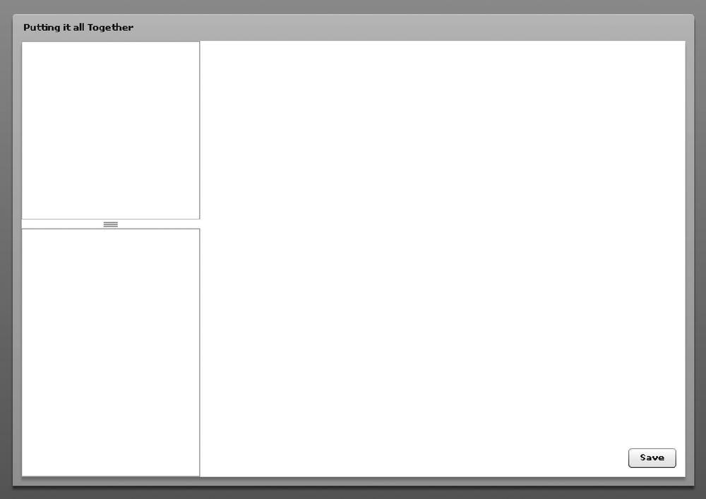
Figure 6-13. Layout example that contains different nested container types and controls
In Figure 6-13, the
application is contained within a Panel, and the width and height properties are set to resize to maximize the application area. When
resizing occurs, the left VDividedBox
continues to have the same width, but it expands to fill the maximum
vertical space. The Canvas on the right expands to fill the entire region, which allows
the children to be laid out with the Canvas using constraint-based layout techniques
(discussed earlier). Example 6-10 shows the code used
to produce Figure 6-13.
Example 6-10. Code used to produce the layout in Figure 6-13
<?xml version="1.0" encoding="utf-8"?> <mx:Application xmlns:mx="http://www.adobe.com/2006/mxml"> <mx:Panel layout="horizontal" width="100%" height="100%" title="Putting it all Together"> <mx:VDividedBox width="200" height="100%"> <mx:List width="100%" height="200"/> <mx:List width="100%"/> </mx:VDividedBox> <mx:Canvas width="100%" height="100%"> ...
Get Programming Flex 3 now with the O’Reilly learning platform.
O’Reilly members experience books, live events, courses curated by job role, and more from O’Reilly and nearly 200 top publishers.

