Pop-Up Controls
Apart from the ability to programmatically create menus and menu
bar navigator (discussed in the next section), there are two Flex
framework controls that you can use to create pop-up controls: PopUpButton and PopUpMenuButton. Both of these controls allow a
user to display a pop up. PopUpMenuButton allows the user to pop up a
menu, whereas PopUpButton is more
generic, allowing a user to pop up any control.
Using PopUpButton
The PopUpButton control allows
you to associate the button with a pop up. The pop up can be
any other UI component. Typically, you would use a pop-up button to
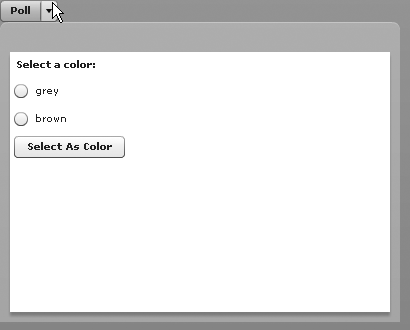
display a small window or something similar. As you can see in Figure 7-9, the pop up appears
adjacent to the button, appearing and disappearing from the
button.

Figure 7-9. Using a PopUpButton to display a pop up
For the example shown in Figure 7-9, we created a simple MXML component that looks like the following:
<?xml version="1.0" encoding="utf-8"?>
<mx:TitleWindow xmlns:mx="http://www.adobe.com/2006/mxml" width="400" height="300">
    <mx:VBox>
         <mx:Label text="Select a color:" />
         <mx:RadioButton groupName="colors" label="grey" />
         <mx:RadioButton groupName="colors" label="brown" />
         <mx:Button label="Select As Color" />
    </mx:VBox>
</mx:TitleWindow>
Assuming we name the component PollWindow (and save it in the root directory), the code that allows the user to display the window using a pop-up button ...
Get Programming Flex 3 now with the O’Reilly learning platform.
O’Reilly members experience books, live events, courses curated by job role, and more from O’Reilly and nearly 200 top publishers.

