Chapter 4. Line Graphs
Line graphs are typically used for visualizing how one continuous variable, on the y-axis, changes in relation to another continuous variable, on the x-axis. Often the x variable represents time, but it may also represent some other continuous quantity, like the amount of a drug administered to experimental subjects.
As with bar graphs, there are exceptions. Line graphs can also be used with a discrete variable on the x-axis. This is appropriate when the variable is ordered (e.g., “small”, “medium”, “large”), but not when the variable is unordered (e.g., “cow”, “goose”, “pig”). Most of the examples in this chapter use a continuous x variable, but we’ll see one example where the variable is converted to a factor and thus treated as a discrete variable.
Making a Basic Line Graph
Solution
Use ggplot() with geom_line(), and
specify what variables you mapped to x and y
(Figure 4-1):
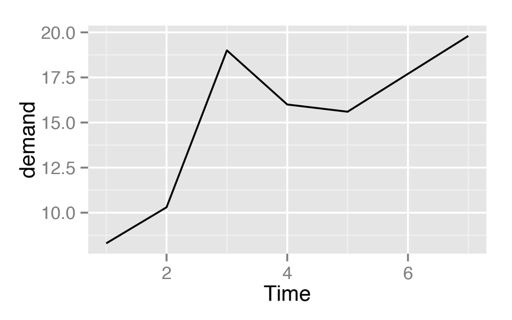
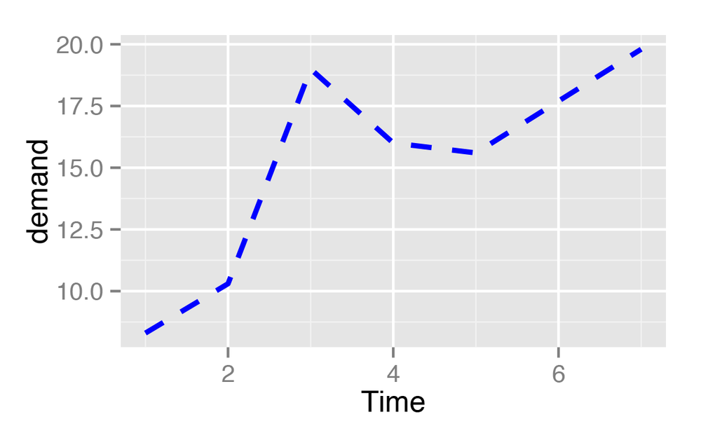
ggplot(BOD,aes(x=Time,y=demand))+geom_line()
Discussion
In this sample data set, the x variable,
Time, is in one column and the
y variable, demand, is in another:
BOD

 Time demand
    1    8.3
    2   10.3
    3   19.0
    4   16.0
    5   15.6
    7   19.8
Line graphs can be made with discrete (categorical) or
continuous (numeric) variables on the x-axis. In the example here, the
variable demand is numeric, but it
could be treated as a categorical variable by converting it to a factor
with factor() (Figure 4-2). When the
x variable is a factor, you must also use aes(group=1) to
ensure that ggplot() knows that the data points
belong together and should be connected with a line (see Making a Line Graph with Multiple Lines for an explanation of why
group is needed with
factors):
BOD1<-BOD# Make a copy of the dataBOD1$Time<-factor(BOD1$Time)ggplot(BOD1,aes(x=Time,y=demand,group=1))+geom_line()
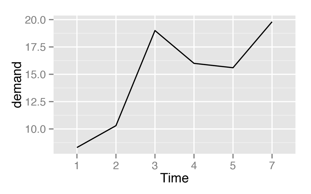
In the BOD data set there is
no entry for Time=6, so there is no level 6 when Time is converted to a factor. Factors hold
categorical values, and in that context, 6 is just another value. It
happens to not be in the data set, so there’s no space for it on the
x-axis.
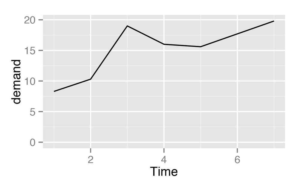
With ggplot2, the default y range of a
line graph is just enough to include the y values
in the data. For some kinds of data, it’s better to have the
y range start from zero. You can use ylim() to set the
range, or you can use expand_limits() to
expand the range to include a value. This will set the range from zero
to the maximum value of the demand
column in BOD (Figure 4-3):
# These have the same resultggplot(BOD,aes(x=Time,y=demand))+geom_line()+ylim(0,max(BOD$demand))ggplot(BOD,aes(x=Time,y=demand))+geom_line()+expand_limits(y=0)
See Also
See Setting the Range of a Continuous Axis for more on controlling the range of the axes.
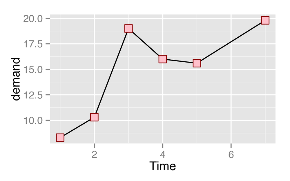
Adding Points to a Line Graph
Solution
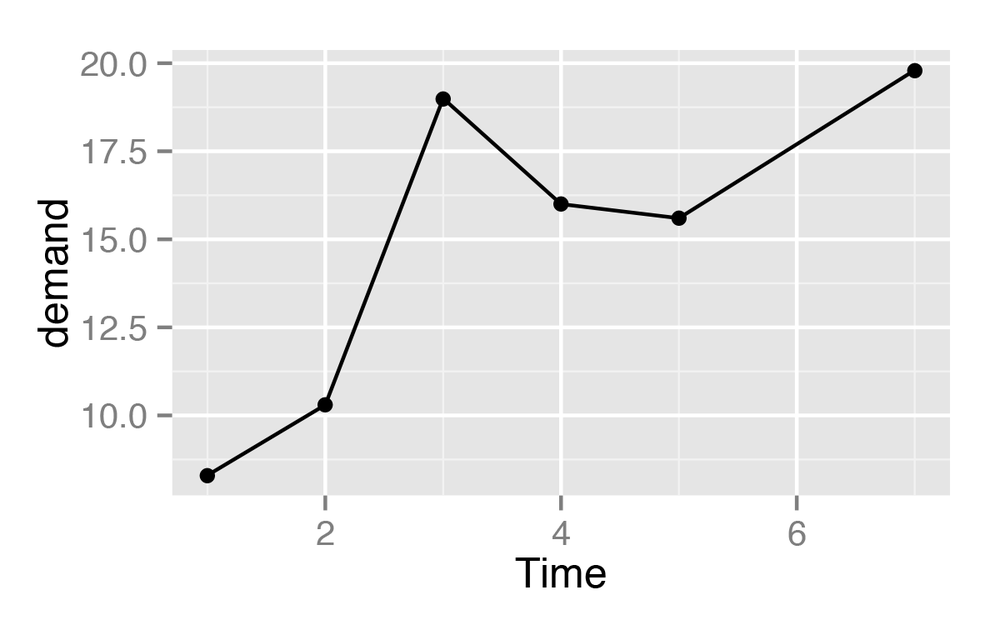
Add geom_point() (Figure 4-4):
ggplot(BOD,aes(x=Time,y=demand))+geom_line()+geom_point()
Discussion
Sometimes it is useful to indicate each data point on a line
graph. This is helpful when the density of observations is low, or when
the observations do not happen at regular intervals. For example, in the
BOD data set there is no entry for
Time=6, but this is not apparent from
just a bare line graph (compare Figure 4-3 with Figure 4-4).
In the worldpop data set,
the intervals between each data point are not consistent. In the far
past, the estimates were not as frequent as they are in the more recent
past. Displaying points on the graph illustrates when each estimate was
made (Figure 4-5):
library(gcookbook)# For the data setggplot(worldpop,aes(x=Year,y=Population))+geom_line()+geom_point()# Same with a log y-axisggplot(worldpop,aes(x=Year,y=Population))+geom_line()+geom_point()+scale_y_log10()
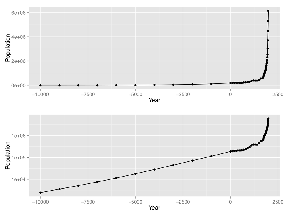
With the log y-axis, you can see that the rate of proportional change has increased in the last thousand years. The estimates for the years before 0 have a roughly constant rate of change of 10 times per 5,000 years. In the most recent 1,000 years, the population has increased at a much faster rate. We can also see that the population estimates are much more frequent in recent times—and probably more accurate!
See Also
To change the appearance of the points, see Changing the Appearance of Points.
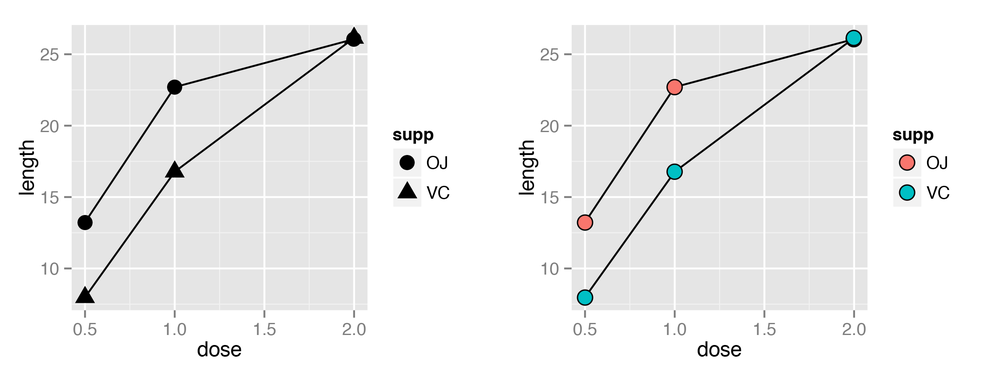
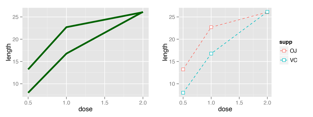
Making a Line Graph with Multiple Lines
Solution
In addition to the variables mapped to the x- and y-axes, map
another (discrete) variable to colour
or linetype, as shown in Figure 4-6:
# Load plyr so we can use ddply() to create the example data setlibrary(plyr)# Summarize the ToothGrowth datatg<-ddply(ToothGrowth,c("supp","dose"),summarise,length=mean(len))# Map supp to colourggplot(tg,aes(x=dose,y=length,colour=supp))+geom_line()# Map supp to linetypeggplot(tg,aes(x=dose,y=length,linetype=supp))+geom_line()
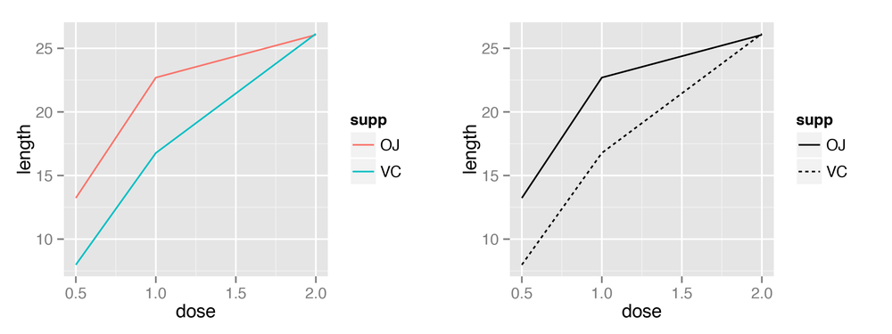
Discussion
The tg data has three
columns, including the factor supp,
which we mapped to colour and
linetype:
tgsupp dose length OJstr0.513.23OJ1.022.70OJ2.026.06VC0.57.98VC1.016.77VC2.026.14(tg)'data.frame':6obs. of3variables:$supp : Factor w/2levels"OJ","VC":111222$dose : num0.5120.512$length: num13.2322.726.067.9816.77...
Note
If the x variable is a factor, you must
also tell ggplot() to group by that same variable, as described
momentarily.
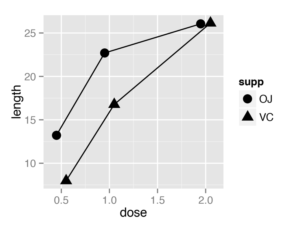
Line graphs can be used with a continuous or categorical variable on
the x-axis. Sometimes the variable mapped to the x-axis is
conceived of as being categorical, even when it’s
stored as a number. In the example here, there are three values of
dose: 0.5, 1.0, and 2.0. You may want
to treat these as categories rather than values on a continuous scale.
To do this, convert dose to a factor
(Figure 4-7):
ggplot(tg,aes(x=factor(dose),y=length,colour=supp,group=supp))+geom_line()
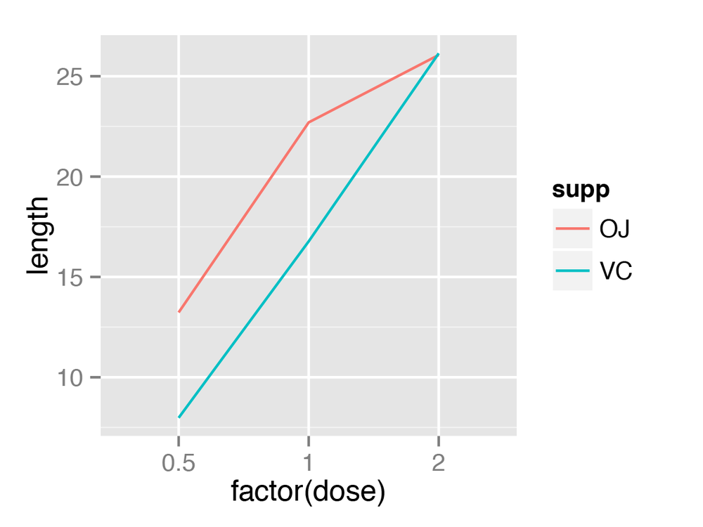
Notice the use of group=supp. Without this statement, ggplot() won’t know how to group the data
together to draw the lines, and it will give an error:
ggplot(tg,aes(x=factor(dose),y=length,colour=supp))+geom_line()geom_path: Each group consists of only one observation. Do you need to adjust the group aesthetic?
Another common problem when the incorrect grouping is used is that you will see a jagged sawtooth pattern, as in Figure 4-8:
ggplot(tg,aes(x=dose,y=length))+geom_line()
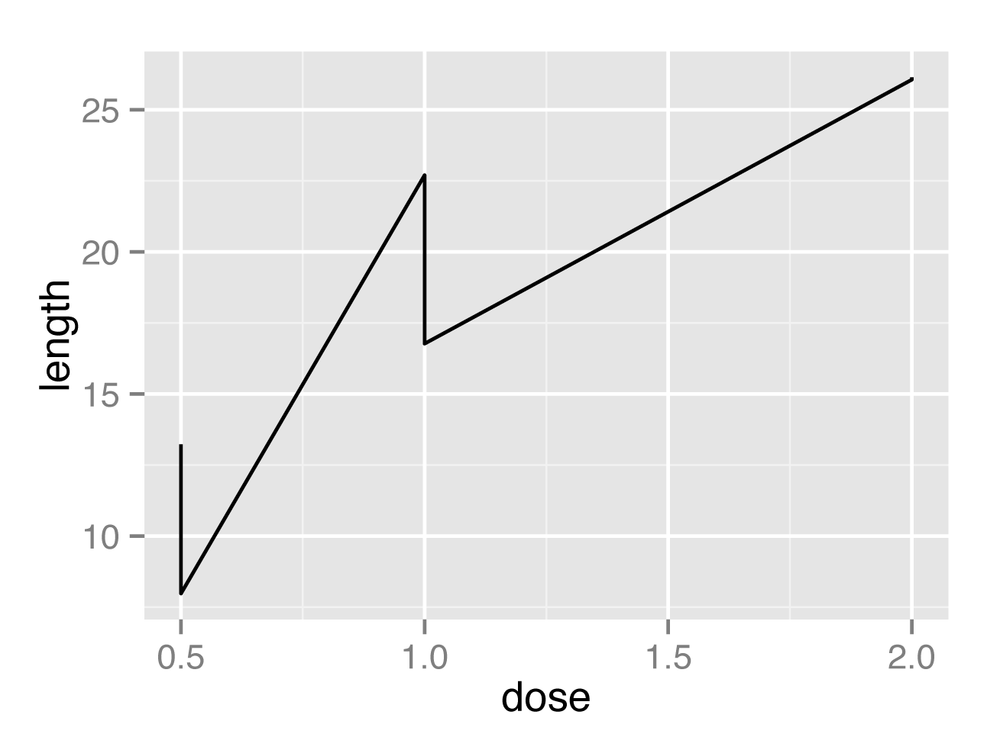
This happens because there are multiple data points at each
y location, and ggplot() thinks
they’re all in one group. The data points for each group are connected
with a single line, leading to the sawtooth pattern. If any
discrete variables are mapped to aesthetics like
colour or linetype, they are automatically used as
grouping variables. But if you want to use other variables for grouping
(that aren’t mapped to an aesthetic), they should be used with group.
Note
When in doubt, if your line graph looks wrong, try explicitly
specifying the grouping variable with group. It’s common for problems to occur
with line graphs because ggplot()
is unsure of how the variables should be grouped.
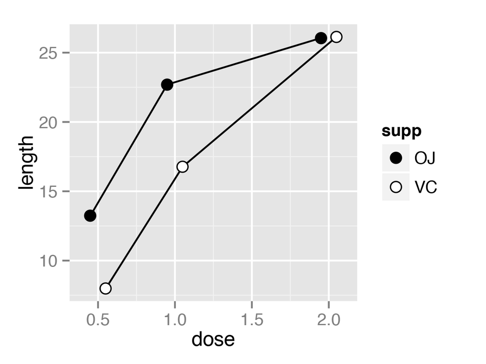
If your plot has points along with the lines, you can also map
variables to properties of the points, such as shape and fill (Figure 4-9):
ggplot(tg,aes(x=dose,y=length,shape=supp))+geom_line()+geom_point(size=4)# Make the points a little largerggplot(tg,aes(x=dose,y=length,fill=supp))+geom_line()+geom_point(size=4,shape=21)# Also use a point with a color fill
Sometimes points will overlap. In these cases, you may want to dodge them, which means their positions will be adjusted left and right (Figure 4-10). When doing so, you must also dodge the lines, or else only the points will move and they will be misaligned. You must also specify how far they should move when dodged:
ggplot(tg,aes(x=dose,y=length,shape=supp))+geom_line(position=position_dodge(0.2))+# Dodge lines by 0.2geom_point(position=position_dodge(0.2),size=4)# Dodge points by 0.2
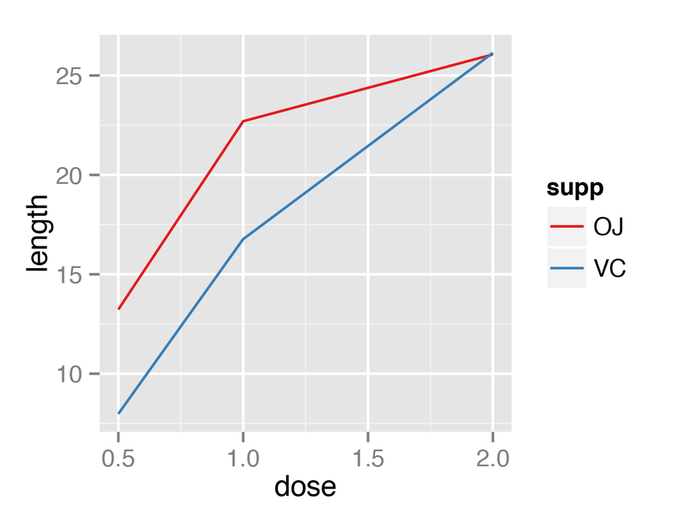
Changing the Appearance of Lines
Solution
The type of line (solid, dashed, dotted, etc.) is set with
linetype, the thickness (in mm) with
size, and the color of the line with colour.
These properties can be set (as shown in Figure 4-11) by passing them values
in the call to geom_line():
ggplot(BOD,aes(x=Time,y=demand))+geom_line(linetype="dashed",size=1,colour="blue")
If there is more than one line, setting the aesthetic
properties will affect all of the lines. On the other hand,
mapping variables to the properties, as we saw in
Making a Line Graph with Multiple Lines, will result in each
line looking different. The default colors aren’t the most appealing, so
you may want to use a different palette, as shown in Figure 4-12, by using scale_colour_brewer() or scale_colour_manual():
# Load plyr so we can use ddply() to create the example data setlibrary(plyr)# Summarize the ToothGrowth datatg<-ddply(ToothGrowth,c("supp","dose"),summarise,length=mean(len))ggplot(tg,aes(x=dose,y=length,colour=supp))+geom_line()+scale_colour_brewer(palette="Set1")
Discussion
To set a single constant color for all the lines, specify
colour outside of aes(). The same works for size, linetype, and point shape (Figure 4-13). You may also have
to specify the grouping variable:
# If both lines have the same properties, you need to specify a variable to# use for groupingggplot(tg,aes(x=dose,y=length,group=supp))+geom_line(colour="darkgreen",size=1.5)# Since supp is mapped to colour, it will automatically be used for groupingggplot(tg,aes(x=dose,y=length,colour=supp))+geom_line(linetype="dashed")+geom_point(shape=22,size=3,fill="white")
See Also
For more information about using colors, see Chapter 12.
Changing the Appearance of Points
Solution
In geom_point(), set
the size, shape, colour, and/or fill outside of aes() (the result is shown in Figure 4-14):
ggplot(BOD,aes(x=Time,y=demand))+geom_line()+geom_point(size=4,shape=22,colour="darkred",fill="pink")
Discussion
The default shape for points
is a solid circle, the default size
is 2, and the default colour is
"black". The fill color is relevant only for some point
shapes (numbered 21–25), which have separate outline and fill colors
(see Using Different Point Shapes for a chart of shapes).
The fill color is typically NA, or
empty; you can fill it with white to get hollow-looking circles, as
shown in Figure 4-15:
ggplot(BOD,aes(x=Time,y=demand))+geom_line()+geom_point(size=4,shape=21,fill="white")

If the points and lines have different colors, you should specify the points after the lines, so that they are drawn on top. Otherwise, the lines will be drawn on top of the points.
For multiple lines, we saw in Making a Line Graph with Multiple Lines how to draw differently
colored points for each group by mapping variables to aesthetic
properties of points, inside of aes(). The default colors are not very
appealing, so you may want to use a different palette, using scale_colour_brewer() or scale_colour_manual(). To set a single
constant shape or size for all the points, as in Figure 4-16, specify shape or size outside of aes():
# Load plyr so we can use ddply() to create the example data setlibrary(plyr)# Summarize the ToothGrowth datatg<-ddply(ToothGrowth,c("supp","dose"),summarise,length=mean(len))# Save the position_dodge specification because we'll use it multiple timespd<-position_dodge(0.2)ggplot(tg,aes(x=dose,y=length,fill=supp))+geom_line(position=pd)+geom_point(shape=21,size=3,position=pd)+scale_fill_manual(values=c("black","white"))
See Also
See Using Different Point Shapes for more on using different shapes, and Chapter 12 for more about colors.
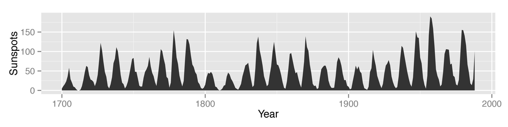
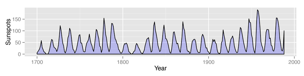
Making a Graph with a Shaded Area
Solution
Use geom_area() to
get a shaded area, as in Figure 4-17:
# Convert the sunspot.year data set into a data frame for this examplesunspotyear<-data.frame(Year=as.numeric(time(sunspot.year)),Sunspots=as.numeric(sunspot.year))ggplot(sunspotyear,aes(x=Year,y=Sunspots))+geom_area()
Discussion
By default, the area will be filled with a very dark grey and
will have no outline. The color can be changed by setting fill. In the following example, we’ll set it
to "blue", and we’ll also make it 80%
transparent by setting alpha to 0.2.
This makes it possible to see the grid lines through the area, as shown
in Figure 4-18. We’ll also add an
outline, by setting colour:
ggplot(sunspotyear,aes(x=Year,y=Sunspots))+geom_area(colour="black",fill="blue",alpha=.2)
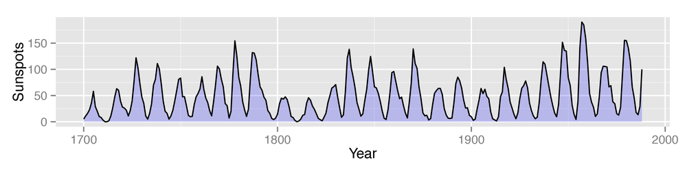
Having an outline around the entire area might not be
desirable, because it puts a vertical line at the beginning and end of
the shaded area, as well as one along the bottom. To avoid this issue,
we can draw the area without an outline (by not specifying colour), and then layer a geom_line() on top, as shown in Figure 4-19:
ggplot(sunspotyear,aes(x=Year,y=Sunspots))+geom_area(fill="blue",alpha=.2)+geom_line()
See Also
See Chapter 12 for more on choosing colors.
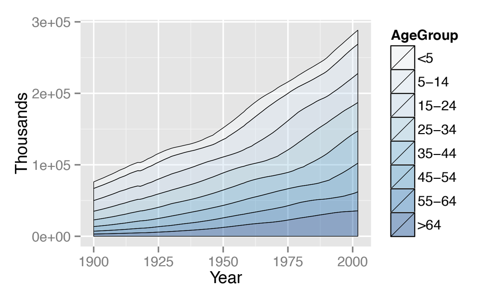
Making a Stacked Area Graph
Solution
Use geom_area() and
map a factor to fill
(Figure 4-20):
library(gcookbook)# For the data setggplot(uspopage,aes(x=Year,y=Thousands,fill=AgeGroup))+geom_area()
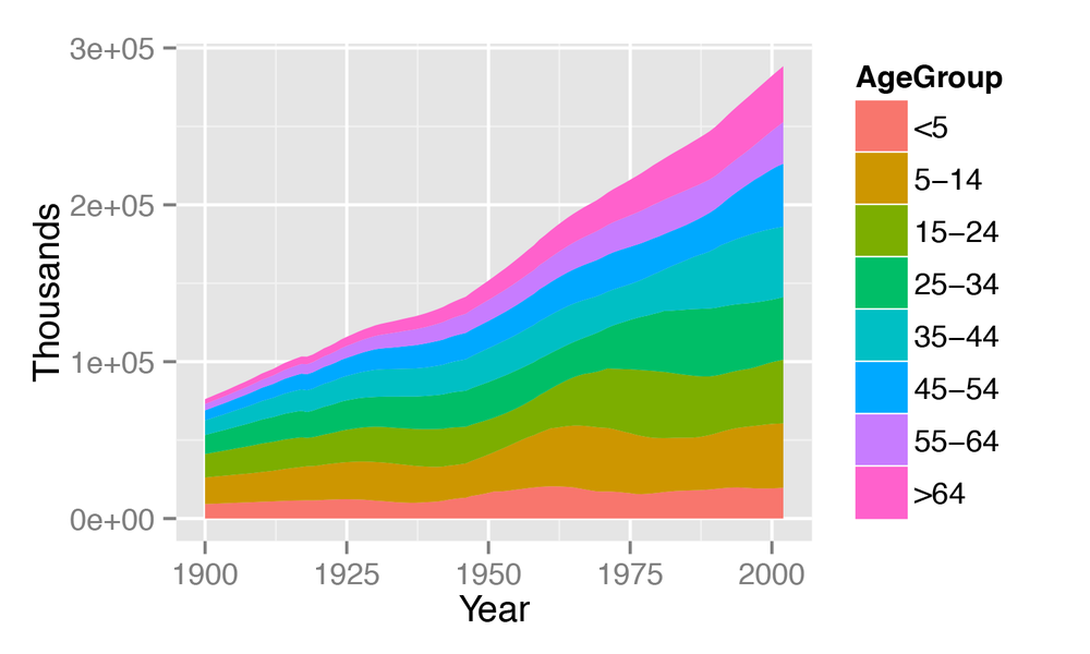
Discussion
The sort of data that is plotted with a stacked area chart is
often provided in a wide format, but ggplot2() requires data to be in long format. To convert it, see
Converting Data from Wide to Long.
In the example here, we used the uspopage data set:
uspopage

 Year AgeGroup Thousands
 1900       <5      9181
 1900     5-14     16966
 1900    15-24     14951
 1900    25-34     12161
 1900    35-44      9273
 1900    45-54      6437
 1900    55-64      4026
 1900      >64      3099
 1901       <5      9336
 1901     5-14     17158
...
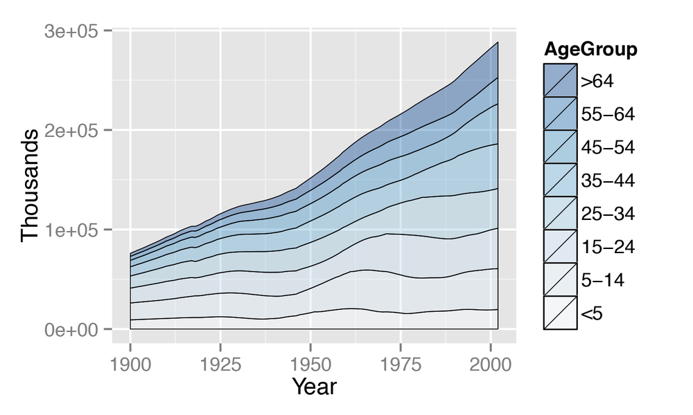
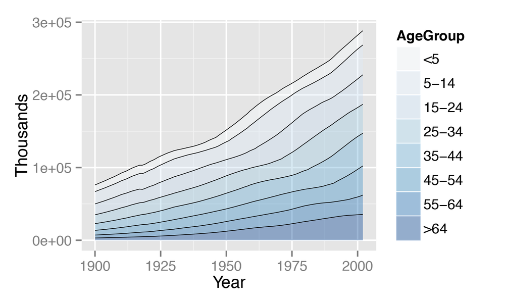
The default order of legend items is the opposite of the
stacking order. The legend can be reversed by setting the breaks in the
scale. This version of the chart (Figure 4-21) reverses the legend order, changes the palette to a
range of blues, and adds thin
(size=.2) lines between each area. It
also makes the filled areas semitransparent (alpha=.4), so
that it is possible to see the grid lines through
them:
ggplot(uspopage,aes(x=Year,y=Thousands,fill=AgeGroup))+geom_area(colour="black",size=.2,alpha=.4)+scale_fill_brewer(palette="Blues",breaks=rev(levels(uspopage$AgeGroup)))
To reverse the stacking order, we’ll put order=desc(AgeGroup) inside of aes() (Figure 4-22):
library(plyr)# For the desc() functionggplot(uspopage,aes(x=Year,y=Thousands,fill=AgeGroup,order=desc(AgeGroup)))+geom_area(colour="black",size=.2,alpha=.4)+scale_fill_brewer(palette="Blues")
Since each filled area is drawn with a polygon, the outline
includes the left and right sides. This might be distracting or
misleading. To get rid of it (Figure 4-23), first draw the
stacked areas without an outline (by leaving
colour as the default NA value), and then add a geom_line() on top:
ggplot(uspopage,aes(x=Year,y=Thousands,fill=AgeGroup,order=desc(AgeGroup)))+geom_area(colour=NA,alpha=.4)+scale_fill_brewer(palette="Blues")+geom_line(position="stack",size=.2)
See Also
See Converting Data from Wide to Long for more on converting data from wide to long format.
For more on reordering factor levels, see Changing the Order of Factor Levels.
See Chapter 12 for more on choosing colors.
Making a Proportional Stacked Area Graph
Solution
First, calculate the proportions. In this example, we’ll use
ddply() to break
uspopage into groups by Year, then calculate a new column, Percent. This value is the Thousands for each row, divided by the sum of
Thousands for each
Year group, multiplied by 100 to get a percent
value:
library(gcookbook)# For the data setlibrary(plyr)# For the ddply() function# Convert Thousands to Percentuspopage_prop<-ddply(uspopage,"Year",transform,Percent=Thousands/sum(Thousands)*100)
Once we’ve calculated the proportions, plotting is the same as with a regular stacked area graph (Figure 4-24):
ggplot(uspopage_prop,aes(x=Year,y=Percent,fill=AgeGroup))+geom_area(colour="black",size=.2,alpha=.4)+scale_fill_brewer(palette="Blues",breaks=rev(levels(uspopage$AgeGroup)))
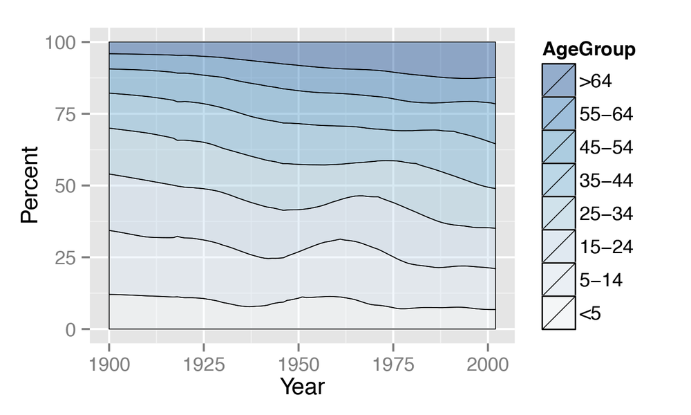
Discussion
Let’s take a closer look at the data and how it was summarized:
uspopage

 Year AgeGroup Thousands
 1900       <5      9181
 1900     5-14     16966
 1900    15-24     14951
 1900    25-34     12161
 1900    35-44      9273
 1900    45-54      6437
 1900    55-64      4026
 1900      >64      3099
 1901       <5      9336
 1901     5-14     17158
...
We’ll use ddply() to split
it into separate data frames for each value of Year, then apply the transform() function to each piece and calculate the Percent for each piece. Then ddply() puts all the data frames back
together:
uspopage_prop<-ddply(uspopage,"Year",transform,Percent=Thousands/sum(Thousands)*100)Year AgeGroup Thousands Percent1900<5918112.06534019005-141696622.296107190015-241495119.648067190025-341216115.981549190035-44927312.186243190045-5464378.459274190055-6440265.2908251900>6430994.0725941901<5933612.03340919015-141715822.115385...
See Also
For more on summarizing data by groups, see Summarizing Data by Groups.
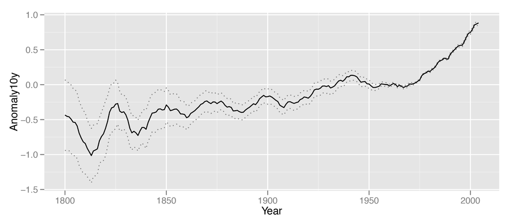
Adding a Confidence Region
Solution
Use geom_ribbon() and map values to ymin
and ymax.
In the climate data set,
Anomaly10y is a 10-year running
average of the deviation (in Celsius) from the average 1950–1980
temperature, and Unc10y is the 95%
confidence interval. We’ll set ymax
and ymin to Anomaly10y plus or minus Unc10y (Figure 4-25):
library(gcookbook)# For the data set# Grab a subset of the climate dataclim<-subset(climate,Source=="Berkeley",select=c("Year","Anomaly10y","Unc10y"))climYear Anomaly10y Unc10y1800-0.4350.5051801-0.4530.4931802-0.4600.486...20030.8690.02820040.8840.029
# Shaded regionggplot(clim,aes(x=Year,y=Anomaly10y))+geom_ribbon(aes(ymin=Anomaly10y-Unc10y,ymax=Anomaly10y+Unc10y),alpha=0.2)+geom_line()
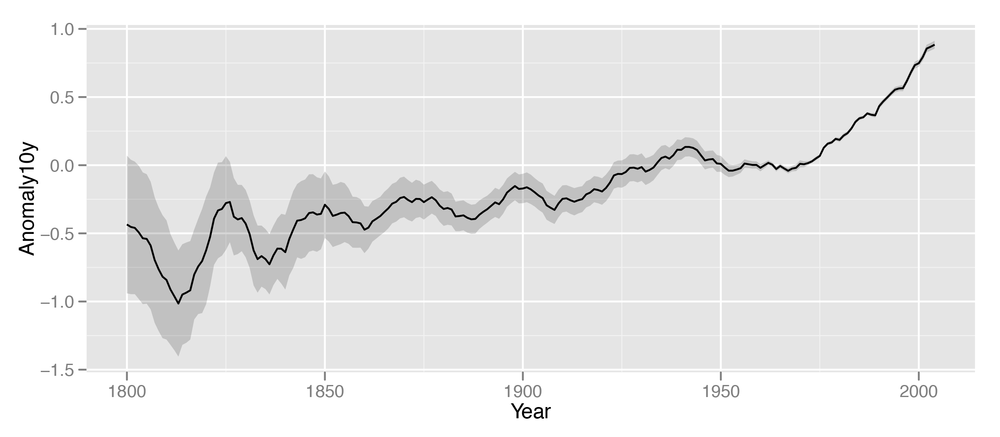
The shaded region is actually a very dark grey, but it is
mostly transparent. The transparency is set with alpha=0.2, which makes it 80%
transparent.
Discussion
Notice that the geom_ribbon() is
before geom_line(), so that the line is drawn on top of the shaded region. If
the reverse order were used, the shaded region could obscure the line.
In this particular case that wouldn’t be a problem since the shaded
region is mostly transparent, but it would be a problem if the shaded
region were opaque.
Instead of a shaded region, you can also use dotted lines to represent the upper and lower bounds (Figure 4-26):
# With a dotted line for upper and lower boundsggplot(clim,aes(x=Year,y=Anomaly10y))+geom_line(aes(y=Anomaly10y-Unc10y),colour="grey50",linetype="dotted")+geom_line(aes(y=Anomaly10y+Unc10y),colour="grey50",linetype="dotted")+geom_line()
Shaded regions can represent things other than confidence regions, such as the difference between two values, for example.
In the area graphs in Making a Stacked Area Graph, the y
range of the shaded area goes from 0
to y. Here, it goes from ymin to
ymax.
Get R Graphics Cookbook now with the O’Reilly learning platform.
O’Reilly members experience books, live events, courses curated by job role, and more from O’Reilly and nearly 200 top publishers.

