December 2012
Beginner to intermediate
411 pages
8h 53m
English
This chapter explores how to visualize summarized distributions of data.
You want to make a histogram.
Use geom_histogram() and
map a continuous variable to x (Figure 6-1):
ggplot(faithful,aes(x=waiting))+geom_histogram()
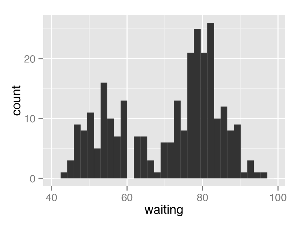
All geom_histogram()
requires is one column from a data frame or a single vector of data. For
this example we’ll use the faithful
data set, which contains data about the Old Faithful geyser in two
columns: eruptions, which is the
length of each eruption, and waiting,
which is the length of time to the next eruption. We’ll only use the
waiting column in this
example:
faithful

eruptions waiting
    3.600      79
    1.800      54
    3.333      74
...
If you just want to get a quick look at some data that isn’t in
a data frame, you can get the same result by passing in NULL for the data frame and giving ggplot() a vector of values.
This would have the same result as the previous code:
# Store the values in a simple vectorw<-faithful$waiting ggplot(NULL,aes(x=w))+geom_histogram()
By default, the data is grouped into 30 bins. This may be too
fine or too coarse for your data. You can change the size of the bins by
using binwidth, or you can divide the range of the data into a specific number of bins. The default colors—a dark fill without an outline—can make it difficult to ...
Read now
Unlock full access


 O’Reilly covers everything we've got, with content to help us build a world-class technology community, upgrade the capabilities and competencies of our teams, and improve overall team performance as well as their engagement.I wanted to learn C and C++, but it didn't click for me until I picked up an O'Reilly book. When I went on the O’Reilly platform, I was astonished to find all the books there, plus live events and sandboxes so you could play around with the technology.I’ve been on the O’Reilly platform for more than eight years. I use a couple of learning platforms, but I'm on O'Reilly more than anybody else. When you're there, you start learning. I'm never disappointed.I'm always learning. So when I got on to O'Reilly, I was like a kid in a candy store. There are playlists. There are answers. There's on-demand training. It's worth its weight in gold, in terms of what it allows me to do.