A Short Introduction
To explain ggplot2, we’ll
start by looking at a very simple data set:[47]
> d <- data.frame(a=c(0:9), b=c(1:10), c=c(rep(c("Odd", "Even"), times=5)))
> d
   a  b    c
1  0  1  Odd
2  1  2 Even
3  2  3  Odd
4  3  4 Even
5  4  5  Odd
6  5  6 Even
7  6  7  Odd
8  7  8 Even
9  8  9  Odd
10 9 10 Even
Let’s think about what we want to show. We want to show how variable
y varies with variable x. (To start with, we’ll forget about showing
which points belong in a or b, and just plot points.) We’ll use the
qplot (for “quick plot”) function to
show this relationship. Plotting points is the default for qplot, so we’ll call qplot with the arguments x=a, y=b, and
data=d:
> library(ggplot2)
> qplot(x=a, y=b, data=d)
The result is shown in Figure 15-1. Notice
what we specified: a value to plot on an x-axis, a value to plot on a
y-axis, and a data set. We focused on describing the relationship we
wanted to show, not on the type of plot. That’s the key idea of ggplot: you describe what you want to present,
not how to present it.
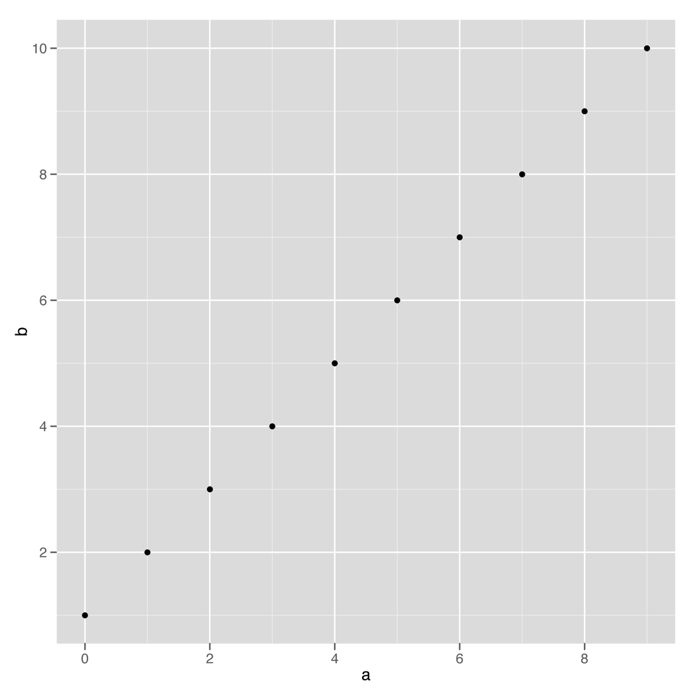
Figure 15-1. Simplest qplot example
When you create a new plot with ggplot2, you are not actually plotting the data to the screen. Instead, you are creating a new plot object. (This is very similar to how the lattice package works.) When you type a plot command on the console, R will create the object, and then the print method will be called on the object; the print method actually draws ...
Get R in a Nutshell, 2nd Edition now with the O’Reilly learning platform.
O’Reilly members experience books, live events, courses curated by job role, and more from O’Reilly and nearly 200 top publishers.

