Chapter 4. Design Patterns
A language is a system of symbols and rules to convey ideas and information. We rely on natural languages like English, Spanish, and Swahili to communicate with one another. We use artificial languages like SQL, Perl, and Java to specify instructions and behavior. These language types have much in common, but they differ with respect to rules. Artificial languages are planned and constructed by an individual or group. Their vocabularies and syntax are precisely defined. In contrast, natural languages emerge and evolve in unpremeditated fashion. They’re spoken before they’re written and only later do we derive the rules (like “i” before “e” except after “c”), which are riddled with weird exceptions because they’re not really rules at all. In fact, "patterns” is a better word. Patterns allow for emergence, evolution, and imperfection. We can detect patterns and adapt them to our needs. They are free of charge and subject to change. And yet, access does not ensure success. Eloquence requires sensitivity to structure and situation. How do our patterns work together within specific contexts? And which patterns are we missing?
These are the tough questions we often ignore. While Christopher Alexander is most famous for his patterns, he’s the first to point out their limits. He notes, “The links between the patterns are almost as much a part of the language as the patterns themselves.” He argues that how we put the patterns together makes all the difference:
"The difference between prose and poetry is not that different languages are used, but that the same language is used differently. In an ordinary English sentence, each word has one meaning, and the sentence too, has one simple meaning. In a poem, the meaning is far more dense. Each word carries several meanings; and the sentence as a whole carries an enormous density of interlocking meanings, which together illuminate the whole.”[13]
Finally, Alexander warns of the dangers of language by invoking the linguistic relativity of the Whorf hypothesis—the idea that language shapes (and constrains) thought. To avoid limiting the solution space, we must give our language sufficient expressive power. Even then, when faced with new problems, we must be ready to change the language or leave it behind. As Alexander concludes, “This ageless character has nothing, in the end, to do with languages. The language, and the processes which stem from it, merely release the fundamental order which is native to us.” The timeless way and the quality without a name flow naturally from observing and responding to human behavior within an environmental context. The language is a map, but empathy is the key.
As we study the patterns of search, we’d do well to heed these lessons from disciplines more storied than ours. After all, the design of search is a new and rapidly evolving practice. We’re still working on the basic alphabet, even as we aspire to the poetry of language. We design applications that work beautifully, but then struggle to repeat our success. Getting the design right and the right design often feels like trying to catch lightning in a bottle. That’s because all too often we don’t understand why the design works. We search for solutions by trial and error. It’s a long, risky process and sometimes there’s no alternative, but often there is a better, more timeless way.
In this chapter, we’ll survey 10 patterns that have emerged as repeatable solutions to common problems. Simply identifying and describing each pattern has value, but we won’t stop there. We’ll explore how each pattern relates to others and which contexts are most suitable to which patterns. Most importantly, we’ll ask why. Why does this pattern work? Why is this a common problem? Why have we selected this solution? In this final question, we sow the seeds of innovation. Can we escape the limits of existing tools and templates? Is there a better way? Answering this question may require modifying the fundamental system of symbols and patterns that we use to communicate our ideas. After all, as the architect said, “The design of the garden lies within the language.”
Autocomplete
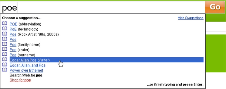
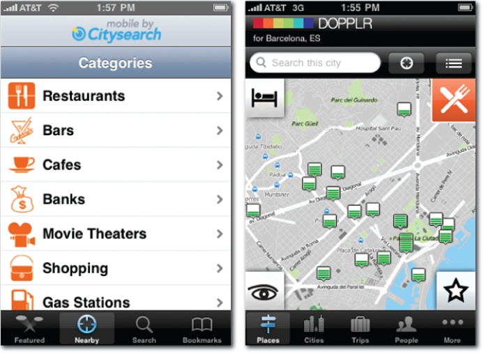
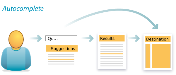
The autocomplete design pattern is a good place to start. As users type into a text entry box, suggestions appear automatically. It’s a pattern that first emerged within the Help functions of desktop applications. This solution solves several very common problems. First, typing takes time. Second, users can’t spell well. Third, we’re often at a loss for words. We simply don’t know or can’t remember the right terms. Since these problems are portable, it was only a matter of time before the pattern spread. Autocomplete is now a familiar fixture across desktop, web, and mobile platforms (Figure 4-1).
A major prerequisite of autocomplete is a source of data for suggestions. Classic desktop applications rely on an alphabetical index of help topics. Google draws from a user’s personal search history and from the collective search behavior of many users (Figure 4-2). Firefox (also shown in Figure 4-2) taps browsing history and bookmarks. Yahoo! steps beyond autocomplete to autosuggest, shown in Figure 4-3 by tapping query reformulation data to recommend related queries that need not include the original search term.
Autosuggest can help users to pivot by highlighting alternate concepts and relevant verticals. It’s worth noting that while autocomplete and autosuggest are distinct concepts, most applications blend them together for a small footprint. Consequently, in this book, we’ve bundled both under the autocomplete pattern.
A pioneer in this area, Yahoo! has also experimented with visual autocomplete, shown in Figure 4-4. Sometimes users are able to clarify better with an image than a word.
Many websites, such as Apple.com, draw from their product catalogs to suggest Best Bets rather than popular queries, allowing users to skip search and go directly to their destination. Reference sites like Answers.com, shown in Figure 4-5 draw upon a structured database to support query disambiguation, helping users to clarify before they search.
On the mobile platform, autocomplete is clearly a natural. Small, shaky keyboards are not conducive to text entry, so Google and Yahoo! work overtime to recall past searches, suggest common queries, and recommend popular destinations, all before we’ve typed the first word. Of course, autocomplete isn’t the only solution to this common problem—both Google and Yahoo! support mobile voice search. We can’t limit ourselves to refinement and continuous improvement. We should also strive to innovate with novel approaches and complementary solutions. We must think outside the box.
For instance, autocomplete isn’t only about typing and spelling. Suggestions help us when we’re not sure what to seek. On websites, the information architecture provides users with structural and semantic clues that precede and inform the search. Similarly, in mobile applications, we use categories and icons to invite users to explore with a click. In this way, browse complements search by getting folks started and helping them learn what to seek.
In summary, autocomplete is a flexible pattern that works across multiple platforms. And, it’s fairly discrete. It can coexist with or function independently of other patterns.
Autocomplete
Autocomplete
That said, autocomplete can draw suggestions from a Best Bets database and may leverage algorithms from the best first pattern. Autocomplete can also work well with scoped search and personalized search, since it’s easier to make good suggestions when the scope is limited and when we have insight into searcher behavior and intent. However, as Figure 4-9 shows, organizations don’t always tune suggestions to a specific category. It’s unlikely that “kerosene heater” is a popular query among users looking for books.
Best First
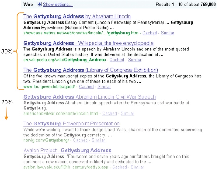
In search, you’re only as good as your first results. While the exact numbers vary by system and depend upon the users, the task, and the interface, it’s a safe bet that the top three results will draw 80 percent of the attention. The remaining results on the first page may each earn a few percentage points. After that, visibility drops off a cliff.
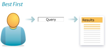
This is important for two reasons. First, surfacing great results satisfies the simplest use case for search. Users enter queries, scan the first few results, click a link, and the search is complete. Best first is crucial to making search simple, fast, and relevant. Second, the first few results inordinately influence query reformulation. Users enter search terms, scan and learn from the first few results, and try a different query. For the 25–50 percent of search sessions that involve query reformulation, those first three results are a vital part of the user interface. What we find changes what we seek.
Consequently, best first must be a top priority during search engine selection. Highquality, transparent, flexible result-ranking algorithms are critical to success. They must be good out of the gate, and they should support tuning to the unique requirements of a particular content collection or application. The algorithms should account for:
- Relevance
These algorithms focus on topical relevance or aboutness. They aim to match the query keywords to the text of the content and metadata. Effective algorithms account for term order, proximity, location, frequency, and document length. An exact phrase match in a short title is worth more than an AND co-occurrence in a long body. A phrase that repeats on a page but is rare on the site merits extra weight. Relevance algorithms must also manage the transformation of text queries to account for plurals and other word variants (e.g., poet and poetry). Tuning may be required to get the right balance of precision and recall. Relevance is typically the default setting and is often in truth a hybrid that combines the inputs of multiple algorithms into a balanced solution.
- Popularity
In most contexts, social data can deliver a big boost to semantic algorithms. Google’s PageRank, which counts links as votes, was the first mainstream success. Today, popularity is typically a multialgorithmic measure. At Flickr, a photo’s interestingness derives from views, comments, notes, bookmarks, favorites, and so on. At Amazon, users can sort by Bestselling or Best Reviews, but even when they sort by relevance, social data influences the results.
- Date
Sorting by date is rarely a good default, but it is a useful option, especially for news and email applications in which reverse chronological order (newest first) is relatively common. In many cases, the date of publication or modification can serve as a valuable input into the general-purpose relevance algorithm by improving the freshness of top results.
- Format
In pure form, format and content type are most useful as filters, allowing users to view only images, videos, or news. However, they can also help to boost the best results. For instance, on an intranet, HTML and PDF documents may be more polished than .doc or .xls files. In such cases, application-specific tuning that brings the best formats to the top is extremely valuable.
- Personalization
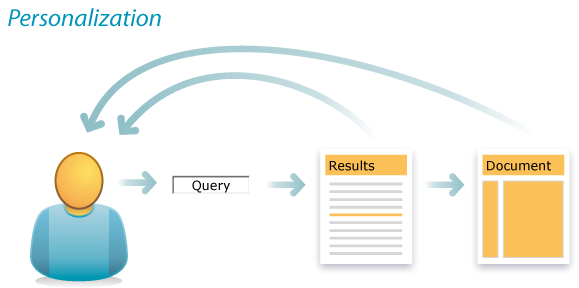
A user’s search history, social network, or current location (online or off) are just a few inputs that might influence the order of results. We’ll delve into this topic when we explore the personalized search pattern. For now, let’s just note that personalization is at least as difficult as it is desirable.
- Diversity
In search, it’s easy to get too much of a good thing. Diversity algorithms guard against redundant results and support query clarification and refinement by surfacing distinct meanings (e.g., apple and AAPL) and formats. Application-specific tuning delivers the right balance and a nice blend of results.
As designers, we need not understand exactly how these algorithms work, but they must be on our requirements list during search engine selection. We must tune them to our content or application. Generally, a blended default is in order. Users typically want results that are relevant, popular, and timely. A pure sort order, like the one shown in Figure 4-11, is a nice option but a poor default. Since The Little Prince is among the most popular books ever written, that’s most likely the best first result. But without algorithms enhanced by social data, this library database serves up The Little Lame Prince instead.
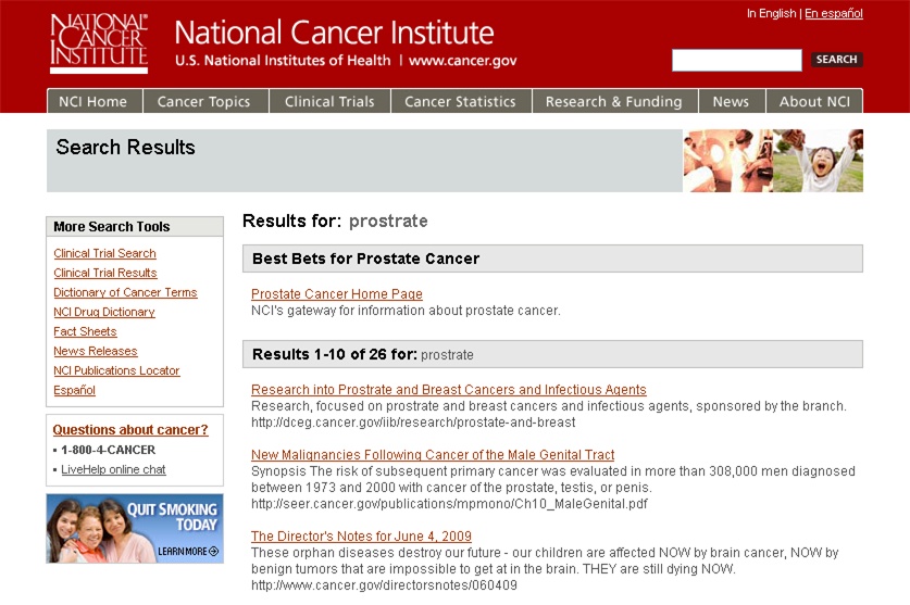
Of course, algorithms aren’t the only way to the top. While we must rely on software and distributed user behavior (e.g., tagging, bookmarking) to manage the long tail of search, applying centralized editorial effort to suggest Best Bets for the most common queries delivers a substantial return on investment. In most cases, the analysis of search query data reveals a power law distribution and invites us to apply the 80/20 rule. A small number of unique search phrases accounts for a large percentage of total queries. It has become a best practice for managers of large websites to integrate a simple database that matches these common search phrases to good starting points or destinations.
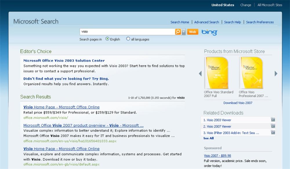
Best Bets goes by many names, including Suggested Links, Recommended Results, and Editor’s Choice. Figure 4-13 shows that Microsoft also complements the algorithmic results with related products and downloads. This diversity enables query disambiguation by letting users clarify whether they want to buy a product or need support. Clearly, there’s also an opportunity for cross-selling and upselling. Best Bets and search analytics in general are as useful in marketing circles as they are in the world of user experience.
For Best Bets, design considerations include the number and presentation of suggested links and their relationship to algorithmic results. Generally, one to three suggestions per query is sufficient. Ideally, links that appear as Best Bets are removed from the algorithmic list to avoid wasting valuable space with redundant results. And while it’s not necessary to spatially separate the two types of results, in the interest of transparency it’s helpful to label the Best Bets and visually distinguish them from the natural results.
Best First
Best First
In short, best first is the most universal and important design pattern in search. Its design is intertwingled with other patterns. The first few results must satisfy the simple lookup and support query clarification and refinement, but those results may appear first in autocomplete and may be modified using faceted navigation. Or they may be prequalified with advanced or personalized search. Finally, it’s no good delivering the best of the worst. It’s impossible for users to find what they need when searching the wrong place, which is why we must study the precarious pattern of federated search.
Federated Search
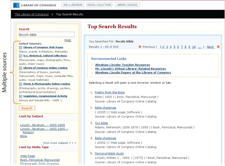
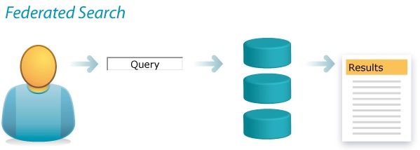
By definition, federated search involves the simultaneous search of multiple databases or collections. In intranets, it runs a single query across the staff directory and the subsites of multiple business units. On the Internet, it takes queries where crawlers can’t by tapping into dynamic databases of the deep Web. In libraries (Figure 4-15), it lets users search multiple catalogs, collections, databases, and websites all at once.
Federated search may be necessary when managing dynamic content from multiple sources with different data models, but it does present challenges. First and foremost, performance is notoriously slow. As the number and size of collections grow, speed suffers. This is a serious flaw. Plus, the query language may be limited to the lowest common denominator in the face of disparate vocabularies and data models. Sophisticated approaches like faceted navigation may be precluded by federated search.
So, before committing to this solution, it’s worth reframing the problem. When content is scattered into silos, users don’t know where to search. Fragmentation is the root cause. Federated search addresses this problem, but it’s not the only way. Instead, we can defragment the content by pulling it all into an integrated index. This may enable fast, powerful, unified queries, but is it still federated search? At this point, our definition needs clarification. Generally, when we talk about “multiple databases or collections,” there’s a symmetry between the front and back ends. But this needn’t be true. Mirroring the technical architecture within the user experience is a design decision. Is it valuable for users to know these resources are from different sources? Is source a more important distinction than topic, format, or date? Will users need to define subsets of collections to search or execute more powerful queries using the native interfaces of individual databases? If the answer to these questions is, “No,” federated search may become an antipattern that adds drag to the back end and visual clutter to the front.
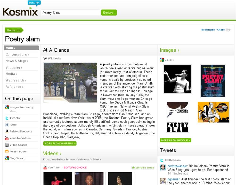
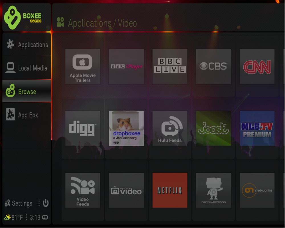
That said, federated search can serve as a stepping stone by helping people visualize and play with possible and desirable outcomes. At the Library of Congress, the prospect of a single search across multiple collections was met with some skepticism. Federated search was a first step to get the ball rolling. However, the very next step may involve moving beyond federated search by unifying indexes and embracing a faceted navigation user interface that emphasizes topic and format more than source. Similarly, the alpha version of Boxee (shown in Figure 4-17) is an intriguing first step. Boxee is a social media center that supports multiple sources and formats of videos, music, and pictures from desktop computers, broadcast networks, and the Internet. It’s a web-based service designed for big-screen television, and it’s a radically federated solution that makes us think differently about how we might find and share media in the not-so-distant future. Boxee is also pretty difficult to use, in part because it spotlights sources rather than focusing on user-friendly ways to search and browse. It’s a stepping stone, not a bridge.
In summary, federated search is important because users don’t know where to search. Whenever content is fragmented into multiple locations, this pattern merits discussion. However, it’s important to focus on the goal, not fixate on the pattern. If it’s possible to unify the indexes, that may be the right solution, even if it’s not technically federated search.
If source isn’t relevant to users, there’s no need to highlight it in the results. It may suffice to list source on the detail pages or include it as a metadata field within the faceted navigation display. Indeed, federated search must be carefully integrated with other patterns. Autocomplete and best first will need to draw suggestions from multiple sources. Advanced search may enable database selection, while the complementary modes of ask and browse may be harder to align across multiple sites. But no pattern is more closely tied to federated search than faceted navigation, since it offers users a great way to see and select sources within an integrated model of clarification and refinement.
Faceted Navigation
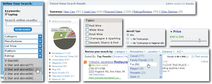
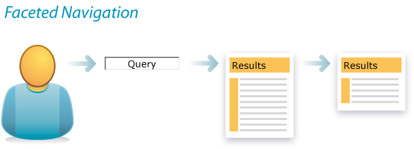
Also called guided navigation and faceted search, the faceted navigation model leverages metadata fields and values to provide users with visible options for clarifying and refining queries. Faceted navigation is arguably the most significant search innovation of the past decade.[14] It features an integrated, incremental search and browse experience that lets users begin with a classic keyword search and then scan a list of results. It also serves up a custom map (usually to the left of results) that provides insights into the content and its organization and offers a variety of useful next steps. That’s where faceted navigation proves its power. In keeping with the principles of progressive disclosure and incremental construction, users can formulate the equivalent of a sophisticated Boolean query by taking a series of small, simple steps. Faceted navigation addresses the universal need to narrow. Consequently, this pattern has become nearly ubiquitous in e-commerce, given the availability of structured metadata and the clear business value of improving product findability. Faceted navigation is being deployed rapidly across an impressively wide variety of contexts and platforms. In the world of search, faceted navigation is everywhere.
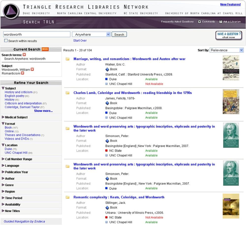
Figure 4-19 illustrates a successful implementation of faceted navigation as a model for interacting with the catalogs of several academic libraries. This is a good example of a federated search in which source (roughly equivalent to location) is deemphasized relative to subject and format. The consortium’s goal is to connect students and faculty with the best materials, regardless of which university owns them. This example also hints at the design challenges. Faceted navigation is not simply a feature to check off a list. Success requires painstaking attention to detail and an appreciation for the vast array of possibilities for interaction design. For instance, the libraries run collapsible facets down the left. Only the most relevant facets (subject, format, location) are open. Most are closed by default. Each open facet reveals only the top four or five most heavily populated values. This allows for a small facet footprint that frees up plenty of space on the main stage for the results themselves. The number of matching results for each value (shown within parentheses) is a key element of the map, as is the reformulation of search terms and selected values as stacking breadcrumbs, which let users view and modify their current search parameters. This interface is the result of user research, usability testing, and iterative design. But it’s not the only way.
For instance, applications rely on a mix of scented widgets for viewing and interacting with facet values, and some shift facet selectors to the top or right rather than the left.
Presenting facets along the top draws added attention to the narrowing facility. Given massive result sets, this is an effective way to highlight the data structure and draw users into filtering. Top placement may sometimes obscure results and cause clutter, but can work well with image collections like Artist Rising (Figure 4-21) or when only a few facets are needed. It’s often useful to allow for flexibility in the number of facets displayed. As shown in Figure 4-22, adaptive facets let controls conform to the content as users shift between categories and drill down within collections. This may be a reason to avoid facets on top. While less visible, facets on the right can work, too, assuming they appear to be controls rather than ads and don’t get cut off by narrow browsers. When in doubt, lean toward the de facto standard (left side) and subject different designs to user research and testing.
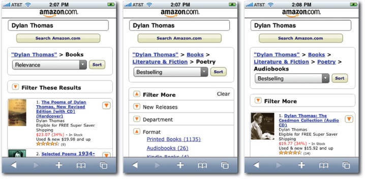
In contrast to the relatively mature design space of the desktop Web, mobile is a platform where standards for faceted navigation have yet to emerge. A few research projects such as FaThumb[15] have explored the challenges and possibilities of facet-based interfaces for mobile search. Clearly, tiny screens preclude the established model. There’s insufficient space to present facets and values alongside results. Ever the pioneer, Amazon is among the first to design a mainstream application that adds faceted navigation to mobile search. As Figure 4-23 shows, it features an iterative model that requires more steps than ideal, but it’s a move in the right direction. As mobile search crosses the chasm, users will expect the features and functions to which they’ve become accustomed on the desktop, and first and foremost outside of the box, they will absolutely, positively need to narrow.
Across all platforms, there are some qualifications and questions worth review. First, we’ve been using the term "faceted navigation” rather loosely. Formal definitions of facets may exclude simple fields and filters, but discrimination is unwarranted in practice, provided that filters operate independently and users can add or remove them in arbitrary order in concert with the updating of results.
On the other hand, the distinction between faceted navigation and parametric search is relevant. In parametric search applications, users specify their search parameters up front using a variety of controls such as checkboxes, pull-downs, and sliders to construct what effectively is an advanced Boolean query. Unfortunately, it’s hard for users to set several parameters at once, especially since many combinations will produce zero results.
Today, it’s rare to see pure parametric search, but many applications lean closer to that end of the spectrum than they should. For example, Snooth fails to indicate the number of matching results until after users execute a refined search. The widgets are decidedly unscented and the interface encourages users to modify multiple parameters before query execution. It’s a solution that’s hard on people but soft on hardware. In other words, it’s an unfortunate compromise that sacrifices immediate response to reduce the server load.
At the other extreme, live search applications like Volkswagen UK (Figure 4-25) and Kayak (Figure 4-26) update results dynamically with no submit button and no page refresh. There are some real advantages to this dynamic model, which allows for immediate response, minimal disruption, and elegant transitions. But there are also costs. The Volkswagen UK application takes time to load, and Kayak must use a conspicuous (and somewhat awkward) overlay to call attention to the updated results. Live search applications are like dangerously quiet hybrid vehicles. When the noise disappears, we find it had value. Elegant transitions can reintroduce some useful disruption, but in cases where both results and facets change simultaneously, this becomes a bit tricky.
Of course, as design and technology evolve in concert, we will solve these problems even as new challenges arise. Processors grow faster; people don’t. So, we’ll need to carefully manage transitions. Meanwhile, faceted navigation will surely adapt to every context and platform because the need to narrow exists at the crossroads of behavior and the box.
Faceted Navigation
Faceted Navigation
Faceted navigation is a master pattern. Its deployment impacts all other search patterns and the information architecture as a whole. To oversimplify, there’s the Google model and the faceted navigation model. Choosing between these two is a major strategic decision. Determining whether or not faceted navigation is sensible and feasible is among the earliest steps in design. The infrastructure for faceted navigation can enable a tighter relationship between search and browse. It can shape the structure and navigation of the entire site or application. It also changes how we think about autocomplete and best first. It offers a familiar framework for managing the sources of federated search. Plus, its discriminatory power to clarify intent and refine results may offset the need for personalization and advanced search. That said, faceted navigation won’t work everywhere. For starters, it’s an expensive proposition. The demands on search software and servers are substantial. Also, the metadata infrastructure involves both initial investment and ongoing expense. For these reasons and more, a simpler search model is sometimes better, but it must often be supplemented by advanced search.
Advanced Search
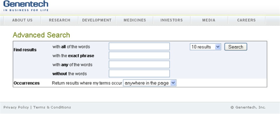
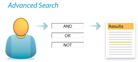
A relative concept, advanced search includes whatever simple search doesn’t. It’s a pattern that many of us love to hate. Often, advanced search is a clumsy add-on that’s rarely used, and it lets engineers and designers take the easy way out. Valuable features that are difficult to integrate into the main interface can be relocated to the ghetto and forgotten. Plus, there’s confusion about its purpose. Is it a user-friendly query builder for novices or a power tool for experts? Many interfaces try (and fail) to be both. For instance, isn’t it fair to assume that users who understand what “exact phrase” means also know to use quotation marks to specify such a search? The main problem with Boolean isn’t the syntax, it’s the logic. And even the plain language shown in Figure 4-28 is unlikely to help the few novices who brave the intimidating realm of advanced search.
This pattern also suffers from an ignorance of context. Searches are situated. They take place in a space. Having navigated through music to the folk genre, users may want to search without leaving. Scoped search is a pattern that meets this need. There’s a risk that users won’t see the scope, but overrides in the case of few or no results can help. In most cases, users benefit, because scoped search caters to context. In contrast, advanced search often teleports us to a distant, unfamiliar locale. It’s disruptive to flow.
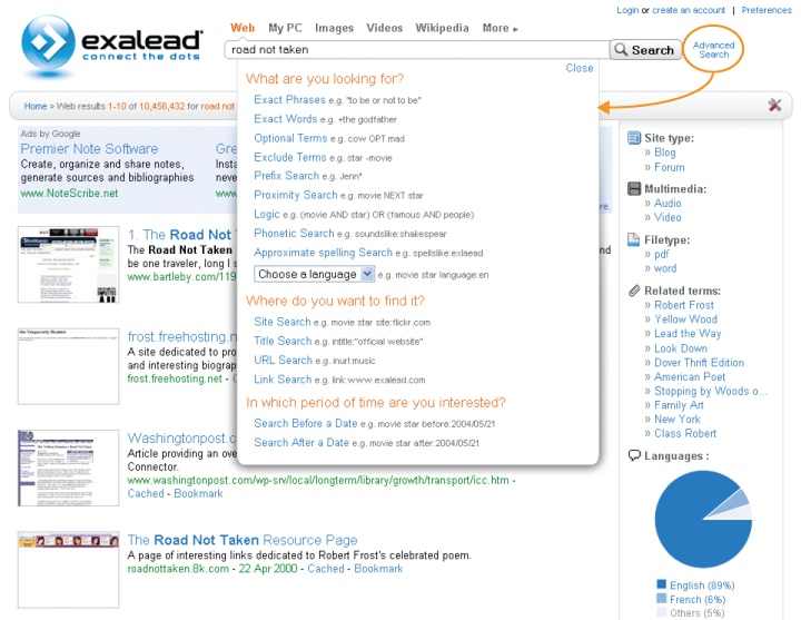
Interestingly, Exalead, shown in Figure 4-29, combines help and advanced search without asking users to leave. A click on Advanced Search launches an interactive menu below the box. It’s unconventional and a little clumsy, but definitely worth a look.
Despite these difficulties, advanced search isn’t only an antipattern. It does help some users learn about the available metadata fields and vocabularies, and offers a path toward greater precision through field-specific searching. Plus, even when we reject the advanced/basic dichotomy and build robust functionality into the main interface, and strive to support contextual queries with scoped search, it’s inevitable that some features that are useful for some tasks and for some people will be left out.
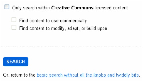
In fact, we should worry if they’re not. Advanced search offers a safe harbor for edge cases and a clear path to progressive disclosure. For instance, Flickr includes features in advanced search, like limit by license, that simply don’t belong on the main stage.
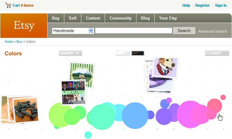
Of equal import, advanced search in concept, if not by name, gets us to think outside the box. What’s the basic interface missing? How else might users wish to search? These are the questions that lead to innovations like Midomi’s search by singing, GazoPa’s discover by drawing, and Etsy’s fabulously fun feature, explore by color.
In conclusion, advanced search is a pattern on the edge. In practice, it’s often abused and rarely used. It can be rendered unnecessary by the narrowing and scoping of faceted navigation and personalization. Yet, like federated search, it invites us to go further in our search for ideas, and serves as a forgiving playground for experiments and exploration.
Personalization
If you’ve seen the bow tie–wearing butler in Apple’s 1987 Knowledge Navigator video, you know that personalization has been the future of search for decades. Software agents that know what we already know and what we want to know will scour the four corners of the earth for the data that makes a difference. It’s a compelling vision that’s entirely unrealistic absent a quantum leap in science and technology that enables computers to tap directly into our minds and memories (and understand the meaning of what they find).
So, while it’s a worthy ambition, personalization is a hard problem. This inconvenient truth is often obscured by semantics and spin. For starters, personalization is often confused with customization, a simpler model in which users can explicitly modify settings. Customization lets us change color and layout and subscribe to feeds. My Yahoo! and iGoogle are popular examples. Of course, in most applications, users mostly fail to customize. They’re too busy. They live with defaults. So designers who count on customization as a crutch will fall flat on their faces. Then there’s the spin. Lots of folks have a vested interest in selling the magic of personalization. Enterprise search vendors use it for product differentiation. Web search companies harness it as a Trojan horse to sneak behind firewalls with their targeted ads. After all, it’s much easier to use demographic and behavioral data to sell advertising than to improve search, but users will only share their data in return for the promise of better results. And if it’s hard for a company like Google, which employs the best and brightest and enjoys unparalleled access to behavioral data, how realistic is it for most sites and applications to personalize search?
OK, enough with the caveats and criticism. Personalization is a pattern worth study. Simple solutions are already well established, and the more sophisticated experiments in similarity computation and social search are intriguing to say the least. Autocomplete is a simple example. As repeat queries are common in many contexts, using search history to inform suggestions is often a good idea. Result reranking based on past post-query behavior is a more complex challenge. A user who repeats a query is likely to click the same result as before. Is it helpful to bring that result to the top? It’s worth asking—that is, if we have the behavioral data and the technology to support analysis and action.
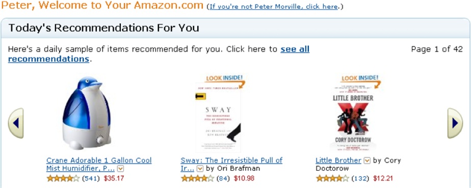
Otherwise, we may find the right balance by employing recommendation engines to search for similarity. The most famous of these is Amazon’s “Customers Who Bought This Item Also Bought This” feature. It’s not perfect. It’s heavily influenced by publication date, since we often buy unrelated books together that are popular at the same time. It’s not personalization but a form of collaborative filtering that’s centered on an item, not an individual. But it does encourage pearl growing, and it’s a repeatable solution to a common problem. It’s a great search pattern, and music recommendation services like Last.fm have successfully interwoven this approach with individual preferences and similar tastes. Sometimes, personalization really does work like magic.
But Amazon’s true personalization is less useful and less used than its collaborative filters. Mining search, navigation, and purchase history to derive helpful, personalized suggestions isn’t easy. Results are skewed when we shop for others and buy a bra for grandma. But that’s not the crux of the matter. The core problem is that what we wanted yesterday or last year often fails to predict our interests and wishes today and tomorrow.
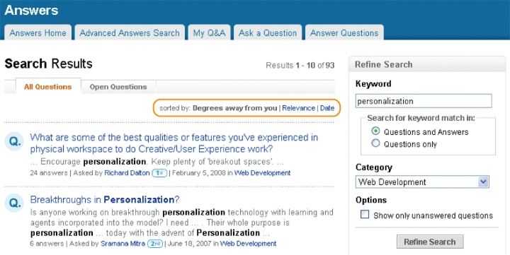
How can software know what we need now? In search, the query affords a peek at intent. History may offer a hint, and we may improve results with a little help from our friends. In fact, social search is a major area of inquiry in academic circles and an intriguing, albeit immature, pattern in practice. At LinkedIn, results are sorted by degrees of separation. Answers from friends are followed by those from friends of a friend (Figure 4-35).
At Twitter, search ignores our friends. Results are sorted solely by time. In contrast, FriendFeed lets us limit queries to our social networks. And therein lies the question: can the personal insights and experience of our friends beat the wisdom of the crowd? The answer is, of course, it depends. The size and composition of the network is a key variable. So is the nature of the question. A tightly knit circle of teenagers may rely heavily on social search for music, fashion, and restaurant recommendations, but similar searches may fall flat for a diverse, international network of executives. For some questions, our friends know us best, but for most queries, there’s strength in numbers.
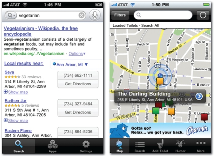
So, it’s worth asking again: how can software know what we need now? The mobile platform has part of the answer in the form of location awareness. Our current location, in concert with a query (or selection of an application), offers insight into intent and a smart default for sort order. Indeed, even our choice of platform is a clue. A desktop query for “vegetarian” is likely a lookup, but on the iPhone, a local search for restaurants is a good guess. Google Mobile plays it safe by covering both angles. Similarly, simply launching SitorSquat (Figure 4-37) clearly indicates searcher intent: find me the nearest public toilet, stat!
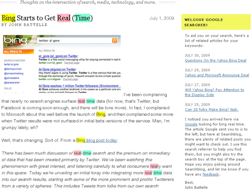
In the digital domain, using the entry point for search as an input for personalization is also an area of inquiry. The most obvious solution is scoped search, covered under the advanced search pattern. Less obvious is an idea popularized by John Battelle and shown in Figure 4-38. If we know where a user came from or how he got here, can we further personalize his experience by embedding recommendations within each result? This extension to contextual search is hardly a pattern, but it’s an interesting question to ponder.
In short, personalization is a dish best served simple. Only in limited contexts will past performance predict desired future results. The query is the clearest and most timely signal of intent. It’s a concise expression of what users need right now. History, social data, and location (online and off) can sometimes boost that signal, but for practical and ethical reasons, these personal algorithms should be transparent and open to override. When it works, personalization can play well with other patterns. In particular, it informs the suggestions of autocomplete and the algorithms of best first. Often, however, personalization must take a back seat to explicit, dynamic customization in the form of faceted navigation. After all, interactions with facets are the closest we come to the reference interview and what Google cofounder Sergey Brin calls the ultimate personalized search engine: the librarian.
Pagination
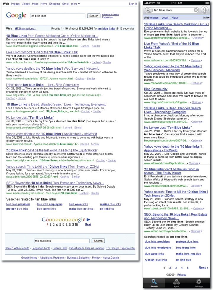
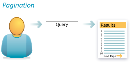
How should we display search results? The next few patterns seek an answer. Since most queries produce too many results for one screen, pagination is a common solution. Google established the most popular pattern in the form of 10 blue links. And while competitors such as Microsoft’s Bing are busy decrying the end of this model, it’s still alive and kicking as the dominant standard across desktop, web, and mobile platforms.
Of course, the 10 blue links don’t really stand alone. Google’s results page is a complex, high-density interface. Designers are forced to count every pixel, because every pixel counts. Features include format filters along the top, dual boxes for query refinement, a variety of tools and advanced search options, invitations to explore related searches, and a pagination control for accessing paged content. Last but not least, there are snippets.
Snippets are the heart and soul of search results. To pinch a phrase from multitouch, the content is the interface. The snippet reveals the aboutness of each result while also serving as the link to live and cached versions and to similar results. A purple link means you’ve already visited, an important and helpful clue for determining the next click. The two lines of text are selected for optimal scent. They provide a concise summary of the result or a brief excerpt with the keywords in context. A URL offers hints about the source and subject of the result. And throughout the snippet, query keywords are highlighted to reveal the reason for inclusion. That’s a lot of work for a simple snippet.
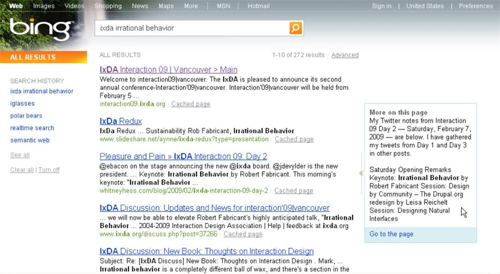
Bing, shown in Figure 4-42, takes snippets a step further by presenting additional text and links from the destination site whenever a user hovers over a particular search result.
Of course, the anatomy of a snippet must adapt to fit each platform, format, and context. In mobile, snippets must be short. In reference and news and enterprise applications, URLs may be useless. And for images and video, a picture’s worth a thousand words.
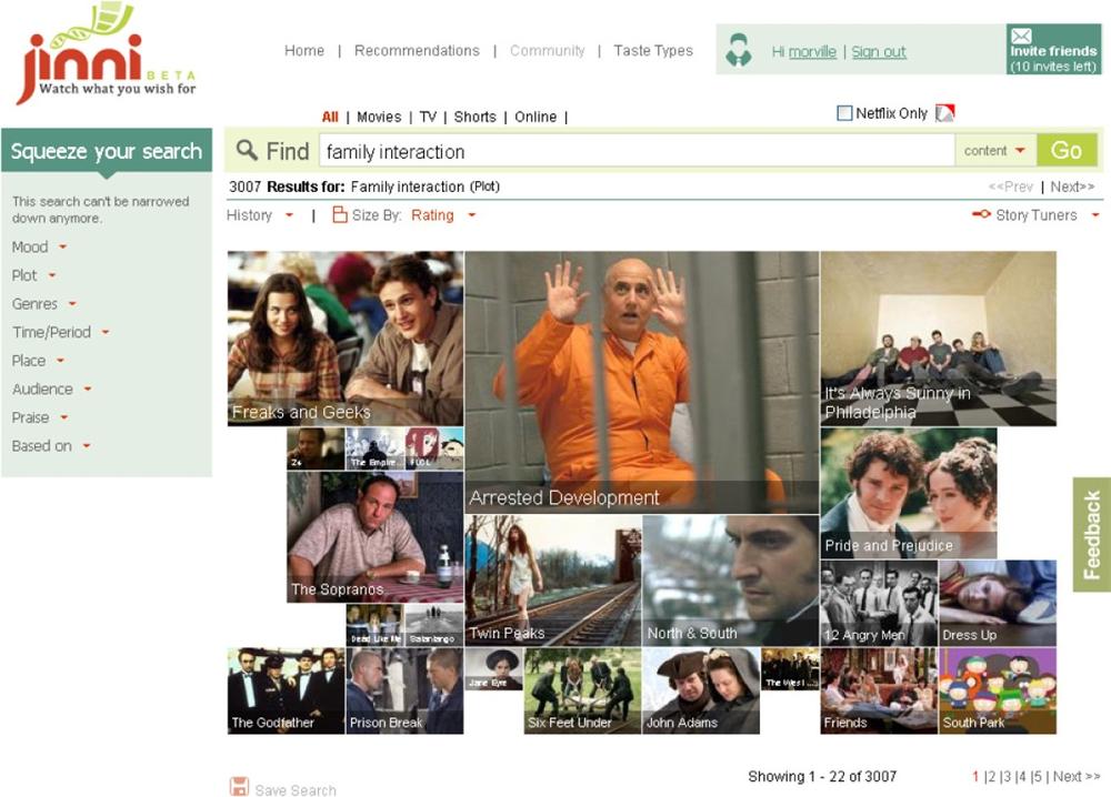
A linear list isn’t the only way to organize results. As Figure 4-44 illustrates, the television and movie discovery service Jinni uses size (and layout) to show sort order.
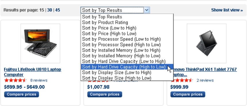
In e-commerce, photos of each product are important. So is choice. At Yahoo! Shopping, users can choose whether they see 15, 30, or 45 results in list or grid view. They also have a wide variety of sort options and can select multiple items for a side-by-side comparison.
Despite all this flexibility, disruption is an inherent problem of pagination. When users advance to the next set of results, the page refresh often disrupts flow. Inline paging is one solution. At Endless.com, for instance, when users advance to the next result page, the old snippets fade out and new ones appear. The rest of the interface stays stable. The user feels like she never leaves the page. However, after scrolling down through results, there’s still a disconcerting jump from page bottom to top. Nothing’s perfect!
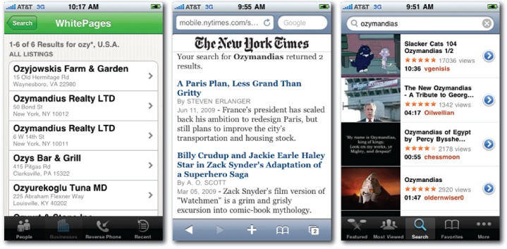
Several solutions are currently employed in mobile. Apple’s iTunes offers to Show 25 More at the end of each list. Amazon abolishes paging with virtual scrolling. Progressive loading ensures that the first few results are shown immediately, then, as users scroll down, more results load automatically. Kayak appears to load all matching flights, but sort and filter options are available to refine results and avoid endless scrolling.
Infinite scroll and inline paging offer clear benefits, but they come at a cost. First, they’re simply more expensive to implement. Second, they may initially confuse users who have become used to the standard model. Third, they may frustrate attempts to bookmark or share a link to a specific set of results. Don’t forget the power of the page!
Clearly, the pattern of pagination is linked to the composition of the snippet. We must find a balance between the richness of each snippet and the number of results per page. That is, unless our application affords the freedom to try something unorthodox, like a zooming user interface (ZUI) that positions all results within an infinite virtual desktop.
In summary, careful attention to pagination delivers results. That’s the bottom line. Snippets are central, serving as both content and interface. But one snippet will not fit all. The ideal composition is shaped by platform, format, and context. Flexible sort and filter options are also important. While best first defines the default, users deserve control. That’s the genius of faceted navigation. Incremental clarification and refinement reduce results until the need for paging and scrolling virtually disappears.
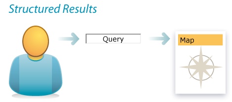
Structured Results
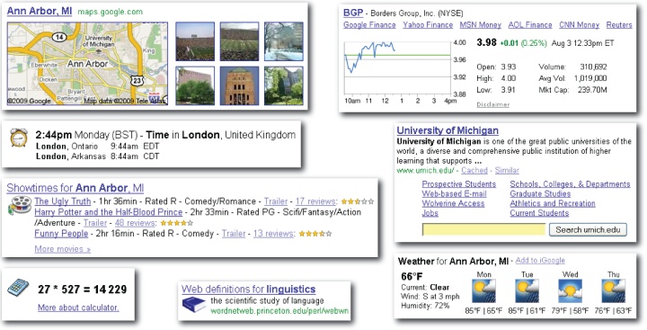
Increasingly, our uniform ranks of ordered blue links are being infiltrated by rich snippets and structured results that dig deeper into the data so users don’t have to. Google made this mainstream by embedding maps, images, stock charts, and more into its results. Google also experiments perpetually with options like timeline view and with new projects like Google Public Data, which makes it easy to find and visually compare statistical data.
What’s the optimal format for this type of result? Will a classic snippet suffice, or is there a better way? Can we summarize or surface data with an image or chart? Can we subtract clicks by adding answers? These are the questions we must ask. Of course, users’ queries are important, too, since the desired output may depend upon structured input. It’s a model that only works well when we can reliably infer user intent.
It’s also a pattern that challenges boundaries. When is search not a search? When it’s a calculator or a dictionary or an application we have yet to define. Wolfram Alpha strays well outside the box. Natural language queries and curated data are subjected to linguistic analysis and computation. Results include tables, charts, formulas, visualizations, and dynamic controls. It’s not really a search engine at all; it’s a computational knowledge engine. Its results are meant to be answers. But where do we draw the line?
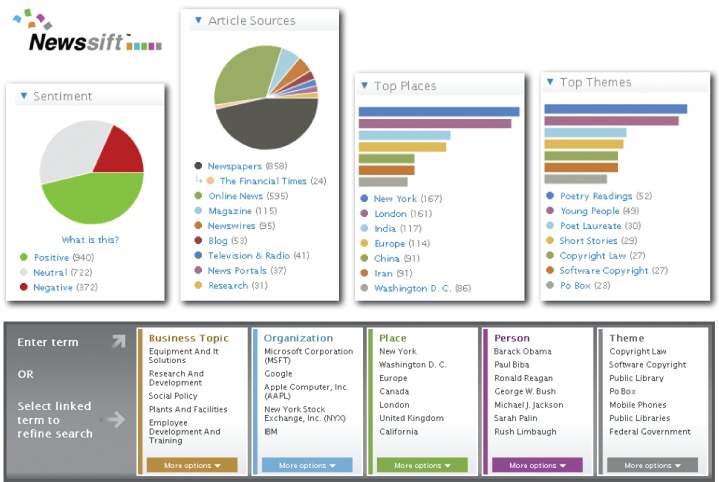
On the search side, subtle visualizations invite attention and analysis. At Newssift, shown in Figure 4-52, emphasis is placed on identifying patterns, trends, and relationships. It’s about the discovery of meaning. Structure isn’t a function of individual answers; rather, it’s a way to understand and manage large sets of results.
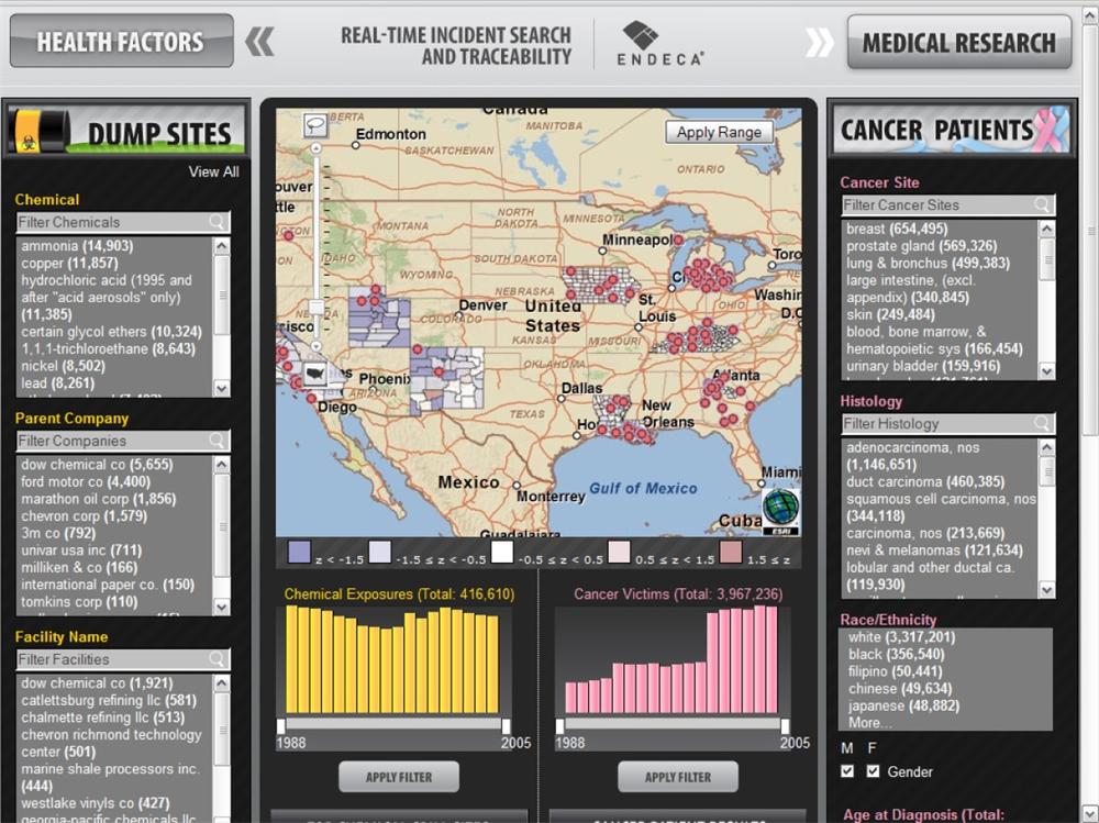
Meanwhile, the distinctions between analytics, business intelligence, decision support, text mining, and exploratory search continue to blur. Powerful queries and visualizations that were limited to structured data are being applied to multiformat collections and unstructured text. Endeca, for instance, is pioneering an approach called guided summarization (shown in Figure 4-53), which integrates faceted navigation with dynamic visualizations that engage users in a rich dialog with their data. While search may still start in a box, the potential applications of modern tools are all over the map.
In summary, structure is reshaping our results. Search applications are simply better when they swap a picture for a thousand words or take users one step deeper into the data. And this pattern plays well with others. While rich snippets may not appear in autocomplete, they’re often part of best first. Features like movies, maps, and weather surely benefit from personalization, and faceted navigation offers a good model for managing text as structured data. Of course, when the response is an answer or a new frame for our question, we must wonder: is this really what we talk about when we talk about search?
Actionable Results
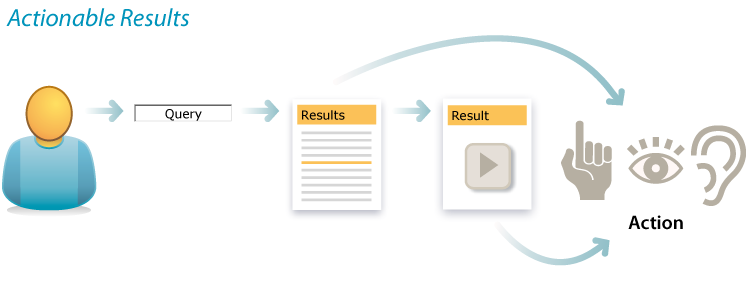
But enough talk already. We want action. We need results. That’s what actionable results are all about. Why list a link when we can lend a hand? First, we must ask what users want to do with their results. The most common tasks are print, save, and share.
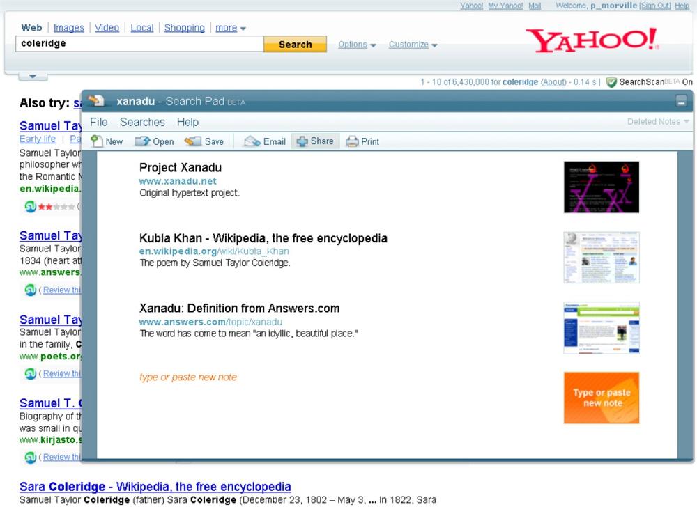
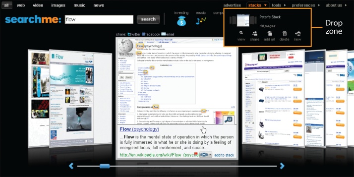
Yahoo! Search Pad (Figure 4-55) manages them all. It’s a handy application that tracks the results we visit. We can add notes, print, save, and share the annotated list of search results via Delicious, Facebook, Twitter, or by using a custom URL. Searchme pioneered a more visual model with similar functionality (Figure 4-56), which lets users drag and drop results into shareable search stacks.
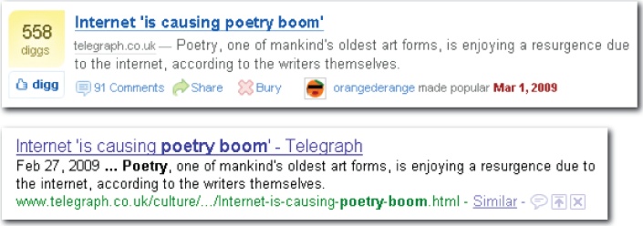
Users may also wish to vote, rate, and comment on results. This is clearly a core feature of Digg, a social news website that proves the power of actionable results. As founder Kevin Rose explained, “Once we added Ajax, activity went through the roof…the ease of the ‘one-click and you’re done’ made all the difference in the world.” Google is now experimenting with this type of feature. When signed into Google, users can remove, promote, or comment upon individual results. For now, it’s considered a personalization feature, but Google is surely storing the social data with an eye toward public results.
Tools that help users to manage results are a good idea, but we can often do better by seeing the goal beyond the search. Hulu, for instance, doesn’t simply list results. There’s a play button in every snippet, so we can watch TV shows and movies with a single click.
Yahoo! has integrated structured and actionable results into its main search experience by presenting expanded snippets for top results when possible. This strategy fits nicely with the best first pattern. As Figure 4-59 illustrates, music fans are able to play songs and watch videos without leaving the results page.
Similarly, Spotlight Search on the iPhone isn’t just a way to find files fast. It’s also an efficient and elegant way to launch applications and make phone calls. Google Mobile goes a step further by integrating single-click phone and map features. And Apple’s iTunes lets us play songs and buy music without having to leave our results.
In short, actionable results are the next step for users and for search. We must stay focused on the goal and design for results beyond results. Clearly, this pattern can be integrated with most others. For instance, actions can begin with autocomplete. On the iPhone, users can launch an application before the query is whole. It’s good to get an early start. The real trick is knowing where to end. Do we embed the basic features of other applications in our search software? Do we create hooks from our results into other software that offers a more robust feature set? Implementation is tricky, but it’s worth the extra effort, because real-world goals require that we think and act outside the box.
Unified Discovery
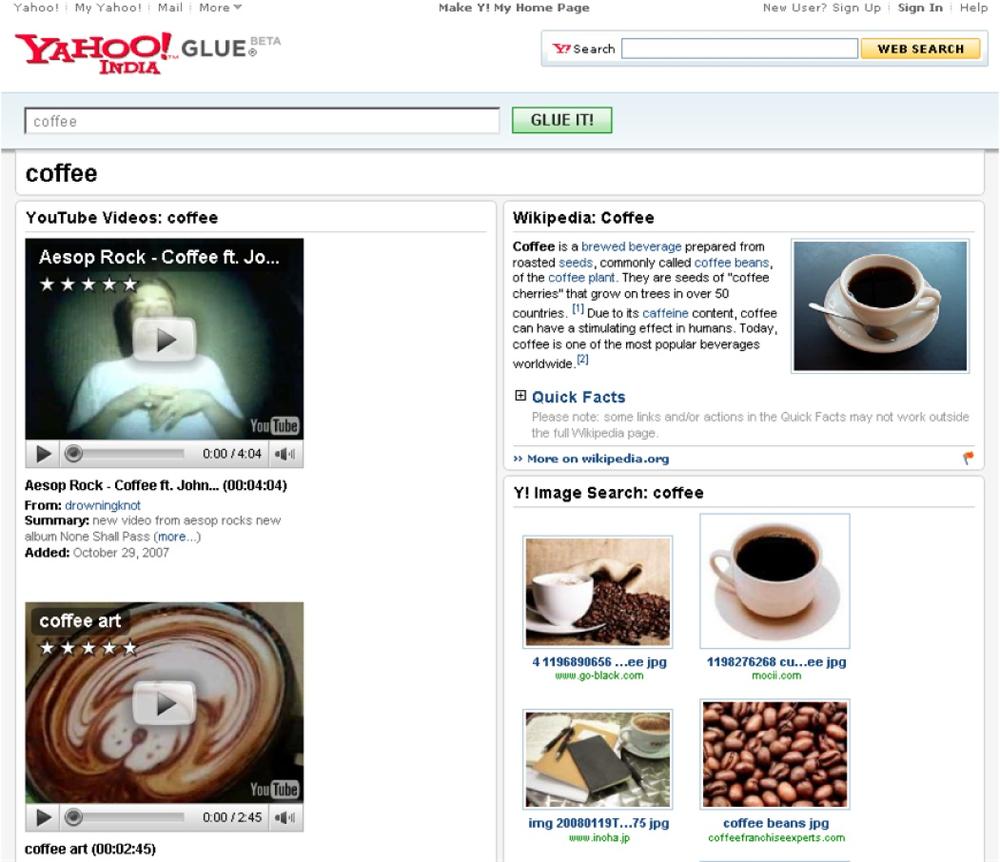
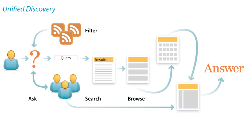
Search rarely stands alone. In most contexts, users move between modes of searching, browsing, and asking. They don’t bother about borders. We can learn from their example by embracing the pattern of patterns known as unified discovery. Sometimes it’s about making the modes work together. Other times it’s about merging modes. For instance, Yahoo! Glue Pages are specialized, visually appealing, browsable search results. They’re Google and Wikipedia, gateway and destination, search and browse all rolled into one.
We’re also making browse more like search. At Lands’ End, there’s little difference between search results and a gallery page (see Figure 4-63) that results from browse. Pagination and the sort and display options are handled the same way. Plus, even as we browse the product taxonomy, faceted navigation options appear to the left.
Unfortunately, Lands’ End fails to integrate modes in other important ways. There’s no scoped search, so we can’t limit our queries to women’s sweaters or boys’ shoes. And, although it does offer a useful Live Help feature, the collaboration is hindered because, as Figure 4-64 shows, we can’t easily share our results with the representative.
One way to make the modes work together is by leveraging category matches. When a user’s query partially or exactly matches a category label, we have a choice. One option, shown in Figure 4-65, is to highlight the category match and present results as usual. That’s a reasonable solution for a partial match. However, users may not notice the category link or understand what it represents. An alternative is to jump to the category page, also shown in Figure 4-65. This requires an exact match or the ability to map a near match onto a single category. In such cases, an override option that lets users run their original query is helpful, since the category page may not always be the desired result.
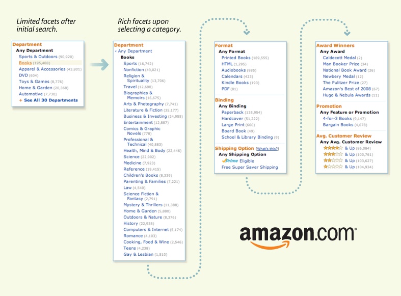
A third option is evident at Amazon (shown in Figure 4-66), where category matches are integrated as facets to the left of results. This is a balanced solution that keeps the user in search while leveraging the structure of the browsable taxonomy.
Of course, Amazon is the champion when it comes to making search and browse work together. As Figure 4-67 shows, while we browse departments, scoped search offers to limit our queries to that section. At Amazon, whether we search or browse first, we can always switch to the other mode without losing our place.
Unified discovery provides a framework in which to integrate patterns. For each search pattern, we should ask how it might relate to browse. Autocomplete and best first might automatically feature category matches. Personalized search may be informed by our current location and browsing history. And, of course, the key fields and filters of faceted navigation should be aligned with categories and the overall information architecture.
The End of the Beginning
In this chapter, we’ve explored 10 major search patterns. It’s a start, but our inventory isn’t nearly complete. Christopher Alexander and his colleagues compiled 253 architectural patterns for houses, gardens, neighborhoods, and villages. We’re not even close. Our best patterns have yet to emerge, and we’re in dire need of a map that shows how they fit together. The task is particularly difficult because our patterns are such a motley crew. Some fall squarely within the boxes of interaction design or information architecture, while others are boundary spanners that blur the lines between user experience, content strategy, knowledge management, and search. These patterns run the gamut from tactical to strategic, and therein lies our challenge: we must pay attention to spelling and syntax while simultaneously telling a good story. The writing doesn’t always come easy. In fact, we’re often at a loss for words. Our vocabulary for designing and describing interactions is limited and limiting. It imprisons our imagination. We can do better, so we must seek new words and weave them together most densely, because:
| in search |
| as in poetry, |
| less is more, |
| patterns slow time, |
| and discovery springs |
| from rhythm and rhyme. |
[13] A Pattern Language, Christopher Alexander (Oxford University Press).
[14] Marti Hearst and her Flamenco project collaborators at UC Berkeley deserve credit for their pioneering research in faceted navigation (http://flamenco.berkeley.edu/).
[15] A facet-based interface for mobile search. Available at http://research.microsoft.com/apps/pubs/default.aspx?id=64303.
Get Search Patterns now with the O’Reilly learning platform.
O’Reilly members experience books, live events, courses curated by job role, and more from O’Reilly and nearly 200 top publishers.


