Chapter 4. Using Incident Metrics to Improve SRE at Scale
Whether your service is looking to add its next dozen users or its next billion users, sooner or later you’ll end up in a conversation about how much to invest in which areas to stay reliable as the service scales up. In this chapter, we take a look how to use incident metrics to focus investments by way of a case study from Microsoft Azure. It applies lessons we’ve learned working on service reliability on a variety of services, ranging from startups to enterprise services all the way to cloud scale. Azure makes a particularly good case study, as the tremendous scale, growth, and diversity of product offerings amplify the typical reliability themes. We show how using data and some innovative techniques to analyze and report on these themes helped us to drive improvements.
The Virtuous Cycle to the Rescue: If You Don’t Measure It…
As with any problem management effort, we began by looking at the data. However, when we went to do so, it turned out that we had thousands of data sources, service telemetry, incident management metrics, deployment metrics, and on and on. In fact, we had so many data sources to look at that it made deciding what data to look at and in which order to tackle the problems tricky. After looking at the best practices in the industry and consulting with experts, we ultimately landed on a system called the virtuous cycle, shown in Figure 4-1, to underpin our improvement efforts. The virtuous cycle created a framework that we could use to see how effective our monitoring was by how quickly we detected outages, how well we were learning from outages by measuring the root-cause analysis (RCA) process and repairs, and how quickly those bugs were getting fixed. We could then look at our code quality and deployment velocity to see how quickly we’d run through the full cycle.
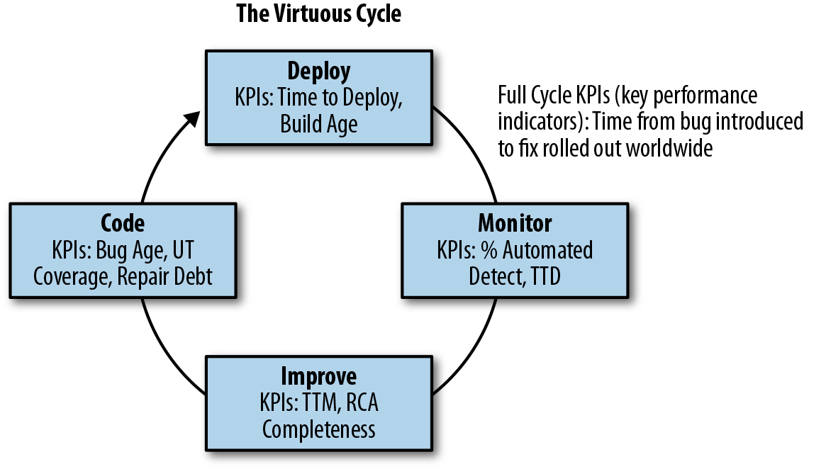
Figure 4-1. The virtuous cycle
As SREs, we know that every minute of downtime matters, so we began by finding the key metrics that told us how effective we were at responding to and repairing incidents. This meant that first we had to define the metrics that were representative and then get agreement on definitions and start/end times. Let’s dive into the metrics that we picked and why we thought they were so important:
- Time to Detect (TTD)
Time to Detect is the time from the impact start to the time that an incident is visible to an operator. We start the counter when impact first becomes visible to the customer, even if our monitoring didn’t detect it. This is often the same as the time that the Service-Level Agreement (SLA) is breached.
Believe it or not, TTD is the most important metric for incidents that require manual mitigation action. This measure determines the quality and accuracy of your monitoring. If you don’t know about your customer pain, you can’t begin the process of recovery, and you certainly can’t actuate automation to respond or mitigate. Maybe even more important, you can’t communicate to your customers that you know about the problem and are working on it. The challenge with TTD is balancing the monitoring sensitivity such that you find all of the customer issues quickly and accurately, without constantly interrupting your engineers for issues that don’t impact customers.
- Time to Engage (TTE)
This is the time from detection until the appropriate engineer is engaged. This can be difficult to determine during the event, and sometimes even afterward. It can be hard to look back through the fog of war to pin this down on a single engineer, so it’s OK to approximate with the first engineer on the scene. This metric is very important to look at how effectively we’re able to mobilize the response, and accounts for both the triage time (determining severity and ownership) as well as the time to escalate and mobilize the responders. There are a lot of ways in which you can improve this; automated escalation and paging systems, clear expectations for on-call, follow-the-sun support models, and even improved monitoring can help ensure the alert goes to the right on-call engineer the first time.
- Time to Fix (TTF)
This is the time that it takes the responder to mitigate the issue.
All of these metrics, when added together (TTD + TTE + TTF) are represented by Time to Mitigate (TTM), the full-cycle time through the outage, as represented in Figure 4-2.
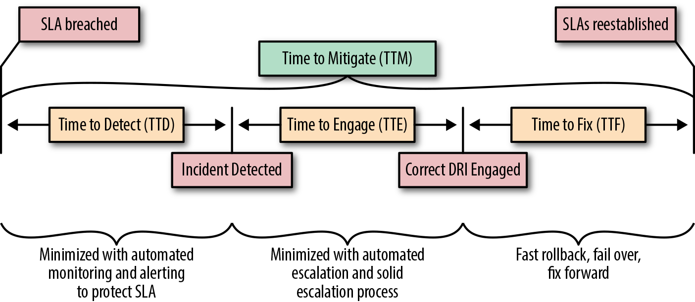
Figure 4-2. Example of an outage mitigation time breakdown
You might have different metrics, definitions, or thresholds, but all that matters is that your group agrees on the common taxonomy and measures. The agreement on taxonomy is particularly important because if the mitigation event is not agreed upon, we can have disconnects, as some teams could try to disengage before the incident is fully resolved. These become especially critical after the incident to ensure a common taxonomy during the incident review meetings to talk about where there are opportunities for improvements.
Metrics Review: If a Metric Falls in the Forest…
After we had these metrics defined, we brought our engineering leaders together to look at the key metrics that we identified as crucial to drive the virtuous cycle. We then could track how we’re progressing and derive insights and create action plans in areas where we weren’t hitting our goals. After defining and agreeing on metrics, we began collecting and reporting on per-service aggregates of the data to determine how we’re doing, find areas and common themes for improvement, and measure the impact of improvements we made. Figure 4-3 shows an example of a dashboard to measure incident and deployment metrics. This allowed us to track metrics trends for our incident response cycle and engineer improvements just the way we engineer features into the product.
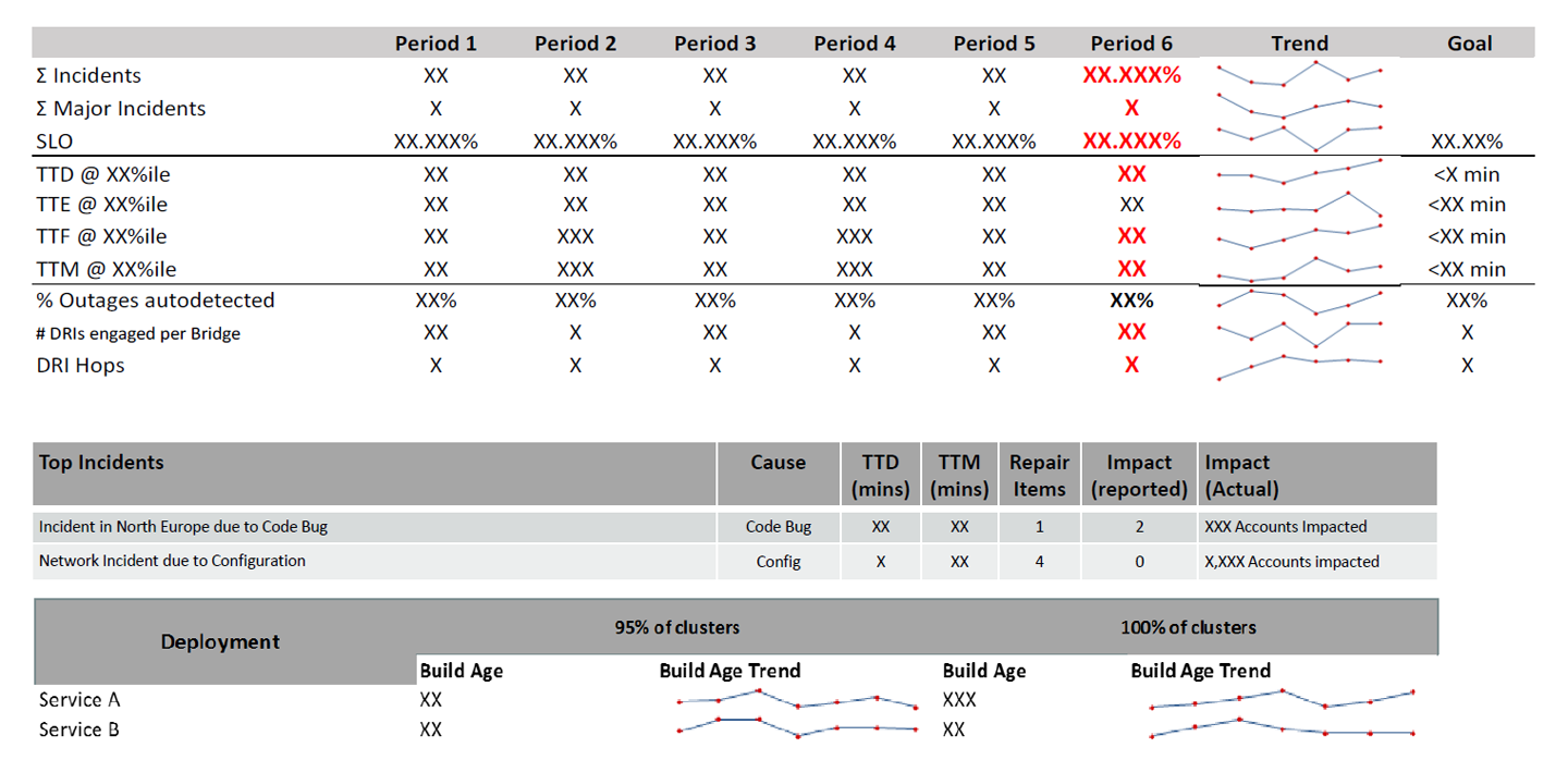
Figure 4-3. SRE metrics dashboard
Notice that the incident response metrics we discussed earlier show up here: TTD, TTE, TTF, and TTM, trending by time period, and measured against goals that we had set and agreed on with service owners. If we found data was sparse, had high variability, or had major outliers, we would apply percentiles to the data to normalize it enough. We then could look at the outliers to understand them better and drive the percentiles toward 100%.
Surrogate Metrics
If you look closely at the SRE metrics dashboard, you’ll notice a few metrics like Directly Responsible Individual (DRI) hops (how many on-call engineers are needed to resolve an incident) and autodetection (how many incidents are detected via monitoring). These are surrogate metrics, which are submetrics related to the top-level “Time to” metric that are more specific and actionable than the high-level metrics, but don’t by themselves indicate success. We found that using surrogate metrics led to faster, more durable improvements because giving engineering managers specific action items and submetrics was a more effective way to drive action than just telling teams to “do better” and “try harder.”
Exploring your data is a great way to find surrogate metrics. Looking at TTE as an example, as we investigated incidents with long engagement times, we found factors that correlated with or led to high engagement times, such as engaging many engineers to resolve a single incident. This would occur due to knowledge gaps, instrumentation gaps, or even inconsistent expectations for on-call response. To address this, we added the “#DRIs engaged per bridge” submetric, which lets us see how many DRIs are engaged on any given incident. Having fewer DRIs engaged could still result in a long response time, especially if they don’t engage additional resources when they should. However, when taken together with the TTD and TTE, this is a good indication of how effective our monitoring and diagnostics are at getting the alert to the right responder early.
Similarly, while working to improve TTD, we noticed that it was 10 times higher when the outage was detected by our customers instead of being caught by monitoring. To measure this, we instrumented the autodetect rate as a surrogate metric for TTD. This doesn’t mean that all autodetect incidents have good TTD, but automated detection is required to get good TTD. As is typical for surrogate metrics, automated detection is necessary, but not sufficient to achieve world-class TTD.
This is not a complete list of surrogate metrics, but just a few examples to get you started.
Repair Debt
Some of the best insight we derived during the metrics review came from the post-incident review process. There is a lot of great material out there already, so I’m not going to go deep into how to do a good postmortem (see “Further Reading” for a few examples). I’ll skip to what matters most to our metric reviews: every time we identify a bug or improvement opportunity, we log it and track it as a repair. Repair items are technology or process fixes that either prevent an outage from recurring or reduce its duration. Typically, these are broken down into short-term items and long-term items. Short-term items should be rolled out quickly (within a week) and might be a process, a script, or a hotfix. Long-term items are more durable fixes, such as more thorough code fixes (i.e., fixing a class of issue versus an instance of an issue, or fixing a class of issue across multiple product lines), creating broader process change (i.e., building and delivering incident management training across multiple organizations), or building tooling like chat bots or autoescalation/mitigation. Repair items are typically tracked in the same work management system you use for tracking product work items, but what matters is that they are recorded and reportable and distinguishable from standard product backlog.
Tracking repair items lets us incorporate operational debt into the standard engineering process and treat it just like feature work. The diagram in Figure 4-4 is a good example of what happens when we first began tracking repairs. There is usually an initial spike in debt as we start to expose previously unknown or unfocused repair actions. Then, the team adjusts its practices to incorporate repair debt into its normal rhythm of business, and the repair debt comes down. Tracking repair debt is important because these problems always existed, but until they were tracked, measured, and shared, the engineering team couldn’t take action to improve the service. This helps to provide a signal for the team, together with the error budget, for how to prioritize service reliability work against feature work.
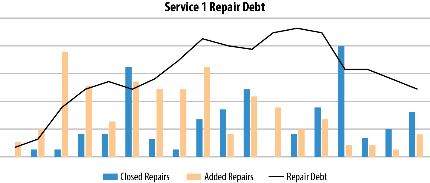
Figure 4-4. An example repair debt graph
Virtual Repair Debt: Exorcising the Ghost in the Machine
Not every movie has a Hollywood ending, and we found that not every service saw the fruits of repair item rigor. In some cases, even though repair debt was stable, the reliability month over month wasn’t necessarily getting better. For these services that had stable repair debt but weren’t seeing reliability improvements, we were baffled. Why weren’t they improving if the repair debt was stable and appeared well attended? We dug deep into some of the data that we hadn’t yet curated, did our best Sherlock Holmes impression, and found a surprising insight. Some services weren’t doing a thorough RCA, and as a result they had either low RCA completion rates or RCAs without enough repairs. This meant that the repair items never made it into the backlog and the service didn’t have the opportunity to improve.
This brought about a new challenge: how do we measure the quality of a postmortem? Not only do we need to measure whether repair items were getting fixed, we also need to measure whether they were getting created in the first place. Most postmortems include a lot of text describing the problem and what was done to mitigate. We could certainly apply some machine learning to the text and try to parse out intent, but that would take a significant investment and would not be deterministic.
The simplest solution was sitting right in front of us all along in the form of the “Time to” metrics that we attach to every incident and every postmortem. Any incident that missed a time to detect, engage, or mitigate goal should have a corresponding repair item. This meant that we had to have a taxonomy in the repair process to attach engagement, diagnosis, and detection flags so that we could programmatically extract “missed repair items.” We then used all of the missed repair items to measure what we called “virtual repair debt.”
Visualizing virtual repair debt became a powerful tool to drive improvements. As seen in Figure 4-5, the gray line representing repair debt makes it look like the team is keeping up with the repair debt, but when you add the dotted red line that represents missed repairs, the dark-matter repair items that form virtual debt become glaringly obvious. Virtual debt is particularly important because it represents the corpus of repair items that were never logged and will end up hurting the service down the road. When there is virtual debt, the specific TTD and TTM misses will repeat over and over until they are logged and fixed.
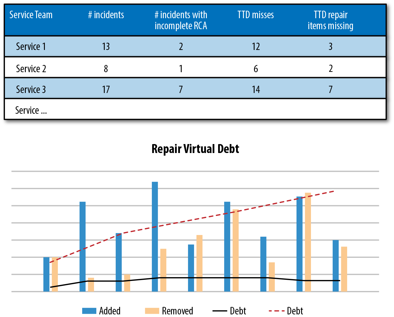
Figure 4-5. Repair virtual debt graph
Real-Time Dashboards: The Bread and Butter of SRE
Possibly the most important part of metrics review is bringing the metrics and insights into real-time dashboards. Looking at the data monthly or even weekly doesn’t help drive change quickly enough. Every service, every component needs to be able to see in real time where they have work to do, where they are doing well, and where they can improve. This meant creating dashboards that can pivot by service, by manager, even down to the individual engineer who owns the work item.
Learnings: TL;DR
If you want to simplify everything from this chapter into a sentence, here it is: measure everything, be relentlessly curious, and don’t be afraid to get dirty and wallow in your data to find the right actions to take. In many cases, getting these insights required hand curating a fair bit of data, but after we understood which metrics mattered, we could then instrument and automate them and help bring visibility to metrics that could help the services get better.
Further Reading
Blameless postmortems:
“Blameless PostMortems and a Just Culture”: John Allspaw, Etsy
“Postmortem Action Items: Plan the Work and Work the Plan”: Sue Lueder and Betsy Beyer, Google
Beyond Blame—Learning from Failure and Success: Dave Zwieback
Using data to derive operational insights:
“Improving Operations Using Data Analytics”: Parviz Deyhim and Arti Garg, Datapipe
“Incident Analysis”: Sue Lueder, Google
“Measuring the Success of Incident Management at Atlassian”: Gerry Millar, Atlassian
“PDA: A Tool for Automated Problem Determination”: Hai Huang, Raymond Jennings III, Yaoping Ruan, Ramendra Sahoo, Sambit Sahu, and Anees Shaikh, IBM T.J. Watson Research Center
Contributor Bio
Martin Check is a site reliability engineering manager on the Microsoft Azure team. He has worked on large-scale services at Microsoft for 14 years in a variety of roles, including service design and implementation, crisis response, problem management, and even leading teams through the DevOps/SRE transition. Martin is currently working as an SRE manager for global SRE teams, where he continues to leverage data insights to drive SRE improvements.
Get Seeking SRE now with the O’Reilly learning platform.
O’Reilly members experience books, live events, courses curated by job role, and more from O’Reilly and nearly 200 top publishers.

