Chapter 3. Show and Tell: Graphing Data
In This Chapter
Introducing graphs
Working with Excel's graphics capabilities
Creating graphs for statistical work
The visual presentation of data is extremely important in statistics. Visual presentation enables you to discern relationships and trends you might not see if you just look at numbers. Visual presentation helps in another way: It's valuable for presenting ideas to groups and making them understand your point of view.
Graphs come in many varieties. In this chapter, I explore the types of graphs you use in statistics and when it's advisable to use them. I also show you how to use Excel to create those graphs.
Why Use Graphs?
Suppose you have to make a pitch to a Congressional committee about commercial space revenues in the early 1990s.
Which would you rather present? The data in Table 3-1, or the graph in Figure 3-1 that shows the same data? (The data, by the way, are from the U.S. Department of Commerce, via the Statistical Abstract of the U.S.)
Table 3.1. US Commercial Space Revenues from 1990 through 1994 (In Millions of Dollars)
Industry | 1990 | 1991 | 1992 | 1993 | 1994 |
|---|---|---|---|---|---|
Commercial Satellites Delivered | 1,000 | 1,300 | 1,300 | 1,100 | 1,400 |
Satellite Services | 800 | 1,200 | 1,500 | 1,850 | 2,330 |
Satellite Ground Equipment | 860 | 1,300 | 1,400 | 1,600 | 1,970 |
Commercial Launches | 570 | 380 | 450 | 465 | 580 |
Remote Sensing Data | 155 | 190 | 210 | 250 | 300 |
Commercial R&D Infrastructure | 0 | 0 | 0 | 30 | 60 |
Total | 3,385 | 4,370 | 4,860 | 5,295 | 6,640 |
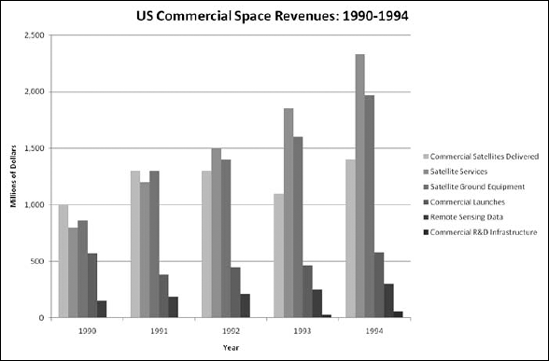
Figure 3.1. Graphing ...
Get Statistical Analysis with Excel® For Dummies®, 2nd Edition now with the O’Reilly learning platform.
O’Reilly members experience books, live events, courses curated by job role, and more from O’Reilly and nearly 200 top publishers.

