Chapter 15. Correlation: The Rise and Fall of Relationships
In This Chapter
What correlation is all about
How correlation connects to regression
Conclusions from correlations
Analyzing items
In Chapter 14, I show you the ins and outs of regression, a tool for summarizing relationships between (and among) variables. In this chapter, I introduce you to the ups and downs of correlation, another tool for looking at relationships.
I use the example of SAT and GPA from Chapter 14, and show how to think about the data in a slightly different way. The new concepts connect to what I showed you in the preceding chapter, and you'll see how that works. I also show you how to test hypotheses about relationships and how to use Excel functions and data analysis tools for correlation.
Scatterplots Again
A scatterplot is a graphic way of showing a relationship between two variables. Figure 15-1 is a scatterplot that represents the GPAs and SAT scores of 20 students at the fictional Sahusket University. The GPAs are on a 4.0 scale and the SATs are combined Verbal and Math.
Each point represents one student. A point's location in the horizontal direction represents the student's SAT. That same point's location in the vertical direction represents the student's GPA.
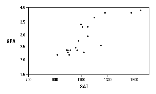
Figure 15.1. A scatterplot of 20 students' SAT and GPA at Sahusket University.
Understanding Correlation
In Chapter 14, I refer to the SAT as the
Get Statistical Analysis with Excel® For Dummies®, 2nd Edition now with the O’Reilly learning platform.
O’Reilly members experience books, live events, courses curated by job role, and more from O’Reilly and nearly 200 top publishers.

