Chapter 4. Becoming Transparent
Solid regions of color have their place, but for many graphics, you want to add a little bit of subtlety. Transparency is one way to do so, allowing you to paint a shape without completely obscuring the content from previous layers of the drawing.
Transparency is in some ways another facet of color, and in some ways a distinct and much more complex topic. This is reflected in the different ways you can define transparency, which we’ll compare and contrast in this chapter.
One thing is constant when talking about transparency and web design: you don’t talk about transparency, you talk about opacity. The two concepts are direct opposites: when something is fully opaque, it is not at all transparent, and when something has zero opacity, it is fully transparent and therefore invisible.
See-Through Styles
SVG uses three distinct properties to control opacity of basic shapes and text: opacity, fill-opacity, and stroke-opacity. All of these can be set with presentation attributes or with CSS style rules.
CSS Color Module Level 3 extended the opacity property to apply to all content. In addition, rather than introduce *-opacity properties for every facet of CSS painting, this module introduced new color functions. Partially transparent color can be defined using the rgba() and hsla() color functions, and then used anywhere in CSS where a color value is needed.
Opacity on the Web is always expressed as a decimal number between 0.0 (invisible) and 1.0 (solid, no transparency). These numbers are also known as alpha values, particularly when discussing opacity as an intrinsic part of colors or images. The a in rgba() and hsla() refers to the alpha channel. These functions take four values, instead of the usual three, with the fourth being the alpha value between 0 and 1.
Note
The keyword transparent, which formerly had a special meaning for CSS backgrounds, has been redefined as a named color. Equivalent to rgba(0,0,0,0), it can be used like any other color keyword in browsers that support CSS 3 colors.
The final effect of modifying a graphic’s alpha value depends on the method you use. In particular, the overall opacity property works in a significantly different way compared to the other options.
The opacity property applies to the element it is set on—even if that is a <g> group, <svg>, or <use> element—and is not inherited. It takes the final drawn result for that element, including all its child content, and makes it uniformly more transparent.
Tip
The opacity value is applied after determining the final color at every point where two shapes—or fill and stroke of the same shape—overlap.
Setting opacity to less than 1 creates a stacking context, flattening and containing all child content. In CSS layout, this can significantly affect the position of elements. It has no similar effect in SVG 1.1 content, but in SVG 2 it will affect z-index stacking and will flatten all 3D transformations.
In contrast, when you set stroke-opacity or fill-opacity, or when you use rgba or hsla color functions, the transparent effect is applied at the time each shape is drawn, to that colored section only. The stroke-opacity and fill-opacity properties are both inherited by default.
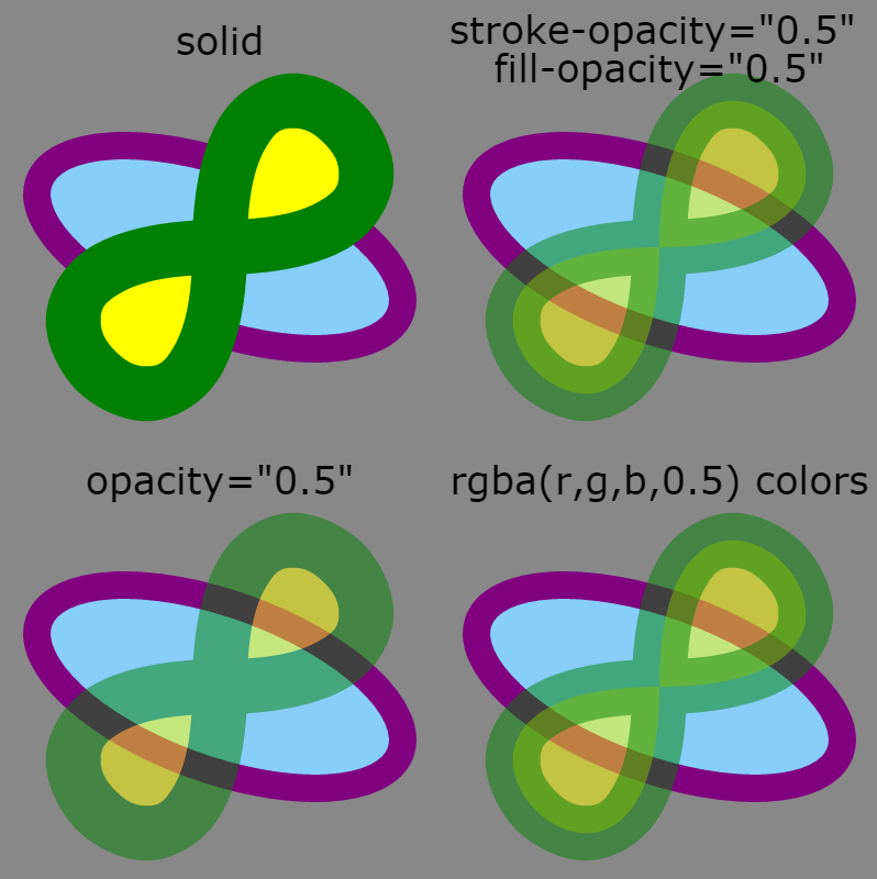
Figure 4-1 demonstrates the difference, using a figure-8 path with a thick green stroke and a yellow fill, partially overlapping a blue-and-purple ellipse whose opacity does not change. The green and yellow shape is shown at full opacity (top left) and set to half opacity using stroke-opacity and fill-opacity (top right), opacity on a <use> element (bottom left), or rgba colors for the stroke and fill (bottom right). Example 4-1 gives the code.

Figure 4-1. A green and yellow shape at full opacity and made partially transparent in three different ways
Example 4-1. Using different opacity options to control the transparency of your graphics
<svgxmlns="http://www.w3.org/2000/svg"xmlns:xlink="http://www.w3.org/1999/xlink"width="400px"height="400px"viewBox="0 0 200 200"xml:lang="en"><title>Opacity Adjustments</title><defs><ellipseid="background"ry="15"rx="35"transform="rotate(20)"stroke="purple"fill="lightSkyBlue"stroke-width="5"/><pathid="foreground"stroke-width="10"d="M0,0C0,-60 60,0 0,0 S 0,60 0,0Z"/></defs><styletype="text/css">svgsvg{overflow:visible;}text{text-anchor:middle;font-size:7px;font-family:sans-serif;}</style><rectfill="#888"width="100%"height="100%"/><svgwidth="100"height="100"x="0"y="0"viewBox="-40,-45 80,80"><usexlink:href="#background"/><usexlink:href="#foreground"fill="yellow"stroke="green"/><texty="-35">solid</text></svg><svgwidth="100"height="100"x="100"y="0"viewBox="-40,-45 80,80"><usexlink:href="#background"/><usexlink:href="#foreground"fill="yellow"stroke="green"fill-opacity="0.5"stroke-opacity="0.5"/><texty="-35"dy="-0.3em">stroke-opacity="0.5"<tspanx="0"dy="1em">fill-opacity="0.5"</tspan></text></svg><svgwidth="100"height="100"x="0"y="100"viewBox="-40,-45 80,80"><usexlink:href="#background"/><usexlink:href="#foreground"fill="yellow"stroke="green"opacity="0.5"/><texty="-35">opacity="0.5"</text></svg><svgwidth="100"height="100"x="100"y="100"viewBox="-40,-45 80,80"><usexlink:href="#background"/><usexlink:href="#foreground"fill="rgba(100%, 100%, 0%, 0.5)"stroke="rgba(0%, 50%, 0%, 0.5)"/><texty="-35">rgba(r,g,b,0.5) colors</text></svg></svg>

The reused shapes are predefined in a
<defs>section. The background ellipse has all its painting properties defined as presentation attributes.
The foreground
<path>has a specifiedstroke-widthbut will otherwise inherit its painting styles.
A CSS
<style>block is used to style the text labels and prevent cropping of the nested<svg>elements. Note that the 7pxfont-sizewill be interpreted within the local coordinate system, and so will not create unusually small type.
Each nested
<svg>re-creates the same local coordinate system in a different quadrant of the main graphic, so that the reused graphics can be positioned in the same way.
The background element is reused as is within each sample, and then the foreground layered on top. In this first example, the foreground is given solid fill and stroke colors.

The following
<svg>elements position the content in the other quadrants of the graphic, and use different presentation attributes on the foreground<use>elements.
For the
opacitysetting, it will apply directly on the<use>element as a combined group, instead of inheriting to the reused graphic.
Figure 4-1 also demonstrates some of the concepts we discussed in Chapter 2. The strokes are centered over the edge of each shape. When the stroke is partially transparent (due to stroke-opacity or an rgba color), this creates a two-toned color effect, with the fill visible under the inside part of the stroke.
Another feature to note is that the overlapping sections of stroke do not have a different color tone, compared to areas where the stroke only passes once. Conceptually, we like to think of strokes as if they were made by a marker or paint brush tracing out the lines. If that were true, these double-stroked regions would have twice as intense color, the way it would if you used translucent watercolor paint and passed your brush over the same region twice. However, the computer works by caculating out the total area of the stroke and then applying the coloring evenly, as if it was cut out of a sheet of semitransparent plastic.
With all these different ways of controlling opacity, what happens when you combine them? The effect is multiplied. For example, the following circle has its fill made partially transparent in two different ways:
<circler="10"fill="hsla(240,100%,75%, 0.5)"fill-opacity="0.6">
The effect would be exactly the same with the following code, because 0.5×0.6=0.3:
<circler="10"fill="hsl(240,100%,75%)"fill-opacity="0.3">
It gets a little more complicated with opacity, because the transparency is applied after combining the other colors. Nonetheless, an opacity: 0.5 property still causes the alpha value of each pixel in the shape to be cut in half (multiplied by 0.5), after applying the opacity levels from all other properties.
Because the opacity property is applied using a simple mathematical adjustment of each pixel value, it can be efficiently implemented by the graphical processing unit (GPU) of most video cards. Changes in opacity can often be animated quite smoothly as a result, although not all browsers take advantage of this for SVG content.
Partially transparent colors, fill-opacity, and stroke-opacity do not create the same optimization, because they only affect parts of an element. However, if you are not animating the opacity, these properties can be more performant because they do not force the creation of a stacking context.
The Net Effect
As mentioned in Chapter 3 (“Mixing and Matching”), the color created by a partially opaque object is calculated using the sRGB model. According to the specifications, it should be affected by the color-interpolation mode, but sRGB is the default and the only mode supported in most software used to view SVG.
The final color displayed when layers overlap is generated by, first, scaling both colors according to the sRGB model, then taking a weighted average between the background and foreground—where the alpha value is the weight of the foreground—and finally reversing the sRGB scale. This calculation works regardless of whether the background color was created from a single element or from blending multiple partially transparent ones.
This method of blending colors is known as simple alpha compositing. In many graphics programs, it is also known as the “normal” blending mode.
The colors created when using simple alpha blending directly correspond to colors in an sRGB gradient between the background color and the solid color of the object. The alpha value determines the distance along the gradient. If alpha is zero, and the object is completely transparent, the initial value of the gradient is used—in other words, the background color. If alpha is 0.5, the midpoint of the gradient is used. If alpha is 1 (the object is completely opaque), the displayed color is the same as the end point of the gradient—the foreground object’s own color.
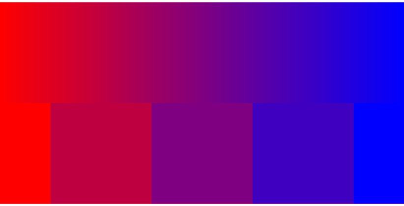
Figure 4-2 demonstrates this relationship by comparing a smooth gradient from red (#F00) to blue (#00F) with the result of layering blue squares overtop of a solid red rectangle, where the squares vary in their fill-opacity values.
Note
It may appear to you as if the squares in Figure 4-2 were also filled with gradients, transitioning in the opposite direction. This is a well-recognized optical illusion. Your eyes and brain enhance the contrast between colors on either side of an edge. When a solid-colored element has different contrasting colors on each side—or a gradient on one side—the contrast enhancement is perceived as a gradient.
To confirm that you really are looking at a solid color, use pieces of paper (all the same color) to cover up the adjacent sections of the figure, until you only see a single, solid-color square.

Figure 4-2. Blending colors with gradients and with opacity; the squares consist of a solid red rectangle underneath blue squares with fill-opacity of 0, 0.25, 0.5, 0.75, and 1
Example 4-2 presents the code used to generate Figure 4-2.
Example 4-2. Using opacity to create blended colors that match gradients
<svgxmlns="http://www.w3.org/2000/svg"xmlns:xlink="http://www.w3.org/1999/xlink"width="400px"height="200px"viewBox="0 0 400 200"xml:lang="en"><title>Blending with opacity and gradients</title><defs><linearGradientid="gradient"><stopoffset="0"stop-color="#F00"/><stopoffset="1"stop-color="#00F"/></linearGradient><rectid="square"width="100"height="100"y="100"/></defs><rectfill="url(#gradient)"width="400"height="100"/><rectfill="#F00"width="400"height="100"y="100"/><gfill="#00F"><usexlink:href="#square"x="-50"fill-opacity="0"/><usexlink:href="#square"x="50"fill-opacity="0.25"/><usexlink:href="#square"x="150"fill-opacity="0.5"/><usexlink:href="#square"x="250"fill-opacity="0.75"/><usexlink:href="#square"x="350"fill-opacity="1"/></g></svg>
Chapter 6 will introduce the <linearGradient> and <stop> elements used in Example 4-2 and describe how they can be adjusted to create different gradient effects. But first, Chapter 5 will explore what it means in SVG to fill one element with a URL reference to another.
Get SVG Colors, Patterns & Gradients now with the O’Reilly learning platform.
O’Reilly members experience books, live events, courses curated by job role, and more from O’Reilly and nearly 200 top publishers.

