Once a coordinate system is established in the <svg> tag, you are ready to begin drawing. This chapter describes the basic shapes you can use to create the major elements of most drawings: lines, rectangles, polygons, circles, and ellipses.
SVG lets you draw a straight line with the <line> element. Just specify the x- and y-coordinates of the line’s endpoints. Coordinates may be specified without units, in which case they are considered to be user coordinates, or with units such as em, in, etc. (as described in Chapter 3, in The Viewport).
<line x1="start-x" y1="start-y"
  x2="end-x" y2="end-y" />
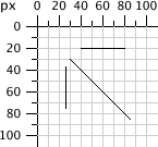
The SVG in Example 4-1 draws several lines; the reference grid in Figure 4-1 is not part of the SVG you see in the example.
Example 4-1. Basic lines
http://oreillymedia.github.io/svg-essentials-examples/ch04/basic-lines.html
<svgwidth="200px"height="200px"viewBox="0 0 200 200"xmlns="http://www.w3.org/2000/svg"><!-- horizontal line --><linex1="40"y1="20"x2="80"y2="20"style="stroke: black;"/><!-- vertical line --><linex1="0.7cm"y1="1cm"x2="0.7cm"y2="2.0cm"style="stroke: black;"/><!-- diagonal line --><linex1="30"y1="30"x2="85"y2="85"style="stroke: black;"/></svg>
Lines are considered to be strokes of a pen that draws on the canvas. The size, color, and style of the pen stroke are part of the line’s presentation. Thus, these characteristics will go into the style attribute.
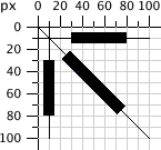
As mentioned in Chapter 3, the canvas grid lines are infinitely thin. Where, then, does a line or stroke fall in relation to the grid line? The answer is that the grid line falls in the center of a stroke. Example 4-2 draws some lines where the stroke width has been set to 10 user coordinates to make the effect obvious. The result, in Figure 4-2, has the grid lines drawn in so you can see the effect clearly.
Example 4-2. Demonstration of stroke-width
http://oreillymedia.github.io/svg-essentials-examples/ch04/stroke-width.html
<svgwidth="200px"height="200px"viewBox="0 0 200 200"xmlns="http://www.w3.org/2000/svg"><!-- horizontal line --><linex1="30"y1="10"x2="80"y2="10"style="stroke-width: 10; stroke: black;"/><!-- vertical line --><linex1="10"y1="30"x2="10"y2="80"style="stroke-width: 10; stroke: black;"/><!-- diagonal line --><linex1="25"y1="25"x2="75"y2="75"style="stroke-width: 10; stroke: black;"/></svg>
Note
The SVG coordinate grid may be infinitely thin, but your computer screen is made of fixed-size pixels. A diagonal line can look jagged as the computer translates it to the nearest pixel blocks; this is known as aliasing. Alternatively, the computer can use anti-aliasing to soften the edges, blurring the line across all pixels it partially overlaps.
Most SVG viewers use anti-aliasing by default, and this can sometimes make a 1-pixel black line look like a 2-pixel gray line, because it is centered on the space between two pixels. You can control the use of anti-aliasing with the CSS shape-rendering style property. Setting this property to crispEdges (on an element or the SVG as a whole) will turn off anti-aliasing, resulting in clear (if sometimes jagged) lines. A value of geometricPrecision will emphasize smooth (if sometimes blurry) edges.
You can specify the stroke color in a variety of ways:
-
One of the basic color keyword names:
aqua,black,blue,fuchsia,gray,green,lime,maroon,navy,olive,purple,red,silver,teal,white, andyellow. You may also use the color keywords from section 4.2 of the SVG specification. -
A six-digit hexadecimal specifier in the form
#, whererrggbbrris the red component,ggis the green component, andbbis the blue component in the range00–ff. -
A three-digit hexadecimal specifier in the form
#, wherergbris the red component,gis the green component, andbis the blue component in the range0–f. This is a shorthand form of the previous method of specifying color. To produce the six-digit equivalent, each digit of the short form is duplicated; thus#d6eis the same as#dd66ee. -
An
rgbspecifier in the formrgb(red-value,green-value,blue-value), where each value is an integer in the range0–255or a percentage in the range0%to100%. -
The
currentColorkeyword, which uses the computed CSScolorproperty for the element. Thecolorproperty—which doesn’t have a direct effect in SVG—is used in HTML to set text color, and is inherited by child elements. UsingcurrentColorin an inline SVG icon (see Inline SVG in XHTML or HTML5) allows the icon to take on the color of the surrounding text.
Example 4-3 uses all of these methods (with the exception of currentColor), giving the colorful results of Figure 4-3.
Example 4-3. Demonstration of stroke color
http://oreillymedia.github.io/svg-essentials-examples/ch04/stroke-color.html
<svgwidth="200px"height="200px"viewBox="0 0 200 200"xmlns="http://www.w3.org/2000/svg"><!-- red --><linex1="10"y1="10"x2="50"y2="10"style="stroke: red; stroke-width: 5;"/><!-- light green --><linex1="10"y1="20"x2="50"y2="20"style="stroke: #9f9; stroke-width: 5;"/><!-- light blue --><linex1="10"y1="30"x2="50"y2="30"style="stroke: #9999ff; stroke-width: 5;"/><!-- medium orange --><linex1="10"y1="40"x2="50"y2="40"style="stroke: rgb(255, 128, 64); stroke-width: 5;"/><!-- deep purple --><linex1="10"y1="50"x2="50"y2="50"style="stroke: rgb(60%, 20%, 60%); stroke-width: 5;"/></svg>
There are yet more ways to specify color. They are taken from the CSS3 Color specification. Although widely supported in web browsers, they are not part of the SVG 1.1 specification, and may not be supported by other SVG implementations; as of this writing, for example, neither Apache Batik nor Inkscape supports them. There are three new color functions and one new keyword:
-
rgba()specifier in the formrgb(red-value,green-value,blue-value,alpha-value), where the color values are in the same format as for thergb()function, and the alpha value is a decimal in the range0–1 -
hsl()specifier in the formhsl(hue,saturation,lightness), where hue is an integer angle from 0 to 360, and saturation and lightness are integers in the range0–255or percentages in the range0%to100% -
hsla()specifier, with the hue, saturation, and lightness values the same as forhsl, and the alpha value the same as forrgba -
transparent(fully transparent); this is the same asrgba(0, 0, 0, 0)
Note
If you do not specify a stroke color, you won’t see any lines; the default value for the stroke property is none.
Up to this point, all the lines in the example have been solid, obscuring anything beneath them. You control the opacity (which is the opposite of transparency) of a line by giving the stroke-opacity a value from 0.0 to 1.0, where 0 is completely transparent and 1 is completely opaque. A value less than 0 will be changed to 0; a value greater than 1 will be changed to 1. Example 4-4 varies the opacity from 0.2 to 1 in steps of 0.2, with the result in Figure 4-4. The red line in the figure lets you see the transparency effect more clearly.
Example 4-4. Demonstration of stroke-opacity
http://oreillymedia.github.io/svg-essentials-examples/ch04/stroke-opacity.html
<svgwidth="200px"height="200px"viewBox="0 0 200 200"xmlns="http://www.w3.org/2000/svg"><linex1="30"y1="0"x2="30"y2="60"style="stroke:red; stroke-width: 5;"/><linex1="10"y1="10"x2="50"y2="10"style="stroke-opacity: 0.2; stroke: black; stroke-width: 5;"/><linex1="10"y1="20"x2="50"y2="20"style="stroke-opacity: 0.4; stroke: black; stroke-width: 5;"/><linex1="10"y1="30"x2="50"y2="30"style="stroke-opacity: 0.6; stroke: black; stroke-width: 5;"/><linex1="10"y1="40"x2="50"y2="40"style="stroke-opacity: 0.8; stroke: black; stroke-width: 5;"/><linex1="10"y1="50"x2="50"y2="50"style="stroke-opacity: 1.0; stroke: black; stroke-width: 5;"/></svg>
If you need dotted or dashed lines, use the stroke-dasharray attribute, whose value consists of a list of numbers, separated by commas or whitespace, specifying dash length and gaps. The list should have an even number of entries, but if you give an odd number of entries, SVG will repeat the list so the total number of entries is even. (See the last instance in Example 4-5.)
Example 4-5. Demonstration of stroke-dasharray
http://oreillymedia.github.io/svg-essentials-examples/ch04/stroke-dasharray.html
<svgwidth="200px"height="200px"viewBox="0 0 200 200"xmlns="http://www.w3.org/2000/svg"><!-- 9-pixel dash, 5-pixel gap --><linex1="10"y1="10"x2="100"y2="10"style="stroke-dasharray: 9, 5;stroke: black; stroke-width: 2;"/><!-- 5-pixel dash, 3-pixel gap, 9-pixel dash, 2-pixel gap --><linex1="10"y1="20"x2="100"y2="20"style="stroke-dasharray: 5, 3, 9, 2;stroke: black; stroke-width: 2;"/><!-- Odd number of entries is duplicated; this is equivalent to:9-pixel dash, 3-pixel gap, 5-pixel dash,9-pixel gap, 3-pixel dash, 5-pixel gap --><linex1="10"y1="30"x2="100"y2="30"style="stroke-dasharray: 9 3 5;stroke: black; stroke-width: 2;"/></svg>
Figure 4-5 shows the results, zoomed in for clarity.
The rectangle is the simplest of the basic shapes. You specify the x- and y-coordinates of the upper-left corner of the rectangle,[6] its width, and its height. The interior of the rectangle is filled with the fill color you specify. If you do not specify a fill color, the interior of the shape is filled with black. The fill color may be specified in any of the ways described in Stroke Color, or it may take the value none to leave the interior unfilled and thus transparent. You may also specify a fill-opacity in the same format as you did for stroke-opacity in stroke-opacity. Both fill and fill-opacity are presentation properties, and they belong in the style attribute.
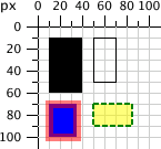
After the interior is filled (if necessary), the outline of the rectangle is drawn with strokes, whose characteristics you may specify as you did for lines. If you do not specify a stroke, the value none is presumed, and no outline is drawn. Example 4-6 draws several variations of the <rect> element. Figure 4-6 shows the result, with a grid for reference.
Example 4-6. Demonstration of the rectangle element
http://oreillymedia.github.io/svg-essentials-examples/ch04/rectangle.html
<svgwidth="200px"height="200px"viewBox="0 0 200 200"xmlns="http://www.w3.org/2000/svg"><!-- black interior, no outline --><rectx="10"y="10"width="30"height="50"/><!-- no interior, black outline --><rectx="50"y="10"width="20"height="40"style="fill: none; stroke: black;"/><!-- blue interior, thick semi-transparent red outline --><rectx="10"y="70"width="25"height="30"style="fill: #0000ff;stroke: red; stroke-width: 7; stroke-opacity: 0.5;"/><!-- semi-transparent yellow interior, dashed green outline --><rectx="50"y="70"width="35"height="20"style="fill: yellow; fill-opacity: 0.5;stroke: green; stroke-width: 2; stroke-dasharray: 5 2"/></svg>
Note
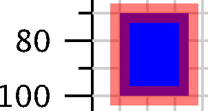
The strokes that form the outline “straddle” the abstract grid lines, so the strokes will be half inside the shape and half outside the shape. Figure 4-7, a close-up of the semi-transparent red outline drawn in Example 4-6, shows this clearly.
If you do not specify a starting x or y value, it is presumed to be 0. If you specify a width or height of 0, then the rectangle is not displayed. It is an error to provide negative values for either width or height.
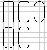
If you wish to have rectangles with rounded corners, specify the x- and y-radius of the corner curvature. The maximum number you may specify for rx (the x-radius) is one-half the width of the rectangle; the maximum value of ry (the y-radius) is one-half the height of the rectangle. If you specify only one of rx or ry, they are presumed to be equal. Example 4-7 shows various combinations of rx and ry.
Example 4-7. Demonstration of rounded rectangles
http://oreillymedia.github.io/svg-essentials-examples/ch04/rounded-rectangles.html
<svgwidth="200px"height="200px"viewBox="0 0 200 200"xmlns="http://www.w3.org/2000/svg"><!-- rx and ry equal, increasing --><rectx="10"y="10"width="20"height="40"rx="2"ry="2"style="stroke: black; fill: none;"/><rectx="40"y="10"width="20"height="40"rx="5"style="stroke: black; fill: none;"/><rectx="70"y="10"width="20"height="40"ry="10"style="stroke: black; fill: none;"/><!-- rx and ry unequal --><rectx="10"y="60"width="20"height="40"rx="10"ry="5"style="stroke: black; fill: none;"/><rectx="40"y="60"width="20"height="40"rx="5"ry="10"style="stroke: black; fill: none;"/></svg>
Figure 4-8 shows the result, with a grid in the background for reference.
Note
If you’re familiar with the CSS border-radius property, you might know the trick of turning a rectangle into a circle or ellipse by setting the corner radius to 50% of the height and width. Although you can specify an SVG rectangle’s corner radius with percent values, they will be interpreted as a percent of the viewport width (rx) or height (ry)—the same as if you used a percentage for setting the rectangle’s width or height—not as a percentage of the rectangle itself. Good thing SVG has an easier way to create circles and ellipses…
To draw a circle, use the <circle> element and specify the center x-coordinate, center y-coordinate, and radius with the cx, cy, and r attributes. As with a rectangle, the default is to fill the circle with black and draw no outline unless you specify some other combination of fill and stroke.
An ellipse needs both an x-radius and a y-radius in addition to a center x- and y-coordinate. The attributes for these radii are named rx and ry.
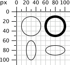
In both circles and ellipses, if the cx or cy is omitted, it is presumed to be 0. If the radius is 0, no shape will be displayed; it is an error to provide a negative radius. Example 4-8 draws some circles and ellipses. They are shown in Figure 4-9.
Example 4-8. Demonstration of circles and ellipses
http://oreillymedia.github.io/svg-essentials-examples/ch04/circles-ellipses.html
<svgwidth="200px"height="200px"viewBox="0 0 200 200"xmlns="http://www.w3.org/2000/svg"><circlecx="30"cy="30"r="20"style="stroke: black; fill: none;"/><circlecx="80"cy="30"r="20"style="stroke-width: 5; stroke: black; fill: none;"/><ellipsecx="30"cy="80"rx="10"ry="20"style="stroke: black; fill: none;"/><ellipsecx="80"cy="80"rx="20"ry="10"style="stroke: black; fill: none;"/></svg>
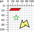
In addition to rectangles, circles, and ellipses, you may want to draw hexagons, octagons, stars, or arbitrary closed shapes. The <polygon> element lets you specify a series of points that describe a geometric area to be filled and outlined as described earlier. The points attribute consists of a series of x- and y-coordinate pairs separated by commas or whitespace. You must give an even number of entries in the series of numbers. You don’t have to return to the starting point; the shape will automatically be closed. Example 4-9 uses the <polygon> element to draw a parallelogram, a star, and an irregular shape.
Example 4-9. Demonstration of the polygon element
http://oreillymedia.github.io/svg-essentials-examples/ch04/polygon.html
<svgwidth="200px"height="200px"viewBox="0 0 200 200"xmlns="http://www.w3.org/2000/svg"><!-- parallelogram --><polygonpoints="15,10 55, 10 45, 20 5, 20"style="fill: red; stroke: black;"/><!-- star --><polygonpoints="35,37.5 37.9,46.1 46.9,46.1 39.7,51.542.3,60.1 35,55 27.7,60.1 30.3,51.523.1,46.1 32.1,46.1"style="fill: #ccffcc; stroke: green;"/><!-- weird shape --><polygonpoints="60 60, 65 72, 80 60, 90 90, 72 80, 72 85, 50 95"style="fill: yellow; fill-opacity: 0.5; stroke: black;stroke-width: 2;"/></svg>
The results, with a grid in the background for reference, are displayed in Figure 4-10.
For the polygons shown so far, it’s been easy to fill the shape. None of the lines forming the polygon cross over one another, so the interior is easily distinguished from the exterior of the shape. However, when lines cross over one another, the determination of what is inside the polygon is not as easy. The SVG in Example 4-10 draws such a polygon. In Figure 4-11, is the middle section of the star considered to be inside or outside?
Example 4-10. Unfilled polygon with intersecting lines
<svgwidth="200px"height="200px"viewBox="0 0 200 200"xmlns="http://www.w3.org/2000/svg"><polygonpoints="48,16 16,96 96,48 0,48 80,96"style="stroke: black; fill: none;"/></svg>
SVG has two different rules for determining whether a point is inside a polygon or outside it. The fill-rule (which is part of presentation) has a value of either nonzero (the default) or evenodd. Depending on the rule you choose, you get a different effect. Example 4-11 uses the rules to fill two diagrams of the star. The result is shown in Figure 4-12.
Example 4-11. Effect of different fill-rules
http://oreillymedia.github.io/svg-essentials-examples/ch04/polygon-fill.html
<svgwidth="200px"height="200px"viewBox="0 0 200 200"xmlns="http://www.w3.org/2000/svg"><polygonstyle="fill-rule: nonzero; fill: yellow; stroke: black;"points="48,16 16,96 96,48 0,48 80,96"/><polygonstyle="fill-rule: evenodd; fill: #00ff00; stroke: black;"points="148,16 116,96 196,48 100,48 180,96"/></svg>
Finally, to round out our discussion of basic shapes, we’ll return to straight lines. Sometimes you want a series of lines that does not make a closed shape. You can use multiple <line> elements, but if there are many lines, it might be easier to use the <polyline> element. It has the same points attributes as <polygon>, except that the shape is not closed. Example 4-12 draws the symbol for an electrical resistor. The result is in Figure 4-13.
Example 4-12. The polyline element
http://oreillymedia.github.io/svg-essentials-examples/ch04/polyline.html
<svgwidth="100px"height="50px"viewBox="0 0 100 50"xmlns="http://www.w3.org/2000/svg"><polylinepoints="5 20, 20 20, 25 10, 35 30, 45 10,55 30, 65 10, 75 30, 80 20, 95 20"style="stroke: black; stroke-width: 3; fill: none;"/></svg>
Warning
It’s best to set the fill property to none when using <polyline>; otherwise, the SVG viewer attempts to fill the shape, sometimes with startling results like those in Figure 4-14.
When drawing a <line> or <polyline>, you may specify the shape of the endpoints of the lines by setting the stroke-linecap style property to one of the values butt, round, or square. Example 4-13 uses these three values, with gray guide lines to show the actual endpoints of the lines. You can see in Figure 4-15 that round and square extend beyond the end coordinates; butt, the default, ends exactly at the specified endpoint.
Example 4-13. Values of the stroke-linecap property
http://oreillymedia.github.io/svg-essentials-examples/ch04/linecap.html
<linex1="10"y1="15"x2="50"y2="15"style="stroke: black; stroke-linecap: butt; stroke-width: 15;"/><linex1="10"y1="45"x2="50"y2="45"style="stroke: black; stroke-linecap: round; stroke-width: 15;"/><linex1="10"y1="75"x2="50"y2="75"style="stroke: black; stroke-linecap: square; stroke-width: 15;"/><!-- guide lines --><linex1="10"y1="0"x2="10"y2="100"style="stroke: #999;"/><linex1="50"y1="0"x2="50"y2="100"style="stroke: #999;"/>
You may specify the way lines connect at the corners of a shape with the stroke-linejoin style property, which may have the values miter (pointed), round (round—what did you expect?), or bevel (flat). Example 4-14 produces the result shown in Figure 4-16.
Example 4-14. Values of the stroke-linejoin attribute
http://oreillymedia.github.io/svg-essentials-examples/ch04/linejoin.html
<polylinestyle="stroke-linejoin: miter; stroke: black; stroke-width: 12;fill: none;"points="30 30, 45 15, 60 30"/><polylinestyle="stroke-linejoin: round; stroke: black; stroke-width: 12;fill: none;"points="90 30, 105 15, 120 30"/><polylinestyle="stroke-linejoin: bevel; stroke-width: 12; stroke: black;fill: none;"points="150 30, 165 15, 180 30"/>
The following tables summarize the basic shapes and presentation styles in SVG.
Table 4-1 summarizes the basic shapes available in SVG.
Table 4-1. Shape elements
| Shape | Description |
|---|---|
| Draws a line from the starting point at coordinates ( |
| Draws a rectangle whose upper-left corner is at ( |
| Draws a circle with the given |
| Draws an ellipse with the given |
| Draws an arbitrary closed polygon whose outline is described by the |
| Draws an arbitrary series of connected lines as described by the |
When you specify a number for an attribute, it is presumed to be measured in user coordinates. In all but the last two elements of Table 4-1, you may also add a length unit specifier such as mm, pt, etc. to any number. For example:
<linex1="1cm"y1="30"x2="50"y2="10pt"/>
You may specify the color for filling or outlining a shape in one of the following ways:
-
none, indicating that no outline is to be drawn or that the shape is not to be filled. -
A basic color name, which is one of
aqua,black,blue,fuchsia,gray,green,lime,maroon,navy,olive,purple,red,silver,teal,white, oryellow. - One of the extended color names from the SVG specifications.
-
Six hexadecimal digits
#, each pair describing red, green, and blue values.rrggbb -
Three hexadecimal digits
#, describing the red, green, and blue values. This is shorthand for the previous method; digits are replicated, sorgb#is equivalent torgb#.rrggbb -
rgb(r,g,b), each value ranging from 0–255 or from 0% to 100%. -
currentColor, the computed (usually inherited)colorproperty value for the element. - One of the specifications from the CSS3 Color module (which may not be supported by all SVG implementations).
In order to see a line or the outline of a shape, you must specify the stroke characteristics, using the following attributes. A shape’s outline is drawn after its interior is filled. All of these characteristics, summarized in Table 4-2, are presentation properties, and go in a style attribute.
Table 4-2. Stroke characteristics
| Attribute | Values |
|---|---|
| The stroke color, as described in Specifying Colors. Default is |
| Width of stroke; may be given as user coordinates or with a length specifier. The stroke width is centered along the abstract grid lines. Default is |
| A number ranging from 0.0 to 1.0; 0.0 is entirely transparent; 1.0 is entirely opaque (the default). |
| A series of numbers that tell the length of dashes and gaps with which a line is to be drawn. These numbers are in user coordinates only. The default value is |
| Shape of the ends of a line; has one of the values |
| The shape of the corners of a polygon or series of lines; has one of the values |
| Maximum ratio of length of the miter point to the width of the lines being drawn; the default value is 4. |
You can control the way in which the interior of a shape is to be filled by using one of the fill attributes shown in Table 4-3. A shape is filled before its outline is drawn.
Table 4-3. Fill characteristics
| Attribute | Values |
|---|---|
| The fill color, as described in Specifying Colors. The default is |
A number ranging from 0.0 to 1.0; 0.0 is entirely transparent; 1.0 (the default) is entirely opaque. | |
| This attribute can have the values |
This is only a small sample of the style properties that can apply to SVG elements; Table B-1, in Appendix B, has a complete list.
[6] Technically, the x value is the smaller of the x-coordinate values, and the y is the smaller of the y-coordinate values of the rectangle’s sides in the current user coordinate system. Because you are not yet using transformations, which are covered in Chapter 6, this is the moral equivalent of the upper-left corner.
Get SVG Essentials, 2nd Edition now with the O’Reilly learning platform.
O’Reilly members experience books, live events, courses curated by job role, and more from O’Reilly and nearly 200 top publishers.
