Chapter 4. Graphical User Interfaces
The graphical user interface (GUI) is one of the defining features of modern computers. No personal computer sold to consumers these days lacks a GUI, and the only time people work with a machine that doesn’t present information graphically is when they’re working with a server, supercomputer, or other specialized tool. Displaying a graphical interface to your user is fundamental to developing with Cocoa, and understanding both how to design an appealing and usable GUI and how to implement that GUI are critical skills for Cocoa developers.
This chapter covers the user interface system available in Cocoa and Cocoa Touch, in addition to implementing a UI. You’ll also learn about Core Animation, the animation system on both OS X and iOS. Designing a usable and pleasant UI is a huge topic that wouldn’t fit in this chapter (let alone in this book!), so if you’re interested in learning how to make a great user interface, take a look at Tapworthy by Josh Clark (O’Reilly).
Interfaces in OS X and iOS
While both iOS and OS X devices use a screen to present their interfaces, there are distinct differences in how they accept user input and in how they display output back to the user.
On OS X, the top-level object is the window. Windows contain controls, such as buttons, labels, and text fields, and can be moved around the screen to suit the user. More than one window is displayed on the screen at a time. Some windows can be resized, which means that windows need to know how to present their layout when the window grows larger or smaller. Finally, some windows can take up the entire screen; this feature has become increasingly common in OS X since the introduction of OS X 10.7 (Lion), which added a standard way for windows to become fullscreen and for more than one window to be fullscreen at once.
iOS also deals with windows, but presents them in a different way. In iOS, the user only deals with one screenful of content at a time. Each screen is managed by an object called a view controller, which manages the presentation of screen-sized views. View controllers are embedded into the application’s window, and there is only one window displayed on the screen at any one time. Almost every application on iOS only ever has one window. Some exceptions include applications that display content on multiple screens (such as when the device is connected to a television); in these cases, each screen has a window.
As mentioned in OS X Applications, applications load their user interfaces from files called nib files. Nib files take their name from an acronym that dates back to the days when Cocoa was being designed by NeXT, the company that Steve Jobs founded after leaving Apple in the late 1980s. NIB stands for “NeXT Interface Builder,” the name of the program that designed the interfaces.
Interface Builder continued to be distributed as a separate application as part of the developer tools until the release of Xcode 4, at which point it was embedded in Xcode.
MVC and Application Design
In Chapter 3, we discussed how the model-view-controller paradigm shapes a lot of the design decisions in Cocoa. To recap, the MVC design pattern divides the responsibilities of an app into three categories: the model, which handles data storage; the view, which presents the user interface and accepts input such as mouse movement or touches on the screen; and the controller, which mediates between the view and the model and provides the main operating logic for the application.
The Interface Builder in Xcode deals exclusively with views. The rest of Xcode handles the model and controller parts of your application, allowing you to concentrate on building the interface in relative isolation.
Nib Files and Storyboards
At the broadest level, nib files contain objects, and a storyboard is an organized grouping of interlinked nib files. In almost all cases, nib files and storyboards contain only interfaces, but it’s possible to (mis)use nib files as a generic container for objects.
Note
Nib files have the extension .nib or .xib. An .xib file is a nib file that’s stored in an XML-based format. Unless you are working with legacy code, you will rarely see .nib files anymore. Regardless of the file extension, they’re referred to as “nibs.”
Nib files work by “freeze-drying” (Apple’s terminology) objects and storing them in a serialized form inside the file. All of the properties of the objects (e.g., in the case of a button, its position, label text, and other information) are stored in the nib file. When an application needs to display a window, it loads the nib file, “rehydrates” the stored objects, and presents them to the user.
Effectively, views and screens assembled in Interface Builder are the exact same objects that appear on screen in your software.
Because nib files simply contain objects, they can also contain objects that are instances of your own class. You can therefore create an instance of a class that is created when a nib is loaded, and connect it to your views.
On their own, views aren’t terribly useful unless you want to create an application that does nothing more than present some buttons that can be clicked on or a text field that does nothing with the text that is entered. If you want to create an application that actually responds to user input, you must connect the views to your controllers (i.e., your application code).
The Interface Builder provides two ways to connect views to code: outlets and actions. We will discuss both in more detail later in this chapter.
Structure of a Nib File
Nib files contain a tree structure of objects. This tree can have many roots—for example, a nib file could contain two windows, each with its own collection of buttons and controls. These objects at the top level of the tree are known as “top-level objects.”
Top-level objects are usually the visible things that are presented to users—windows on OS X and view controllers on iOS. However, any object can be a top-level object in a nib.
On OS X, anything that’s shown on screen is placed in a window. There are many different kinds of windows available in the Interface Builder:
- Standard windows
- The common, garden-variety windows shown on the screen. They have a full-size title bar, and are usually the primary window for an application.
- Panel windows
- These have a reduced-height title bar and are usually hidden when the application is not active. “Inspector” windows and other accessory windows usually use panels.
- Textured windows
- Identical to standard windows, but have a different background color. These have changed quite a bit over the years; they’ve been pin-striped, brushed-metal, a plain gradient, and now a simple, dark gray background (as of OS X 10.10).
- HUD (heads-up display)
- These windows are dark gray, translucent, and designed to show information about something that’s currently selected or to contain auxiliary controls for your applications. These are most often seen in media applications like QuickTime, Logic, and Final Cut.
Windows can contain any view at all. For more information on views, see Chapter 6.
On iOS, as previously mentioned, there is only one window on the screen at any one time. In contrast to OS X, this window stays on the screen for as long as the app is in the foreground, and replaces its contents when the user moves from one screen of content to the next.
In order to manage the various screens of content, iOS uses a category of object called a view controller. View controllers are classes that manage a single view as well as its subviews. We’ll discuss them in more detail later in this chapter, but for practical purposes, you can think of view controllers as a screen’s worth of content.
Note
View controllers also exist on OS X, but their role is less important, as multiple windows can be shown on the screen at once.
Much like OS X’s windows, view controllers on iOS come in a variety of different flavors. These variations are more functionally different than the styles of windows on OS X, which are primarily cosmetic. On iOS, the different categories of view controllers define the structure and behavior of the application and each kind of view controller is designed for a different style of presenting information to the user:
- Standard view controllers
- These present a view, and nothing more. It is most often subclassed to add logic to the screen—in fact, being subclassed is the primary purpose of this view controller.
- Navigation controllers
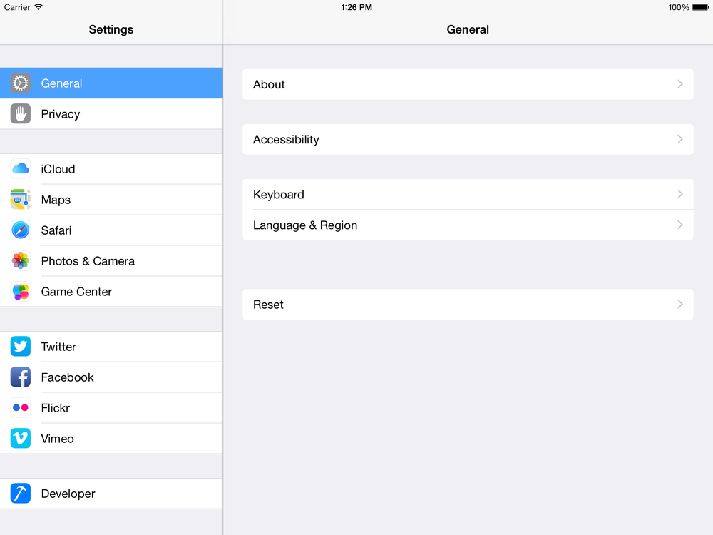
- These present a stack of view controllers, onto which the application can push additional view controllers. When a new view controller is pushed onto the stack, the navigation controller animates the view controller’s view into being visible with a sideways scrolling motion. When the navigation controller is instructed to pop a view controller from the stack, the view animates off with a reverse sliding motion. A good example of this type of view controller is the Settings application.
- Table view controllers
- These present a list of cells that can be individually configured, stylized, ordered, and grouped. Despite being named a table view controller, it only shows a single column of cells. Table view controllers are used to display a list of items, and are often used in conjunction with a navigation controller to list the available views to the user (an example of this is in the Settings app on the iPhone). They’re also seen in the Phone app, where the screens with Favorites, Recents, Contacts, and Voicemail all use table view controllers.
- Tab bar controllers
- These present a set of view controllers, selectable through a tab bar at the bottom of the screen. When a button on the tab bar is tapped by the user, the tab bar controller hides the currently shown view controller and displays another. An example of this style of interface is the Music application. Tab bar controllers are best for presenting multiple ways of viewing the application interface. For example, the App Store is all about finding and purchasing applications, and the tabs presented to the user are simply different views of the same information. Other applications may have more specific angles of presenting the key info that the app is designed around. For example, a chat application could use a tab bar that shows three different tabs: one that shows the list of contacts, one that shows the list of active chats, and one that shows information about the user’s profile.
- Split view controllers
- These present a side-by-side parent and child view structure, allowing you to see an overview in the parent view and detailed information in the child view. Prior to iOS 8, split view controllers were only available on iPads, as the side-by-side nature generally does not work particularly well on iPhones. Now in iOS 8, when you use a split view controller, the system determines what appearance the controller will take; based on the available space, it will either show the views side by side, hide the parent view when viewing the child, or present the parent as an overlay. An example of the split view controller is in the Settings app on an iPad.
- Page controllers
- These present view controllers in a “page-turning” interface, similar to the iBooks application on the iPad and iPhone. Each “page” in the book is a view controller, and the user can drag a finger across the screen to turn the page. These are best used when creating a book or magazine-style application where there is a need to present sequential information.
- GLKit controllers
- These allow you to present 3D graphics to the user using OpenGL. These are a particularly specialized kind of view controller and we won’t be discussing them here—the topic of OpenGL graphics is way outside the scope of a book about Cocoa.
- Collection view controllers
- These present a customizable and configurable grid of views in a manner similar to a table view controller but with flexible items instead of individual cells. An example of this is the Photos app on the iPhone.
- AVKit player view controllers
- These present a full screen video player and are designed, obviously, for playing video content. For more on how to play video and audio, see AVKit.
Windows and view controllers are simply containers that present controls to the user. Controls are the visible items on the screen that the user interacts with: buttons, text fields, sliders, and so forth. To build an interface in Xcode, you drag and drop the controls you want from the object library in the Utilities pane onto the window or view controller. You can then reposition or resize the control.
Note
View controllers can contain other view controllers on iOS. For example, a navigation controller is a view controller that manages the appearance of the navigation bar at the top of the screen, as well as one or more additional view controllers.
View controller containment can be a complex topic. For more information, see “View Controller Basics” in the View Controller Programming Guide for iOS in the Xcode developer documentation.
Storyboards
Originally introduced in iOS 5, storyboards are now the default way of creating your iOS UI in Interface Builder. When you create a new iOS application in Xcode, there will be a Main.storyboard created automatically for you to use in place of a nib. Starting with OS X 10.10, you can now use storyboards for your Mac apps as well. Nibs are still common for OS X apps, because you often don’t need to manage and chain together multiple windows in a Mac app.
In a nutshell, a storyboard is a collection of view controllers all linked together via segues. It is easy enough to think of a storyboard as a collection of nibs inside a single file. They are composed of the same elements and are interpreted by the system and Xcode in the same way. The only significant difference is that a nib generally contains a single view controller whereas a storyboard contains multiple view controllers (although it can only contain one if you want).
One of the nicest features of storyboards are segues, which can be thought of as a link between two view controllers that allows you to transition, or segue, between view controllers without any code. Creating a segue is straightforward. Any element inside a view controller that can perform an action (see Outlets and Actions) can have its action turned into a segue. Simply Control-drag from the element inside the first view controller onto the second view controller and an appropriate segue will be created.
Once a segue has been created in the Interface Builder, it can also be triggered programatically through its identifier. If you select a segue and select the attribute inspector, you can set an identifier for that segue. Your view controller can then use the performSegueWithIdentifier(_, sender:) method to force that segue to run. Shortly before the segue occurs, your view controller’s prepareForSegue(_, sender:) method will be called giving you a chance for final preparations before you transition into the next view controller.
Outlets and Actions
Objects can exist in isolation, but this means that they don’t participate in the application as a whole. A button can look very pretty, but unless it triggers some kind of action when clicked, it won’t do anything but look pretty.
In most cases, an object in an application needs to work with other objects in order to do something useful. For example, a table view, which displays information in a list or grid, needs to be able to contact another object in order to ask it what information should be displayed. The table view does not store the information itself—to do so would violate the model-view-controller pattern. Views should not know anything about the data they are presenting; they should ask their controller about it.
Another kind of relationship is the one between a button and the application—when a button is pressed or tapped, the application should be informed of it and then run code as a response. If there are multiple buttons on the screen, which is common, the application should know which code to run when a particular button is tapped.
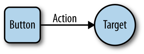
In Cocoa, this kind of relationship is known as a target–action relationship. When you add a button to a window or view controller, you can specify two things: what object should be contacted when the button is clicked or tapped, and what message the object should receive when this happens. The object that is contacted is known as the target, and the message that is sent is called the action. This is shown in Figure 4-1.
To allow these relationships between objects to be set up, Xcode allows you to make connections between objects in the interface. There are two kinds of connections:
- Outlets are relationships in which one object “plugs in” to another to communicate. An example is the table view that needs to contact another object to know what data to display.
- Actions are relationships that describe what method another object should run when an event occurs.
These connections are defined in the nib file, and are used when reconstructing the objects as the nib file loads.
How Nib Files and Storyboards Are Loaded
When a nib file is loaded, usually as part of application startup, every object it contains is re-created based on information stored in the nib: its class, position, label, size, and all its other relevant properties.
Once all objects exist in memory, every outlet defined in the nib file is connected. A nib file effectively describes a source object, a destination object, and the name of a property on the destination object. To connect the objects together, then, the nib file loading process sets the value of the destination object’s property to the source object.
After all outlets are connected, every single object that was loaded receives the awakeFromNib() message. By the time this method is called, every outlet has been connected, and all relationships between the objects have been reestablished.
Actions are a slightly different matter. An action is represented as a target object and an action message that is sent to that object. When a button is clicked, for example, it sends the action message to the target object.
Outlets and actions are independent of each other. Having an outlet connection doesn’t imply that an action is sent, and vice versa. If you want to receive a message from a button and also have a variable that points to that button, you’ll need both an outlet and an action.
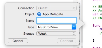
The process for creating actions and outlets is the same for both: you make sure that you have the code for your view controller open in the assistant, and then hold down the Control key on your keyboard and drag from the view into your code. Once you do that, a dialog box will appear that lets you choose what the connection should be called, and whether the connection should be an outlet or an action. The dialog box is shown in Figure 4-2.
Warning
It’s very easy to accidentally create an outlet when you meant to create an action, and vice versa. If you do this, you need to both remove the line of code that the connection creation box inserts, and remove the connection itself from your interface. If you delete just the code, the connection itself remains—and your app may crash on launch, because the relevant property no longer exists.
Deleting the code is straightforward: simply remove it from your source code.
Removing the offending connection is slightly more complex. First, you need to go into your interface file and select the view that you accidentally added the connection for. Then go to the Connections Inspector, which is at the far right, and locate the connection you want to remove. Click the x that appears next to it, and you’re done.
If your app is crashing on launch, and the console mentions something about not being key-value coding compliant, you probably have this issue. Check to make sure that all of your connections are valid!
Constructing an Interface
All interfaces in the Interface Builder are built by dragging components out of the object library and into a container. For windows, and view controllers that have no container, you just drag them out into the canvas.
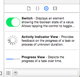
The objects library, shown in Figure 4-3, is in the lower-right corner of the Xcode window. It lists every single object that can be dragged into an interface file—windows, controls, and hidden objects like view controllers are all available. If you are building an OS X interface, Mac controls appear; if you are building an iOS interface, iOS controls appear.
You can filter the list by typing in the text field at the bottom of the list. This filter searches for the name of the object as well as its class name, so you can search for “NSButton” as well as just “button.” If you know exactly what you’re searching for, searching by class name is often faster—over time, you’ll come to recognize objects by class name and start thinking in those terms.
Guidelines and Constraints
Cocoa tries to keep your views and windows laid out nicely. When you drag a button into a view, for example, Cocoa will offer guides as to where the button can be placed based on Apple’s UI recommendations. If you drag in a button and place it next to another button, Cocoa will help you line them up and place the right amount of space between them. The same applies to resizing views—the Interface Builder will try to dissuade you from creating a layout that doesn’t match up to Cocoa’s standard sizes and margins.
The relationships between a view, its container view, and the other views around it are preserved in the form of constraints. You can view the constraints on an object by clicking on it and noting the blue lines that extend from it to other views or to the container view’s edges.
Prior to the release of Xcode 5, constraints were quite tricky to get correct, and very easy to do incorrectly, leading to a variety of bizarre appearances and layouts in your application. With the introduction of Xcode 5, however, constraints have changed. Now when an object is added to a view, it has no visible constraints and Xcode will invisibly create constraints to glue that object at the exact position and size you placed it, because most objects won’t need to move or resize. This lets you ignore most objects and focus on adding constraints only for the ones that actually need them.
Note
Constraints are a new system of laying out a user interface, available from OS X 10.7 Lion and iOS 6 onwards. They replace an earlier model called springs and struts, sometimes referred to as autosizing masks. For more information on this older system, see “Repositioning and Resizing Views” in the View Programming Guide, included in the Xcode developer documentation.
A constraint defines a relationship between a property of a view, like its height or the position of its left edge, and a property of another view. This means that you can define constraints like this:
The left position of the Add button is equal to the left position of the table view above it.
You can also create constraints that are based on constant values:
The width of the Delete button is equal to 50 screen points.
Constraints can work together. If you have multiple constraints on a view, or constraints that affect multiple views, the layout system will attempt to resolve them simultaneously:
The width of the Delete button is equal to 50 screen points, and its left edge is equal to 10 screen points from the right edge of the Add button.
Constraints allow you to create simple rules that define the position and size of all the views on your screen. When the window that contains those views resizes, the layout system will update to satisfy all of the constraints.
You can add your own constraints, called user constraints, via the constraints menu in the lower right of the Interface Builder (Figure 4-4) or through the Editor menu.
The constraints menu has four parts:
- Align defines how different views should line up relative to one another.
- Pin defines width, height, and spacing.
- Resolve Auto Layout Issues provides some solutions to common constraint issues.
- Resizing Behavior defines how constraints should be applied when resizing views.
Building an App with Nibs and Constraints
To demonstrate how to work with nibs and constraints, let’s build a simple interface that makes use of different kinds of constraints. This application won’t have any code—we’ll only be looking at the constraint system. In this example we will be making an OS X application, but constraints work exactly the same way in iOS.
This interface will be for an application that lists a bunch of text documents and provides a text field for editing that text. We’ll also include some buttons to add, remove, and publish these documents. Let’s jump right in:
-
Create a new Cocoa application and name it
Constraints. - Open the interface file (i.e., MainMenu.xib) and select the window in the Outline pane to make it appear.
Add the UI elements. Start by dragging an
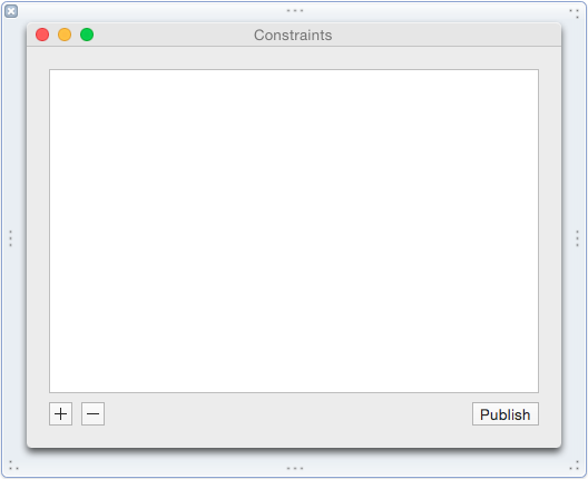
NSTextViewinto the window and placing it to take up most of the space in the window.Drag in three gradient buttons: place two beneath the lefthand side of the table side by side, and the other on the bottom lefthand side.
Customize the UI elements. Select the button at the bottom left, and open the Attributes Inspector. Set the button’s Title to nothing (i.e., select all the text and delete it). Then change the Image of the button to
NSAddTemplate, which will make the button contain a plus image.Do the same for the button immediately to the right, but set the image to
NSRemoveTemplate.Finally, select the button in the lower right of the window, and set its Title to Publish.
When you’re done, the window should look like Figure 4-5.
If you resize the window, the screen’s carefully constructed layout breaks, and it looks ugly. So we’re going to add constraints that make the layout look good at any size:
First, we’ll add constraints to the text view. We want the text view to resize properly when the window is resized. For now, we want the view to resize to however large or small we make the window.
Select the text view and click the Pin button, which is the second button inside the constraints menu. A small window will pop up with a bunch of different controls and options. To pin the position, select the small dotted red spacers for the Top, Right, and Left distance positions and leave the default values.
Now when you select the text view, you will see small blue lines jutting out from it to the borders of the window (these are the constraints we just added). You can select them like any other element in Interface Builder.
Next, we’ll add constraints to the + and - button.
We want the + and - buttons to remain pinned to the bottom left of the screen and to keep their distance from the table view. Select the + button and click the Pin button. Select the spacers for the Left, Right, Top, and Bottom distance positions, with the default values. Also check the Width and Height boxes to force the button to remain its current size.
Select the - button and click the Pin button. Select the spacers for the Left and Bottom distance positions, again leaving the default values.
Now select both the + and - buttons and click on the Pin button. Select Equal Widths and Equal Heights.
Now both the + and - button are pinned to the lower-left corner, and they also maintain the current sizes and distances away from each other and the table view.
Finally, add constraints to the Publish button. We want the Publish button to be aligned with the right edge of the window and to maintain its spacing to the table view and the window edge.
Select the Publish button and click the Pin button. Select the spacers for the Top, Bottom, and Right distance positions and also check the Height and Width to force it to remain its current size.
Now if you run the app, the table will resize and all elements will maintain their correct spacing. However, the app will also let you make the window so small that our careful layout won’t look all that nice, so we need to stop the window from going too small. There are a variety of ways we could do this; we could set the width and height of the text view to have a minimum size, or we could set the distance between other elements to have a mimimum distance from each other:
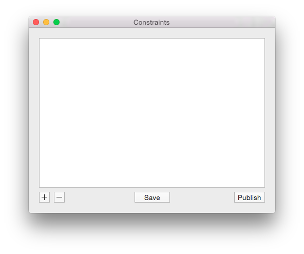
- Add a new button into the window, center it horizontally, and position it vertically in line with the other three buttons. Finally, set the button’s title to Save.
- Now we want this button to always be horizontally centered, which means that we need to add a constraint for it. Select the new button and open the Align constraints menu, using the first button in the constraints list, and select Horizontal Center in Container.
- Select the Save button, open the Pin menu, and set the Width and Height to be the default values. Now our button has a size and a horizontal position.
- Select the Save button, open the Pin menu, and set the Top distance position.
- Now we can use this new button to restrict the size of the window. Select the button, click the Pin button, and select the spacers for the Left and Right positions, with the default values.
- Select the Right distance spacer, and open the Attributes Inspector. Set the Relation of the spacer to be Greater Than or Equal.
Now we have a resizable window that has an effective minimum width, but not height. To do this, select the text view, open the Pin menu, and select Height, with the default values. Again, like with the distance spacers, select the Height constraint, open the Attributes Inspector and set the Relation to be Greater Than or Equal.
The window will now resize correctly while preserving the layout and correct dimensions: the + and = buttons pinned to the left, the Publish button to the right, and the Save button always dead center (see Figure 4-6).
Note
You can also add constraints to UI elements in other ways. In the Xcode menu bar, under the Editor menu, there are options to add and remove constraints. You can also add constraints by selecting a UI element, holding down the Control key, and dragging to another UI element you want the constraint to be relative to. So to get our + and - buttons to have equal width and height, we could have instead selected the - button and Control-dragged onto the + button. A small constraints menu will pop up allowing us to select Equal Width and Equal Height from there. This menu is context sensitive and will change depending on what elements you select and in which direction you drag.
Interfaces on iOS
When you design interfaces on iOS, you use the exact same interface building tools as you do on OS X: you drag and drop items into a canvas, add constraints to define their size and position, and connect them to your code.
In iOS, however, you need to take into account the fact that there are several different kinds of iOS device. The various iPhones and iPads are all different shapes and sizes, and it’s often not feasible to create a whole new interface for each different one. This is made even more complex when you consider that iOS devices can be held in both portrait and landscape modes. Taking all this into account, you could be looking at close to a dozen different interfaces to design.
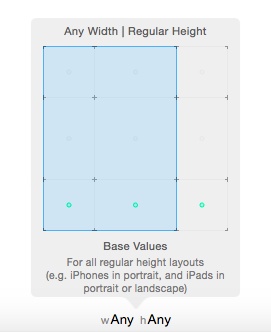
To address this, the interface builder in Xcode has a concept called size classes. Size classes describe, in very general terms, whether the width and height of the current device’s orientation is either regular sized or compact sized. For example:
- On an iPhone 5S and 6 in portrait orientation, the height is regular, and the width is compact.
- On an iPhone 5S and 6 in landscape orientation, both the height and width are compact.
- On an iPhone 6 Plus in landscape orientation, the height is compact, and the width is regular.
- On an iPad, the width and height are both regular.
When you design your interfaces, you can specify whether a view should appear in all size classes, or in only some. You can also specify whether a certain constraint should only appear when running under certain size classes.
Note
If a view controller is entirely filling the screen, it uses the screen’s size classes. For example, a view controller that fills an entire iPad screen has regular width and regular height.
However, a view controller might be presented in another view controller, which might alter its size class. For example, the split view controller presents two view controllers, side by side—one narrow and one wide. You can see an example in Figure 4-7. In a split view controller on an iPad, the view controller on the left uses a compact width and regular height, while the view controller on the right uses a regular width and regular height.
Designing with size classes is surprisingly straightforward. At the bottom of the screen, you select which size class you want to view the interface in (Figure 4-8). By default, this is set to “Any” for both width and height, which means that views and constraints that you add will appear in any width and height configuration. In practical terms, this means that they’ll appear on both the iPhone and the iPad, and in both orientations.
If you change this setting, however, any views and constraints that you add will only apply in the size class that you’ve selected. If you change the size class to “compact” for the height, for example, views and constraints that you add will only appear when the height of the size class is compact.
Launch Screen Files
When an application starts up, the first thing that iOS does is display a launch image. This image is the thing that you see as you transition from the home screen into an app. While you look at the launch image, the application is busily starting itself up, and getting ready to present itself to the user; once it’s loaded, the launch image goes away, and you start looking at the application itself.
The purpose of the launch image is to create an impression that the app is launching faster than it actually is. Launch images aren’t meant to be “splash images” (i.e., images that contain a big logo and company name, as is the case in some desktop apps like Photoshop). Instead, launch images should present a partial view of the loaded application—all of the toolbars and general shapes should be present, but nothing that looks like a button you can tap on. Once the app loads, the user sees the launch image replaced with buttons and controls that can actually be tapped.
Prior to iOS 8, you had to generate your own images for each of the possible resolutions that your app could be presented as, which could get laborious. Now, however, you use a launch screen file—a XIB file, instead of pictures.
When you create a new project, you get a launch screen file as part of the initial set of files that Xcode creates for you. It’s named LaunchScreen.xib; if you open it, you can begin designing the view that appears on launch.
UI Dynamics
UI Dynamics are a new part of UIKit that provides physics-related capabilities and animations to views in iOS, which lets you impart forces and physical properties to views, allowing you to make your views bounce, swing, be affected by gravity, and more. This might seem a little silly and gimmicky at first glance, but creating interfaces with natural feeling elements and movements makes your users more willing to use your app long term.
The workhorse of UI Dynamics is the UIDynamicAnimator class, which is responsible for actually animating the dynamic behavior. You pass multiple UIDynamicBehavior objects to the animator that describe how you want the animation to play out. You can create your own custom behaviors, but luckily for us, Apple has included some useful prebuilt ones you can use.
UI and Gravity
To demonstrate some of the capabilities of UI Dynamics, let’s build a simple app with some gravity applied to the views:
- Create a new single view iPhone application and call it DynamicGravity.
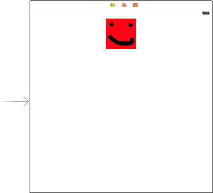
Next, create the interface. Open Main.storyboard and add an image view to the interface. Insert an image.
When you are done, the interface should look like Figure 4-9.
-
Then create the image views outlet. Open ViewController.swift in the assistant. Control-drag from the image view to the view controller, and name the outlet
imageView. Finally, implement the dynamic behavior. Replace ViewController.swift with the following:
importUIKitclassViewController:UIViewController{@IBOutletweakvarimageView:UIImageView!vardynamicAnimator=UIDynamicAnimator()overridefuncviewDidAppear(animated:Bool){super.viewDidAppear(animated)dynamicAnimator=UIDynamicAnimator(referenceView:self.view)// creating and adding a gravity behaviorletgravityBehavior=UIGravityBehavior(items:[self.imageView])dynamicAnimator.addBehavior(gravityBehavior)// creating and adding a collision behaviorletcollisionBehavior=UICollisionBehavior(items:[self.imageView])collisionBehavior.translatesReferenceBoundsIntoBoundary=truedynamicAnimator.addBehavior(collisionBehavior)}}
If you run the app, you should see the image drop down and hit the bounds of the screen.
Snapping UI
Gravity is pretty awesome, but it isn’t that often that we want our views to fall from the virtual sky. However, there are many situations where we want UI elements to move around with a bit of physical momentum without having to manually animate that movement. To quickly show this off, let’s create another iPhone app to demonstrate:
- Create a new single view iPhone application, and call it DynamicSnap.
Next, create the interface. Open Main.storyboard and add an image view into the interface. Then add an image to that view.
When you are done, the interface should look similar to Figure 4-9.
-
Then create the image views outlet. Open ViewController.swift in the assistant. Control-drag from the image view to the view controller, and name the outlet
imageView. -
At this point, create a tap recognizer. Open Main.storyboard and drag in a Tap Gesture Recognizer. Open ViewController.swift in the assistant, Control-drag from the tap recognizer to the view controller, select Action from the menu, and name the action
tapped. Finally, implement the snapping dynamic. Replace ViewController.swift with the following:
importUIKitclassViewController:UIViewController{@IBOutletweakvarimageView:UIImageView!vardynamicAnimator:UIDynamicAnimator?varsnap:UISnapBehavior?overridefuncviewDidLoad(){super.viewDidLoad()self.dynamicAnimator=UIDynamicAnimator(referenceView:self.view)}@IBActionfunctapped(sender:AnyObject){// getting the tap locationlettap=senderasUITapGestureRecognizerletpoint=tap.locationInView(self.view)// removing the previous snapping and adding the new oneself.dynamicAnimator?.removeBehavior(self.snap)self.snap=UISnapBehavior(item:self.imageView,snapToPoint:point)self.dynamicAnimator?.addBehavior(self.snap)}}
Run the app and the little image will dynamically move around to wherever you tap.
Core Animation
At its most basic Core Animation level, a view is a picture drawn in a rectangle, which is then displayed to the user alongside other views. Prior to modern computing hardware’s ubiquitous graphics acceleration hardware, this involved carefully calculating how views overlapped and making sure that they didn’t overlap or intersect other views. This made it challenging to create smooth animations for interfaces.
To address this, Apple developed Core Animation, which is a compositing and animation system for interfaces. Originally devised for iOS, it was ported to OS X in version 10.5.
Core Animation, like many frameworks developed on iOS and later brought to OS X, has an almost identical API on both platforms. This makes it straightforward to port interface code that uses Core Animation between the platforms.
Despite its name, Core Animation is not simply an animation tool, though it is tremendously good at that. Core Animation also provides the rendering architecture for displaying views, which allows for very fast transparency and effects.
Core Animation and UI Dynamics are not mutually exclusive; you can, and will, use both in your applications. When you are after natural feeling motions and behaviors, UI Dyamics is the way to go. When you want precise control over exactly what and how your elements animate, Core Animation will be a better fit. Core Animation also allows you to animate nongeometric properties of your elements, such as color or opacity.
Note
Core Animation is optional, though recommended, on OS X. On iOS, it’s integral, and therefore required—but you rarely need to deal with it directly unless you want to.
Layers
Core Animation works with layers, which are rectangular regions of space rendered by the graphics card. Layers are what the user actually sees; when a view needs to show something, it renders it onto a layer.
Core Animation layers are instances of the CALayer class, and work like NSView and UIView in that you can add a layer as a sublayer of another layer. Unlike the view classes, however, a layer object does nothing more than display content.
Note
Working with any of the CA classes and methods requires that you import the QuartzCore framework at the top of your files, like this:
importQuartzCore
View objects handle layers differently on OS X and iOS:
-
On OS X,
NSViewobjects manage aCALayer, which they keep separate from themselves. This is because on OS X, views are optionally allowed to have layers. -
On iOS,
UIViewobjects are actually just thin wrappers aroundCALayer. When you set the position of a view on the screen, you’re actually moving itsCALayer.
Note
In the background, CALayers are actually just graphics quadrangles and textures. The reason for Core Animation’s performance improvements is that graphics hardware is very good at quickly drawing such quadrangles.
To access a view’s layer, use the layer property (on both UIView and NSView):
// aView is an NSView or UIViewvarlayer=aView.layer
Animations
As its name suggests, Core Animation is useful for animating visual content. For the most part, your animations will involve moving views around, or animating changes in parameters like background color or opacity.
Unfortunately, animations work differently on iOS and OS X.
Animations on OS X
On OS X, if you want to animate a view, you need to create a CAPropertyAnimation (a subclass of the general CAAnimation class) that describes what exactly you want the animation to do. This is done by setting the keyPath property of the animation. This keyPath corresponds to a property on the layer, such as opacity, cornerRadius, or bounds.
Note
There are a great deal of different layer properties you can animate through Core Animation. For a full list, see Apple’s Core Animation Programming Guide.
After deciding what property to change, you need to set the toValue property to whatever value you need to animate; it is also a good idea to set the fromValue property as well.
Finally, you set the duration of the animation, in seconds, to represent how long you want the animation to last. Once the animation is fully configured, you call addAnimation(_:, keyPath:) on the layer you want to animate. After creating and adding the animation to the layer, it is good practice to set the layer’s properties to match the toValue set in the animation.
Warning
If you don’t set the properties of your layer to match the values set in the animation, the final state of the layer might not be what you think it is!
The following code demonstrates how to create a CABasicAnimation that animates the background color of a layer over 1.5 seconds:
// creating the animationvarcolorAnim=CABasicAnimation(keyPath:"backgroundColor")colorAnim.fromValue=NSColor.redColor().CGColorcolorAnim.toValue=NSColor.greenColor().CGColorcolorAnim.duration=1.5// getting the views layervarlayer=myView.layer!layer.addAnimation(colorAnim,forKey:"backgroundColor")// setting the final value after the animationlayer.backgroundColor=NSColor.greenColor().CGColor
This is a simple example, and while CABasicAnimation is obviously designed for simple animations, the principles are the same for building up more complex animations using CAKeyframeAnimation.
Animations on iOS
The animation API on iOS is much more straightforward, and is based on closures, which are discussed in more detail in Functions and Closures. To animate a view, call UIView.animateWithDuration(_, animations:), and provide the duration of the animation and a closure that contains the actual state changes you want to have animated.
For example, to animate a change in position that lasts 0.25 seconds, you do this:
UIView.animateWithDuration(0.25){()->VoidinmyView.center=CGPointMake(200,200)}}
When you call this code, an animation will be created for you that transitions from the view’s current state to the state you specified.
If you want to chain up a number of different animations to all occur within a certain sequence and with specific timing, such as move a view’s position multiple times over 1 second, you do this:
// an example of a keyframe animationUIView.animateKeyframesWithDuration(2.0,delay:0.0,options:UIViewKeyframeAnimationOptions.LayoutSubviews,animations:{()->VoidinUIView.addKeyframeWithRelativeStartTime(0.0,relativeDuration:1,animations:{()->VoidinmyView.center=CGPointMake(100,100)})UIView.addKeyframeWithRelativeStartTime(0.0,relativeDuration:0.5,animations:{()->Voidinvarrotation:CGFloat=CGFloat(45*M_PI/180.0)myView.transform=CGAffineTransformMakeRotation(rotation)})UIView.addKeyframeWithRelativeStartTime(0.0,relativeDuration:0.5,animations:{()->VoidinmyView.backgroundColor=UIColor.greenColor()})},completion:{(finished:Bool)->Voidin// completion handler, in this case we are doing nothingprintln("Animation completed:\(finished)")})
Note
As with OS X, when animating changes in iOS, you can change many of the properties, including the color, the shadow, the corner radii, and the position (and you can change any number of these in a single animation).
However, just because you can do all this does not mean that you should. A little animation goes a long way; too much, and you can give the users of your app motion sickness.
Core Animation is hugely powerful, giving you amazing control over how your apps will move and look. However, it is another of those topics that’s large and complex, and, as always, the Apple documentation on the subject is vast and comprehensive. To learn more about using Core Animation, a great place to start is Apple’s Core Animation Programming Guide, which is included in the Xcode documentation.
Get Swift Development with Cocoa now with the O’Reilly learning platform.
O’Reilly members experience books, live events, courses curated by job role, and more from O’Reilly and nearly 200 top publishers.

