Chapter 1. Categorical Analysis
Categorical analysis is the foundation of data visualization. It is the first and most frequent type of data visualization that data analysts use. Categorical analysis takes a dimension (for example, [Regions]) and breaks it apart by a measure (for example, [Sales]). A dimension is typically a categorical value; these do not get aggregated. They are likely used to create data headers or to generate filters. A measure is a (usually numerical) value that can be aggregated using mathematical functions (like sum, average, or median). Measures create unbroken axes, those that extend from one end of a range to the other.
This type of analysis aids in answering common business questions such as these:
-
How does A compare to B?
-
How is X measure distributed across Y categories?
-
How much do A, B, and C contribute to the total?
-
How does X measure change over time (where time is the dimension)?
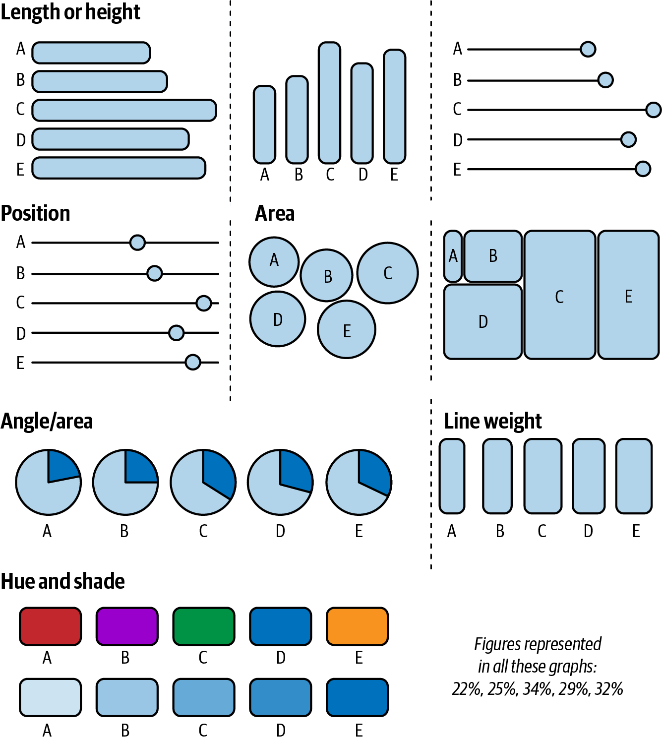
Categorical analysis is usually presented as bar charts. Bar charts use height or length as visual encoding to express a measure. Visual encoding refers to the techniques used to display data in charts; Figure 1-1 shows some examples. Encoding data in bar charts is effective because humans can quickly analyze the variation among the size of the bars; they are also easy to understand and label.
In our first use case, we will explore how to make effective bar charts. You’ll play the role of a large financial institution that wants to understand which merchant categories make up the majority of transactional spending in order to drive marketing efforts and partnerships and better serve customers’ interests. We will also expand from the defaults and learn two additional methods for making bar charts that demonstrate the most important information.
In the second case study, you’ll learn about working with many dimensions. While bar charts are very useful, you’ll need other data visualization tools when doing categorical analysis. When a dimension has many members, displaying each one as a bar chart sometimes becomes problematic. When this happens, you can use alternative chart forms to conserve space but still display all members. The most useful chart for this scenario is a treemap. We’ll explore treemaps through this case study about a nonprofit organization.
In our final use case of this chapter, you’ll learn how to use pie charts and donut charts to visualize whole relationships. This case study involves conducting a survey about IT professionals and mental health. Pie charts are often the first type of data visualization you learn in school, but we like to use them sparingly and as an alternative option. By the time we get to this use case, you’ll see how properly executed pie charts can be great tools to craft and share data with your audience.
Bar Charts: Banco de Tableau Case Study
Our first case study involves a large financial institution that is trying to understand consumer behaviors. We’ll call it Banco de Tableau (BoT for short).
The data team at BoT is working to understand how and where consumers spend their money. This objective is fundamental to the organization’s success because it will drive the direction of marketing efforts, partnerships, and product promotions. It will also provide insight into profiling customers and may even unearth opportunities to grow the customer population. What kind of chart should the team use to present its results?
Bar charts should be the first visualization type you try when exploring categorical analysis. Because they use length and height as visual encoding, they make it easy to interpret and compare members.
To solve the bank data team’s problem, you’re going to start with a basic bar chart. It will help you compare types of merchants by how much consumers spend. It will also serve as the first step in understanding the data.
Strategy: Build a Bar Chart in Tableau
To build your first bar chart, you’ll use the Financial Institution Transactions dataset as you follow along in Tableau. Here are the steps:
-
Drag the [Merchant Category] dimension to the Rows shelf.
-
Drag the [Transaction Amount] measure to the Columns shelf as
SUM([Transaction Amount]). -
From the toolbar, sort the merchants in descending order by Transaction Amount (aka spending).
Congratulations—you’ve built your first bar chart. Now this may not seem revolutionary, but it is the first step in finding out where consumer spending is focused. This simple chart, shown in Figure 1-2, dispels any intuition-based theories and presents us with the facts.
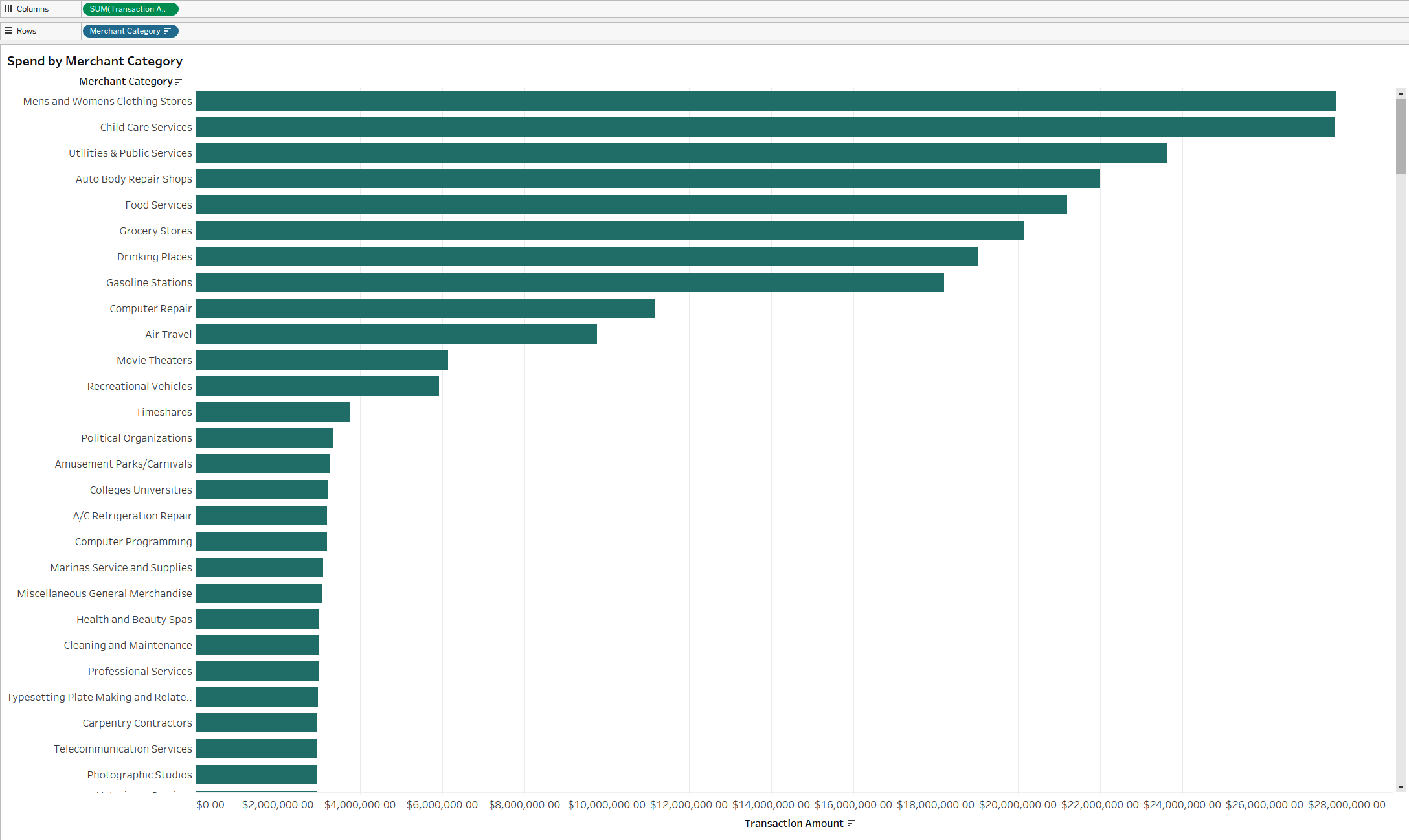
Figure 1-2. A bar chart showing the merchant categories sorted in descending order by transaction amount
This is a great starting point. We’ve now visualized the data and can see that the largest merchant category is Men’s and Women’s Clothing Stores. We can also see that several small merchant categories aren’t responsible for a lot of spending, like Cleaning and Maintenance. Knowing that there are many types of merchant categories, and that some are much larger than others, is additional insight we can act on to improve our visualization.
A good incremental way to do this is to limit the number of visible merchant categories by using a Top N filter with a parameter. This filter limits the chart by N, the number defined, in order to show only the top members in the chart. A parameter is a dynamic entry field defined by the end user.
In this scenario, we will create a parameter that allows the user to dynamically define the number of categories they want to see. Adding the parameter not only gives our audience more control over the visualization, but also provides a more conversational way to understand the chart’s content. A Top 10 illustration is a much more tangible and bite-size takeaway than a long list of bars.
Tip
In the upcoming strategy, you’ll be working with a parameter for the first time. We use the mnemonic ABC to remember the most common steps to building a parameter:
-
A: Add a new parameter.
-
B: Bring the parameter control onto your worksheet (show the control).
-
C: Include the parameter in a calculated field.
Strategy: Create a Top N Bar Chart
To create the Top N bar chart, follow these steps:
-
Drag [Merchant Category] to the Filters shelf.
-
Navigate to the Top section.
-
From the drop-down list, select Create a New Parameter.
-
Name the parameter
[Top N]and save it. -
Right-click the parameter at the lower left of the Data pane to expose the parameter control.
Notice in Figure 1-3 that we’ve put the parameter value in the title of the chart. Now, when the user makes a dynamic change, the number will update in response. With this small act, we’ve created a portfolio of charts that can be customized to suit the audience’s needs. The change also makes the chart feel responsive to the audience; their actions change the visualization.
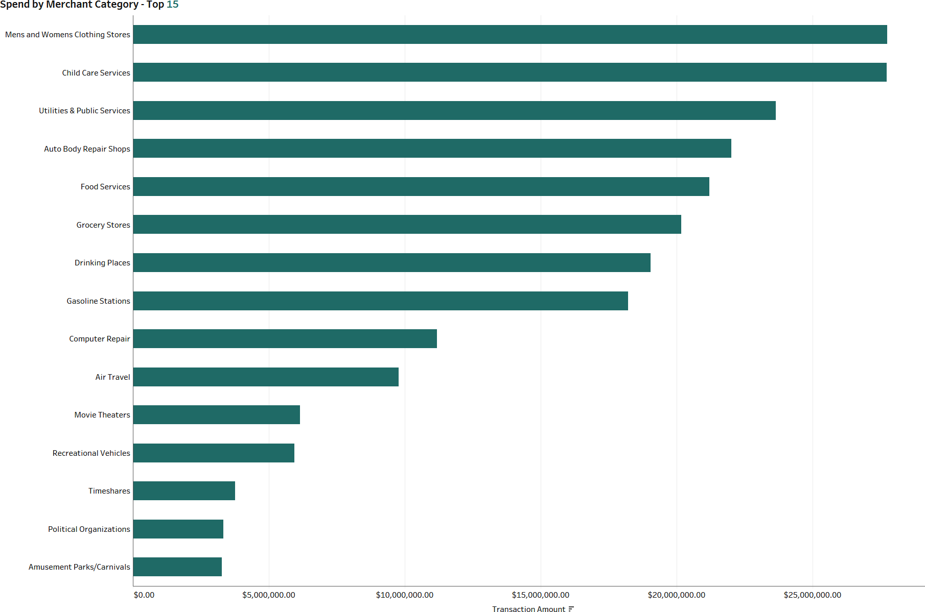
Figure 1-3. A bar chart with Top N filtering and a parameter applied
So how can we take this one step further? We’re guessing that you’ve been wondering what percentage of the total each of these categories represents. Although comparing them is useful as we try to synthesize our thinking further, a natural inclination would be to change the commentary that “Men’s and Women’s Clothing Stores makes up $27 million in customer spending” to “Close to 4% of all customer spending is attributed to Men’s and Women’s Clothing Stores.”
How do we approach presenting this information? Well first, we can change the measure from a direct measure to a percent of the total. But we’re now left with the lingering notion that if we limit our chart to a Top 10, we’ll lose the context of how much spending is in all the other categories.
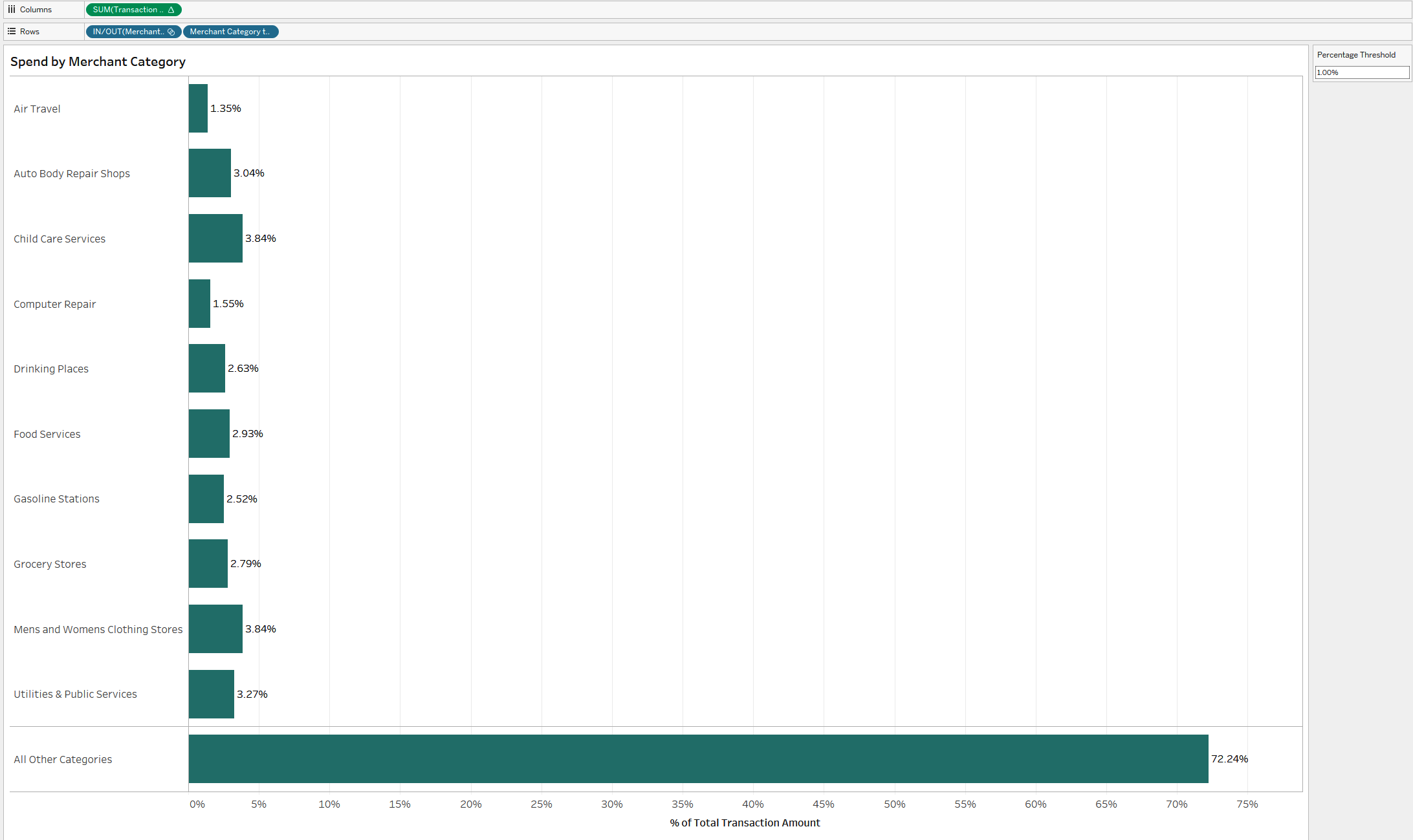
To work around this constraint, we can allow the audience to utilize a parameter to define the proportion of customer spending that they want to see broken out into the merchant categories, and to automatically group together all other categories. They still have dynamic control over the chart, but are left with a full picture of the data, as shown in Figure 1-4.
Notice that you’ll need to construct a calculation that is equivalent to the percentage-of-total calculation you made. To do this, you can utilize level-of-detail (LOD) expressions. An LOD expression lets you define the aggregation of the calculation, independent of the dimensions used in the visualization. This calculation takes the SUM([Transaction Amount]) and divides it by the total SUM([Transaction Amount]) for the entire dataset.
Strategy: Dynamically Group Other Dimensions
To update our chart to dynamically group other dimensions and show the percent of the total, follow these steps, using the worksheet from the previous strategy:
-
Remove the [Merchant Category] filter from the Filters shelf by right-clicking and selecting “Remove” or by dragging it into the gray space beneath the Marks card.
-
Change the measure to a percentage of the total by using Quick Table Calculations. Right-click
SUM([Transaction Amount])and choose Quick Table Calculations → Percentage of Total. -
Create a parameter called
[Percentage Threshold]. Set the data type to a float with 0.01 as the current value. Display the number format as a percentage. -
Create a set based on the [Merchant Category] dimension. This will be a formula set based on the calculation that the percent of the total is greater than or equal to the parameter. Right-click [Merchant Category] in the Data pane and choose Create → Set.
-
In the Create Set dialog box, select “Use all” and then navigate to Condition tab and enter the following in the “By formula” text box:
SUM([Transaction Amount])/MAX({SUM([Transaction Amount])}) >= [Percentage Threshold] -
Create a calculated dimension called
[Merchant Category to Display]://Merchant Category to Display IF [Merchant Category Set] THEN [Merchant Category] ELSE "All Other Categories" END
-
Drag the new [Merchant Category to Display] dimension on top of [Merchant Category] on the Rows shelf.
-
Drag [Merchant Category Set] to the left of [Merchant Category to Display]. This will organize the way the categories are listed. Right-click and hide the header.
-
Finish up the visualization by right-clicking and adding the [Percentage Threshold] parameter to the sheet. Also right-click and hide the field header for [Merchant Category to Display]. Add labels by clicking Label on the Marks card and selecting the “Show mark labels” check-box.
The updated analysis is much more flexible to the audience’s preferences. Now, they have contextual information about the percentage of the total, and input to determine how much data is shown. This visualization is a step ahead of the bar chart with the sum of spending, because we are no longer sacrificing knowing the total distribution of data.
If you’ve reached this point and still want more, you can introduce additional items to add even more context and feedback. Similar to our original parameter for Top N, these additional techniques will provide feedback to the audience as the chart reacts to their input, and will help enhance their trust in the chart.
Strategy: Enhance Your Bar Chart with Color
One addition you can make to your bar chart is color. Follow these steps for this enhancement:
-
You can use the parameter as a reference line to reinforce the concept of dynamic entry. Right-click the [% of Total Transaction Amount] axis and choose Add Reference Line. Set the Scope to Entire Table, the Value to Percentage Threshold, and the Label to Value. Click OK.
-
Now adjust the Percentage Threshold to 0.75% (0.0075). Notice that additional categories display, but none are less than 0.75%.
-
You can also further encode the target large merchant categories by utilizing our set for color. Drag [Merchant Category Set] onto Color. Those merchants in the set will appear as one color, while those not in it and part of “All Other Categories” will be another color.
Figure 1-5 shows the result.
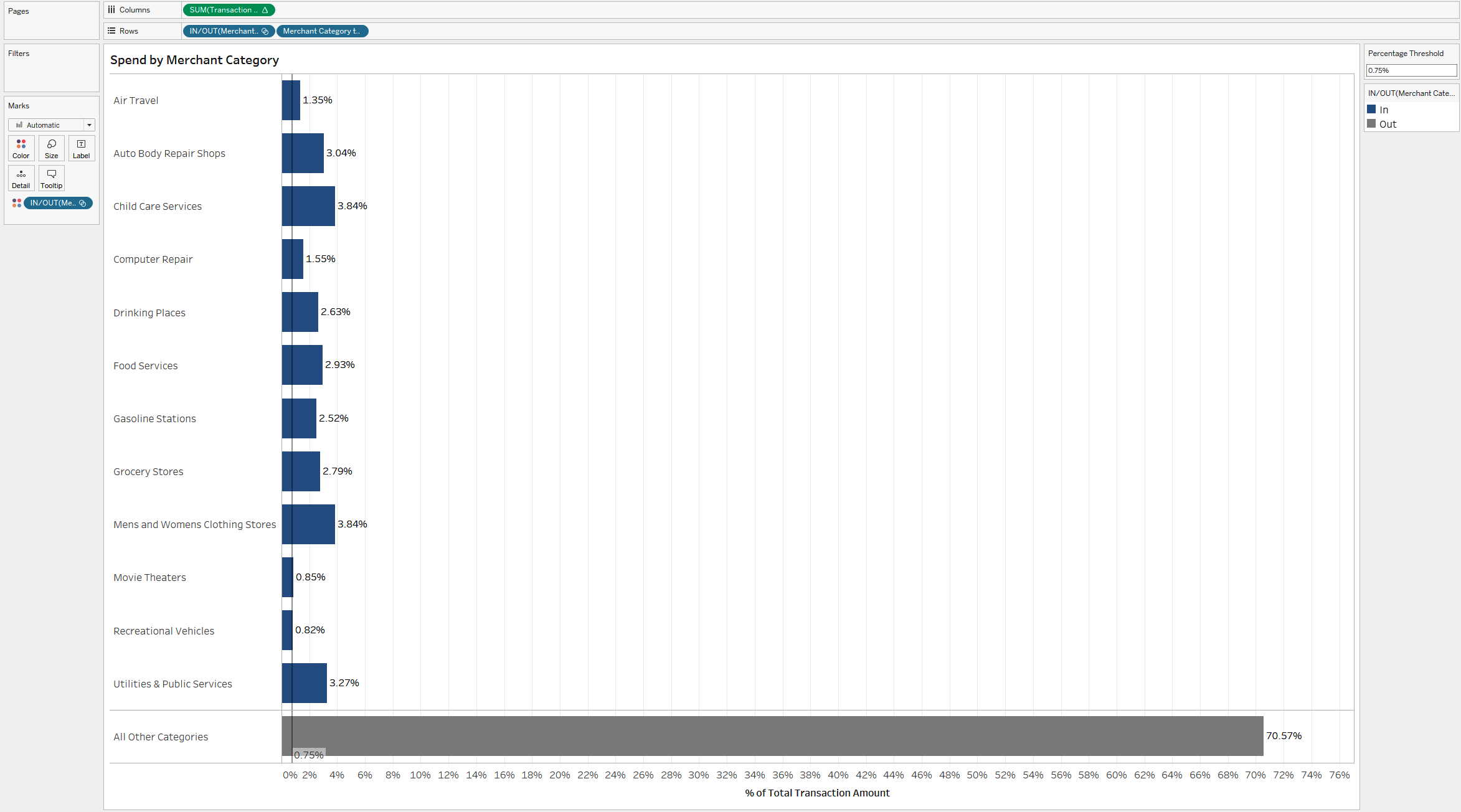
Figure 1-5. The same bar chart, now with color encoding to distinguish between the individual categories and the grouped category
Well done! We love bar charts—they are critical tools for any analysis. While they can start out very simple, you can take a bar chart from basic to amazing through abstracted metrics and dynamic entries.
Sometimes the value is in the way you format text on and around those bar charts. In this section, we discuss three more ways to spice up your bar charts with formatting that makes them pop. You’ll continue using the Financial Institution Transactions dataset to build these.
Strategy: Left-align Text
Starting with a new worksheet, you’ll use Network to create this formatted bar chart:
-
Add [Network] to the Rows shelf and
SUM([Transactions])to the Columns shelf. Set the view to Entire View and use the sort icon on the axis to sort the networks in descending order bySUM([Transactions]). -
Add [Network] and
SUM([Transactions])to Label on the Marks card by holding down the Ctrl key and dragging each one from their respective Rows/Columns shelf. -
Right-click [Network] on the Rows shelf and deselect Show Header.
-
To edit the label, click Label on the Marks card. In the dialog box that opens, click the ellipsis next to the Text option. Customize the label to read
<Network> // <SUM(Transactions)>and to be left-aligned. We recommend setting the font size of the dimension to be about 1.5 times larger than the measure’s font. You can do this by setting <Network> to 12 and <SUM(Transactions)> to 10. -
Click Label again and adjust the horizontal alignment to be Left.
-
Right-click the axis and deselect Show Header to hide the axis for [Transactions].
-
From the toolbar, choose Format → Lines. Remove both the grid lines and zero lines by setting them to None. Set the rows’ Axis Rulers to solid black.
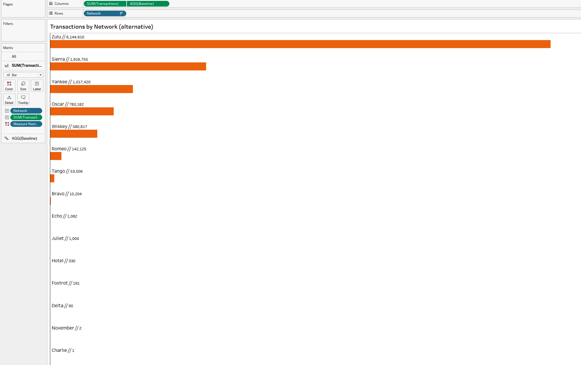
The result is a visualization with labels that contain the dimension name and the value associated with the measure (Figure 1-6).
Strategy: Create Bars with Labels on Top
This strategy also places labels and the values directly above the bars. The trick about creating this bar chart is that we are not going to use the Bar mark type at all:
-
Right-click the worksheet from the previous strategy and duplicate it.
-
Create a calculation called
[Baseline]. This calculation will be used to establish the baseline location of the bar charts://Baseline MIN(0.0)
-
Add [Baseline] to the Columns shelf. Right-click and make a dual axis. Synchronize the axis and then change the mark type to Gantt. Hide the axis by right-clicking and deselecting Show Header. You may have to change the mark type of
SUM([Transactions])back to Bar. While you’re doing that, also uncheck “Show mark labels.” -
On the Marks card for [Baseline], edit the width of the Gantt chart by clicking Size and adjusting the slider so the Gantt bars are as wide as possible. Change the color to white and set the opacity to zero.
-
Adjust the label alignment to be right-justified horizontally and at the top vertically.
-
Now you can adjust the size of the
SUM([Transactions])bar to be smaller, giving the appearance of the labels from the Gantt mark sitting on top of the bar. Figure 1-7 shows the reformatted chart.
Strategy: Create a Percent-of-Maximum Bar Chart
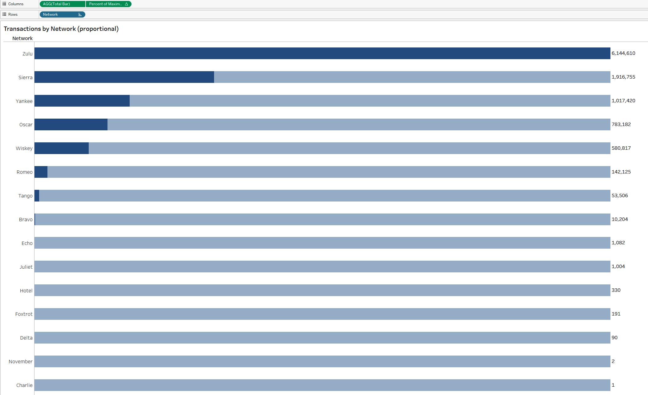
For this example, you’ll build another bar chart (Figure 1-8), but this time the background of the bar will also be highlighted with color:
-
Create a calculation called
[Total Bar]:// Total Bar MIN(1.0)
Tip
We’re going to use this calculation to represent 100% of the transaction amount within the visualization.
-
Add [Network] to the Rows shelf.
-
Add [Total Bar] to the Columns shelf. Fix the axis to start at 0 and stop at 1.1. You can do this by right-clicking the axis and selecting Edit Axis. In the dialog box, set the Range to Fixed and use 0 as the fixed start and 1.1 as the fixed end.
-
Set the color opacity to 40%. Drag
SUM([Transactions])to Label. -
Create a measure called
[Percent of Maximum]:// Percent of Maximum Transactions SUM([Transactions])/WINDOW_MAX(SUM([Transactions]))
-
Add this new measure to the Columns shelf. Create a dual axis and synchronize the axes. You may have to change your mark types back to Bar. Remove [Measure Names] from Color on all Marks cards. Remove the label from the [Percent of Maximum Transactions] Marks card.
-
Sort the networks by clicking the axis and selecting descending order. Then hide both axis headers. Adjust the sizing of the bar charts to be at the center tick mark on Size.
Bar-on-Bar Charts: Amplify Performance Case Study
Our next case study looks at a nonprofit organization, Amplify Performance (AP), that controls and awards grant money for creative, performing, and cultural arts programs and initiatives for the state of New York. Grant money is broken into two category types: one is related to the organization’s budget and the other more directly categorizes the programs’ initiatives. The AP data team tried to show both types with side-by-side bar charts, but the results were confusing. What kind of visualization would work better?
Not all categorical comparisons are going to require a simple bar chart. Sometimes the comparisons are more complex. For example, you might have to compare groups on a single metric but across two different time periods. Your audience will want to understand changes across members, but also how individual groups have changed over time.
Novice developers’ first instinct in these situations is often to use a side-by-side bar chart. These can be effective, but they take up a lot of space. When doing this type of analysis, we prefer to use a bar-on-bar chart instead. In Figure 1-9, you can see the total grant sizes for 2018 and 2019 for each category in a side-by-side bar chart.
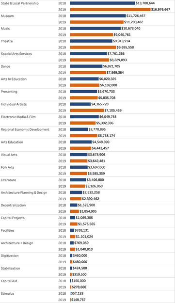
Figure 1-9. Side-by-side bar charts are effective but take up too much space
It looks like you have all the information you really want: there are bars for two years, and you can quickly compare. But you’ll notice that the data is not sorted on the total for 2019; rather, it is sorted on the total across the two years.
Additionally, any comparisons we make within a group (for instance, Arts Education) requires the audience to do mental math to understand the magnitude of the change from 2018 to 2019. It would be great to have that information directly in the visualization. It also might be helpful if the audience could quickly note which categories increased from the prior year and which decreased.
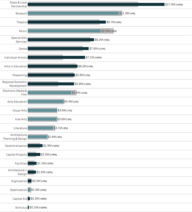
You can do all of this using a bar-on bar chart, as shown in Figure 1-10. Follow along to create this using the Nonprofit Grant Data dataset.
Strategy: Create a Bar-on-Bar Chart
In Figure 1-10, we’ve placed 2019 grant totals over the 2018 grant totals for each category. Here, your audience can still quickly compare groups across the base year, in this case 2019, as well as how that group performed versus the previous year.
We aided in the year-to-year comparison by adding color—we didn’t choose two distinct colors, but two colors with the same hue. Totals that decreased from the prior year are represented with a brighter, less saturated version of the color used to indicate totals that increased from the prior year.
Finally, we added the year-over-year change as a percentage next to the total for 2019. The result in Figure 1-10 is a chart that consolidates three comparisons: total grant dollars across groups for 2019, changes in total grant dollars from 2018 to 2019 for each group, and changes in magnitude from 2018 to 2019.
So how do you create this chart? Follow these steps:
-
Create your measures. Instead of using a date dimension to partition your data, it’s more effective to create two separate calculations that filter to the relevant data inside the calculation. Let’s create a calculation for grant amounts in 2018:
// Grant Amount | 2018
SUM(
 IF YEAR([Date]) = 2018
 THEN [Grant Amount]
 END
)
And a calculation for grant amounts in 2019:
// Grant Amount | 2019
SUM(
 IF YEAR([Date]) = 2019
 THEN [Grant Amount]
 END
)
Generally speaking, avoid hardcoding anything inside calculations. In this case, we’d normally use calculations or parameters to automate change as the data is updated. (We’ll discuss this more in Chapter 4.)
-
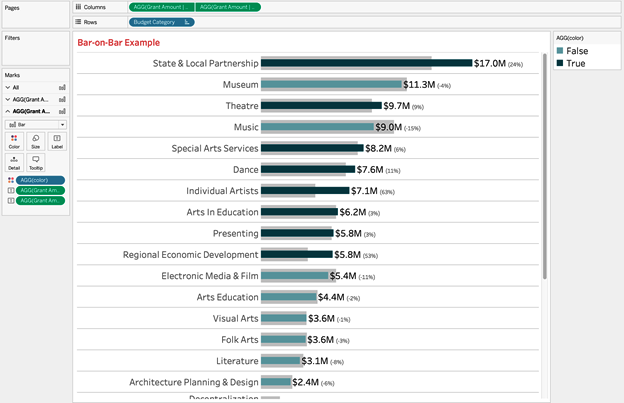
Create the base visualization by adding [Budget Category] to Rows and both [Grant Amount | 2018] and [Grant amount | 2019] to Rows.
-
Create a synchronized dual-axis chart with both mark types as Bars. Be sure to place 2018 as the leftmost dimension in the dual axis.
Change the 2019 bar size to be narrower than the 2018 bars. You might have to adjust both to get your bars in a happy place.
-
Be sure to remove [Measure Names] from both Marks cards. (You didn’t add this; Tableau did this automatically when you created a dual-axis chart.)
-
Set the color on the outer bar to a light gray that is still distinguishable from the background, as shown in Figure 1-11.
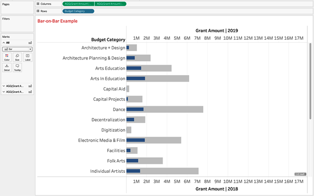
Figure 1-11. Use a dual axis with custom calculations to create bar-on-bar charts
Tip
We prefer to make the width of our outer bars (in Figure 1-11, 2018) equal to the width of whitespace between bars. For our inner bars, we look to have the width between 50% and 75% of the outer bars’ width.
-
-
We could rely on the axes for comparisons, but because we are using a horizontal bar chart, it makes sense to add labels:
-
On the [Grant Amount | 2019] Marks card, click and drag [Grant Amount | 2019] to Labels.
-
Create a new calculation called
[Grant Amount | % Change]for the percent change from 2018 to 2019:// Grant Amount | % Change ([Grant Amount | 2019] - [Grant Amount | 2018]) / [Grant Amount | 2018]
-
After you create the measure, right-click it and change the default settings of the number format, as shown in Figure 1-12.
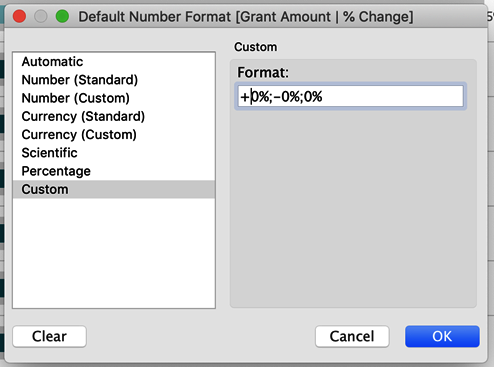
Figure 1-12. Use custom formatting to get your percentage displays just right
This will display a plus sign in front of the positive values, a minus sign in front of the negative values, and no sign when there is no change in the direction.
-
Add this calculation to Label as well. Now edit the text of the label. Format [Grant Amount | 2019] to be both larger and a darker shade than the [Grant Amount | % Change] measure. Your chart should look like Figure 1-13.
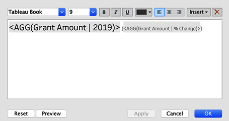
Figure 1-13. The text editor showing how you should format the text labels on the visualization
For this example, we’re using size 15 and size 9 fonts, respectively. Text colors are #000000 (black) and #555555 (dark gray), respectively. Additionally, we’ve added [Grant Amount | % Change] between parentheses. Your chart should look like Figure 1-14.
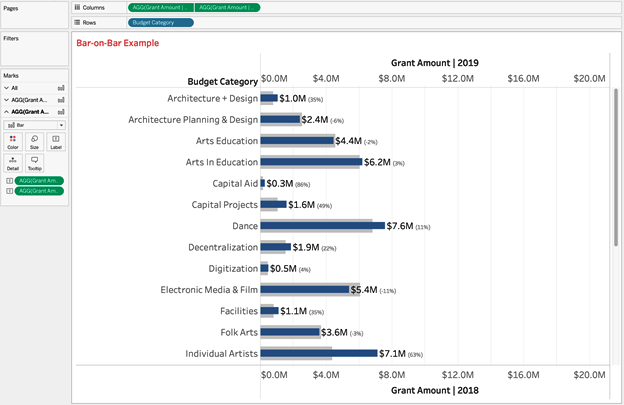
Figure 1-14. A look at the bar-on-bar chart before we finalize formatting
-
-
To add color, create a simple Boolean called
[Color]that compares 2019 to 2018 and then add it to the [Grant Amount | 2019] Marks card:// Color [Grant Amount | 2019] > [Grant Amount | 2018]
You can edit the color and select two colors that start with the same color: for instance, the base hex color #19626B for values that are True and a second color, #84B6BC, that is brighter and less saturated.
-
Add finishing touches:
-
Sort your categories by total grant amounts in 2019.
-
Hide your axes and row header labels. Remove all extra lines.
-
Remove your vertical divider. Keep your horizontal divider, but make sure it separates each member.
Your result should look like Figure 1-15.
-
Treemaps: Amplify Performance Case Study
A treemap is similar to a bar chart, but uses the area of a rectangle relative to the height or length to encode data. If you have many members of a dimension and must show all members, a treemap is a great alternative to a bar chart.
Area is a less precise measure, but often when working with treemaps, the goal is not to be completely precise but rather to display all the members of a category in a single, compact visualization that is sorted from largest to smallest.
One of the main benefits we’ll explore with treemaps is being able to use color to represent a measure or a dimension. In the example with a drillable treemap, we’ll use color to represent both budget categories and the program categories within them. We’ll then show how to display additional detailed members to the audience on demand. With this feature, the audience is free to explore multiple facets without being overwhelmed. We’ll also represent color as a measure, both directly and indirectly.
Next, we’ll be focusing on what to do when you need to show all members of a dimension in a single visualization. You’ve already seen the problem of a long scroll when using a bar chart, so what chart type can you employ to get around this barrier?
Imagine you are working with the nonprofit organization introduced previously, AP, that controls and awards grant money for creative, performing, and cultural arts programs and initiatives for the state of New York. Grant money is broken into two category types: one focused on the organization’s budget and the other on the programs’ initiatives.
In this scenario, you can’t sacrifice small members. Having visibility into some of the smaller categories is crucial, in order to provide insight into where additional grant money should go.
If you’re facing a similar scenario, we recommend a treemap. While you’ll lose some precision in comparing your chosen measure, you will get a well-ordered and compact visualization that will show all the members of your dimension.
Strategy: Create a Basic Treemap
Create a new worksheet using the Nonprofit Grant dataset and then follow these steps:
-
Drag [Budget Category] to Text.
-
Drag
SUM([Grant Amount])to Size, and Ctrl-drag this to Color as well. -
Ensure that the mark type is set to Square.
The result is shown in Figure 1-16.
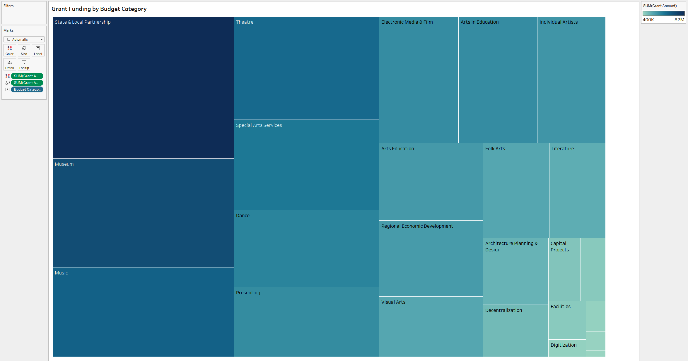
Figure 1-16. A treemap showing the budget categories ordered by grant amount
This will give you a full picture of how AP’s grants are distributed. No single budget category has a significant majority of funding, but some smaller categories take up less than 1%.
Tip
The standard convention when working with treemaps is to double-encode a measure by using size and color. This helps to further distinguish the pieces and members. But it is not a requirement. As an alternative, you could consider encoding the categories on color. However, we recommend caution: there are many members and, in this case, you would be encoding redundant information.
This treemap is a great start, but takes us only halfway to providing specifics about the grant data. Dollars are not only divided among budgets, but also assigned to program categories. There are 55 unique program categories, a significant additional level of detail that could be overwhelming. We really need to know only which program categories that budget dollars are tied to within one given budget category at a time.
To solve the next-level question of program categories within budgets, the AP team can create a drillable treemap: an interactive treemap in which the audience can click a specific budget category to see further information.
Strategy: Create Drillable Treemaps
Let’s try creating a drillable treemap, continuing to use the Nonprofit Grant Data dataset:
-
Starting from the finished treemap from the previous strategy, create a set based on both [Budget Category] and [Program Category] by first dragging [Program Category] onto the Marks card of the treemap view. This will allow you to click a mark and create a set that combines both dimensions. Right-click any mark and create a set called
[Program & Budget Set]. It doesn’t matter what values are in the set initially, only that there are two columns, one for each dimension. -
Now create a calculated field called
[Label Program]. This will evaluate whether something is part of the set and return the program if it is://Label Program IF [Program & Budget Set] THEN [Program Category] END
-
Drag this calculated field on top of [Program Category] on the Marks card.
-
Create the drill-down functionality. Choose Worksheet → Actions → Add Action → Change Set Values.
-
Call it
Drill Down to Program. It will be run on Select. The Target Set is [Program & Budget Set]. The action you want when clearing the selection is “Remove all values from set.” -
Drag [Budget Category] onto Color, replacing
SUM([Grant Amount]). -
Now click Dance, and the treemap rectangle will drill in to show all the programs that comprise the Dance budget.
Notice in Figure 1-17 that you’ve changed how color is leveraged here. Instead of tying color to the repetition of the grant spending, you are using it to distinguish the budget categories.

Figure 1-17. A treemap showing both the budget category and program category (the treemap is colored by budget category, and the size of the rectangle represents the grant amount)
Let’s go back to our treemap example one more time, and take color encoding in one more direction. In this scenario, you’re going to start with program categories to create the treemap. This time, the AP team is trying to ensure not only that different program types are getting a sufficient distribution of funding, but also that diversity exists in the types of programs that are funded and supported.
Strategy: Encode a Continuous Measure with Color
For this visualization, you’ll use color encoding to spot opportunities for programs to be revitalized. You’ll also use it to highlight another continuous measure: days since the most recent grant was funded.
A continuous measure is one that spans an infinite range, typically on a number line or timeline:
-
On a new worksheet, create a treemap of [Program Category] and [Grant Amount].
-
Create a calculated field that evaluates how long it has been since a grant was awarded in a category:
//Days Since Last Grant
DATEDIFF( 'day',MAX([Date]),TODAY())
-
When you use this calculation in the view, it will evaluate the maximum or most recent date per [Program Category] and then calculate the number of days since today.
-
Put this measure on Color and change the Palette to Blue-Green Sequential reversed.
You can see the result in Figure 1-18.
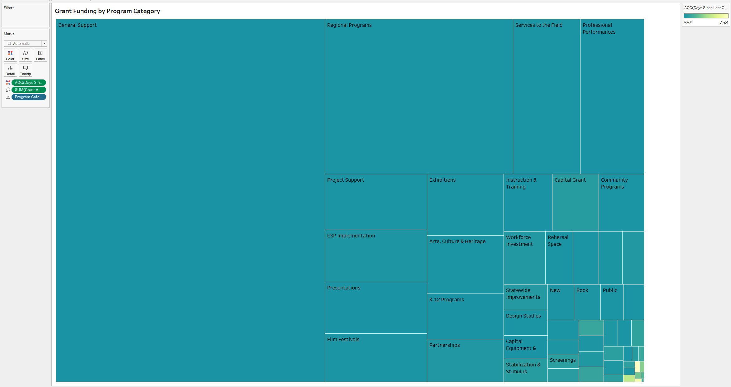
Figure 1-18. A treemap showing grant amount by program category; color has been encoded to show the number of days since the program was last funded
You’ve now seen three approaches to treemaps, utilizing different color-encoding techniques and dynamic elements that allow the audience to dig into a category and explore it in even more depth.
Pie and Donut Charts: IT Employee Wellness Project Case Study
Our last case study in this chapter involves the IT Employee Wellness Project, an initiative that conducts surveys of IT professionals and their employers. The project investigates how IT work affects employees’ mental health, as well as employers’ attitudes about mental health.
As with most surveys, there are many questions to analyze to determine attitudes, but a core task is to provide a demographic overview of respondents. The project’s data analysts’ goal is to show gender distribution among the survey respondents by profession. They would also like to compare that distribution across several professions at the same time. What chart types would help them convey this most effectively to the project’s board members?
When you’re looking at a parts-to-whole relationship, a natural place to start is a pie chart. A pie chart divides a circle into slices by members of a dimension, and each piece represents a proportion of the whole. Some chart lovers cringe at the thought of a pie chart, but pie charts are familiar to most people. They also use space efficiently and can serve as color legends or interactive filters. They’re not the best choice in every situation, but they do have their place when used correctly.
In our final strategy for the chapter, you’ll take your donut charts one step further by making small multiples, or repeated versions of the same chart, separated out by profession. This will let the data team compare gender distribution among several professions at the same time.
Strategy: Build a Basic Pie Chart
Let’s start with the basic pie chart. You’ll use the IT Survey Data dataset to follow along:
-
Drag [Gender] onto Color.
-
Change the mark type to Pie.
-
Create a calculated field called
[# Respondents].//# Respondents COUNTD([Respondent ID])
-
Drag [# Respondents] onto Angle. Change the colors to your choosing (we’re using the Summer palette and a white border). Drag [Gender] onto Label along with [# Respondents]. Format the Label to match the mark colors.
Figure 1-19 shows the result.
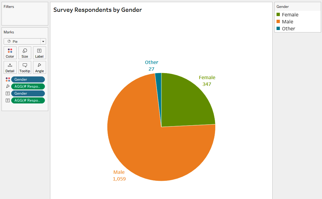
Figure 1-19. A pie chart showing the distribution of gender for survey respondents
Why does this pie chart work? First, it has only three slices; this pie doesn’t have many pieces, so it’s pretty easy to compare the differences. Next, you’ve gone the extra mile to directly label and put the percentage next to each slice. This makes it easy for the audience to comprehend. If you had many more values, or several slices of relatively the same size, our recommendation would be a bar chart, but here that’s clearly not the case.
Strategy: Build a Donut Chart
Now let’s turn this pie chart into a donut chart by adding a hole to its middle. This hole allows you to communicate an additional piece of information. In this case, it allows you to represent two concepts in a single chart—the number of respondents and the distribution of gender:
-
Create a dummy measure
[MIN(1)]; this will be used as multiple measures for a dual-axis chart://Dummy MIN(1)
-
Drag it onto Rows twice, right-click, and make a dual-axis chart. You can use the visualization from the previous strategy as a starting point.
-
Make the size of the first measure the right tick on recommended size.
-
Right-click [# Respondents] and change it to a Percent of Total Quick Table Calculation. Then format the percentage to have no decimals by right-clicking the field and selecting Format.
-
Click the second measure and remove all fields, except [# Respondents], which should be on Label. Add the text
Respondentsin 8 pt. font beneath the field. -
Make the size of the second measure the left tick on recommended size.
-
Align the label middle and center, and set the color of the mark to white.
-
Hide the axes and remove all lines from the chart.
You can see the result in Figure 1-20.
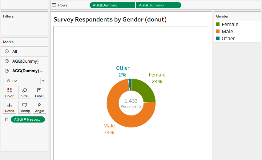
Figure 1-20. A donut chart with the number of respondents has been added to the center; the slices represent the distribution of survey respondents by gender
Now you have a donut chart that serves two purposes and is fantastic at generating insightful descriptions. You can say “24% of respondents were female” and immediately know the survey’s sample size, which will be necessary for the audience to make decisions from the results.
To complete the donut chart, you could utilize it as an interactive filter; when a user clicks a slice, Tableau filters in subsequent visualizations. It could also serve the purpose of a color legend—one that does more than just say that green means male.
Strategy: Create Small Multiples
Since we’re working with dessert charts, there’s one last visualization we’d like to introduce: the small multiple, which is any chart repeated multiple times in a smaller format. With pie and donut charts, small multiples become pretty powerful. You can take a dimension with more members and use that to create repetitive charts for comparisons.
We know the project board wants to see how gender distribution changes among professions. Small multiples can help you separate out the answer quickly. Yes, you could create a filter to select the role, but you’ll get more insight at one glance when you create small multiples that can show the distribution and still provide the sample size in context.
Starting with the donut chart you just made, you need to make only a few tweaks:
-
Remove the word “Respondents” from the label to save space.
-
Drag [Professional Role] onto the Columns shelf.
You can see the result in Figure 1-21.

Figure 1-21. A small-multiples donut chart, which includes separating out the distribution by gender among different professions
Now that you’ve seen some examples of pie charts, we hope you’ll recognize when it is appropriate to utilize them—and more importantly, when utilizing them can enhance the data presentation for your audience.
Conclusion
You’ve now had a chance to see different chart types used for categorical analysis. You started with a basic horizontal bar chart and quickly learned how to create a Top N chart to limit the data for your audience to the most relevant information.
From there, you explored dynamically grouping small categories into an Other bar and allowed your audience to define the scope of analysis with a parameter, allowing them to define the percentage contribution a category must have to be shown in the chart.
You also explored using color encoding with bar charts to further accentuate categorical analysis and learn some of our favorite formatting techniques to make bar charts pop.
Next, we moved onto our case study for Amplify Performance and used a treemap to ensure that all members of a dimension (even really small ones!) were represented in a visualization. You learned how to make this chart type even more dynamic by allowing drill-down to further split the data. And you also used color encoding and dipped a toe into date calculations to show AP executives which areas may not be getting funding (if this was fun, wait until Chapter 4).
Finally, we wrapped up the chapter by exploring dessert charts, first the pie and then the donut chart. You learned when to effectively use a pie chart (not too many slices) and how to take advantage of the hole inside a donut chart to display two pieces of information at one time.
With all of these new techniques, we are confident you will be able to create flexible, compelling, and insightful visualizations that let your audience explore questions and analyses dynamically.
In the next chapter, we’ll introduce you to quantitative analysis—all charts focused on different ways to plot numerical fields and to use statistics. You’ll be taking the foundations you learned through creating charts and putting them into practice with a variety of chart types (bye bye, bar chart).
Get Tableau Strategies now with the O’Reilly learning platform.
O’Reilly members experience books, live events, courses curated by job role, and more from O’Reilly and nearly 200 top publishers.
