Chapter M. The Mobile Web
An increasing number of people are starting to access the Web from mobile devices. However, designing for mobile devices is not the same as designing for desktops. Mobile devices have smaller screens and impoverished input capabilities. This pattern group describes near-term research, as well as pragmatic issues in preparing your Web site for the Mobile Web.
<feature><title></title> </feature>Mobile Screen Sizing

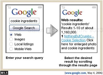
Figure M1.1. Google offers a special homepage for visitors using mobile phones. This stripped-down version of the main homepage offers access ...
Get The Design of Sites: Patterns for Creating Winning Web Sites, Second Edition now with the O’Reilly learning platform.
O’Reilly members experience books, live events, courses curated by job role, and more from O’Reilly and nearly 200 top publishers.

