Out-of-the-Box Visualization
The out-of-the-box solutions are by far the easiest for beginners to pick up. Copy and paste some data or load a CSV file and you’re set. Just click the graph type you want—maybe change some options here and there.
Options
The out-of-the-box tools available vary quite a bit, depending on the application they’ve been designed for. Some, such as Microsoft Excel or Google Documents, are meant for basic data management and graphs, whereas others were built for more thorough analyses and visual exploration.
Microsoft Excel
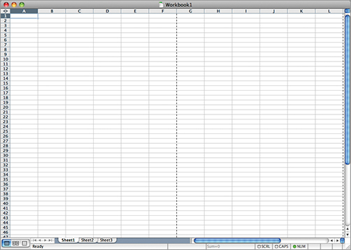
You know this one. You have the all-familiar spreadsheet where you put your data, such as in Figure 3-1.
Figure 3-1: Microsoft Excel spreadsheet
Then you can click the button with the little bar graph on it to make the chart you want. You get all your standard chart types (Figure 3-2) such as the bar chart, line, pie, and scatterplot.
Some people scoff at Excel, but it’s not all that bad for the right tasks. For example, I don’t use Excel for any sort of deep analyses or graphics for a publication, but if I get a small dataset in an Excel file, as is often the case, and I want a quick feel for what is in front of me, then sure, I’ll whip up a graph with a few clicks in everyone’s favorite spreadsheet program.
Graphs Really Can Be Fun
The first graph I made on a computer was in Microsoft Excel for my fifth grade science fair project. ...
Get Visualize This: The FlowingData Guide to Design, Visualization, and Statistics now with the O’Reilly learning platform.
O’Reilly members experience books, live events, courses curated by job role, and more from O’Reilly and nearly 200 top publishers.

