Continuous Data
Visualizing continuous time series data is similar to visualizing discrete data. You do, after all, still have a discrete number of data points, even if the dataset is continuous. The structure of continuous and discrete is the same. The difference between the two is what they represent in the physical world. As previously covered, continuous data represents constantly changing phenomena, so to this end, you want to visualize the data in a way that shows that.
Connect the Dots
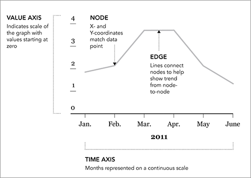
You’re probably familiar with this one. The time series chart is similar to drawing points, except you also connect the points with lines. Often, you don’t show the points. Figure 4-33 shows the geometry of the popular chart type.
You have the nodes, or points, that take on X- and Y-coordinates, and then the edges, or connecting lines that help you see trends in your data. It’s usually a good idea to start the value axis at zero because starting anywhere else could affect the scale.
How far you stretch the horizontal axis can also affect the appearance of trends. Squish too much, and an increase from point to point might look more than it is. Stretch too far out, and you might not see patterns.
Figure 4-33: Time series chart framework
Create a Time Series Chart
If you know how to make a scatterplot in R, you know how to make a time series chart. Load your data and use the plot() function, ...
Get Visualize This: The FlowingData Guide to Design, Visualization, and Statistics now with the O’Reilly learning platform.
O’Reilly members experience books, live events, courses curated by job role, and more from O’Reilly and nearly 200 top publishers.

