Over Space and Time
The examples so far enable you to visualize a lot of data types, whether it be qualitative or quantitative. You can vary colors, categories, and symbols to fit the story you’re trying to tell; annotate your maps to highlight specific regions or features; and aggregate to zoom in on counties or countries. But wait, there’s more! You don’t have to stop there. If you incorporate another dimension of data, you can see changes over both time and space.
In Chapter 4, “Visualizing Patterns over Time,” you visualized time more abstractly with lines and plots, which is useful, but when location is attached to your data, it can be more intuitive to see the patterns and changes with maps. It’s easier to see clustering or groups of regions that are near in physical distance.
The best part is that you can incorporate what you’ve already learned to visualize your data over space and time.
Small Multiples
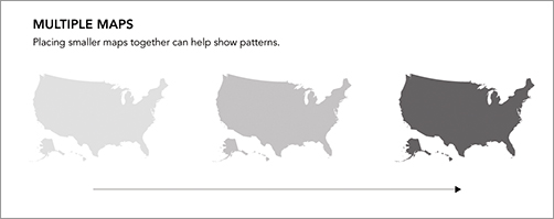
You saw this technique in Chapter 6, “Visualizing Relationships,” to visualize relationships across categories, and it can be applied to spatial data, too, as shown in Figure 8-24. Instead of small bar graphs, you can use small maps, one map for each slice of time. Line them up left to right or stack them top to bottom, and it’s easy for your eyes to follow the changes.
Figure 8-24: Small multiples with maps
For example, in late 2009, I designed a graphic that showed unemployment ...
Get Visualize This: The FlowingData Guide to Design, Visualization, and Statistics now with the O’Reilly learning platform.
O’Reilly members experience books, live events, courses curated by job role, and more from O’Reilly and nearly 200 top publishers.

