Chapter 1. The Seven Stages of Visualizing Data
The greatest value of a picture is when it forces us to notice what we never expected to see.
What do the paths that millions of visitors take through a web site look like? How do the 3.1 billion A, C, G, and T letters of the human genome compare to those of the chimp or the mouse? Out of a few hundred thousand files on your computer’s hard disk, which ones are taking up the most space, and how often do you use them? By applying methods from the fields of computer science, statistics, data mining, graphic design, and visualization, we can begin to answer these questions in a meaningful way that also makes the answers accessible to others.
All of the previous questions involve a large quantity of data, which makes it extremely difficult to gain a “big picture” understanding of its meaning. The problem is further compounded by the data’s continually changing nature, which can result from new information being added or older information continuously being refined. This deluge of data necessitates new software-based tools, and its complexity requires extra consideration. Whenever we analyze data, our goal is to highlight its features in order of their importance, reveal patterns, and simultaneously show features that exist across multiple dimensions.
This book shows you how to make use of data as a resource that you might otherwise never tap. You’ll learn basic visualization principles, how to choose the right kind of display for your purposes, and how to provide interactive features that will bring users to your site over and over again. You’ll also learn to program in Processing, a simple but powerful environment that lets you quickly carry out the techniques in this book. You’ll find Processing a good basis for designing interfaces around large data sets, but even if you move to other visualization tools, the ways of thinking presented here will serve you as long as human beings continue to process information the same way they’ve always done.
Why Data Display Requires Planning
Each set of data has particular display needs, and the purpose for which you’re using the data set has just as much of an effect on those needs as the data itself. There are dozens of quick tools for developing graphics in a cookie-cutter fashion in office programs, on the Web, and elsewhere, but complex data sets used for specialized applications require unique treatment. Throughout this book, we’ll discuss how the characteristics of a data set help determine what kind of visualization you’ll use.
Too Much Information
When you hear the term “information overload,” you probably know exactly what it means because it’s something you deal with daily. In Richard Saul Wurman’s book Information Anxiety (Doubleday), he describes how the New York Times on an average Sunday contains more information than a Renaissance-era person had access to in his entire lifetime.
But this is an exciting time. For $300, you can purchase a commodity PC that has thousands of times more computing power than the first computers used to tabulate the U.S. Census. The capability of modern machines is astounding. Performing sophisticated data analysis no longer requires a research laboratory, just a cheap machine and some code. Complex data sets can be accessed, explored, and analyzed by the public in a way that simply was not possible in the past.
The past 10 years have also brought about significant changes in the graphic capabilities of average machines. Driven by the gaming industry, high-end 2D and 3D graphics hardware no longer requires dedicated machines from specific vendors, but can instead be purchased as a $100 add-on card and is standard equipment for any machine costing $700 or more. When not used for gaming, these cards can render extremely sophisticated models with thousands of shapes, and can do so quickly enough to provide smooth, interactive animation. And these prices will only decrease—within a few years’ time, accelerated graphics will be standard equipment on the aforementioned commodity PC.
Data Collection
We’re getting better and better at collecting data, but we lag in what we can do with it. Most of the examples in this book come from freely available data sources on the Internet. Lots of data is out there, but it’s not being used to its greatest potential because it’s not being visualized as well as it could be. (More about this can be found in Chapter 9, which covers places to find data and how to retrieve it.)
With all the data we’ve collected, we still don’t have many satisfactory answers to the sort of questions that we started with. This is the greatest challenge of our information-rich era: how can these questions be answered quickly, if not instantaneously? We’re getting so good at measuring and recording things, why haven’t we kept up with the methods to understand and communicate this information?
Thinking About Data
We also do very little sophisticated thinking about information itself. When AOL released a data set containing the search queries of millions of users that had been “randomized” to protect the innocent, articles soon appeared about how people could be identified by—and embarrassed by—information regarding their search habits. Even though we can collect this kind of information, we often don’t know quite what it means. Was this a major issue or did it simply embarrass a few AOL users? Similarly, when millions of records of personal data are lost or accessed illegally, what does that mean? With so few people addressing data, our understanding remains quite narrow, boiling down to things like, “My credit card number might be stolen” or “Do I care if anyone sees what I search?”
Data Never Stays the Same
We might be accustomed to thinking about data as fixed values to be analyzed, but data is a moving target. How do we build representations of data that adjust to new values every second, hour, or week? This is a necessity because most data comes from the real world, where there are no absolutes. The temperature changes, the train runs late, or a product launch causes the traffic pattern on a web site to change drastically.
What happens when things start moving? How do we interact with “live” data? How do we unravel data as it changes over time? We might use animation to play back the evolution of a data set, or interaction to control what time span we’re looking at. How can we write code for these situations?
What Is the Question?
As machines have enormously increased the capacity with which we can create (through measurements and sampling) and store data, it becomes easier to disassociate the data from the original reason for collecting it. This leads to an all-too frequent situation: approaching visualization problems with the question, “How can we possibly understand so much data?”
As a contrast, think about subway maps, which are abstracted from the complex shape of the city and are focused on the rider’s goal: to get from one place to the next. Limiting the detail of each shape, turn, and geographical formation reduces this complex data set to answering the rider’s question: “How do I get from point A to point B?”
Harry Beck invented the format now commonly used for subway maps in the 1930s, when he redesigned the map of the London Underground. Inspired by the layout of circuit boards, the map simplified the complicated Tube system to a series of vertical, horizontal, and 45°diagonal lines. While attempting to preserve as much of the relative physical layout as possible, the map shows only the connections between stations, as that is the only information that riders use to decide their paths.
When beginning a visualization project, it’s common to focus on all the data that has been collected so far. The amounts of information might be enormous—people like to brag about how many gigabytes of data they’ve collected and how difficult their visualization problem is. But great information visualization never starts from the standpoint of the data set; it starts with questions. Why was the data collected, what’s interesting about it, and what stories can it tell?
The most important part of understanding data is identifying the question that you want to answer. Rather than thinking about the data that was collected, think about how it will be used and work backward to what was collected. You collect data because you want to know something about it. If you don’t really know why you’re collecting it, you’re just hoarding it. It’s easy to say things like, “I want to know what’s in it,” or “I want to know what it means.” Sure, but what’s meaningful?
The more specific you can make your question, the more specific and clear the visual result will be. When questions have a broad scope, as in “exploratory data analysis” tasks, the answers themselves will be broad and often geared toward those who are themselves versed in the data. John Tukey, who coined the term Exploratory Data Analysis, said “. . . pictures based on exploration of data should force their messages upon us.”[1] Too many data problems are labeled “exploratory” because the data collected is overwhelming, even though the original purpose was to answer a specific question or achieve specific results.
One of the most important (and least technical) skills in understanding data is asking good questions. An appropriate question shares an interest you have in the data, tries to convey it to others, and is curiosity-oriented rather than math-oriented. Visualizing data is just like any other type of communication: success is defined by your audience’s ability to pick up on, and be excited about, your insight.
Admittedly, you may have a rich set of data to which you want to provide flexible access by not defining your question too narrowly. Even then, your goal should be to highlight key findings. There is a tendency in the visualization field to borrow from the statistics field and separate problems into exploratory and expository, but for the purposes of this book, this distinction is not useful. The same methods and process are used for both.
In short, a proper visualization is a kind of narrative, providing a clear answer to a question without extraneous details. By focusing on the original intent of the question, you can eliminate such details because the question provides a benchmark for what is and is not necessary.
A Combination of Many Disciplines
Given the complexity of data, using it to provide a meaningful solution requires insights from diverse fields: statistics, data mining, graphic design, and information visualization. However, each field has evolved in isolation from the others.
Thus, visual design—the field of mapping data to a visual form—typically does not address how to handle thousands or tens of thousands of items of data. Data mining techniques have such capabilities, but they are disconnected from the means to interact with the data. Software-based information visualization adds building blocks for interacting with and representing various kinds of abstract data, but typically these methods undervalue the aesthetic principles of visual design rather than embrace their strength as a necessary aid to effective communication. Someone approaching a data representation problem (such as a scientist trying to visualize the results of a study involving a few thousand pieces of genetic data) often finds it difficult to choose a representation and wouldn’t even know what tools to use or books to read to begin.
Process
We must reconcile these fields as parts of a single process. Graphic designers can learn the computer science necessary for visualization, and statisticians can communicate their data more effectively by understanding the visual design principles behind data representation. The methods themselves are not new, but their isolation within individual fields has prevented them from being used together. In this book, we use a process that bridges the individual disciplines, placing the focus and consideration on how data is understood rather than on the viewpoint and tools of each individual field.
The process of understanding data begins with a set of numbers and a question. The following steps form a path to the answer:
- Acquire
Obtain the data, whether from a file on a disk or a source over a network.
- Parse
Provide some structure for the data’s meaning, and order it into categories.
- Filter
Remove all but the data of interest.
- Mine
Apply methods from statistics or data mining as a way to discern patterns or place the data in mathematical context.
- Represent
Choose a basic visual model, such as a bar graph, list, or tree.
- Refine
Improve the basic representation to make it clearer and more visually engaging.
- Interact
Add methods for manipulating the data or controlling what features are visible.
Of course, these steps can’t be followed slavishly. You can expect that they’ll be involved at one time or another in projects you develop, but sometimes it will be four of the seven, and at other times all of them.
Part of the problem with the individual approaches to dealing with data is that the separation of fields leads to different people each solving an isolated part of the problem. When this occurs, something is lost at each transition—like a “telephone game” in which each step of the process diminishes aspects of the initial question under consideration. The initial format of the data (determined by how it is acquired and parsed) will often drive how it is considered for filtering or mining. The statistical method used to glean useful information from the data might drive the initial presentation. In other words, the final representation reflects the results of the statistical method rather than a response to the initial question.
Similarly, a graphic designer brought in at the next stage will most often respond to specific problems with the representation provided by the previous steps, rather than focus on the initial question. The visualization step might add a compelling and interactive means to look at the data filtered from the earlier steps, but the display is inflexible because the earlier stages of the process are hidden. Furthermore, practitioners of each of the fields that commonly deal with data problems are often unclear about how to traverse the wider set of methods and arrive at an answer.
This book covers the whole path from data to understanding: the transformation of a jumble of raw numbers into something coherent and useful. The data under consideration might be numbers, lists, or relationships between multiple entities.
It should be kept in mind that the term visualization is often used to describe the art of conveying a physical relationship, such as the subway map mentioned near the start of this chapter. That’s a different kind of analysis and skill from information visualization, where the data is primarily numeric or symbolic (e.g., A, C, G, and T—the letters of genetic code—and additional annotations about them). The primary focus of this book is information visualization: for instance, a series of numbers that describes temperatures in a weather forecast rather than the shape of the cloud cover contributing to them.
An Example
To illustrate the seven steps listed in the previous section, and how they contribute to effective information visualization, let’s look at how the process can be applied to understanding a simple data set. In this case, we’ll take the zip code numbering system that the U.S. Postal Service uses. The application is not particularly advanced, but it provides a skeleton for how the process works. (Chapter 6 contains a full implementation of the project.)
What Is the Question?
All data problems begin with a question and end with a narrative construct that provides a clear answer. The Zipdecode project (described further in Chapter 6) was developed out of a personal interest in the relationship of the zip code numbering system to geographic areas. Living in Boston, I knew that numbers starting with a zero denoted places on the East Coast. Having spent time in San Francisco, I knew the initial numbers for the West Coast were all nines. I grew up in Michigan, where all our codes were four-prefixed. But what sort of area does the second digit specify? Or the third?
The finished application was initially constructed in a few hours as a quick way to take what might be considered a boring data set (a long list of zip codes, towns, and their latitudes and longitudes) and create something engaging for a web audience that explained how the codes related to their geography.
Acquire
The acquisition step involves obtaining the data. Like many of the other steps, this can be either extremely complicated (i.e., trying to glean useful data from a large system) or very simple (reading a readily available text file).
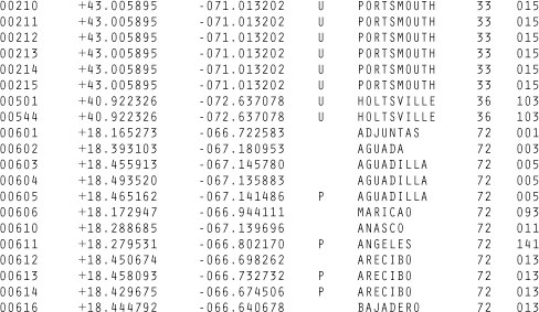
A copy of the zip code listing can be found on the U.S. Census Bureau web site, as it is frequently used for geographic coding of statistical data. The listing is a freely available file with approximately 42,000 lines, one for each of the codes, a tiny portion of which is shown in Figure 1-1.
Acquisition concerns how the user downloads your data as well as how you obtained the data in the first place. If the final project will be distributed over the Internet, as you design the application, you have to take into account the time required to download data into the browser. And because data downloaded to the browser is probably part of an even larger data set stored on the server, you may have to structure the data on the server to facilitate retrieval of common subsets.
Parse
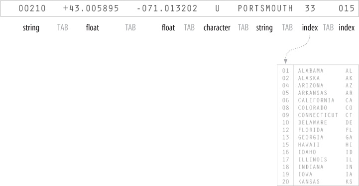
After you acquire the data, it needs to be parsed—changed into a format that tags each part of the data with its intended use. Each line of the file must be broken along its individual parts; in this case, it must be delimited at each tab character. Then, each piece of data needs to be converted to a useful format. Figure 1-2 shows the layout of each line in the census listing, which we have to understand to parse it and get out of it what we want.
Each field is formatted as a data type that we’ll handle in a conversion program:
- String
A set of characters that forms a word or a sentence. Here, the city or town name is designated as a string. Because the zip codes themselves are not so much numbers as a series of digits (if they were numbers, the code 02139 would be stored as 2139, which is not the same thing), they also might be considered strings.
- Float
A number with decimal points (used for the latitudes and longitudes of each location). The name is short for floating point, from programming nomenclature that describes how the numbers are stored in the computer’s memory.
- Character
A single letter or other symbol. In this data set, a character sometimes designates special post offices.
- Integer
A number without a fractional portion, and hence no decimal points (e.g., −14, 0, or 237).
- Index
Data (commonly an integer or string) that maps to a location in another table of data. In this case, the index maps numbered codes to the names and two-digit abbreviations of states. This is common in databases, where such an index is used as a pointer into another table, sometimes as a way to compact the data further (e.g., a two-digit code requires less storage than the full name of the state or territory).
With the completion of this step, the data is successfully tagged and consequently more useful to a program that will manipulate or represent it in some way.
Filter
The next step involves filtering the data to remove portions not relevant to our use. In this example, for the sake of keeping it simple, we’ll be focusing on the contiguous 48 states, so the records for cities and towns that are not part of those states—Alaska, Hawaii, and territories such as Puerto Rico—are removed. Another project could require significant mathematical work to place the data into a mathematical model or normalize it (convert it to an acceptable range of numbers).
Mine
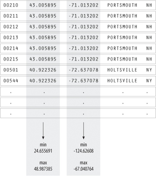
This step involves math, statistics, and data mining. The data in this case receives only a simple treatment: the program must figure out the minimum and maximum values for latitude and longitude by running through the data (as shown in Figure 1-3) so that it can be presented on a screen at a proper scale. Most of the time, this step will be far more complicated than a pair of simple math operations.
Represent
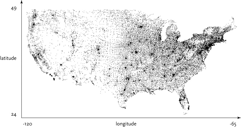
This step determines the basic form that a set of data will take. Some data sets are shown as lists, others are structured like trees, and so forth. In this case, each zip code has a latitude and longitude, so the codes can be mapped as a two-dimensional plot, with the minimum and maximum values for the latitude and longitude used for the start and end of the scale in each dimension. This is illustrated in Figure 1-4.
The Represent stage is a linchpin that informs the single most important decision in a visualization project and can make you rethink earlier stages. How you choose to represent the data can influence the very first step (what data you acquire) and the third step (what particular pieces you extract).
Refine
In this step, graphic design methods are used to further clarify the representation by calling more attention to particular data (establishing hierarchy) or by changing attributes (such as color) that contribute to readability.
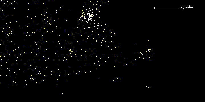
Hierarchy is established in Figure 1-5, for instance, by coloring the background deep gray and displaying the selected points (all codes beginning with four) in white and the deselected points in medium yellow.
Interact
The next stage of the process adds interaction, letting the user control or explore the data. Interaction might cover things like selecting a subset of the data or changing the viewpoint. As another example of a stage affecting an earlier part of the process, this stage can also affect the refinement step, as a change in viewpoint might require the data to be designed differently.
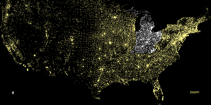
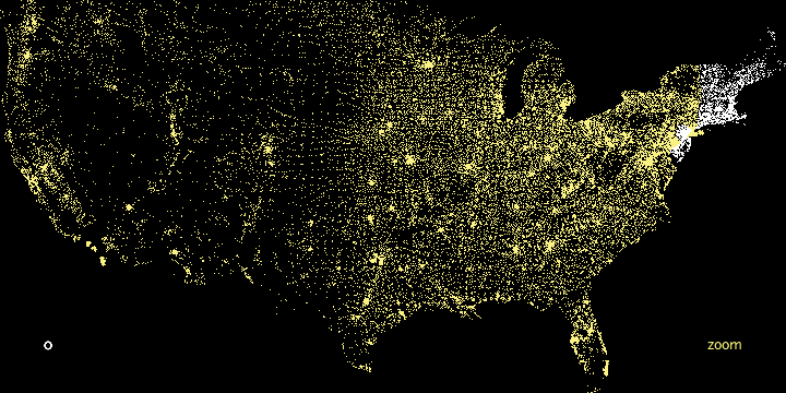
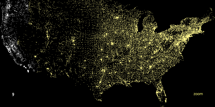
In the Zipdecode project, typing a number selects all zip codes that begin with that number. Figure 1-6 and Figure 1-7 show all the zip codes beginning with zero and nine, respectively.
Another enhancement to user interaction (not shown here) enables the users to traverse the display laterally and run through several of the prefixes. After typing part or all of a zip code, holding down the Shift key allows users to replace the last number typed without having to hit the Delete key to back up.
Typing is a very simple form of interaction, but it allows the user to rapidly gain an understanding of the zip code system’s layout. Just contrast this sample application with the difficulty of deducing the same information from a table of zip codes and city names.
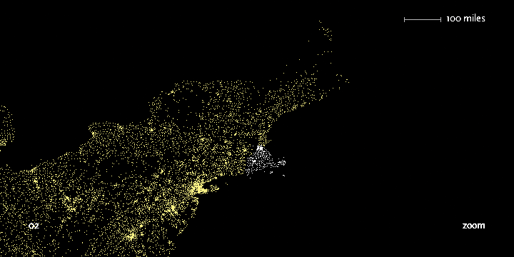
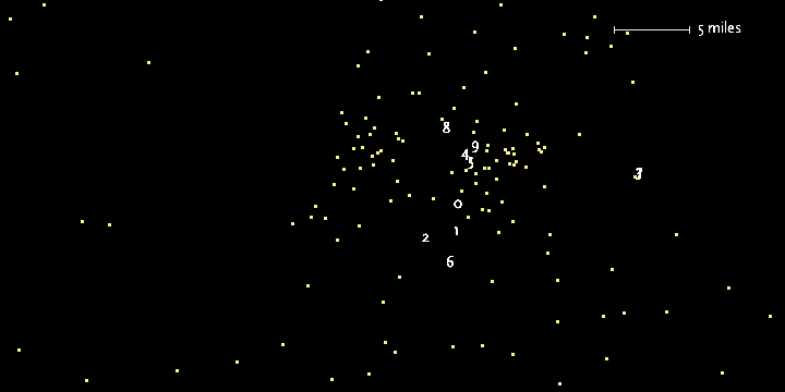
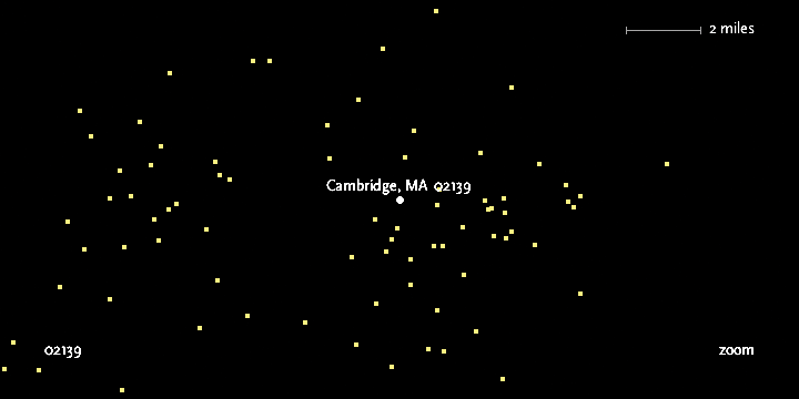
The viewer can continue to type digits to see the area covered by each subsequent set of prefixes. Figure 1-8 shows the region highlighted by the two digits 02, Figure 1-9 shows the three digits 021, and Figure 1-10 shows the four digits 0213. Finally, Figure 1-11 shows what you get by entering a full zip code, 02139—a city name pops up on the display.
In addition, users can enable a “zoom” feature that draws them closer to each subsequent digit, revealing more detail around the area and showing a constant rate of detail at each level. Because we’ve chosen a map as a representation, we could add more details of state and county boundaries or other geographic features to help viewers associate the “data” space of zip code points with what they know about the local environment.
Iteration and Combination
Figure 1-12 shows the stages in order and demonstrates how later decisions commonly reflect on earlier stages. Each step of the process is inextricably linked because of how the steps affect one another. In the Zipdecode application, for instance:
The need for a compact representation on the screen led me to refilter the data to include only the contiguous 48 states.
The representation step affected acquisition because after I developed the application I modified it so it could show data that was downloaded over a slow Internet connection to the browser. My change to the structure of the data allows the points to appear slowly, as they are first read from the data file, employing the data itself as a “progress bar.”
Interaction by typing successive numbers meant that the colors had to be modified in the visual refinement step to show a slow transition as points in the display are added or removed. This helps the user maintain context by preventing the updates on-screen from being too jarring.
The connections between the steps in the process illustrate the importance of the individual or team in addressing the project as a whole. This runs counter to the common fondness for assembly-line style projects, where programmers handle the technical portions, such as acquiring and parsing data, and visual designers are left to choose colors and typefaces. At the intersection of these fields is a more interesting set of properties that demonstrates their strength in combination.
When acquiring data, consider how it can change, whether sporadically (such as once a month) or continuously. This expands the notion of graphic design that’s traditionally focused on solving a specific problem for a specific data set, and instead considers the meta-problem of how to handle a certain kind of data that might be updated in the future.
In the filtering step, data can be filtered in real time, as in the Zipdecode application. During visual refinement, changes to the design can be applied across the entire system. For instance, a color change can be automatically applied to the thousands of elements that require it, rather having to make such a tedious modification by hand. This is the strength of a computational approach, where tedious processes are minimized through automation.
Principles
I’ll finish this general introduction to visualization by laying out some ways of thinking about data and its representation that have served me well over many years and many diverse projects. They may seem abstract at first, or of minor importance to the job you’re facing, but I urge you to return and reread them as you practice visualization; they just may help you in later tasks.
Each Project Has Unique Requirements
A visualization should convey the unique properties of the data set it represents. This book is not concerned with providing a handful of ready-made “visualizations” that can be plugged into any data set. Ready-made visualizations can help produce a quick view of your data set, but they’re inflexible commodity items that can be implemented in packaged software. Any bar chart or scatter plot made with Excel will look like a bar chart or scatter plot made with Excel. Packaged solutions can provide only packaged answers, like a pull-string toy that is limited to a handful of canned phrases, such as “Sales show a slight increase in each of the last five years!” Every problem is unique, so capitalize on that uniqueness to solve the problem.
Chapters in this book are divided by types of data, rather than types of display. In other words, we’re not saying, “Here’s how to make a bar graph,” but “Here are several ways to show a correlation.” This gives you a more powerful way to think about maximizing what can be said about the data set in question.
I’m often asked for a library of tools that will automatically make attractive representations of any given data set. But if each data set is different, the point of visualization is to expose that fascinating aspect of the data and make it self-evident. Although readily available representation toolkits are useful starting points, they must be customized during an in-depth study of the task.
Data is often stored in a generic format. For instance, databases used for annotation of genomic data might consist of enormous lists of start and stop positions, but those lists vary in importance depending on the situation in which they’re being used. We don’t view books as long abstract sequences of words, yet when it comes to information, we’re often so taken with the enormity of the information and the low-level abstractions used to store it that the narrative is lost. Unless you stop thinking about databases, everything looks like a table—millions of rows and columns to be stored, queried, and viewed.
In this book, we use a small collection of simple helper classes as starting points. Often, we’ll be targeting the Web as a delivery platform, so the classes are designed to take up minimal time for download and display. But I will also discuss more robust versions of similar tools that can be used for more in-depth work.
This book aims to help you learn to understand data as a tool for human decision-making—how it varies, how it can be used, and how to find what’s unique about your data set. We’ll cover many standard methods of visualization and give you the background necessary for making a decision about what sort of representation is suitable for your data. For each representation, we consider its positive and negative points and focus on customizing it so that it’s best suited to what you’re trying to convey about your data set.
Avoid the All-You-Can-Eat Buffet
Often, less detail will actually convey more information because the inclusion of overly specific details causes the viewer to miss what’s most important or disregard the image entirely because it’s too complex. Use as little data as possible, no matter how precious it seems.
Consider a weather map, with curved bands of temperatures across the country. The designers avoid giving each band a detailed edge (particularly because the data is often fuzzy). Instead, they convey a broader pattern in the data.
Subway maps leave out the details of surface roads because the additional detail adds more complexity to the map than necessary. Before maps were created in Beck’s style, it seemed that knowing street locations was essential to navigating the subway. Instead, individual stations are used as waypoints for direction finding. The important detail is that your target destination is near a particular station. Directions can be given in terms of the last few turns to be taken after you exit the station, or you can consult a map posted at the station that describes the immediate area aboveground.
It’s easy to collect data, and some people become preoccupied with simply accumulating more complex data or data in mass quantities. But more data is not implicitly better, and often serves to confuse the situation. Just because it can be measured doesn’t mean it should. Perhaps making things simple is worth bragging about, but making complex messes is not. Find the smallest amount of data that can still convey something meaningful about the contents of the data set. As with Beck’s underground map, focusing on the question helps define those minimum requirements.
The same holds for the many “dimensions” that are found in data sets. Web site traffic statistics have many dimensions: IP address, date, time of day, page visited, previous page visited, result code, browser, machine type, and so on. While each of these might be examined in turn, they relate to distinct questions. Only a few of the variables are required to answer a typical question, such as “How many people visited page x over the last three months, and how has that figure changed each month?” Avoid trying to show a burdensome multidimensional space that maps too many points of information.
Know Your Audience
Finally, who is your audience? What are their goals when approaching a visualization? What do they stand to learn? Unless it’s accessible to your audience, why are you doing it? Making things simple and clear doesn’t mean assuming that your users are idiots and “dumbing down” the interface for them.
In what way will your audience use the piece? A mapping application used on a mobile device has to be designed with a completely different set of criteria than one used on a desktop computer. Although both applications use maps, they have little to do with each other. The focus of the desktop application may be finding locations and print maps, whereas the focus of the mobile version is actively following the directions to a particular location.
Get Visualizing Data now with the O’Reilly learning platform.
O’Reilly members experience books, live events, courses curated by job role, and more from O’Reilly and nearly 200 top publishers.
