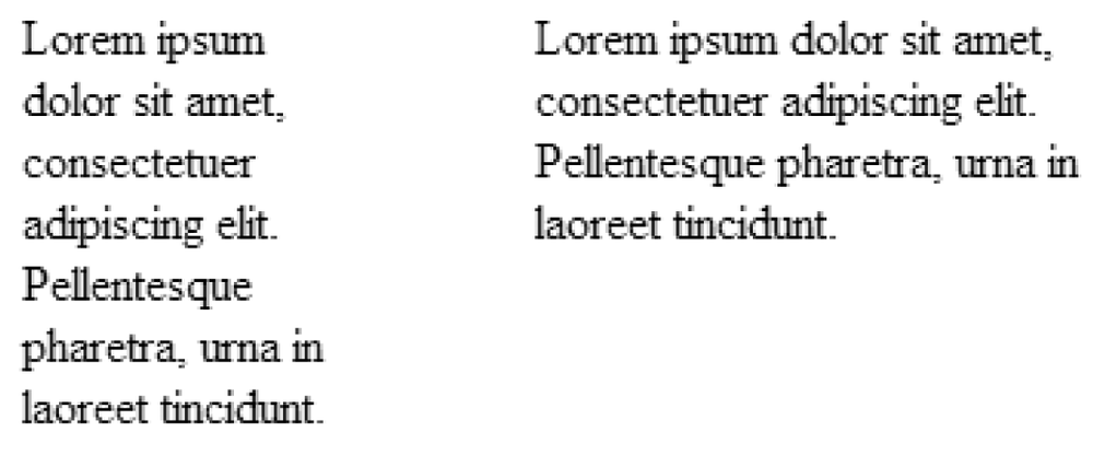
Using the height and width properties is straightforward, as shown
in these examples and Figure
19-3.
    div#tall {width:100px; height:200px; }
    div#wide {width:200px; height:100px; }

    <div id="tall" style="position:absolute;">
      Lorem ipsum ...
    </div>

    <div id="wide" style="position:absolute; left: 205px;">
      Lorem ...
    </div>
There are only a few special behaviors to be aware of:
widthandheightproperties apply to the content area of the element only. Padding, borders, and margins are added onto thewidthandheightvalues to arrive at the total element box dimensions. (See the sidebar "The IE/Windows Box Model Problem" for details regarding the notoriously incorrect implementation of box model measurements in Internet Explorer for Windows.)
Figure 19-3. The height and width properties
An element’s height is calculated automatically and is just large enough to contain the element’s contents; therefore, it is less common to specify height. The height of the content may change based on
font-size, user settings, or other factors. If you do specify a height for a text element, be sure to also consider what happens should the content not fit (theoverflowproperty is discussed in Chapter 21).For images, it is recommended that both
widthandheightvalues be provided.CSS 2 introduced percentage values for
widthandheight. Percentage values are calculated as a percentage of the width of the parent ...