ASP.NET’s controls are wonderful things. They save developers vast amounts of time by providing well-tested, robust, and rich-featured controls for creating everything from menus to data lists.
Unfortunately, the HTML these controls generate isn’t particularly easy to work with if you’re trying to get the most out of CSS. For example, ASP.NET’s Menu control dynamically binds data from an XML file or database, creates the menu, and outputs it using HTML table elements. This can be quite frustrating, especially if you’re in the web standards camp, where using tables for layout is considered evil.
The CSS Friendly ASP.NET 2.0 Control Adapters not only win the award for the longest tool name in this book, they also help solve this problem. The package, created by Microsoft’s ASP.NET team, lets you generate much nicer HTML output by injecting custom control adapters into the flow just described.
CSS adapters exist because too many developers were dissatisfied with the control they had over how the stock ASP.NET controls rendered HTML. A prime example of this is the recent movement to use ul tags rather than table tags for creating menus. Well-known CSS guru Eric Meyer has talked about this approach in his article “Pure CSS Menus,” which is posted at his web site (http://www.meyerweb.com/eric/css/edge/menus/demo.html).
Tool | CSS Friendly ASP.NET 2.0 Control Adapters |
Version covered | Beta 1.1 |
Home page | |
Power Tools page | |
Summary | Lets you get better HTML out of your ASP.NET controls, making it easier to style them with CSS |
License type | Microsoft Permissive |
Online resources | Online tutorials, white paper, and forums (all accessible from the project’s home page) |
Supported Frameworks | .NET 1.1, 2.0 |
The Control Adapters download is packaged as a Visual Studio Content Installer .vsi file. Double-click that file from an Explorer window to install it.
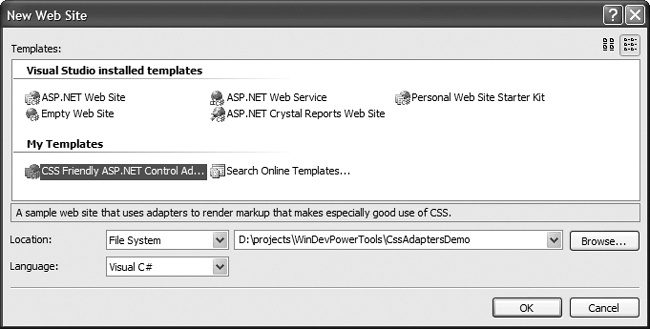
Once the install completes, launch Visual Studio and create a new Web Project. You’ll see a new template available in the My Templates area: CSS Friendly ASP.NET Control Adapters (Figure 1-12). Select this option, choose your language, and specify the location as for a normal project.
At this point, you’re ready to press on with using the adapters.
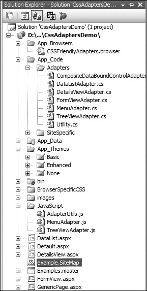
The Control Adapters aren’t a library you’ll be referencing. Rather, new projects based on this template will contain the source code for the custom control adapters, several different CSS themes, several JavaScript files, and extensive source data, as shown in Figure 1-13. You can examine the implementation details and decide whether using the adapters’ code for your project is appropriate, or whether you’ll need to extend what’s delivered.
The best approach to rolling these control adapters into your own project is to look at how they work in the examples, reference the extensive and well-written tutorials and white papers, and then start migrating the CSS styling to your own data and needs.
Tip
The web developer toolbars for Firefox and IE will be very helpful as you explore the control adapters.
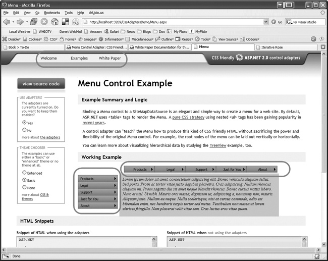
Figure 1-14 shows the Menu control example screen. The control adapters help you get multiple instances of one type happily coexisting on the same page. This example shows a menu on the banner (upper left), plus a second menu displayed both horizontally and vertically in the middle of the page. The banner menu is defined on the master page, while the two central menus are defined on the Menu control example page.
Content for all three menus comes from a sitemap file bound through a SiteMapProvider. Additionally, each menu is marked off with different CssSelectorClass attribute values, enabling you to easily control styling for the different menus.
As the white paper accompanying the distribution says, the adapters “produce markup that is intended to be simple and predictable.” The stylesheets bundled in the distribution are well commented and sensibly broken into two groups: files holding selectors that don’t often change, and those you’ll customize more frequently. Each selector is extensively documented, greatly speeding your ability to get cracking with development.
The example pages have a number of terrific features to help you learn. One nice bit is side-by-side views of HTML generated by plain ASP.NET controls and HTML rendered by the adapters. Example 1-1 shows what the HTML without adapters looks like for a small portion of the example menu.
Example 1-1. Menu HTML without adapters
<a href="#ctl00_ctl00_MainContent_LiveExample_Menu1_SkipLink">
<img alt="Skip Navigation Links" src="/CssAdaptersDemo/WebResource.axd?
d=2jD0p8ZSnW_hGCc2BeHyVw2&t=632778544211406250"
width="0" height="0"
style="border-width:0px;" />
</a>
<table id="ctl00_ctl00_MainContent_LiveExample_Menu1"
class="Menu-Skin-Vertical ctl00_ctl00_MainContent_LiveExample_Menu1_2"
CssSelectorClass="PrettyMenu" cellpadding="0" cellspacing="0" border="0">
<tr onmouseover="Menu_HoverStatic(this)" onmouseout="Menu_Unhover(this)"
onkeyup="Menu_Key(event)" title="Products"
id="ctl00_ctl00_MainContent_LiveExample_Menu1n0">
<td><table class="Menu-Skin-StaticItem
ctl00_ctl00_MainContent_LiveExample_Menu1_4"
cellpadding="0" cellspacing="0" border="0" width="100%">
<tr>
<td style="white-space:nowrap;width:100%;">
<a class="ctl00_ctl00_MainContent_LiveExample_Menu1_1
Menu-Skin-StaticItem ctl00_ctl00_MainContent_
LiveExample_Menu1_3"
href="/CssAdaptersDemo/GenericPage.aspx?goto=Products"
style="border-style:none;
font-size:1em;">Products</a>
</td>
<td style="width:0;">
<img src="/CssAdaptersDemo/WebResource.axd?
d=Y33QeBh4xf3xB8AJfmKdgNTBFV6SazKTOeGxIcN-bI41&
t=632778544211406250"
alt="Expand Products"
style="border-style:none;vertical-align:middle;" />
</td>
</tr>
</table></td>Example 1-2 shows the same menu snippet, this time rendered via the control adapter. Not much of a contest for clarity and simplicity, is it?
Example 1-2. HTML with adapters
<div class="PrettyMenu">
    <div class="AspNet-Menu-Vertical">
        <ul class="AspNet-Menu">
            <li class="AspNet-Menu-WithChildren">
                <a href="/CssAdaptersDemo/GenericPage.aspx?goto=Products"
                        class="AspNet-Menu-Link" title="Products">
                    Products
                </a>
                <ul>
                    <li class="AspNet-Menu-Leaf">
                        <a href="/CssAdaptersDemo/GenericPage.aspx?
                                goto=ProductsWindows"
                                class="AspNet-Menu-Link" title="Windows">
                            Windows
                        </a>
                    </li>
                    <li class="AspNet-Menu-Leaf">
                        <a href="/CssAdaptersDemo/GenericPage.aspx?
                                goto=ProductsOffice"
                                class="AspNet-Menu-Link" title="Office">
                            Office
                        </a>
                    </li>
With this greatly simplified HTML, we can write clear CSS to handle displaying the various elements. Better yet, the adapters look at the data fed to them and determine whether a menu item has children or is a leaf. The two types of data are marked with different classes, enabling custom styling such as the arrow character by each menu item. This is handled by the BuildItem method in the MenuAdapter class found in the App_Data\Adapters folder:
private void BuildItem(MenuItem item, HtmlTextWriter writer)
{
    Menu menu = Control as Menu;
    if ((menu != null) && (item != null) && (writer != null))
    {
        writer.WriteLine( );
        writer.WriteBeginTag("li");
        writer.WriteAttribute("class",
        item.ChildItems.Count > 0 ?
            "AspNet-Menu-WithChildren" : "AspNet-Menu-Leaf");
        writer.Write(HtmlTextWriter.TagRightChar);
        writer.Indent++;
        writer.WriteLine( );

        // remainder elided for brevity
For example, leaf items are styled by this selector:
/* When a menu item contains no submenu items it is marked as a "leaf"
and can be styled specially by this rule. */
.PrettyMenu ul.AspNet-Menu li.AspNet-Menu-Leaf a,
.PrettyMenu ul.AspNet-Menu li.AspNet-Menu-Leaf span
{
    background-image: none;
}
Items that aren’t leaves (and therefore have children) get styled with this selector, nicely displaying the right arrow that indicates that submenus follow:
.PrettyMenu ul.AspNet-Menu li a,
.PrettyMenu ul.AspNet-Menu li span
{
    color: black;
    padding: 4px 2px 4px 8px;
    border:1px solid #648ABD;
    border-bottom: 0;
    background: transparent url(arrowRight.gif) right center no-repeat;
}
Don’t like how this particular hierarchy is created and rendered? You can easily change it by modifying the adapters delivered with the distribution. The white paper gives a large amount of detail, providing a great starting point for moving out on your own.
Get Windows Developer Power Tools now with the O’Reilly learning platform.
O’Reilly members experience books, live events, courses curated by job role, and more from O’Reilly and nearly 200 top publishers.


