Chapter 15. Templates
Properties and styles determine a control's appearance and behavior. For example, a Slider control's TickFrequency, TickPlacement, Background, and Width properties help determine its appearance, while its Minimum, Maximum, LargeChange, and IsEnabled properties help determine its behavior.
In contrast, templates determine a control's structure. They determine what components make up the control and how those components interact to provide the control's features.
This chapter describes templates in general terms and shows how you can build templates of your own to change the way existing controls work.
Template Overview
If you look closely at Figure 15-1, you can see that a Slider control has a bunch of parts including:
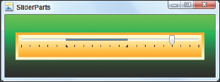
Figure 15.1. Figure 15-1
A border
Tick marks
A background
Clickable areas on the background (basically anywhere between the top of the control and its tick marks vertically) that change the current value
A Thumb indicating the current value that you can drag back and forth
Selection indicators (the little black triangles) that indicate a selected range
These features are provided by the pieces that make up the Slider. By default, a Slider is made up of a multitude of Border, Grid, TickBar, Track, RepeatButton, Rectangle, Thumb, Canvas, and Path controls, together with many brushes, transformations, styles, and triggers.
A template determines what the pieces ...
Get WPF Programmer's Reference: Windows Presentation Foundation with C# 2010 and .NET 4 now with the O’Reilly learning platform.
O’Reilly members experience books, live events, courses curated by job role, and more from O’Reilly and nearly 200 top publishers.

