

The Unreasonable Importance of Causal Reasoning
We are immersed in cause and effect. Whether we are shooting pool or getting vaccinated, we are always thinking about causality. If I shoot the cue ball at this angle, will the 3 ball go into the corner pocket? What would happen if I tried a different angle? If I get vaccinated, am I more or less likely to get COVID? We make decisions like these all the time, both good and bad. (If I stroke my lucky rabbit’s foot before playing the slot machine, will I hit a jackpot?)
Whenever we consider the potential downstream effects of our decisions, whether consciously or otherwise, we are thinking about cause. We’re imagining what the world would be like under different sets of circumstances: what would happen if we do X? What would happen if we do Y instead? Judea Pearl, in The Book of Why, goes so far as to say that reaching the top of the “ladder of causation” is “a key moment in the evolution of human consciousness” (p. 34). Human consciousness may be a stretch, but causation is about to cause a revolution in how we use data. In an article in MIT Technology Review, Jeannette Wing says that “Causality…is the next frontier of AI and machine learning.”
Causality allows us to reason about the world and plays an integral role in all forms of decision making. It’s essential to business decisions, and often elusive. If we lower prices, will sales increase? (The answer is sometimes no.) If we impose a fine on parents who are late picking up their children from daycare, will lateness decrease? (No, lateness is likely to increase.) Causality is essential in medicine: will this new drug reduce the size of cancer tumors? (That’s why we have medical trials.) This kind of reasoning involves imagination: we need to be able to imagine what will happen if we do X, as well as if we don’t do X. When used correctly, data allows us to infer something about the future based on what happened in the past. And when used badly, we merely repeat the same mistakes we’ve already made. Causal inference also enables us to design interventions: if you understand why a customer is making certain decisions, such as churning, their reason for doing so will seriously impact the success of your intervention.
We have heuristics around when causality may not exist, such as “correlation doesn’t imply causation” and “past performance is no indication of future returns,” but pinning down causal effects rigorously is challenging. It’s not an accident that most heuristics about causality are negative—it’s easier to disprove causality than to prove it. As data science, statistics, machine learning, and AI increase their impact on business, it’s all the more important to re-evaluate techniques for establishing causality.
Scientific Research
Basic research is deeply interested in mechanisms and root causes. Questions such as “what is the molecular basis for life?” led our civilization to the discovery of DNA, and in that question there are already embedded causal questions, such as “how do changes in the nucleotide sequence of your DNA affect your phenotype (observable characteristics)?” Applied scientific research is concerned with solutions to problems, such as “what types of interventions will reduce transmission of COVID-19?” This is precisely a question of causation: what intervention X will result in goal Y? Clinical trials are commonly used to establish causation (although, as you’ll see, there are problems with inferring causality from trials). And the most politically fraught question of our times is a question about causality in science: is human activity causing global warming?
Business
Businesses frequently draw on previous experience and data to inform decision making under uncertainty and to understand the potential results of decisions and actions. “What will be the impact of investing in X?” is another causal question. Many causal questions involve establishing why other agents perform certain actions. Take the problem of predicting customer churn: the results are often useless if you can’t establish the cause. One reason for predicting churn is to establish what type of intervention will be most successful in keeping a loyal customer. A customer who has spent too long waiting for customer support requires a different intervention than a customer who no longer needs your product. Business is, in this sense, applied sociology: understanding why people (prospects, customers, employees, stakeholders) do things. A less obvious, but important, role of causal understanding in business decision making is how it impacts confidence: a CEO is more likely to make a decision, and do so confidently, if they understand why it’s a good decision to make.
The Philosophical Bases of Causal Inference
The philosophical underpinnings of causality affect how we answer the questions “what type of evidence can we use to establish causality?” and “what do we think is enough evidence to be convinced of the existence of a causal relationship?” In the eighteenth century, David Hume addressed this question in An Enquiry Concerning Human Understanding, where he establishes that human minds perform inductive logic naturally: we tend to generalize from the specific to the general. We assume that all gunpowder, under certain conditions, will explode, given the experience of gunpowder exploding under those conditions in the past. Or we assume that all swans are white, because all the swans we’ve seen are white. The problem of induction arises when we realize that we draw conclusions like these because that process of generalization has worked in the past. Essentially, we’re using inductive logic to justify the use of inductive logic! Hume concludes that “we cannot apply a conclusion about a particular set of observations to a more general set of observations.”
Does this mean that attempting to establish causality is a fool’s errand? Not at all. What it does mean is that we need to apply care. One way of doing so is by thinking probabilistically: if gunpowder has exploded under these conditions every time in the past, it is very likely that gunpowder will explode under these conditions in the future; similarly, if every swan we’ve ever seen is white, it’s likely that all swans are white; there is some invisible cause (now we’d say “genetics”) that causes swans to be white. We give these two examples because we’re still almost certain that gunpowder causes explosions, and yet we now know that not all swans are white. A better application of probability would be to say that “given that all swans I’ve seen in the past are white, the swans I see in the future are likely to be white.”
Attempts at Establishing Causation
We all know the famous adage “correlation does not imply causation,” along with examples, such as the ones shown in this Indy100 article (e.g., the number of films Nicolas Cage makes in a year correlated with the number of people drowning in a swimming pool in the US). Let us extend the adage to “correlation does not imply causation, but it sure is correlated with it.” While correlation isn’t causation, you can loosely state that correlation is a precondition for causation. We write “loosely” because the causal relationship need not be linear, and correlation is a statistic that summarizes the linear relationship between two variables. Another subtle concern is given by the following example: if you drive uphill, your speed slows down and your foot pushes harder on the pedal. Naively applying the statement “correlation is a precondition for causation” to this example would lead you to precisely draw the wrong inference: that your foot on the pedal slows you down. What you actually want to do is use the speed in the absence of your foot on the pedal as a baseline.
Temporal precedence is another precondition for causation. We only accept that X causes Y if X occurs before Y. Unlike correlation, causation is symmetric: if X and Y are correlated, so are Y and X. Temporal precedence removes this problem. But temporal precedence, aligned with correlation, still isn’t enough for causation.
A third precondition for causation is the lack of a confounding variable (also known as a confounder). You may observe that drinking coffee is correlated with heart disease later in life. Here you have our first two preconditions satisfied: correlation and temporal precedence. However, there may be a variable further upstream that impacts both of these. For example, smokers may drink more coffee, and smoking causes heart disease. In this case, smoking is a confounding variable that makes it more difficult to establish a causal relationship between coffee and heart disease. (In fact, there is none, to our current knowledge.) This precondition can be framed as “control for third variables”.
We could go further; the epidemiologist Bradford Hill lists nine criteria for causation. For our purposes, three will suffice. But remember: these are preconditions. Meeting these preconditions still doesn’t imply causality.
Causality, Randomized Control Trials, and A/B Testing
Causality is often difficult to pin down because of our expectations in physical systems. If you drop a tennis ball from a window, you know that it will fall. Similarly, if you hit a billiard ball with a cue, you know which direction it will go. We constantly see causation in the physical world; it’s tempting to generalize this to larger, more complex systems, such as meteorology, online social networks, and global finance.
However, causality breaks down relatively rapidly even in simple physical systems. Let us return to the billiard table. We hit Ball 1, which hits Ball 2, which hits Ball 3, and so on. Knowing the exact trajectory of Ball 1 would allow us to calculate the exact trajectories of all subsequent balls. However, given an ever-so-slight deviation of Ball 1’s actual trajectory from the trajectory we use in our calculation, our prediction for Ball 2 will be slightly off, our prediction for Ball 3 will be further off, and our prediction for Ball 5 could be totally off. Given a small amount of noise in the system, which always occurs, we can’t say anything about the trajectory of Ball 5: we have no idea of the causal link between how we hit Ball 1 and the trajectory of Ball 5.
It is no wonder that the desire to think about causality in basic science gave rise to randomized control trials (RCTs), in which two groups, all other things held constant, are given different treatments (such as “drug” or “placebo”). There are lots of important details, such as the double-blindness of studies, but the general principle remains: under the (big) assumption that all other things are held constant,1 the difference in outcome can be put down to the difference in treatment: Treatment → Outcome. This is the same principle that underlies statistical hypothesis testing in basic research. There has always been cross-pollination between academia and industry: the most widely used statistical test in academic research, the Student’s t test, was developed by William Sealy Gosset (while employed by the Guinness Brewery!) to determine the impact of temperature on acidity while fermenting beer.
The same principle underlies A/B testing, which permeates most businesses’ digital strategies. A/B tests are an online analog of RCTs, which are the gold standard for causal inference, but this statement misses one of the main points: what type of causal relationships can A/B tests say something about? For the most part, we use A/B tests to test hypotheses about incremental product changes; early on, Google famously A/B tested 40 shades of blue to discover the best color for links.
But A/B tests are no good for weightier questions: no A/B test can tell you why a customer is likely to churn. An A/B test might help you determine if a new feature is likely to increase churn. However, we can’t generate an infinite number of hypotheses nor can we run an infinite number of A/B tests to identify the drivers of churn. As we’ve said, business is applied sociology: to run a successful business, you need to understand why your prospects and customers behave in certain ways. A/B tests will not tell you this. Rather, they allow you to estimate the impact of product changes (such as changing the color of a link or changing the headline of an article) on metrics of interest, such as clicks. The hypothesis space of an A/B test is minuscule, compared with all the different kinds of causal questions a business might ask.
To take an extreme example, new technologies don’t emerge from A/B testing. Brian Christian quotes Google’s Scott Huffman as saying (paraphrasing Henry Ford), “If I’d asked my customers what they wanted, they’d have said a faster horse. If you rely too much on the data [and A/B testing], you never branch out. You just keep making better buggy whips.” A/B tests can lead to minor improvements in current products but won’t lead to the breakthroughs that create new products—and may even blind you to them.
Christian continues: “[Companies] may find themselves chasing ‘local maxima’—places where the A/B tests might create the best possible outcome within narrow constraints—instead of pursuing real breakthroughs.” This is not to say that A/B tests haven’t been revolutionary. They have helped many businesses become more data driven, and to navigate away from the HiPPO principle, in which decisions are made by the “highest paid person’s opinion.” But there are many important causal questions that A/B tests can’t answer. Causal inference is still in its infancy in the business world.
The End of Causality: The Great Lie
Before diving into the tools and techniques that will be most valuable in establishing robust causal inference, it’s worth diagnosing where we are and how we got here. One of the most dangerous myths of the past two decades was that the sheer volume of data we have access to renders causality, hypotheses, the scientific method, and even understanding the world obsolete. Look no further than Chris Anderson’s 2008 Wired article “The End of Theory: The Data Deluge Makes the Scientific Method Obsolete”, in which Anderson states:
Google’s founding philosophy is that we don’t know why this page is better than that one: if the statistics of incoming links say it is, that’s good enough. No semantic or causal analysis is required….
This is a world where massive amounts of data and applied mathematics replace every other tool that might be brought to bear.
In the “big data” limit, we don’t need to understand mechanism, causality, or the world itself because the data, the statistics, and the at-scale patterns speak for themselves. Now, 15 years later, we’ve seen the at-scale global problems that emerge when you don’t understand what the data means, how it’s collected, and how it’s fed into decision-making pipelines. Anderson, when stating that having enough data means you don’t need to think about models or assumptions, forgot that both assumptions and implicit models of how data corresponds to the real world are baked into the data collection process, the output of any decision-making system, and every step in between.
Anderson’s thesis, although dressed up in the language of “big data,” isn’t novel. It has strong roots throughout the history of statistics, harking back to Francis Galton, who introduced correlation as a statistical technique and was one of the founders of the eugenics movement (as Aubrey Clayton points out in “How Eugenics Shaped Statistics: Exposing the Damned Lies of Three Science Pioneers” and his wonderful book Bernoulli’s Fallacy, the eugenics movement and many of the statistical techniques we now consider standard are deeply intertwined). In selling correlation to the broader community, part of the project was to include causation under the umbrella of correlation, so much so that Karl Pearson, considered the father of modern statistics, wrote that, upon reading Galton’s Natural Inheritance:
I interpreted…Galton to mean that there was a category broader than causation, namely correlation, of which causation was the only limit, and that this new conception of correlation brought psychology, anthropology, medicine and sociology in large part into the field of mathematical treatment. (from The Book of Why)
We’re coming out of a hallucinatory period when we thought that the data would be enough. It’s still a concern how few data scientists think about their data collection methods, telemetry, how their analytical decisions (such as removing rows with missing data) introduce statistical bias, and what their results actually mean about the world. And the siren song of AI tempts us to bake the biases of historical data into our models. We are starting to realize that we need to do better. But how?
Causality in Practice
It’s all well and good to say that we’re leaving a hallucination and getting back to reality. To make that transition, we need to learn how to think about causality. Deriving causes from data, and data from well-designed experiments, isn’t simple.
The Ladder of Causation
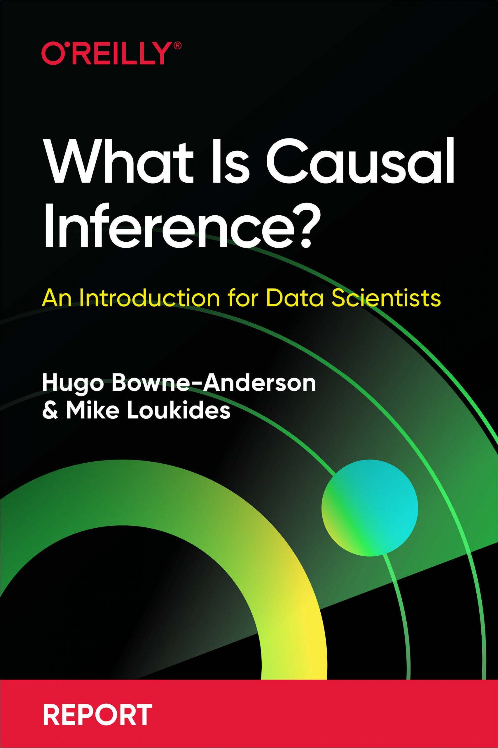
In The Book of Why, Judea Pearl developed the ladder of causation to consider how reasoning about cause is a distinctly different kind of ability, and an ability that’s only possessed by modern (well, since 40,000 BC) humans. The ladder has three rungs (Figure 1), and goes like this:
Association
We, along with just about every animal, can make associations and observations about what happens in our world. Animals know that if they go to a certain place, they’re likely to find food, whether that’s a bird going to a feeder, or a hawk going to the birds that are going to the feeder. This is also the level at which statistics operates—and that includes machine learning.
Intervention
On this rung of the ladder, we can do experiments. We can try something and see what happens. This is the world of A/B testing. It answers the question “what happens if we change something?”
Counterfactuals
The third level is where we ask questions about what the world would be like if something were different. What might happen if I didn’t get a COVID vaccine? What might happen if I quit my job? Counterfactual reasoning itself emerges from developing robust causal models: once you have a causal model based on association and intervention, you can then utilize this model for counterfactual reasoning, which is qualitatively different from (1) inferring a cause from observational data alone and (2) performing an intervention.
Historically, observation and association have been a proxy for causation. We can’t say that A causes B, but if event B follows A frequently enough, we learn to act as if A causes B. That’s “good old common sense,” which (as Horace Rumpole often complains) is frequently wrong.
If we want to talk seriously about causality as opposed to correlation, how do we do it? For example, how do we determine whether a treatment for a disease is effective or not? How do we deal with confounding factors (events that can cause both A and B, making A appear to cause B)? Enter randomized control trials (RCTs).
RCTs and Intervention
The RCT has been called the “gold standard” for assessing the effectiveness of interventions. Mastering ‘Metrics (p. 3ff.) has an extended discussion of the National Health Interview Survey (NHIS), an annual study of health in the US. The authors use this to investigate whether health insurance causes better health. There are many confounding factors: we intuitively expect people with health insurance to be more affluent and to be able to afford seeing doctors; more affluent people have more leisure time to devote to exercise, and they can afford a better diet. There are also some counterintuitive factors at play: at least statistically, people who have less money to spend on health care can appear more healthy, because their diseases aren’t diagnosed. All of these factors (and many others) influence their health, and make it difficult to answer the question “does insurance cause better health?”
In an ideal world, we’d be able to see what happens to individuals both when they have insurance and when they don’t, but this would require at least two worlds. The best we can do is to give some people insurance and some not, while attempting to hold all other things equal. This concept, known as ceteris paribus, is fundamental to how we think about causality and RCTs.
Ceteris paribus, or “all other things equal”
The key idea here is “all other things equal”: can we hold as many variables as possible constant so that we can clearly see the relationship between the treatment (insurance) and the effect (outcome)? Can we see a difference between the treatment group and the control (uninsured) group?
In an RCT, researchers pick a broad enough group of participants so that they can expect randomness to “cancel out” all the confounding factors—both those they know about and those they don’t. Random sampling is tricky, with many pitfalls; it’s easy to introduce bias in the process of selecting the sample groups. Essentially, we want a sample that is representative of the population of interest. It’s a good idea to look at the treatment and control groups to check for balance. For the insurance study, this means we would want the treatment and control groups to have roughly the same average income; we might want to subdivide each group into different subgroups for analysis. We have to be very careful about gathering data: for example, “random sampling” in the parking lot of Neiman-Marcus is much different from random sampling in front of Walmart. There are many ways that bias can creep into the sampling process.
Difference between means
To establish causality, we really want to know what the health outcomes (outcome) would be for person X if they had insurance (treatment) and if they didn’t (control). Because this is impossible (at least simultaneously), the next best thing would be to take two different people that are exactly the same, except that one has insurance and the other doesn’t. The challenge here is that the outcome, in either case, could be a result of random fluctuation, so may not be indicative of the insured (or uninsured population) as a whole. For this reason, we do an experiment with a larger population and look at the statistics of outcomes.
To see if the treatment has an effect, we look at the average outcome in the treatment and control groups (also called group means): in this case, the insured and uninsured. We could use individuals’ assessment of their health, medical records (if we have access), or some other metric.
We compare the groups by looking at the difference between the averages. These averages and groups are comparable due to the law of large numbers (LLN), which states that the average of the sample will get closer and closer to the population average, as we take more samples.
Even when drawing the samples from the same population, there will always be a difference between the means (unless by some fluke they’re exactly the same), due to sampling error: the sample mean is a sample statistic. So, the question becomes, How confident are we that the observed difference is real? This is the realm of statistical significance.
Statistical significance, practical significance, and sample sizes
The basic idea behind statistical significance is asking the question “were there no actual difference between the control and treatment groups, what is the probability of seeing a difference between the means equally or more extreme than the one observed?” This is the infamous p-value of the hypothesis test.2 In this case, we’re using the Student’s t test, but it’s worth mentioning that there are a panoply of tools to analyze RCT data, such as ANCOVA (analysis of covariance), HTE (heterogeneity of treatment effects) analysis, and regression (the last of which we’ll get to).
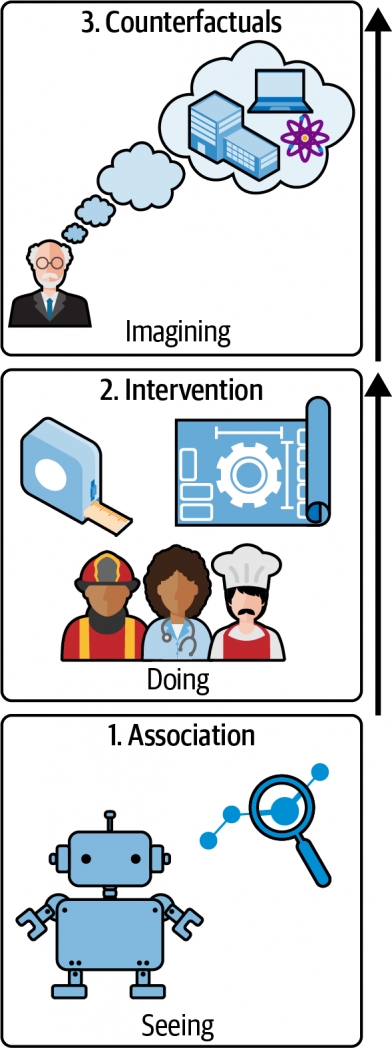
To answer this question, we need to look at not only the means, but also the standard error of the mean (SEM) of the control and treatment, which is a measure of uncertainty of the mean: if, for example, the difference between the means is significantly less than the SEM, then we cannot be very confident that the difference in means is a real difference.3 To this end, we quantify the difference in terms of standard errors of the populations. It is standard to say that the result is statistically significant if the p-value is less than 0.05. The number 0.05 is only a convention used in research, but the higher the p-value, the greater the chance that your results are misleading you.
In Figure 2, the two curves could represent the sampling distributions of the means of the treatment and the control groups. On the left and the right, the means (a1 and a2) are the same, as is the distance (d) between them. The big difference is the standard error of the mean (SEM). On the left, the SEM is small and the difference will likely be statistically significant. When the SEM is large, as it is on the right, there’s much more overlap between the two curves, and the difference is more likely to be a result of the sampling process, in which case you’re less likely to find statistical significance.
Statistical testing is often misused and abused, most famously in the form of p-hacking, which has had a nontrivial impact on the reproducibility crisis in science. p-hacking consists of a collection of techniques that allow researchers to get statistically significant results by cheating, one example of which is peeking. This is when you watch the p-value as data comes in and decide to stop the experiment once you get a statistically significant result. The larger the sample, the smaller the standard error and the smaller the p-value, and this should be considered when designing your experiment. Power analysis is a common technique to determine the minimum sample size necessary to get a statistically significant result, under the assumption that the treatment effect has a certain size. The importance of robust experimental design in randomized control trials cannot be overstated. Although it’s outside the scope of this report, check out “Randomized Controlled Trials—A Matter of Design” (Spieth et al.), Trustworthy Online Controlled Experiments (Kohavi et al.), and Emily Robinson’s “Guidelines for A/B Testing” for detailed discussions.
It is important to note that statistical significance is not necessarily practical significance or business value! Let’s say that you’re calculating the impact of a landing page change on customer conversion rates: you could find that you have a statistically significant increase in conversion, but the actual increase is so small as to be inconsequential to business or, even worse, that the cost of the change exceeds the return on investment. Also note that a result that is not statistically significant is not necessarily negative. For example, if the impact of a landing page change on conversion is not significant, it doesn’t imply that you should not ship the change. Businesses often decide to ship if the conversion rate doesn’t decrease (with statistical significance).
Check for balance
All of the above rests on the principle of ceteris paribus: all other things equal. We need to check that this principle actually holds in our samples. In practice, this is called checking for balance: ensure that your control and treatment groups have roughly the same characteristics with respect to known confounding factors. For example, in the insurance study, we would make sure that there are equal numbers of participants in each income range, along with equal numbers of exercisers and nonexercisers among the study’s participants. This is a standard and well-studied practice. Note that this assumes that you can enumerate all the confounding factors that are important. Also note that there are nuanced discussions on how helpful checking for balance actually is, in practice, such as “Mostly Harmless Randomization Checking”, “Does the ‘Table 1 Fallacy’ Apply if It Is Table S1 Instead?”, and “Silly Significance Tests: Balance Tests”. Having said that, it is important to know about the idea of checking for balance, particularly to get data scientists keeping front of mind the principle of “all other things equal.”
But what if we can’t do an experiment or trial, because of high costs, the data already having been collected, ethical concerns, or some other reason? All is not lost. We can try to control for other factors. For example, if we are unable to run a vaccine trial, we could (1) sample the populations of those who did and did not get vaccinated, (2) identify potentially confounding factors (for example, if one group has a higher proportion of people living in urban areas), and (3) correct for these.
In this process, we’re attempting to climb Pearl’s ladder of causality: we have only correlational data but want to make a causal statement about what would happen if we intervene! What would happen if uninsured people were insured? What would happen if unvaccinated people were vaccinated? That’s the highest (counterfactual) rung of Pearl’s ladder. It is important to note that the following techniques are not only useful when you cannot run an experiment but this is a useful way to introduce and motivate them.
The Constant-Effects Model, Selection Bias, and Control for Other Factors
What if all things aren’t equal across our groups? There are many evolving tools for dealing with this problem. Here, we’ll cover the most basic, the constant-effects model. This makes a (potentially strong) assumption, known as the constant-effects assumption, that the intervention has the same causal effect across the population. Looking back at the insurance example, the constant effects model asks us to assume that insurance (the treatment) has the same effect across all subgroups. If this is true, then we would expect that:
difference in group means = average causal effect + selection bias
where the selection bias term is the difference in the outcome of both groups had they both been uninsured. As Angrist and Pischke point out in Mastering ‘Metrics (p. 11),
The insured in the NHIS are healthier for all sorts of reasons, including, perhaps, the causal effects of insurance. But the insured are also healthier because they are more educated, among other things. To see why this matters, imagine a world in which the causal effect of insurance is zero…. Even in such a world, we should expect insured NHIS respondents to be healthier, simply because they are more educated, richer, and so on.
The selection bias term is precisely due to the issue of confounding variables, or confounders. One tool to deal with the potential impact of confounders and the (sample) selection bias outlined here is regression.
Making Other Things Equal with Regression
Regression is a tool to deal with the potential impact of other factors and the (sample) selection bias outlined previously. Many who have worked a lot with regression remark how surprised they are at the robustness and performance of these modeling techniques relative to fancier machine learning methods.
The basic idea is to identify potential confounders and compare subgroups of control and treatment groups that have similar ranges for these confounders. For example, in the NHIS insurance example, you could identify subgroups of insured and not insured that have similar levels of education and wealth (among other factors), compute the causal effects for each of these sets of subgroups, and use regression to generalize the results to the entire population.
We are interested in the outcome as a function of the treatment variable, while holding control variables fixed (these are the variables we’ve identified that could also impact the outcome: we want to compare apples to apples, essentially).
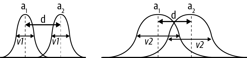
The specific equation of interest, in the case of a single control variable, is:
Here, Y is the outcome variable (the subscript i refers to whether they had the treatment or not: 1 if they did, 0 if they did not, by convention), P the treatment variable, A the control variable, e the error term. The regression coefficients/parameters are a, the intercept; b, the causal effect of the treatment on the outcome; and c, the causal effect of the control variable on the outcome.
Again, thinking of the NHIS study, there may be many other control variables in addition to education and wealth: age, gender, ethnicity, prior medical history, and more. (The actual study took all of these into account.) That is the nature of the game: you’re trying to discover the influence of one effect in a many-dimensional world. In real-world trials, many factors influence the outcome, and it’s not possible to enumerate all of them.
A note on generative models
Although generative modeling is outside the scope of this report, it is worth saying a few words about. Loosely speaking, a generative model is essentially a model that specifies the data-generating process (the technical definition is: it models the joint probability P(X, Y) of features X and outcome variable Y, in contrast to discriminative models that model the conditional probability P(Y|X) of the outcome, conditional on the features). Often the statistical model (such as the previous linear equation) will be simpler than the generative model and still obtain accurate estimates of the causal effect of interest, but (1) this isn’t always the case and (2) getting into the habit of thinking how your data was generated, simulating data based on this generative model, and checking whether your statistical model can recover the (known) causal effects, is an indispensable tool in the data scientist’s toolkit.
Consider the case in which we have a true model telling us how the data came to be:
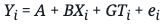
In this generative model, G is the causal effect of Ti on Yi, B is the causal effect of Xi on Yi, and ei is the effect of “everything else,” which could be purely random. If Xi and Ti are not correlated, we will obtain consistent estimates of G by fitting a linear model:
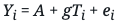
However, if Ti and Xi are correlated, we have to control for Xi in the regression, by estimating:
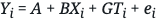
As previously stated, we have recovered the statistical model we started out with, but now have the added benefit of also having a generative model that allows us to simulate our model, in accordance with the data-generating process.
Omitted Variable Bias
Regression requires us to know what the important variables are; your regression is only as good as your knowledge of the system! When you omit important variables for whatever reason, your causal model and inferences will be biased. This type of bias is known as omitted variable bias (OVB). In Mastering ‘Metrics (p. 69), we find:
Regression is a way to make other things equal, but equality is generated only for variables included as controls on the right-hand side of the model. Failure to include enough controls or the right controls still leaves us with selection bias. The regression version of the selection bias generated by inadequate controls is called omitted variables bias (OVB), and it’s one of the most important ideas in the metrics canon.
It’s important to reason carefully about OVB, and it’s nontrivial to do so! One way to do this is performing a sensitivity analysis with respect to our controls, that is, to check out how sensitive the results are to the list of variables. If the changes in the variables you know about have a big effect on the results, you have reason to suspect that results might be equally sensitive to the variables you don’t know about. The less sensitive, or more robust, the regression is, the more confident we can be in the results. We highly recommend the discussion of OVB in Chapter 2 of Mastering ‘Metrics if you want to learn more.
Before moving on to discuss the power of instrumental variables, we want to remind you that there are many interesting and useful techniques that we are not able to cover in this report. One such technique is regression discontinuity design(RDD) which has gained increasing popularity over recent years and, among other things, has the benefit of having visually testable assumptions (continuity of all X aside from treatment assignment around the discontinuity). For more information, check out Chapter 6 of Cunningham’s Causal Inference and “Regression Discontinuity Design in Economics”, a paper by Lee and Lemieux.
Instrumental Variables
There are situations in which regression won’t work; for example, when an explanatory variable is correlated with the error term. To deal with such situations, we’re going to add instrumental variables to our causal toolkit.
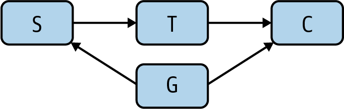
To do so, we’ll consider the example of the cholera epidemic that swept through England in the 1850s. At the time, it was generally accepted that cholera was caused by a vaporous exhalation of unhealthy air (miasma) and poverty, which was reinforced by the observation that cholera seemed more widespread in poorer neighborhoods. (If you’re familiar with Victorian literature, you’ve read about doctors prescribing vacations at the seaside so the patient can breathe healthy air.) The physician John Snow became convinced that the miasma theory was pseudoscience and that people were contracting cholera from the water supply.
To keep track of the different potential causal relationships, we will introduce causal graphs, a key technique that more data scientists need to know about. We start with the proposed causal relationship between miasma and cholera. To draw this as a graph, we have a node for miasma, a node for cholera, and an arrow from miasma to cholera, denoting a causal relationship (Figure 3).
The arrow has an associated path coefficient, which describes the strength of the proposed causal effect. Snow’s proposed causal relationship from water purity to cholera introduces another node and edge (Figure 4).
However, the miasma theory stated that miasma could be working through the water supply. Therefore, we need to include an arrow from miasma to water purity (Figure 5).
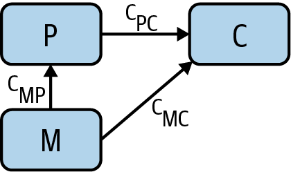
We’re running up against the challenge of a potential confounder again! Even if we could find a correlation between water purity and cholera cases, it still may be a result of miasma. And we’re unable to measure miasma directly, so we’re not able to control for it! So how to disprove this theory and/or determine the causal relationship between water purity and cholera?
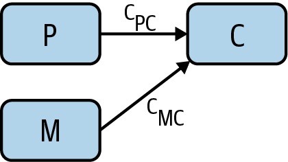
Enter the instrumental variable. Snow had noticed that most of the water supply came from two companies, the Southwark and Vauxhall Waterworks Company, which drew its water downstream from London’s sewers, and the Lambeth Waterworks Company, which drew its water upstream. This adds another node water company to our causal graph, along with an arrow from water company to water purity (Figure 6).
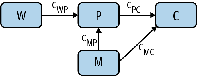
Water company (W) is an instrumental variable; it’s a way to vary the water purity (P) in a way that’s independent of miasma (M). Now that we’ve finished the causal graph, notice which arrows are not present:
- There are no arrows between water company and miasma. Miasma can’t cause a water company to exist, and vice versa.
- There is no direct arrow from water company to cholera, as the only causal effect that water company could have on cholera is as a result of its effect on water purity.
- There are no other arrows (potential confounders) that point into water company and cholera. Any correlation must be causal.
Each arrow has an associated path coefficient, which describes the strength of the relevant proposed causal effect. Because W and P are unconfounded, the causal effect cWP of W on P can be estimated from their correlation coefficient rWP. As W and C are also unconfounded, the causal effect cWC of W on C can also be estimated from the relevant correlation coefficient rWC. Causal effects along paths are multiplicative, meaning that cWC = cWPcPC. This tells us that the causal effect of interest, cPC, can be expressed as the ratio cWC /cWP = rWC /rWP. This is amazing! Using the instrumental variable W, we have found the causal effect of P on C without being able to measure the confounder M. Generally, any variable possessing the following characteristics of W is an instrumental variable and can be used in this manner:
- There is no arrow between W and M (they are independent).
- There is no direct arrow from W to C.
- There is an arrow from W to P.
All of this is eminently more approachable and manageable when framed in the language of graphs. For this reason, in the next section, we’ll focus on how causal graphs can help us think through causality and causal effects and perform causal inference.
NOTE
To be explicit, there has been something of a two cultures problem in the world of causality: those that use econometrics methods (such as those in Mastering ‘Metrics) and those that use causal graphs. It is plausible that the lack of significant crosspollination between these communities is one of the reasons causal inference is not more mature and widespread as a discipline (although proving this causal claim would be tough!). There are few resources that deal well with both worlds of causality, but Cunningham’s Causal Inference: The Mixtape is one that admirably attempts to do so.
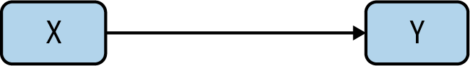
Causal Graphs
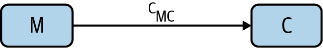
Randomized control trials are designed to tell us whether an action, X, can cause an outcome, Y. We can represent that with the simplest of all causal graphs (Figure 7). But in the real world, causality is never that simple. In the real world, there are also confounding factors that need to be accounted for. We’ve seen that RCTs can account for some of these confounding factors. But we need better tools to understand confounding factors and how they influence our results. That’s where causal graphs are a big help.
Forks and confounders
In the causal diagram in Figure 8, a variable Y has a causal effect on two variables X and Z, which means that X and Z will be correlated, even if there’s no causal relation between X and Z themselves! We call this a fork. If we want to investigate the causal relationship between X and Z, we have to deal with the presence of the confounder, Y. As we’ve seen, RCTs are a good way to deal with potential confounders.
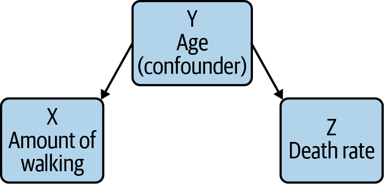
As an example, a 1998 New England Journal of Medicine paper identified a correlation between regular walking and reduced death rates among retired men. It was an observational study so the authors had to consider confounders. For example, you could imagine that age could be a confounder: health decays as you get older, and decaying health makes you less likely to walk regularly. When the study’s authors took this into account, though, they still saw an effect. Furthermore, that effect remained even after accounting for other confounding factors.
Colliders
The causal diagram in Figure 9 is a collider. Colliders occur whenever two phenomena have a common effect, such as a disease X, a risk factor Y, and whether the person is an inpatient or not. When you condition on the downstream variable Y (in hospital or not), you will see a spurious negative correlation between X and Y. While this seems strange, reasoning through this situation explains the negative correlation: an inpatient without the risk factor is more likely to have the disease than a general member of the population, as they’re in hospital! This type of bias is also known as Berkson’s paradox.
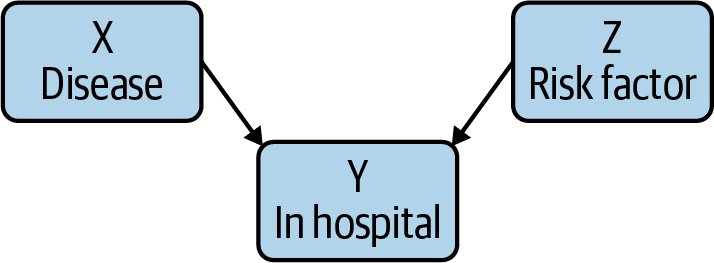
To think about this concretely, imagine one group of patients with COVID, and another with appendicitis. Both can cause hospital admissions, and there’s no plausible (at least as far as we know) connection between COVID and appendicitis. However, a hospital patient who does not have appendicitis is more likely to have COVID than a member of the general public; after all, that patient is in the hospital for something, and it isn’t appendicitis! Therefore, when you collect the data and work the statistics out, there will be a negative correlation between hospitalization from COVID and appendicitis: that is, it will look like appendicitis prevents severe COVID, or vice versa; the arrow of correlation points both ways. It’s always risky to say “we just know that can’t be true.” But in the absence of very compelling evidence, we are justified in being very suspicious of any connection between COVID and a completely unrelated medical condition.
RCTs often condition on colliders—but as we’ve seen, conditioning on a collider introduces a false (negative) correlation, precisely what you want to avoid. In the absence of other causal possibilities, the collider itself is evidence that X and Y are not causally related.
The flow of information
Causal graphs allow us to reason about the flow of information. Take, for example, the causal chain X → Y → Z. In this chain, information about X gives us information about Y, which in turn provides information about Z. However, if we control for Y (by choosing, for example, a particular value of Y), information about X then provides no new information about Z.
Similarly, in the fork X ← Y → Z, where X = walking, Y = age, Z = death rate, information about walking gives us information about death rate (as there is correlation, but not causation). However, when controlling for the confounder age, no information flows from walking to death rate (that is, there is no correlation when holding age constant).
In the collider X → Y ← Z, where X = disease, Y = in hospital, Z = risk factor, the situation is reversed! Information does not flow from X to Z until we control for Y. And controlling for Y introduces a spurious correlation that can cause us to misunderstand the causal relationships.
If no information flows from X → Y through Z, we say that Z blocks X → Y, and this will be important when thinking more generally about information flow through causal graphs, as we’ll now see.
In practice: The back-door adjustment
At this point, we have methods for deciding which events might be confounders (forks), and which events look like confounders but aren’t (colliders). So, the next step is determining how to deal with the true confounders. We can do this through the back-door and front-door adjustments, which let us remove the effect of confounders from an experiment.
We’re interested in whether there’s a causal relationship between X and an outcome Y, in the presence of a potential confounder Z: look at Figure 10.
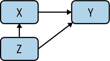
If there is a causal effect, though, and the back-door criterion (which we define later) is satisfied, we can solve for the causal relationship in question. Given X → Y, a collection of variables Z satisfies the back-door criterion if:
- No node in Z is a descendant of X.
- Any path between X and Y that begins with an arrow into X (known as a back-door path) is blocked by Z.
Controlling for Z essentially then blocks all noncausal paths between X and Y while not blocking any causal paths. So how does the adjustment work?
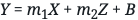
Here, we’ll consider the simplified case, in which Z contains a single variable. We could compute the correlation between X and Y for different values of the confounding factor Z, and weight them according to the probabilities of different values of Z. But there’s a simpler solution. Using linear regression to compute the line that best fits your X and Y data points is straightforward. In this situation, we take it a step further: we compute the best fit plane for X, Y, and Z. The math is essentially the same. The equation for this plane will be of the form:
The slope associated with X (m1) takes into account the effect of the confounder. It’s the average causal effect of X on Y. And, while we’ve only discussed a single confounder, this approach works just as well with multiple confounders.
In practice: The front-door adjustment
We still have to account for one important case. What if the confounding factor is either unobservable or hypothetical? How do you account for a factor that you can’t observe? Pearl discusses research into the connection between smoking and cancer, into which the tobacco companies inserted the idea of a “smoking gene” that would predispose people towards both smoking and cancer. This raises a problem: what happens if there’s a cause that can’t be observed? In the ’50s and ’60s, our understanding of genetics was limited; if there was a smoking gene, we certainly didn’t have the biotech to find it. There are plenty of cases where there are more plausible confounding factors, but detecting them is impossible, destructive, or unethical.
Pearl outlines a way to deal with these unknowable confounders that he calls the front-door adjustment (Figure 11). To investigate whether smoking S causes cancer C in the presence of an unknowable confounder G, we add another step in the causal graph between S and C. Discussing the smoking case, Pearl uses the presence of tar in the lungs. We’ll just call it T. We believe that T can’t be caused directly by the confounding factor G (though that’s a question worth thinking about). Then we can use the back-door correction to estimate the effect of T on C, with S coming through the back door. We can also estimate the causal effect of S on T as there is a collider at C. We can combine these to retrieve the causal effect of S on C.
This has been abstract, and the only real solution to the abstraction would be getting into the mathematics. For our purposes, though, it’s enough to note that it is possible to correct for hypothetical confounding factors that aren’t measurable and that might not exist. This is a real breakthrough. We can’t agree with Pearl’s claim that one causal graph would have replaced years of debate and testimony—politicians will be politicians, and lobbyists will be lobbyists. But it is very important to know that we have the tools.
One thing to note is that both the back-door and front-door adjustments require you to have the correct causal graph, containing all relevant confounding variables. This can often be challenging in practice and requires significant domain expertise.
The End of Correlation, the Beginning of Cause
Correlation is a powerful tool and will remain so. It’s a tool, not an end in itself. We need desperately to get beyond the idea that correlation is an adequate proxy for causality. Just think of all those people drowning because Nicolas Cage makes more films!
As “data science” became a buzzword, we got lazy: we thought that, if we could just gather enough data, correlation would be good enough. We can now store all the data we could conceivably want (a petabyte costs around $20,000 retail), and correlation still hasn’t gotten us what we want: the ability to understand cause and effect. But as we’ve seen, it is possible to go further. Medical research has been using RCTs for decades; causal graphs provide new tools and techniques for thinking about the relationships between possible causes. Epidemiologists like John Snow, the doctors who made the connection between smoking and cancer, and the many scientists who have made the causal connection between human activity and climate change, have all taken this path.
We have tools, and good ones, for investigating cause and weeding out the effects of confounders. It’s time to start using them.
Footnotes
- In practice, what is important is that all confounding variables are distributed across treatment and control.
- The p-value is not the probability that the hypothesis “there is no difference between the control and treatment groups” is true, as many think it is. Nor is it the probability of observing your data if the hypothesis is true, as many others think. In fact, the definition of p-value is so difficult to remember that “Not Even Scientists Can Easily Explain P-values”.
- Note that the standard error is not the same as the standard deviation of the data, but rather the standard deviation of the sampling distribution of the estimate of the mean.
Glossary
A/B test
A randomized control trial in tech.
causal graph
A graphical model used to illustrate (potential) causal relationships between variables of interest.
ceteris paribus
The principle of “all other things being equal,” which is essential for randomized control trials.
collider
A causal model in which two phenomena have a common effect, such as a disease X, a risk factor Y, and whether the person is an inpatient or not: X → Y ← Z.
confounding variable
A variable that influences both the dependent and independent variables.
counterfactual
The rung of the ladder of causation at which we can use causal models to reason about events that did not occur.
fork
A causal model in which there is a confounding variable X ← Y → Z.
generative model
A generative model is essentially a model that specifies the data-generating process. The technical definition is that it models the joint probability P(X, Y) of features X and outcome variable Y, in contrast to discriminative models that model the conditional probability P(Y|X) of the outcome, conditional on the features).
instrumental variable
Given X → Y, an instrumental variable Z is a third variable used in regression analyses to account for unexpected relationships between other variables (such as one being correlated with the error term).
intervention
The rung of the ladder of causation at which we can perform experiments, most famously in the form of randomized control trials and A/B tests.
omitted variable bias
When failure to include enough controls or the right controls still leaves us with selection bias.
p-value
In a hypothesis test, the p-value is the probability of observing a test statistic at least as extreme as the one observed.
randomized control trial (RCT)
An experiment in which subjects are randomly assigned to one of several groups, in order to ascertain the impact in the outcome of differences in treatment.
standard error
The standard error of a statistic (for example, the mean) is the standard deviation of its sampling distribution. In other words, it’s a measure of uncertainty of the sample mean.
References
Key references are marked with an asterisk.
Anderson, Chris. “The End of Theory: The Data Deluge Makes the Scientific Method Obsolete”. Wired (2008).
*Angrist, Joshua D., and Jörn-Steffen Pischke. Mastering ‘Metrics: The Path from Cause to Effect. Princeton University Press (2014).
Aschwanden, Christie. “Not Even Scientists Can Easily Explain P-values”. FiveThirtyEight (2015).
Bowne-Anderson, Hugo. “The Unreasonable Importance of Data Preparation”. O’Reilly (2020).
Clayton, Aubrey. “How Eugenics Shaped Statistics”. Nautilus (2020).
Clayton, Aubrey. Bernoulli’s Fallacy. Columbia University Press (2021).
*Cunningham, Scott. Causal Inference: The Mixtape. Yale University Press (2021).
Eckles, Dean. “Does the ‘Table 1 Fallacy’ Apply if It Is Table S1 Instead?”. Blog (2021).
Google. “Background: What Is a Generative Model?”. (2021).
*Kelleher, Adam. “A Technical Primer on Causality”. Blog (2021).
Kohavi, Ron, et al. Trustworthy Online Controlled Experiments: A Practical Guide to A/B Testing. Cambridge University Press (2020).
Lee, David S., and Thomas Lemieux. “Regression Discontinuity Designs in Economics”. Journal of Economic Literature (2010).
*Pearl, Judea, and Dana Mackenzie. The Book of Why. Basic Books (2018).
Wikipedia. “Berkson’s paradox”. Last modified December 9, 2021.
Wikipedia. “Regression discontinuity design”. Last modified June 14, 2021.
Robinson, Emily. “Guidelines for A/B Testing”. Hooked on Data (2018).
Simonite, Tom. “A Health Care Algorithm Offered Less Care to Black Patients”. Wired (2019).
Spieth, Peter Markus, et al. “Randomized Controlled Trials—A Matter of Design”. NCBI (2016).
Thanks
The authors would like to thank Sarah Catanzaro and James Savage for their valuable and critical feedback on drafts of this report along the way.