View Components
The material design guidelines specify a few kinds of view components that were new in Lollipop. The Android team provides implementations of many of these components. Let’s take a look at a few of the views you are likely to run into.
Cards
The first new widget is a frame for other widgets: cards (Figure 35.10).
Figure 35.10 Cards
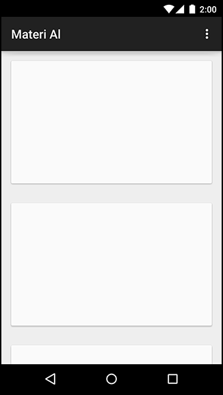
A card is a container for other kinds of content. It is elevated slightly, with a shadow behind it, and its corners are slightly rounded.
This is not a design book, so we cannot provide advice on when and where to use cards. (See Google’s material design documentation ...
Get Android Programming: The Big Nerd Ranch Guide, Third Edition now with the O’Reilly learning platform.
O’Reilly members experience books, live events, courses curated by job role, and more from O’Reilly and nearly 200 top publishers.

