Chapter 4. Thinking for Glass: How Glass Is, and Should Be, Personal
Glass as Personal Technology
By bringing technology closer, Google Glass keeps technology out of the way. There. That’s Chapter 4…all of it. Hope you enjoyed it. Go back and read it aloud. And don’t blink, because you’ll probably miss it. Good thing we’re not getting paid by the word.
Oh…still here? Good, because the devil is really in the details. Read on.
Cheap laughs and literary parlor tricks aside, that simple statement stands as the core underlying theme for Glass. And we’re using this to kick off the Design section of the book. And nonintimidating as it may be, it’s often the hardest thing for people to grasp when thinking about the platform. Isn’t Glass supposed to be an always-on device that’s built for microinteractions, sending us stuff as it happens and letting us capture events around us? And by that merit, coupled with the fact that it’s sitting on our heads, doesn’t that make it omnipresent? Yes, absolutely. But there’s so much more than that.
And, appropriately, so much less.
As we’ve seen, Glass is a platform that makes for an extremely lightweight solution—figuratively and literally—for staying connected and interactive while experiencing the world around you. The goal of Glass is to put you in control of your life by not taking you away from living in the moment. Glass isn’t just another mobile device, and getting the most out of it means thinking about technology in a completely new and different way—probably more than you ever have before.
And when it comes to building Glassware, this means thinking about structuring information and experiences in new ways, being more terse than you’re probably accustomed to, and really using the timeline and cards to your advantage. The secret is making the user’s atomic world part of the digital UI, not just basing their interaction with the system on controls, input, data, and bandwidth. This means designing software that plays up the benefits of the technology being personal.
In this chapter, we’re going to cite several examples from Glassware vendors that do it right. We’ll highlight what we feel are the best of the best, and show what you can learn from them in putting together your own UIs and features.
Best in Show
Let’s examine some amazing services that in our opinion really separate themselves from the pack in terms of their winning design and the experience they deliver. As developers, we appreciate beautiful engineering and design approaches that are logical and creative, and there’s always something you can learn in positive ways with any project. But it’s no surprise that those that get the nonexistent Think for Glass Blue Ribbon for Awesome Glassware Design are household names, known for their form-and-function excellence across all platforms. On Glass, they enforce proper branding so you know who sent which cards, and have really put thought into making their presence on wearables the best it can be.
These top-shelf productions are services that provide perpetual communication ability, but on Glass do so in a way that’s not bludgeoning the wearer with nonstop alerts about incoming information, each figuring out a creative way to deal with what can be huge inbound conversation streams. And they also get the nod for fulfilling the promise to make content creation easy—users are able to initiate new posts and interact with their social connections in mere seconds, not making the act of staying connected a laborious chore.
By the same token, nobody’s perfect and even the creme of the crop has the occasional area where it might need revision. This, too, is a learning experience.
So let’s take a look at three examples of truly outstanding Glassware: Twitter, Gmail, and Google+, discovering what design decisions make their brands stand out. What’s important to keep in mind as you read these is that like Glass, these aren’t just software products, they’re entire platforms with ecosystems of their own. They each feature massive streams of inbound data, very complex UIs, and memberships in the hundreds of millions. But by using the Glass paradigm the right way, and not trying to force older models, they’ve managed to create really usable services and create powerful Glassware.
Warning
As we went to press, Twitter removed its Glassware for new users (but you can still get notifications and interact with others through their mobile app connected to Android Wear). We’re including this discussion about the now-defunct Mirror API-based service in this section, however, because we continue to think it is a good example of Glassware design.
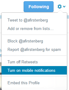
Twitter’s Glassware supports full read/write capabilities for a user’s timeline using a creative solution (Figure 4-1). The Glassware empowers users to share images they’ve taken with Glass, as well as receive mentions and direct messages and retweets for their own account. For getting updates, Glass users can enable mobile notifications on Twitter.com for select profiles they follow, which are pushed to Glass as their authors update their feeds. Tweets can be replied to via voice, retweeted, and favorited. It’s a proper translation of its core service that curates a member’s broader timeline, without inundating the Glass wearer with a constant barrage of notifications that would kill the battery. As Figure 4-2 shows, you can also enable mobile notifications from Twitter’s web client that get pushed to Glass.
Twitter also happily puts into practice a design pattern that many people don’t realize at first—your Glassware can have as many custom menu items as you wish, not just one, and it does this to translate its own commands to Glass, providing Reply, Retweet, and Favorite right alongside a custom Delete command, all wired up to its own API so the experience is what you’d expect and what you would want from a head-mounted Twitter client. The tweet body itself is front and center, while still giving space to see the user’s real name and handle. Direct messages are clearly marked with a “DM” in the left side of the footer in cards so you know when something isn’t public, along with the timestamp in the right corner of the footer. Since it seamlessly implements its own functions on Glass, Twitter doesn’t use any of the stock Glass actions, so it’s its own self-contained platform. Path is a great example of using multiple custom menu items, too, letting members assign an emotion to a friend’s post.
In contrast, Evernote deviates from this route, opting rather to implement the Mirror API’s stock SHARE built-in menu item, which uploads a resource to its system and stores it in the generic All Notes notebook with the default title “Note from Glass.” The hierarchy it uses for organizing its notebooks would be complex if replicated on Glass and likely require multiple nested menus, so they went with a simple solution that really works for them.
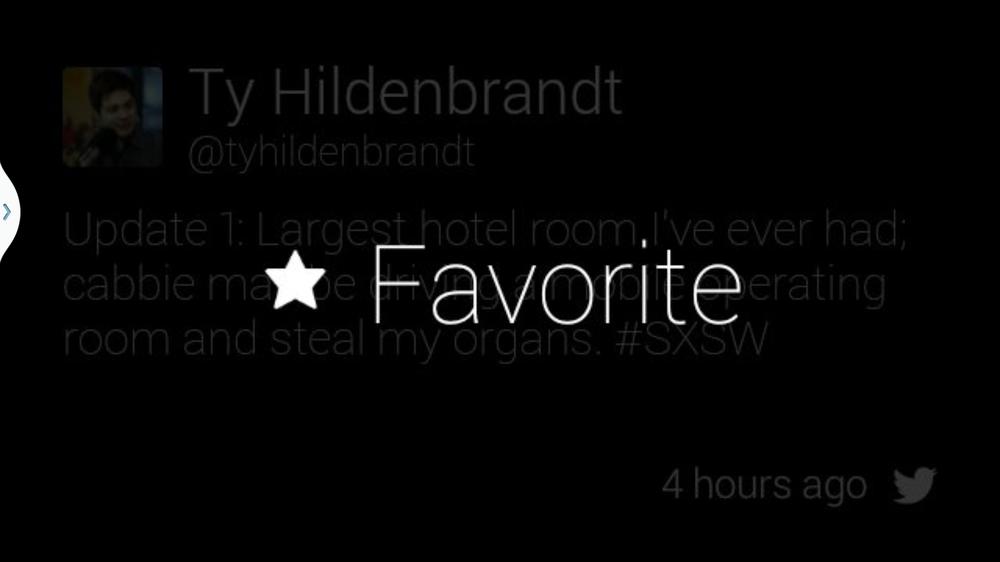
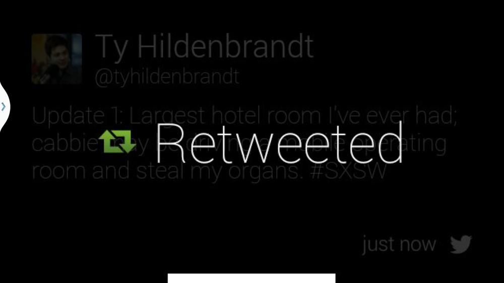
Twitter also demonstrates a clever usability technique—keeping track of state for menu items. If you’ve previously retweeted or favorited a juicy tidbit or hilarious zinger, the menu items from that point on use a different icon to appear colored (instead of their default white) and read “Retweeted” or “Favorited” as noted in Figures 4-3 and 4-4, just like they do across Twitter. This is not only good UX practice, but it deters users from taking the same actions repeatedly because they have no idea if their action went through the first time—which could potentially devour the number of calls against the Mirror API your project is allotted from Google daily. We’ll be discussing this quota and how to manage it in Chapter 7. (Oddly though, Twitter’s menu items can be tapped even after they’ve already been selected. They don’t do anything because their state has already been changed, which is more a gotcha of the Mirror API since all menu items are tappable and you’re unable to nullify that behavior. We’d like to see this changed in the future release.)
As far as letting members compose and publish tweets, Twitter’s Glassware handles images shot on Glass by letting you share to Twitter, as well as handling text input from the “Post an update” voice command. However, as of the time of this writing you can’t share video from Glass with it, so don’t expect to have a clip appear with a shortened URL and get tweeted out as a Vine post. We hope this will soon be resolved somehow by Twitter or a third-party tool.
You also can’t see the total social engagement statistics for a tweet, like other mentions in a threaded conversation or who else has retweeted it. This is deliberate—some things are more appropriate on other more powerful platforms. It’s intelligently not a crude port of the more complex web and mobile layouts, but an effective redesign of the data to properly fit the parameters of Glass—it retains all of the properties of a tweet with interactivity features while keeping things very lean and light.
Design takeaways:
- Multiple custom menu items
- Tracking state changes in menu items
- Web-controlled curation of user’s social stream
- Not a straight port of the more complex web UI, but an effective redesign
Gmail
The Gmail Glassware delivers your electronic mail to you just as it would on a mobile app or desktop web client, with the twist that you can reply to messages via voice dictation, freeing your hands and eyes to work on other things (Figure 4-5). To keep the load light and your notifications at a manageable level, your subscription delivers messages only from your Important folder, which Gmail algorithmically calculates based on recipient frequency, and which can always be tuned by the user by moving messages around to other folders—it learns about you as you use it.
This is really helpful and is an object lesson for applying a custom filter for data so that the entire stream isn’t imposed on a Glass user. And since items in Important are the result of machine learning algorithms listing only those people you correspond with the most, you won’t have to worry about spam on Glass. (Now would be the appropriate time for you to jump for joy.)
Gmail also uses a message structure we’ll see in many other scenarios—a mosaic of avatars on the left of the card lets you quickly assess who a message is from, so you can determine if you want to take further time to read the message, have it read to you, reply to it, or if this is important enough that you should pull out your phone. Like Twitter, Gmail also applies several of its own custom actions as menu items for Archive and Star, along with the Glass stock versions of Read more and Read aloud, and custom versions of Reply, Reply all, and Delete (Figure 4-6).
It makes use of the ability for longform text to be automatically paginated over several cards, as an entire message can be displayed in addition to organizing conversation threads into their own distinct bundles. The cover card is also different from other cards within its bundle, noted by the subject header being on the cover card and the use of an ellipsis to indicate more text. Gmail doesn’t insert new cards any time there’s a reply to an ongoing conversation, but more intelligently updates existing ones in place and as such reseats a bundle to the front of the timeline with the new message as its cover card. This is a critical best practice for Mirror API programming you always need to keep in mind, and one we’ll be talking about in Chapters 9 and 11 when we get into the mechanics of the timeline and sharing.
Additionally, Gmail demonstrates a key part of Glassware design: adding value by omission. The service doesn’t include a menu item that allows you to forward a message to someone else on the Internet, which makes sense because with the current composition of your contacts, you’d only be able to do so with 10 people, and even mighty Google’s voice transcription powers can’t dictate even a simple email address. Really consider this as a lesson in how you apply your logic to Glass, realizing that some things just can’t be done.
One area where Gmail on Glass could do a better job is in attachments. Currently there’s no visual indication within a Gmail card that it includes a file at all—which would, of course, prompt users to use another device or a laptop to review what’s been sent. We can’t load PDFs in Glass or Excel spreadsheets on Glass, but maybe being able to view an image would be a nice touch to an already amazing application.
Design takeaways:
- Updating bundles, using pagination over multiple cards to reflect conversation threads
- Effective layout of headers and message body
- Custom menu items
- Filtered data streams
Google+
Google’s social layer pushes cards to Glass only for posts that the wearer is directly sent or mentioned in or for conversations that were posted with Glass, which like Twitter uses a subset of the user’s normal data stream, not the entire shebang. It’s a really neat way to use Google+ across devices to share content and communicate with people. The simple card UI shows how a system with lots of moving parts can be adopted within the static prism display—Google+ on Glass doesn’t look anything like Google+ does on the desktop web, in mobile web browsers, or on tablets. And it shouldn’t.
The Glassware also gives users the ability to engage in posts—reading and adding comments to conversations, as well as +1’ing them. Google+ on Glass accepts text, photo, and video posts as well as link shares, and was the first Glassware service that really let you involve your social graph and keep you in touch with your connections. Google+ achieves this by registering itself as a recipient for most types of multimedia formats as well as links to places on the Web. It opens up its full range of engagement as a sharing contact—it lets you share content with the people you’ve added in MyGlass, entire circles of people, and Communities groups you belong to. This is a new way of thinking about how data exists, as data isn’t just shared to an app like on other mobile platforms, but to people and services alike.
The Glassware also does a masterful job with funneling notifications. There are a ton of interactions that Google+ could alert you to, but only the most appropriate make it to Glass. If your profile is tagged by someone, you get notified once on Glass with the card shared with you, but then not again unless you jump in the conversation, just as Google+ behaves on other clients. If you share a photo or link with a Google+ connection of yours from Glass, your posts will append the hashtag #throughglass—which is a great design tactic to consider for self-promotion for your platform—and then also register you to receive notifications on Glass, in an intuitive way. Your headset will only sound the Glass alert tone when a new comment has been added to the post, not when someone has +1’ed it or shared it. But whenever anyone on Google+ engages with you, the original card for that post gets updated with the current +1 count and number of comments, represented visually in the footer (Figure 4-7).
It’s very well done and makes good use of the cardspace without feeling forced or cramped.
Don’t Sleep on Using the Footer
The footer area in cards is a great place to put tiny fragments of information. By convention, the right side of the footer is reserved for an icon identifying your service and for timestamp data. But on the left side, you’ve got carte blanche. As we’ve seen with Twitter and Google+, helpful information like direct message indicators and social metrics, respectively, can be included with only a few of characters or an icon and can make a huge difference in describing content.
You can also get creative by using the footer in cover cards for bundles, as the Hangouts Glassware does by including the name of the user chatting with you.
Be wise though—don’t just slap something in there just because the space is available. Supplementary information that helps describe the main body content is always best.
However, the biggest room in the world is the room for improvement, and Google+ isn’t without its minor oopsies. It’s an elaborate application that has different view conditions that aren’t always displayed as you might anticipate. For example, if you’re mentioned or tagged in a post with a video, you see a card with the clip attached to it, with the PLAY_VIDEO menu item available to trigger playback. But this also means you’re unable to tap and swipe through the comments that are available for that thread, because whereas you’d normally tap on what would be a card bundle and iterate through comments, tapping with an attachment brings up the menu items for that card. In that case, comments are unavailable.
Additionally, early builds of the Glassware had an issue when encountering internationalization within posts, converting UTF-8 characters to ASCII, due to the way that Google+ supports foreign character sets on its web and mobile clients to allow comments by people typing in non-Roman alphabets like Cyrillic, Farsi, Hiragana, or Greek, which drives the helpful Translate feature. For example, if a post including the line I’m going to say “I’m finished with dinner & I’m ready for dessert!” would appear in cards with URL-encoded text, it would be I'm going to say "I'm finished with dinner and I'm ready for dessert!", which would not only be a nightmare to read visually, but also would come out horribly when the Read aloud action was selected, annunciating every escaped character verbatim. Make sure that if your Glassware incorporates multiple languages, you test and retest and properly use your web development framework’s internationalization features to avoid this.
These are minor gotchas, but we have full confidence the Google+ team will continue to work on it and find a creative way to incorporate much of the feature set.
Design takeaways:
- Reporting engagement metrics
- Social notifications
- Support for text, photos, videos, and link shares
- Platform promotion
- Internationalization
- Use of the footer
- Custom layout that fits the form factor
Winning Glassware Design Takeaways
Now let’s look at some other notable design instances from the initial salvo of Glassware vendors that leverage the Glass experience (Tables 4-1 and 4-2). Many are existing web brands and were challenged with transposing their in-place ideas to the Glass UX. Check them out on Glass yourself and pay attention to both what they do and how they do it.
| Glassware | Genre | Design takeaways |
Evernote | Productivity | Integration with existing APIs, send-to-Glass from web |
Path | Social | Rapid development (a full-stack port to Glass took a few weeks), multimedia resource sharing |
The New York Times | News | User configuration, delivery batching, photo captioning |
Elle | News | User configuration outside of Glass, web-based reading queue |
CNN | News | Web administration, user-defined content selection, time-based delivery |
Social | Sharing with varying social scope, integration with APIs | |
Tumblr | Social | Read/write access, integration with API |
Ice Breaker | Game | Using Glass as a casual gaming client |
| Glassware | Genre | Design takeaways |
Spellista | Game | UI outside of the timeline, game controller driven by accelerometer data |
Compass, Stopwatch, Timer | Utility | Long-lived live cards updating content constantly, in the same way that Google Now cards work; real-time sensor data |
Strava Run, Strava Cycling | Fitness | Capturing motion information, real-time visualizations, social integration; provides sporadic feedback only at the most important times |
Word Lens | Communications | Real-time processing of video data |
The main thing to remember about these examples is that they exemplify one of the key aspects of how to Think for Glass—each is a well-designed service specifically written for the idiosyncrasies of the platform, not just force-fitting an existing mobile website or a clumsily ported native app or ramming an RSS feed at the user. They conform to the Glass UI restrictions, emphasize minimal user interaction, leverage the system’s low-bandwidth ideals, exploit the platform’s numerous hardware capabilities, and take into consideration the wearer’s behavior during use.
How Are Pinned Items Ordered?
Since live cards in GDK apps will appear when Glass wakes up instead of the home screen, how will you know which pinned item a user sees if they’ve got more than one live card running? Just like the timeline items that sit to the right of the home screen, the ordering of pinned items uses LIFO (last in, first out), with a twist: live cards always take precedence over any static cards, regardless of when they’re pinned.
And the most impressive thing about these services is that they’re not all carbon copies of each other laid out across different industries. Each demonstrates something distinct about the Glass ecosystem. They’re built for maximum effectiveness by emphasizing some of the best aspects of the platform through playing up the features of the Google Mirror API and emphasizing positive minimalism, or leveraging the low-level control and system capabilities with native code via the GDK. Despite the first-glance restrictions of its display, Glass is extremely flexible as a stage for third parties to build upon.
And that’s the point: understanding what Glass is and is not and what it can and cannot do, and repurposing platforms for that model. These examples prove that if done right, a service can be extremely useful—but more than that, they demonstrate that Glassware can achieve something in interesting, helpful, convenient, and fun ways!
Designing with the Think for Glass Mindset
Let’s revisit the rather heavy concept we floated in Chapter 1, in which we laid out what it means to Think for Glass. Quoting ourselves:
Glass is designed to live in your world, not for you to live in Glass’ world. It is meant to adapt to your life, not for you to adapt to how it does things. Your apps are expected to behave the same way. Everything else stems from this basic idea. It means that anything that works through Glass should be secondary to the world around the person wearing Glass, and that an app should never expect otherwise.
This philosophy means approaching program design in a way that not only remains cognizant of the user’s surroundings—it actively incorporates them. Central to this is keeping the experience personal to the wearer. You need to be able to read your user’s mind—which is no small task. The Glass experience was meant to tightly involve contextual signals, so involving sensors, location, real-time data delivery, and one’s social graph is part of what constitutes the user interface. Most important is tailoring your design around users’ environments (the people, places, and things surrounding them) at the moment that they use the application. Modern mobile applications took design into a new stratosphere by getting architects to base their UIs around accelerometers, gyroscopes, and GPS data—Glass now flies even higher, bringing the full range of context into the picture.
Glass progresses human–computer interaction in that the environment of the user is a top priority for the design decisions you’ll make when creating Glassware. Situations that the person wearing Glass encounters may be ripe scenarios in which to use your program. Or, they may be absolutely inappropriate. This is the delicate balance you’ll need to keep in mind when using control mechanisms like voice commands. Imagine the trouble you’d get some poor unsuspecting user into if they had to yell out “Fire!” to play a game while in a movie theater in which you shoot rockets at aliens…if they happened to be near federal agents. Not good.
If this need for clairvoyance is intimidating or at the very least confusing, don’t worry. Let’s consider a couple of illustrations from the Glass system software that reinforce this idea.
Vignettes
Glass includes the incredibly popular ability to create vignettes. This simple idea lets a user take a screengrab of whatever timeline element or application screen is currently being displayed in the prism, and then sets that image against whatever backdrop the user is looking at in real life (Figure 4-8). The overlay is composited with the background image and saved on the timeline, which can then be shared with contacts or Glassware like any other applicable resource. With only two input actions (holding the shutter button down to take the screengrab, then selecting the Make vignette menu item), the user has captured the moment from his unique perspective of the world, and maybe added a funny remark about the environment around him, or created something neat without escaping the moment.
The wearer is using his own interpretation of the world as the backstage for the application. It’s the key element in how the feature is used. He could snap a photo and include that picture within a picture, or take a screengrab of any item on his timeline and include it on top of a scenic shot of wherever he happens to be. And whatever the situation, it didn’t require the user to meticulously manage a complex application menu or look down and meticulously negotiate controls. With vignettes, you literally never look away from what you’re doing.
Vignettes are system software, available by default to nearly any piece of Glassware, even those from third parties, and even in native apps. A third-party service for Glass, Vignette Postcards, even jumped on this idea and allows wearers to apply seasonal greeting card designs to their images. People have gotten extremely creative in combining their Glass content with real-life views using vignettes. This is a stellar example of how both worlds merge for a seamless experience with a personal touch. And it only took a couple of seconds to snap-and-tap to capture.
Google Now
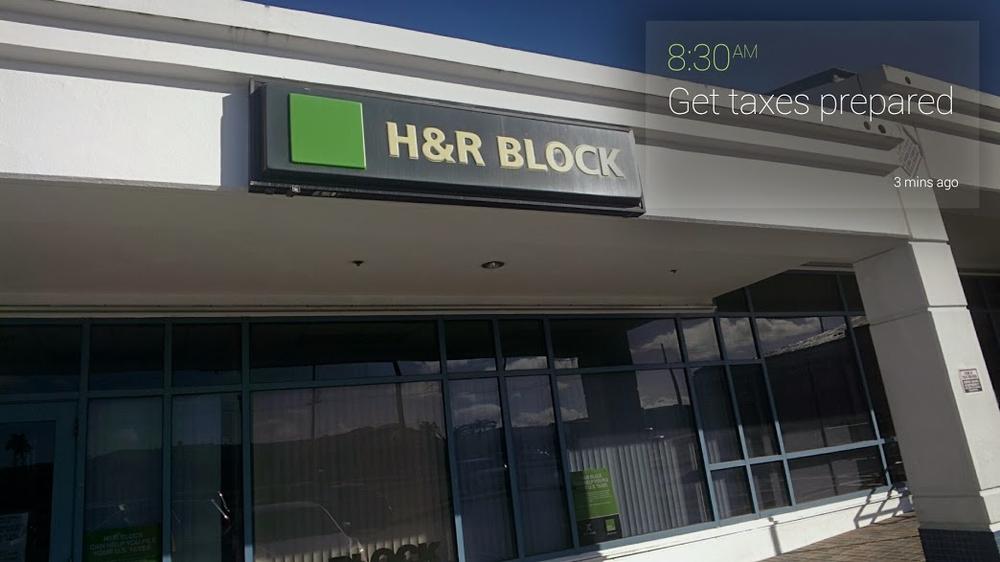
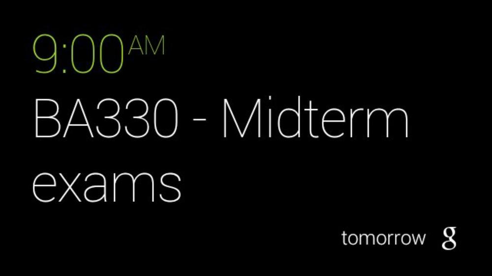
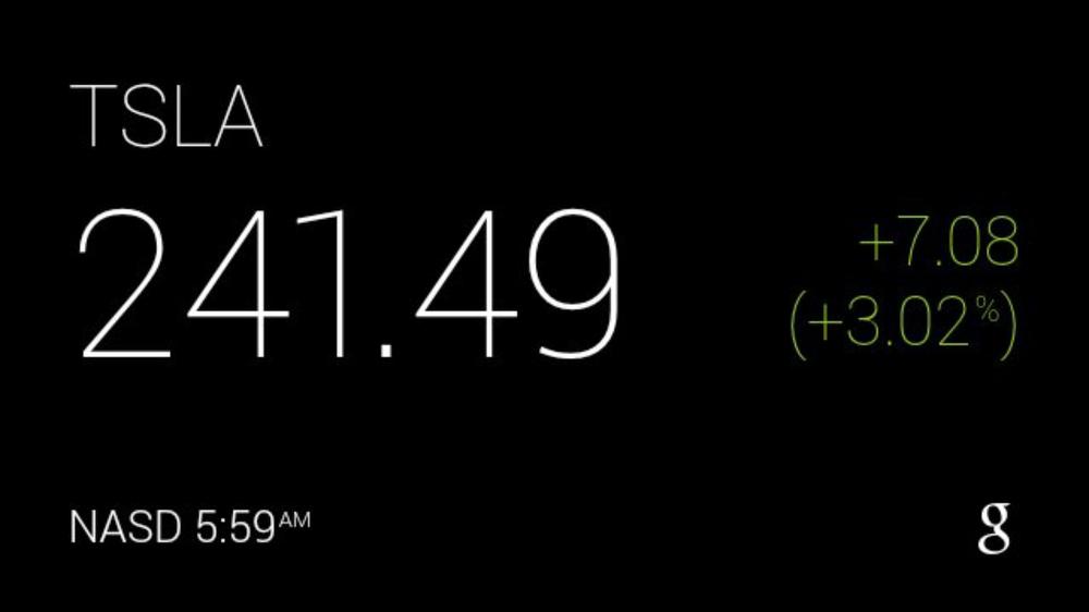
We’ll be riffing on contextual information a lot throughout this book, so strap in. Using a number of signals relative to the user is a major aspect in making Glass content distinct, relevant, and valuable. And nowhere is this more evident than in the platform’s integration with Google Now as noted in Figures 4-9 through 4-13. The feature is touted as “the right information at the right time,” based on your physical location, the time of day, what you’ve searched for in you web history, appointments you’ve made in Google Calendar, messages you’ve received in Gmail, and various other preferences about the world around you.
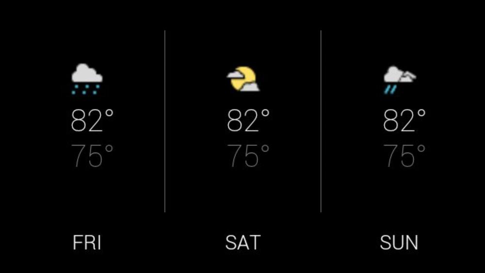
Google Now keeps track of your activity and learns about your behavior, generating cards based on patterns. Its Glassware uses a variety of templates to format the various types of data it displays, not sticking to a single one for all types. The stock price card isn’t laid out the same as the sports scores card, which doesn’t have the exact same formatting as a card with a map, or one with an upcoming appointment. This demonstrates flexibility within a single application.
The cards that Google Now generates are also tied into the larger scope of Google Now on mobile devices and the desktop via Chrome notifications, which illustrates another example of great design: the ability to dismiss items on one platform and have them cascade across other clients. When you dismiss a card about a flight delay on Glass or on your phone, it syncs with other platforms to not appear there. This is a best practice you should emulate in your own projects, too.
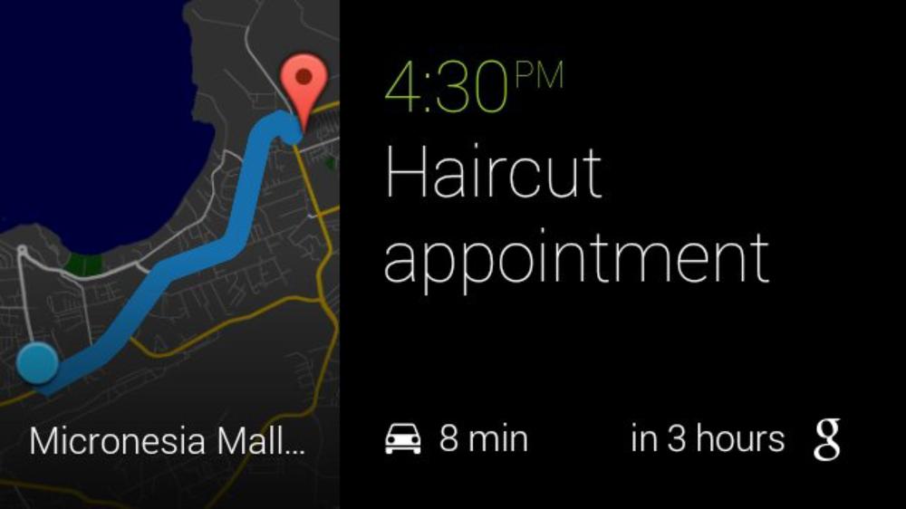
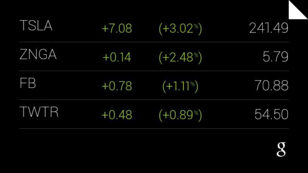
Figure 4-12 is a great illustration of how Glass can pull in data from different sources you’ve expressed interest in and present them in a useful way. The most recent stock prices you searched on Google Search are listed as cards within a bundle you can drill down into. This is, perhaps, one of the best examples of contextual computing.
And, most importantly, the cards are created and delivered when in the appropriate context—again, with sensitivity to the user’s time, location, and things happening around her, and in terms of events she is participating in, people with whom she’s connected, or occasions she’s keeping tabs on. This is another example of making the user’s real-life activities a core part of the application experience.
Google Search
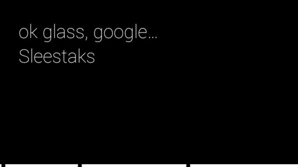
The canonical way to use Google also has a strong presence on Glass, and serves as a great lesson on how to handle the very complicated task of fetching and showing results from web-wide queries, which is intensive from processing and interface standpoints. Conducting voice-driven searches requires connectivity and is comprised of two steps: preparing the query and displaying search results.
Try doing a search on Glass yourself, and take note that the “working” status bar at the bottom of the card by the Google Search app then returns a result set back to Glass. The use of iconography and visual cues about what steps to take are well laid out, using the familiar animated microphone when input (or background noise) is detected.
As good defensive programming, Glass enforces a timeout if no vocal input is detected within a few seconds and terminates the job; and if the connectivity isn’t good enough, it times out and shows a card asking the users if they want to check on their connection settings. Both are good visual cues about the work being done behind the scenes and provide the application with some time to do the heavy lifting, which in this case is talking over the Internet. And this all happens in mere moments.
Most information retrieval services won’t be anywhere near this fast, so check out Appendix A for a couple of ideas you could play around with while the results are being compiled if you need search features for your project.
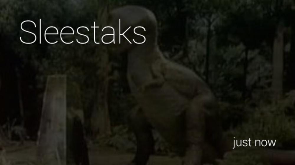
For this example in Figures 4-14 through 4-16, we’ll perform a search on Glass for “sleestaks.”
So Figure 4-14 is the querying-and-assembly phase. What about displaying the results back on Glass? By default Google Search lists a small collection of matches, and in cases where the topic has a match in Wikipedia or Google’s Knowledge Graph, reads the first item back to you automatically.
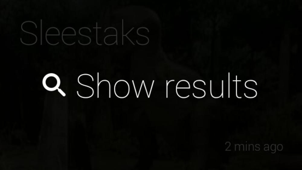
For archival purposes, the search results persist on your timeline as a bundle of cards so you can refer to them later, not unlike Figure 4-16. This is a big win in terms of usability and system optimization, saving the user from having to go across the network to review past searches. At scale, this adds up.
But a possible UI challenge remains in how to dig into more search results than just those provided. Even the most obscure search won’t have just a handful of matching URLs, and many people like getting into the weeds. There’s currently no ability to see more results beyond those provided to you. Play with this idea and see what you could come up with in your own projects.
But before you set off on this little thought experiment, keep in mind that the number of results that are returned is capped for a reason. Can you guess when it is? It’s our favorite word beginning with an “m”—microinteractions! Other mobile platforms still handle the job of showing tens of pages of search results just fine, so there’s no shame in deferring more work to a device that was meant to do it. It’s a well-executed and deliberate UX trade-off between letting users access information quickly, while not spending excessive time on Glass searching and thus taking them away from what they’re doing in the real world. Use your best judgment and see what tests best with your users.
We’re coming back to this again—the integral part of the Glass experience is getting technology to be high-impact and low-intrusion. Let the users quickly search, find results, review them, then continue to do what they were doing without ever taking them out of the moment. Google Search on Glass is a very lean frontend, which highly encourages multitasking.
These types of features typify the program design ethos we’re bringing to light by not preventing the users from taking part in their world, and always letting them return to it at a moment’s notice. This is active engagement.
Whereas critics of Glass have said its input mechanics are limited, being only virtual menu items, voice commands, and gestures, we prefer to see this as a great opportunity with tremendous flexibility. And you should, too. We’re far beyond just having a d-pad, a keyboard, and a couple of buttons at our disposal for cutting-edge program control. Again, having clairvoyance about the user’s activities in the real world is a big advantage to coming up with great wearable usability. It’s not easy, and not the way we’re used to planning software projects—but it will pay off.
Glass for Gaming
One topic that’s gaining a lot of momentum is how Glass will be used for gaming. Gaming has always been an application of technology that drives many other uses of software and hardware, and this isn’t a lesson that’s lost on the Glass ecosystem. While the very respected craft of good video game design tends to lean toward high-end proprietary systems to accommodate the rich UIs for graphics and sound and create addictive gameplay, there’s a lot we can learn and implement within the wearable space. The gaming market is expected to be enormous with Glass, both for playing directly on the HMD and in using it to display auxiliary information while a user is playing a game on a completely separate platform, ostensibly all connected through a common socket.
The Mini Games Glassware package developed by Google proves that casual gaming has a place on Glass; it is a series of titles that only take less than a minute to play each, yet can still be challenging, captive, and won’t dramatically drain the battery. They all use user movement, sound, and tapping as controls. And each is complete with tutorials for beginners, scoreboards, and varying levels of difficulty. They’re complete ideas—proper video games, not disappointing diluted afterthoughts or incomplete translations.
Several other early adopters put together some very interesting game concepts, concentrating on using the gesture capabilities of Glass as controller mechanisms to play sidescrollers like GlassCopter, or the parallax clay pigeon shooting fun of Glass Hunt—both of which are GDK apps. GlassFrogger, which won first place at the Breaking Glass hackathon in San Francisco in 2013, is a Mirror API Glassware service that was built in Dart in just two days and uses players’ motion for program control—having players literally jump in place to move the little frog across the busy highway in a throwback to the classic 8-bit title.
(We’ve yet to see anyone apply the old Up-Up-Down-Down-Left-Right-Left-Right-B-A-Start Konami code trick yet. Hopefully by the time this book goes to print, that’ll be a thing without putting Glass users in traction from whipping their heads in all directions.)
Speaking of reinventing the classics, imagine applying Think for Glass design to timeless titles. Think for example of a version of the classic game Battleship (which was, coincidentally, an idea BrickSimple implemented with its GlassBattle concept), using the turn-based model for wearable gameplay. This might be a little easier to pull off across platforms like Glass, PCs, portable gaming devices, console, the Web, and even other wearables, as opposed to something like a clone of Breakout or an MMORPG or real-time strategy title whose gameplay requires input from all involved without latency of any sort (though those other genres still may be possible).
Or consider a low attention span version of Monopoly using your actual neighborhood as the gameboard, with houses you define in geofences as properties. Players nearby could “land on” various locations in your real-life neighborhood and “rent” space. Or, how about the timeless Operation where you perform virtual medical procedures on a friend also wearing Glass? What Ice Breaker proved, which led to it winning Google’s first Glass hackathon in San Francisco in 2012, is that the fun factor is achieved by blending data with real-world interactions, so keep that in mind.
Further, how might the popular augmented reality game Ingress be enhanced? Imagine the interesting applications that may arise by playing a real-world version of hide-and-seek, with players subscribed to the same game instance moving around in space, with Glass letting them track each other, while still not demanding long sessions, typically a minute or two.
Glassware and apps driven by Android Wear may breathe new life into legacy social games, too, by giving them an added dimension as another outlet to receive and respond to in-game notifications—an extended interactive stage. Imagine applying this to a title like Happy Aquarium by Crowdstar, a Flash title that incorporates a player’s Facebook friends. It routinely generates bonus gifts, such as the elusive and valuable baby turtle, which a beneficiary must accept on their Facebook wall within a few minutes, or the chance to add it to their fish tank expires. Facebook notifications fire to inform users about such gifts.
Happy Aquarium could push a card to Glass and/or a smartwatch, which would have only required a simple interaction to confirm the action—tap, gesture, or voice command—and accept the gift. The player wouldn’t necessarily have to be at their desktop browser and in the game environment to stay an active part of it.
By introducing microinteractions, a social game’s overall play can be enhanced by keeping users engaged with an ongoing game, even if they’re not actively engaged with it at the moment. Simple and effective!
Games existing solely on and for Glass have already demonstrated their worth, concentrating on being the best they can be within the scope of the platform. On the opposite end of the spectrum, our community’s history has also witnessed several examples of designs that don’t work—both in terms of the visual appeal they project and the way they apply gameplay. Glassware that forces the user to pay attention for extended periods of time (typically more than 60 seconds), keeping the display active, and being excessively noisy with notifications are largely examples of what you don’t want to do.
Design for the Cloud
Another high-level mindset you need to have when thinking of the architecture for your application is: design for the cloud, not a particular platform. You should adopt a practice of creating your own ecosystem around your idea and not be limited to a single client. Right from the start, you’re building a distributed multitier application. This approach may have some familiarity to it, as many of the web services you might use are probably based on this structure. And from a customer’s perspective, your users might expect to be able to access your slick Glassware on a browser and on their phone, too, and not just to customize settings.
We’ve now got a touch-aware computing solution in Android, Chrome for the Web, and Android Wear and Google Glass for wearables. To support those tiers and integrate across them you need to craft RESTful services with decoupled components, such as with Google Cloud Endpoints. You can then add frontends to your logic, each with their own idiosyncratic UIs and capabilities.
Check out the Google Cloud Platform to see what scalable infrastructure and resources you can use to build, host, and run your application. Again, the Mirror API supports any cloud infrastructure, including existing ones.
Are You Starting to Think for Glass?
Let’s conclude this chapter by coming full circle, back where we started with the simple concept of why Glass exists. And it bears repeating to emphasize the advantage to knowing how to Think for Glass, now that you’ve been enlightened with the knowledge of exactly what that entails.
The key is implementing these ideas within the constraints of the form factor using the principles we detailed at the onset of this chapter. Prioritize what the wearers are doing at the time they use the Glassware. Design not with system capabilities or the physical layout and arrangement of controls, but the user’s behavior in the real world and how the software fits into that event. It’s not simply porting existing frontend code to a new client—it’s retrofitting entire ideas and applying new design approaches, while maximizing the experience.
So again, here’s the concept about what not just Glass, but its ecosystem, truly is: by bringing technology closer, Google Glass keeps technology out of the way.
Makes a little more sense now, doesn’t it?
Get Designing and Developing for Google Glass now with the O’Reilly learning platform.
O’Reilly members experience books, live events, courses curated by job role, and more from O’Reilly and nearly 200 top publishers.

