Chapter 4. The Complementary Design Approach
The third approach in the 3Cs framework—complementary design—involves collaboration among multiple devices operating together as a group. While in the previous two approaches (consistent and continuous), user interaction at any given point takes place with a single device, the complementary approach involves interaction with multiple devices as a connected group, which together create a complete experience.
What Is Complementary Design?
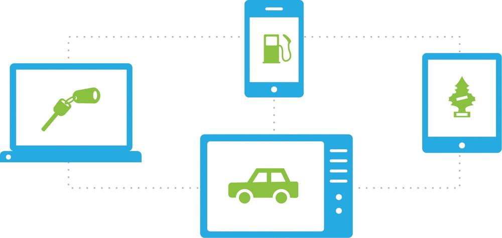
The complementary design approach introduces a new multi-device experience, where different devices complement one another, either by collaborating as a connected group, controlling one another, or both (see Figure 4-1). This means that the full experience involves interaction with at least two devices—usually simultaneously—at any given moment. Up to now we’ve focused on experiences based on interaction with a single device, either throughout the entire experience (consistent) or before the user moves on to the next device in the sequence (continuous). With complementary design, we are entering a new space of concurrent multi-device usage. While there are use cases in which the user interacts with the devices asynchronously (as we’ll see), the essence of a complementary approach remains that of devices that work in concert.
Achieving a complementary approach involves two types of device relationships:
- Collaboration
Different devices, each with its own distinct role, work together collaboratively (and usually simultaneously) to construct the whole experience—for example, playing Scrabble, where the tablet is used as a game board and smartphones hold the tiles.
- Control
The user’s primary experience takes place with a particular device, while other devices control aspects of that experience, usually remotely (e.g., a smartphone that serves as a remote control for a television).
Additionally, devices can carry different weight in the overall ecosystem experience:
- Must-have
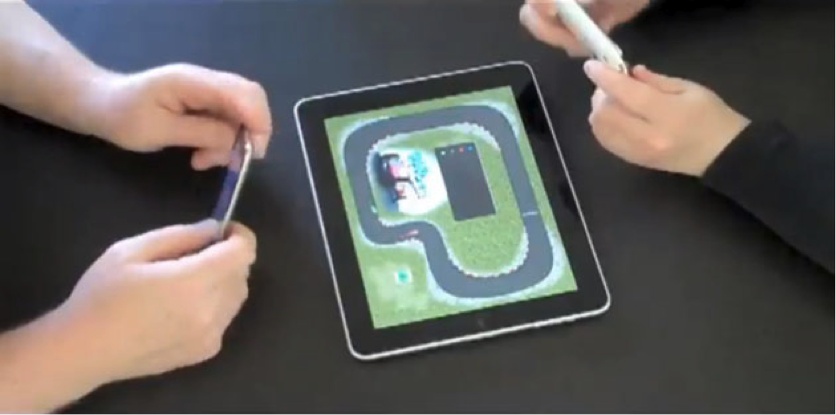
Participating devices are an integral part of the experience, and the experience cannot exist without each device contributing its part. One example is the racetrack game Pad Racer, in which the iPhone serves as the steering wheel and the iPad displays the racetrack; in this case, each of the two devices is a must-have for the gaming experience.
- Nice to have
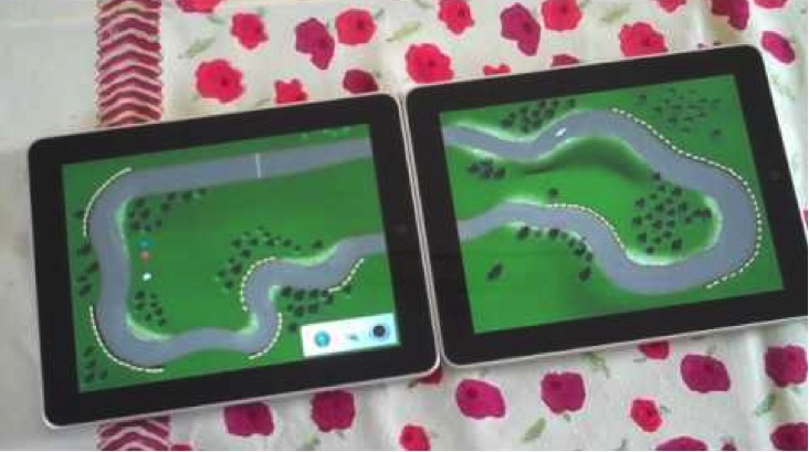
A nice-to-have device is an added device that can deepen the user’s experience, enriching it in content or functionality, but isn’t essential to accomplishing the fundamental task. For example, in the case of the Pad Racer app, users can connect two iPads to have a richer set of tracks. In this case, the second tablet is nice to have, as it is not essential for the gaming experience.
As we progress through the examples that follow, you will see that this must-have and nice-to-have distinction is actually an evolving, fluid one; what is considered nice to have today may become a must have tomorrow, as the industry develops and new standards emerge.
Think, for example, about Internet connectivity in mobile phones. In the early days of the mobile industry, when the phone was still perceived as a communication tool focused on call management, having an Internet connection was a nice-to-have feature. However, as technology developed and mobile phones became small computers offering a wide variety of services well, Internet connectivity became a must have. The story was the same for phone cameras—a nice-to-have feature became a must have. We will see similar potential pathways in some of the multi-device experiences available today.
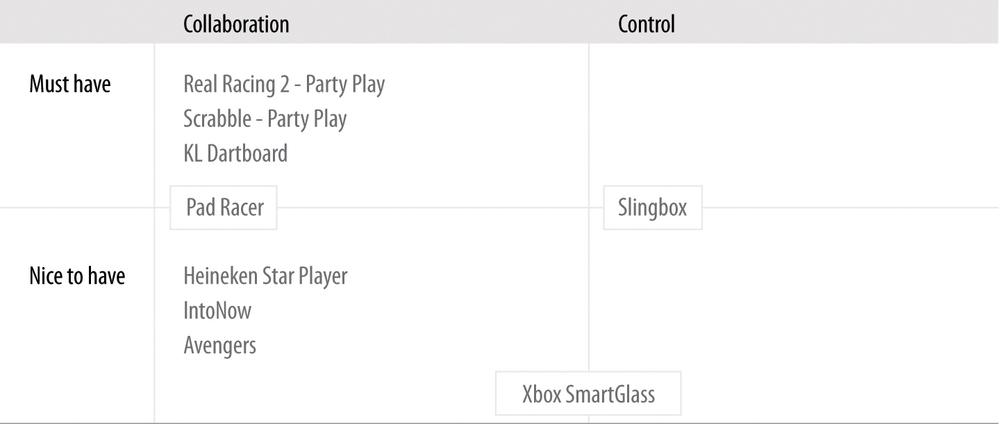
The set of product experiences outlined in Table 4-2 will accompany us in this chapter as we dig into the complementary approach.
Table 4-2 maps the product examples reviewed in this chapter along the two main complementary design dimensions: device relationship type (collaboration/control), and the weight devices carry in the ecosystem experience (must-have/nice-to-have). As you can already see, some products (like Xbox SmartGlass) incorporate both relationship types in their experience. In a similar manner, products can integrate both must-have and nice-to-have devices (as indicated with Pad Racer and Slingbox).
Before we start, bear in mind that there is no single combination in the Table 4-2 matrix that is arguably the best. Each product addresses different use cases and carries its own set of characteristics and flows. The “right” combination for you really depends on your product offering and the user needs on which you focus. You will understand that better once we review some examples and discuss the principles behind them.
Collaboration: Must-Have
The following examples demonstrate that collaborative design can be particularly powerful in bringing people together and enhancing social interactions—online and offline—through game play.
Playing With Friends: Real Racing 2—Party Play
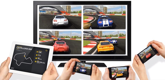
Real Racing 2 is a racing video game (by Firemint, Ltd.). With its Party Play mode, two to four friends can play together in a split screen on the HD TV, using an iPad 2 or iPhone 4S as the host. This capability takes advantage of iOS devices people already own and carry with them to offer an enriched social gaming experience (see Figure 4-2).
The gaming experience flow is beautifully simple.[37] Friends meet up at someone’s place, pull out their phones (which they have with them anyway) or grab a nearby tablet, and spread comfortably throughout the living room, playing together in front of the split-screen TV.
If you compare this experience to a traditional video gaming experience, you can see how much more streamlined this one is; users simply use the devices they already know and have with them in a modular way. Their devices are repurposed contextually for new use scenarios. It is low cost in that it’s unnecessary to buy a proprietary game console with a dedicated set of controllers; it’s convenient in that players can gather anywhere, not just at the friend’s house with the game console; and it’s uncluttered in that there are no cords and cables.
Design Lesson: Extending the game experience
People carry their phones with them everywhere, all day long. Once these devices become part of the game, they can also be used “off-game time” to extend the experience and enhance it. Here are a few examples of how smart devices partaking in the game experience can be used pre- and post-game. Users can:
Set up group gaming events, which can take place at anyone’s house.
Receive alerts about friends playing nearby and/or invite friends to join (before or during the game).
Manage personal and group leaderboards, and share achievements on social networks.
Keep a score history across multiple games (with analysis over time).
Save memorable moments from games (so they can always go back and see how a certain player pulled off a crazy turn and won the race).
Extend the game experience to other spaces (who said it has to remain within the walls of the house?). If you consider our movement toward the Internet of Things (a topic Chapter 6 is dedicated to), having connected things everywhere introduces new opportunities for continuing the game play in the street, in a store, while waiting at the bus station, and elsewhere.
Enhance the core game with a broader gamification layer for ongoing engagement. In that respect, Foursquare did many things right with its points and badges mechanics (up to the point of relying too heavily on them). Still, its rules and rewards strategy encouraged hundreds of thousands of people to pursue the desired behavior (that is, to check in) repeatedly, frequently, and across a variety of places and contexts, creating a healthy competitive drive.
Creating these kinds of games takes a lot of work, but when done right, it can significantly engage users and encourage behaviors.
Design lesson: A new species of game controllers
Traditionally, game console controllers serve as peripheral accessories that provide only input to a video game, in order to control an object or a character (see Figure 4-3). They don’t have screens, memory, or processing power and cannot operate as independent devices when not being used in a game. During game play, there’s a predefined set of actions players can perform with the controllers using the tactile buttons.
Smart devices like phones and tablets offer the opportunity for players to use smart-device game controllers in new ways—not only pre- and post-game, as just discussed, but also during the game play itself.
While smart devices can’t equal some of the specialized game controllers (in terms of industrial design, ergonomics, convenience of grip and operation, robustness of the tactile keys, etc.), they offer other advantages:
Motion and orientation sensors built into these devices, such as the accelerometer, can be used for fun, natural user interface control. Touch gestures can be leveraged as well for game maneuvers.
The basic shape and functionality of the smartphone can be somewhat optimized for game play through smart accessories (like covers, readers, and other devices that plug into the phone). Coupled with a corresponding app, this allows for enhanced game controllers that are still smartphone-based, but tailored for more serious gamers or specific types of games. We will see several examples of such modular smart-device ecosystems in the next chapters.
Repurposing existing devices for different use cases could help with reducing electronic waste (e-waste)—a fast-growing problem worldwide, due to the rapid changes in technology and media. An estimated 50 million tons of e-waste are produced each year. In the United States, an estimated 70% of heavy metals in landfills comes from discarded electronics.[38]
But the advantages of smart-device game controllers go beyond hardware. The stronger value offering smartphones bring to the table lies in their software, which has a significant effect on the user experience:
- Personalization
Games that know who the players are and what their preferences are (through ongoing data collection) could save players the hassle of a lot of the pregame configuration. For example, user input—like choosing the number of players, entering their details, choosing their preferred car models and colors, and more—can be automated through connected devices that record players’ preferences (remember the importance of sign-in?), and detect who’s around them.
- Multi-tasking
Even if there is some setup flow to go through, when each player has a personal screen, everyone can complete it at the same time instead of sitting in front of one screen (the TV) and doing the setup serially.
- Augmentation
Smart devices can do much more than just serve as game controllers. For example, they could augment the game, adding new layers of information or display when users are looking at the TV through their smartphones. Additionally, when you have multiple players using their devices to play a collaborative game, you could potentially design a game experience that is distributed along these devices. In other words, instead of having everyone getting the same experience—each on his own device—different users can play different roles in the game, thereby experiencing a different game UI. As a group, the players establish the full game experience.
Question to the Reader
Can you think of any other experiences—digital or physical—where smartphones and/or tablets could potentially serve as replacements for traditional tools, offering an enhanced complementary experience?
Try to think about this question from the following angles:
Product experiences that are based on a set of physical components that can be replaced with digital ones
Collaborative social experiences, incorporating a group of individuals interacting with one another
Situations or contexts in which users are already interacting with multiple devices at the same time
Day-to-day scenarios where the variety of devices that need to be operated becomes confusing and daunting
Digitalizing Social Games: Scrabble for iPad—Party Play
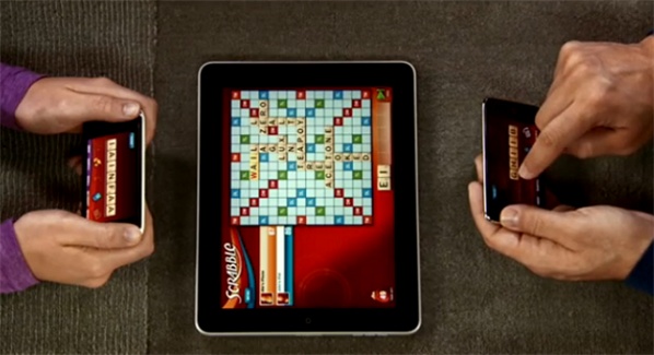
Scrabble for iPad (by Electronic Arts) is a virtual version of the highly popular game Scrabble. One of the options offered in this version is Party Play support for two to four players. Here, the iPad serves as the board, and players can use their iPhones or iPod touches as tile racks (see Figure 4-4).
Whereas Apple AirPlay takes a digital experience based on proprietary devices and ports it to our day-to-day ones, Scrabble for iPad takes an offline board game experience and brings it to the digital sphere.
The combination of the tablet and smartphone in this game does a good job of preserving the classic game experience of a group of people gathering around a board and interacting through a game (as opposed to playing on a website, for example). From a design perspective, that familiar social experience is facilitated through gestures like “flicking” tiles from the iPhone rack to the main iPad board, and “shaking” your smartphone in order to shuffle the letters. All in all, the Scrabble app demonstrates how a multi-device experience that is based on the highest-end devices can be leveraged to encourage “traditional” face-to-face social interactions.
You might ask yourself, why do we even need to bring such games to devices? Why not simply continue playing Scrabble on the good old board? It’s true that a physical board game does have its advantages (for example, it’s more tactile, you can spread it out over a larger space, and it doesn’t need batteries or software upgrades). At the same time, there are several important design considerations that make the digital version an attractive route.
Data, data, data
Playing through devices allows you to collect valuable data about your users and their use habits: who they are (demographics), when they play, how long they play, how many people (and possibly whom) they play with, and how frequently they play. This allows you to better understand game play patterns, response times, exit points, areas of difficulty, feature usage, and more.
This data is invaluable in continuously learning what works well in your product and what needs improvement. Furthermore, if you offer several related products, or can correlate the data with other usage data you have available, you can learn even more about your users, which is the key to designing successful experiences. I will talk in depth about data analysis and why it is critical in a multi-device world in Chapter 7.
Richer, more streamlined game experiences
In our discussion of the Real Racing 2 Party Play example, considered how multiple devices can extend the game experience beyond just the actual game time and place. These opportunities apply in the Scrabble for iPad use case as well. In addition, the Scrabble use case demonstrates ways in which the digitalized version of an offline game can streamline the experience and improve it. The most prominent example is the electronic dictionary feature. During the game, users can access the dictionary to verify that the word they’re about to play actually exists. In real life (using the board game), that would require either using a smartphone to search for the word, keeping an online dictionary open, or maybe even having a physical one within reach—three solutions that are hardly as streamlined or effective as verifying the word in-app, on the spot.
The dictionary integration is yet another example of how designing a multi-device experience opens up new opportunities to improve a traditional, familiar experience. Reassessing the game experience flows in light of the new devices’ capabilities allows for reconstructing it in ways that better support people’s needs.
Lower barriers for entry
Scrabble for iPad relies on devices many players already have (and these continue to disseminate at a fast pace). Downloading the app is still an easier, shorter, and often cheaper process than going to the store or buying the game online. Furthermore, as opposed to physical board games—where cards, tiles, and other pieces tend to get lost, torn, or broken—digital experiences don’t wear.
Integrating Must-Have and Nice-To-Have Designs: Pad Racer
As with Scrabble for iPad, the experience in Pad Racer (from SMHK Funlab) is split between two devices. The iPhone becomes a steering wheel and the iPad becomes a racetrack (see Figure 4-5). Clearly, one must have both devices in order to play the game.
However, one interesting design aspect in Pad Racer is how it incorporates a nice-to-have component in the game. Pad Racer enables users to link two iPads together to create a much larger racetrack, enriching the game experience by offering more track adventures and challenges (see Figure 4-6).
With this enhancement, Pad Racer takes into account its ongoing, more advanced users in order to foster the longevity of the game. Being able to step up the game by connecting another iPad (or two, or three) introduces new racing challenges and difficulty levels, boosting the players’ excitement and confidence in their improving skills.
Not Just for Multi-Party Games: KL Dartboard
The last example in this collection comprises two apps, from Key Lime 314, LLC: KL Dartboard for the iPad, which transforms the device into a dartboard, and KL Darts for the iPhone, which “holds” the darts (see Figure 4-8). Once they are both installed, the user can aim her iPhone at her new iPad dartboard, give it a quick shake, and watch as the dart is “thrown” from the iPhone onto the iPad.
The apps share a Bluetooth connection, and the iPhone determines the dart’s location on the board using accelerometer data. Clearly, this experience is strongly collaborative in design—each device plays its own role, and the magic happens when they are used together.
This example shows that collaborative must-have experiences are not necessarily multi-player ones. This product can definitely benefit from several people playing together, but one person can also enjoy the core multi-device experience.
Additionally, the focused, easy-to-use, fun design of this experience is a great example of the power of simplicity. I wouldn’t be surprised if soon enough the traditional dartboards in local pubs will be replaced with digital ones. It might actually encourage more people to take part, as many people will already have the darts in their pockets, and the fear of being hit by a stray sharp projectile is completely removed.
Collaboration: Nice to Have
We saw in Chapter 1 that tablets and smartphones are used widely for multi-tasking with other media, especially as an interactive part of regular TV viewership. The traditionally passive act of watching television is steadily becoming far more interactive, offering new opportunities for contextually enhanced TV watching experiences. This type of experience is known as the second-screen experience.
In this next group of examples, we’ll look at how the complementary approach enhances the traditional experience of watching movies or sports by taking advantage of additional devices in order to offer complementary content and actions. The end result is a truly enhanced entertainment experience, one that offers new design opportunities.
Social Layer Atop Television Viewing: Heineken Star Player
Heineken Star Player (Figure 4-9) offers an engaging game-watching companion during a live soccer match from the UEFA Champions League.
The app works in real time, allowing viewers to log in only 10 minutes prior to the big match. During the match, users are engaged with various real-time activities tied to the game’s progress: they are invited to anticipate the outcome of corners, free kicks, and penalties, as well as to predict when goals will take place. During the game’s quieter moments, the app engages viewers with trivia questions related to the UEFA Champions League. All of this is wrapped in a thick social layer, including a points system, badges, leaderboards, the ability to form leagues with friends, and the ability to share scores on Facebook.
A comparison between this type of complementary approach and the examples we looked at earlier in the chapter reveals a few important differences in the role the complementary device plays:
- The mobile device is not mandatory (yet)
While the basic complementary approach principle holds in the Heineken example—all the devices operating together to provide the full experience—the second screen is merely a nice-to-have component. It enhances the TV watching experience, but isn’t essential to the primary experience (at least not yet).
If and when the second-screen experience reaches the critical adoption point, becoming a robust standard in the TV industry, it could actually transform from a nice-to-have to a must-have device.
- An ecosystem experience was developed from a single device
While the previous examples required developing apps across all participating devices in order to establish a product ecosystem, Heineken Star Player developed an app only on a single device: the smartphone. In this case, Heineken Star Player created an ecosystem by leveraging an existing device—the TV—and encouraging new behavior patterns across devices through a live event. Its creators still offered an ecosystem experience from the users’ perspective, despite the users’ actively controlling only one touchpoint.
This might sound like the dream ecosystem from a developer’s standpoint: just build a single mobile app, tie it to a live TV event, and—voilà!—you have an instant ecosystem experience. You save a lot of design and development resources, you launch more quickly, and people enjoy a fun, engaging ecosystem experience. So far, so good, right?
But there’s a catch.
What’s easy for you is easy for others as well, leading to second-screen experiences becoming almost too easy to build—and a market flooded with apps. Somrat Niyogi, CEO of Miso, talks about this challenge in his article “Please Don’t Ruin The Second Screen”:
Take three engineers from a top-tier school and after writing some Objective-C and doing some simplistic design…there you go, an app is launched. Since we started Miso, there have been more than 100 second-screen apps developed (and this doesn’t even include the one-off iPhone apps that have been created by the networks)…[L]ook at the Super Bowl. I think I could have downloaded at least 15 apps just to experience that one-time event.[39]
The race to produce second-screen experiences enhances fragmentation in the mobile market. Startups, companies, TV networks, and other players are all building proprietary second-screen apps, trying to win consumers’ attention—sometimes for the same event. Don’t get me wrong: competition in a market is important and beneficial. It encourages creativity, growth, effectiveness, progress, and focus on the consumer (who holds the power to choose). The question, however, is always one of magnitude.
Right now—as usually happens with emerging revolutionary technologies—there’s chaos out there. There’s no data trajectory, structure, best practices, or standards to use. We are in the process of establishing those. However, the huge potential such ecosystems embody is staggering, driving many companies and developers to jump into this new territory and try to conquer it.
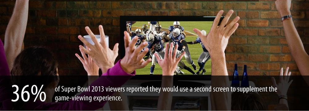
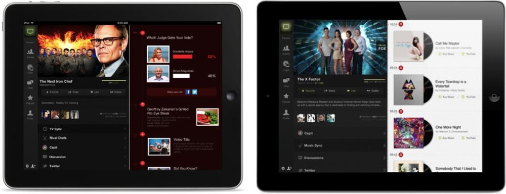
From networks and advertisers to production companies and even TV manufacturers, they all get one thing: the audience is no longer focused on the TV screen alone. Whether for live events like the Oscars or the Super Bowl, reality shows like Iron Chef or The X Factor, or even presidential debates, the second screen has become a major player in the TV viewing experience (see Figure 4-10)—let alone the third screen, fourth screen…soon enough, I’m sure, these will join in, too.
When we look at the heated social TV market, it seems it’s only a matter of time until we will start seeing even richer groups of even more layered shared TV watching experiences. What might this look like? Different family members could use the same TV device on different occasions, each person having an individual second-screen experience tailored to his preferences and interests. Or it could look like a group of friends watching TV together at the same time, each getting different content on her second-screen device—and, together, they’ve created a super-power experience (à la Captain Planet and the Planeteers).[41]
Second-Screen Experience as a Platform: Intonow
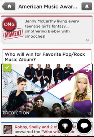
IntoNow, bought by Yahoo! only three months after launching its first app version, adds a rich social layer to TV watching (Figure 4-11). The app listens to what people are watching on TV, identifies the program, and unlocks a companion experience.
This experience offers a wide set of complementary elements:
Captures and shares “did you see that?” moments with a user’s friends by pulling up screenshots of the show the user is watching
Identifies music playing in the show as it happens (song titles and artists)
Retrieves related articles, people, live stats, behind-the-scenes photos, and additional information during the show
Lets users see what their friends are watching, chat with them, and start groups around a show
Provides trivia, discussions, and polls
Displays live tweets from actors, athletes, and celebrities related to the show currently being watched
These elements provide real-time accompaniment to the TV shows, resulting in a much richer viewing experience in terms of both content and social networking.
Design lesson: A second-screen experience can go beyond a specific show
Whereas Heineken’s Star Player and the plethora of Super Bowl second-screen experiences all focus on a single type of TV event with limited frequency, which makes scaling difficult, IntoNow provides a second-screen platform that serves many different TV shows. As a result, it not only accompanies the TV watching experience, but also helps users discover TV content through their social circles and their own TV watching habits. This also means that the second-screen app becomes useful not only during showtime, but also between shows, extending the usage potential beyond the limited time when a show is aired.
Design lesson: A second-screen experience doesn’t have to be associated with a predetermined broadcast time
While Heineken Star Player was inherently tied to the broadcasting time of the event (which is not in the user’s control), the IntoNow experience is associated with the user’s own viewing time. Accordingly, it provides much more flexibility in terms of the time, place, and frequency at which the product can be consumed. The second-screen experience in this case does not rely on a specific live broadcast time, but rather on the time(s) the user chooses to watch a show, at his leisure.
This is an important aspect given the radical shift in the way people have come to consume TV content over the last decade. Previously reliant on a given program guide, schedule, and channel selection provided by the broadcasting company, viewers can now create their own personalized viewing experiences based on their preferences. Services like Video on Demand (VOD), Netflix, Hulu, and Aereo—along with products such as Apple TV, Slingbox, Roku, and Google’s Chromecast—significantly expand and completely change the contexts, touchpoints, and ways in which people watch TV.
Design lesson: A second-screen experience can complement TV watching continuously
Continuing with the theme of usage potential, the second-screen experience has strong use cases ranging along a broad timeline:
TV show engagement is not bound to the time a show is aired. Viewers anticipate and prepare for it ahead of time, and talk about it after. The second-screen experience can accommodate these needs, providing both relevant, fresh content and a social communication platform to interact with friends.
If the TV show airs weekly, even more opportunities open up, as the TV watching experience can be viewed as a continuous one, from one week to the next. The second-screen experience can tap into that flow and create a longer-term narrative between episodes, keeping the viewers engaged. Opportunities include running polls among viewers about what they think will happen with a certain character or event in the next episode, sharing episode trailers, providing fresh news on the show’s stars or exclusive interviews, and recommending similar shows.
Tying Together Watching Experiences: Avengers
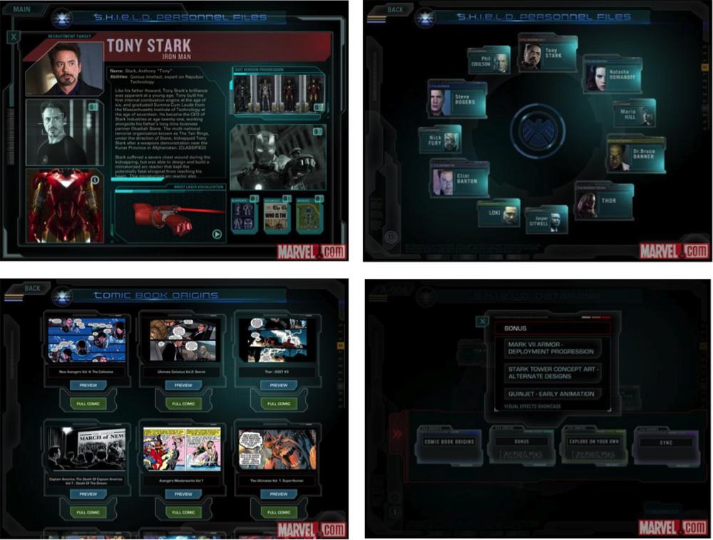
The Avengers second-screen app (Marvel’s The Avengers: A Second-Screen Experience) is a companion experience for the blockbuster movie The Avengers (see Figure 4-13). You might be scratching your head right now (as I was), wondering if Marvel was expecting people to take out their phones and use the app at the theater during the movie. The answer is no. This second-screen app targets the movie fans who bought it on Blu-ray or DVD, and is meant to accompany the movie-watching experience at home.
The user experience starts after the user completes the required Blu-Ray and WiFi configurations to sync mobile devices with the movie; then, when the user presses Play, the second-screen app comes to life with rich content streaming in.
The app is themed around the S.H.I.E.L.D. database, which offers access to personnel files, comic book origins, and exclusive interactive content, as well as the option to become a S.H.I.E.L.D. agent. Users can explore rich content about the film and its cast, behind-the-scenes footage, storyboards, videos, photos, and more.
A unique feature offered in this app is a button to sync the app to the movie, which immediately injects relevant interactive content for exploration that is tied to the currently playing scene—for example, loading the visual effects labs to explore the special effects layer by layer. Syncing the movie to the app is also available.
From a design perspective, this feature offers interaction flexibility that we haven’t seen before: you can wander around the app freely, exploring any movie content you want (without being bound to the movie playing), and at the same time, anytime you wish, with a click of a button you can sync the app immediately with the movie and get contextually relevant content.
An additional feature this app offers is that viewers can use their mobile devices as remote controls for the movie. This means they can pause the movie, for example, using simply the devices they already have in their hands.
This brings us to the second type of device relationship in the complementary approach—control, which we’ll look at next.
Question to the Reader
The sync flexibility offered by the Avengers second-screen app raises interesting questions related to its design affordance.
On the one hand, this flexibility puts the steering wheel in the hands of users, giving them much more control over the content they consume (when and how).
On the other hand, this flexibility could get in the way of actually watching the movie (which is the main activity in this scenario). Could this be overly distracting in the context of movie watching? How much complexity does this add to the app usage? Does it justify the added value?
Then there are the actual usage patterns. How many users use the sync button, and how often? Do they engage with synchronous and asynchronous content while the movie is playing, or do they separate between them?
Is there another way to approach this design challenge? Can contextual signals help in the content management here?
What do you think?
Control: Nice to Have
In this last set of examples, we are faced with a dominant device, usually the TV (at least today), where the main experience takes place. The other ecosystem devices—once installed with the required apps—can control different aspects of this experience, extending its reach beyond traditional time and space limitations.
Let’s have a closer look.
Not Necessarily a Simultaneous Experience: Slingbox
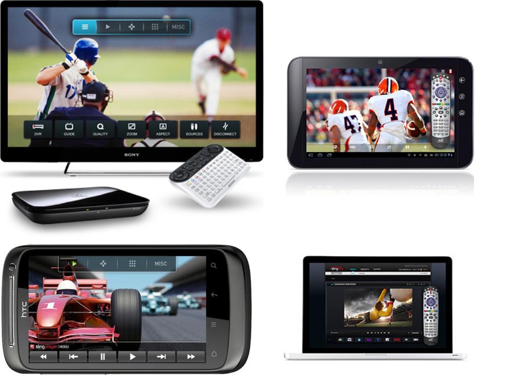
Slingbox is a TV streaming media device focused on ensuring that viewers don’t miss their favorite TV shows and events when they’re away from home (Figure 4-14). It’s accompanied by a proprietary SlingPlayer app for mobile devices.
With Slingbox, users can control their home TVs remotely in several ways—from a laptop, tablet, smartphone, or any other connected device. First, viewers can use a mobile phone as a TV remote control to change channels, adjust the volume, and so on. In addition, Slingbox provides an even more powerful feature: any of the ecosystem devices can be used to remotely choose a program for Slingbox to record. This means that when people are out having drinks with friends and suddenly remember that their favorite TV show starts in 10 minutes, all they need to do is pull out their mobile phones or tablets (whatever is at hand at that moment) and set their TVs to record that show.
So is the Slingbox example really that different from what we’ve seen so far?
The answer is yes.
Slingbox demonstrates for the first time an ecosystem experience in which devices can interact with one another—complement one another—without necessarily having to operate simultaneously. They don’t even have to be in the same room. This is a first.
This expands the ecosystem possibilities beyond time and space to a world of asynchronous ecosystem relationships, which theoretically can continue indefinitely. By comparison, collaborative games or second-screen experiences require all the devices to play together at the same time and in the same place, and the experience lasts only as long as the devices are active. With the Slingbox design approach, the experience is not bound to these space/time limitations.
When Collaboration and Control Meet: Xbox Smartglass
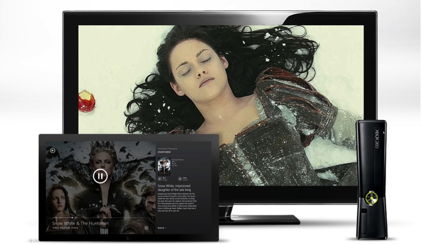
Xbox SmartGlass (Figure 4-15) allows for various devices and the TV to connect with one another to enhance the overall Xbox experience for TV shows, movies, music, sports, and games. As with the previous second-screen experience examples, the added devices are all considered nice to have, as they aren’t strictly necessary to the core Xbox experience taking place on the TV.
Xbox SmartGlass demonstrates how the two types of complementary device relationships—control and collaboration—can be incorporated into a single experience:
- Control
The smartphone, tablet, and PC can all control the living room Xbox experience. Players can use a mobile device to navigate to the Xbox dashboard; pause and rewind movies; swipe, pinch, and tap to surf the Web on the TV; and use the device’s keyboard for text input and search on the go.
- Collaboration
A smartphone or tablet can transform into a second-screen companion by automatically serving up extended-experience TV shows, movies, music, games, and sports. For example, Xbox collaboration provides relevant immersive details about a movie, TV show, or game; interactive guides; behind-the scenes commentary; real-time game strategy; and more.
In other words, the Xbox SmartGlass experience offers an interesting universal complementary experience. Not only does the second-screen device enrich the viewing experience, but it also releases users from the need to maintain and operate yet another device (the TV remote control). All TV-related activities are merged into a single device.
Is integrating both collaboration and control activities on one device a problem?
Not necessarily.
These two relationship types—collaboration and control—represent alternative activities on a single device that do not actually conflict or overlap. Either users’ attention is focused on consuming content on the current channel, or they’re flipping through channels or adjusting the volume. In fact, the relationship types can be perceived as compatible and potentially facilitate the overall TV experience.
To clarify, I’ll share a story from my days as a senior UX designer at a design consultancy several years ago. One of my biggest projects at the time was to redesign the entire TV interface for a leading cable television provider. When we started working on the EPG (electronic program guide), a key guideline (based on a lot of user research and A/B testing) was to maintain the context of the current channel being watched, even when viewers browsed through the channel guide. For that reason, we made sure to allocate space for an on-screen TV window in all our design explorations.
Now, if you take into account the design challenges with TV, the amount of content the EPG contains, the one-quarter-screen TV window that needs to fit in, and the sacred goal of keeping it all simple, clean, and light, you’ll quickly realize that this was quite a challenging task. Any design option involved significant compromises.
If I had the same project today in our multi-device world, I could approach the design challenges from many new directions. For example, if we go back to the Xbox SmartGlass, the second-screen device has already leveraged the functionality of the remote control, so it already includes the “button” to trigger the program guide. And if we can already call the EPG from the device, why can’t its content be displayed on that same device as well? This provides a seamless flow (i.e., there’s no need to switch focus between devices) and allows increased design flexibility on the second-screen device—all while maintaining the TV’s current context. Furthermore, the EPG could naturally link to extended information about each show—another feature that belongs under the jurisdiction of the complementary Xbox SmartGlass.
With that said, we would probably still need to come up with a design solution for the TV only, as not all Xbox users necessarily own a device that serves as a second screen. Still, the second screen opens up new design opportunities for creativity and innovation by exploring how the experience can be distributed between the TV as the activity center, and the second screen devices that complement it.
Fascinating Use Cases: What Do They Mean for My Work?
Collaborative games, second-screen experiences, and the other complementary experiences are beyond interesting examples; they could not exist with only a consistent design approach. These experiences come to life when an ensemble of devices play together, complementing one another to create a bigger, better experience.
In fact, almost any user activity is worth exploring in terms of everyday experiences that could benefit from complementary enhancement. For example, someone who is exercising might want to also watch a TV show or listen to music, and in this case those activities are complementary to the main activity. Once you have this realization, you find yourself looking at every product design from a new perspective—a context-sensitive one. This inevitably leads to examining the problem through the lens of the broader relationships between users and their devices; reassessing user flows, needs, and tasks; and constructing them anew in a more streamlined way.
Once we are able to create these collaborative experiences, we can begin to gain speed and move into some very promising opportunities. The benefits include:
- Lower barrier to entry
The mere fact that all these experiences are built upon devices people already own and carry with them significantly lowers the barrier to joining in. Anyone with a connected device can now play these games, or enjoy an enhanced viewing experience. There’s no need to buy a special controller or dedicated accessories; just download the app, sit back, and enjoy.
- Increased reach and accessibility
Being able to use only the ecosystem devices to partake in the full experience increases its reach to new audiences, new locations, new contexts, and potentially new settings (playing Monopoly remotely, for example).
In addition, these experiences are accessible anytime, anywhere. All users need to do is pull out their connected devices and get started. They are no longer bound to a specific place where the game console, TV, or game board is located.
- Accumulating knowledge
Having people shift their offline experience (physical board game, isolated game console, or living room chats during a TV show) to the connected ecosystem opens a window for an increased understanding of viewer/player behavior. A digital ecosystem can potentially provide usage data on each device, as well as on the overall ecosystem connections. This can then help us continue to optimize the experience. Furthermore, if we can correlate and analyze this data with other ecosystem data, we can derive even deeper insights.
- Enhanced social connections
The complementary experience is very much suited to supporting social engagements between people, like the previously discussed collaborative game play. As a new game is now just a tap away—easily accessible and readily available for party play with friends—it enhances social engagements and helps strengthen group ties.
- Enforced habits
The more users engage and interact with devices, the stronger their use habits become, which triggers a positive feedback loop that encourages them to continue using the devices.
Complementary experiences contribute to this mechanism, helping to enforce habits around the overall usage of multiple devices.
With consistent design, there’s no imminent incentive to use more devices, since the entire experience can be consumed on any device. When people use complementary design, the use across all these devices is reinforced and strengthens both the whole ecosystem and each device individually.
Summary
Complementary design involves interaction with at least two devices—usually at the same time and place—and is based on two types of device relationships:
Collaboration, where the different devices work together as a connected group to create the full experience
Control, where the primary experience takes place on a certain device and other devices control aspects of it, usually remotely
You’ve seen a diverse set of examples demonstrating different combinations of device relationships and weights—all of which convey the idea of an experience whole that is greater than its parts:
Multi-player game experiences (like Real Racing 2 and the Scrabble for iPad and Pad Racer apps) show how complementary design fits social activities nicely, and allows users to extend the experience beyond the game time and location.
Second-screen experiences (such as with Heineken Star Player, IntoNow, the Avengers app, and Xbox SmartGlass) illustrate the radical shift in the TV watching experience, from a passive experience to an active one involving multiple screens that complement one another. While this experience is still considered “nice to have,” we might not be far from the day it is established as a standard, becoming a “must have.”
The control relationship (like with Slingbox) demonstrates that complementary experiences can serve asynchronous contexts, extending the experience beyond specific time and place constraints.
Through these examples, you also saw that different device relationships can be integrated in the same experience (as in the Xbox SmartGlass case), as well as different device weights (as in Pad Racer).
A Summary of the 3Cs
This concludes the discussion of the 3Cs framework for addressing multi-device experience design. To summarize, the framework includes three main design approaches:
- Consistent
Each device acts as a solo player, creating the entire experience on its own.
- Continuous
Multiple devices handle different pieces sequentially, advancing the user toward a common goal.
- Complementary
Multiple devices play together as an ensemble to create the experience.
Table 4-2 gives a comparison view of these three approaches, summarizing their main characteristics.
CONSISTENT | COMPLEMENTARY | CONTINUOUS | |||
Collaborative | Control | Same activity | Sequenced activities | ||
Pattern type | |||||
Description | Same experiences is offered independently in each device (with minor adjustments to fit device traits) | Experience is split simultaneously between devices. They complement each other, to collaboratively create the full experience | Primary experience takes place on a single device, whereas others can control aspects of it (usually remotely) | Experience is split simultaneously between devices. They complement each other to collaboratively create the full experience | |
Devices need to be at the same place? | No | Yes | No | No | No |
Devices need to work together at the same time? | No | Yes | Depends | No | No |
1 | At least 2 | At least 2 | 1 | 1 | |
Examples |
|
| Slingbox |
|
|
Xbox SmartGlass | |||||
Most of the examples we examined in the last three chapters illustrated one approach in isolation. However, we’ve also started to see how some products combine more than one approach in their multi-device experiences in order to meet more use cases, or engage users across the various contexts in which they use the product.
In the next chapter, I will dive deeper into the topic of integrated design approaches, as in actuality most products integrate more than one design approach in their experiences. Let’s explore why and how the 3Cs framework supports that.
[37] Here, I’m focusing on the conceptual design of this product (putting aside the limitations of the iOS walled garden).
[39] “Please Don’t Ruin The Second Screen,” TechCrunch, May 27, 2012, http://tcrn.ch/1cRHRqP.
[40] “Big Game Survey,” Century 21, December 2012, http://www.century21.com/superbowl.
[41] In the TV show Captain Planet and the Planeteers, when the Planeteers came across situations they couldn’t resolve alone, they’d combine their powers to summon Captain Planet, a superhero, who possessed all of their powers magnified, symbolizing the premise that the combined efforts of a team are stronger than those of its individual parts (source: http://bit.ly/1hzDmsQ).
[42] Author note: in the interest of full disclosure, Bites was one of the startup I worked with as part of my role as UX mentor on the UpWest Labs accelerator.
Get Designing Multi-Device Experiences now with the O’Reilly learning platform.
O’Reilly members experience books, live events, courses curated by job role, and more from O’Reilly and nearly 200 top publishers.
