Chapter 4. Layout Basics
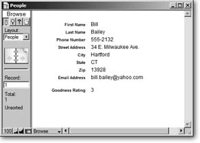
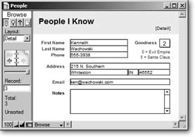
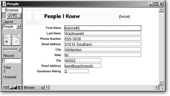
In the last chapter you created your first database, and it really works. Unfortunately, it doesn’t lookall that great. For example, the Street Address field is the same width as the State field, even though street addresses are usually much longer than state names. The Goodness Rating field is muchlonger than it needs to be. And unless you’re a real minimalist, the whole thing just looks boring (see Figure 4-1).
There are other things to worry about as well. There’s no good way to see lots of people at one time—in a nice list, for example. A list would also be handy for printing. As it stands, you have to print a whole page for each person in the database if you want a hard copy.
The FileMaker concept of layouts solves all these problems and more. While the Define Database window lets you define the structure of your database (its fields and tables), layouts let you design the look and feel.
What Is a Layout?
If the tables form the heart of a database, layouts give it a face. When you design a layout, you feel like you’re working in a graphics program: You can change the fonts, paste in your logo, make the background light fuchsia, and drag the fields around as though they’re little onscreen Lego blocks. A single database may look like a White Pages, a “Hello! My Name Is” name tag, a glossy brochure, or a library card catalog index card. FileMaker displays the same information—but how it displays that information is up to you.
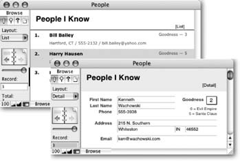
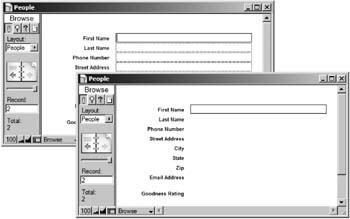
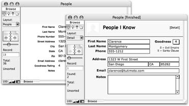
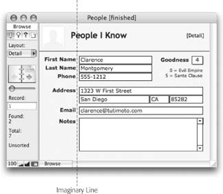
Better yet, a single database can contain as many layouts as you want; each shows the data in a certain way for a specific purpose. Figure 4-2 shows the People database with two layouts.
Types of Layouts
You can make layouts for just about anything. Most databases start off with a few common kinds of layouts for the most basic needs. Then, over time, you usually add more layouts to meet specific needs. When thinking about layouts, you should be thinking about how you’ll want to see the data—what kinds of information should be onscreen at the same time, for example—and how you want to print your data (printable lists, name tags, special forms, envelopes, statements, reports, and so on). Here are some common kinds of layouts:
Detail layouts show all (or nearly all) fields on the screen for one record at a time—a full employee profile, for example. You use detail layouts for most, if not all, of your data entry. If you have a lot of fields, you can even create more than one detail layout: Contact Info, Emergency Info, and Payroll Info, for example.
List layouts show multiple records at one time, in a scrolling list. They usually show less information from each record than a detail layout so that more records can fit on the screen.
Table layouts are designed to work best in Table view (see Section 2.1.2). Like a list layout, they show lots of records at once, but unlike a list layout, it doesn’t matter how the fields are arranged on the layout itself, since Table view always looks like a spreadsheet.
Report layouts are designed for printing (see Section 2.9). They usually show multiple records in a list form, often with a title at the top and summary information at the bottom. Reports can even have groups of data and intermediate summaries or running totals (see Section 6.9).
Envelope and Label layouts format the data so that you can print it directly onto an envelope or a sheet of peel-and-stick labels. This layout makes addressing envelopes to people in your database a breeze. FileMaker can automatically create layouts for many envelope sizes and common label formats.
Very often, you create both a detail layout and a list layout for each table in your database. The list provides an easy way to scroll through records and find what you’re looking for without getting data-overload. When you’re ready to see all the data, you switch to the one-at-a-time detail layout.
Switching Between Layouts
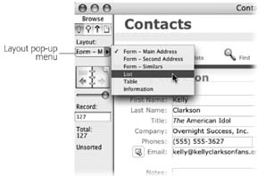
The ever-helpful status area tells you what layout you’re on and lets you switch to another one. The layout pop-up menu (Figure 4-3) is one of the most prominent elements of the status area. You can also see the same list of layouts in the View → Go to Layout menu.
Note
The layout pop-up menu doesn’t necessarily show every layout. You can actually tell FileMaker to hide certain layout names in this menu. You’ll learn how on Section 4.4.2.15.
Your People database has only one layout, making for a poor demonstration. To get a feel for how layouts work, you can use the Contact Management database instead (you created this database from a template in Chapter 1).
Open the Contact Management database.
It appears on the screen. If you need a sample database to play with, you can find it on the Missing Manual Web site (Section 3.4.5), complete with sample data.
If the status area isn’t showing, click the status area control to show it.
You now see the status area. (The status area control is explained back in Figure 1-2.)
From the layout pop-up menu, choose List View .
Now that you finally understand the difference between layouts and views, the silly database has the nerve to name a layout “List View.” Remain calm: The name just happens to be the best way to describe the layout (at least the developer thought so), because this layout is a List and it’s displayed in list view.
The List View layout shows in the window. FileMaker remembers which view you last used with each layout.
Since the layout affects only how the data shows, your found set and current record stay consistent as you change layouts. The following two steps show how this layout works.
From the List view layout, use the status area’s book icon to switch to another record.
Since you are viewing this layout as a list, as you change records, the little black line along the left edge of the window moves, as explained on Section 2.1.2.
From the layout pop-up menu, choose Form — Main Address .
You’re now viewing details of the record you selected when in list view. In other words, FileMaker stayed on the same record while you switched layouts.
Likewise, if you do a find on the Form — Main Address layout, and then switch to the List layout, you’ll see just the found records in the list. Since FileMaker is all about making all your data easy to see, search, print, and otherwise use, switching among various layouts is a big part of the game.
Note
As you spend more time with your own databases, you’ll probably discover that you switch layouts a lot. You may decide all those trips to the tiny layout pop-up menu are slowing you down. That’s why most databases (the Contact Management template included) use buttons to make layout switching faster.
In Chapter 1, you learned how to click the tab graphics to switch between viewing record details, a list, or a table (Section 1.5.3). Now you know these tabs simply switch between three distinct layouts. You too can create buttons to switch between layouts, and you’ll learn how in Chapter 6.
What Makes a Layout
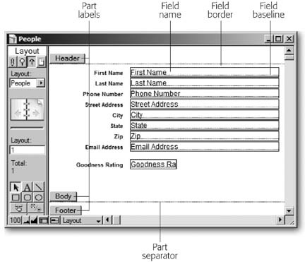
A layout is made up of layout parts—sections that each behave a little differently when displaying or printing multiple records. Even the simplest layout has at least one part, and each part has objects on it. One kind of object is a field, which you’ve seen plenty of so far in this book. Each field in your database has a little label beside it that tells you which field it is. These labels are another kind of object: they’re text objects. It just so happens those objects all belong to a part called the body, and if you need to talk about your layout, you’d say they are on the body.
Parts tell FileMaker how to treat the objects inside them when it displays or prints the layout. One part might show just once at the top of the window, while another shows over and over again for each record. This section tells you exactly what each part type does and when to use it. Finally, you’ll learn how they work together and how they behave in each mode.
Layout Parts
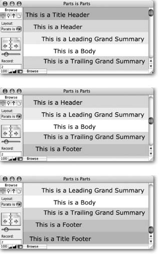
FileMaker has eight different kinds of parts in all. Every layout uses at least one of these parts, and often several—although not all databases need all eight kinds of parts. Most types can occur only once on each layout (like a header), while others can appear several times.
Title Header. The Title Header part holds things you want to appear only at the top of the very first printed page. Use it for a descriptive title, larger column labels, a company logo, or you can even make it the height of your paper, and it acts as a cover page.
Header. The Header part prints at the top of every page—unless you also use a Title Header, in which case the Title Header is on page one and the regular Header is at the top of all other pages. In Browse mode, the Header shows up at the top of the window. This part is where you might put a date and time, small title, smaller column labels, and anything else that you want on every page of the printout.
Leading Grand Summary. This part prints below the header but above the records themselves. It’s meant to contain totals and similar fields that add up, average, or in some way round up the results of your records, which FileMaker calls summarizing.
Note
Leading Grand Summary and all the other “summary” parts are how FileMaker creates reports. Reports, which help you compile and analyze your data, are nothing more than a special kind of layout, as you’ll learn in Chapter 6.
Body. The body shows the actual record information. In list view, or when printed, it repeats once for every record.
Sub-Summary. These parts help you add things like subtotals to complex reports. You’ll learn all about this layout in Chapter 6.
Trailing Grand Summary. If you prefer totals and overall summary information at the bottom of a report, it would go in this part.
Footer. The footer prints at the bottom of every page—unless you also use a Title Footer, in which case, the Title Footer appears on page one and the regular Footer appears on all other pages. The Footer also appears at the bottom of the window in Browse mode. The footer’s a perfect place for page numbers, copyright notices, and anything that ought to appear at the bottom of every page of your printout.
Title Footer. The Title Footer part shows at the bottom of just the first page. Use it for special footer info that only needs to show once.
Figure 4-4 shows a layout with seven parts—one of each type except sub-summary.
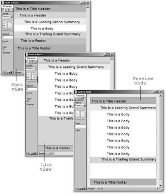
Parts in form view
When in Browse mode, and viewing the layout as a form, you see every part except sub-summary parts. As Figure 4-4 shows, the parts go in the same order as in the list on the previous page. In practice, you’ll probably never use all these parts on a layout you plan on viewing this way. In fact, if you only ever want to view a layout as a form in Browse mode, you really need only a body part.
If the window isn’t big enough to show every part, you get scroll bars as usual. In form view, the entire layout scrolls up and down, as shown in Figure 4-5.
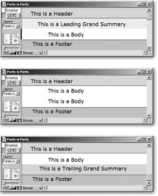
Parts in list view
In list view, the header is anchored to the top of the page and the footer to the bottom. When you use the scroll bars, the header and footer stay in place and the body part scrolls. If you resize the window, the footer moves with it so that it is always the same height, and always at the very bottom.
List view is a list because it shows several records at once. FileMaker accomplishes this magic by repeating the body part once for each record. The database in Figure 4-2 has three records, so in effect, the body part repeats three times.
The leading grand summary shows directly below the header, and before the body part’s first appearance. The trailing grand summary, on the other hand, shows right after the last record’s body part.
Scrolling in List view is altogether different from Form view, as shown in Figure 4-6.
Parts in Preview mode
Figure 4-6 might lead you to believe that Preview mode shows only the title header and footer (exactly the opposite of list view) but that’s not the whole story. Turn your eyes to Figure 4-7 for the whole story.
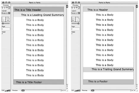
Just like list view, the grand summary parts place themselves before the first record and after the last record. Finally, scrolling in Preview mode just scrolls the current page. If you need to see other pages of your report while you’re in Preview mode, use the Book icon to move around.
When to use ‘em
While it’s perfectly legal to put any parts on any layout, you can probably tell from the discussion above that some arrangements are more common than others:
Detail layouts usually have just a body part, or some combination of header, body, and footer. These layouts may show only a single record, so there isn’t much point to summary parts since there’s no list of data to summarize.
List layouts usually have a header and a body, and sometimes a footer. Occasionally, you want a trailing grand summary on your list layout as well, since it can show summary information after all the records without taking up precious space like a footer.
Printed reports come in many forms. People often use all the parts shown above on a report: a large title header for the first page, and a smaller header for each additional page; a leading grand summary that shows below the title header and before the first record; a body part for each record; a trailing grand summary to show totals from all records, and a footer to show page numbers and the like.
Envelope and label layouts often need headers and/or footers just to get the record data to align properly on the printed page. These parts are generally empty.
You may have a list layout that you use to browse your records, but you often print it as well. Make the layout do double duty by adding a title header or title footer. They’ll show only when you print, and you can save valuable screen real estate.
Layout Objects
Parts aren’t so useful by themselves. They control how the items in your layout arrange themselves on screen or on the page, but they need to have things in them to be really useful. You call those things layout objects. Layout objects come in six flavors: Text objects, lines and shapes, images, fields, portals, and tab controls.
Note
Portals are all about relationships, and you won’t learn about relationships—or portals—until Part 4. You’ll take up tab controls a little sooner. Look for them in Chapter 6.
Text objects
Almost every layout ever created has included text objects: little blocks of text that are the same on every record displayed using that layout. Think about what happens when you move from record to record. The text labels for each field stay the same, even though the data inside each field changes with every record. Text objects give you one form of stability in the ever-changing world of database records.
When you design a layout, you can control every aspect of a text object, from the words in it to the font, size, style, color, line spacing, tab stops, and so on. (In fact, everything you learned in Chapter 2 related to formatting text in fields applies to text objects on layouts as well.)
Tip
FileMaker’s spell checker works in layout mode too. Just choose Spelling → Check Layout. It looks and works just as it does in Browse mode—except that it checks text objects on the current layout. Also, the visual spell checking feature (Section 2.8.2) works in Layout mode as well.
Lines and shapes
If you need simple graphic embellishments in your layouts, FileMaker has built-in tools. For example, you might want to put a box around a person’s address information, and another around the Notes field, so they are visually separated. You can draw lines, rectangles, ovals, and round-cornered rectangles right on your layout. You can also control the line color, thickness, and pattern for lines and shapes; and the fill color and pattern for shapes.
Images
If simple shapes can’t properly convey your artistic vision for your layout, you have recourse: You can paste any picture right on to the layout. You can also insert a picture from a file on your hard drive. Database developers often add icons, logos, and other decorations this way. For example, you might add your company logo to the top-right corner of your layout, or put a cute little envelope icon by the Email Address field. Just remember a little of this “eye candy” goes a long way. If you get carried away, you can actually create so much visual clutter that people using the program are confused, instead of enlightened.
Fields
A layout without fields is just a picture. Perhaps it’s a very complex picture that changes as you switch from list view to form view, and has an entirely different effect when printed (thank you, parts!), but it’s a picture nonetheless.
To get data into your layout, you add field objects. For instance, if you make a new layout in the People database, and you want to show the person’s address, you can add the Street Address, City, State, and Zip Code fields to the body part of the layout. If the field is in the body part (the most common place), then it shows data from the current record (or each record when you view the layout as a list). In list view, fields in header, footer, or grand summary parts show the values from the first or last record in the found set. In Preview mode (or when printing), headers and footers show data from the first or last record on each page.
Note
You won’t usually put ordinary fields in header, footer, and grand summary parts. These parts usually contain global fields, summary fields (see Section 6.9), page numbering, dates, or just text and pictures.
With a firm understanding of layouts, views, parts, and objects, you’re ready to get down to business. The next section shows you how to put all these ideas to work in your own databases.
Layout Mode
OK. It’s time to dive into Layout mode and see what it’s all about. You’ll probably spend most of your time in Browse, Find, and Preview modes, but despite this fact, Layout mode has more options, more buttons, more menu commands, and more hidden features than any other mode. As you explore Layout mode in this section, you’ll work with the People database you created in the last chapter, so to start things off, open that database and switch to Layout mode:
Open the People database you created in Chapter 3 .
The database appears on the screen, in Browse mode. If you don’t have the People database, you can download a copy from the “Missing CD” page (Section 3.4.5).
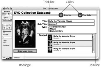
Whoa! Welcome to Layout mode…and you thought you had this FileMaker stuff figured out. (Figure 4-8 shows what you should see on your screen.)
The Status Area
You don’t have to look too closely to see that the status area has changed significantly (Figure 4-9):
Instead of the current record number and record count, the status area now shows the current layout number, and the layout count. (You can’t tell yet since you only have one layout, but the book icon now moves you through layouts rather than records.)
A handful of tools—little square buttons with icons on them—appear. (Read on to find out what they do.)
In the bottom-left corner of the window, a new control called the part label toggle has joined the usual zoom controls and status area control.
The Mode pop-up menu and mode tabs now show that you’re in Layout mode.
Note
It isn’t just the status area that changes, though. Take a look at the menus. The Insert and Format menus, which are almost always gray in Browse mode, are fully functional now. And you have two new menus to help you design: Layout and Arrange.
Note
You may need to make your window taller to see everything the status area has to offer in Layout mode. In Windows, drag the top edge of the window up, or the bottom edge of the window down. In Mac OS X, drag the resize box at the bottom-right corner of the window.
View Options
Although Figure 4-9 shows how your database normally looks in Layout mode, FileMaker offers a host of options to change it. Each of these options has absolutely no effect on the finished look of your layout in Browse mode; rather, they help you while you’re designing the layout. The View menu keeps those old standby commands (Browse Mode, Find Mode, Layout Mode, Preview Mode, and Go to Layout) right there where they belong. But you get choices that are more suitable for layout tasks.
Go to Layout
This hierarchical menu gives you an alternative to using the status area’s Layout pop-up menu to move to all your layouts. In Browse mode, the Go to Layout submenu shows only those layouts that you’ve specified for inclusion in Layout menus. But in Layout mode, all layouts are listed, so you can switch quickly as you work.
Page margins
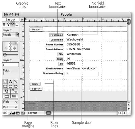
If you want a better feel for how your layout will look when printed, choose View → Page Margins (Figure 4-10). FileMaker shows a light gray border around your layout, representing your current page margins.
Graphic rulers
Choose View → Graphic Rulers to get a handle on the actual size of the layout and the objects on it. When they’re turned on, you see a ruler running up the left edge of the layout, and another across the top (see Figure 4-10). You can use this ruler to measure how big layout objects are and align things perfectly to a spot on the printed page, since an inch, centimeter, or pixels on the ruler matches the same unit when printed. Change the rulers’ unit of measurement by clicking the square where they intersect. Units cycle through a series of presets: inch, centimeters, and pixels.
Text ruler
You might not care how tall your page is, but you do want to know how wide objects are. If so, choose View → Text Ruler. When you have no text objects selected on a layout, the text ruler looks just like the graphic rulers above, except there’s no ruler along the left margin. You see text ruler in action when you have a text object selected. Then the ruler shrinks to the width of your object, and displays margins, indents, and tabs—an ideal tool for judging space when your trying to cram a lot of information onto a small screen.
You don’t have to be content with the lines and rulers File-Maker gives you. If your rulers are in inches, for example, and you prefer to work in pixels, you can easily make the change. When in Layout mode, simply choose Layouts → Set Rulers. In this window, you can choose the units your ruler uses. If you choose Inches, FileMaker draws ruler lines one inch apart. If you choose Centimeters, your lines are one centimeter apart instead. When you set your ruler units to Pixels, the lines are 100 pixels apart (a line every pixel would probably be counter-productive).
If you have graphics rulers showing, you can avoid the trip to the Set Rulers dialog box. In this example, you can see that your current choice of units is in the top-left corner of the layout. If you click the unit label, it changes. Each time you click, the units change, rotating between all three options.
This dialog box also has a setting for grid spacing. See the box “Exercise Some Constraint” on Section 4.4.9.4 for an explanation.

Ruler lines
Rulers running along the edge of the window may not provide enough visual alignment aid to suit your tastes. In that case, choose View → Ruler Lines. FileMaker draws dotted lines along your layout in a grid pattern. With this grid, you can more easily see how things line up on the layout, and get objects just where you want them on the printed page.
T-Squares
Choose View → T-Squares to show the T-Squares (Figure 4-11). When FileMaker shows you the T-squares, they always land aligned smack-dab in the middle of your layout. To move them where you want them, just drag them into place. Unfortunately, you have to move them one at the time. Practice your multiplication tables while you do this tedious task.
You can even use the T-Squares to line up objects on more than one layout. Align something to the T-Squares, and then switch to a different layout and align another object to them. Now, as you switch between these layouts, the two objects stay in the same place. So what, you say? Most often, the two objects are really two copies of the same thing, say a button you want in the same place on two different layouts. If these two objects aren’t precisely aligned on each layout, you’ll see a very distracting flash when you switch between those two layouts. Sure it takes a little time, but this kind of precision will give your database polish and a professional look.
Object size
This tiny window is a powerhouse of formatting options. See the box on Section 4.4.9.1 for power users’ secrets.
Buttons
Contrary to what you might think, View → Show → Buttons doesn’t show or hide your buttons. Instead, this command puts a thick gray line around all objects you’ve defined as buttons. You haven’t learned about buttons yet, so see Section 6.6.5.3 for directions on how to make objects bend to your will and turn into buttons.
Sample data
As mentioned above, FileMaker normally shows the name of each field inside the field itself. If you yearn for something less useful (alright, differently useful), you can choose View → Show → Sample Data. FileMaker shows semi-random sample data in each field. Actually, this feature does have some limited value: It shows numbers in your number field, dates in your date fields, and so on. This feature can give you a visual clue about how these values are being formatted (you’ll learn how to format data in fields shortly). Figure 4-10 also shows fields with sample data.
Text boundaries
Normally, text objects on a layout (like the field labels you see now) have no border around them. Sometimes, though, you can have a tough time visually lining text up since different letters have different shapes and sizes. If you choose View → Show → Text Boundaries, you see a tidy box surrounding each text object. When you line up these boxes, you ensure that the text inside them is lined up too.
Field boundaries
All the view options available in layout mode are turned off unless you turn them on yourself—except for this one. FileMaker normally shows a border around every field no matter how you have that field formatted. If you don’t want to see this border, choose View → Show → Field Boundaries. Figure 4-10 shows how the layout looks with field boundaries turned off.
Sliding objects
This command places small, black arrows near the top of any item that’s been set to slide during printing. See Section 5.3.4.3 to learn how to make objects slide.
Non-printing objects
This command puts square black handles at the corners of any object that’s set as non-printing. See Section 6.5 to learn how to make objects non-printing.
Toolbars
You can find all FileMaker’s toolbar commands in either the menus or on the status bar. But if the fascination of menus has lost its steely grip on you, you can show or hide any of FileMaker’s toolbars at will. They come in four flavors:
Standard. This toolbar contains the stuff you find in most application’s toolbars. There are buttons for creating new files, for opening existing files, for saving, for undos and for cut, copy and paste, among many others.
Text Formatting. Here you’ll find the stuff you need to make your text look great. You can change fonts, sizes, styles, alignment and spacing.
Arrange. These oddly marked buttons let you align objects, move them backwards and forward in layers, and rotate them.
Tools. This powerful little bar gives you the strength to draw simple objects and to create those objects that make a database do what it does best. You can make fields, buttons, portals and tab controls, as well as insert parts into your layout. Any of those items mentioned here that don’t make sense yet will make sense in due time, Grasshopper. Keep reading this chapter and the next one. Soon, you’ll be ready to leave the temple and embark on your own journey of discovery and saving the world through better databases.
Tip
If the icons on these buttons don’t immediately convey meaning to you, let your mouse pointer hover over each one. After a second or two, the button’s name appears in a yellow field, called a tooltip. (If you have FileMaker Advanced, you can create tooltips of your own, as explained in Chapter 19.)
The first time you see these toolbars, they’re anchored near the top of the screen, just under the menu bar. But they all have dotted gray lines at their left edges. Just use these lines to drag the toolbars wherever you want them. They are powerless to resist you and will stay where they’re put. Use the close box to make them go away.
Status area
This is a menu-based choice for showing and hiding the status area. If you have to work on a laptop, or any other computer with a small screen, you’ll be grateful for the extra pixels you can squeeze out by hiding the status area while you’re designing your layouts.
Zoom in and out
The View menu also has options to zoom the layout in or out (View → Zoom In and View → Zoom Out). If the thrill of clicking the zoom controls in the status area isn’t enough for you, you can alternate between zoom buttons below and zoom menus above. You do have some control over what area of the screen is magnified. If there’s an object you need to see, select it before zooming in. FileMaker tries to keep that object centered as it zooms.
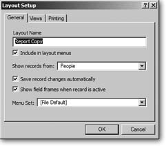
Layout Setup
Most of your layout work simply involves creating and adjusting layout parts, and filling them with things. But some important aspects of a layout aren’t visible on the layout itself. These settings are tucked away in the Layout Setup dialog box (Figure 4-12) instead. You can call this window into action by choosing Layouts → Layout Setup.
With the People database open, switch to Layout mode. Now’s a good time to set some options.
Layout name
First up, suppose your People database holds all your clients. You might want to change the name of this layout to “Personal Details.” This change clears the way for a “People List” layout down the road.
Choose Layouts → Layout Setup.
The Layout Setup dialog boxs appears.
In the Layout Name box, type Personal Details .
You can give a layout just about any name you want, so long as it’s no more than 100 characters long. You can even have more than one layout with the same name, if you’re a fan of confusion. FileMaker keeps track of layouts using an internal ID number, so it always knows which layout is which. But you have to depend on the names you give your layouts, so name them wisely.
Make sure the “Include in layout menus” checkbox is turned on.
Normally, each layout is listed in the Layouts pop-up menu, so that when you’re using the database you can switch to that layout at any moment. In this case, you want to be able to check out client details at an instant’s notice.
Sometimes, you’ll turn this checkbox off when a layout serves a special purpose: Perhaps it’s a report that makes sense only after performing a special find and sort; or a search screen that works only in Find mode. In cases like these, you can turn off the “Include in layout menus” checkbox and use a script (Part 5) to go to the layout instead. When you do, the layout no longer shows up in the Layouts pop-up menu or the View → Go to Layout menu in Browse, Preview, or Find modes. Every layout shows in the Layouts pop-up menu in Layout mode, no matter how you set this checkbox.
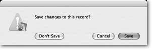
Turn off the “Save record changes automatically” checkbox.
This way, FileMaker displays the message shown in Figure 4-13 whenever you try to exit a record after making edits to it using this layout. It’s confirming that you want to save those changes when you commit the record.
If you leave this checkbox turned on, this saving happens quietly in the background. FileMaker’s factory setting is to commit changes the moment you leave the record, as you learned on Section 1.5.3. In this case, however, as your business grows, you’re planning to hire a helper to edit and update client information. Until that person gets up to speed in FileMaker, you want to give him a chance to double-check his work.
Figure 4-13. When the “Save record changes automatically” option is turned off, you see this message when you exit a record if you’ve made any changes. If you’d rather not keep the changes you made, click Don’t Save. Click Cancel if you want to stay in the record, changes intact and un-saved. Click Save to exit the record and save the changes.Note
Pay close attention to the fact that this is a layout setting. If you want to make sure record changes are always confirmed before being saved, you have to turn this setting on for every layout. There’s a point to turning it on, though: Suppose you don’t want to confirm changes to most of your fields, but you do want this behavior for the notes field. You can simply leave the notes field off the main layout, and create a separate notes layout. When you create this layout, you get the ask-before-saving feature for the notes field without the hassle for every other field.
Turn off “Show field frames when record is active.”
The “Show field frames when record is active” option affects how FileMaker shows fields in Browse and Find mode. You’ve probably noticed that whenever you’re in a field, every field on the layout has a dotted-line border around it. These borders help people figure out where the enterable fields are. Figure 4-14 illustrates the difference.
Using the tools in this chapter, you, O savvy database developer, can make your layout clear and user-friendly without the unsightly dotted lines, so turn them off.
You can always return to this dialog box (Layout → Layout Setup) if you ever get confused and want to use the dotted fields as a guide.
Note
The Menu Set pop-up menu gives you heretofore unheard-of power. Using FileMaker Advanced, you can control which menus and commands are available when your users view a layout. But you won’t learn how to do that until Chapter 19, so don’t touch that dial just yet.
Now, if you switch to Browse mode, you see the new name in the Layout pop-up menu, and no frames when you click a field. Of course, without the field frames, your invisible fields look a little odd. You’ll fix this problem shortly. But first, you need to learn about the tools you have in Layout mode.
Layout Tools
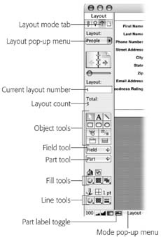
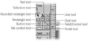
The vast majority of new goodies in the status area are tools—like their real-world counterparts, you use tools to build things—in this case, your layout. You can see all the tools in Figure 4-15.
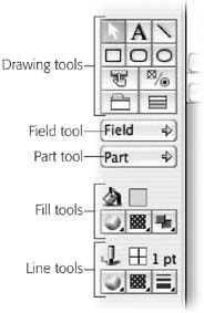
The drawing tools
The first set of tools in the status area is the drawing tools. These tools, for the most part, just let you draw decorations on the layout. They’re the top two rows of the main tools panel, and you see them up close in Figure 4-16.
The selection tool is active when you first enter Layout mode, and whenever you’ve finished using another tool, it immediately becomes active again. It’s sort of the default tool in FileMaker—if you’re not using some special tool, File-Maker assumes you want to use this one. Its only purpose in life is so you can select objects on the layout. Once an object is selected, you can do things to it (like move it, resize it, or adjust the way it looks).
The text tool lets you put text on your layout. For the most part, this text is unchanging—it’s the same no matter what record you’re looking at. The most common example of text on layouts is field labels, which you’ve seen in every database you’ve used so far. See Section 4.4.5.3 for the skinny on working with text on a layout.
Figure 4-15. The layout tools come in three flavors. The drawing tools require just a click—once you select them, you can literally draw right on the layout. The field and part tools work like a post-it-note pad—just drag from the tool into the layout to peel off a blank field or part, ready to stick where you want. When you click one of the fill or line tools, you get a pop-up menu of choices.Figure 4-16. These are the drawing tools. In this picture, the selection tool is active (it has a darker background). To choose a different tool, click it. Once active, you can click or drag on the layout to draw a shape or add some text. When you release the mouse button, FileMaker automatically activates the selection tool again.The line, rectangle, rounded rectangle, and oval tools. FileMaker has a built-in understanding of a few basic shapes. You can draw lines, squares and rectangles, circles and ovals, and rounded rectangles (rectangles or squares with round corners). Figure 4-17 shows a few ways people often use these shapes on layouts. On Section 4.3.2, you’ll get a chance to create some shapes and lines of your own.
Note
If you Find FileMaker’s drawing tools limited, fear not. You can create icons, buttons, or any other elements in any drawing program, and then place these images on your layout. Find out how on Section 4.4.9.4.
The control tools
The drawing tools let you gussy up your layout. But the control tools let the layout get down to business. With this fantastic four, you tell the layout where to put data and where it should go looking for that data. You can also create buttons to automate tedious or lengthy processes, and you can create tab controls, which make designing complex databases a breeze.
The Button tool helps you create a button which, when you click it, tells File-Maker to do something interesting—create a new record, switch to a different layout, or even run a script. You’ll learn how to create buttons in Chapter 6 and how to write scripts in Chapter 13.
The Field Control tool lets you determine everything that’s important about a field except what’s inside it. You can control a field’s placement on your layout, its shape and size, and even what it looks like. The first part of Chapter 5 is all about field control.
The Tab Control tool gives you a major leg up on placing lots of fields on a single layout without clutter. Look to Chapter 6 for the full scoop on how tab control makes your life easier.
The Portal tool creates portals—mysterious passageways to a different dimension. Wait…that can’t be right. Portals actually show data from a different table right on your layout. You’ll learn more in Part 4.
The field and part tools
The next tools in line are the Field and Part tools, which simply let you add fields and parts to your layout. To create a new field, drag the Field tool onto your layout. When you let go of the mouse, FileMaker draws the field and pops up the “Specify Field” dialog box. Click the “Create label” option if you need a field label. Click OK and your field is created.
The line and fill Tools
Next up are the fill and line attribute tools, shown more closely in Figure 4-18. When you click these buttons, you get menus from which to pick colors, patterns, line thicknesses, and other special effects, each of which you can apply to assorted objects on the layout. For example, when you have a shape selected, you can choose from the menu under the fill color tool and change the shape’s color. You’ll use these tools all throughout this chapter.
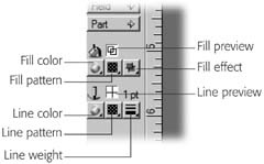
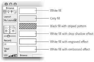
Fill color, pattern, and effect. When you select an object on the layout, the fill color changes the color of the object itself. You can also apply a repeating pattern to the object for that oh-so-80s look. If the early 90s is more your style, the Fill Effects tool lets you apply a simple drop shadow, an embossed effect, or an engraved effect. Figure 4-19 shows some rectangles with various fills.
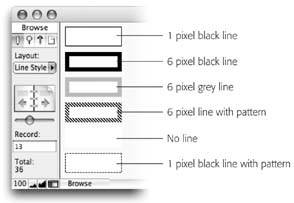
Line color, pattern, and weight. The next three tools affect the outline of an object, rather than its fill. You can again control color and pattern. The Line Weight tool also lets you adjust the thickness of the outline itself. You can see some line settings in action in Figure 4-20.
Working with Parts
The first step to any layout design is to put the parts where they belong (or at least approximately where they belong; you can always tweak them later). In the beginning of this chapter you learned about the kinds of parts a layout can have, and it’s your job to decide which ones you want for the layout you’re building.
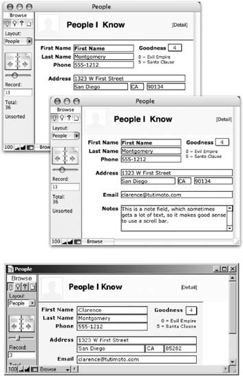
In your People database, your first job is simple—to pretty up the layout FileMaker created for you. It makes sense that such a layout would have a header part (where you can announce the layout’s title) and a body (where you can put the actual fields). Figure 4-21 shows one person’s idea of a nicer looking detail layout.
Deleting a part
The quickest way to delete the footer part (which you don’t need for this particular layout) is to click its part label and press Delete. (The part label is the little gray tag that says Footer.) Go ahead and delete the footer part now. Since this footer is completely empty, it simply goes away immediately. If a part has any objects in it at all, FileMaker asks you if you’re sure before removing the part and everything in it.
Resizing parts
Your next job is to make the header a little larger. Just drag the part label straight down a bit. As you drag, a dotted line tells you where the part will land when you let go. For now, make it about double its original size.
Every part below the one you resize moves down to make room, which is almost always what you want. But suppose your overall layout size is just where you want it (perhaps it’s designed to print on a special form, and the exact size is critical). In a case like this, if you want to resize the header, you probably don’t want it to push other parts down. Instead, as the header grows, you want the body to shrink a little, so that the header eats into the body. To get this effect, hold down the Alt (Windows) or Option (Mac) key while you drag the part label. When you do, the border between parts changes, but the overall layout size remains the same, and the objects on the layout don’t move at all.
Note
Unless you hold the Alt (Windows) or Option (Mac) key when making a part smaller, you can’t drag the part boundary above the bottom-most object it contains. To get around this glitch, you must move the objects out of the way, delete the objects, or hold down the necessary keys while you drag.
FileMaker won’t let you put objects outside a part, so sometimes as you’re arranging things you get cramped for space. To make the rest of your layout work easier, go ahead and make the body part taller as well—you can shrink it back down later.
Coloring a part
The finished details layout should have a shaded header (Figure 4-21). Getting this effect is a breeze:
Click the header part label to select it.
The label itself darkens to let you know it is selected.
Click the Fill Color tool in the status area (it’s shown in Figure 4-19).
A menu of available colors pops up.
From the menu, select the color you want for the header.
The header part changes to match the selected color.
Repeat the steps above, this time selecting the body part and a different color (like light gray). When you color a part, this color becomes the background color both in the database window and when you print. With this phenomenon in mind, you should probably avoid excessively dark or otherwise awful colors and patterns.
Adding and Editing Text
Figure 4-22 shows how your layout probably looks right now, and how it’s going to look when you’re done. Your next assignment is to put the text in the header. FileMaker’s text tool makes it a cinch to click anywhere in a layout part and type away.
Adding new text
The first piece of text in the header should say “People I Know.” This is a title for your entire database (in other words, your list layout will say the same thing on top). Here’s how to do it:
In the status area, click the Text tool (it has an “A” on it).
The Text tool button darkens to let you know it’s active.
Choose Format → Font → Trebuchet MS.
The text you’re about to create will appear in this font.
Choose Format → Size → 18 Point.
Now you’re telling the text tool you want it to create larger text.
Choose Format → Style → Bold.
And finally, you want this title to be bold.
Figure 4-22. The window in the back should look something like your database. Your ultimate goal is to make it look like the one in the front. You’ve still got a lot to do, and the next step is to add text to the header.Note
You can dress up your text in any font, size, and style you like. But don’t forget that the computer your database is used on must have the font installed. If you have fine-and-fancy $300 fonts on your computer, but your employees will be using the database on stripped-down PCs, you want to pick a font that comes standard with your operating system so everybody sees the same lovely letter forms.
Click somewhere in the header.
A new text box appears (Figure 4-23). This text box is FileMaker’s way of saying “Go ahead and type.”
In the text box, type People I Know.
As you type, the words appear in the box.
Press Enter.
The dotted outline and flashing insertion point disappear and you’re left with a full-fledged text object. This object is automatically selected for you.
If necessary, move the new text object to its proper place, using Figure 4-22 as a guide.
You move a text object like any other object: Just drag it.
After you create a text object with the text tool, the selection tool is automatically activated. FileMaker assumes you want just one text object, and saves you the trouble of switching back to the selection tool. If you anticipate creating several objects of the same type, give the tool icon a double-click instead of a single click. The icon on the button turns white to let you know the tool is now locked. With a locked text tool, you can create as many text objects as you want: Click to create the text box, type the text, click again for another text box, and so forth. When you’re finished, click the selection tool again to make it active.
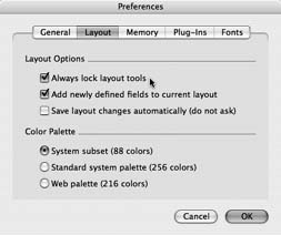
If, for some reason, you don’t like FileMaker always switching back to the selection tool on your behalf, you can instruct it to lock the drawing tools automatically—so even a single-click keeps a tool active until you say otherwise. In Windows, choose Edit → Preferences. In Mac OS X, choose FileMaker Pro → Preferences. In the preferences window, select the layout tab (shown here) and turn on the “Always lock layout tools” checkbox. If you’re like most people, you want to switch this checkbox off after trying it for about ten seconds; just revisit the Layout tab of the preferences window and turn this checkbox off.
As well as the main title, a header often also includes something to remind you (and the people who use your database) what layout you’re looking at—the “[Detail]” text in this case. You already know how to do it:
Using the text tool, click somewhere in the header part, being careful not to click the existing text object.
A new text box appears, ready for typing.
Type [Detail].
The text box reflects your typing, but the text isn’t the right size or style.
Press Enter.
Again, the signs of an editable text box disappear and FileMaker selects the new text object.
Choose Format → Size → Custom.
The Custom dialog box pops up.
Enter 11 in the “Custom font size” box, and then click OK.
The text you just created immediately changes size.
Note
Since 11 Point isn’t normally in the Format → Size menu, you have to use the Custom size option instead. This option works the same in layout mode as it does in Browse mode (see Section 2.5.1).
Choose Format → Style → Plain Text.
The text object loses its “boldness.”
Move the text object to its proper place.
You can see it coming: Just drag.
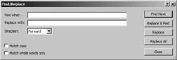
Layout mode retains some features you’ve already learned from Browse mode—albeit slightly modified to make sense to a database designer rather than a database user. For example, you might want to find and replace text on a layout, on occasion. Imagine you have decided to call the Zip Code field Postal Code instead, since you’re planning a big drive into Canada. You can use Find/Replace to fix every field label on every layout in just one shot. When you’re in layout mode, the Find/Replace command searches through text on the layout itself rather than search through the data in fields and records.
Here’s the pared-down dialog box you see when you choose Edit → Find/Replace → Find/Replace in layout mode. Aside from a the lack of “Search across” and “Search within” options—which make no sense when you’re not searching records and fields—it looks and works just like its Browse mode counterpart.
The other commands on the Edit → Find/Replace submenu—Find Again, Replace and Find Again, and Find Selected—also work exactly as they do in Browse mode. (See Section 2.5.1 for details on the ins and outs of Find/Replace.)
Changing text font, size, and style
FileMaker created a handful of text objects for you when it made this layout—the field labels. You can change the font and style of each label to make them attractive and easy to read, and you can also adjust the size to make sure everything fits. Figure 4-22 shows 11-point Verdana—a simple style that looks tidy and readable on most monitors.
Tip
If you’re designing a database on the Mac for use on PCs, you’ll need to make all your text objects just a little larger than you think they need to be, because PCs display fonts larger than their Mac brethren do. It helps to check your layouts on a PC, because any text object that isn’t wide enough will flow over onto another line, which probably isn’t what you intended.
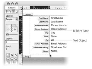
You’ve probably already figured out that to change something about an object, you first need to select it. You can select the first object, change its font, change its size, change its style; then select the second object and repeat…over and over until you’re done or until you’ve torn out your last remaining hair. Or you can select all the field labels and change them in one shot. The box on Section 4.4.6.2 describes several ways of selecting multiple layout objects, but the quickest way is often to rubber band them. That is, you drag to encompass the objects with your mouse. Here’s how:
With your mouse, position the selection tool just below and to the right of the Notes field label, and then click.
This spot is where you’ll start your rubber band. Notice that as you drag around, a dotted rectangle follows you—that’s the rubber band.
Drag from this point up and to the left until the dotted rectangle completely surrounds the field labels.
Every object you want to select must be inside the rubber band—it can’t hang out the edge—so be sure you go far enough to the left. You can see a picture of a rubber band in action on the next page.
Release the mouse button.
You should see all the field labels selected. This process is easier to do than to explain, so the best way to learn how is to try it.
Choose Format → Font → Verdana.
Poof! All the labels change fonts.
Choose Format → Size → 11 Point.
Poof again! All the labels change size.
Note
Since the last custom size you used was 11 Point (when adding the “[Detail]” text on Section 4.4.6.1), FileMaker now lists it at the bottom of the Format → Size menu. (If it isn’t there, shame on you for not following directions! Only kidding.) Choose Format → Size → Custom instead.
Selecting objects on a layout is such a common task that FileMaker gives you several ways to do it. You can always click an object to select it, but you can use any of the following methods as well:
If you want to select more than one object (so you can operate on them all at once), select the first object, and then press the Shift key and click each additional object. As you click, each object joins the selection. If you accidentally select an object, Shift-click it again to deselect it.
To select everything on the layout, choose Edit .Select All or press Control-A (Windows) or ⌘-A (Mac).
You can even select every object of a certain type (every field, for example). First select one object of the type you want. Then hold down the Shift (Windows) or Option (Mac) key and choose Edit → Select All. FileMaker selects every object that is similar to the one you selected yourself.
If you have more then one object selected when you choose this command, FileMaker selects every object like any of the selected objects. For example, to select every field and every text object, select one field and one text object, and then choose this command.
Finally, you can easily select objects that are close together on the layout by rubber banding them, (see the figure below). Rubber banding takes a little practice, but the idea is simple: Click and hold any empty spot on the layout, and then drag diagonally. As you drag, a dotted rectangle follows the mouse. When you let go, any object completely inside this box is selected. If surrounding every object is too difficult, hold down the Control key (Windows) or the ⌘ key (Mac) and FileMaker will instead select any object the box touches.
See the box “Locking and Grouping below for a few more commands that help when you work with lots of objects.
The labels were already bold, so you don’t need to change the style. Now you have labels that look right, but their positions are all out of whack. That’s OK, though, ‘cause you’re about to move them all anyway—after one more text editing maneuver.
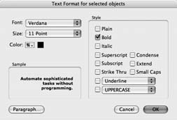
If you’ve read Chapter 2, you know that you can choose Format → Text to summon the Format Text dialog box, a one-stop shop for all your text formatting needs. This handy window is fully accessible in layout mode as well (the Text command is just a little lower down in the Format menu). From here, you can adjust the font, size, and style in one shot if you prefer. You can also change text color and paragraph settings, both of which work just as well for text objects in layout mode as they do for field data in Browse mode.
For example, if you want to make the field labels bold, italic, red, 16-point Times New Roman, you can click the Format menu five separate times, choosing a different submenu each time. Or you can do the steps below. You get to decide which method to use. Ahhhh…choice.
Select the text object. As usual, you have to tell FileMaker which object to work with.
Choose Format → Text to open the Text Format dialog box.
From the Font pop-up menu, choose Times New Roman.
From the Size pop-up menu, choose 16 Point.
From the Color pop-up menu, pick a lovely shade of red.
Turn on the Bold and Italic checkboxes.
Editing existing text
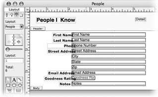
If you compare the field labels you have now to those in Figure 4-22, you’ll see you have a little more editing to do. The final layout has these field label changes:
City, State, and Zip go away.
Phone Number becomes Phone.
Street Address becomes Address.
Email Address becomes Email.
Goodness Rating becomes Goodness.
Now you need to make these changes to your field labels.
First, get rid of the City, State, and Zip labels. Zapping them is a breeze: Select them all (using any of the methods described on the previous pages) and choose Edit → Clear or press the Delete or Backspace key. (If you’re good with the mouse, you can use the rubber-band trick [Section 4.4.6.2] to select them all, but it’s probably just as easy to Shift-click each one.)
Now edit the remaining labels. Start with the Phone Number field:
In the status area, double-click the text tool.
Your mouse pointer now has the typical text-editing I-beam shape. As an added bonus, the text tool is locked so you won’t have to pick it again to fix the next field label.
In the Phone Number label, double-click the word Number.
The text object turns back into an editable text box, with dotted outline and all.
Press the Delete key twice.
The first Delete removes the word Number. The second wipes away the blank space after Phone.
Note
When you’re editing a text object like this, you’re free to use the mouse or arrow keys to move about the object. It works just like entering text in a field in Browse mode. You can even apply fonts, sizes, and styles to individual letters or words inside a text object. For example, you could make the “e” in Phone bold (if you really wanted to).
Press Enter.
The label is now selected, and it says Phone, just like it’s supposed to.
Three more labels need fixing: Street Address, Email Address, and Goodness Rating. Repeat steps two through four above to make the necessary edits. (Don’t forget that you’re just changing the field label here, not the actual field name [as you did back on Section 3.2.1]. You can confirm this by looking inside the field in layout mode, or making a quick trip to the Define Database window. You can even give the same field different labels on different layouts.)
Note
By almost every measure, a field label is just like any other text object. But the labels FileMaker creates for you have one hidden property that makes them special: When you change a field’s name in the Define Database window, its label automatically changes to match. As soon as you edit the text in a field label, though, this magical bond is broken. This break may be a good thing or a bad thing depending on your point of view. Some people edit their field labels manually so they can pick just the right name given the available space and the nature of the layout. Other people find that keeping their field labels and field names in sync helps them keep things straight in their heads. Thou mayest choose for thyself.
Figure 4-24 gives a quick sanity check. Your layout should look something like this.
Formatting Fields
Before you get to arranging the fields on the layout, you need to make one more adjustment. In the previous section, you formatted the labels—the text that identifies your fields onscreen at all times. FileMaker also lets you control how text appears when someone types into those fields later.
Text formats
Formatting text fields works just like formatting field labels. The trick is to select the actual fields first. You can also give fields borders for emphasis or decoration. Here’s how to give your fields the look shown in Figure 4-22:
Click the First Name field to select it, and then hold down the Shift key (Windows) or the Option key (Mac) and choose Edit → Select Same.
All the fields are now selected.
Hold down the Shift key and click the Goodness Rating field.
This field needs special formatting, and you’ll get to that later in this chapter, so you don’t want to change it now. When you Shift-click an already selected object, you remove it from the selection.
Now that you have the fields selected, your first job is to adjust the text formatting—the way text will look when someone types in Browse mode. You’ve done this with text objects already (Section 2.5.4), and there’s no difference here. Use the Format → Text command to bring up the Text Format dialog box, where you can choose 11-Point Verdana.
Other field type formats
If you’ve worked with numbers in other programs, like other databases or a spreadsheet program, you know that number formatting can save lots of keystrokes and help you organize numbers so they’re more legible. Likewise, entering in Date, Time, and Timestamp fields can have their challenges when you’re trying to get the data to look a certain way. See Section 6.6.2.1 for details on formatting these alternate field types.
Field Control
You can get information into a database without typing. You can attach value lists to fields and format them as checkboxes, radio buttons, or menus for making data entry fast and accurate. And you can tell the field how decorative it ought to be by defining borders for it.
Field/Control setup
Up to now, you’ve been learning about formatting the text, or the stuff that’s in a field. But now, you’ll see that the field itself can be formatted with styles that have nothing to do with text. When FileMaker threw those first fields you defined out on the layout for you, it just made plain old fields, called Edit Boxes. But with Field/Control, you’re in charge of how the field accepts information.
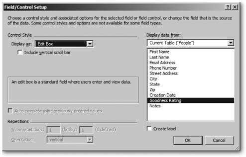
Control style. Take control with the Format → Field/Control → Setup command, which you can see in Figure 4-25. To see how it all works, you’re going to turn your Goodness Rating field into a pop-up menu field and assign it a value list.
(And if you’re wondering what all this talk of pop-up menus has to do with formatting, see the box on Section 4.4.8.1 for an explanation.)
In the People database you’ve been working on so far, the Goodness Rating field works just like any other: You can type any number you want into it. But you’ve already decided it should only take whole numbers between zero and five. You want to prevent anyone (even if that’s you) from messing up your database by accidentally (or nefariously) adding a bogus number—like 21.785 or 4E27.
The perfect solution is to make the Goodness Rating field a pop-up menu showing the choices 0–5. That way, anyone using the database can immediately see what the expected options are and choose one with a swift flick of the mouse. By providing only acceptable choices, a pop-up menu ensures that the right kind of information ends up in the field—and makes data entry easier to boot.
Click the Goodness Rating field to select it.
It grows selection handles.
Choose Format → Field/Control → Setup.
You see the Field/Control Setup dialog box. (You can see it in Figure 4-25, too.)
Figure 4-25. The Field/Control Setup dialog box (Format → Field/Control → Setup) lets you control how a field presents itself on the layout. You can add scroll bars, control the display of repeating fields, and—most useful of all—turn ordinary fields into pop-up menus, checkboxes, or radio buttons. All of these advanced options are covered in detail in Chapter 6.From the “Display as” pop-up menu, choose Pop-up Menu .
The “Include vertical scroll bar” checkbox disappears and a new pop-up menu takes its place.
From the “Display values from” pop-up menu, choose Define Value Lists.
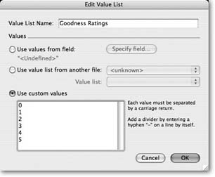
The Define Value Lists dialog box swings into view. The details of creating value lists are explained in Chapter 3; flip back to Section 3.3.3.1 if you need a refresher.
Create a new value list with the values 0, 1, 2, 3, 4, and 5. Click OK when you’re done to close the Field Format box.
The Goodness Rating field now looks like a pop-up menu (a retro-80s pop-up menu, but a pop-up menu nonetheless). In Figure 4-26, you can see how it displays the value list you just created.
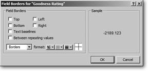
Field/Control borders. Next up are the field borders. In layout mode, your fields probably have black borders and baselines (see Figure 4-8), but in Browse mode, they’re just floating bits of text. To give them a little more substance, you can put a true border around them, and then give them a nice engraved effect:
Choose Format → Field/Control → Borders.
The “Field Borders for selected objects” dialog box appears. It’s shown in Figure 4-27.
Turn on the Top, Left, Bottom, and Right checkboxes.
The Sample area shows how your field will look with borders applied to all four sides.
Click OK.
The Field Borders dialog box goes away. You probably won’t notice any change since FileMaker normally shows a thin border around fields in layout mode, but your fields really do have borders now, even in Browse mode.
In the status area, click the Fill Effects button (it has two blue squares on it), and choose Engraved.
FileMaker draws a beveled edge around each field.
In addition, the notes field needs a scroll bar.
Select the notes field, and then choose Format → Field/Control Setup and turn on “Include vertical scroll bar.”
Click OK to close the Field Format dialog box.
The fields now look a little more like…well…fields. But you’ve unwittingly created a new problem: The fields are now too short. When you added the engraved effect, FileMaker put an extra border around each field. This extra border uses up one pixel on each side, reducing the vertical space inside the field by two pixels. These few pixels make a difference—look at the City field, for example, whose “y” has lost its tail.
To remedy this problem, you need to make each field a little taller. But how much taller? Luckily, FileMaker knows just how tall a field needs to be, and it’s ready to help you out. When you resize a field with the mouse, FileMaker won’t let it get smaller than it needs to be to properly show one line of text in the selected font and size. You just need to manually resize the fields, letting FileMaker do its thing. You can see the process in Figure 4-28.
You’ll learn lots more about resizing, moving, and aligning objects in the next section.
Laying Out the Layout
You’re finally ready to organize the fields on the layout. The goal of a layout is to present information in a clear and attractive manner—in this case, the details for the people in your database. Turn back to Figure 4-22 to remind yourself how this layout is supposed to look.
Right now, though, your window probably shows something of a mess. More like Figure 4-29, perhaps. To organize and beautify your layout, you need to move and resize your fields, and line things up, as described in this section.
Resizing objects
Turn on text boundaries (View → Show → Text Boundaries) and take a look at the labels you edited a few pages back. You see that some text objects are quite a bit longer than the text they contain. When you delete part of a label, the object itself doesn’t get shorter. FileMaker doesn’t let objects extend off the edge of a layout, so those long text boxes don’t allow room to put the labels as far to the left as you want. You’ll need to shorten them.
The first three fields are bigger than they need to be too. You can easily fix them all at once. Select each object (Shift-click or use the rubber band), and then resize one of them using its handles (it doesn’t matter which one you resize). When you finish, every selected field changes size to match the one you dragged.
Tip
The trick above works great if all the fields start at the same size, but it gets squirrelly if they aren’t equal sizes to start with. Use the Arrange → Resize to → Smallest Width command to resize fields that start out different sizes, but need to end up the same width. You can also resize fields by height and to the largest size instead of the smallest.
While you’re at it, make the Goodness Rating field narrower too. It can be very small since it shows only one digit. Finally, make the notes field nice and tall so it can hold lots of notes.
Aligning objects
Most of the field labels on the finished layout are right-aligned against an imaginary line running down the layout, as shown in Figure 4-30. Only the Goodness label doesn’t follow this rule, so for starters, move it to the right of the fields so it’s out of the way.
Dragging or using the Arrange menu aren’t the only ways to resize objects. If you’re a numbers person, you can use the Object Size palette instead. Use the View → Object Size menu command to bring up this tiny window. It shows information about the selected object—namely, its position (how far the left, right, top, and bottom edges of the object are from the top-left corner of the layout) and its height and width.
But the power of the palette doesn’t stop there. You can also type numbers into the palette, and the selected object will move or resize appropriately. If you have two similar objects on two different layouts, and you want to make sure they’re the same width on both layouts, the Object Size palette is the easiest way:
Select the first object. Note its width in the Object Size palette.
Switch to the other layout.
Select the second object.
Type the same width in the Object Size palette.
When you’re done, you can be absolutely certain both fields are the same width. Of course, you can also use this technique to set an object’s height. You can even change an object’s position and both dimensions in the same trip. If your memory is good, remember all four numbers. If you’re middle-aged, write them down, because you’ll have forgotten at least one of the numbers by the time you switch to the second layout.
The Object Size palette uses the same units you have your graphics rulers configured to use. But don’t waste a trip to the Layout → Set Rulers menu just to change it. Instead, you can click the units displayed on the palette. As you click, FileMaker cycles between the supported unit types—Inches, Centimeters, and Pixels— keep clicking until you find the one you want.

But in your layout as you have it now, the fields labels are all over the place. Your first order of business is to get them all lined up along the right edge: Select all the field labels except the Goodness label. Then choose Arrange → Align → Right Edges. They leap to attention, all with their right edges in line with the text object that had been farthest to the right.
Moving objects
Now that the field labels are lined up, you can move them to their final resting place. Just select them all and then drag them a little to the left. Hold down the Shift key to make sure they don’t drift up or down while you drag. When you Shift-drag objects, FileMaker makes sure they only move in one direction: up and down or left to right.
Tip
You have to press the Shift key after you press the mouse button to start dragging. If you don’t, File-Maker just sees a Shift-click, and deselects the object. Luckily, you can press the Shift key any time during a drag, and FileMaker will instantly snap the object to a perfect trajectory. You can even release Shift middrag if you decide you don’t want constrained movement after all.
Using all the arrangement powers you now possess, it’s time to line things up so the fields sit next to their labels. If you’re using the Object Grids command (see the box on Section 4.4.9.4) or you have very sharp eyes, you can probably just drag the fields next to their labels and get perfect alignment.
Adding images
The finished layout has a cute person icon next to the People I Know text. To add a picture to the layout, you can copy it from any other program, and then paste it directly on the layout. If the picture you want is in a file on your hard drive, use the Insert → Picture command instead. When you do, FileMaker will ask you to pick a picture file, and then insert it on the layout.
Once the picture is added to the layout, drag it into position in the header. If necessary, resize the header to accommodate it, and move the People I Know text object out of the way.
Adding a Dividing Line Between Layout Parts
You may also want to add a line between the header and body parts. As you can see in Figure 4-30, this line helps break up the space in the window, and helps your eye locate the important information in the lower (body) part of the window. If you use a Mac, this line can serve as more than decoration, as discussed in Figure 4-31. (In Chapter 14, you’ll learn more about how to deal with the differences between Mac OS X and Windows when working with multiple windows.)
In the status area, activate the line tool.
The mouse arrow changes to a crosshair.
With the Shift key held down, drag a horizontal line about the desired width of the layout.
As you drag, a dotted line shows you what your line will look like. When you release the mouse button, the line appears.
Drag the new line as far to the right as it will go, and place it as close to the header part boundary as you can.
The Object Grids might prevent you from getting it right on the part boundary.
Using the up or down arrow keys, nudge the line so that it covers the dotted part boundary perfectly.
The dotted part boundary line marks the end of the part above it, so this line is at the bottom of the header, not the top of the body.
If necessary, resize the line so that it ends just a bit to the right of the [Detail] text object.
As you drag, hold the Shift key while you resize the line to make sure it stays perfectly horizontal. The line now marks the desired width for the layout.
Tip
If you’re using the horizontal line as a device in Mac OS X to control the width of the window, but you don’t actually want a line across your layout, you can make the line invisible. Just draw the line as described above, and set its thickness to None, using the Line Weight tool
Wrapping up
You only have a few last touches to complete your layout. First, add a text object to hold the Goodness Rating key and type into it, 0 = Evil Empire, 5 = Santa Claus.
Tip
If you’re like most people, your Font menu is half a mile long. It can be a real drag finding and selecting just the font you want. To save the trouble, duplicate one of your field labels and use that for the Goodness Rating key instead (Edit → Duplicate). Just edit it to show the correct text, and then change it to 9 Point and remove the bold style. You have an easier time duplicating an existing object than you do making a new one, since the duplicate picks up all the attributes you painstakingly set.
Just for added flair, go ahead and make the Goodness Rating field use a red text color. With the field selected, choose Format → Text Color and pick a red from the color menu.
The Goodness Rating pop-up menu looks nicer if you center its text. Select the field and choose Format → Align Text → Center.
You’re ready to switch to Browse mode. When you do, FileMaker asks if you’d like to save your changes. Click Save. Now you see your new layout in action!
Phew! That was a lot of work. Designing a FileMaker layout is a very visual process. That’s really good news since it makes the process pretty obvious once you learn the tools. This chapter may make it seem like a lot of work, but making a layout like this will quickly become second nature—you’ll be able to crank one out in just a few minutes.
Get FileMaker Pro 8: The Missing Manual now with the O’Reilly learning platform.
O’Reilly members experience books, live events, courses curated by job role, and more from O’Reilly and nearly 200 top publishers.

