Chapter 19. Common Pitfalls of Color Use
Color can be an incredibly effective tool to enhance data visualizations. At the same time, poor color choices can ruin an otherwise excellent visualization. Color needs to be applied to serve a purpose, it must be clear, and it must not distract.
Encoding Too Much or Irrelevant Information
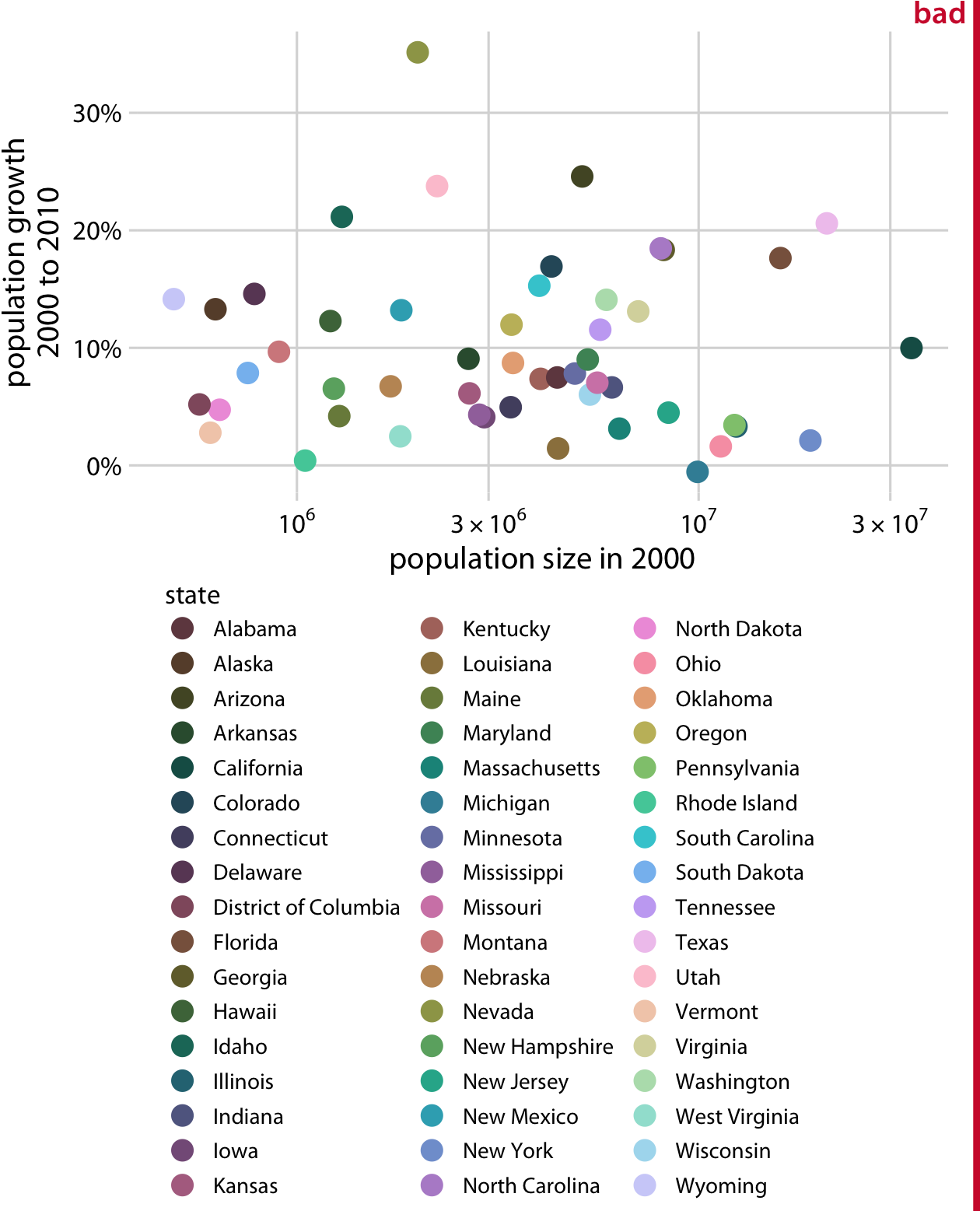
One common mistake is trying to give color a job that is too big for it to handle, by encoding too many different items in different colors. As an example, consider Figure 19-1. It shows population growth versus population size for all 50 US states and the District of Columbia. I have attempted to identify each state by giving it its own color. However, the result is not very useful. Even though we can guess which state is which by looking at the colored points in the plot and in the legend, it takes a lot of effort to go back and forth between the two to try to match them up. There are simply too many different colors, and many of them are quite similar to each other. Even if with a lot of effort we can figure out exactly which state is which, this visualization defeats the purpose of coloring. We should use color to enhance figures and make them easier to read, not to obscure the data by creating visual puzzles.

Figure 19-1. Population growth from 2000 to 2010 versus population size in 2000, for all 50 US states and the District of Columbia. Every ...
Get Fundamentals of Data Visualization now with the O’Reilly learning platform.
O’Reilly members experience books, live events, courses curated by job role, and more from O’Reilly and nearly 200 top publishers.

