Chapter 1. State of the Industry of Responsive Design
The Problem with Responsive Design
I WAS SITTING IN A ROADMAP PLANNING SESSION WITH ONE OF MY TEAMS AND OUR PRODUCT PERSON, and we were discussing a redesign of our video section when my team lead started talking about how we were planning to make the video experience for our website responsive. We described having one page that would load our default HTML5 video player but would resize and load assets and playlists of different video types depending on what devices our users used to view the page. It was going to be beautiful, all encompassing, and open our video viewership up to a range of devices that had previously been locked out of the video experience that we offered.
Our product owner wrinkled her nose and said, “Well about that, we have somewhat of a bad taste about the idea of responsiveness after how the responsive home page turned out.”
That took me by surprise. What was wrong with our responsive home page? I started doing some research.
The impression from the product team was that it was heavy and slow to load. When it was demonstrated for them on developer laptops, it looked great, but when they tried to show it on actual devices for their executives, it took a long time to load—too long.
I took a look at waterfall charts[1] for both the desktop and the smartphone rendering of the home page. What I saw was something that in time I began noticing in a lot of other websites when I became aware of what to look for.
The smartphone rendering loaded all of the same assets as the desktop version, plus an additional CSS and sprite file. Figure 1-1 illustrates that this made the payload of the smartphone rendering slightly larger than the desktop version (1.2 MB versus 952 KB), and it added two additional HTTP requests.
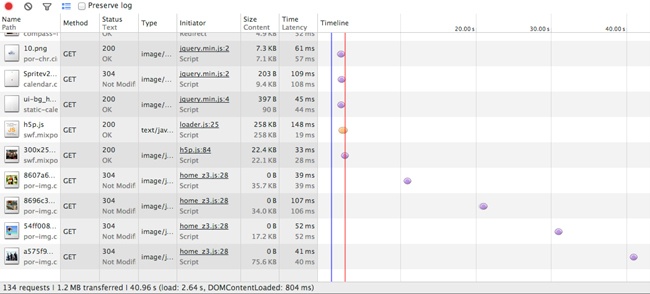
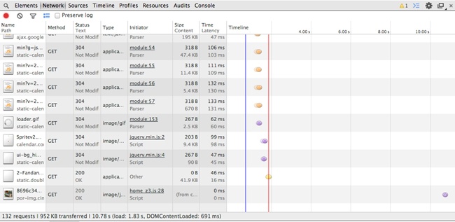
Notice in Figure 1-1 that the total payload transferred is 1.2 MB from 134 HTTP requests. But this is the smartphone version; it should be a smaller payload. And yet it’s not, as illustrated in Figure 1-2.
Observe how the total payload for the desktop is 952 KB from 132 HTTP requests. Clearly the smartphone version is loading all of the same content as the desktop version, plus an additional two files. It goes without saying that this is not responsive to the bandwidth concerns of the mobile experience.
This is completely contrary to our intention in creating a mobile page.
And we weren’t alone. I opened up a browser on my laptop and consulted HTTPWatch on my iPhone, and I went through the Alexa.com top 50 sites to do some competitive analysis. What I found was that 30% of the websites had a larger mobile payload than their desktop equivalent—technology companies, banks, and retailers alike.
Beyond my own research, a number of notable reports also reflected similar results. The Search Agency (a global digital marketing agency) analyzed the top 100 retail sites as well as the Fortune 100 companies’ sites and produced the following reports:
“Multichannel Retailers” (http://bit.ly/1vqYUPh)
“Fortune 100 Companies” (http://bit.ly/1r1SDlA)
Tip
To access these reports, you will need to give The Search Agency your email address, and it will then send the reports to you.
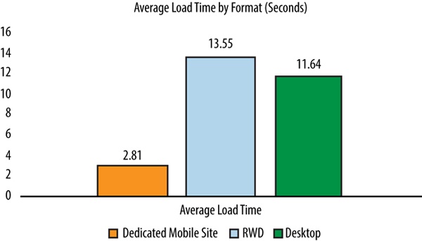
Among its results is the chart in Figure 1-3, which shows that websites that used (or more accurately, misused) responsive design took an average of 1.91 seconds longer to load than plain, vanilla desktop websites. Most egregious of all, these same websites took 10.74 seconds longer than dedicated mobile sites.
Guy Podjarny, CTO at Akamai, also wrote up a piece on his blog detailing his findings from running similar tests. He compared page sizes across a number of resolutions and found little difference between them. You can find his write-up at http://bit.ly/1tBv6cT.
Were we all missing the point of creating a responsive experience?
Observations from Competitive Analysis
My own observations from the Alexa list yielded some interesting data, as well. Among other things, I noticed the following:
Of the top websites for the United States, 47% still used dedicated mdot sites.[2] Think about that number for a minute. These are the most trafficked websites on the Internet, arguably the leaders of their respective industries, with members including YouTube, eBay, and Target, and they are foregoing a responsive site in favor of a standalone segmented site.
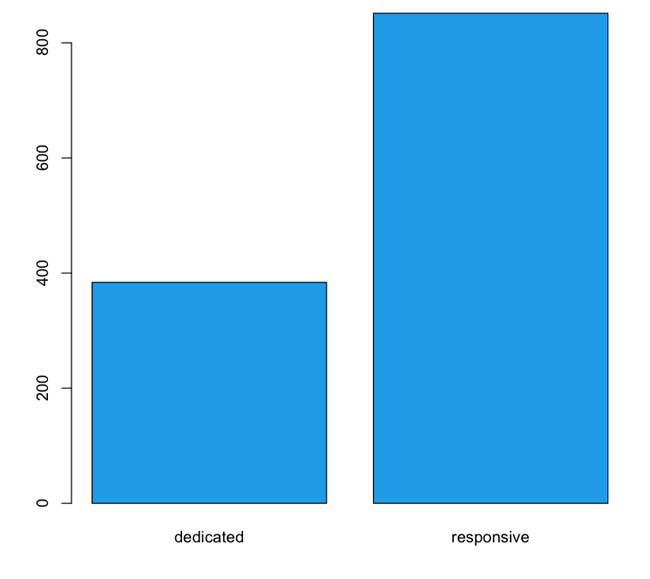
On average, these dedicated sites were 55% smaller than responsive sites. The mean size of the subset that used mdots was 383 KB, whereas the responsive sites had a mean size of 851 KB (see Figure 1-4). This speaks to a gross discrepancy between intention and implementation.
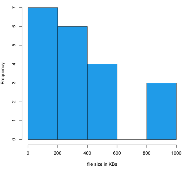
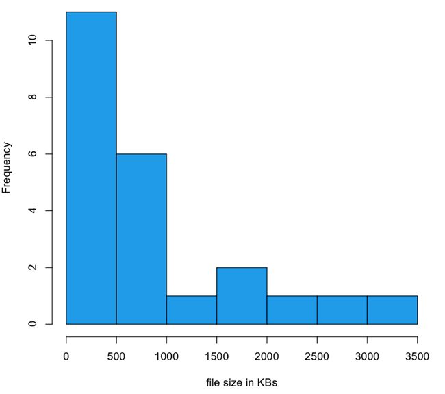
The payload of responsive websites has a long-tailed distribution that stretches out into 4 MB, whereas mdot sites are all distributed across ranges less than 1 MB. In fact, mdots are most thickly grouped into the 0 to 200 KB and 200 to 400 KB ranges. I created histograms to look at the distribution of file sizes between mdot sites and responsive sites, which you can see in Figure 1-5 and Figure 1-6.
Note the scale of the x-axis in each histogram. The three outliers for the dedicated experiences were up against 1 MB. For the responsive sites, 1 MB is the second largest grouping and the tail keeps going out to 4 MB.
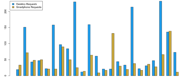
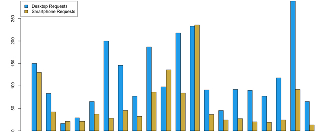
Of the responsive websites, 43 percent had nearly the same or slightly more HTTP requests for their smartphone experiences compared to their desktop experiences. Contrast this to the 1.5 percent of the dedicated sites that had the same or higher HTTP requests for their smartphone experience compared to their desktop experience. Figure 1-7 and Figure 1-8 depict this breakdown.
Figure 1-7. Grouped bar chart of HTTP requests for desktop and smartphone experiences on responsive sitesIn Figure 1-7, notice that in each grouping, the blue bar represents the number of HTTP requests for a page served for the desktop experience, whereas the yellow bars represent the number of HTTP requests served for the same page served to a smartphone.
Figure 1-8. Grouped bar chart of HTTP requests for desktop and smartphone experiences on dedicated mdot sitesAgain, note that for each grouping, the blue bar represents the number of HTTP requests for a page served for the desktop experience; the yellow bars show the number of HTTP requests for a smartphone.
Clearly there is an issue with how we implement responsive design. Also, there is a discernable advantage to be gained from serving a dedicated experience, at least in terms of total number of HTTP requests and total payload delivered to render a page (though it is important to note that mdots do come with their own set of problems, which we will discuss shortly). My thesis and a recurring theme that you should notice throughout this book is that responsive design and a dedicated experience are not mutually exclusive implementations but are instead aspects of the same philosophy.
In addition to the preceding metrics, I also observed a number of anti-patterns[3] and patterns that the websites which I audited seemed to follow.
Anti-patterns
As I looked at each website on the Alexa list there were some common issues that they shared, anti-patterns that they each utilized. Let’s identify and look at these anti-patterns in the following subsections.
Load the same content for all devices
Some of the sites loaded the exact same assets for both smartphone and desktop rendering. They loaded the same CSS file across experiences, which contained media queries that handled all of the breakpoints in resolution. They loaded the same images across experiences that are just downscaled when the browser detects that the resolution warrants it.
Evidence for this offense is in the HTTP traffic. Websites that had the exact same number of HTTP requests between experiences most likely were doing this. This solution doesn’t scale when we begin to talk about displays of larger resolution such as the Retina display from Apple and Ultra HD TVs.
Load additional assets
Although loading the same set of assets for all devices ignores the intrinsic differences between devices, loading additional assets on top of the common set just for the smartphone experience is completely contrary to everything we know about the mobile experience. These additional assets generally were an additional CSS file and an additional sprite file.
Websites that had more HTTP requests and a larger payload for the mobile experience than the desktop one were exhibiting this behavior. As previously noted, this was the anti-pattern that my own site was using.
Load images at twice the size
The greatest offense was that some sites were loading an additional set of images for the smartphone version that were sized at twice the size of the desktop images. This is in addition to the regular set of images for the desktop.
The intent of loading larger images and then resizing them is that they appear sharper at the smaller size. The unfortunate side effect of this practice is that it produces websites that have mobile payloads roughly 30 percent larger than their desktop equivalents.
All of these issues had several philosophical points in common:
They were clearly seeing the desktop version as the base upon which elements were altered or added, instead of working from the smallest version up.
They were not exploiting the benefits or being mindful of the limitations of each platform.
They were trying to solve the problem exclusively from the client side.
Patterns
Not all of the sites on the Alexa list were doing it wrong—some clearly had great experiences that were optimized for the devices and resolutions that they were targeting. Let’s look at some of the design patterns that they employed.
Load device-appropriate assets
Instead of loading images twice the size of desktop images for the mobile view, some websites loaded images that were half the size of their desktop counterparts. Figure 1-9 and Figure 1-10 show an example of this.
Notice that the image in Figure 1-9 and Figure 1-10 are the same; they’re just resized to take into consideration the resources of the client environment.
In the same way, some websites loaded device-specific sprites and CSS only—not the desktop set plus additional sets for other devices. This appropriately takes into consideration the bandwidth limitations and costs of cellular networks. Unfortunately, most of the websites that on the Alexa list that did this were dedicated mdot sites. But we can utilize this pattern for responsive sites as well, as you can see in Chapter 4.
Serve a dedicated experience from the backend
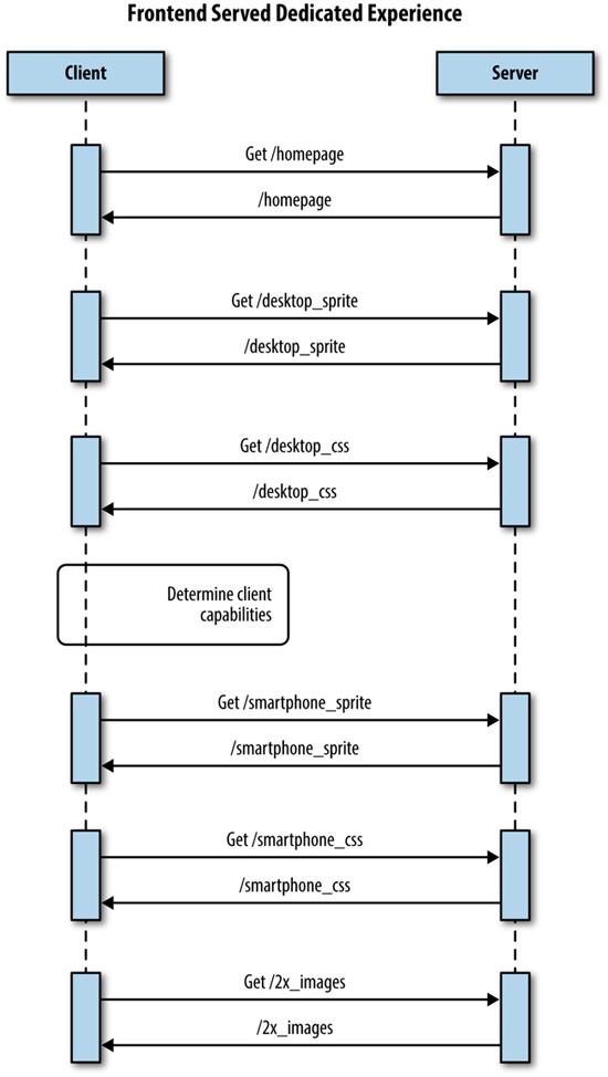
The best experiences of all were the websites that served a completely dedicated experience. Some were separate mdot sites but others had device-specific layouts and assets written to the page from the server side. This solution is sometimes called RESS (Responsive Design + Server-Side Components), but is really just combining the same logic that we used to segment traffic into an mdot site to load the appropriate content for a predefined resolution breakpoint. We discuss this solution in greater detail in Chapter 4.
For a better idea of the architecture of this solution, take a look at the sequence diagram outlining it in Figure 1-11.
Note that the websites that delivered a dedicated experience generally had the smallest payload and biggest boost to performance. This is most likely why 47 percent of the top websites still serve dedicated content.
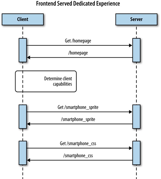
Lazy load dedicated experience from the frontend
Some of the sites lazy loaded[4] not just images but entire modules of content, both above and below the fold. In this way, they were able to avoid loading the content for each breakpoint and instead intelligently load only the content that would be necessary for the experience that is appropriate for the capabilities of the client. But instead of determining all of this at the backend, it’s determined on the client side. We talk about this tactic in Chapter 5.
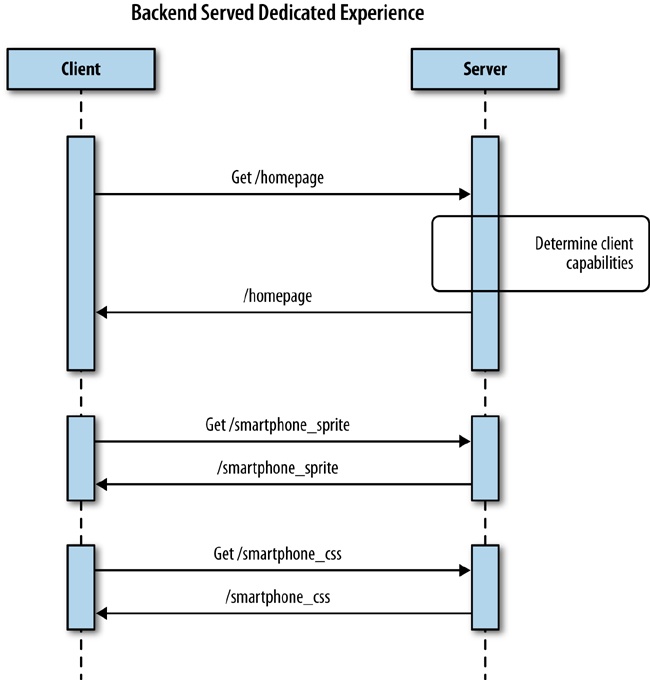
Figure 1-12 presents a sequence diagram detailing this approach.
How Did We Not Notice This?
I described earlier in the chapter how we demonstrated our responsive home page to our product owners. During a sprint review, we opened the page on one of our laptops, projected our desktop to a screen, and resized our browser window to reflect the different breakpoints. Although it was fun to watch the page reflow and resize on the fly, it completely missed the point of responding to different devices.
We displayed it the same way that we developed it, on a Macbook Pro using the corporate network. Of course, the performance looked fine to us. We weren’t working off of a predetermined performance agreement (i.e., a service-level agreement, or SLA).[5] We weren’t using an actual mobile device on a cellular network. At the time, we hadn’t even acquired any devices for testing, outside of our own personal ones.
Most important, we also were not working against a performance SLA. Parity with our existing home page was an acceptable target and didn’t set off any red flags in our existing performance monitors. We talk at length about this problem in Chapter 3.
How Did We Get Here?
In the long ago days of 2008 or thereabouts, before responsive design, we would maintain two URLs: mysite.com and of course m.mysite.com (our mdot site). Each website could be different pages in the same web app, or could even be different apps, possibly even maintained by different teams of people. But this would have been the case only if we were really forward thinking and even had mobile sites to begin with, which at the time was somewhat rare.
Then, in 2011, The Boston Globe website relaunched, and the terms responsive design and progressive enhancement became the topic of every blog post and brainstorming session. We all read the articles coming out about how to create sites that are responsive to the capabilities of the user’s device, and we all played with these concepts and became enamored with the idea. There were curmudgeons who remembered creating fluid layouts with relative heights and widths back in the early 2000s; they didn’t see the difference at first, but after seeing how font sizes and images could be scaled as well, even they were turned on to the idea.
Books were written, speaking engagements were arranged, and everyone started making responsive websites. We all began talking about and using media queries to encapsulate the styles for different screen sizes. And we experimented with different ways to scale our images.
When the time came to try out these new ideas in the office “for real,” we all knew that we should be starting with the smallest screen first and progressively enhance based on that. In reality, however, stakeholders wanted to see the “complete” version (i.e., the desktop version) of what they would be showing to their executives, so the design teams prioritized that work, and we all ended up building those versions first. But we could craft media queries to hold the CSS for the breakpoints and degrade the visual experience from there, so it all seemed to work out, right?
Our base CSS and JavaScript files ended up being the desktop versions (in all likelihood several hundred kilobytes in size), and we would layer on the smartphone and tablet CSS and JavaScript files after we determined client capabilities on the frontend. After that was complete, we could demonstrate the projects for stakeholders, they would demonstrate for their executives, and the project would go to production. Inevitably, one or two developers would bring up that we really should think about refactoring, because our base CSS is the desktop CSS, and oh yeah, all of our links connected out to desktop versions anyway. Yet, there was never any appetite to refactor, because the project worked, and there was no time anyway given that the next project would be starting soon, for which we needed all hands on deck to groom.
The project worked, but the problem was that we were all looking only at the frontend. Media queries and scaling images looked cool, but focusing only on those intrinsically missed the point of tailoring the holistic experience for the device that the user is currently using. It was the appearance of responsiveness without really being responsive.
We didn’t just focus on how the frontend appeared; we also put all of our logic on the frontend. Relying solely on media queries to handle different device resolutions, or capability testing in JavaScript on the frontend, meant that we were already downloading unnecessary assets to the client side. This is the behavior that led to the anti-patterns that we have already identified. Figure 1-13 shows a sequence diagram that exhibits all of the anti-patterns that we identified earlier.
Differences between devices, including network infrastructure, processing power, battery life, and on-board memory, are ignored when we focus only on the frontend or only on how the page looks. In reality, these are all factors that you would need to include in any response. They are the reasons why a good percentage of the major players on the Web are still maintaining dedicated mdot sites.
Why Not Use an MDot?
With all this talk about the benefits of mdot sites, you might be wondering why I’m not instead writing about why we all should start using them, instead. Make no mistake; I’m not endorsing mdots. Although they do have a performance advantage over how people are currently using responsive design, they have several downsides.
Resource overhead
When I created my first mdot website in the early 2000s, I had to staff an entire new team of engineers to create and maintain it. This was mainly because our product team did not want to sacrifice the velocity on the main site to set up this mobile experience. It was also because mobile sites were—and still can be—extremely laborious endeavors because they support not just the mainstream iOS and Android devices, but an enormous array of feature phones which have different screen sizes and capabilities, including lack of JavaScript, or even support of only a subset of JavaScript functionality.
Even if you don’t maintain a separate team, you would still need to track work for the mdot website as a separate body of work from your main site work; in fact, some features might not even be possible on certain feature phones.
Segmented source code
Maintaining a separate website most likely means that you need to maintain a separate web app and separate code base. Maintaining parity between code bases is an age-old problem, solved mainly through vigilance and supervision, which means that eventually it will succumb to entropy and get out of sync. When the code bases fall out of sync, the experiences will differ between websites, and more effort will be needed to update in the future.
Segmented URL
Having a separate mdot website means creating and maintaining a separate URL. This is contrary to the entire idea of URLs being a single location for a resource. An mdot is a second location for your site. Moreover, where is the line drawn for what goes to the mdot site? Do you set it at feature phones? Smartphones? Do tablets go as well? And what about phablets? Do they all go to the same mdot website, or do you maintain separate sites based on screen size and capability? You see how this segmentation can quickly become cumbersome.
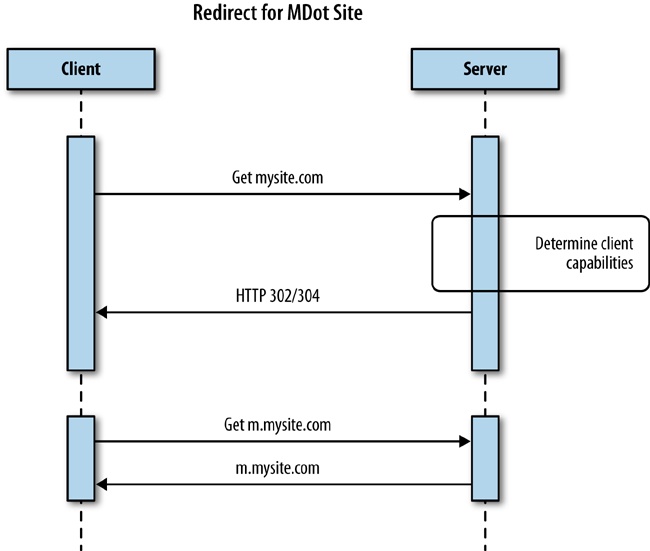
Pointless redirects
Having physically separate URLs also means adding in a redirect for the client to step through. Adding a redirect technically adds unneeded latency to your experience because the server has to respond back to the client with a 302 or a 304 status code, and the client must then make an additional request for the new location, as is illustrated in Figure 1-14.
This Matters Because of Scale
So far, we have been talking mainly about the smartphone and desktop experience, because those, along with tablets, are the main devices that people are thinking about right now. But the industry is constantly changing and growing, and the past few years have seen a number of new devices with their own resolutions, network infrastructure, and sets of client-side assets to include.
For example, when Apple’s new Retina display came out, we had to work with the design team to create unique images to include that would look great on devices using that display. This trend will continue as web development begins to show up on television guides and apps, and television displays continue to increase with 4K and 8K Ultra HDTVs.
As Google Glass becomes more pervasive, we will need to think about what the Glass experience for our websites will be. Right now, Google provides an API called the Mirror API and makes available client-side libraries to interact with the Mirror API (http://bit.ly/1rXkSpb).
These are just some of the new form factors that are on the leading edge. There are many more beyond that.
If we continue treating responsive design as a frontend tool, we will see the problem of bloated pages just continue to grow worse. Or we will see more companies going back to mdot sites.
Summary
The industry is slowly turning against responsive design. Almost half of the sites that I audited are using dedicated experiences—the same solutions that we came up with in the early 2000s—instead of providing responsive sites.
Responsive design is not a flawed methodology; it is only when it is misused and treated as an add-on instead of an overarching philosophy that it can result in a bloated and counterintuitive experience. Likewise, it is only when we focus on a single aspect of responsiveness, specifically the frontend, that we lose sight of the performance of our responsive sites. Yet, performance is an aspect of responsiveness and needs to be part of the conversation, starting in planning and design. It needs to be baked into how we architect our solutions.
We have identified some design patterns in this chapter to build performance into responsiveness. We will explore these patterns, and more, in the coming chapters.
If we don’t do this and build performance into our responsive solutions, the problem will only worsen as new products and devices with greater and greater resolutions are introduced along with new form factors that will require unique client interactions.
[1] Waterfall charts are data visualizations that show the HTTP requests, the time it took to load the resources requested, and the payload or file size of each request that make up a web page. A much more in-depth discussion of waterfall charts concepts is presented in Chapter 2.
[2] An mdot site is a dedicated website created just for the mobile experience that has its own URL, usually following the convention of using “m” as a subdomain (e.g., m.comcast.net or m.homedepot.com). There are even more recent derivations of the mdot for tablets, for which “t” is a subdomain for a dedicated tablet experience (e.g., t.homedepot.com).
[3] Anti-patterns are commonly used solutions to problems that are inefficient, ineffective, or counterproductive. They are the opposite of design patterns, which are tested and reliable solutions to common problems.
[4] Lazy loading is a design pattern whereby initialization of an object or downloading of a resource is deferred until it is actually needed.
[5] SLAs define the terms of a service contract. This definition can be as formal or informal as needed. It could apply to an application programming interface (API) provider agreeing that their API will maintain a certain amount of uptime and respond in a predetermined amount of time. It could also apply to an engineering or product team agreeing that they will fix bugs discovered in their product in a certain amount of time.
Get High Performance Responsive Design now with the O’Reilly learning platform.
O’Reilly members experience books, live events, courses curated by job role, and more from O’Reilly and nearly 200 top publishers.

