Chapter 1. What Is Responsive Design?
By now pretty much everybody in the web world has heard of responsive web design (often referred to as RWD), but a surprising number don’t have a good understanding of what it is.
In this chapter, you’ll learn the basics of what it means for a website to be responsive. After that, we’ll go through a little of the history of web design, so you can understand where the idea of responsive design came from and how it compares to the old way of doing things.
We’ll also look at why responsive design is usually the best choice for making websites that will work well across different devices and screen sizes, and how it means less work in the long run. We’ll also look at a less obvious effect of choosing responsive design: how it impacts your search engine rankings.
Just the Basics
If you picked up this book because you’ve heard of responsive design, but you’re not quite sure what it is, this section will help you understand the basics.
Even if you’re somewhat experienced with responsive design, you’ve probably found that it can be difficult to explain it to others without using overly technical language. This section will give you a better idea of how to explain responsive design to users, to clients, to less technical team members, or to your mom, who wonders what it is you get paid to do all day.
Responsive design, overall, is a way to make websites that can be easily viewed and used on any type of device and size of screen, all the way from the smallest mobile phones up to the widest desktop monitors.
The easiest way to explain it is to compare responsive websites to sites that are not responsive, and look at how each type of site is viewed on smartphones.
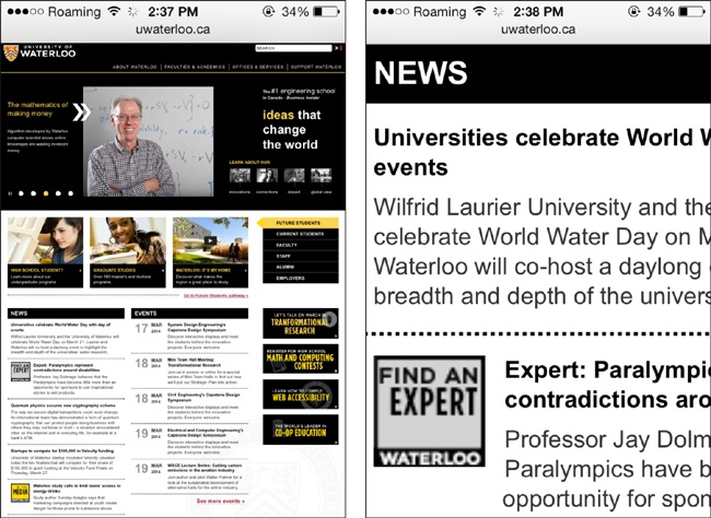
Imagine you’re using your smartphone to view a fixed-width website—that is, a site that is designed to always display at a set width, such as 960 pixels. You’ll see the entire website just as it appears on your desktop monitor, but it will initially be displayed at a tiny size to fit on the screen. You’ll have to continually zoom in and out to read text and navigate through the site, as you can see in Figure 1-1. It’s a lot of extra work.
And then for some websites, there is a mobile website that is separate from the regular desktop site. This type of site displays at full size when you load it on your smartphone (no zooming necessary), but you’ll notice that it’s often very different from the same website when you view it on your desktop monitor—there’s often a lot of content missing, so the site owner can cut down on the work involved in maintaining multiple versions of the site.
And because mobile sites are usually made for one specific device size, like an iPhone, if you have a different device, the website may not fit on the screen so well.
Separate mobile websites are generally optimized to work on one size of device, but there are many different devices on the market, and building a mobile site to work on one device can mean leaving behind all the users who have different devices.
As an example, Ikea has a separate mobile website optimized to fit on phones of a certain size. In Figure 1-2, the navigation for the Ikea desktop site is at the top. On the bottom left is the site on an iPad, and the bottom right shows the site on an iPhone.
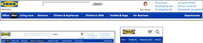
The three screenshots are to scale, so you can compare the sizes of everything you see on the screen. Viewing the mobile site on the iPhone, you only have a few navigation links, but they’re a similar size to the links on the desktop site. But on the iPad you don’t get the mobile site, you get the desktop site, and everything is really tiny to fit on that small screen. You’ll have to do a lot of zooming to use the site.
Ikea put a lot of work into creating a good mobile site, but if your device is a tablet, you don’t get to use it, and you get a suboptimal experience. If Ikea had a responsive site, it could make sure that people using any size device would get an appropriate interface.
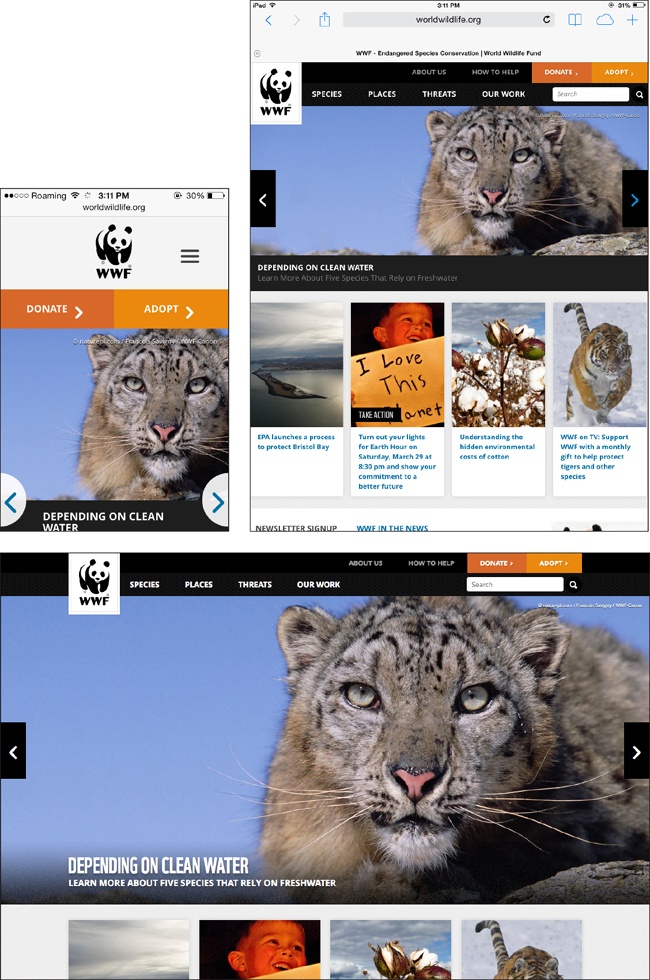
With responsive design, there is only one version of the website, so you get all the content, but the design rearranges itself so that it fits perfectly on any size screen, with full-size text so you don’t have to zoom in and out, as you can see in Figure 1-3.
There are a lot more technical details (which we’ll cover later in the book), but from the user’s perspective, the key to describing a responsive site is that things can change size and move around to fit on the screen.
A Short History
Before learning where responsive design came from, it’s helpful to know a little of the history of web design.
Fixed-Width Design
Up until the last few years, websites were designed so they would fit well on the most common sizes of desktop and laptop screens. In 2000, that meant designing for a screen width of 800 pixels (a pixel is a tiny dot of colored light on the screen); by the mid-2000s, most displays were 1,024 pixels wide.
Although most monitors were one of only a few fixed sizes, there were some much wider monitors on the market, and also some older, narrower monitors still in use. Web designers wanted their designs to look exactly the same no matter what monitor was being used, so they would usually create designs of a fixed width to fit on the most common monitor size, such as 960-pixel-wide sites to fit easily on 1,024-pixel-wide screens. Wider screens would simply display the sites with empty space (called whitespace in design terms) filling the extra space on either side of the design, as you see in Figure 1-4.
These fixed-width designs are actually still fairly common.
The ideas of fluid design and liquid layout gained some traction in the early 2000s. These techniques used percentage-based widths to allow a web page’s design to flow to fit the width of the screen, so it could take advantage of the available space on wider screens. Although this sounded good in theory, giving up control of the design meant you could end up with super-long line lengths and weird column divisions on wide screens, leading most web designers to stick to easier-to-handle fixed-width designs.
Mobile Web Browsing
When mobile phones with Internet access first became available in the mid-1990s, they generally didn’t even have the capability to display actual websites, and instead provided only data that could be displayed in text, such as weather forecasts, stock reports, and sports scores. The first mobile browsers could only display basic HTML, often in grayscale rather than color. It wasn’t until the mid-2000s that mobile browsers were able to display “real” web pages using technologies like CSS2 and JavaScript, on more advanced devices referred to as smartphones, such as the iPhone in Figure 1-5.
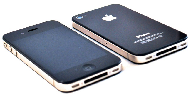
The iPhone, which came out in 2007, was a game changer. It had a beautiful interface that could take advantage of all the current web technologies to display web pages as they’d be seen on a full-size monitor.
Although touchscreen devices had been around for years, the iPhone was one of the first mobile devices with multi-touch, a technology that allows the device to recognize more than one simultaneous point of contact with the screen—necessary for browsing behavior we now take for granted, such as pinch-to-zoom.
All of this led the iPhone to be continually referred to as one of the most innovative products of that year—but there was a problem. Web pages were designed to be viewed on full-size monitors, not on tiny phones, so pretty much every web page was 960 pixels or wider. The iPhone’s screen, on the other hand, was only 320 pixels wide. Apple’s solution was to automatically shrink web pages to fit inside the viewing area of the screen (the viewport), and then allow the user to tap or pinch to zoom in on any area of the page.
But viewing little pieces of a page does not make for a good user experience.
Web designers knew that this was not an optimal way for people to use the Web, and that they would need to find a way to make web pages that were easier to view on the iPhone’s small screen.
Mobile Websites
Because designers were accustomed to making web pages with fixed widths, the easiest and most obvious solution was to simply make separate mobile websites with a fixed page width that would fit on a 320-pixel-wide screen, instead of the common 1,024-pixel-wide monitor, as in Figure 1-6.
Users were often automatically redirected to the mobile version of the site if they were using a mobile phone. Otherwise, they could choose to go to the mobile website by clicking a link, or by visiting the site via a different URL, commonly using an m subdomain (such as http://m.sprint.com). This practice led these separate mobile sites to be referred to as m-dot websites.
Of course, this meant extra work for the web team, but they usually made the job easier by making the mobile site a stripped-down version of the regular website with only a small portion of the content, as in Figure 1-6.
Their justification—that mobile phones were only used “on the go” or for certain basic activities—was probably true for most users at that point. But as mobile phones became more ubiquitous, people started to use these devices for more and more tasks that they had previously done only on their desktop or laptop computers.
More Devices
Having an “iPhone website,” as they were often called, worked out okay in the early days, as for a while the iPhone was the only major player in the smartphone market. But that didn’t last long. Other mobile phone companies soon jumped on the bandwagon and came out with their responses to the iPhone.
But these new smartphones were not all the same size. Compared to the iPhone’s 320-pixel width, many had screens that were narrower (240 pixels or less), and others had screens wider than the iPhone’s—especially those designed to be used with the screen held horizontally instead of vertically. A 320-pixel-wide iPhone website didn’t fit perfectly on all those screens.
So web designers started trying to find a solution: how can we make websites that work on any size screen? There wasn’t an easy answer.
Then, in 2010, Apple released the iPad. Again, this was a game changer. Mobile websites were too small to take advantage of the iPad’s much larger screen, but desktop-sized fixed-width sites were too big to be easily viewed in portrait mode on an iPad.
Although some designers reacted by creating separate iPad websites (so now they had three separate websites), most realized that as more and more device sizes arrived on the market, it was no longer sustainable to create separate websites for every possible screen size.
Media Queries
The web design community again came back to the concept of fluid layouts, using percentage-based widths, and tried to figure out how to make that into a solution for smaller, mobile devices.
Using percentages instead of pixels allows a web page and sections of the page to change width to fit in any screen size, so accounting for differences among similar-sized devices is easy.
But once you look at the entire range of devices, you have a problem. Narrowing a three-column design into a smartphone width makes the columns of text too narrow to be readable. Likewise, a one-column layout that looks good on a smartphone screen would be too wide to easily read when viewed on a desktop monitor.
Essentially, the problem was this: without having to create separate sites, how can a website be displayed in one column on narrow screens and multiple columns on wider screens? How can you ask the browser to make changes to the design, based on qualities of the device the site is being viewed on?
Enter media queries.
The CSS @media rule, which allows you to display different CSS styles based on device qualities, was actually part of CSS2 more than a decade ago, but back then it only supported queries of media types, such as screen or print. This was commonly used for creating a print version of a website’s design (which may include changes as basic as removing background colors that will waste printer ink), but its utility stopped there.
It wasn’t until CSS3 that the specification (i.e., a formal and detailed description of how something is required to work) for media queries allowed more precise queries based on media (device) features, such as width, height, and color capability. Media queries don’t affect the HTML (the actual content and structure of the underlying page)—they only affect the styles that are applied to the page using CSS. Browsers started to support CSS3 media queries around 2009.
So what do these media queries do?
As a basic example, let’s say we have a website with two separate sections of content. We might create a single-column design that fits well on smartphones, displaying the two sections stacked vertically. On wider screens, we may want to display the two sections of content as two separate columns, next to each other.
Using a media query, we can ask the device how wide its screen is. Then we can tell it to display the content in two columns only if its screen is wide enough for the columns to fit nicely.
To code this, we simply start out with CSS that will display the contents in one column. Then we add a CSS media query that asks if the screen is 40 ems or wider (you’ll learn about ems in Chapter 4; 40 ems is slightly narrower than the width of a typical tablet, but you could specify any width in the media query).
Inside the media query, we add the CSS that will display the content in two columns instead of one. The browser will only use this CSS if the media query is true (i.e., if the screen is 40 ems or wider). If the screen is narrower, it ignores this CSS and the content remains in one column.
Thus, we can give our website a different layout for different screen sizes, without having to create separate websites.
By using media queries, we can change any aspect of the website’s style, not just the number of columns. Media queries can be used to move things around, change the text size, hide or display pieces of content, adjust margins and spacing, and adjust any other style that can be applied with CSS.
Note
In this section, I referred to media queries that ask for the width of a device’s screen. Actually, the media queries that are common in responsive design ask for the width of a device’s viewport, not the screen. The viewport is the area on the screen (inside the browser window) in which a website is displayed.
On desktop computers, you can change the size of a browser window, so the window is not always the maximum width of the screen. The media query looks at the space inside the browser window, so your viewport will change if you change the size of the browser window. On mobile devices, the screen and viewport are always the same width, because you can’t change the size of the window.
Even though viewport width is the correct term, you’ll often hear people refer to screen width when they’re talking about media queries and responsive design. While they aren’t technically correct, they most likely mean viewport width (as I do in this book, unless I specify otherwise).
There are other media queries that do measure the actual device screen width instead of the viewport width, but they are not commonly used at this time.
Flexibility
Media queries can rearrange your layout, but responsive design wouldn’t work without a foundation of flexibility.
For starters, pretty much every horizontal measurement on your site needs to be in flexible units rather than inflexible pixels. This means the width of columns and other layout elements will be in percentages, and the text will be measured in a relative unit called an em.
Sizing images on the page works a little bit differently, because you don’t necessarily want them to change size depending on the width of the screen—you want photos large enough to see ample detail, as long as there’s room on the screen. The problem is that depending on the size of the device’s screen, there may not always be room to display an image at full size. You’ll need to make sure that the image won’t be cut off if it doesn’t fit. In Chapter 6 we’ll look at a CSS trick that will make sure images always fit in the space where we put them.
Responsive Web Design
Neither of these ideas—media queries or flexibility—was new or groundbreaking by itself. But in 2010, web designer Ethan Marcotte figured out a way to use these concepts together to make websites that would respond to different screen sizes.
Marcotte coined the term responsive web design and first wrote about it in an article for A List Apart (http://alistapart.com/article/responsive-web-design) in in 2010, and followed that with the book Responsive Web Design (http://www.abookapart.com/products/responsive-web-design) in 2011.
Why Responsive Design
The concept of responsive web design has been hotly debated since it was first introduced. Like any new technology idea, some people embraced it and others dismissed it.
Getting the Right Design on Every Device
The most compelling reason for using responsive design is that you will be creating a website that not only will look good and work correctly on the devices that are on the market now, but is likely to look good and work correctly on any new devices that will be available in the future.
In addition, with responsive design you don’t run the risk that users will be viewing the mobile version of a site on their desktop monitors, or vice versa.
If you have separate websites, this can definitely be an issue, whether you use device detection to send the correct version of the site to each device or you use a separate set of URLs (such as an m-dot subdomain) to serve a mobile site.
Sites that have a separate mobile version commonly use device detection (which happens on the website’s server before the page is displayed) to determine which version of a web page (mobile or desktop) should be sent to any particular device. That way, each page on the site will only have one URL, although there are actually two separate versions with different HTML. However, this process is not 100% accurate, and sometimes the incorrect version of the page will be sent. Additionally, the device detection process can increase the load time of the page.
Using a different URL for your separate mobile site (i.e., an m-dot site) is easier to implement, but it relies on the user to get to the correct version of the site. With links being passed back and forth between users via social media or email, getting to the correct version of a page will often add an extra burden on the users—or sometimes they won’t have the option at all.
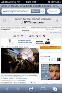
For example, if a desktop user emails a link from The New York Times to a mobile user, the mobile user will get a message at the top of the screen letting her know that there’s a mobile version of the site, as in Figure 1-7. Nice, but it requires extra work by the user, and extra time for the user to click and then load a totally separate page.
On the other hand, if I’m visiting The New York Times mobile site on my phone and I email a link to an article to someone who opens that link on a desktop computer, they get what you see in Figure 1-8: a mobile-optimized page, with no clear way to go to the full desktop website. The user can read the article, but he’ll have to click to see full-size versions of any images, and he won’t see a lot of the supplemental links and recommended articles that are on the desktop version of the site.

With responsive design, you only have one web page, so you’ll never get the “wrong version.” The site will be displayed correctly no matter what device it’s being viewed on.
Less Work
The most obvious advantage to using responsive design is that you only have to create one website, one design, one set of code, and one set of content.
If you have a separate mobile-only version of your site, you will have to create and maintain two (or more) entirely separate sets of HTML. Changes will need to be made on each site, and even if you’re trying to keep them the same, there will almost certainly be issues and something will end up not matching. Although using a content management system (CMS) or templating system may make the work easier, there is more code and content to maintain, and more things that can potentially break.
With a responsive site, you only have one set of content, and it will be displayed appropriately no matter what the screen size is. Future design adjustments can be made by making changes to the stylesheet.
For someone who is inexperienced with responsive design, the initial task of creating a responsive website (as you learn how everything works) may take more effort than creating a fixed-width site, but in the long term you will have less work to do maintaining the website.
Optimized for Search
A separate mobile site, with a separate set of URLs, can create issues with your site’s placement in search results.
If you have two separate versions of a page with the same or similar content but different URLs (i.e., http://www.example.com and http://m.example.com), search engines need to know that they are considered to be the same page so that the page can be indexed correctly and displayed as one entry in the search results listing.
Although this is possible using JavaScript or code on your server, it’s a bit complicated, and if you fail to do it correctly you may end up with both versions of a page appearing in search results, confusing users. It can also negatively affect your search ranking.
Google has recommended responsive design for smartphone-optimized websites since 2012, not only because it creates a better experience for users but also because it allows Google’s site crawler to retrieve your content more efficiently, which means changes to your site will likely be updated in search results more quickly.
Bing recommends using a method that results in only one set of URLs, but hasn’t specifically endorsed responsive design as a way to do that.
Summary
Until responsive design was introduced, websites were generally fixed-width, which meant the website’s design was the same width no matter what size screen it was displayed on. When smartphones came along, that really didn’t work, because websites appeared tiny on the small screens and users had to continually zoom in and out to read anything.
Mobile websites followed soon after, and many companies built these second websites separately from their main, or desktop, websites. Mobile websites often contained only a fraction of the content and functionality available on regular websites, so mobile users missed out.
As more devices came along, designers soon realized that it was impractical, if not impossible, to create multiple websites to fit each of the different screen sizes. The concept of responsive design was introduced as a way to make websites that could respond to the width of a device’s screen and display the site’s content in a way that was appropriate for that screen size.
Responsive web design consists of two main components: flexibility, which means that horizontal measurements need to use relative units like percentages so they can respond to the size of the screen, and media queries, which allow you to use CSS to change the design of the website depending on the width of the device’s screen.
Responsive design allows you to provide an appropriate design for any screen size using only one set of code. Not having to maintain separate sets of code means less work. And implementing a responsive design means that your site will be optimized for search.
Next, in Chapter 2, we’ll talk about why content is important and how to make sure you’re designing content that works well on responsive websites.
Get Learning Responsive Web Design now with the O’Reilly learning platform.
O’Reilly members experience books, live events, courses curated by job role, and more from O’Reilly and nearly 200 top publishers.

