Chapter 4. CSS for Responsive Sites
While HTML gives structure to all the content on your site, CSS will tell the browser how to style it.
Like Chapter 3, this chapter will be a review for anyone who is already experienced with the technology. However, we’re going to go into more detail on the basic concepts of CSS than we did with HTML, simply because CSS is the code that responsive design is made of. It’s impossible to have a real comprehension of how a responsive website is put together without understanding concepts like the cascade and the box model.
We’ll first look at how versioning of CSS works, and how browser prefixes are used to make sure that new style properties can be rendered appropriately in different browsers, even while these properties are still in the testing period.
Then we’ll look at the different ways to include styles in your website, either by embedding the styles in web pages, by using stylesheets to apply styles to multiple pages or an entire website at once, or by using inline styles to apply styles to individual elements.
Next, you’ll learn the concept of the cascade, which gives Cascading Style Sheets its name. The cascade determines the order in which styles are applied and how the browser chooses among conflicting style rules. We’ll also look at the best way to use the cascade to implement styles on your site with minimal confusion.
After that, we’ll go over the concept of the box model, which determines how elements are displayed on the web page: each element is represented as a box, having values (sometimes zero) for width, height, margins, padding, and borders. We’ll also look at display and positioning, which affect where elements are placed on the page.
Finally, we’ll go back to our example page and add some basic typography and layout styles to give some visual definition to the page.
How CSS Works
For anyone who isn’t already familiar with CSS, here’s a quick overview of how the code in a stylesheet is put together. This doesn’t cover all the variations on what you can do with CSS, but it’s enough that you’ll be able to look at CSS and know what’s happening.
To start, each time you apply a style to an HTML element, it’s called a rule:
p { color: red; }Each rule contains two separate sections. The selector corresponds to the HTML element that the style is applied to, just without the brackets. In this case, the p corresponds to the HTML element <p>, and this rule is telling the browser how to display the paragraphs on the page.
To go along with the selector, you have one or more declarations. This is everything inside the brackets, and it defines the style that’s being applied to the element.
In a declaration, the property is the quality of the element that you’re changing, such as the color or the width. The value is what you’re setting it to, such as orange or 50%. Each property is followed by a colon and then a value, such as color: red in the earlier example, which specifies that paragraph text should be red.
If there are one or more declarations in the same rule, they are separated by semicolons:
p { color: red; font-size: 1.5em; }The semicolon is optional after the last declaration (or if you have only one declaration), but many developers include it for consistency. All the declarations together are called the declaration group, which is surrounded by curly braces.
Styles can also be applied to a subset of an element, using a class or ID:
.classname { color: blue; }
#idname { color: green; }
This code will affect elements with the class classname (i.e., <p class= "classname">) or the ID idname (i.e., <div id="idname">).
Classes and IDs work similarly, by allowing you to target any element on the page, but you can only apply an ID to one element on a page, whereas you can apply a class to as many elements as you want.
You should use class and ID names that are descriptive. The browser doesn’t care if they are semantic, as with HTML, but it is easier for the developer when it’s apparent what the classes and IDs correspond to. For example:
<p class="intro">...</p>
<nav id="main">...</nav>
You can also target items more specifically with descendant selectors, which just means something that’s inside something else:
.classname p { color: purple; }In this case, we’re telling the browser to first find any elements with the classname class, and then that the <p>s inside those elements should be purple (but not the <p>s that are not inside a classname element).
If you want the same style to apply to more than one selector, you can group them using commas, instead of creating two separate rules:
h1, h2 { color: green; }This example tells the browser that both <h1> and <h2> elements should be green.
When you’re writing CSS, the spaces and line breaks are optional, except for the spaces in the descendant selectors, such as .classname p in the earlier example.
So, some stylesheets might look like this, which is perfectly all right (although hard to read):
p{color:green}div{width:50%;background-
color:blue}.classname{color:yellow}
By removing the spaces, or optimizing the stylesheet, you’re reducing the file size of the CSS document (every byte counts). This can help make your page load faster (we’ll talk about how to use software to remove the spaces automatically in Chapter 11).
Note
It’s hard to read a stylesheet that’s been optimized, because everything runs together. There are several online tools that can add spaces and line breaks back in at the appropriate places, so it’s easier to read. Try Clean CSS (http://www.cleancss.com/), or just search online for CSS optimizers.
Versions of CSS
Just as with HTML, there are different versions of CSS. The first version of CSS came out in 1996, just a couple years after HTML was first used to create web pages. The most recent version is CSS3.
Each version of CSS is made up of all the properties that can be styled using CSS. Properties are the qualities of your HTML elements that are affected by the styles. Some of these qualities include color, typeface, size of elements, and location of elements on the page.
Several new properties were added in CSS3. One of the most significant changes in CSS3 was to media queries, which made responsive design possible. You’ll learn more about how media queries work in Chapter 5.
Just as with HTML, you need to keep in mind that not all browsers have the ability to render, or display on the page, all of the properties in the latest version of CSS. I’ve noted in the book which properties you’ll need to pay attention to.
And like with HTML, not all browsers will render everything in CSS exactly the same way. You should be aware of the differences, and remember to test your website in various browsers and devices to make sure it looks the way you want it to look.
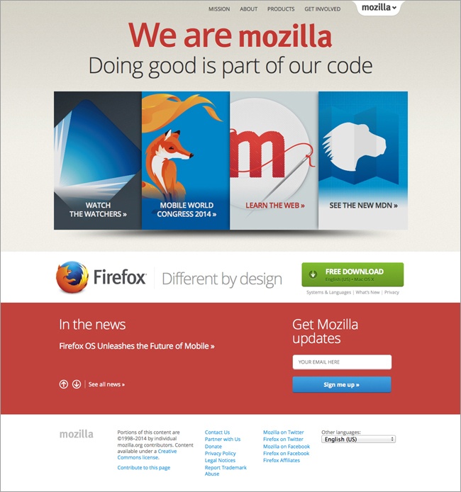
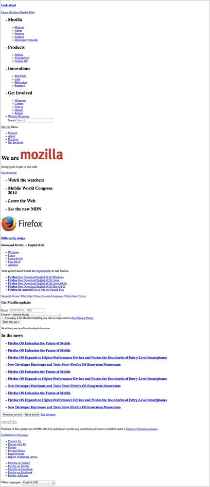
In Figure 4-1 you’ll see the Mozilla website displayed as intended, but in Figure 4-2, you’ll see the same website displayed with all the CSS removed.
Browser Prefixes
Parts of CSS3 are still being worked out by the W3C and tested by the browser vendors. So, the final specification for any new style may be slightly different from how the browsers are currently rendering it.
Rather than leaving developers in limbo, not knowing how their code will look in any given browser, the browsers support browser prefixes (often called vendor prefixes) that allow developers more control when using the new parts of CSS.
We don’t actually have to worry about all of the different browsers, because most of them rely on one of four browser rendering engines, which determine how web pages are displayed. To render a page, the browser will take all the content (HTML and images) and styles (CSS) as well as any JavaScript and put it all together to determine how to display the page on the screen. All of the browsers that use the same rendering engine will display a particular set of code in the same way.
The four rendering engines, which will be referenced in the code snippet a few paragraphs ahead, are as follows:
WebKit, which is used by Apple’s Safari and Google’s Chrome browser
Mozilla’s rendering engine, called Gecko, which is used in Firefox
Microsoft’s rendering engine, called Trident, used in IE
Opera’s rendering engine, called Presto, which is used in the Opera web browser
Because each of the browser rendering engines may render a still-in-progress style differently, each rendering engine has its own prefixed CSS property to correspond with these styles, which are variations on the actual property.
For example, the hyphens property is not yet finalized, so it has variations for the four browser rendering engines, and you need to list each one in your code:
p {
    -webkit-hyphens: auto;
    -moz-hyphens: auto;
    -ms-hyphens: auto;
    -o-hyphens: auto;
    hyphens: auto;
}
The five declarations all have a different property, the last being the non-prefixed hyphens, the property that will eventually be finalized by the W3C.
The four before it correspond to each browser rendering engine listed—you can tell which is which by the first part of the property name, webkit, moz, ms, or o. Note that the prefixed properties also start with a dash.
In this example, if WebKit is still testing the hyphens property, WebKit browsers will see -webkit-hyphens and render that declaration. They won’t recognize the other prefixed properties, or the non-prefixed property, and thus will ignore them.
But then what happens when the specification is approved? Once WebKit implements the actual hyphens property, the -webkit-hyphens property will still be recognized by WebKit browsers, at least for a little while. However, because the non-prefixed hyphens is further down the stylesheet, and it is now valid, it will be recognized by WebKit browsers too and will override -webkit-hyphens.
Most of the time, when using a property that has not yet been finalized, you will need to include all four of the prefixed properties, similar to what is displayed in the example just shown.
The order of the four browser prefixed properties does not matter. Many people prefer the order used in the previous example (i.e., longest to shortest), just because it looks neater in your stylesheet. But the non-prefixed property always has to come last.
You’ll notice in this code that I placed each declaration on a separate line, which I don’t otherwise do in CSS. I make the exception in this case because separate lines make it much easier to make sure all the prefixes are included, and to see that each one includes the same value (although in some cases, you may need to use different values for some of them).
Eventually, you’ll be able to stop using the prefixed versions of each property and only use the non-prefixed property (although there will always be more new properties being introduced that will require prefixes).
Several new properties in CSS3 are already supported by some or all of the major browsers. It doesn’t hurt the rendering of the page to keep the prefixed properties in your CSS when they’re no longer needed—that’s why the non-prefixed property comes last, to override the rest. However, they’ll add a little unnecessary weight to your CSS.
If a CSS3 property requires prefixes at the time that this book goes to press, it will be noted, but by the time you read this, that status may have changed.
Check Can I Use... (http://caniuse.com/) to find out which CSS properties are supported by which browser versions, and whether you need to use prefixes.
Where CSS Goes
Styles can be applied to your web page in a few different ways, either through a separate file called a stylesheet or included in the code of the web page. Where you choose to include your CSS has an effect on how it is applied to the page.
Embedded Styles
If you want styles to apply to only one page on the site, you can add them directly in the <head> of the HTML file, using the <style> element. You just place one or more CSS rules inside the element, as follows:
<head>

<style>
p { color: blue; }
</style>

</head>
Normally, though, you don’t want styles to apply to only one page; you want them to apply to the whole website. Even if a particular style will only apply to a particular page, it’s still best to include it in a separate stylesheet so that everything is in one place and easy to find, especially if more than one person will be working on the code for the site.
However, embedded styles should be used when you’re coding an HTML email, because email clients usually can’t import external stylesheets.
Stylesheets
Generally, your CSS declarations will be collected in one or more separate files called stylesheets, which are linked to from your HTML files. You want styles such as typeface, colors, and layout to be consistent throughout the website, and using stylesheets means that you can declare a style once and have it apply to every page of your site.
The <link> element allows you to link documents (files) to your HTML page, including CSS and JavaScript files. The <link> element is included in the <head> of the HTML file:
<head>
<link rel="stylesheet" href="styles/mystyle.css">
</head>
Any particular web page can link to more than one stylesheet.
You can also use @import to link styles to a page. Inside the <head> of the document, you would add an @import rule inside a <style> element:
<head>

<style>
@import url(styles/mystyle.css)
</style>

</head>
Linking to and importing a stylesheet effectively do the same thing, as far as getting the styles to the browser. However, choosing one or the other can have an effect on the site’s performance, which we’ll look at in Chapter 11. Generally, you should use <link> and minimize the number of stylesheets that you’re using.
Inline Styles
Occasionally you will want to be even more specific and apply a style to only one occurrence of an element, directly inside the HTML.
To do this, you simply add a style attribute (style="...") to the element, and any styles you wish to apply go inside the quotation marks:
<p style="color: green; font-size: 2em;">This is a paragraph.</p>
You should avoid using inline styles on websites, because it’s easy to lose track of where all your CSS is and what it’s doing, making the website harder to maintain. However, it can be useful when testing out changes to a page.
The Cascade
If you’re already comfortable using CSS, this section will contain familiar material, but it’s worth a review.
So far, we have styles in external stylesheets, styles in the page <head>, and inline styles. We also learned that styles can be attached to elements, classes, and IDs. If more than one conflicting style is assigned to the same element, how does the browser know which to pick?
CSS has very detailed rules about what order to apply styles in, which is the cascade in Cascading Style Sheets. The cascade determines which rules take precedence over other rules.
The cascade can be pretty difficult to comprehend, but most of the time your CSS will be straightforward and it will be clear what’s going on. I’m going to present a somewhat simplified version of how the cascade works, but if you’re going to be working with code a lot this is something you should learn more about.
How It Works
Every HTML element has several properties that apply to it. For example, the properties of a <p> include text color, background color, font size, typeface, whether it’s bold, whether it’s italic, if there’s a border and if so what the border looks like, where the paragraph is positioned on the page, and so on (there are dozens more).
As the browser is rendering the web page, it looks at each individual element one at a time and decides how to render that element, by determining the values for each of those properties.
The browser goes through a very specific routine—a hierarchy—to decide which style to apply to the particular element. These steps are in order of priority, starting with the highest priority:
The order of the steps is often called the CSS specificity, as it goes from the most specific rules (applying to only one or a few instances of an element) to the least specific rules (applying to all instances of an element).
For each element on the page, the browser will go through the hierarchy in order until it finds a style for each particular property. For example, let’s say it needs to know the color of the text (color) for a paragraph. It will start by looking for rules marked as important, and go on to inline styles, IDs, and so on. Once it has found all the color values for the paragraph, it will choose which one takes priority according to the cascade.
Important
If you want a particular rule to apply no matter what, you can mark it with !important. This can be used either in your regular styles or in inline styles. The browser will look for !important everywhere before moving on to the next rule.
In the following example, the color has been marked as !important, but the font-weight has not. !important comes directly before the semicolon and applies to only one declaration, not the whole declaration group:
p { font-weight: bold; color: blue !important; }This paragraph will have blue text, no matter whether other colors are applied to that same element in other declarations.
Although !important seems like a useful tool, you should use it only very, very rarely, if you absolutely can’t accomplish what you want using classes, IDs, or other selectors. Once you apply !important, you’re at the top level, so there’s really no way to go over its head, so to speak.
Inline Styles
If the browser doesn’t find any !important rules to apply to our color, next it will look for inline styles. These are styles that are attached directly to elements within your HTML document. All inline styles take precedence over any styles found in external stylesheets or embedded in the <head> of the document:
<p style="color: blue;">Paragraph text.</p>
IDs
If there are no inline styles for the color, next the browser will look for any IDs that apply to the element, either directly or through a descendent selector:
<p id="example">Paragraph text.</p>

#example { color: blue; }
Classes, Attributes, and Pseudo-classes
If there are no ID styles for the color, the browser will next look for any classes, attributes, and pseudo-classes that apply to the element. Again, it can be included in a descendent selector:
.example { color: blue; }
.example p { color: green; }
Elements and Pseudo-elements
If there are no styles for the color that contain classes, attributes, or pseudo-classes, the browser will next look for any styles that only contain elements or pseudo-elements in the selector:
<p>Paragraph text.</p>

p { color: blue; }
Inherited Rules
At this point, if the browser has found no styles that directly apply to the color of our <p>, it will look for any inherited styles that might apply.
Inheritance is pretty simple. This just means that if an element does not have a style applied to it, it will inherit the style of its parent element:
<p>This is a paragraph with <strong>bold text</strong>.
</p>

p { color: blue; }
Because the <strong> doesn’t have a color value assigned to it, it will inherit the value from its parent element, which is the <p>. The color of the <p> is set to blue, so that will be the color of the <strong>.
Not every property is inherited, but it will be pretty obvious which ones are. For example, font size is inherited, because once you set the size for your <p>, you want everything inside the <p> to be the same size—even text that’s also inside a <strong> or <em>.
On the other hand, borders aren’t inherited. If you gave your <div> a border, you wouldn’t want or expect each individual paragraph in the <div> to have its own border as well.
Default Values
If we’ve gotten this far without finding a color for our <p>, all is not lost: every element has a default value.
For most properties, the default value is part of the CSS specification. For example, the default color for any text element is black. If you don’t specify a color, the browser will use the default color.
So, if there are no styles at all that would apply a color to our <p>, it will be black text.
What If Anything Conflicts?
There’s still a bit more to it than what I’ve already explained.
Beyond the hierarchy, specificity looks at how many items are in a selector. More items equals higher priority (i.e., a rule with two IDs has priority over a rule with only one ID).
If two style rules are still equal, and it doesn’t know which one to pick, it uses the one that comes last, after putting all your styles in order (from the top of your first stylesheet to the end of your last stylesheet).
What you’ve read here is a summary that will cover pretty much everything you need to know. But if you want to learn more about specificity, or use it to do more powerful things with your CSS, refer to Vitaly Friedman’s Smashing Magazine article, “CSS Specificity: Things You Should Know” (http://coding.smashingmagazine.com/2007/07/27/css-specificity-things-you-should-know/).
Using the Cascade
All of that probably seemed really confusing, but in reality it’s simple, because you are deciding what to apply styles to.
As you’re styling a page, you’ll actually go in the opposite order of what we just discussed. You want to apply styles as broadly as possible, so you’ll rarely get into the specifics.
For example, you aren’t likely to have dozens of text colors for paragraphs on your page, with numerous competing style rules to sort through. You might have one or two, but you’ll know exactly how you applied them. This is the order you will follow:
Default values
Inherited rules
Rules containing elements and pseudo-elements
Rules containing classes, attributes, and pseudo-classes
Rules containing IDs
Inline style rules
Rules that are marked as important
Default Values and Reset
First, start with the default values. For most things, this is pretty obvious. Without any styles, as we saw in the HTML page we were working on in Chapter 3, the text is black, heading text is larger than paragraph text, and nothing has a border. Those are default values.
However, browsers don’t always use the default values they’re supposed to, so to make sure we’re starting at the same place no matter what browser is being used, we’re going to reset some values to zero. Otherwise we might have little leftover remnants of incorrect defaults that may affect our design and make it display differently in different browsers.
Reset
To reset the CSS, we’ll set all the margins and padding to zero, and set some of the font properties to a standard base size. After everything is reset, we’ll add all of our styles to set everything to the properties we want. The section of CSS that resets everything is often called a reset CSS or reset stylesheet.
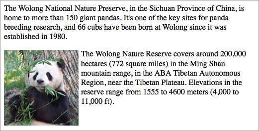
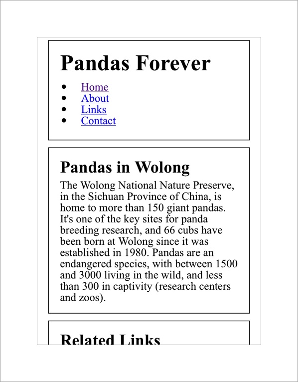
For example, if we use a reset CSS on our Pandas Forever site, we get what you see in Figure 4-3.
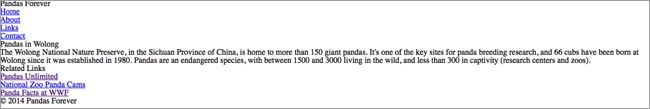
It looked better before, right? Don’t worry, we’ll fix it in a bit.
It would be a lot of work to figure out all the different elements you’re using in your CSS, and then write the style declarations to reset all of them. Luckily, a few people have already done this for us, creating blocks of CSS containing all the reset styles you need, that you can simply copy and paste into your own stylesheet.
One of the most popular is Eric Meyer’s Reset CSS (http://meyerweb.com/eric/tools/css/reset/). It’s in the public domain, so it’s free for you to use and modify in any way you wish.
An alternative is Normalize.css (http://necolas.github.com/normalize.css/) from Nicolas Gallagher.
You can also create your own reset—see “Quick Tip: Create Your Own Simple Reset.css File” (http://net.tutsplus.com/tutorials/html-css-techniques/weekend-quick-tip-create-your-own-resetcss-file/) by Jeffrey Way on Nettuts+ for details.
The reset needs to be the very first CSS rendered by the browser, to make sure that it doesn’t override any of your other styles. So, it should either be the first CSS file linked to in your <head> or, if you don’t have it in a separate file, the first lines of code in your first CSS file.
Inherited Rules
The next step we’ll look at is inherited rules. Most styles on your site will be inherited.
So, if you set the text color of your <body> to be pink (although I don’t think you’d want to), all text on the site will be pink. You don’t need to worry about setting the color for paragraphs, lists, <div>s, and so on, unless you want them to be something other than pink:
body { color: pink; }There’s one exception to this: links (<a>) don’t inherit color; they are blue by default (and purple for visited links) so that they will be visually differentiated on the page. You can leave them blue/purple, or give them a different color by assigning a color to the <a> element.
Also, make sure not to add style declarations that are redundant. If the <body> is set to pink, don’t also add a rule to make all the <p>s pink. They’re already pink, so you’re just adding code you don’t need.
Elements
Apply styles first in the broadest stroke. For example, if you want all your text to be in Helvetica, apply that style rule to the <body> element, and everything else on the page will inherit.
If you want all your top-level headings to be Georgia instead, apply that style to the <h1> element, and all your headings will be Georgia while everything else remains Helvetica.
Whatever style you are applying, try to find the highest-level element that it can apply to.
In our case, we want to change the size of the headings on our site to be larger than the other text on the page, and bold:
h1 { font-size: 2em; }
h2 { font-size: 1.3em; }
h1, h2 { font-weight: bold; }
p, ul { font-size: 1em; }
The em unit is a relative unit, and 2em means that the <h1> text will be two times as large as the base font size (the size of all other text on the site). We’ll talk about ems in more detail in the Measurements section later in this chapter.
Even though the paragraphs and lists will be the default font size, we’ll include that in our CSS just so there’s no confusion, so we’ll give them a value of 1em.
Everything Else
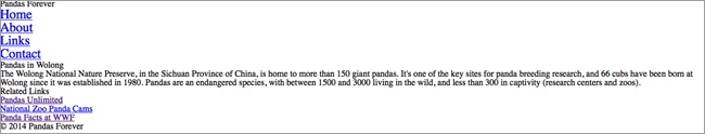
If a style needs to be more specific than all instances of an element, you can differentiate those in a few ways. For example, if you want the links in the <nav> to be larger:
nav li { font-size: 1.5em; }All the other <li>s on the site will continue to inherit their size, so you’ll see in Figure 4-4 that the links in the “Related Links” section didn’t change size.
Start by using descendant selectors as in the previous example, before moving on and adding classes to elements to differentiate them from others.
But don’t use descendants and classes unless you actually need them. In the previous example, because the links were actually the only text inside the <nav>, we could have applied the style directly to the <nav> instead of using a descendant selector. This would have the exact same effect:
nav { font-size: 1.5em; }The most specific selectors are IDs, inline styles, and !important, but you should avoid using those unless you really know what you’re doing.
Keeping It Simple
You might be wondering why it’s necessary to keep CSS as simple as possible. Why not just add in some classes and !importants if they’ll do what you want them to do?
The reason is that for any website, you’re almost certainly going to be making changes to the CSS later on, whether it’s tiny tweaks or a major site overhaul. The simpler the CSS is to start, the easier it is to make changes, especially if someone other than the original developer is the one making the changes.
And as I mentioned, this book only tells you the very basics of how CSS works.
If something doesn’t look as expected on your page, it may be that the cascade is rendering a different style than you intended. Test and make changes until you figure out what’s going on. The easiest way to learn how everything works is to try out different things and see what happens.
And always make sure to test your site in multiple browsers and devices, to make sure that the CSS is applied the same in all of them. We’ll talk about testing more in Chapter 8.
Comments
As with HTML, you can add comments to your CSS files, although you use different symbols to mark your comments as such.
The browser will simply ignore everything inside the comment.
Common ways to use comments in a stylesheet are to provide a description or explanation of what something is used for or to make notes of when changes are made:
/* this is a CSS comment */

/* they can be on one or multiple lines
or on the same line as your style code */ h1 { color: #7b0000; }
Organizing Your Stylesheet
Other than when styles need to go in a specific order to be applied correctly, your stylesheet can be in pretty much any order. But it’s best to go about it in a systematic way to make it easier to find everything later. Once you start adding media queries to the mix, you’ll need to know where everything is.
You’re always going to start with the reset CSS. That may be a separate file, or it may be the first lines of CSS in your primary stylesheet.
Some people like to arrange their stylesheets by page or site section, with comments labeling each section of the stylesheet. You can add dashes or other symbols inside a comment to draw “lines” between the sections of your stylesheet, making it easier to find particular code:
/* Main Content ----------------------------- */

styles for typography, layout, etc. in main content

/* Header ----------------------------- */

styles for typography, layout, etc. in header

/* Footer ----------------------------- */

styles for typography, layout, etc. in footer
Other people prefer to put like items together, regardless of what section of the page they are styling, for a better idea of what’s happening:
/* Typography ----------------------------- */

p { ... }
header p { ... }
footer p { ... }
.classname p { ... }

li { ... }
footer li { ... }
.classname li { ... }

/* Layout ----------------------------- */

header { ... }
footer { .... }
In your web browser, you can view the HTML and CSS files from any website. Look at the CSS from various websites to see how the styles are arranged. There isn’t a right way to do it, but be consistent.
The Box Model
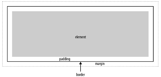
The most important concept in CSS layout is the “box model.” This just means that every single HTML element on the page is a rectangular box. Each box may or may not have borders, padding (empty space inside the edges of the box), and margins (empty space outside the edges of the box).
As you see in Figure 4-5, the content of the box is in the center. The content of an element can be text, images, or child elements (like a paragraph inside a <div>). The element is surrounded by padding, then a border, then margins, any of which can be set to a width and height of zero (a border with zero width and height would be invisible).
Measurements
The height, width, padding, margin, and borders of elements can be set using any one of a variety of units of measurement.
Traditionally, absolute units of measurement have been used, to ensure an element’s exact placement on the screen. In responsive design, you’ll generally use relative units of measurement, so that each element can respond to the size of the viewport.
These are the most common relative units of measurement:
%Percent is measured against the containing element.
emEms are relative to the
font-sizeof the element.remRems are relative to the
font-sizeof the document (i.e., thehtmlelement).
And these are the most common absolute units of measurement:
pxPixels are an absolute measurement, but they aren’t necessarily consistent across devices.
in,cm, andmmPhysical measurements map to pixels, but also aren’t consistent across devices. One inch is 96 pixels, one centimeter is 37.8 pixels, and a millimeter is 3.78 pixels.
ptPoints are equal to 1/72 of an inch, and are much more common in print design. On the Web, they can be useful for making a print stylesheet.
Ems
You’ll use ems for measurements a lot in responsive design.
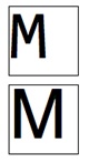
In old-fashioned metal typesetting, the em referred to the size of the metal plates that contained a raised letter, which had to be wide enough to fit the widest letter, the capital M.
Many people assume that digital ems are also based on the width of the letter M, but they aren’t. In digital terms, an em is simply equal to the font size of the element. And the em doesn’t change depending on the font chosen, as you can see in Figure 4-6.
Height and Width
In the box model, every element has a height and width, which can sometimes be changed by CSS.
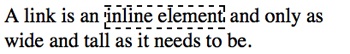
Inline elements have an inherent height and width, which cannot be overridden. An inline element will, by default, only be as wide and high as it needs to be to display its content, as shown in Figure 4-7.
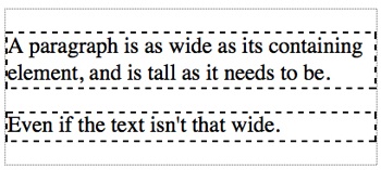
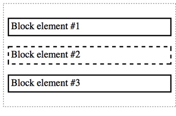
Block elements are, by default, 100% the width of the containing element, even if the content doesn’t fill the space.
The height is, by default, as high as it needs to be to contain the content. For example, a paragraph will be the height necessary to contain all the text as it wraps onto multiple lines, as you can see in Figure 4-8.
You can change the width or height of a block element with CSS:
div { width: 75%; height: 200px; }Keep in mind that a percentage width is based on the width of the containing element. So, in the preceding code, the <div> will be 75% of the width of whatever element it is in.
Margins and Padding
Every element has margins to provide space around the outside of the element in the layout of the page. Each element also has padding, which provides space on the inside of the element, around the content. The effect is often similar, unless the element has a border, which is outside the padding and inside the margin.
Browsers have a default margin and padding for each of the elements, but it’s not always consistent from browser to browser. That’s why we used the reset CSS earlier to set the margins and padding to zero for every element. That way, you won’t accidentally have margins and padding that are different sizes on different browsers, making things not line up the way you expect.
Generally, in responsive design you’ll use percent to set the horizontal (left/right) margins and padding of elements, so that the layout can respond to the size of the viewport. On a wide screen, you have space for ample margins around content. On a small screen, you don’t want to waste valuable screen space with huge margins.
Vertical margins and padding (top/bottom) can be set in pixels, because they don’t need to respond to the size of the viewport.
Each of the four sides of the element can have different values for the width of the padding or margin.
This example sets each of the four sides separately. The order goes clockwise—top, right, bottom, left (as an easy way to remember the order, think of it with the mnemonic TRBL, or “trouble”):
div {
    padding: 1px 2px 3px 4px;
    margin: 1px 2px 3px 4px;
}
In this example, the top margin/padding is set to 1 pixel, the right to 2 pixels, the bottom to 3 pixels, and the left to 4 pixels.
If the measurements are the same on opposing sides, or on all four sides, the values can be consolidated.
You still use the same mnemonic TRBL, and the missing numbers will mirror the opposite side of the box. So in the following example, top is 1 pixel and right is 2 pixels, and bottom will be the same as top (1 pixel) and left the same as right (2 pixels):
div {
    padding: 1px 2px;
    margin: 1px 2px;
}
If there are three numbers, the same thing goes. If you give numbers for top, right, and bottom, the missing number for left will mirror the right (2 pixels):
div {
    padding: 1px 2px 3px;
    margin: 1px 2px 3px;
}
If there is only one number, it will be used for all four sides of the box:
div {
    padding: 1px;
    margin: 1px;
}
You can also set one side individually—for example, if you had set margins for all paragraphs, but wanted to override that for one margin on a particular paragraph:
p { margin: 5px 10%; }
.other p { margin-top: 10px; }
You can set any side individually, with padding-top, padding-right, padding-bottom, padding-left, margin-top, margin-right, margin-bottom, and margin-left. Of course, if any of these are being applied to the same element, you would want to combine them into one declaration as noted previously.
If you want to center a block element in its containing element, you can do so by setting the left and right margins of the element to the value of auto. This sticks the element in the middle of the container, and the remaining space is split evenly between the left and right margins, effectively centering the element, as you see in Figure 4-9.
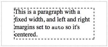
auto will center it in the containing element.This only has a visual effect if the element you’re centering has a width of less than 100%; otherwise, it will just fill the whole space.
Borders
Borders are placed between the padding and margin and provide an outline for an element.
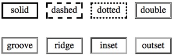
When declaring a border, you need to specify the width of the line, the style of border, and the color.
Border width is commonly declared in pixels.
border-style values include solid, dotted, and dashed. double provides a double line, and groove, ridge, inset, and outset all provide 3D borders in different directions. You can see examples of these in Figure 4-10.
To declare borders all in one declaration, you can include the values in any order. The following code sets the <div> border to 1 pixel, with a style of solid and a color of red:
div { border: 1px solid red; }You can also set each of the three properties separately, if you only need to do one at once:
div { border-width: 2px; }
div { border-style: dotted; }
div { border-color: green; }
You can set each side of an element separately, as well:
div { border-left-width: 2em; }
div { border-right-style: inset; }
div { border-top-color: blue; }
And so on: each of the three properties can be set for top, bottom, left, and right.
Box-Sizing
Now that you’ve learned how to measure all the pieces of the box, you need to know that unfortunately it’s kind of tricky to figure out the size of the box on the web page. Do the padding, borders, and margins count as part of the width and height of an element? It depends.
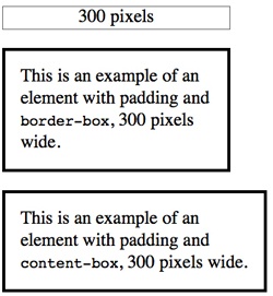
There are actually two separate ways to tell the browser how to measure everything. The box-sizing property, which is new in CSS3, allows you to choose between the two methods, which are border-box and content-box.
With border-box, once you set the width of your block element, any padding and borders you add will be inside that width. In contrast, with the default content-box, any padding and borders will be outside the width.
border-box is generally easier to use. However, this is not the default, so to use it, you have to set your element to box-sizing: border-box.
This property isn’t fully supported by all browsers, so you have to use the vendor prefixes. IE8+ and Opera already support this property, so you only need prefixes for WebKit and Mozilla:
div {
    -webkit-box-sizing: border-box;
    -moz-box-sizing: border-box;
    box-sizing: border-box;
}
You may want to apply border-box to your whole website. The code to do so is:
*, *:before, *:after {
    -moz-box-sizing: border-box;
    -webkit-box-sizing: border-box;
    box-sizing: border-box;
}
Those asterisks just mean that the CSS should be applied to every element.
Note
box-sizing doesn’t work in IE 7 and older, so even if you set something to border-box, it will render as the default content-box. When you’re testing your site, you may decide you need to add additional CSS to fix any layout issues. You can also find a polyfill to make box-sizing work in IE 6 and 7 at HTML5 Please (http://html5please.com/#box-sizing), from the people behind HTML5 Boilerplate, Modernizr, and CSS3 Please.
In Figure 4-11, both paragraphs have a width of 300 pixels, padding of 20 pixels on each side, and a border width of 5 pixels. In the first paragraph, the padding and border are inside the 300-pixel width. In the second paragraph, the padding and border are added on outside the 300-pixel width.
display
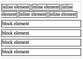
One of the key properties of HTML elements is display, which affects how an element takes up space on the screen. Most elements have a value of either block or inline. The difference is just like it sounds—block elements are rendered as stacked blocks, and inline elements are rendered inline with the flow of text, as you see in Figure 4-12.
display is a CSS property, so you can change the value for any element, but you should know the default values for the elements you’re working with.
An example of a block element is a paragraph. Look at Figure 4-12, and imagine each block element as a paragraph. Each one automatically starts on a new line, and whatever is after it also starts on a new line. Some other block elements include structural elements like <nav> and <article>, headings, and <div>.
Block elements always fill their containing element horizontally, unless you manually set the width to be different. So, a block element that is only inside the <body> will be as wide as the browser window. Each block element starts on a new line, and the following element starts on a new line, whether or not it’s a block element.
Inline elements, on the other hand, are inline, in the middle of other text. For example, an inline element might be <strong>, which contains just a few words in the middle of a paragraph that you have set to appear in bold. Other inline elements include <em>, <span>, and links.
Inline elements are only as big as they need to be. The words inside an inline element stay where they’re supposed to be inside the paragraph or other block element, without starting on a new line and without making the following text start on a new line.
Besides the block and inline elements, there are also list-item elements, which are the items in a bulleted list, <li>. They behave similarly to block elements in most respects. Tables, table rows, and table cells have their own display properties.
There are a few other values for the display property, which you will likely not use much (if at all). You can see a full list in the Mozilla Developer Network’s “display” article (https://developer.mozilla.org/en-US/docs/CSS/display).
Although you’ll keep the default display value for most elements, you can use CSS to change it. For example, it’s common to change list items from list-item to inline so that they will display in a horizontal row instead of a vertical row:
li { display: inline; }Positioning
The key to putting things where you want them on a page is positioning. This is a little tricky, so if you’re not a coder, don’t worry if you don’t understand exactly how it works—you just need to understand the gist of the differences.
By default, the flow of the page goes from left to right for inline elements, wrapping onto a new “line” when necessary, and from top to bottom for block elements, as you saw in Figure 4-12. The various position values can change that.
Static
The default position setting is static. Things just go where you think they’re supposed to go, as in Figure 4-13.
Relative
An element can be given a relative position, which moves it to a different location but ignores the flow of other content on the page. For example, in Figure 4-14, the second paragraph has relative positioning, moving it 40 pixels from the top and 40 from the left:
p.2nd { position: relative; left: 40px; top: 40px; }The browser leaves a space where the element should be, but then just moves the element, relatively, in the direction(s) specified.
As you can see, it simply overlaps other elements on the page, rather than pushing them out of the way to make space. On the right side of the screen, there is no room for the edge of the box to go 40 pixels to the right, so part of the box moves off-screen and is no longer visible to the user.
Note that the positioned element is on top of the other elements on the page.
To make this work you need to set the position to relative, and then also define the change in position, either horizontally, vertically, or both.
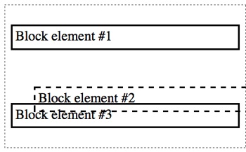
Absolute
Absolute positioning is different. The browser moves the element as you request, but it doesn’t leave a space where the element should have been.
And instead of the directions being in relation to where the element should be in the document flow, they position it in the first containing element that doesn’t have a position of static.
In the following example, the three blocks are in a containing <div>:
p.2nd { position: absolute; left: 40px; top: 40px; }Box #2 is absolutely positioned, so it’s ignored in the flow of the other elements. Instead, it’s placed 40 pixels down from the top-left corner of the containing element, and 40 pixels to the right of the top-left corner of the containing <div>.
Because there is no empty space left for it, it simply overlaps the other elements, as you can see in Figure 4-15.

An odd thing you’ll notice about the absolutely positioned element shown in Figure 4-15 is that its width is only as wide as the content, and not the full width of the containing element, as would be normal for a block element. Absolutely positioned elements don’t have the default width of 100% that other block elements do.
If there was more text in the element, it would expand until it hit the right edge of the containing elements, and then the text would wrap.
Note
You’ll have noticed that in some of these cases, elements overlap. To change which element is in front, you can give elements a z-index value: The element with the highest value will be in front. Negative numbers are allowed:
p.1st { z-index: 50; }
p.2nd { position: relative; left: 40px; top: 40px; z-index: 25; }
Fixed
Fixed positioning is very similar, but the element will be positioned relative to the entire page, not just the containing element. So, in the previous example, if we used fixed positioning, box #2 would be positioned in the top-left corner of the web page, 40 pixels down and 40 pixels to the right of the lefthand edge.
Any element with a fixed position will stay in place even if the user scrolls the page, so if you want a navigation section or another element to always be at the top of the page, this is the way to do it. Keep in mind that the other elements will ignore the fixed element, so it will overlap.
Fixed positioning is a little quirky in mobile browsers. Brad Frost’s article “Fixed Positioning in Mobile Browsers” (http://bradfrostweb.com/blog/mobile/fixed-position/) explains why in more detail.
Measurements for Positioned Elements
When an element is given a relative, absolute, or fixed position, the offset numbers will be given from the left, right, top, or bottom.
You can use either left or right (but not both) to move it horizontally, and/or either top or bottom (but not both) to move it vertically. If you accidentally give it conflicting directions (i.e., both left and right), the browser will ignore the first declaration.
You don’t have to move an element both horizontally and vertically; you can declare only one of the direction properties.
Note that when using the directions, the element is being moved from that direction, not toward that direction. So, left: 40px; will move the box 40 pixels away from the lefthand side of its original location, so it’s actually moving to the right.
You can also use negative numbers. If you’re doing relative positioning, moving an element 40 pixels to the left has the same effect as moving it –40 pixels to the right. The same is true with top and bottom, because you’re only moving it in relation to itself.
However, the same isn’t true of absolute and fixed positioning. Positioning the element 40 pixels from the top and 40 pixels from the left, as shown in the following code, will place it 40 pixels from the left edge of the containing element (see Figure 4-16):
p.2nd { position: absolute; left: 40px; top: 40px; }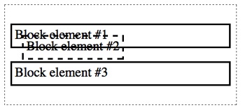
Positioning it –40 pixels to the right, on the other hand, will start it flush against the right edge of the containing element and then move it 40 more pixels to the right (see Figure 4-17):
p.2nd { position: absolute; right: -40px; top: 40px; }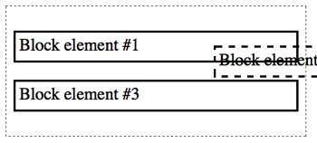
Positioning can be kind of tricky. The best way to learn it is to put together a test page and try out all these properties to get a better feel for how they work.
float and clear
The float and clear properties also allow you to change where an element is positioned on the page, although they are separate from the position property.
float is what you use to make content flow around a particular element. For example, let’s say you have an image in between two paragraphs, as in the following code (see Figure 4-18):
<p>...</p>
<img src="image.jpg">
<p>...</p>
You don’t want all that empty space in there, so you will want to fill it up with text, as in Figure 4-19.
Using the float property tells the browser to float the element on the left or right side of its containing element, and the following elements, whether block or inline, will wrap around that floated element.
Of course, you don’t want to float all the images on your website, so you will need to differentiate that image somehow, such as with a class. You might make a class such as floatleft that you could apply to any element that you want to float to the right:
.floatleft { float: left; }
Keep in mind that all following elements will wrap around the floated element until there is no more space. You might end up with things wrapping that you don’t want, such as the heading in Figure 4-20.
If you don’t want everything to float, just apply the clear property to the first element that you want to clear onto a new line:
ul { clear: left; }When you clear, the left or right needs to match the previous float.

Basic Styles
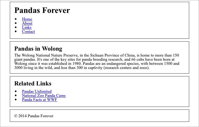
Going back to our Pandas Forever site, let’s add in some basic styles to make it look a little nicer.
First, to do it the easy way instead of the hard way, we’re going to use box-sizing as discussed earlier in the chapter. We’ll apply it to all elements:
*, *:before, *:after {
    -moz-box-sizing: border-box;
    -webkit-box-sizing: border-box;
    box-sizing: border-box;
}
We already set a font size for the headings, paragraphs, and lists, and we made the headings bold. Next, we’ll add some margins and padding to separate things a bit, and add bullets on the list items, which you’ll see in Figure 4-21:
h1 { font-size: 2em; }
h2 { font-size: 1.5em; }
h1, h2 { font-weight: bold; margin: 5px 0; }
p { font-size: 1em; margin: 5px 0; }
ul { padding-left: 10px; margin: 10px 0; list-style-type: disc; }
li { margin-left: 10px; padding-left: 10px; }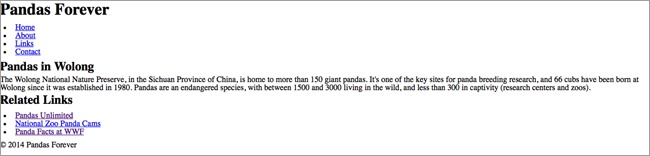
Next, we’re going to add a border to the structural elements of the page, just to make it easier to see where everything is. Even if you don’t have borders on the final design, it’s often helpful to add borders to elements while you are working on creating a design, just so you can easily see what’s going on with the margins and padding. Here’s the code (you’ll see the results in Figure 4-22):
header, article, aside, footer { border: 1px solid #111; }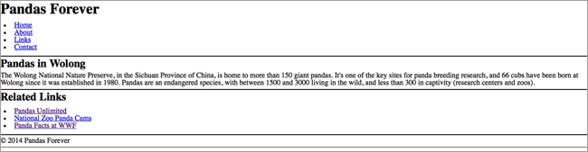
To make things look a little neater, we’ll add some padding and margins to the structural elements, resulting in Figure 4-23:
header, article, aside, footer { border: 1px solid #111; padding: 10px 1em; margin: 0 5% 10px; }
header { margin-top: 10px; }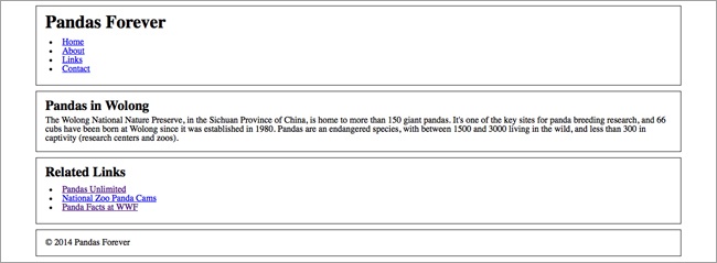
You’ll notice that I haven’t been talking about responsive design as we’ve added styles to our site. If you’ll remember, we started out with just HTML and no styles, which is a responsive site by default. So far we haven’t done anything to make it not responsive. The site works in various screen sizes, such as in Figure 4-24 and Figure 4-25, although in wider screen sizes the text is wide and difficult to read.
When we move on to talking about media queries in Chapter 5, you’ll learn how to have the site change its layout in regard to the screen width.
Summary
In this chapter, we learned that CSS has been released in versions, similar to HTML versions. The latest version, CSS3, gives us several new properties to use, including media queries, which are the backbone of responsive design.
Although some of the CSS3 properties are still in the testing phase, we can include them in our designs by using browser prefixes to allow browsers to render their testing versions of a property.
CSS can be applied to your web page either through separate files called stylesheets, or by including it in the code of the web page as embedded or inline styles. Generally, using stylesheets is the best option, as it allows you to apply styles globally across a whole site or sections of a site.
The cascade is a set of very detailed rules about how browsers apply styles to a web page—what order the styles are applied in, and which rules take precedence over one another. Rules that are marked as important take top priority, followed by inline style rules, then rules containing IDs, classes, and elements, inherited rules, and default values. As tiebreakers, the browser will look at specificity and the order of the styles.
Although the cascade can be very complex, if you plan ahead when adding styles to your website, adding them broadly and consistently wherever possible, you can make a style implementation that’s simple and straightforward, requiring less maintenance and giving you fewer headaches.
Starting out your CSS by resetting the default values will ensure that all browsers will render the styles as you expect. You can find various reset stylesheets online, if you don’t want to create your own.
There isn’t one particular correct way to organize the code in your stylesheets, but it’s best to use a consistent system so it’s easier to find things later. You may want to group styles by page or site section, or group like items together, such as typography styles.
The most important concept in CSS layout is the box model, which determines how elements are displayed on the web page, with each element represented as a rectangular box. Each box has a width and height, and may or may not have borders, padding, and margins.
Elements will start out with default values for all those properties, but the values can be changed using various units of measurement. For responsive design, most measurements should be in relative units such as percent, ems, and rems. Vertical measurements can sometimes be in absolute units like pixels. You can also use auto, which calculates the value based on adjacent or containing elements.
The box-sizing property allows you to change how the browser renders padding and borders—that is, whether their measurements are included inside the width of an element or outside the width. Positioning allows you to determine where elements appear on the page.
Now that you have seen the basics of how CSS works, in Chapter 5 we’re going to learn how to use CSS media queries to make a website responsive.
Get Learning Responsive Web Design now with the O’Reilly learning platform.
O’Reilly members experience books, live events, courses curated by job role, and more from O’Reilly and nearly 200 top publishers.

