Chart the Data
The final step is to display the data graphically using a chart. To chart the data from a pivot table:
Select the pivot table and click the Chart Wizard button on the PivotTable toolbar. Excel creates a default pivot chart.
Select the chart area and change the chart type to a line chart.
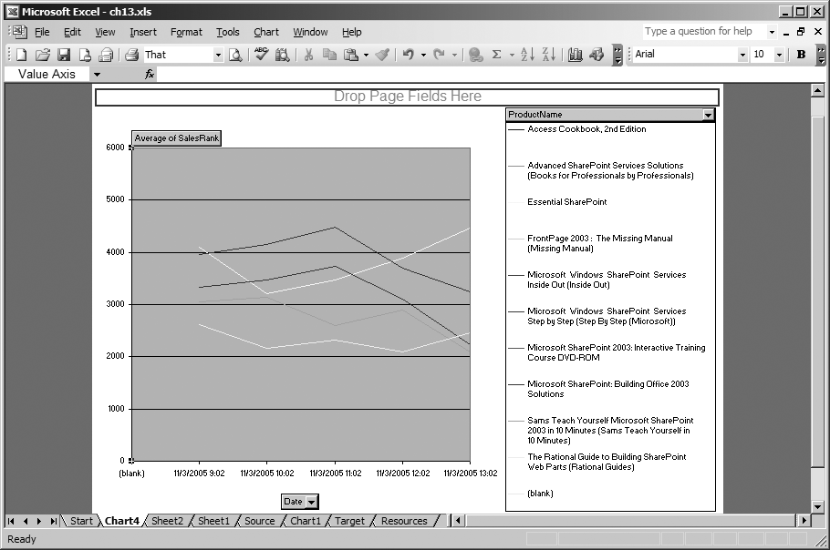
Drag the ProductName field to the chart legend. Figure 13-8 shows the result of these changes.

Figure 13-8. A pivot chart created with the PivotChart Wizard
That last step illustrates how pivot charts are different from ordinary Excel charts: you can reposition the fields to get different views of the data. Changing the field layout on the chart also changes the layout on the original pivot table. If you want to preserve the pivot table layout, create a new pivot chart based on the original source data.
To create an independent pivot chart:
Select the columns to chart on the source worksheet (Figure 13-1).
Choose Data → Pivot Table and Pivot Chart Report; select “PivotChart report” on the wizard (Figure 13-2) and click Next to follow the wizard steps or just click Finish to create the chart quickly. Excel creates a new pivot table and pivot chart based on the original source data.
Drag fields from the Field List onto the chart, select the chart type, and format the chart as you would normally.
Each pivot chart must have an underlying pivot table. If you click Next in Step 2, Excel asks if you ...
Get Programming Excel with VBA and .NET now with the O’Reilly learning platform.
O’Reilly members experience books, live events, courses curated by job role, and more from O’Reilly and nearly 200 top publishers.

