Almost every website needs some kind of media management support, ranging from allowing users to upload photos to handling automatic media encoding in different file formats. Drupal’s flexibility allows for managing media in a variety of ways, and for scaling from a one-person portfolio to millions of users uploading photos on a fan site.
This chapter introduces the following modules:
- Image (core)
Provides a field for uploading images, as well as the ability to establish “styles” of images such as thumbnails
- Media
Provides media management for Drupal: comes with a media browser and various tools that other modules can leverage and extend
- Media: YouTube
Extends the Media module to allow users to easily embed videos from YouTube
- WYSIWYG
Provides support for WYSIWYG (“What You See Is What You Get”) editors
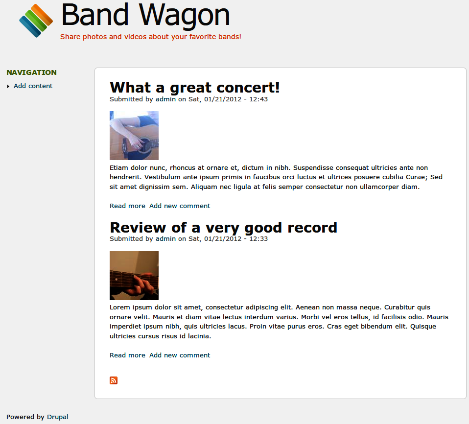
If you would like to participate in the hands-on exercises in this chapter, install Drupal using the Chapter 4: Media installation profile from the book’s sample code. This will create the example website on your web server. The completed website will look as pictured in Figure 4-1 and at //media.usingdrupal.com. For more information on using the book’s sample code, see the Preface.
Note
To complete this chapter, you must have the Clean URLs feature working, and your version of PHP must have the GD library installed. See Troubleshooting Image Styles for more information.
John and Lisa are both music lovers. They love listening to records, going to shows, and talking about music with their friends. They’ve been thinking for a while about setting up a website where they could write reviews of new records and shows, and share their concert photos and YouTube videos of their favorite bands. Since many of their friends are also into music, John and Lisa want to do this in a way that will allow their friends to sign up and join in the fun. Lisa has heard about Drupal from her coworker, and decides that it seems like a perfect match for their project.
After a few evenings of brainstorming, John and Lisa have come up with a list of things they want the website to do. When photos are uploaded, they should be automatically resized for use on different pages: a thumbnail to use on overview pages, and a proportionally scaled version for review pages. John and Lisa also want to be able to group reviews of the same band together in overview pages, using a simple tagging system.
Since they want their friends (many of whom don’t know anything about websites, let alone HTML) to be able to use the website, the process of uploading photos, posting videos, and creating attractive review pages needs to be really easy. Users should be able to easily enrich their posts by changing text styles (bold, italic, lists, etc.) and mixing and matching photos and videos with their text. When a user writes a review, it should be possible to use another user’s photo or video by selecting it from a media archive.
Even though there is a wide array of options to choose from when it comes to handling multimedia in Drupal, recent developments in the Drupal community have simplified this area of Drupal a lot. The Media module, together with Drupal core’s tools and other contributed modules, provides solid support for multimedia, while leaving all the room you need to build a unique project.
Image handling in Drupal has long been a distributed effort between several cooperating (or competing) modules. In Drupal 7, you can still choose between several options, with Drupal core’s Image module and the Media module being the main ones.
The Image module, which we encountered in Creating an Article, provides an image upload field that you can add to content types, taxonomy terms, users, and every other Drupal entity that you can imagine.
The Media module, which is a contributed module, is the go-to option if you want broader multimedia support. As we will see later in this chapter, it was developed specifically to solve the long-standing problem of media management in Drupal. It supports media file uploads (image, video, and audio file types are supported out of the box), management and reuse of media assets, and much more.
In this chapter, we’ll use the Media module’s Media field instead of the Image module’s Image field. Media’s solution offers not only a way of uploading photos, but also of adding other media types such as videos. It even comes with an easy-to-use media browser to add existing media assets to content.
The Media module not only allows uploading and managing local media assets, but it also provides a centralized way to access media on various third-party content sources. For example, there are modules available to help you post photos from Flickr and videos from YouTube on your Drupal website by simply copy/pasting the photo’s or video’s URL, or its embed code, a string of code that allows you to show a video or photo from somewhere else on the Web on your own site.
Drupal core’s Image module comes with a very powerful feature called “Image styles,” which takes care of all sorts of image manipulation. It can not only be used to create thumbnails, but also to chain together several image effects such as crop, rotate, scale, desaturate, and sharpen to create completely customized displays of images. The Media module uses the “Image styles” functionality to take care of image manipulation.
WYSIWYG editors allow nontechnical website users to use bold or italic text, create bulleted lists, or add links to other web pages (and much more than that) by using an interface that heavily resembles that of word processing software. The Media module comes with a plug-in for WYSIWYG editors, so users can easily embed media assets in their posts. Instead of choosing one of the many available standalone editor modules, we’ll use the WYSIWYG module to add an editor to our site, since more Drupal 7 sites use it and the developers are much more active in maintaining it.
The next step is choosing a WYSIWYG editor to plug in to the WYSIWYG module. The WYSIWYG module is an incredibly flexible framework, and actually supports multiple WYSIWYG editors. We’ll use the CKEditor WYSIWYG editor, as it won top billing in an extremely comprehensive review of all available editors for the WYSIWYG module.
When you’re uploading photos to a website, it’s important to ensure that they are displayed at the right size. Otherwise, when you upload an exceptionally large image, chances are good that it will break your site’s layout. To prevent this, you’ll want to scale these images so that they’re a consistent size, and create thumbnails for use in listing pages. “Image styles,” a feature that’s part of Drupal core’s Image module, will provide these options and many more for displaying images.
Note
We tackle image manipulation before going into detail on how to set up media handling for Drupal in general, since some of the concepts explained here will come in handy later.
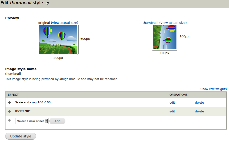
The automatic image manipulation provided by “Image styles” allows you to combine a series of effects such as cropping, scaling, or resizing into what is called an image style. By combining effects, you can create a customized display of your images. Figure 4-2 shows the result of a style that combines a crop effect with rotate to make a square image that is rotated 90 degrees.
The image is generated on the fly, then saved (or “cached”) in a directory with the same name as the image style. This way, the expensive part of manipulating images only happens once, and subsequent requests are read directly from disk.
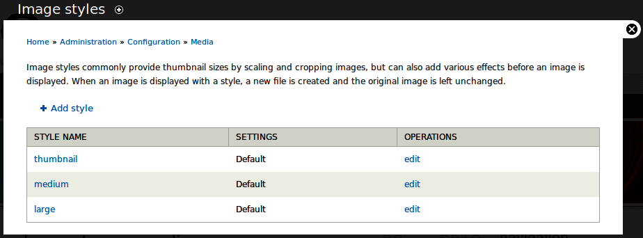
The main “Image styles” page, which you can reach by clicking Configuration→Media→“Image styles” (admin/config/media/image-styles), displays a list of the styles available on the site, as shown in Figure 4-3. You can add new styles and edit existing styles.
Note
The style name will be part of the URL of all generated images, so it’s good to keep it short, make it all lowercase, and use only alphanumeric characters, underscores, and dashes. If you’re building a site where standard image sizes will be used in a variety of places, a name that describes the final output is also a good idea, such as “160_square,” “200_width,” or “300x200_resize.” For our examples, we’ll use default names like “thumbnail” and “large,” which are semantic in their use.
The real fun comes in when you add new effects to a style. Multiple effects may be added to a single style, and the effects will be applied from top to bottom. Whenever you edit a style, the cached files will all be flushed so that they can be regenerated. This makes it easy to change all the images on the site from using a 100-pixel thumbnail to a 120-pixel thumbnail (or make any other possible changes). The configuration form for adding a new effect to a style is shown in Figure 4-4.
Crop allows you to trim off edges of the image that are not wanted. Crop takes pixel values, and allows you to define which part of the image is retained by choosing an anchor point. The end result of a cropping effect will be similar to Figure 4-5.
Desaturate allows you to convert a color image into a black and white image. This effect, shown in Figure 4-6, doesn’t have any settings.
Resize can be used to force an image to a particular dimension. You can enter width and height values to scale to a specific pixel size.
Usually, you’ll want to use the scale action instead of resize, as resizing might make your image look squished or stretched. Rather than maintain proportions, resize forces an image to be exactly those dimensions, as shown in Figure 4-7.
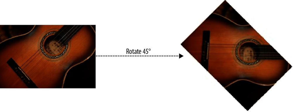
Rotate allows you to rotate images according to a given amount of a degrees, as shown in Figure 4-8. A positive number of degrees rotates the image clockwise; a negative number rotates it counterclockwise. You can also define a background color to fill areas of the image that are exposed after the rotation. If you want to get funky, you can even randomize the rotation angle for each image.
Scale is used to size images proportionally. Unlike resize, you need to enter either a width or height. The dimension without a value will be automatically determined when the image is scaled to the given dimension. If both dimensions are entered, the image will be scaled to fit within both values.
If your site absolutely needs images to be no smaller than a certain size, you can use the Allow Upscaling option to enlarge images to the entered dimensions.
Scaling will always maintain the aspect ratio of the original image. The end result of a scaling action is shown in Figure 4-9.
As the name implies, the scale and crop action is a single-action combination of the scale and crop functions. In this action, the image is scaled until one dimension fits within the given size, then the larger dimension is cropped off (also called a zoom crop). This action is most helpful for making square thumbnails while maintaining the aspect ratio of the original image. An example of the result of the scale and crop action is shown in Figure 4-10.
Note
The effects just described are the ones that are available in Drupal core’s “Image styles.” For an expanded set of actions (including watermark, border, text placement, brightness, and transparency), you can install the ImageCache Actions module, available at http://drupal.org/project/imagecache_actions (the name comes from the contributed ImageCache module, which was the image manipulation toolkit in previous versions of Drupal).
After setting up styles in the “Image styles” administration area, you need to tell Drupal where these styles should be used. The field that comes with Drupal core’s Image module provides options to display the image in either the original size or in one of the styles you configured.
The typical display of images is configured with field formatters, as shown in Figure 4-11. For every style setup on your site, “Image styles” adds a field formatter. It also allows you to link the image either to the content (the node where the image is used), to the image file, or not at all.
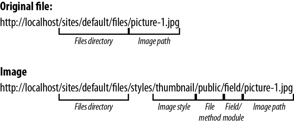
You may view an image style at any time by manually assembling the URL to the image and style. Assembling such a URL is illustrated in Figure 4-12.
After configuring an image style, it’s easy to test what an image will look like by visiting the URL of an image.
“Image styles” makes use of several advanced PHP and Apache features, such as URL rewriting and the GD image library. Because its software requirements are steep, any misconfiguration in your server or Drupal setup may cause “Image styles” to break. The following sections describe common problems with getting “Image styles” to work. If you are able to successfully upload images to your articles, you can safely skip this section.
The most common problem is that Clean URLs (a core feature that provides URLs like http://example.com/node/1 instead of http://example.com/?q=node/1, which is the default) are not enabled, or not supported by the software on the web server. Visit the Clean URLs configuration page, as shown in Figure 4-13, by clicking Configuration in the administrative toolbar, then Clean URLs in the “Search and metadata” section on that page (admin/config/search/clean-urls). If you receive an error on the configuration form, see the handbook page for setting up Clean URLs (http://drupal.org/getting-started/clean-urls) for help configuring your server.
Warning
Drupal’s Clean URLs feature requires the Apache extension mod_rewrite, or its equivalent for your web server. See http://drupal.org/node/717772 for instructions on setting up Clean URLs on almost every possible web server platform.
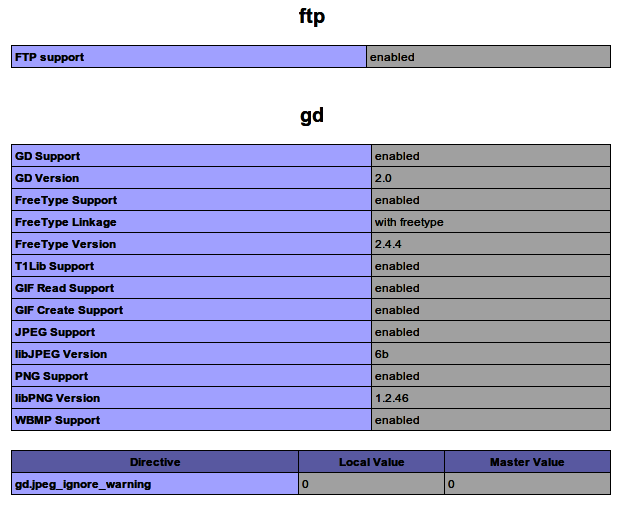
Another common problem is a lack of the GD image library on the server. This could be the problem if no image is being generated at all when you visit an “Image styles” URL. GD is a software package that is enabled by default with installations of PHP, but sometimes it is missing from the installation when you’re doing custom installs of PHP. You can check the status of GD in your installation by clicking Reports in the administrative toolbar, then Status report (admin/reports/status). Halfway down the page, you should see a message similar to Figure 4-14, confirming that GD is enabled.
If GD looks OK but you’re still not having images generated, try checking the configuration of your PHP installation by clicking the “more information” link next to PHP on the status report page (admin/reports/status/php).
Check for the “GD settings” section, which should be similar to Figure 4-15. Check that all the needed libraries are available for the kinds of images being uploaded. If the entire section is missing from this page, then GD is not installed at all.
Note
If you prefer to use ImageMagick instead of GD, you can download the ImageMagick module.
Before we can nicely publish our favorite bands’ photos on our website, we need to make sure to set up image styles, in order to create scaled-down versions of the images while leaving the original images intact. Otherwise, full-resolution photos and images in different sizes will appear all over the place, which is not what we want.
We’ll set up image styles to provide us with thumbnails for listing pages and a scaled-down version to use on review pages. Later in this chapter, we’ll learn how to use these image styles in various places across the site.
Drupal core’s Image module, which is enabled by the book’s source code, provides three image styles out of the box. It is possible to override these default styles for your own needs, or you can create new styles from scratch. In this section, we’ll override existing image styles. We’ll also briefly explain how to create your own custom style from scratch, which is very similar.
Go to the “Image styles” settings page by clicking Configuration→Media→“Image styles” (admin/config/media/image-styles). You’ll see a list of the image styles that exist on your site (the ones that the Image module provides by default).
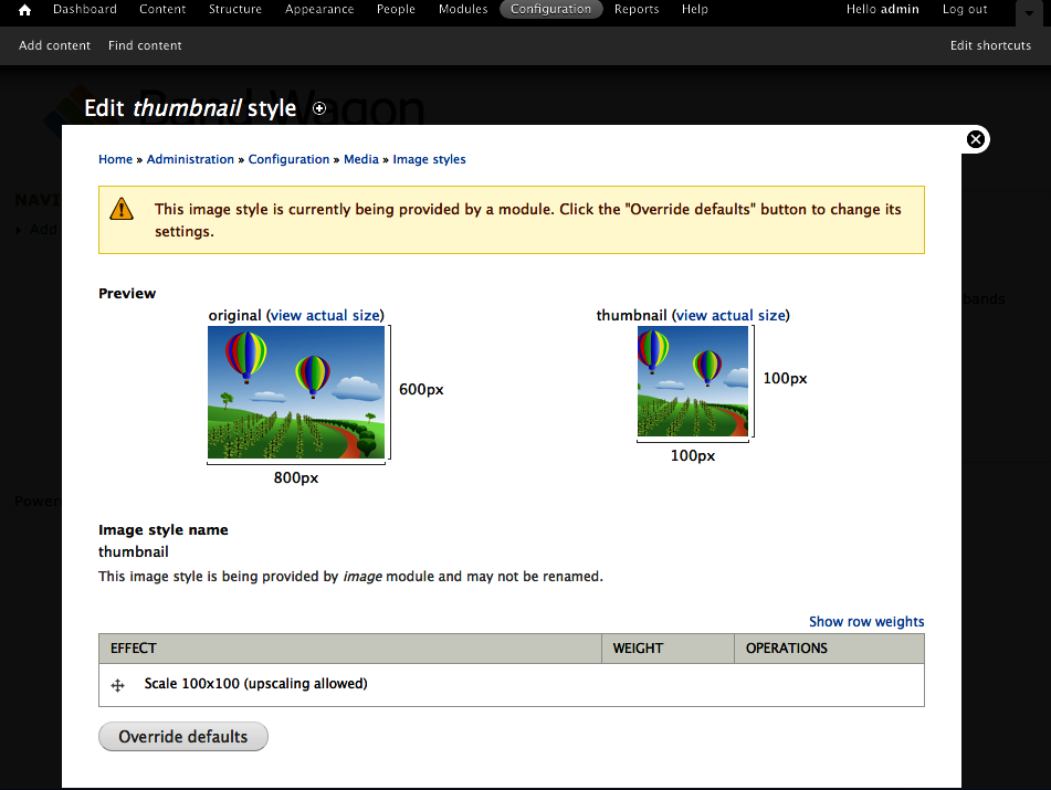
Next to the “thumbnail” style, click “edit” (admin/config/media/image-styles/edit/thumbnail). This will take you to the style’s configuration page, pictured in Figure 4-16.
Note
On the configuration page, you’ll see a message that the style you’re currently editing is being provided by a module. This means you can override the style, but you can also revert to the default style provided by the module later (i.e., delete whatever changes you made to the style), since the style is defined by the module’s code. The ability to store site configuration to code is useful in deployments from one server to another. For information about this concept, see http://drupal.org/node/580026.
At the bottom of the configuration page, click “Override defaults.” Once you’ve clicked that button, the form is unlocked and you can begin making changes.
We want to change the existing thumbnail from a rectangle into a square. To accomplish this, rather than using just the Scale effect, we’ll use the “Scale and crop” effect to round off the rough edges. So first, go ahead and delete the “Scale 100×100” effect from the style by clicking “delete” next to that effect, and then the Delete button on the next screen. Watch how the preview image changes in response.
Next, select “Scale and crop” from the effect drop-down menu and click Add.
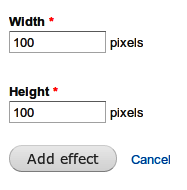
On the next page, configure the “Scale and crop” effect. Enter the values from Table 4-1 and as shown on Figure 4-17 for the scale and crop effect, to create image thumbnails as 100-pixel-wide squares. Click “Add effect” when finished.
That completes the configuration of the thumbnail style. When you return to the style’s configuration page after adding the “Scale and crop” effect, you’ll see that the preview image displays a thumbnail of the correct size, as shown in Figure 4-18.
The other two styles that come out of the box with “Image styles” are also scaling styles—just like the thumbnail style we’ve just overridden. This is fine, since we’ll want to display scaled-down photos on the review pages. The existing “large” style, which we’ll use on review node pages, needs a little tweaking, though: we want to display our photos a little bigger than these styles allow.
Changing this is easy: the only things we need to change are the width and height values for the styles:
Return to the main “Image styles” page either via the breadcrumb, or by navigating back to Configuration→Media→“Image styles” (admin/config/media/image-styles). Next to the “large” style, click “edit.”
Once again, override the default style, as we’ve just learned with the thumbnail style. Afterward, tweak the existing “Scale 480×480” effect by clicking “edit” next to it and using the values in Table 4-2 for the scale action to limit medium images to a maximum of 500 pixels wide. Uncheck the Allow Upscaling checkbox. Click “Update effect” to save the changes you’ve made.
Note
In this section, we’ve overridden default styles provided by “Image styles.” If you want to create your own custom image style from scratch, click “Add style” when on the main “Image styles” page (admin/config/media/image-styles), provide a name for your style, and click “Create new style.” From there, the configuration is very similar as we’ve seen in this section: add effects and tweak them to your heart’s content.
All our image styles are complete! We’ve set up two styles: a “thumbnail” style for use in listings of many images, and a “large” style to use on review node pages. We’ll use these styles later in the chapter to configure how image files will be displayed on the site.
If you were to look at a sample thumbnail generated by “Image styles” at this point, you might notice the quality of the image is a bit low and overcompressed. “Image styles” uses Drupal core’s setting for image quality when processing JPEG images, which defaults to 75%. Increasing this level will generate much higher-quality images.
The steps are:
Go to the Image toolkit configuration for Drupal by clicking Configuration→Media→“Image toolkit” (admin/config/media/image-toolkit).
Set the JPEG quality to 90% or higher and click “Save configuration.”
To see this effect on existing thumbnails, return to the “Image styles” administration page by going back to Configuration→Media→“Image styles” (admin/config/media/image-styles).
Next to the “large” style, for example, click “edit” to see the newly created preview images, which should appear slightly sharper.
The Media module for Drupal 7 solves a number of long-standing media-related problems in Drupal (see below). At its core, Media provides a framework to manage media assets on a Drupal site, regardless of whether those assets exist on the site’s server or somewhere else on the Internet; the Media Internet module, which is part of the Media module and is covered in Spotlight: Media Internet Sources, makes it possible to use remote files the same way as files on your server. The Media module has been under active development and improvements are still in progress as of this writing. There are two distinct versions of the module. While the 1.x version is currently stable and recommended, we are using Media 2.x here due to its improvements, and the fact that it will ultimately be the normal version going forward.
Media is built to be extended—a number of modules that build upon Media already exist, with a lot more to come. For example, Workbench Media integrates the Media module with Workbench (covered in Chapter 7) to improve media management for editors. You’ll find a full list of modules that integrate with Media and extend it at http://groups.drupal.org/node/168009.
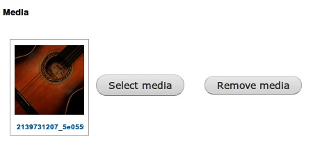
Remember the file field that Drupal uses, which we learned about in Chapter 3? The Media module extends this field by allowing you to use it to upload and reuse media files through a media browser, as shown in Figure 4-19. Like other fields, you can configure file fields to allow multiple values, so any number of media assets can be uploaded to a single node. You can even add multiple fields to a single content type, in case you want to use a separate field for an audio file, and another for an album cover. Since we’re dealing with a normal file field, it can take any type of media file you throw at it, as long as you allow the file types in your field’s settings.
Using a predefined field to handle media is a good solution for a lot of use cases, but sometimes the user needs more control over the final display of media assets in content. To cater to this need, the Media module provides integration with WYSIWYG editors. This makes it possible to insert media assets directly into a text area and to place them where you wish in your content, instead of having your images and videos appear in a spot predefined by your site’s theme. If you’re not sure what a WYSIWYG editor is, don’t worry: we’ll learn all about it (and its integration with the Media module) later in this chapter.
Note
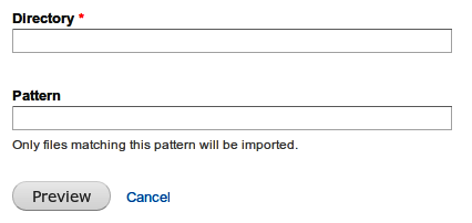
When you’re starting a new site, it is often handy to be able to import a whole bunch of files at once, instead of having to upload them all one by one—for example, when you have files on your computer that you want to upload, or a previous website that hosted media files. The Media module provides a way to do this. If you navigate to Content→Files, and then click the “Import media” link (admin/content/file/import), you’ll see a field where you can enter a directory from which to import files, as shown on Figure 4-20 (you can also use a file matching pattern to limit the files that will be uploaded). Enter the name of the directory (for example, sites/default/files/my_pictures) where your files are, click Preview, and then click Confirm to pull all those files into Drupal. The files will immediately be ready for use in the media browser. Note that you need the “Import media files from the local filesystem” permission to be able to import media files this way.
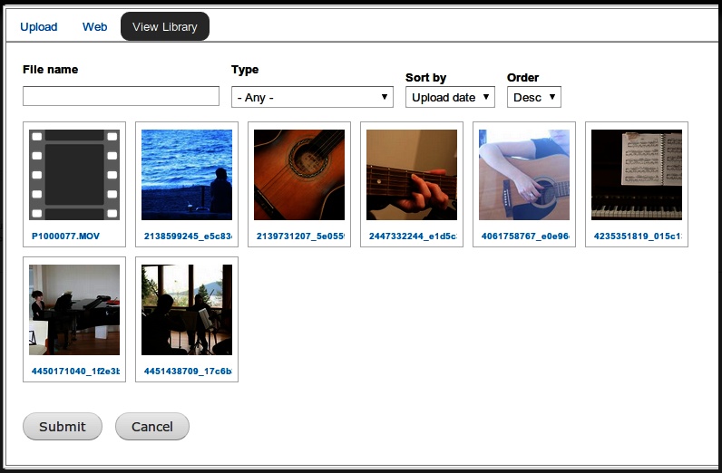
The Media module not only provides a way to add media assets to a Drupal site, but an easy means to manage them. Centralized media management and reuse of media assets outside the context of a given node has always been a pain point within Drupal. The media browser, as shown in Figure 4-21, is a solution for this problem.
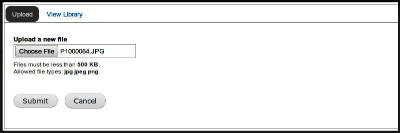
The media browser allows users to browse through existing media items on a site and reuse them in their own posts. By clicking the View Library tab in the pop-up window that appears when you click “Select media,” you can look through media assets that users have previously added to the site. Using an existing media asset in a post is as simple as selecting it and clicking Submit.
Note that the media browser is powered entirely by the Views module, which we covered in Chapter 3. That means you can change the media browser in a number of ways. For example, you could change the filters that are displayed on the media browser. With Views’ exposed filters settings, it’s fairly easy to add filters for file size, or add a filter for the date a file was uploaded.
Another really interesting feature that comes with Media’s Views integration is the ability to add your own tabs to the media browser. For example, a site might want to use a separate tab for video files, or a tab specifically to display newer media files. Just add a “Media browser tab” to the media browser view and tweak its filters.
To begin, we need to handle some basics: creating a form with which to create reviews, and a way to tag reviews of the same band.
The first thing that we’ll need for our music review site is a new content type. This content type will let users enter reviews and add media assets to them. A file field will allow users to add a photo that is used as a thumbnail in teasers, and shown on the full node page in a cropped version. Later in this chapter, we will configure the content type’s Body field in a way that allows users to insert media assets directly into the text area.
To help you get started, this chapter’s source code provides a basic Review content type, with nothing but a Title and a Body field (if you’re not using the book’s source code, go ahead and create a new content type now, using the skills you learned in Chapter 3). In this section, we’ll enrich our basic Review type with a file field that allows you to upload and use several types of media files through the media browser.
In the administrative toolbar, click Modules (admin/modules) and enable the following modules:
Chaos tool suite
Chaos tools
Media
File entity
Media
Views
Views
Go to the content type configuration page at Structure→“Content types” (admin/structure/types). Click the “manage fields” link next to the Review content type and add a file field, using the settings indicated in Table 4-3. Note that we’ll use the “Media file selector” as the widget, which allows a user to upload and reuse files using the media browser.
After clicking Save to add the new field, you’ll end up on the field’s settings page, where you can configure the upload destination for this file field. Since we’re using Drupal’s default public filesystem (which we learned about in Chapter 3), there is nothing we need to do here. Click the “Save field settings” button to further configure the file field, and enter the values shown in Table 4-4.
The settings form allows you to enable several media browser plug-ins: these are the tabs that will show up on the media browser, which you can configure for each field. Also important is the configuration of the allowed file extensions used for this field: this will make sure users can only upload photos to this field.
Table 4-4. Configuration for the file field on the Review content type
Field
Value
Review settings
Label
Intro photo (default)
Required field
Unchecked (default)
Help text
Add or select a photo to be used as thumbnail and displayed on the node page (cropped).
Enabled browser plugins
Upload, Library, View Library
Allowed file extensions for uploaded files
jpg, jpeg, png
Allowed URI schemes public:// (Public files) (default) File directory Leave empty (default) Maximum upload size 500 KB Intro photo field settings
Number of values 1 (default) After submitting the form, you’ll be returned to the list of all the fields in the Review content type. Let’s add a tagging field to our content type now, so users can tag reviews of the same bands in order to display them together on overview pages. If you’re using the source code for this chapter, there is already a Tags field that you can use here. Under “Add existing field,” add the Tags field, using the settings indicated in Table 4-5. Note: make sure to select the existing field first in the Name column, before you add a label.
After clicking Save to add the Tags field, you can configure the field using the settings in Table 4-6. Since we are sharing this field with other content types (the Article content type, which is also created by the book’s source code, uses this field as well), some settings apply to all content types using this field, and some settings are specific to the Review content type. We only want to touch the latter; we’ll leave the settings applying to all content types alone.
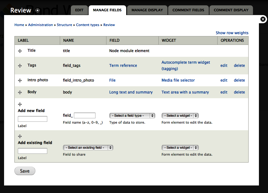
After submitting the form, you’ll be returned to the list of all the fields in the Review content type again. Order the fields as follows by dragging them in the correct position, and click Save:
Title
Tags
Intro photo
Body
When finished, your screen should match Figure 4-23.
We’re almost there. We still need to make it so that users can publish a review on the site, though. Go to People→Permissions (admin/people/permissions), and give each role the permissions indicated in Table 4-7.
Table 4-7. User permissions for the new Review content type
Permission
anonymous user
authenticated user
editor
administrator
Node
Review: Create new content
Checked
Review: Edit own content Checked Review: Edit any content Checked Checked Review: Delete own content Checked Review: Delete any content Checked Checked While we’re on the Permissions page, we’ll also make sure users can add media to the site. Assign each role the permissions indicated in Table 4-8.
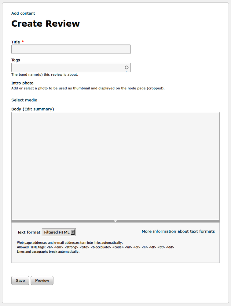
This completes the basic configuration for the Review content type. A basic user can now add reviews to the site, using a form similar to that in Figure 4-24.
Figure 4-24. How our new review submission form appears when we’re logged in as an authenticated user
To upload a photo, click the “Select media” link and select the photo to upload using the form shown in Figure 4-25. Click Submit when finished. Photos uploaded through this field are also available to other users of the site; this is really handy, as users don’t have to upload the same picture over and over again if they want to use it in different reviews, for example.
Before reviews can be successfully published on the site, a few important things remain to be done, like the configuration of our intro photo’s display—if you were to publish a review now, you’ll notice the photo you uploaded isn’t shown on the site with our fancy image styles yet! We’ll deal with this in the next section.
Now that users can post reviews on the Band Wagon site, we need to make sure that the content they publish, including their intro photos, is displayed correctly. We’ll do this by configuring the fields’ display settings.
In the administrative toolbar, click Structure→“Content types,” then click the “manage display” link for the Review content type (admin/structure/types/manage/review/display).
At the bottom of the page, expand the “Custom display settings” fieldset, check the box for “Full content,” and click Save. Once you check that box, it’s now possible to define a separate display configuration for content when it’s viewed directly, at a URL like http://example.com/node/1. This allows us to, for example, use a different image style for photos in teasers (shown on the front page) than for photos on the node page (shown when you click to view a single review).
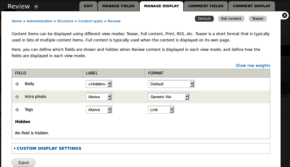
The small buttons in the top-right corner of the page you’re on indicate that we’re using custom displays for the full content and the teaser, as shown in Figure 4-26. This means we’re now able to define what content will be shown on review teasers and on review node pages, and how that content will be displayed. Leave the Body field as it is by default for all available displays.
To configure how photos will be displayed on node pages, click the “Full content” link in the secondary navigation (admin/structure/types/manage/review/display/full). Hide the intro photo’s field label by setting it to Hidden, and set its format to “Rendered file” as indicated in Table 4-9. This will output the image as HTML tags.
After you’ve changed the format setting for the “Intro photo” field, you’ll see an extra option appear, called “View mode”: this determines how the photo will be displayed on the review node page. Change the view mode by clicking on the gear icon (shown in Figure 4-27), and then select Large, as indicated in Table 4-9. Click Update, then Save, to store your changes.
Next, go to the display configuration page for the Teaser display (admin/structure/types/manage/review/display/teaser) to configure the display settings for review teasers. The steps are the same as with the “Full content” display configuration. Drag the “Intro photo” field from Hidden to just below the Body field. Set the intro photo’s label to Hidden, as indicated in Table 4-10, and set its format to “Rendered file,” and its view mode to Small, by clicking the gear icon and selecting that option. Don’t forget to save the field’s display settings page afterward.
Now that we’ve told Drupal which display settings to use for the “Intro photo” field, we still need to configure how those displays will actually work.
Remember the image styles and the file types we learned about earlier in this chapter? This is where those come together. We’re going to configure how the Image file type will be displayed, using image styles:
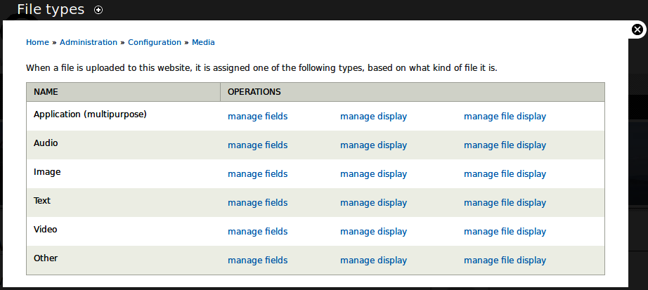
To configure the display settings for the image file type, go to Configuration→Media→File Types (admin/config/media/file-types). This screen looks very similar to the “Content types” screen you’re already familiar with.
Click the “manage display” link (not to be confused with the “manage file display” link) for the Image file type (admin/config/media/file-types/manage/image/display). You’ll see a series of buttons in the top-right corner of the overlay, similar to the ones you saw when configuring field display settings on the Review content type. These buttons allow us to configure the display of the file types: every view mode of images can have its own configuration.
Click the Small button (admin/config/media/file-types/manage/image/display/media_small) and change the file’s visibility by selecting Visible in the Format list and saving the page. This will ensure that the image file will be visible in the Small view mode (which we’ve chosen for the “Intro photo” field in our content type’s teaser display). Save the form.
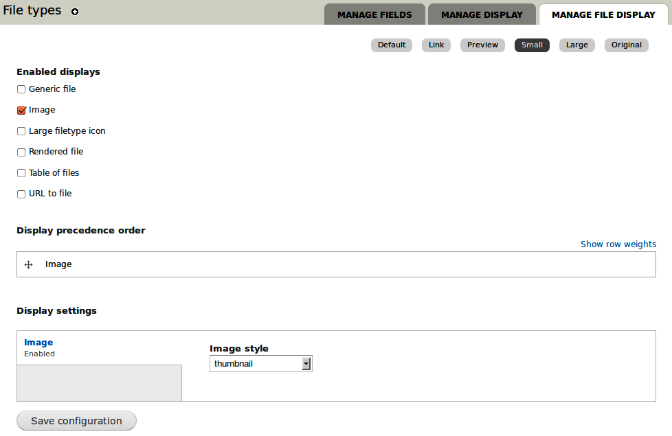
Next, return to the file types overview screen and click the “manage file display” link next to Image (admin/config/media/file-types/manage/image/file-display). This is where you configure the display of the file itself for the Small view mode. Check the box next to Image to enable and configure image display settings, and set its image style to “thumbnail” at the bottom of the page, as indicated in Table 4-11 and shown in Figure 4-28.
For the Large file view mode, the Media module provides us with good default settings, so we’ll leave those alone.
Sweet! We’ve set up our content type, added a file field for intro photos, and configured everything to display correctly. Go ahead and add some reviews (node/add/review) and see the power of the Media module, the media browser, and image styles in action. In particular, you should notice that when you’re viewing a review on its main review page, the image is large, but on the front page it’s much smaller.
Furthermore, if you add one or more tags to your reviews using the Tags field on the node form, you’ll see the tags appear on the node page after you submit the form. Clicking one of those tags will take you to the page listing all the nodes that have that tag attached. Tagging is explained in detail in Chapter 7.
We now have a site with most of the basic functionality the Band Wagon project needs to start. However, one important piece remains: streamlining the content editing process, and allowing easy image and video integration in posts.
By default, Drupal’s content entry is done with HTML. Like most Earthlings, the majority of John and Lisa’s music fan friends aren’t fluent in code, so it’s important that they are able to format their content and add images without seeing any spooky HTML. Not surprisingly, a number of community solutions to this issue have cropped up over the years:
- Toolbars
Some users can use HTML fine if they’re given a toolbar that inserts the tags on their behalf. The BUEditor module, pictured in Figure 4-29, is an example of a module that provides such a toolbar.
- Text-to-HTML translators
Modules such as Markdown Filter or Textile provide the ability to take simple text such as
**bold**and transform it into its HTML equivalent (<strong>bold</strong>). This syntax, once learned, is much easier and faster to type in than raw HTML.- What You See Is What You Get (WYSIWYG) editors
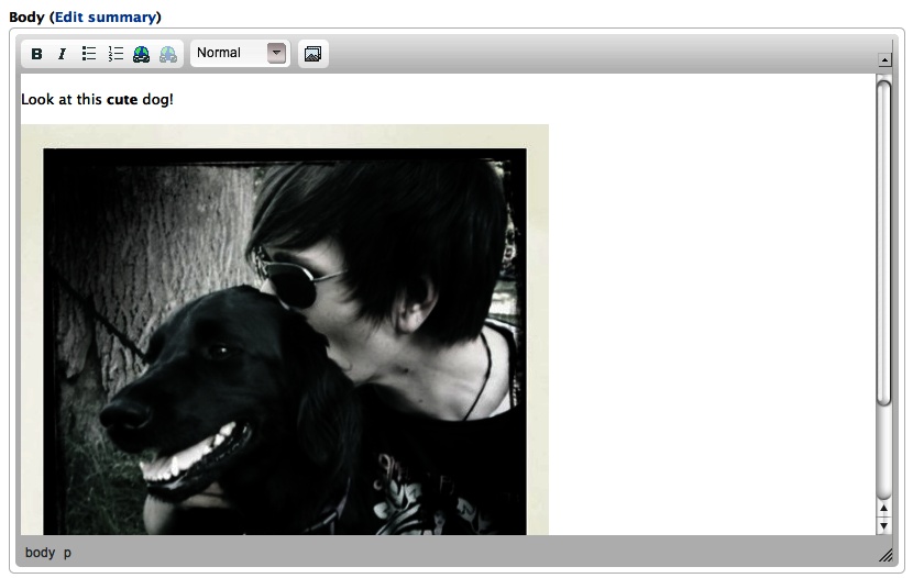
WYSIWYG editors not only provide a toolbar, but also display the formatting directly in the text area, which looks similar to a word processor, as pictured in Figure 4-30. There are two ways of adding a WYSIWYG editor to a Drupal site. You can either add a module that supports a specific editor, like CKeditor, or you can use the WYSIWYG module, which integrates a large number of existing WYSIWYG editors with Drupal. For the Band Wagon site, we’ll be using the WYSIWYG module option to ease the content editing process.
Warning
The further away from raw HTML entry you go, the greater chance there is that the “smart” WYSIWYG editing plug-in will get confused and choke on complex formatting. Subtle differences between web browsers, incompatibilities with the CSS that you’re using to customize your site, and other problems are all possible—if not common. Many times, the trade-off is still worth it, because the users of your site aren’t interested in learning the subtleties of HTML to make something bold or italic. But due to the pitfalls, it’s often best to ask, “Does my site really need this?” before dropping in a “pretty” HTML editor module.
In the past, one of the biggest criticisms of Drupal, apart from the fact that it didn’t (and unfortunately, still doesn’t) come with a WYSIWYG editor built in, was that it had no built-in image handling. Users had to either manually insert images in their posts, or choose one of the many available contributed modules to support images (and other media) on their site.
As we’ve seen earlier in this chapter, Drupal 7 has changed this. Out of the box, Drupal core now comes with an image field that allows users to upload images. For a lot of sites, this is exactly what they need: a way to add images to nodes and display them in a predefined size and position. An example might be an Album content type, which always has an Album Cover image on each individual node, placed in exactly the same place every time.
However, the Band Wagon site needs something more advanced. John and Lisa want to allow their friends to be able to freely mix photos and videos with their written content. This requires the ability to insert images in a text area, rather then in a fixed position on the node page. Luckily, the Media module that we use for photo and video support provides integration with the WYSIWYG module. We’ll learn more about this when we set up the WYSIWYG editor later in this chapter.
You may have noticed a funny fieldset on node and block body fields that we keep ignoring, called “Text format,” pictured in Figure 4-31. The text format you select for the content will affect how that content is displayed on the site. Text formats are an important security feature of Drupal, so it pays to understand them. A text format will “scan” your content and make HTML formatting changes to it before sending it to the browser for display. Each piece of content will be associated with a text format so that Drupal always knows what it is looking for and modifying, on a case-by-case basis.
The Text format select list in Figure 4-31 provides three choices, Filtered HTML, Full HTML, and “Plain text.” These are the default text formats that come with Drupal core. Sites can have several text formats to choose from; some can be provided by modules, like Drupal core’s PHP filter module, and you can also create custom formats. Text formats are restricted by roles so that you can allow everyone to use one text format, like Filtered HTML, but also make a more permissive text format, like Full HTML, available only to your most trusted users (e.g., the “site administrator” role).
Note
If a user reports a node’s edit tab as mysteriously missing when she should otherwise have access to it, check its text format. Drupal will disallow editing on content if the user’s role does not have access to the text format of the content. This behavior can be used to your advantage if you want to protect certain pages from editing by users who would otherwise have access to do so.
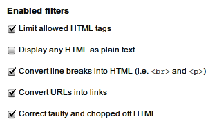
Text formats are composed of filters. Figure 4-32 shows the list of filters
that are used in the Filtered HTML text format. The filters are doing
the real work; the text format is simply a group of filters. A filter
modifies content and outputs the proper HTML for display. Filters can
transform new lines (carriage returns) into <br /> and <p> tags; transform a text URL such as
http://www.example.com into a clickable link, like
<a
      href="http://www.example.com">http://www.example.com</a>
;
and a whole lot more. The Media module uses its own filter to allow users to
securely add media assets directly in text fields.
Filters are really important for security on your site. People can do all kinds of malicious things when given a text entry box in a web browser. Using the filters that are specifically designed to help strip out malicious content, like the “Limit allowed HTML tags” filter, can save your site from being compromised.
Warning
The most important filter of all is “Limit allowed HTML tags.” It strips out dangerous HTML tags such as <script> and <object> and protects your site from
various sneaky attacks that could trick a browser into embedding
malicious JavaScript or other executable code. This filter is enabled
by default only on the Filtered HTML and “Plain text” formats. Make
sure that you implicitly trust anyone who has access to a format
without this filter included, such as Full HTML.
You order filters within text formats by assigning them “weights,” and the filter modifications happen in that sequence. You can see the default order for the Filtered HTML format in Figure 4-33. Many contributed modules let you add more filters to your site, and you can mix and match them as you like, either adding them to the existing text formats or making your own.
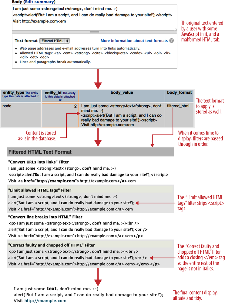
A very important point to understand about text formats is that they are applied only when the content is leaving the database and about to be displayed on the page. When a user enters content into a form and saves it, that content is stored in the database exactly the way it was written. When someone visits the page to view it, Drupal retrieves the raw information from the database; applies the text format that is associated with it, running through each filter in turn; and then displays the final result to the browser, as shown in Figure 4-34.
Warning
The order of the filters is extremely important. If your text doesn’t seem to be outputting properly, always check that the filters are in a logical sequence.
You should note that each filter is applying its own rules, in
turn, to get to the finished display. If we had set this particular
piece of content to use the Full HTML text format, instead of Filtered
HTML, then the end result would be a bit different. With Filtered HTML,
the text “alert(‘But I am a script, and I can do really bad damage to
your site!’);” is printed out to the screen because the <script> tags are removed prior to
display. With Full HTML, these tags would not be stripped and the script
in the text would be executed rather than displayed
as plain text. In this example, that script would cause a harmless
JavaScript window to pop up that has some text in it, but it could just
as easily be a malicious script that could wreak havoc.
Note
Because Drupal strips only on output, if you are using something in your content that is not allowed, you will still see it there when you go to edit it; it is just stripped on display. If you notice this happening and think you are going crazy, you should check the text format for the content and make sure it is not set to one that is designed to strip what you want to display. The most common instance of this behavior is when you’re trying to display an image using the Filtered HTML text format.
Let’s set up the WYSIWYG editor for the Band Wagon website, using the WYSIWYG module and CKEditor. Note that if you prefer a different WYSIWYG editor, such as TinyMCE or Aloha, the installation instructions are very similar.
In the administrative toolbar, click Modules (admin/modules), and enable the following modules:
User interface
WYSIWYG
Note
Users with the administrative role have access to the WYSIWYG configuration page. Permission for the actual WYSIWYG editor on node forms is regulated by the user’s permission to use the text format for which the editor is configured.
In the administrative toolbar, click Configuration→“Content authoring”→“Wysiwyg profiles” (admin/config/content/wysiwyg).
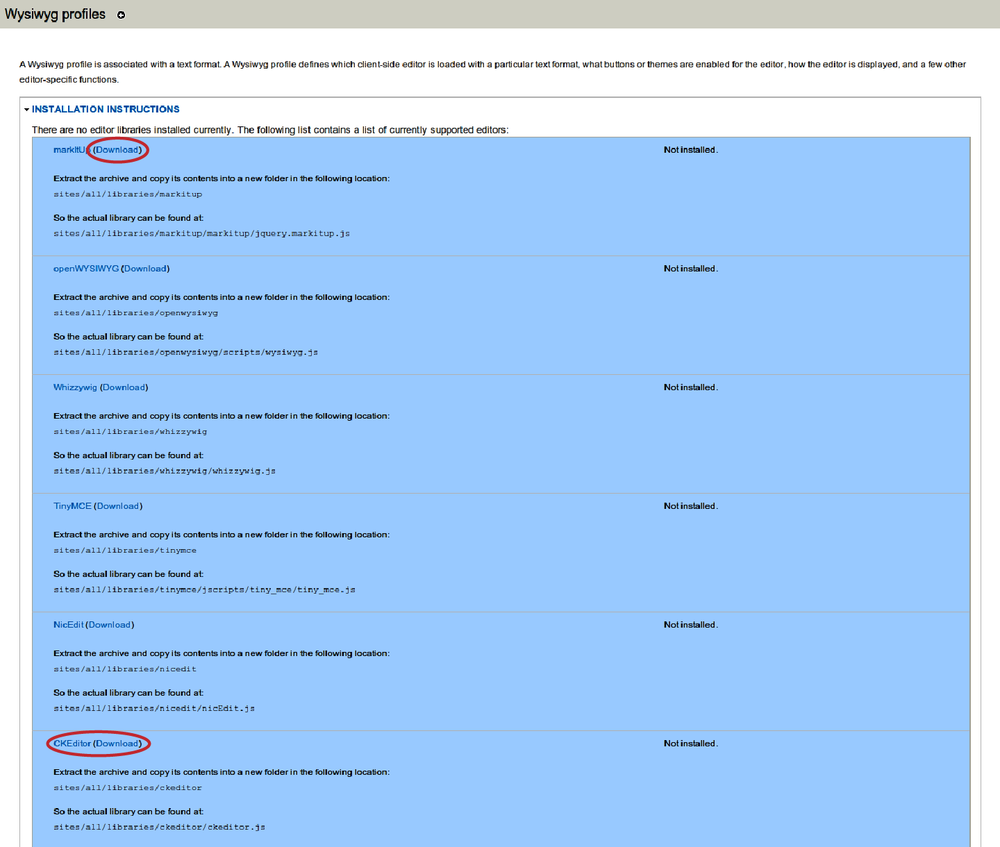
You’ll be presented with a screen that prompts you to download an editor for use in the WYSIWYG module, as pictured in Figure 4-35. The WYSIWYG module actually supports a number of different editors, as well as the ability to use many of them at a time and mix and match editors per text format. For our site, we’re going to keep things simple and just use one editor everywhere. If you are using the source code, you can skip to step 6 now, since you already have CKEditor downloaded. If you are not using the source code provided with the book, then you will need to download CKEditor yourself, by clicking the Download link next to CKEditor.
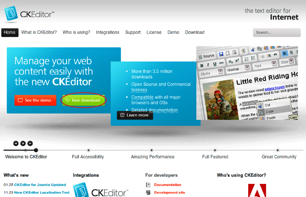
You’ll now be on the CKEditor website’s download page. Download the plain CKEditor library, not the “CKEditor for Drupal” version (which is a standalone module + plug-in package), pictured in Figure 4-36.
Note
In “real life,” you may actually want to use the bundled module and editor plug-in that CKEditor itself provides. It has a few additional features and deeper integration with the editor, so is worth evaluating for your needs. Sticking with the WYSIWYG module, however, gives you the flexibility to switch editors if you discover in testing that your users prefer a different one, and also helps ensure that the instructions in this book will work for readers with other editor interests as well.
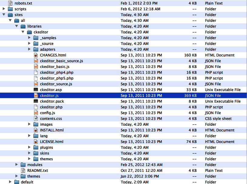
In your root Drupal directory, navigate to the sites/all directory. Create a new folder called libraries within that directory. Inside the new sites/all/libraries directory, extract the .zip file you just downloaded within the folder to create a sites/all/libraries/ckeditor directory, with a ckeditor.js inside. When you’re finished with this process, your sites directory should now look as pictured in Figure 4-37.
Note
Using the sites/all/libraries directory for third-party dependencies is a common pattern used in many contributed modules.
If these steps were completed correctly, when you return to the WYSIWYG settings page in Drupal at Configuration→“”Content authoring”→“Wysiwyg profiles” (admin/config/content/wysiwyg), you should now see a table with a selection of text formats instead of the screen you saw before. If you expand the “Installation instructions” fieldset below, you should see CKEditor at the top of the list in green.
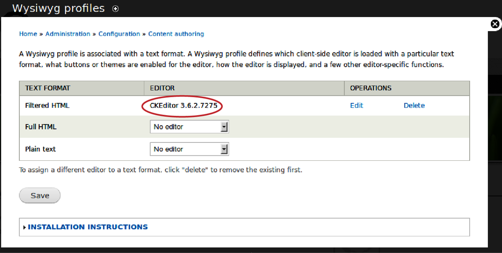
The WYSIWYG module allows us to create a separate profile for each of those formats. If we want to, we could even use a different editor per text format. For the Band Wagon site, we’ll create a profile for the Filtered HTML text format, using the CKEditor. Next to the Filtered HTML text format, select CKEditor, as pictured in Figure 4-38, and click Save. Next, click Edit under Operations to configure the profile.
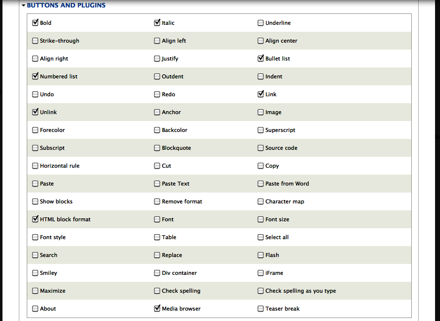
The next screen provides oodles of configuration options for your editor to customize its look and behavior. The default settings that the profile provides us with are pretty good for what the Band Wagon website needs. The only thing we need to configure are the buttons the users will be able to use when editing content. Click “Buttons and plugins” to open the fieldset, and enable the buttons shown in Table 4-12 and pictured in Figure 4-39.
If you return to the review creation form at “Create content”→Review (node/add/review), you’ll see that we now have a nice WYSIWYG toolbar on our body field, as shown in Figure 4-40. Awesome! You can click the “Add media” button on the far right, select a picture from your desktop, and see it drop right in, in all its image-y glory.
Hooray! We’re all done now, right? Right? BZZT. Wrong! Try
saving the form. What the? If your review
looks full of gibberish like [{"type":"media","view_mode":"media_large","fid":"2","attributes":{"alt":"","class":"media-image","height":"402","typeof":"foaf:Image","width":"314"}}]]
instead of like what the supposedly WYSIWYG editor showed
you, you might understandably be confused. Perhaps even upset. Worry
not! We’re just missing one last configuration detail.
What’s being shown here is the actual raw output provided by the “Add media” button. The Media module can read the gibberish strings and turn them into its own smart, sanitized creation of potentially dangerous tags, which the “Limit allowed HTML tags” filter normally strips out. But in order for this magic to work, we need to add Media’s filter to the Filtered HTML text format.
In the administrative toolbar, click Configuration→“Content authoring”→“Text formats” (admin/config/content/formats). You will see the available text formats listed.
Click the configure link for the Filtered HTML format (admin/config/content/formats/filtered_html).
Under “Enabled filters,” check the box for “Converts Media tags to Markup” and save the text format’s configuration. Media filter tags will now work properly.
Note
This same page is also how you expand the list of allowed tags that Filtered HTML will let through its clutches. Underneath “Filter settings,” click the “Limit allowed HTML tags” vertical tab to add more white-listed tags. Once again, though, since this filter represents a major component of the security of your site, be very cautious about which tags you allow here.
If you navigate back to the review you created earlier, you’ll see your picture now shows up as expected. Awesome!
The Media module for Drupal 7 not only supports adding and managing media that is uploaded from a user’s computer into Drupal, but it also comes with a submodule, called Media Internet Sources, that allows using media assets from various Internet locations. Media Internet Sources provides the interface and the central piece of functionality that other contributed modules can leverage to allow usage of media files in specific places.
For example, the Media: YouTube module allows users to post YouTube videos on a Drupal site by using the video’s URL or embed code. While Media: YouTube makes sure that Drupal can talk to YouTube, in order to fetch the correct video, Media Internet Sources provides the interface to add the video in Drupal.
There are several “provider modules” available. Media: Flickr allows users to post photos that are hosted on Flickr in Drupal, and Media: Vimeo allows the same for videos on Vimeo. The full list of provider modules can be found at http://groups.drupal.org/node/168009, under “Provider projects.” Check back regularly; developers continue to add support for various sites and services.
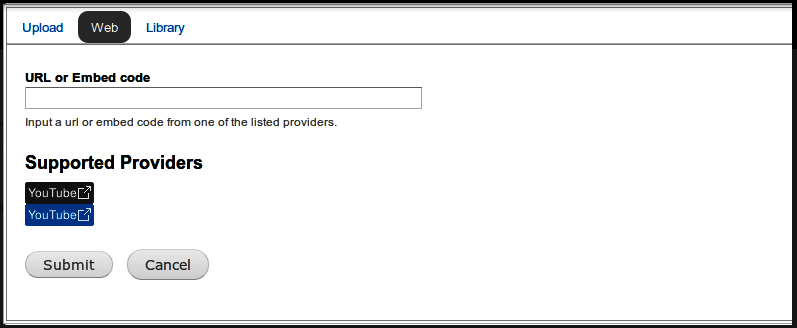
If you have a provider module enabled, like the Media: YouTube module, adding a video from YouTube (or whichever external service the module supports) is child’s play. In the Media Browser, there is a tab called Web, as shown in Figure 4-41. If you click it, you’ll see a simple form where you can paste the media asset’s external URL or its embed code (the code typically used to add external videos or photos to a site). The provider module will find the remote media asset and display it on your site. Since you added the external asset using Internet Media Sources, the asset will also be available to other users on the Drupal site.
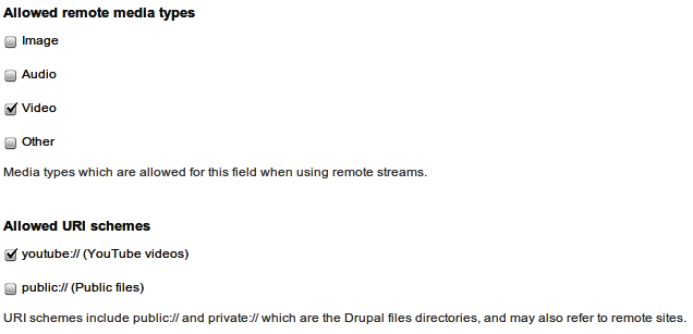
If you configure a file field to add media using the media browser, that field’s settings let you limit the remote media types to allow in the field. For example, you might only want to allow remote image files for a field that should only handle photos, or remote video files for a field where you want users to add a video from a third-party site. On top of that, you can control which providers a user can add remote media from by configuring the “Allowed URI schemes,” as shown in Figure 4-42.
Because we already installed the Media module, it’s really easy to enable support to post videos from YouTube on the Band Wagon site.
In the administrative toolbar, click Modules (admin/modules), and enable the following modules:
Media
Media Internet Sources
Media: YouTube
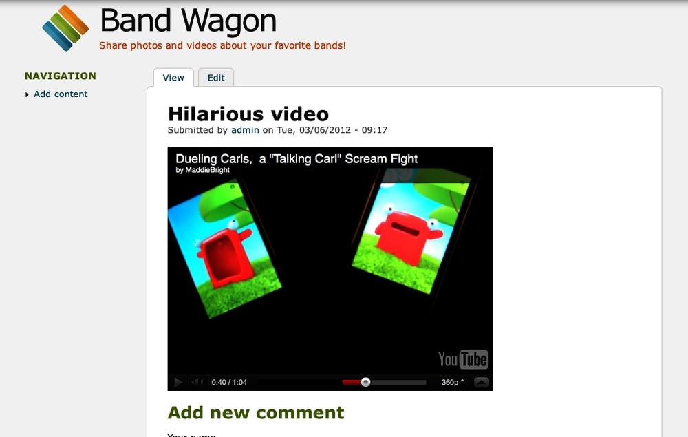
Go ahead and add a new review (node/add/review), and click the Media button in the WYSIWYG toolbar. Click the Web tab, paste the URL of your favorite YouTube video in the “URL or Embed code” field, and click Submit. When you save the new node, the YouTube video should appear, as pictured in Figure 4-43.
You can configure the display of remote video files in the file display settings that we learned about in Displaying Media Files. The Media: YouTube module allows you to configure the size of the video player for each display, and specify whether to automatically start the video when the content page loads.
Great! We have included support for adding remote media files, so users can post YouTube videos of their favorite bands. Note that you can mix and match text, videos, and photos, all by using the Media button in the WYSIWYG editor. This is a great way to create the attractive, multimedia-rich review pages that John and Lisa wanted.
If you’ve completed the Band Wagon site to this point, you’ve built a solid foundation for a Drupal-based music fan site! However, there’s no need to stop here. One of the great things about building a site with Drupal is that you can continuously refine it, adding new features to any part of your site. This section details a few additional pieces of functionality that are common in photo- and video-sharing websites. Also make sure to keep an eye on the list of modules that extend the Media module on http://groups.drupal.org/node/168009.
- Views Slideshow (http://drupal.org/project/views_slideshow)
Views Slideshow, a plug-in for the Views module, allows you to build fancy slideshows using any content you can display in a view. The module supports a lot of transition effects, options to set slide timing and to use different control widgets. Once the Media 7.x-2-x branch is released (which provides Views integration), combining it with Views Slideshow will open up a lot of possibilities.
- Fivestar (http://drupal.org/project/fivestar)
The Fivestar module allows users to vote on content using a star-voting widget. Several widget designs are available out of the box, with the ability to add your own. The Band Wagon could use this to allow visitors to vote on reviews and individual photos. Fortunately, this module is covered in the very next chapter, Chapter 5.
- Service Links (http://drupal.org/project/service_links)
Adding social network integration is a breeze with the Service Links module: it adds links or buttons to node pages to share content in Drupal on social network sites (Twitter, Facebook, Google+, etc.). There is support available for just about every existing social network, and with some PHP skills, you can add support for other services if necessary.
In this chapter, we introduced the Media and WYSIWYG modules to build a music fan site that allows users with limited technical knowledge to publish music reviews. We also used the image styles functionality of Drupal core’s Image module to crop and scale our photos so they look nice on our site. We discussed the option to enrich our community site with voting, slideshows, and social network integration.
Here are the modules that we referenced in this chapter:
Fivestar: http://drupal.org/project/fivestar
Image (core)
ImageCache Actions module: http://drupal.org/project/imagecache_actions
Media: Flickr: http://drupal.org/project/media_flickr
Media: YouTube: http://drupal.org/project/media_youtube
Service Links: http://drupal.org/project/service_links
Views Slideshow: http://drupal.org/project/views_slideshow
WYSIWYG: http://drupal.org/project/wysiwyg
Get Using Drupal, 2nd Edition now with the O’Reilly learning platform.
O’Reilly members experience books, live events, courses curated by job role, and more from O’Reilly and nearly 200 top publishers.
