Chapter 4. Time Series
The time series is a ubiquitous type of data set. It describes how some measurable feature (for instance, population, snowfall, or items sold) has changed over a period of time. Edward Tufte credits Johann Heinrich Lambert with the formal introduction of the time series to scientific literature in the 1700s.[2]
Because of its ubiquity, the time series is a good place to start when learning about visualization. With it we can cover:
Acquiring a table of data from a text file
Parsing the contents of the file into a usable data structure
Calculating the boundaries of the data to facilitate representation
Finding a suitable representation and considering alternatives
Refining the representation with consideration for placement, type, line weight, and color
Providing a means of interacting with the data so that we can compare variables against one another or against the average of the whole data set
For a straightforward data set, let’s turn to the U.S. Department of Agriculture (USDA) for statistics on beverage consumption. Government sites are a terrific resource for data; see Chapter 9 for more information about them and other sources of data.
Most methods will be implemented “by hand” in this section. Further down the line, we’ll make generalized code to handle different scenarios, such as reading a table from a file or placing labels and grid lines on a plot.
Milk, Tea, and Coffee (Acquire and Parse)
The data set we use was originally downloaded from http://www.ers.usda.gov/data/foodconsumption/foodavailqueriable.aspx.
The page lets you define a query to download a data set of interest. The site claims that the data is in Excel format, but a glance at the contents of the resulting file shows that it’s only an HTML file with an .xls extension that fools Excel into opening it. Rather than getting into the specifics of how to download and clean the data, I offer an already processed version here:
| http://benfry.com/writing/series/milk-tea-coffee.tsv |
This data set contains three columns: the first for milk, the second for coffee, and the third for tea consumption in the United States from 1910 to 2004.
To read this file, use this modified version of the Table class from the previous chapter:
| http://benfry.com/writing/series/floattable.pde |
The modified version handles data stored as float values, making it more efficient than
the previous version, which simply converted the data whenever getString( ), getFloat( ), or getInt( ) were used.
Open Processing and start a new sketch. Add both files to the sketch by either dragging each into the editor window or using Sketch → Add File.
Cleaning the Table (Filter and Mine)
It’s necessary to determine the minimum and maximum of each of the columns in the pre-filtered data set. These values are used to properly scale plotted points to locations on the screen.
The FloatTable class has
methods for calculating the min and max for the rows and columns. These
methods are worth discussing because they are important in later code.
The following example calculates the minimum value for a column
(comments denote important portions of the code):
  float getColumnMax(int col) {
    // Set the value of m to the lowest possible value,
    // so that the first value found will automatically be larger.
    float m = MIN_FLOAT;

    // Loop through each row.
    for (int row = 0; row < rowCount; row++) {

      // Only consider valid data elements (see later text).
      if (isValid(row, col)) {
        // Finally, check to see if the value
        // is greater than the maximum found so far.
        if (data[row][col] > m) {
          m = data[row][col];
        }
      }
    }
    return m;
  }
The isValid( ) method is
important because most data sets have incomplete data. In the milk-tea-coffee.tsv file, all of the data is
valid, but in most data sets (including others used in this chapter),
missing values require extra consideration.
Because the values for milk, coffee, and tea will be compared against one another, it’s necessary to calculate the maximum value across all of the columns. The following bit of code does this after loading the milk-tea-coffee.tsv file:
FloatTable data;
float dataMin, dataMax;

void setup(  ) {
  data = new FloatTable("milk-tea-coffee.tsv");

  dataMin = 0;
  dataMax = data.getTableMax(  );
}
Sometimes, it’s also useful to calculate the minimum value, but
setting the minimum to zero provides a more accurate comparison between
the three data sets. The minimum for this data set is 5.1, and the
values for the tea column hover around 6, so using 5.1 as the dataMin value would produce a chart that
looked as though the beverage history included periods of no (or nearly
no) tea consumption in the U.S. In addition, if the value is 6, it’s
important that the relative difference seen by the viewer is not just
0.9, but that it shows the full range from 0 up to 5.1 and how it
compares to a value of 6.
Each row name specifies a year, which will be used later to draw
labels on the plot. To make them useful in code, it’s also necessary to
get the minimum and maximum year after converting the entire group to an
int array. The getRowNames( ) method inside FloatTable returns a String array that can be converted with the
int( ) casting function:
FloatTable data;
float dataMin, dataMax;int yearMin, yearMax;
int[] years;

void setup(  ) {
  data = new FloatTable("milk-tea-coffee.tsv");
  years = int(data.getRowNames(  ));
  yearMin = years[0];
  yearMax = years[years.length - 1];

  dataMin = 0;
  dataMax = data.getTableMax(  );
}
A Simple Plot (Represent and Refine)
To begin the representation, it’s first necessary to set the
boundaries for the plot location. The plotX1, plotY1, plotX2, and plotY2 variables define the corners of the
plot. To provide a nice margin on the left, set plotX1 to 50, and then set the plotX2 coordinate by subtracting this value
from width. This keeps the two sides
even, and requires only a single change to adjust the position of both.
The same technique is used for the vertical location of the
plot:
FloatTable data;
float dataMin, dataMax;float plotX1, plotY1;
float plotX2, plotY2;

int yearMin, yearMax;
int[] years;


void setup(  ) {
  size(720, 405);

  data = new FloatTable("milk-tea-coffee.tsv");

  years = int(data.getRowNames(  ));
  yearMin = years[0];
  yearMax = years[years.length - 1];

  dataMin = 0;
  dataMax = data.getTableMax(  );

  // Corners of the plotted time series
  plotX1 = 50;
  plotX2 = width - plotX1;
  plotY1 = 60;
  plotY2 = height - plotY1;

  smooth(  );
}
Next, add a draw( ) method that
sets the background to a light gray and draws a filled white rectangle
for the plotting area. That will make the plot stand out against the
background, rather than a color behind the plot itself—which can muddy
its appearance.
The rect( ) function normally
takes the form rect(x, y, width,
height), but rectMode(CORNERS) changes the parameters to
rect(left, top, right, bottom), which
is useful because our plot’s shape is defined by the corners. Like other
methods that affect drawing properties, such as fill( ) and stroke(
), rectMode( ) affects all
geometry that is drawn after it until the next time rectMode( ) is called:
void draw(  ) {
  background(224);

  // Show the plot area as a white box.
  fill(255);
  rectMode(CORNERS);
  noStroke(  );
  rect(plotX1, plotY1, plotX2, plotY2);

  strokeWeight(5);
  // Draw the data for the first column.
  stroke(#5679C1);
  drawDataPoints(0);
}


// Draw the data as a series of points.
void drawDataPoints(int col) {
  int rowCount = data.getRowCount(  );
  for (int row = 0; row < rowCount; row++) {
    if (data.isValid(row, col)) {
      float value = data.getFloat(row, col);
      float x = map(years[row], yearMin, yearMax, plotX1, plotX2);
      float y = map(value, dataMin, dataMax, plotY2, plotY1);
      point(x, y);
    }
  }
}
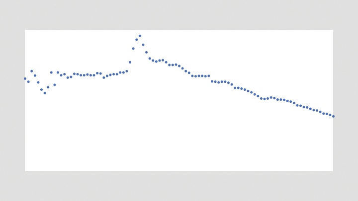
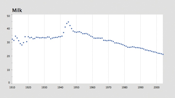
Because the data is drawn as points using the drawDataPoints( ) method, a stroke color and
weight are set. This method also takes a column index to draw as a
parameter. The results are in Figure 4-1. For the first step, I’ve shown
only the first column of data (the values for milk consumption).
The map( ) function does most
of the work. The x coordinate is
calculated by mapping the year for each row from yearMin and yearMax to plotX1 and plotX2. Another option would be to use the
row variable, instead of the
year:
float x = map(row, 0, rowCount-1, plotX1, plotX2);
But a value for row would be
less accurate because a year or two might be missing from the data set,
which would skew the representation. Again, this data set is complete,
but often that is not the case.
Labeling the Current Data Set (Refine and Interact)
Missing from the previous code is an indicator of the currently
visible column of data (whether milk, tea, or coffee) and a means to
swap between each of the three. For this, we add a variable to keep
track of the current column, and another for the font used for the
title. And few lines of code are added to the draw( ) method to write the name of the column
with the text( ) method:
FloatTable data;
float dataMin, dataMax;

float plotX1, plotY1;
float plotX2, plotY2;int currentColumn = 0;
int columnCount;

int yearMin, yearMax;
int[] years;

PFont plotFont;


void setup(  ) {
  size(720, 405);
  data = new FloatTable("milk-tea-coffee.tsv");
  columnCount = data.getColumnCount(  );

  years = int(data.getRowNames(  ));
  yearMin = years[0];
  yearMax = years[years.length - 1];

  dataMin = 0;
  dataMax = data.getTableMax(  );

  // Corners of the plotted time series
  plotX1 = 50;
  plotX2 = width - plotX1;
  plotY1 = 60;
  plotY2 = height - plotY1;

  plotFont = createFont("SansSerif", 20);
  textFont(plotFont);

  smooth(  );
}


void draw(  ) {
  background(224);

  // Show the plot area as a white box.
  fill(255);
  rectMode(CORNERS);
  noStroke(  );
  rect(plotX1, plotY1, plotX2, plotY2);

  // Draw the title of the current plot.
  fill(0);
  textSize(20);
  String title = data.getColumnName(currentColumn);
  text(title, plotX1, plotY1 - 10);

  stroke(#5679C1);
  strokeWeight(5);
  drawDataPoints(currentColumn);
}
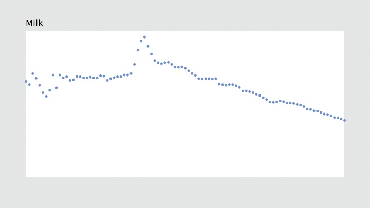
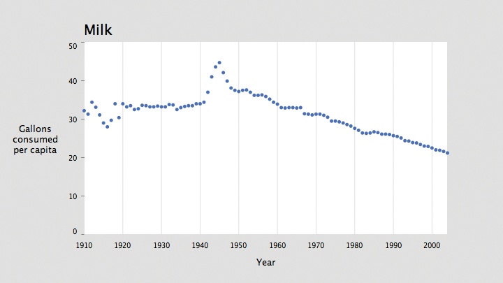
The text( ) line draws the text
10 pixels above plotY1, which
represents the top of the plot, and the drawDataPoints( ) line uses currentColumn instead of just 0. Results are
shown in Figure 4-2.
The createFont( ) function is
used to create a font from one of the built-in typefaces. The built-in
typefaces are Serif, SansSerif, Monospaced, Dialog, and DialogInput; they map to the default fonts on
each operating system. On Mac OS X, for instance, SansSerif maps to Lucida Sans, whereas on
Windows it maps to Arial. The default fonts are useful when you don’t
want to deal with the Create Font tool, but the font choices are not
particularly inspiring, and they don’t guarantee consistent output
across different operating systems. For instance, making pixel-level
decisions with a built-in font is a bad idea because the shaping and
spacing of the characters can be significantly different on other
operating systems.
One advantage of using createFont(
) is that the text will look smooth at any size, unlike a font
used with loadFont( ), which may be
distorted as it is resized.
It is possible to use createFont(
) to specify something besides a built-in font, but there’s no
guarantee that the font will be installed on another user’s system. This
can be useful for testing, after which you can use the Create Font tool
before deployment. The name of a font used by createFont( ) should be identical to how it is
listed in the Create Font tool. You can also get a list of the available
fonts with the PFont.list( ) method,
which returns a String array. The
following will print the list of all available fonts to the
console:
println(PFont.list( ));
Tip
If you have a lot of fonts installed on your system, there might be a long delay before they are listed.
The createFont( ) method can
also be used with a TrueType (.ttf)
or OpenType (.otf) file added to
the data folder. Most TrueType
fonts will work, but OpenType support varies by platform. Be mindful of
copyrighted fonts when using this method in a sketch for public
distribution.
A simple means of swapping between columns of data is to add a
keyPressed( ) method, which will
automatically run any time a key is pressed:
void keyPressed(  ) {
  if (key == '[') {
    currentColumn--;
    if (currentColumn < 0) {
      currentColumn = columnCount - 1;
    }
  } else if (key == ']') {
    currentColumn++;
    if (currentColumn == columnCount) {
      currentColumn = 0;
    }
  }
}
This method will rotate through the columns as the user presses
the [ and ] (bracket) keys. When the number gets too big or too small,
it wraps around to the beginning or end of the list. Because columnCount is 3, the possible currentColumn values are 0, 1, and 2. So, when
currentColumn reaches a value less
than zero, it wraps around to 2 (columnCount -
1).
Drawing Axis Labels (Refine)
An unlabeled plot has minimal utility. It clearly displays relative up or down swings, but without a sense of the time period or amounts to indicate the degree of swing, it’s impossible to know whether values have changed by, say, 5% or 50%. And some indication is required to explain that the horizontal axis represents the year and the vertical axis represents actual volumes: the amount consumed of a particular beverage, measured in gallons per capita per year.
There are clever (and complicated) means of selecting intervals, but for this project, we will pick the interval by hand. Choosing a proper interval and deciding whether to include major and minor tick marks depends on the data, but a general rule of thumb is that five intervals is at the low end, and more than ten is likely a problem. Too many labels make the diagram look like graph paper, and too few suggests that only the minimum and maximum values need to be shown.
The most important consideration is the way the data is used. Are minute, year-by-year comparisons needed? Always use the fewest intervals you can get away with, as long as the plot shows the level of detail the reader needs. Sometimes no labels are necessary—if values are only meant to be compared against one another. For instance, you might dispense with labels if you want to show only upward and downward trends. Other factors, such as the width of the plot, also play a role, so determining the correct level of detail usually requires a little trial and error.
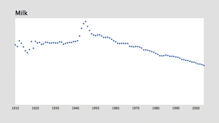
Year Labels
Creating the year axis is straightforward. The data ranges from
1910 to 2004, so an interval of 10 years means marking 10 individual
years: 1910, 1920, 1930, and so on, up to 2000. Add the yearInterval variable to the beginning of
the code before setup( ):
int yearInterval = 10;
Next, add the following function to draw the year labels:
void drawYearLabels(  ) {
  fill(0);
  textSize(10);
  textAlign(CENTER, TOP);
  for (int row = 0; row < rowCount; row++) {
    if (years[row] % yearInterval == 0) {
      float x = map(years[row], yearMin, yearMax, plotX1, plotX2);
      text(years[row], x, plotY2 + 10);
    }
  }
}
The fill color is set to black, the text size to 10, and the alignment to the middle so that the year number centers on the position of the data point for that year.
Two lines in this code deserve further consideration. The first
is the line that makes use of the %, or modulo, operator. A modulo operation
returns the remainder from a division. So, for example, 7 % 2 is equal
to 1, and 8 % 5 equals 3. It’s useful for drawing labels because it
provides a way to easily identify a year ending in 0. Dividing 1910 by
10 returns 0, so a label is drawn, whereas dividing 1911 by 10
produces 1, and so it continues until the loop reaches 1920, which
also returns 0 when divided by 10.
A second parameter to textAlign(
) sets the vertical alignment of the text. The options are
TOP, BOTTOM, CENTER, and BASELINE (the default). The TOP and CENTER parameters are straightforward. The
BOTTOM parameter is the same as
BASELINE when only one line of text
is used, but for multiple lines, the final line will be aligned to the
baseline, with the previous lines appearing above it. When only one
parameter is used, the vertical alignment resets to BASELINE.
The resulting image is shown in Figure 4-3.
Tip
To draw text that does not bump into the elements above it, you need to know the height of the tallest character in the font. Typographers refer to this as the ascent. Traditionally, the ascent of a font is the height to the top of a capital H character. Characters such as the capital O or a capital B are in fact slightly taller than the letter H and dip slightly below the baseline—the bottom line from which text is drawn. The ascent value essentially refers to the optical height of the font, which is the height perceived by our eyes.
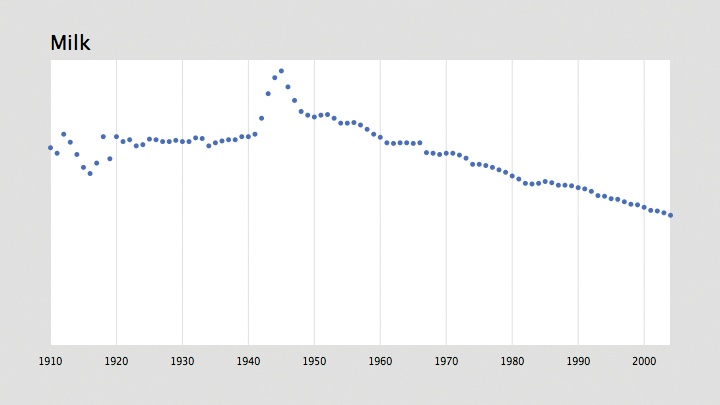
Simple grid lines can also help the presentation by identifying
each interval. The following modifications add a grid to the drawYearLabels( ) function:
void drawYearLabels(  ) {
  fill(0);
  textSize(10);
  textAlign(CENTER, TOP);// Use thin, gray lines to draw the grid.
  stroke(224);
  strokeWeight(1);

  for (int row = 0; row < rowCount; row++) {
    if (years[row] % yearInterval == 0) {
      float x = map(years[row], yearMin, yearMax, plotX1, plotX2);
      text(years[row], x, plotY2 + 10);
      line(x, plotY1, x, plotY2);
    }
  }
}
Figure 4-4 shows the result.
Notice that because the fill color does not affect lines, and a
stroke color does not affect text, it is not necessary to use noFill( ) or noStroke( ) in this method.
With a separate method to draw the year labels, it makes sense
to put the code that draws the title into its own method. The drawTitle( ) method takes this code from the
draw( ) function. Just replace the
title drawing code inside draw( )
with:
drawTitle( );
and then add the following method to the code:
void drawTitle(  ) {
  fill(0);
  textSize(20);
  textAlign(LEFT);
  String title = data.getColumnName(currentColumn);
  text(title, plotX1, plotY1 - 10);
}
Because the drawYearLabels( )
function changes the text alignment, a line is added to reset to
textAlign(LEFT) before drawing the
title. Otherwise, the title would appear centered at plotX1 on the next trip through the draw( ) method, inheriting the text
alignment settings from the previous draw(
).
Labeling Volume on the Vertical Axis
The vertical axis can be handled the same way as the horizontal,
but it is a bit trickier. A quick println(dataMax) added to setup( ) tells us that the maximum value is
46.4. Intervals of 10 will again suffice, this time producing only 5
divisions (as opposed to 10 in the horizontal):
int volumeInterval = 10;
With a dataMax value of 46.4
and intervals of 10, rounding up dataMax to the nearest interval will make
the maximum value on the plot 50, making it a little easier to read
changes in vertical values. To do so automatically, divide dataMax by volumeInterval. The result is 4.64. Next,
use ceil( ), which rounds a
float up to the next int value (in this case, 5), called the
ceiling of a float. Then, set dataMax to the rounded value multiplied by
volumeInterval. That calculation
took a few sentences to explain, but the code consists of a one-line
change to setup( ):
dataMax = ceil(data.getTableMax( ) / volumeInterval) * volumeInterval;
To draw the labels, create a loop that iterates from the minimum
to maximum data values. Use an increment of volumeInterval to draw a label at each
interval:
void drawVolumeLabels( ) {
fill(0);
textSize(10);
textAlign(RIGHT, CENTER);
for (float v = dataMin; v <= dataMax; v += volumeInterval) {
float y = map(v, dataMin, dataMax, plotY2, plotY1);
text(floor(v), plotX1 - 10, y);
}
}Add a draw VolumeLabels( ) call to the draw( ) method, next to drawTitle(
). When you’re drawing the text label, the floor(
) function removes decimals from the number value because there’s no need to
write 10.0, 20.0, 30.0, etc. when 10, 20, and 30 will suffice. If dataInterval included decimal points, the nf(
) method could be used instead to format the value to a specific number of
decimal places.
Tip
The text( ) method can draw
int or float values instead of just String objects. For float values, it is best to use the
nf( ) method to first convert the
float to a specific number of
decimal places. By default, text(
) will format a float
to three decimal places. That is different from Java, which can have
many digits in the decimal place for a float, because using just a
few digits is usually more useful for a graphical display. To get
the full 4-, 8-, or 15-digit version of the float value, use the
str( ) function to convert the
float to a String. For Java programmers, using
str( ) is equivalent to String.valueOf( ).
The x-coordinate of the label text is the lefthand edge of the
plot minus a few pixels. Also note the use of textAlign( ) to vertically center the
text.
With the vertical centering, the label drawn at 0 is visually a
little too close to the year markers below. In its current state, this
example is not detailed enough to be used for real analysis and is
better at showing upward and downward trends. In that context, it’s
clear from a glance that the bottom of the plot is 0, so the bottom
label could be left out completely. The same goes for the top value,
which gets close to the title. To leave these out, alter the first
value drawn by adding a volumeInterval to dataMin, and end the loop at v < dataMax instead of v <= dataMax so that the 50 won’t be
drawn:
void drawVolumeLabels( ) {
fill(0);
textSize(10);
textAlign(RIGHT, CENTER);float dataFirst = dataMin + volumeInterval;
for (float v = dataFirst; v < dataMax; v += volumeInterval) {
float y = map(v, dataMin, dataMax, plotY2, plotY1);
text(floor(v), plotX1 - 10, y);
}
}In other cases, it might not be appropriate to remove upper and
lower values. If dataMin were
something other than 0, or the intervals more awkward than simple
intervals of 10, viewers might be confused without the minimum and
maximum values. In such cases, the maximum value (50) can be
vertically aligned to the top of the plot, and the minimum value (0)
to the bottom, rather than centered vertically like the rest of the
labels:
void drawVolumeLabels( ) {
fill(0);
textSize(10);for (float v = dataMin; v <= dataMax; v += volumeInterval) {
float y = map(v, dataMin, dataMax, plotY2, plotY1);
if (v == dataMin) {
textAlign(RIGHT); // Align by the bottom
} else if (v == dataMax) {
textAlign(RIGHT, TOP); // Align by the top
} else {
textAlign(RIGHT, CENTER); // Center vertically
}
text(floor(v), plotX1 - 10, y);
}
}Horizontal lines can be fashioned in the same manner as those for the year. Choosing whether to use a horizontal or vertical grid depends on the axis with data that is most important to be measured. If this plot is being used to analyze exact changes in milk consumption, the horizontal gridlines will better help with identifying changes. But if the purpose is to compare upward and downward trends across different years (for instance, to understand how milk consumption changed during and after World War II), the vertical gridlines are more valuable. For this data set, it’s most interesting to compare changes over the years, so we’ll stick with vertical lines.
Instead of gridlines, small tick marks near the labels on the
vertical axis can be produced with the same technique, by drawing a
short line just outside the edge of the plot. Minor gridlines or tick
marks can be drawn by including a variable for a second interval
that’s a multiple of the first and incrementing by that interval in
the loop. The following modification to drawVolumeLabels( ) adds major and minor
tick marks to the volume axis:
int volumeIntervalMinor = 5; // Add this above setup( )void drawVolumeLabels( ) { fill(0); textSize(10);stroke(128); strokeWeight(1); for (float v = dataMin; v <= dataMax; v += volumeIntervalMinor) { float y = map(v, dataMin, dataMax, plotY2, plotY1); if (v % volumeInterval == 0) { // If a major tick mark if (v == dataMin) { textAlign(RIGHT); // Align by the bottom } else if (v == dataMax) { textAlign(RIGHT, TOP); // Align by the top } else { textAlign(RIGHT, CENTER); // Center vertically } text(floor(v), plotX1 - 10, y); line(plotX1 - 4, y, plotX1, y); // Draw major tick } else { line(plotX1 - 2, y, plotX1, y); // Draw minor tick } } }
The result with the tick marks and vertical labels is shown in Figure 4-5.
Strictly speaking, the minor tickmarks in this example are not very informative. They can be removed to avoid visual clutter; simply comment out the line that draws the minor ticks.
Bringing It All Together and Titling Both Axes
So far, anyone looking at this diagram should be able to guess that it has something to do with milk from 1910 to sometime after 2000. To further explain the plot, the next step is to provide titles for the year and volume axes. Informative axis titles are important for the people viewing your data.
The year axis title is simple: just a piece of text centered
between plotX1 and plotX2. After centering the text in both
directions with textAlign(CENTER,
CENTER), the text is drawn centered between plotY1 and plotY2. To fit both, the values for plotX1 and friends must be changed to make
room for the labels. In this case, eyeballing the placement is
sufficient, though textWidth( )
could be used to accurately size the lefthand margin, and textAscent( ) could do the same for the
label below.
For the vertical axis, it might be tempting to rotate the title
on its side, but more often than not it is more effective at giving
your viewer eyestrain than it is at communicating. I’ve kept the text
horizontal and broken the label into three lines by inserting newline
characters (\n) into the
string.
Figure 4-6 shows our progress.
Here’s the code listing for the program thus far, with the lines highlighted that were altered to display the titles:
FloatTable data; float dataMin, dataMax; float plotX1, plotY1; float plotX2, plotY2;float labelX, labelY; int rowCount; int columnCount; int currentColumn = 0; int yearMin, yearMax; int[] years; int yearInterval = 10; int volumeInterval = 10; int volumeIntervalMinor = 5; PFont plotFont; void setup( ) { size(720, 405); data = new FloatTable("milk-tea-coffee.tsv"); rowCount = data.getRowCount( ); columnCount = data.getColumnCount( ); years = int(data.getRowNames( )); yearMin = years[0]; yearMax = years[years.length - 1]; dataMin = 0; dataMax = ceil(data.getTableMax( ) / volumeInterval) * volumeInterval; // Corners of the plotted time series plotX1 = 120; plotX2 = width - 80; labelX = 50; plotY1 = 60; plotY2 = height - 70; labelY = height - 25; plotFont = createFont("SansSerif", 20); textFont(plotFont); smooth( ); } void draw( ) { background(224); // Show the plot area as a white box fill(255); rectMode(CORNERS); noStroke( ); rect(plotX1, plotY1, plotX2, plotY2); drawTitle( ); drawAxisLabels( ); drawYearLabels( ); drawVolumeLabels( ); stroke(#5679C1); strokeWeight(5); drawDataPoints(currentColumn); } void drawTitle( ) { fill(0); textSize(20); textAlign(LEFT); String title = data.getColumnName(currentColumn); text(title, plotX1, plotY1 - 10); } void drawAxisLabels( ) { fill(0); textSize(13); textLeading(15); textAlign(CENTER, CENTER); // Use \n (aka enter or linefeed) to break the text into separate lines. text("Gallons\nconsumed\nper capita", labelX, (plotY1+plotY2)/2); textAlign(CENTER); text("Year", (plotX1+plotX2)/2, labelY); } void drawYearLabels( ) { fill(0); textSize(10); textAlign(CENTER, TOP); // Use thin, gray lines to draw the grid. stroke(224); strokeWeight(1); for (int row = 0; row < rowCount; row++) { if (years[row] % yearInterval == 0) { float x = map(years[row], yearMin, yearMax, plotX1, plotX2); text(years[row], x, plotY2 + 10); line(x, plotY1, x, plotY2); } } } void drawVolumeLabels( ) { fill(0); textSize(10); stroke(128); strokeWeight(1); for (float v = dataMin; v <= dataMax; v += volumeIntervalMinor) { float y = map(v, dataMin, dataMax, plotY2, plotY1); if (v % volumeInterval == 0) { // If a major tick mark if (v == dataMin) { textAlign(RIGHT); // Align by the bottom } else if (v == dataMax) { textAlign(RIGHT, TOP); // Align by the top } else { textAlign(RIGHT, CENTER); // Center vertically } text(floor(v), plotX1 - 10, y); line(plotX1 - 4, y, plotX1, y); // Draw major tick } else { // Commented out; too distracting visually //line(plotX1 - 2, y, plotX1, y); // Draw minor tick } } } void drawDataPoints(int col) { for (int row = 0; row < rowCount; row++) { if (data.isValid(row, col)) { float value = data.getFloat(row, col); float x = map(years[row], yearMin, yearMax, plotX1, plotX2); float y = map(value, dataMin, dataMax, plotY2, plotY1); point(x, y); } } } void keyPressed( ) { if (key == '[') { currentColumn--; if (currentColumn < 0) { currentColumn = columnCount - 1; } } else if (key == ']') { currentColumn++; if (currentColumn == columnCount) { currentColumn = 0; } } }
Choosing a Proper Representation (Represent and Refine)
A series of points can be difficult to follow if they’re not connected. It’s not as easy to compare milk and coffee in these images, for instance, because the predominant difference between the two plots is that the coffee values are far more erratic than those for milk. Instead of a specific shape, the points make an indeterminate cloud that is difficult to make sense of at a quick glance.
When values are truly a series and there is no missing data, it’s
possible to use a line graph and simply connect the points. The beginShape( ) and endShape( ) methods provide a means for
drawing irregular shapes. The vertex(
) method adds a single point to the shape. To connect the dots
in a line, replace the point( )
method with vertex( ).
Three examples follow that show the basic drawing modes of
beginShape( ) and endShape( ). See Figure 4-7. Using noFill( ) will produce the image at left, and
the default fill and stroke settings will produce the image in the
center. The CLOSE parameter in the
endShape( ) method handles the
connection of the final point to the first, so that the stroke
completely outlines the shape. Always use endShape(CLOSE) when closing a shape because
the alternative—repeating the first point—may cause unexpected visual
defects.
// Leftmost image: fill disabled and the default stroke noFill( ); beginShape( ); vertex(10, 10); vertex(90, 30); vertex(40, 90); vertex(50, 40); endShape( ); // Center image: default fill (white) and stroke (black) beginShape( ); vertex(10, 10); vertex(90, 30); vertex(40, 90); vertex(50, 40); endShape( ); // Rightmost image: default fill and stroke, closed shape beginShape( ); vertex(10, 10); vertex(90, 30); vertex(40, 90); vertex(50, 40); endShape(CLOSE);
To represent a time series, we want a simple line with no fill, so
we’ll use the nofill( ) form of the
shape. The following method is a variation of drawPoints( ) that draws the data with
beginShape( ) and endShape( ), with the alterations
highlighted:
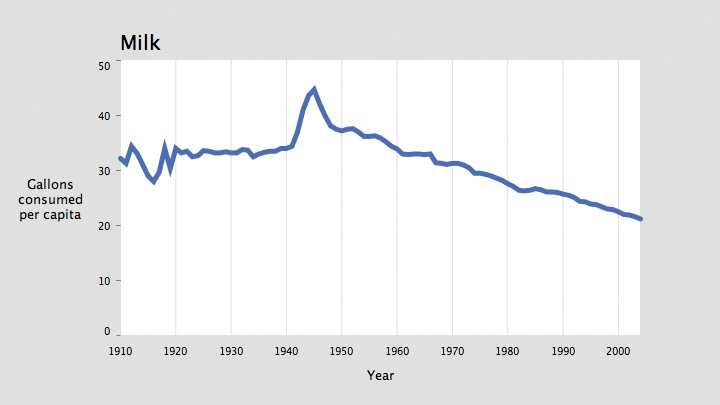
void drawDataLine(int col) { beginShape( ); int rowCount = data.getRowCount( ); for (int row = 0; row < rowCount; row++) { if (data.isValid(row, col)) { float value = data.getFloat(row, col); float x = map(years[row], yearMin, yearMax, plotX1, plotX2); float y = map(value, dataMin, dataMax, plotY2, plotY1);vertex(x, y); } } endShape( ); }
Inside draw( ), comment out the
line that reads:
drawDataPoints(currentColumn);
by placing a pair of slashes (//) in front of it. On the line that follows,
add:
noFill( ); drawDataLine(currentColumn);
The noFill( ) command is
important; without it, the shape would have a strange black background
because the fill was last set to black in the prior lines that draw the
text label for the plot. This version of the code produces the image
shown in Figure 4-8.
It could also be used to draw all three series (milk, tea, and
coffee) on a single plot. To do this, call drawDataLine( ) once for each of the three
columns, and set a different stroke color for each.
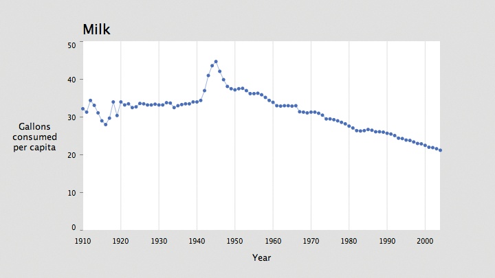
It’s also easy to mix lines and points in the representation to
create a background line that highlights the individual data points. To
do so, set the stroke weight to something smaller while drawing the
lines and keep the thicker weight for the points. Modify the end of
draw( ) to read as follows:
stroke(#5679C1); strokeWeight(5); drawDataPoints(currentColumn); noFill( ); strokeWeight(0.5); drawDataLine(currentColumn);
The result appears in Figure 4-9.
Note that the functions themselves should not be merged, as other
shape commands (such as point( )) are
not permitted inside a beginShape( )
and endShape( ) block.
Depending on how you use this code, it may be important to draw the points after the lines. For example, if you set the stroke of the line to a light gray, it would be best to draw the blue points on top of the line so that the points are not bisected by an odd gray line (which has poor contrast with blue).
Using Rollovers to Highlight Points (Interact)
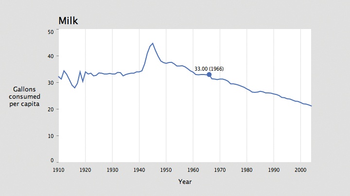
The lines and points combination is overkill for this data set: there are so many data points horizontally that the individual dots (at a size of five pixels) are nearly the size of the space allotted for each data point (around seven pixels), leaving only two pixels between them. Another option is to highlight individual points when the mouse is nearby. This is technique is nearly identical to the one used at the end of the previous chapter, and the function looks like the following:
void drawDataHighlight(int col) {
for (int row = 0; row < rowCount; row++) {
if (data.isValid(row, col)) {
float value = data.getFloat(row, col);
float x = map(years[row], yearMin, yearMax, plotX1, plotX2);
float y = map(value, dataMin, dataMax, plotY2, plotY1);
if (dist(mouseX, mouseY, x, y) < 3) {
strokeWeight(10);
point(x, y);
fill(0);
textSize(10);
textAlign(CENTER);
text(nf(value, 0, 2) + " (" + years[row] + ")", x, y-8);
}
}
}
}The stroke weight for the point is set to 10 because the weight
used in the drawDataPoints( ) method
(5) would not contrast enough with the rest of the image. Similarly, the
stroke weight for the lines is set to 2, rather than the 0.5 stroke used
when combining drawDataLines( ) and
drawDataPoints( ), because it should
stand out more. But strokeWeight(2)
is still thinner than the strokeWeight(5) used when the drawDataLines( ) method is run by itself
because if the line itself is too thick, the rollover won’t be prominent
enough.
The modified draw( ) method to
draw the highlight follows:
void draw( ) {
background(224);
// Show the plot area as a white box.
fill(255);
rectMode(CORNERS);
noStroke( );
rect(plotX1, plotY1, plotX2, plotY2);
drawTitle( );
drawAxisLabels( );
drawYearLabels( );
drawVolumeLabels( );
stroke(#5679C1);noFill( );
strokeWeight(2);
drawDataLine(currentColumn);
drawDataHighlight(currentColumn);
}An image of the result is shown in Figure 4-10.
Ways to Connect Points (Refine)
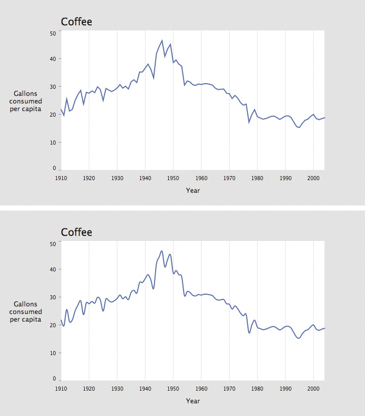
Connecting the points with a curve is often a better option
because it prevents the spikiness of the plot from overwhelming the data
itself. The curveVertex( ) function
is similar to the vertex( ) function,
except that it connects successive points by fitting them to a
curve.
The drawDataCurve( ) method, a
modification of drawDataLine( ),
follows:
void drawDataCurve(int col) {
  beginShape(  );
  for (int row = 0; row < rowCount; row++) {
    if (data.isValid(row, col)) {
      float value = data.getFloat(row, col);
      float x = map(years[row], yearMin, yearMax, plotX1, plotX2);
      float y = map(value, dataMin, dataMax, plotY2, plotY1);curveVertex(x, y);
      // Double the curve points for the start and stop
      if ((row == 0) || (row == rowCount-1)) {
        curveVertex(x, y);
      }
    }
  }
  endShape(  );
}
To draw a curve with curveVertex(
), at least four points are necessary because the first and
last coordinates in curveVertex( )
are used to guide the angle at which the curve begins and ends. In this
particular example, doubling start and stop points will work fine. In
other cases, additional points can be used to maintain continuity
between two connected curves.
The results of using a smooth curve can be seen most clearly when
comparing the coffee data drawn with vertex(
) and curveVertex( ) in
Figure 4-11.
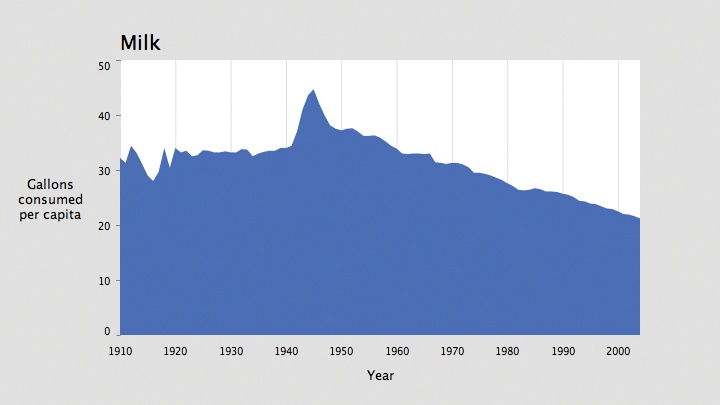
Showing Data As an Area
Another variation of drawDataLine(
) draws the values as a filled area. Before calling endShape( ), add the lower-right corner and
then the lower-left corner to complete the outline of the shape to be
filled. And instead of endShape( )
with no parameters, use endShape(CLOSE) to close it, reconnecting it
to the first vertex.
The new drawDataArea( )
function is:
void drawDataArea(int col) {  beginShape(  );
  for (int row = 0; row < rowCount; row++) {
    if (data.isValid(row, col)) {
      float value = data.getFloat(row, col);
      float x = map(years[row], yearMin, yearMax, plotX1, plotX2);
      float y = map(value, dataMin, dataMax, plotY2, plotY1);
      vertex(x, y);
    }
  }// Draw the lower-right and lower-left corners.
  vertex(plotX2, plotY2);
  vertex(plotX1, plotY2);
  endShape(CLOSE);
}
Next, modify the end of the draw(
) method to replace the stroke(#5679C1) line with fill(#5679C1), and change noFill( ) to noStroke( ); drawing an outline around an
already filled shape is unnecessary:
  noStroke(  );
  fill(#5679C1);
  drawDataArea(currentColumn);
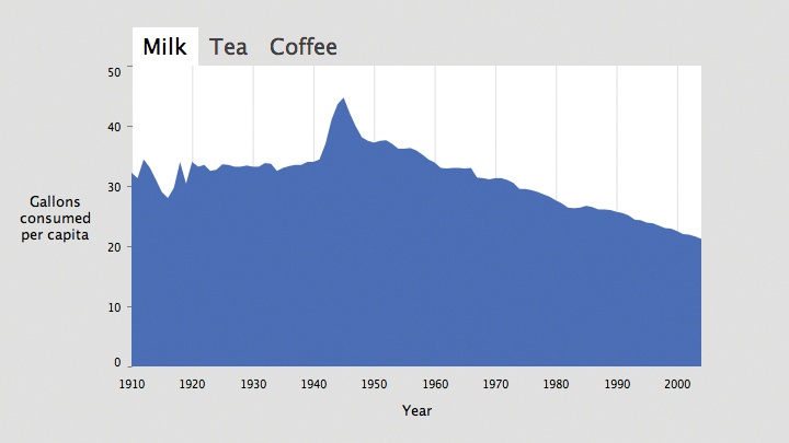
The new plot is shown in Figure 4-12.
This makes a more attractive plot, and because the data set considers the actual volume of consumption—that is, the vertical axis starts at 0—it makes sense to fill the area beneath the data points. Whenever filling a plot, consider whether the data being shown refers to some kind of actual area or volume. For instance, it would not be appropriate to fill the area beneath a plot of temperature because the lower bound is arbitrary (unless you’re measuring temperatures above absolute zero). A graph of rainfall, however, refers to the actual volume or amount that can be measured upward from “none,” making it a candidate for a filled plot.
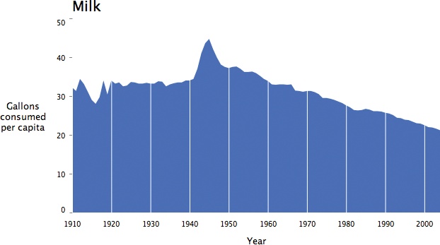
Further Refinements and Erasing Elements
The highest priority of any information graphic is to place the
data it represents first and foremost. A filled area can seem too much
like the background, so sometimes it’s best to remove the background.
Without the gray background, the grid lines become awkward without
some kind of box around them to contain the plot. A box adds no
additional usefulness, just clutters the composition, so a better
option is to remove the background and make the gridlines part of the
graphic itself by setting their color to white. To draw the gridlines
on top of the data, move the drawYearLabels(
) method after drawDataArea(
) inside draw( ) so that
the grid lines will be drawn after the filled shape. The new draw( ) method is very sparse:
void draw( ) {
background(255);
drawTitle( );
drawAxisLabels( );
drawVolumeLabels( );
noStroke( );
fill(#5679C1);
drawDataArea(currentColumn);
drawYearLabels( );
}Inside drawYearLabels( ), use
stroke(255) instead of stroke(224) to make the gridlines white. The
results are shown in Figure 4-13.
Such minimization of graphic elements has long been the province of those who champion a “less is more” approach to design. Edward Tufte later popularized this approach in his series of books on information graphics.
Discrete Values with a Bar Chart (Represent)
When values are discrete and cannot be shown in a series, a bar chart might be more suitable. A common example is when data is missing and therefore does not represent a complete series. Drawing a bar chart is a matter of using rectangles instead of individual points, and then drawing the data centered at each horizontal location.
The following replacement for drawDataArea( ) creates a bar chart:
float barWidth = 4; // Add to the top of the page, before setup(  )

void drawDataBars(int col) {  noStroke(  );rectMode(CORNERS);

  for (int row = 0; row < rowCount; row++) {
    if (data.isValid(row, col)) {
      float value = data.getFloat(row, col);
      float x = map(years[row], yearMin, yearMax, plotX1, plotX2);
      float y = map(value, dataMin, dataMax, plotY2, plotY1);
      rect(x-barWidth/2, y, x+barWidth/2, plotY2);
    }
  }
}
Here, the barWidth variable
makes the bars four pixels wide. Calculating widths for a bar chart
can be done with algebra (by dividing the distance between plotX2 and plotX1 by the number of rows of data) or by
trial and error.
It’s also necessary to disable the lines drawn in drawYearLabels( ) because vertical grid
lines will conflict with the bars.
Unfortunately, this is too much data to show at this width, resulting in the vibrating texture shown in Figure 4-14, which looks more like a swatch of patterned fabric.
This example highlights an important consideration: when deciding on a representation, use a bar chart only when there’s enough room to leave clear gaps between bars.
Once a bar chart is laid out properly, the method of using white grid lines in Figure 4-13 could be better utilized to highlight the divisions on the left axis by erasing thin horizontal lines across the plot. Like the version that sliced the area plot into individual decades, this would provide another cue to help the viewer quickly read data values.
Text Labels As Tabbed Panes (Interact)
Using keys to navigate an interface should be used only during
testing. A more sophisticated method is to use on-screen buttons, as
users expect from a modern interface. This section describes how to
replace the drawTitle( ) function
with drawTitleTabs( ) to introduce a
series of tabbed panel—one for each data series.
Adding the Necessary Variables
The tabTop and tabBottom variables specify the upper and
lower edge of the tabs. The tabLeft
and tabRight variables store the
coordinates for the left and right edges of each tab so that we can
detect mouse clicks inside the tabs. The tabPad variable specifies the amount of
padding on the left and right of the tab text:
float[] tabLeft, tabRight; // Add above setup(  )
float tabTop, tabBottom;
float tabPad = 10;
Drawing Tabs Instead of a Single Title
The important part of this method keeps track of a value named
runningX to calculate the positions
of each tab. The width of each tab is calculated using textWidth( ), and the tabPad value is added to provide padding on
the sides:
void drawTitleTabs(  ) {
  rectMode(CORNERS);
  noStroke(  );
  textSize(20);
  textAlign(LEFT);

  // On first use of this method, allocate space for an array
  // to store the values for the left and right edges of the tabs.
  if (tabLeft == null) {
    tabLeft = new float[columnCount];
    tabRight = new float[columnCount];
  }

  float runningX = plotX1;
  tabTop = plotY1 - textAscent(  ) - 15;
  tabBottom = plotY1;

  for (int col = 0; col < columnCount; col++) {
    String title = data.getColumnName(col);
    tabLeft[col] = runningX;
    float titleWidth = textWidth(title);
    tabRight[col] = tabLeft[col] + tabPad + titleWidth + tabPad;

    // If the current tab, set its background white; otherwise use pale gray.
    fill(col == currentColumn ? 255 : 224);
    rect(tabLeft[col], tabTop, tabRight[col], tabBottom);

    // If the current tab, use black for the text; otherwise use dark gray.
    fill(col == currentColumn ? 0 : 64);
    text(title, runningX + tabPad, plotY1 − 10);

    runningX = tabRight[col];
  }
}
This piece of code also introduces the conditional operator,
identified by the ?. The
conditional statement:
fill(col == currentColumn ? 0 : 64);
is equivalent to writing:
if (col == currentColumn) {
  fill(0);
} else {
  fill(64);
}
The benefit of the former is compact code: a single line instead
of five. The conditional operator is most useful in situations such as
this one, where a simple if test is
used to control something straightforward like the fill color. In this
case, it can be argued that the shorter code is more readable than all
five lines. However, use the conditional operator sparingly because
overuse can result in code that is difficult to read.
Handling Mouse Input
Next, we’ll add the mousePressed(
) method, which tests whether the mouse is inside one tab or
another. This method is a simple matter of iterating through each tab
and checking the mouseX and
mouseY coordinates against the
variables that contain the boundaries of each tab rectangle. If the
mouseY value is in the correct
range, mouseX is tested against
each tabLeft and tabRight value. If inside, the value of
currentColumn is updated with the
setColumn( ) method:
void mousePressed(  ) {
  if (mouseY > tabTop && mouseY < tabBottom) {
    for (int col = 0; col < columnCount; col++) {
      if (mouseX > tabLeft[col] && mouseX < tabRight[col]) {
        setColumn(col);
      }
    }
  }
}

void setColumn(int col) {
  if (col != currentColumn) {
    currentColumn = col;
  }
}
The setColumn( ) method is
expressed in a separate piece of code because it will be modified in
the next section, and the keyPressed(
) method should simply be removed.
Finally, the result is shown in Figure 4-15.
Better Tab Images (Refine)
The tabs in Figure 4-15 look pretty boring, but some tweaking of the text, the colors, and a line here and there could improve them. Another option is to load the tabs from a series of image files. Three separate image files would be used for the nonselected state of the tabs, and three others would be used for the selected state. Then, instead of setting the fill differently for the rectangle and the text title, one of the six images would be used in its place. A modified version of the code looks like this:
float[] tabLeft, tabRight; // Add above setup(  )
float tabTop, tabBottom;
float tabPad = 10;PImage[] tabImageNormal;
PImage[] tabImageHighlight;

void drawTitleTabs(  ) {
  rectMode(CORNERS);
  noStroke(  );
  textSize(20);
  textAlign(LEFT);

  // Allocate the tab position array, and load the tab images.
  if (tabLeft == null) {
    tabLeft = new float[columnCount];
    tabRight = new float[columnCount];

    tabImageNormal = new PImage[columnCount];
    tabImageHighlight = new PImage[columnCount];
    for (int col = 0; col < columnCount; col++) {
      String title = data.getColumnName(col);
      tabImageNormal[col] = loadImage(title + "-unselected.png");
      tabImageHighlight[col] = loadImage(title + "-selected.png");
    }
  }

  float runningX = plotX1;
  tabBottom = plotY1;
  // Size based on the height of the tabs by checking the
  // height of the first (all images are the same height)
  tabTop = plotY1 - tabImageNormal[0].height;

  for (int col = 0; col < columnCount; col++) {
    String title = data.getColumnName(col);
    tabLeft[col] = runningX;
    float titleWidth = tabImageNormal[col].width;
    tabRight[col] = tabLeft[col] + tabPad + titleWidth + tabPad;

    PImage tabImage = (col == currentColumn) ?
      tabImageHighlight[col] : tabImageNormal[col];
    image(tabImage, tabLeft[col], tabTop);

    runningX = tabRight[col];
  }
}
When preparing the images, be sure to keep their heights the same. As with the text version, the widths of the titles can vary, but the width of the selected versus non-selected version should always be the same. The images should be named based on the title of each column, so, in this case, the following six files are used:
Milk-selected.png
Tea-selected.png
Coffee-selected.png
Milk-unselected.png
Tea-unselected.png
Coffee-unselected.png
For those who want to use standard interface components instead of making their own, later chapters cover integrating Processing with Java code. Custom components are useful when a unique interface is preferred, but they are less helpful if a standard interface is more appropriate for your audience.
Interpolation Between Data Sets (Interact)
Chapter 3 showed how to interpolate between
values in a data set with the use of the Integrator class. Download itfrom http://benfry.com/writing/series/Integrator.pde.
The changes are identical to those in the previous chapter. First,
declare the array of Integrator
objects before setup( ):
Integrator[] interpolators;
Inside setup( ), create each
Integrator and set its initial
value:
  interpolators = new Integrator[rowCount];
  for (int row = 0; row < rowCount; row++) {
    float initialValue = data.getFloat(row, 0);
    interpolators[row] = new Integrator(initialValue);
    interpolators[row].attraction = 0.1; // Set lower than the default
  }
The attraction value is set to
0.1 (instead of the default, 0.2) so that the interpolation occurs at a
less frantic pace.
In draw( ), each Integrator is updated:
   for (int row = 0; row < rowCount; row++) {
    interpolators[row].update(  );
  }
Next, for whatever variation of the drawData( ) function you would like to use,
replace its data.getFloat( ) line.
The original looks like this:
float value = data.getFloat(row, col);
Change the line to the following to use the interpolated values:
float value = interpolators[row].value;
Finally, modify setColumn( ) to
set each Integrator to target the
value for the current column:
void setColumn(int col) {
  currentColumn = col;

  for (int row = 0; row < rowCount; row++) {
    interpolators[row].target(data.getFloat(row, col));
  }
}
The final code, with modifications highlighted, follows:
FloatTable data;
float dataMin, dataMax;

float plotX1, plotY1;
float plotX2, plotY2;
float labelX, labelY;

int rowCount;
int columnCount;
int currentColumn = 0;

int yearMin, yearMax;
int[] years;

int yearInterval = 10;
int volumeInterval = 10;
int volumeIntervalMinor = 5;

float[] tabLeft, tabRight;
float tabTop, tabBottom;
float tabPad = 10;Integrator[] interpolators;

PFont plotFont;


void setup(  ) {
  size(720, 405);
  data = new FloatTable("milk-tea-coffee.tsv");
  rowCount = data.getRowCount(  );
  columnCount = data.getColumnCount(  );

  years = int(data.getRowNames(  ));
  yearMin = years[0];
  yearMax = years[years.length - 1];

  dataMin = 0;
  dataMax = ceil(data.getTableMax(  ) / volumeInterval) * volumeInterval;

  interpolators = new Integrator[rowCount];
  for (int row = 0; row < rowCount; row++) {
    float initialValue = data.getFloat(row, 0);
    interpolators[row] = new Integrator(initialValue);
    interpolators[row].attraction = 0.1; // Set lower than the default
  }

  plotX1 = 120;
  plotX2 = width - 80;
  labelX = 50;
  plotY1 = 60;
  plotY2 = height - 70;
  labelY = height - 25;

  plotFont = createFont("SansSerif", 20);
  textFont(plotFont);

  smooth(  );
}


void draw(  ) {
  background(224);

  // Show the plot area as a white box
  fill(255);
  rectMode(CORNERS);
  noStroke(  );
  rect(plotX1, plotY1, plotX2, plotY2);

  drawTitleTabs(  );
  drawAxisLabels(  );

  for (int row = 0; row < rowCount; row++) {
    interpolators[row].update(  );
  }

  drawYearLabels(  );
  drawVolumeLabels(  );

  noStroke(  );
  fill(#5679C1);
  drawDataArea(currentColumn);
}
void drawTitleTabs(  ) {
  rectMode(CORNERS);
  noStroke(  );
  textSize(20);
  textAlign(LEFT);

  // On first use of this method, allocate space for an array
  // to store the values for the left and right edges of the tabs.
  if (tabLeft == null) {
    tabLeft = new float[columnCount];
    tabRight = new float[columnCount];
  }

  float runningX = plotX1;
  tabTop = plotY1 - textAscent(  ) - 15;
  tabBottom = plotY1;

  for (int col = 0; col < columnCount; col++) {
    String title = data.getColumnName(col);
    tabLeft[col] = runningX;
    float titleWidth = textWidth(title);
    tabRight[col] = tabLeft[col] + tabPad + titleWidth + tabPad;

    // If the current tab, set its background white; otherwise use pale gray.
    fill(col == currentColumn ? 255 : 224);
    rect(tabLeft[col], tabTop, tabRight[col], tabBottom);

    // If the current tab, use black for the text; otherwise use dark gray.
    fill(col == currentColumn ? 0 : 64);
    text(title, runningX + tabPad, plotY1 - 10);

    runningX = tabRight[col];
  }
}


void mousePressed(  ) {
  if (mouseY > tabTop && mouseY < tabBottom) {
    for (int col = 0; col < columnCount; col++) {
      if (mouseX > tabLeft[col] && mouseX < tabRight[col]) {
        setColumn(col);
      }
    }
  }
}


void setCurrent(int col) {
  currentColumn = col;

  for (int row = 0; row < rowCount; row++) {
    interpolators[row].target(data.getFloat(row, col));
  }
}
void drawAxisLabels(  ) {
  fill(0);
  textSize(13);
  textLeading(15);

  textAlign(CENTER, CENTER);
  text("Gallons\nconsumed\nper capita", labelX, (plotY1+plotY2)/2);
  textAlign(CENTER);
  text("Year", (plotX1+plotX2)/2, labelY);
}


void drawYearLabels(  ) {
  fill(0);
  textSize(10);
  textAlign(CENTER);

  // Use thin, gray lines to draw the grid
  stroke(224);
  strokeWeight(1);

  for (int row = 0; row < rowCount; row++) {
    if (years[row] % yearInterval == 0) {
      float x = map(years[row], yearMin, yearMax, plotX1, plotX2);
      text(years[row], x, plotY2 + textAscent(  ) + 10);
      line(x, plotY1, x, plotY2);
    }
  }
}


void drawVolumeLabels(  ) {
  fill(0);
  textSize(10);
  textAlign(RIGHT);

  stroke(128);
  strokeWeight(1);

  for (float v = dataMin; v <= dataMax; v += volumeIntervalMinor) {
    float y = map(v, dataMin, dataMax, plotY2, plotY1);
    if (v % volumeInterval == 0) { // If a major tick mark
      float textOffset = textAscent(  )/2; // Center vertically
      if (v == dataMin) {
        textOffset = 0; // Align by the bottom
      } else if (v == dataMax) {
        textOffset = textAscent(  ); // Align by the top
      }
      text(floor(v), plotX1 - 10, y + textOffset);
      line(plotX1 - 4, y, plotX1, y); // Draw major tick
    } else {
      //line(plotX1 - 2, y, plotX1, y); // Draw minor tick
    }
  }
 }


void drawDataArea(int col) {
  beginShape(  );
  for (int row = 0; row < rowCount; row++) {
    if (data.isValid(row, col)) {
      float value = interpolators[row].value;
      float x = map(years[row], yearMin, yearMax, plotX1, plotX2);
      float y = map(value, dataMin, dataMax, plotY2, plotY1);
      vertex(x, y);
    }
  }
  vertex(plotX2, plotY2);
  vertex(plotX1, plotY2);
  endShape(CLOSE);
}
End of the Series
In this chapter, we looked at the most common form of data plot:
the time series. The point was to get comfortable with functions such as
map( ), pick up some principles on
how to choose a representation, and see how a few lines of code can help
produce an alternate representation or a more refined appearance. The
techniques implemented here are useful for nearly any type of plot, as
the algebra for placement and considerations for use will be identical
across all other data sets that we examine.
Developers familiar with Processing or Java might want to make
this code into a class. Classes are a useful means for encapsulating
data sets. For instance, this code could be made into a class named
TimeSeries to handle arbitrary data
stored in a table. This might be a useful abstraction, but keep in mind
how you customize the code once it’s in a class. The final version of
the program listing in this chapter is just over 200 lines (a little
more than three printed pages). Once you’ve moved this code into a
200-line class, how do you keep it flexible? Do you modify it directly
or subclass it? Is it necessary to create a new subclass for each new
type of representation, when each new representation is between 5 and 20
lines apiece? Always weigh such decisions in terms of how the code will
be used. If only one representation is required for your particular
project, why bother maintaining multiple subclasses? Just do the
representation right the first time. And when reusing the code in your
next project, you’ll probably change at least 10% of the base code
anyway, so there’s no need to maintain several subclasses. As our
projects become more complicated, we’ll do more to encapsulate code into
modular units, while doing our best to avoid needless levels of
abstraction.
Of course, there are libraries that allow you to plot data in a number of ways, particularly for simple things such as time series or bar charts. For Java coders, JFreeChart is a widely used example (see http://www.jfree.org/jfreechart). JFreeChart is a nice tool for basic charting and graphing, but it doesn’t allow the kind of flexible customization taught here—which you are hopefully coming to appreciate. This book intends to teach you the starting point for drawing basic representations, such as a plot or chart, and then goes on to show how they can be manipulated in a more sophisticated manner than can be done with standard tools.
[2] * Tufte, Edward R. The Visual Display of Quantitative Information. Cheshire, Conn.: Graphics Press, 1983.
Get Visualizing Data now with the O’Reilly learning platform.
O’Reilly members experience books, live events, courses curated by job role, and more from O’Reilly and nearly 200 top publishers.
