February 2006
Intermediate to advanced
826 pages
63h 42m
English
Fixed web page designs are created by using exact pixel measurements for all the elements on the page. Figure 3-2 shows a two-column web page similar to the one in Figure 3-1; however, this one has been sized to exactly 900 pixels wide, with the two columns set to 700 and 200 pixels, respectively.
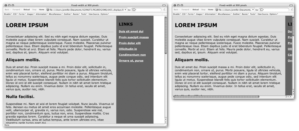
Figure 3-2. A fixed-width web page with exact pixel measurements viewed on large (left) and small (right) monitors
Style sheets offer the best set of tools for fixed-measurement layouts. In the past, designers resorted to tricks such as sized transparent graphics to hold “whitespace” on the page and multiple nested tables to control spacing around elements. Thankfully, these workarounds are no longer necessary.
Style sheets allow you to set specific pixel measurements for the page, columns, margins, indents, and so on. You can also specify the font size in pixels, ensuring the text will wrap similarly for most users.[*] The CSS Level 2 specification provides tools for the precise positioning of elements on the page, right down to the pixel. For designers looking for control over layout, style sheets are great news.
Some visual HTML authoring tools make it easy to create fixed-width designs . Adobe GoLive (http://www.adobe.com/products/golive/main.html) has an option for designing your page on a grid as though it were a page-layout program. GoLive then automatically generates ...