Creating flexible pages
The key to creating web pages that resize proportionally to fill the browser is using relative measurements, such as percentages) in your style sheets, tables, or frames or not specifying measurements at all and allowing elements to size automatically.
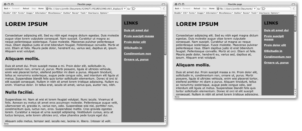
As an example, let’s consider a web page that is divided into
two sections: a main content column and a links column (Figure 3-1). By using percentage
values for the divs, table cells,
or frame measurements, the columns and elements will remain
proportional to one another. In this example, the main content column
takes up 75% of the screen regardless of the size of the browser
window. Note that the content of that column reflows to fill the
available width.

Figure 3-1. A flexible web page with proportional columns
Using style sheets, you can also set the contents of the page to flex based on the user’s text size preference by setting measurements in ems, a unit used in printing to refer to the width of one capital letter M. In CSS, an em is equal to the font size; in other words, an em unit in 12-point text is 12 points square. Using em measurements for element dimensions, margins, line-height, and so on ensures that page elements scale proportionally with the user’s chosen text preference.