May 2020
Beginner
267 pages
7h 37m
English

Traditional Java profilers use either byte code instrumentation or sampling (taking stack traces at short intervals) to determine where time was spent. Both approaches add their own skews and oddities. Understanding the output of those profilers is an art of its own and requires quite some experience.
Fortunately, Brendan Gregg, a performance engineer at Netflix, came up with flame graphs, an ingenious kind of diagram for stack traces that can be gathered from almost any system.
A flame graph sorts and aggregates the traces up to each stack level, so that their count per level represents the percentage of the total time spent in that part of the code. Rendering those blocks as actual blocks (rectangles) with the width being proportional to the percentage and stacking the blocks onto each other turned out to be very useful.
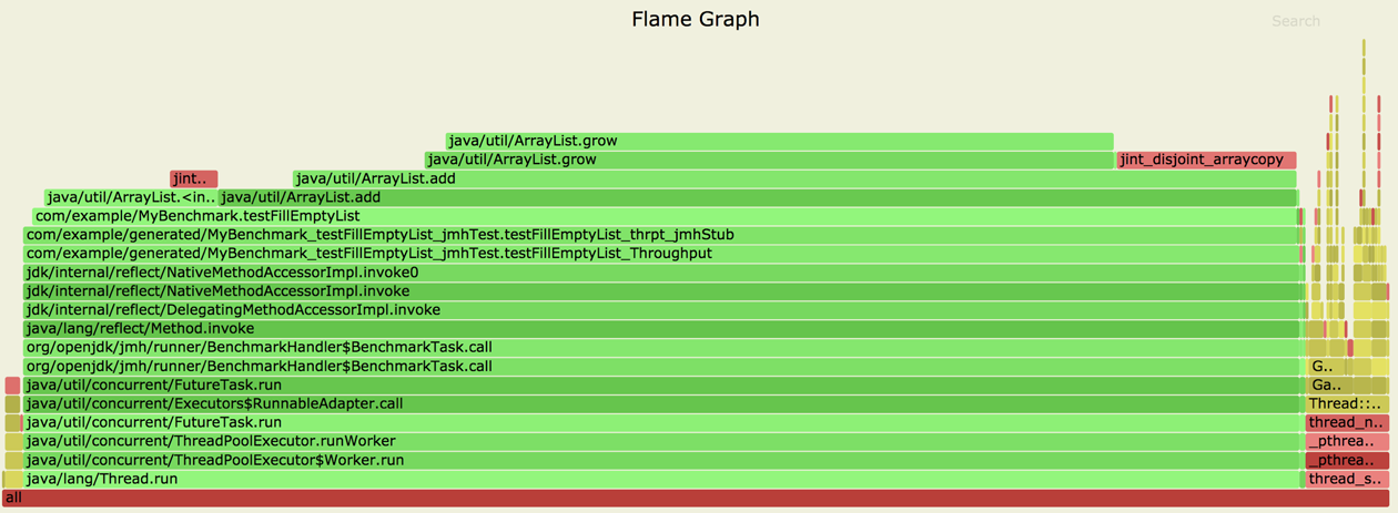
The “flames” represent from bottom to top the progression from the entry point of the program or thread (main or an event loop) to the leaves of the execution in the tips of the flames. Note that the left-to-right order has no significance; often, it’s just alphabetical sorting. The same is true for colors. Only the relative widths and stack depths are relevant.
You can immediately see if certain parts of the program ...