Although detailed discussions of an app’s design and development are beyond the scope of this book, I want to outline some of the primary elements of each. What I cover in this section will be a good starting point for you, but you should strive to deeply understand all aspects of bringing an app to the App Store. So, although you will possibly be relying on others to design and develop your app, knowing what is being worked on and being able to provide intelligent feedback regarding work in progress will make you a more useful member of your team. Ultimately, that will help deliver a better app to the App Store.
Note
As alluded to previously, the more detailed the product assets you create—research, wireframes, feature and task list, and roadmap—the fewer questions, and consequently, the less upfront work there will be for your designer and developer. This not only speeds the progress of your app, but also reduces your bottom-line costs.
You’ll work closely with your designer to expand your concept app. Through that collaboration, you’ll determine your app’s color scheme, fonts, logo, app icon, and of course, the screens themselves. Be inspired as you undertake your app’s design. Review with your team apps that reflect what you consider great design; it’s a major distinction for Apple and for customers. Through these sessions, take time to not only study the actual designs, but also how you interacted with the app. In the following paragraphs, Josh Clark, the author of Tapworthy: Designing Great iPhone Apps (http://oreilly.com/catalog/0636920001133/; O’Reilly), provides some key points regarding the importance of visual design. Note that his tips for iPhone apps are equally applicable to the iPad.
As an app designer, your interface choices affect not only what your customers can do with their devices but how they feel about them, too. A well-designed interface has the power to charm and beguile. Don’t dismiss this as touchy-feely hokum: an emotional connection is the basis for all marketing and storytelling, and make no mistake—your app is in fact a story. In this very personal context, people think about an app as content more than “software,” an experience more than a tool, and entertainment more than a task. Here are some pointers for balancing style, efficiency, and usability in an iPhone interface—the ingredients of personal connection.
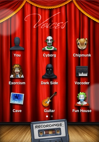
Choose a personality. Just like people, apps are irresistible when their personalities are in tune with both audience and context (Figure 5-2). An efficient, just-the-facts design lends an air of confidence to a productivity app. Warm wood textures, meanwhile, give other apps an organic feeling that is both homey and luxurious. Don’t let your app’s personality emerge by accident. Before you start tinkering with color schemes, graphics, and navigation models, consider how you’d like people to perceive your app. Businesslike and authoritative? Comforting and familiar? Sleek and poised? Homespun and crafty? Fun and toy-like? Opulent and plush? By choosing a personality for your app before you start crafting its visual identity, you give yourself a framework for making consistent decisions based on the emotional vibe you’re after.
Favor standard controls. Because they’re commonplace, the iOS’s standard controls are sometimes dismissed as visually dull. Not so fast: commonplace means familiarity and ease for your audience. Conventions are critical to instant and effortless communication. That’s why road signs around the world are standardized. Drivers hurtling down the freeway shouldn’t have to do double takes to figure out what a sign means. When instant and effortless communication is critical, conventions are a designer’s best friend. Buttons, icons, and toolbars are the road signs for your app, and iPhone screens that use standard controls have a no-nonsense seriousness that lends them a similar authority and don’t-make-me-think understanding. Before creating a brand new interface metaphor or inventing your own custom controls, ask whether it might be done better with the built-in gadgetry.
Add a fresh coat of paint. Standard controls don’t have to be dreary. Use custom colors and graphics to give them a fresh identity (Figure 5-3). This technique requires a light touch, however; don’t distract from the content itself or drain the meaning from otherwise familiar controls.
You stay classy. Luxurious textures applied with taste (Figure 5-4) increase your app’s perceived value. The same sumptuous materials of beloved personal totems—a leather-bound notebook, a glossy gadget, a retro timepiece—can likewise be put to good use in your interface to conjure the same attachment.
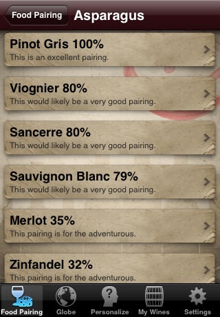
Figure 5-3. Wine Steward, which adds a parchment graphic to the background of each table cell, making the entries appear to be written on an aged wine label
Borrow interface metaphors from the physical world. Lean on users’ real-world experience to create intuitive experiences. People will try anything on a touchscreen, for example, that they’d logically try on a physical object or with a mouse-driven cursor. The card decks, spinning dials, push buttons, sliders, and light switches of the iPhone’s standard toolkit require no learning; we already know how to use them thanks to our experience with their real-world counterparts. These physical look-alikes are most effortless when the interface is the same size as the gadget that inspired it. When iPhone apps mimic a real-world handheld device (Figure 5-5), for example, the iPhone actually seems to become that device, and you inherit the time-tested ergonomics of the original, too.
Don’t be afraid to take risks. Make sure your interfaces are intuitive, sure, but don’t be afraid to try something completely new and different. Designers and developers are hatching fresh iPhone magic every day, and there’s still much to explore and invent. While you should look hard at whether you might accomplish what you need to do with standard controls, it’s also worth asking, am I going far enough? Allow yourself to explore the possibilities, and don’t be afraid to experiment with offbeat concepts.
The app icon is your business card. The icon carries disproportionate weight in the marketing of your app, and it’s important to give it disproportionate design attention, too. Think of the icon as a packaging label (Figure 5-6)—it’s great if it’s pretty, but it’s even more important that it be descriptive and identifiable at a glance, for both branding and usability. Avoid cryptic or inscrutable imagery, and don’t be overly clever with the visual metaphors. More commerce, less art. Make your app icon a literal description of your app’s function, interface, name, or brand.

Figure 5-6. App icons for Canabalt, which borrow the colors, styles, and textures directly from the app interface to create recognition and fidelity
Note
Two good resources on the process of designing an app’s icon include Michael Flarup’s “iPhone App Icon Design: Best Practises” (http://pixelresort.com/blog/iphone-app-icon-design-best-practises/) and Sebastiaan de With’s “Here, Icon Icon!” (http://blog.cocoia.com/2010/here-file-file/). Point your designer to these links.
Of course, there’s more to designing an app than aesthetics alone. Beyond colors and typography, which are extremely important, the design process for the iPhone and iPad is especially unique because the interaction with these devices is centered on touch (i.e., Apple’s Multi-Touch).
To give a little more context to the importance of the touch metaphor (besides what we covered in Chapter 2), an entire subspecialty of the larger design field is dedicated to user experience and interaction design. Those involved in this arena focus on designing products to be usable and easy to understand, instead of creating the visual aspects of them. Many designers take on both roles, with some doing so more successfully than others.
The importance of user experience, in particular, has grown tremendously in the digital age. And that attention increased back when the primary mode of interaction was through the mouse and keyboard on much larger screens. This should underscore how significant the user experience will be with your apps, where the screens are considerably smaller yet controlled with touch gestures.
Apple heavily touts the Multi-Touch elements of its devices and the new standard it set with the iOS platform. The company has worked diligently to preserve the elegant experience it has enabled on its devices, both within its own apps and with those developing for the Apple platform. To do that, Apple has created a set of standardized design frameworks and extensive Human Interface Guidelines (HIG) for each of its devices.
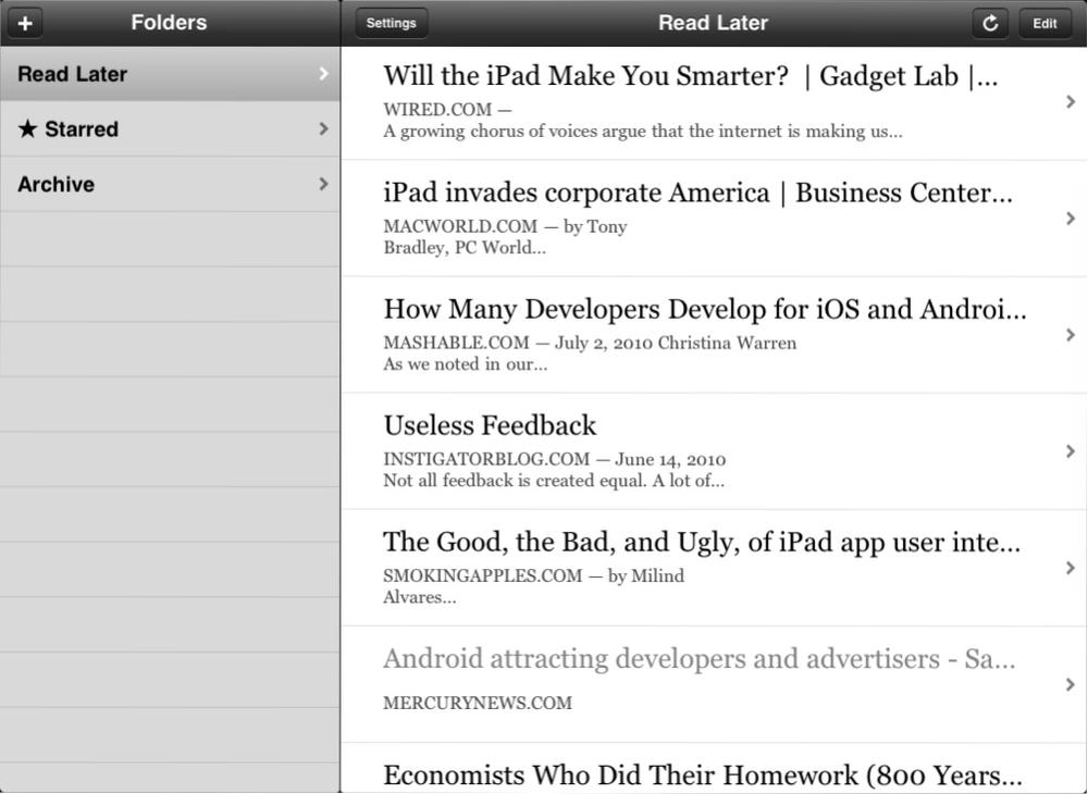
If you’ve completely ignored all of Apple’s documentation to this point, do yourself a favor and read the HIG for both the iPhone and the iPad (part of the iOS Reference Library). In doing so, you’ll learn how Apple approached porting apps such as Mail and iPhoto to the iPhone, and subsequently, how it did the same from the iPhone to the iPad. You’ll also become familiar with all the iPhone and iPad views and controls that Apple provides in its design frameworks and you’ll learn how to properly implement each of them. In Figure 5-7, Macro Arment’s popular Instapaper shows the split view in use for the iPad version of his app.
With the knowledge you will gain from the HIG, even if you are not a design expert, you’ll help shape your app’s user experience by ensuring that these elements are properly implemented. This particular point is critical, for two reasons:
Apple is fairly stringent about its HIG, and failing to observe them, at least in the past, was one of the most common reasons for app rejection during the approval process.
Apple favors applications that embrace the same simplicity of its applications; this partially follows from adhering to the HIG.
Through the HIG, I’m hoping you are now completely aware that your application will need great visual and user experience design to be considered a well-designed app.
As mentioned before, the differences between the iPhone and the iPad start with how you use the devices. The iPad display is more than 2.5 times larger than the iPhone display, so unlike the iPhone, the iPad is not extremely functional when you use it with only one hand; you need to use both hands or rest it on a surface. And where the iPhone and iPod touch are predisposed to being portrait-oriented, the iPad appears more natural and useful when in landscape mode.
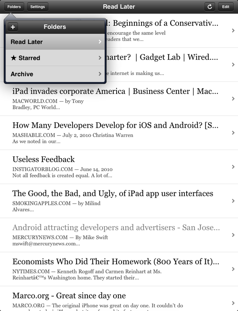
For the iPad, however, there is a much higher expectation—almost a demand—that applications work in both modes. The change in orientation typically only alters the view and controls that are displayed. For example, when in portrait mode, the list of folders for Instapaper is moved from the master pane of the split view (shown in Figure 5-7) to a popover view (see Figure 5-8).
The proverbial elephant in the room, however, is the difference in display size between the two devices. Although a big design challenge with the iPhone is its limited screen real estate, the iPad has the exact opposite challenge, with considerably more screen to fill. To accommodate these differences, even though the iPhone and iPad share some common views and controls, Apple did release a number of iPad-specific ones with the launch of iOS 3.2. You probably already saw many of the iPhone or iPad views and controls in either your wireframing tool or Apple’s HIG. You can also leverage Teehan+Lax’s iPhone and iPad GUI Photoshop design templates to understand the different elements available:
The views and controls for each device facilitate the different use cases for the iPhone and iPad. As you might recall from the multitasking discussion in Chapter 2, the iPhone’s focus is on discrete and short-lived, often time-filling tasks, flowing from its portability. Clearly the iPad is also portable, but unlike the iPhone, it is not pocket-sized. The resultant experience is that it is used more like a laptop than the iPhone is. Arguably, the iPad is a more portable laptop, and that’s how many people treat it. The iPad’s dimensions make it comfortable to use for much longer periods of time, especially for reading, browsing the Web, and managing email. Even though the iPhone 3GS and iPhone 4 can also be paired with a Bluetooth keyboard in iOS 4, the iPad is the obvious winner for this feature, with its considerably larger display.
You can see these differences most evidently in the popular apps on each device. The killer iPhone apps included to-do managers such as Things, flick games such as Flight Control, and streamlined mobile views for websites such as Mint.com. Comparatively, the earliest successes for the iPad included the document reader GoodReader, numerous newspaper and magazine apps, full-sized board games such as SCRABBLE for iPad, and Apple’s own iPad-optimized iWork suite (Pages, Keynote, and Numbers).
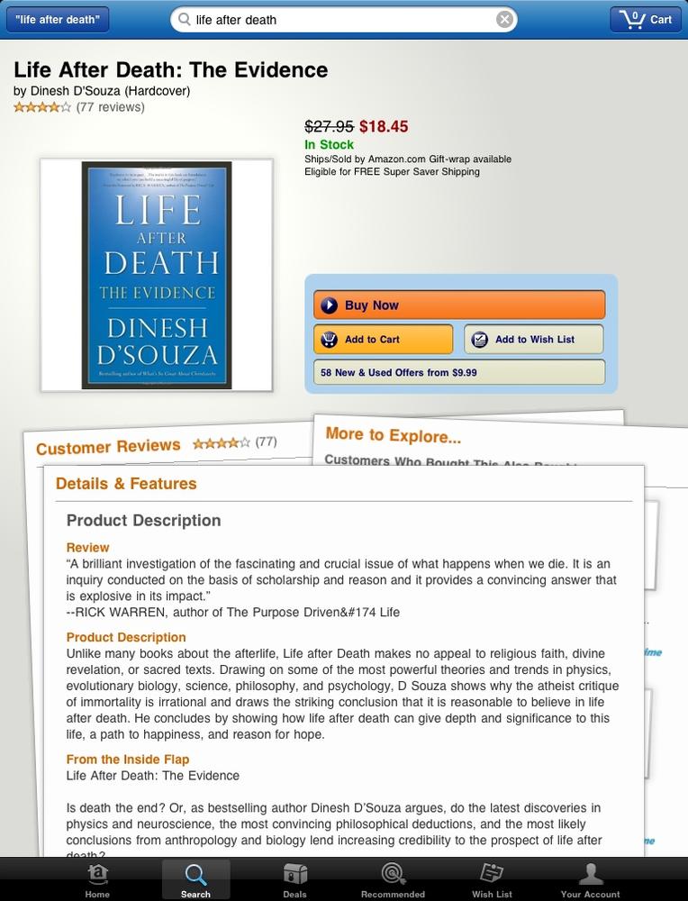
Beyond the HIG distinctions, however, these iPad apps reveal considerably more custom visual design. With the iPhone’s smaller real estate, many developers got away with using the native design elements provided by Apple for their iPhone apps. Not customizing the design becomes much more obvious on the iPad, however, and the best iPad apps take advantage of every pixel available, reinterpreting and reinvesting in their interfaces on this device. For example, compare Amazon.com’s iPhone and iPad apps, in Figure 5-9 and Figure 5-10, respectively, and notice the more custom design of the latter.

Note
It’s going to take some more time to truly understand how people experience and interact with the iPad. For some initial usability results, read Jakob Nielsen’s first findings at http://www.useit.com/alertbox/ipad.html.
The big task in the design phase will be to translate any wireframe assets you initially created into a refined, usable, and visually pleasing design. I recommend that your designer begin this part of the process once a first pass at the branding elements (colors, fonts, and logo) is completed, as you will need to use these branding assets in other places, such as your website, even before the app is released.
Of course, at this stage you likely haven’t developed wireframes for your entire application. As you gain experience in wireframe development, I recommend that you have done so once you reach this stage in future projects. Assuming you haven’t, though, have your designer start with what you did develop and work on that screen (or those screens) until you jointly agree that they properly reflect the look-and-feel (visual design) and layout (user experience design) that you want for your app. In other words, finish one or two screens and use them to help set the tone for the remaining screens. The features you outlined for the first release should inform how you identify the remaining screens and flow for your application.
With the introduction of the iPad, and subsequently the iPhone 4, designing for iOS apps has become increasingly more intensive. The reason relates to the differences in the sizes of these devices and their resolutions (see Table 2-1 in Chapter 2).
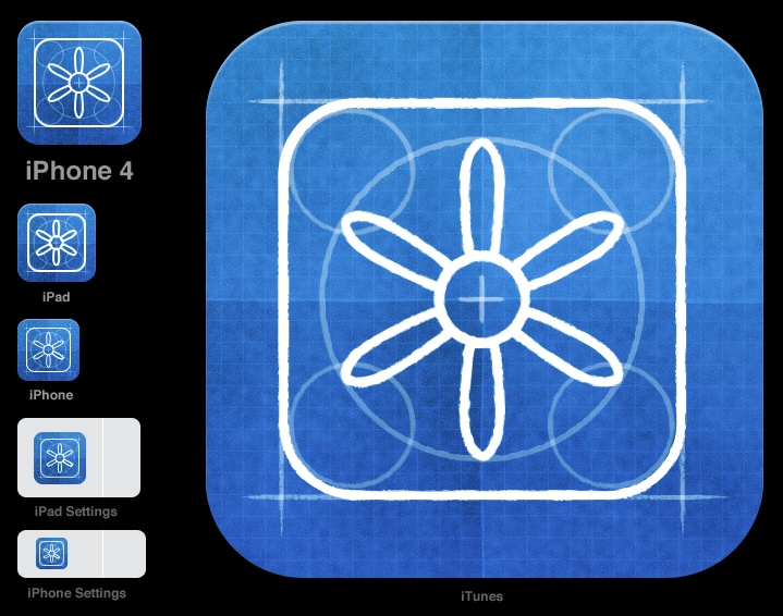
Depending on the devices you target, multiple versions of the same screen and icon will need to be created. In fact, if your app is to be released across all devices, it will require up to nine versions of its icon because of the screen sizes and resolutions of the iPhone (original, 3G, and 3GS), iPhone 4, and iPad (see Figure 5-11). You can point your designer to the following links, which provide more detail about this subject:
As described in the iPhone versus iPad section, some of these screens will not require a simple resizing, but rather will entail a fresh approach that caters to the device. The same is true for the icons. In particular, the iPhone 4’s Retina display provides for the highest-quality design, with 326 pixels per inch (versus 163 for its predecessor or 132 for the iPad). This means icons can contain more detail and richer textures. It is very likely that the next-generation iPad will also have Retina display, which will require another variation of design assets.
Focusing on the user experience of your app will go a long way toward removing some of the confusion or questions your customers may have, but it won’t eliminate all of them. That’s why, as you finish your app’s design, you should consider adding fun and interactive ways to guide and educate your customers about your app.
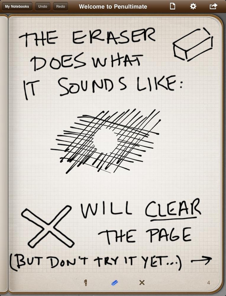
The best approach is to incorporate this guidance into the natural use of the app. There’s usually a correlation between apps that include this type of detail and their level of success. One stellar example is the iPad app Penultimate, which is a notebook that allows a person to sketch and write notes. The first notebook included in Penultimate is a dedicated user guide detailing the various functions of the app. Figure 5-12 shows how Penultimate explains its eraser function.
Other great examples include the initial introduction to Tapbots’ Pastebot (see Figure 5-13) and the opening hint from Sophia Teutschler’s Articles (see Figure 5-14).
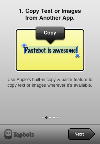
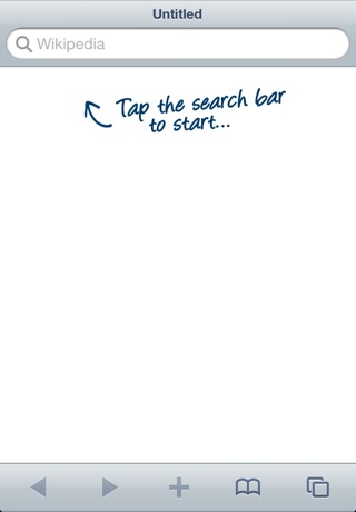
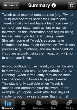
Figure 5-15. The Tweeb information button—the “i” shown here—which, when tapped, reveals help text that is specific for each screen
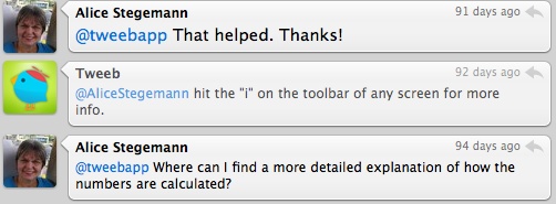
Depending on your app, you may not have the opportunity to create such an engaging experience. In Tweeb, for example, I opted for a more content-focused implementation. Tweeb performed some fairly complex calculations, and so even though it received rave reviews about its design, some customers had questions about how their stats were calculated. Nearly all customer questions were addressed by directing them to the information button available for each screen—identified by the “i” shown in Figure 5-15—which, when tapped, displayed customized help text on the screen (see Figure 5-16).
As you explore more and more apps, take screenshots; press the Home + Power buttons at the same time and a screenshot will be saved to the device’s Camera Roll. Over time, you’ll have a nice collection of best practices, tips, and unique design elements that you’ll be able to adopt and make your own. For additional inspiration, visit galleries such as http://ipadappsthatdontsuck.com, http://www.tappgala.com/, http://wellplacedpixels.com/, and http://tapfancy.com/. Regularly discuss with your team, and especially with your designer, apps that inspire you.
Getting into the details of programming may send chills through your body. Most people feel less comfortable with development than with design because development is typically a less familiar area and does not provide the same type of visual inspection that design does.
There are ways to check on the progress of development, though, and validate that it is on track and moving forward. Before I help you understand how to do that, I want to give you a brief overview of what will be happening in the development process.
Your developer should spend some time thinking about how the various pieces of your application interact. In larger technical efforts, before a single line of code can be written, an architecture of the system is usually created. Some may consider this overkill for an iPhone or iPad app, but I recommend that you have your developer provide either a concise written description of your app’s architecture or a visualization of it.
From personal experience, I can tell you that even developers who have taken the time to create a sketch of an app’s technical architecture often run into situations they didn’t expect. Taking the time to think through these aspects with your developer before any code is written greatly reduces the risk of the developer not accounting for a major piece of functionality or a scenario that can cause you to miss your initial release deadline.
The majority of your developer’s time will be spent programming the inner workings of your app. As with the design process, I recommend having your developer try to focus on one screen or feature at a time. This will allow you to fully test and experience a completely finished part of your application versus having random, unconnected pieces available.
Push your developer to identify and start on the hardest elements of the application first. This might mean no functionality is available for a longer period of time at the start of the development process. But this approach will avoid a situation in which you think you are coming to the end of the development phase, only to discover there’s a serious problem with a complex and integral part of the app.
If your app integrates with external data sources through APIs or web services, the parts that handle this integration will likely be the most complex. This could include connecting to social networking sites such as Facebook or downloading data from a server. These situations will require your application to check network connectivity and potentially cache or store data onto the device. The challenge with integrations is that your app will be dependent on something external to it and outside your control. Your developer will need plenty of error checking to make integrations work; your job will be to try to break them once they’re available for testing.
Note
Installing your app onto your device is covered in Chapter 6. You should, however, start installing and testing the app on your device(s) as soon as a feature or screen is ready.
In Chapter 4, I mentioned ensuring that you have access to your app’s in-progress design and development assets. In that context, ensuring access was as a matter of safety and to protect you from relationships gone bad. Hopefully, however, you’ll primarily use this access to successfully collaborate with your team members.
Although it is mostly a tool that your developer and designer will use, to facilitate this collaboration you’ll want to use a hosted repository to house your app’s assets. The repository should include the designer’s creative designs or artwork, the developer’s code, and possibly any strategic materials. The repository not only allows all team members to access these assets, but will also provide version control, ensuring that everyone is using the most current version of the assets and that they are able to recover and compare older versions of the assets. In reality, your developer is the only person who probably needs access to all of the assets.
Today, the most commonly used repositories are based on Subversion or Git. Developers will usually dictate what they prefer, so don’t be concerned about which to choose. Some project management tools covered in the next section, such as Unfuddle, can act as both your hosted source control repository and your issue tracker, making them more appealing options. Here are a handful of repository options for you and your team to consider:
Beanstalk (Subversion), http://beanstalkapp.com/
GitHub (Git), http://github.com/
Unfuddle (Subversion; Git), http://www.unfuddle.com
Kiln (Mercurial), http://www.fogcreek.com/Kiln/
Note
These repositories are also useful if you plan to open-source all or part of your app (e.g., http://github.com/brow/leaves/) and make it publicly available. Although uncommon, it is worth noting that you will probably not want to open-source anything until you’ve submitted and released the app.
To make it easier to get the source code from your repository (e.g., Unfuddle or GitHub), I recommend using version control client software rather than just using a web or command-line interface. The software you use is dependent on the type of repository for your app (noted earlier). The following list includes options for each:
Versions (Subversion), http://versionsapp.com/
Cornerstone (Subversion), http://www.zennaware.com/
Gitti (Git), http://www.gittiapp.com/
Gity (Git), http://macendeavor.com/gity/
GitX (Git), http://gitx.frim.nl/
It’s always good to try a couple of options until you feel comfortable. Once you’ve settled on one, ask your developer to help you connect to your repository. There will be a one-time setup, and after that you should only be refreshing (“update” in SVN or “pull” in Git) your source. The software you downloaded will make these updates easy going forward because there are buttons that initiate this process (see Figure 5-17). Unless you are also the designer and/or the developer, it’s highly unlikely that you’ll ever need to send anything back to your repository, so you’ll mostly be bringing the updated assets down from the repository.
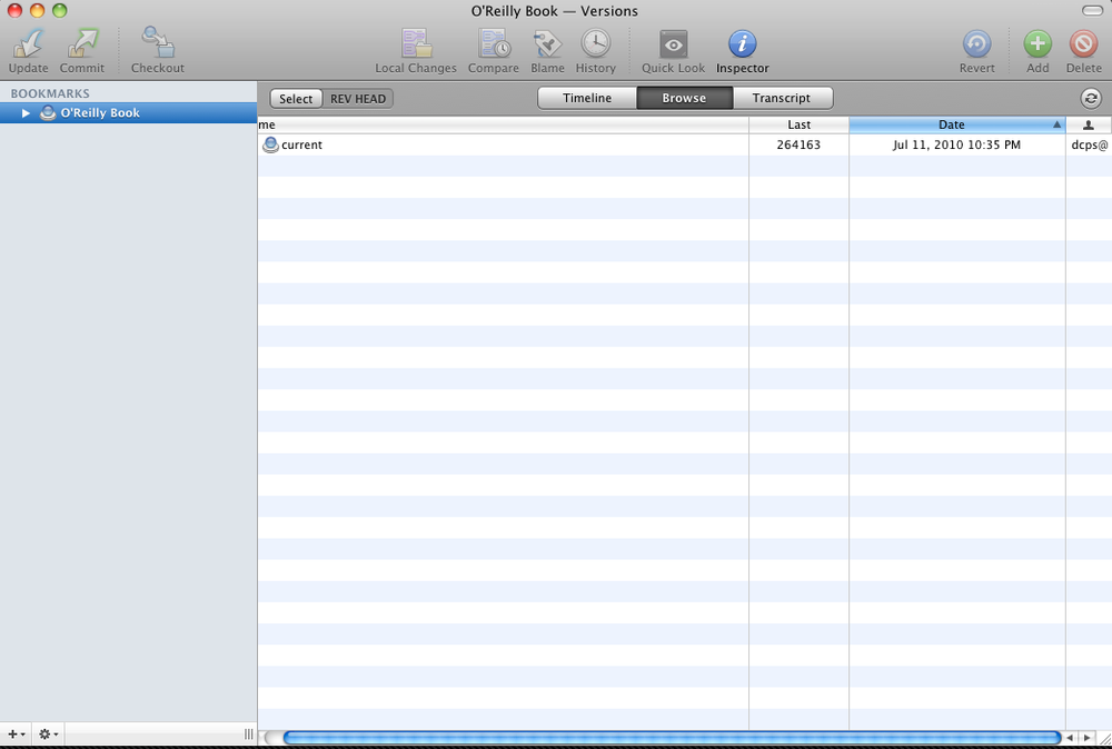
Figure 5-17. The Mac application Versions, which provides an Update button to retrieve the latest source code
At this point, the main benefits of having access to the repository will be to have physical possession of your app’s assets, as well as to see how often your app is being updated (technically, how often commits with new or updated code are sent to the repository). There are other benefits, such as being able to build your app onto your device. This is a more technical process that is mentioned in Chapter 6 and detailed in the Appendix for those who are interested.
Much further into the process, the development focus should shift from building new functionality to tuning and optimizing what exists. From a customer perspective, this means making the app snappier, smoother, and issue-free. More technically, your developer will be working on ensuring that your application is not leaking memory, overutilizing the device’s CPU, or being submitted with poorly written code.
Get App Savvy now with the O’Reilly learning platform.
O’Reilly members experience books, live events, courses curated by job role, and more from O’Reilly and nearly 200 top publishers.

